Tagged: half-square triangles
Sunday sketch #342
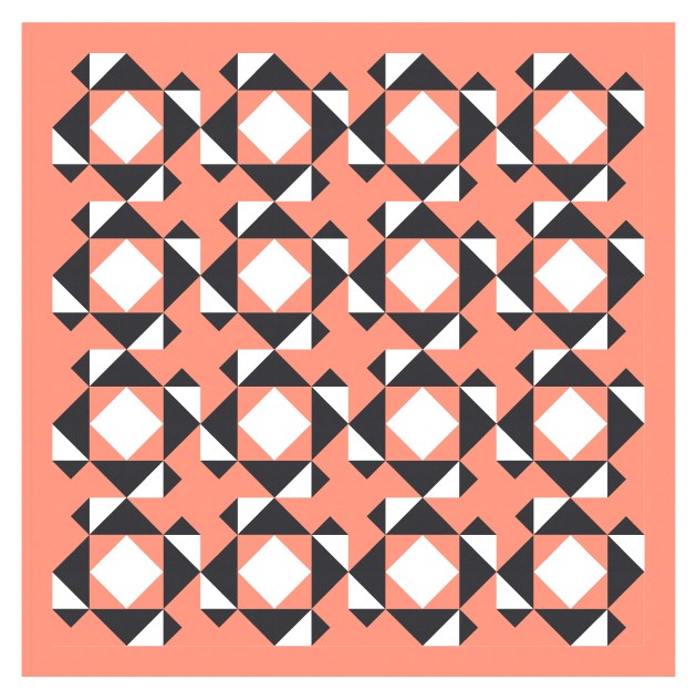
This week’s sketch is a direct progression of Sunday sketch #341. Instead of half-circles, I’ve used flying geese, and instead of larger circles in the inside of those black squares, I’ve introduced more squares. The colouring’s much the same, and there’s still a ton of movement, with lots of secondary shapes created by all those horizontal, vertical and diagonal lines.

The good thing about introducing flying geese is that their angles match those already in use in the design – so the sides of the geese are parallel to other lines in the design. Same with the central white squares. That helps to keep the whole design feeling coherent and less cluttered.
Here it is in a standard layout (with the blocks not on point).
I also tried replacing the flying geese with another shape – a triangle-in-a-square unit – but… nah. I don’t think it works well at all.

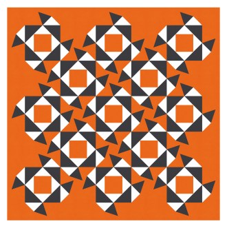
I’m not entirely sure why I don’t love these variations very much… they just feel a bit too busy and chaotic for me. The triangle-in-a-square units just add too many new angles that aren’t repeated elsewhere in the design, and it all feels very pointy and sharp. No thanks. But hey, I’m happy to share them anyway, because that’s what the Sunday sketches are all about: exploring design ideas, playing with shapes, and inspiring you to do the same.
These designs could be made using squares, half-square triangles, flying geese and rectangles. The standard layout above is an 8 x 8 grid, so 64 blocks total. Although you wouldn’t have to construct blocks before constructing the whole quilt – you could just make all the individual units and then piece them together in rows or columns. All the colouring is the same in all blocks, so you could chain-piece your way through them in no time.
Sunday sketch #341
This week’s sketch might look like a 4 x 4 grid, but it’s actually 8 x 8 (with a border). Each block is a 4-patch made up of one square, two half-square triangles, a half-circle and a rectangle. Tile and rotate the blocks, and the diagonal, horizontal and vertical lines start joining up to make new shapes. And so much movement!

Alter the block rotation, and those diagonal black squares shift up and over. I love how such a simple design can have so much going on.

The diagonal black squares are kinda empty, so let’s fill them with something. More curves seems apt.

Or maybe curves without so much colour. That’s better.

Another thing I often try with block-based designs is setting the layout on point – basically a layout where the square blocks are all rotated by 45 degrees. I really love this variation – all the elements and movement are still there, but with slightly fewer blocks (13 instead of 16), it just feels a little lighter I think.

We can fill those inner circles back in…

…or leave the squares empty.

I love so many things about this sketch. The back and forth, scribble-like movement of the curves across the whole design; the horizontal, vertical and diagonal lines that emerge to create secondary shapes; the symmetry and simplicity… it just ticks alll the boxes for me. It’s the kind of design where I think ‘OMG THIS IS THE BEST DESIGN I’VE EVER DONE!’ hahaha, so I’ll be interested to see what other people think 🙂
This one’s definitely going on my list of things to (possibly) make in 2023.
Sunday sketch #333
I started this week’s sketch on my dot pad, but I’ll show you where I ended up first.

This palette’s one that I’ve had in my head for awhile – that murky, blue-y green (teal I guess? but darker?), and that bright orange. I love it! Anyway, I didn’t start with that palette either, but I’ll explain how I got there.
I started by playing with triangles of different size. These shapes kinda look like (conical) martini glasses. By shading the components differently, it creates an overlapping effect. I decided to explore the idea more in Electric Quilt 8.

It’s pretty clear from the sketch that the easiest way to recreate the hand-drawn sketch is to break down the triangles into half-square triangles. So that’s what I did. Although I coloured the first version in a palette of four colours (against a white background).

This design feels busier than I’d normally like. I decided that big triangles that weren’t overlapped shouldn’t include the smaller triangle from the adjacent shape, so they’re solid. And just something about this version feels… I dunno, not quite right. I don’t like how the predominant lines are the diagonals connecting the hypotenuses of the larger triangles. And there’s way too much going on with that palette.
So I made a few tweaks: I set the half-square triangles on point, so the triangle shapes now appear to be in rows and columns. That removes those diagonal lines; they’re now horizontal, which is somehow less imposing. And I reduced the palette by one colour. It’s still pretty busy, but a bit more manageable now.

I often like to set designs against large white borders – almost like an artwork framed by a mat board. But I think this version would actually look better without the borders, so the repetition fills the quilt top. I like this version a lot more…

…but it’s still not what I had in mind originally. So I kept tweaking. I reduced the palette once again, to a pair of colours for the triangles against another colour in the background (I’ve used this light grey, blue and black combo before, most recently in Sunday sketches #314 and #315). And I found a fantastic combo with acid yellow – I know this won’t be everyone’s cup of tea, but I love it!
Finally, I started removing triangles to create some negative space and introduce some more interesting movement. I don’t usually plan this; I just pull things out until I like how the design feels.


And then I found this colour combo, which I stuck with.

I liked that version a lot, but the middle of the design felt a bit heavy compared to the rest. I decided to break up the columns of triangles in the middle – adding a bit of negative space. It was also an opportunity to add more large orange triangles. I think that naturally draws the eye from orange triangle to orange triangle, helping to create more movement in the design.
I also added a floating shape at the bottom right. This breaks my rules a bit – every other shape touches at least one other – but I’m allowed 🙂
These sketches could be made into quilts using half-square triangles and squares. You might need a design wall to keep everything organised until you were ready to sew rows or columns together.
This week’s sketch reminds me a lot of Sunday sketch #308. It’s got the same columns of repetitive, overlapping shapes. And the shapes themselves are very similar, with a large component and a small component that touch at a point. These are two of my favourite Sunday sketches (I know I say that all the time)!
