Sunday sketch #287

This week’s sketches are iterations of last week’s. It’s been awhile since I’ve done a series of related sketches. Although I’m not sure two posts in a row counts as a series…!

So last week’s sketches were all based around interlocking crosses – a bit like Brigid’s crosses – with alternating blocks having the reverse colouring. Using random colour placement instead produces a design like this:

And then I just started removing bits. I designed the block using flying geese and a square-in-a-square units, which means there are lots of bits that can be subtracted to create new and interesting designs. Here’s the first design again:

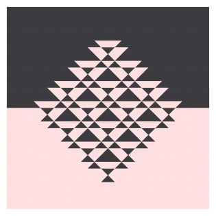
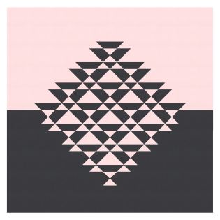
And here it is with alternating blocks removed (actually still there, but with only the centre square showing), to add some more negative space and help you see the individual crosses (or what’s left of them):

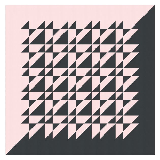
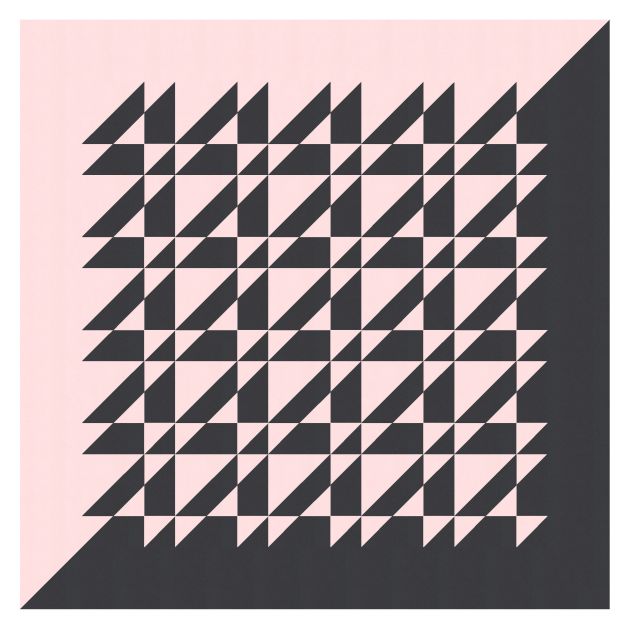
I also tried a simpler palette, so you can concentrate on the shapes rather than the colours.

This week’s sketch could be made into a quilt using flying geese, squares, square-in-a-square units and rectangles.

This isn’t one that I’ll be rushing to make, but I enjoyed the process of iterating the design and exploring different shapes and palettes. That’s the kind of experimentation that I like doing with the Sunday sketches – often a little shape or combination of shapes will spark a new idea and a new sketch. For example, I really love this little shape, which is repeated and rotated in the above designs:

It feels a bit like fingertips touching (not that I’m comparing my work to that of Michelangelo or anything..!). Anyway, I’ll keep playing with it and see if I can come up with something new. Watch this space!

Sunday sketch #286

I love using an alternating palette (usually of only two colours) on a regular repeating pattern to give the impression that some blocks are sinking into the background while others are coming to the foreground.

In this week’s sketches, each main ‘cross’ shape is made up of one block, with the outermost edges created by adjacent blocks.

The problem with a two-colour palette is that I can never decide which version I like best….

This kind of design has sooo much potential for different block placement. I tend to start with the blocks in the centre, often surrounded by a wide border (like in the above two images). When I’m happy with that version, I’ll try other versions by adding or removing blocks or borders.

With this sketch, I actually started with a multi-colour palette of my usual warm pinks, oranges and yellows. These colours always work well with a white background or a darker one (like the dark blue shown here). I like using wide borders in my sketches to frame the design a little, but of course you needn’t do that when making a quilt. I know some quilters hate dealing with things like sashing and borders.


These blocks also work well when set on point (i.e. on a diagonal grid). The lines within each block end up stretching horizontally and vertically instead of diagonally.

I removed the corner blocks in the above two designs, just to add some negative space. But you can fill out the whole grid if you want.

Or mix up the palette and placement…

And use whatever colours you want!

I originally designed the block using a square-in-a-square unit, a bunch of flying geese, and some half-square triangles. But seeing the block set on point, I realise it would probably be easier to make a quilt from this design using squares and rectangles that are assembled into rows or columns –rather than making complete blocks that are then sewn together.

Sunday sketch #285

Lots of lines this week. Horizontal, vertical and diagonal.

I’ve extended a diagonal line in the blocks through to the border, bisecting the quilt top diagonally. I kinda like this two-tone approach, splitting the quilt into light and dark.

In the version above, all the triangles are in black. The reverse colourway puts them all in pink instead; below I’ve rotated the design so that the black background remains in the bottom right half (otherwise it would’ve been in the top left when the colours were flipped).

I also tried the same layout on point, so that the line between the two halves of the design is horizontal rather than diagonal. Here are the two versions again, with black triangles (left) and pink triangles (right).

As usual, I’m not sure which I prefer!

This week’s sketches are all block-based designs (5 x 5 layout, or 4 x 4 on point); the blocks are made from half-square triangles and squares. The blocks are all the same, so could easily be chain-pieced. I like the design in just two colours, but you could try multiple colours per block – such as colouring the larger half-square triangles differently than the smaller ones.