Tagged: paper piecing
Sunday sketch #179
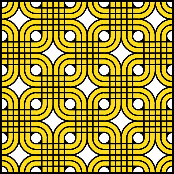
This week’s design is derived from an image that I posted to Instagram almost 3 years ago (I have to link to the post, because I’ve long since lost the image itself). It was a picture of a decorative metal grille that I’d seen on the wall of a restaurant on Melbourne’s Southbank – I walked past it and couldn’t stop thinking about it, so went back the next day to find it and take a photo.
At the time, I had no idea how to translate the design into a quilt pattern. I wasn’t sewing curves then, and I certainly wasn’t designing with them – but I saw this quilt-like pattern and snapped a pic for future reference.
Well, the day finally came when I could figure it out! I was recently scrolling through my Instagram feed, saw this picture again, and realised I now have the skills to recreate it pretty easily in EQ8.
I started off with a simpler version…

…in a few different colour variations.


Then I moved to the more complex version…

… in the same colour combinations (seriously, I love white, black and yellow together! and how cute do the different versions look right next to each other?).

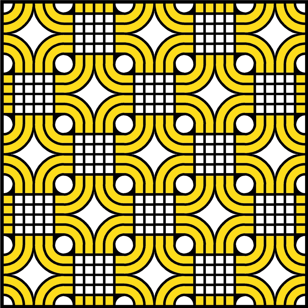
I don’t know if I’ll ever make this design into a quilt, but I like the fact that my skills have developed to the point where I could figure out how to make it. Probably because it’s not unlike Sunday sketch #177, which also features those leaf shapes and overlapping, round-cornered squares.
This design could be made into a quilt pattern using strips/rectangles and curves. You’d need to use templates for the curves, and possibly paper-piece the rest for accuracy. The bold black lines are an integral part of the design; I guess you could appliqué bias strips over a pieced top, but I’d probably opt for piecing the strips as well.
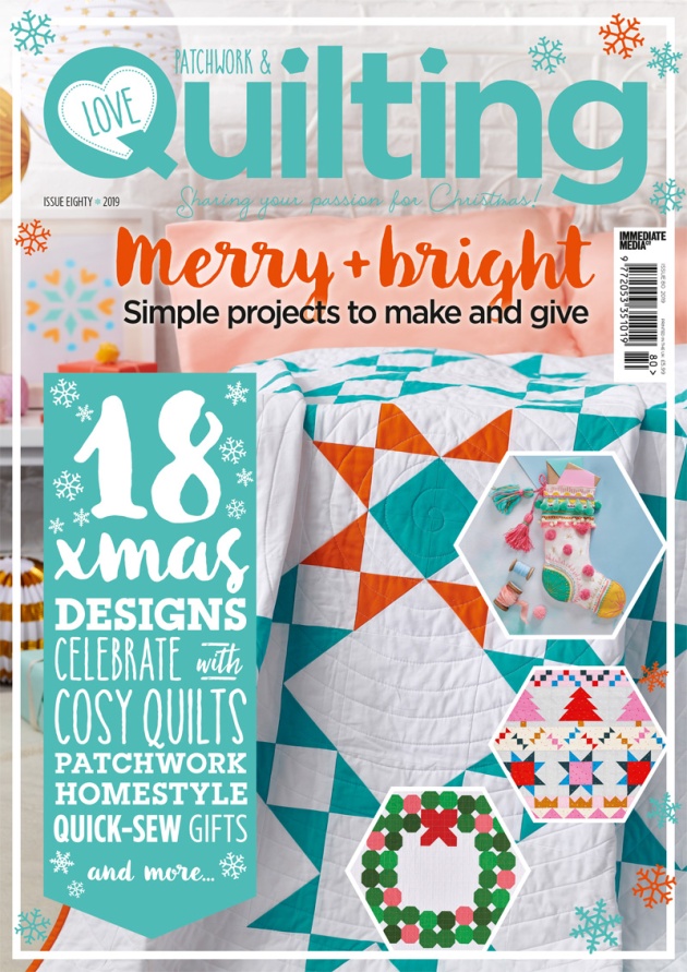
Quilt pattern: Northern Lights
My latest quilt pattern, Northern Lights, is out now in Love Patchwork & Quilting!
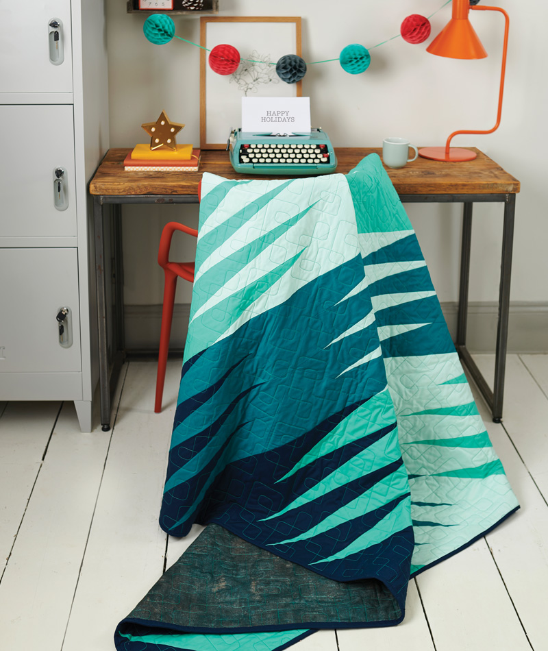
I posted the Sunday sketch (#124) for Northern Lights on 11 November 2018 – almost a full year ago!
I ended up changing the colour palette and reversing the order of the colours, with the darkest on the outside. I went with a cool-ish palette: (from dark to light) Navy, Ultramarine, Candy Green and Ice Frappe, all Kona Cotton solids from Robert Kaufman. The backing is Mist from Jennifer Sampou’s Chalk and Charcoal collection, which is also manufactured by Robert Kaufman.
Northern Lights is my first paper-pieced pattern, and it was a steep learning curve for me! The blocks are quite large – 18″ square – and I tried freezer paper piecing before going back to normal paper. Because there are 4 copies of each block, I eventually got into a rhythm of placing, sewing, pressing, trimming, placing, sewing, pressing, trimming….until they were all done. There was a point where I wasn’t sure I was going to manage it, but it’s amazing what a deadline can do to motivate me 🙂
Northern Lights was quilted by Sharni Crossett from Lyrebird and Lamb Quilt Works. Sharni has done a few quilts for me now, and she has taken a huge weight off my shoulders (literally as well as figuratively, haha). I’d love to get better at the actual quilting stage of making a quilt, but for now, it’s an area where I’d rather pay a professional – particularly for quilts that are destined for magazines!
Issue 80 of Love Patchwork & Quilting is on sale from Wednesday 30 October. You can find it in newsagents or online.
If you make Northern Lights, please tag me on Instagram (@geometriquilt) or send me an email. I’d love to see it!
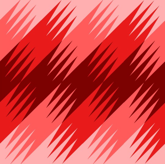
Sunday sketch #174
I’m still stuck on the same theme as Sunday sketches #173 and #172… folded strips creating interesting shapes.
I love how this design brings two fairly hefty groupings of strips together at a single point, right in the centre of the design.

The vertical black strips meet in the middle, as do the diagonal orange strips. And then they shoot off in the opposite direction, leaving a bold diagonal line in their wake.
I tried recreating this design in EQ8, but I don’t love how it turned out.

(It might’ve helped if I’d put a border around the whole quilt so you could clearly see where the edges are.)
Somehow the difference between the line weights was more obvious in EQ8… the vertical lines are skinnier than the diagonal ones (because geometry!), but I could live with that in the hand-drawn sketch. In the EQ8 version, the design just ended up looking too sparse. Maybe it was my colour choice? I dunno. I ended up adding 2 more lines, but that didn’t really help.
I would’ve liked to extend the diagonal red lines all the way to the corner of the top and bottom edges, but that would’ve made the quilt very wide, which I felt was unbalanced and left too much negative space. So I kept playing, and came up with a square version…

…which I like, but for different reasons. I think the fact that the pink lines are now fully overlapped (or ‘underlapped’?) with red lines fundamentally changes the design. I liked it when they had a bit of space on their own. Still, I like the boldness of this design and the fact that all four corners are (almost) occupied by a strip. Half of the quilt is still negative space, although I don’t think that necessarily matters.
I played around a bit more with the colours in EQ8, which is so easy to do.

And how about this one, for a very 80s vibe…

But after all that, I think I still prefer the original hand-drawn sketch!
These designs could be translated fairly easily into quilt patterns using the same approaches as suggested for the previous weeks’ designs: long strips, lots of half-square triangles, and/or paper piecing for accuracy.
