Tagged: quarter-circle
Sunday sketch #370
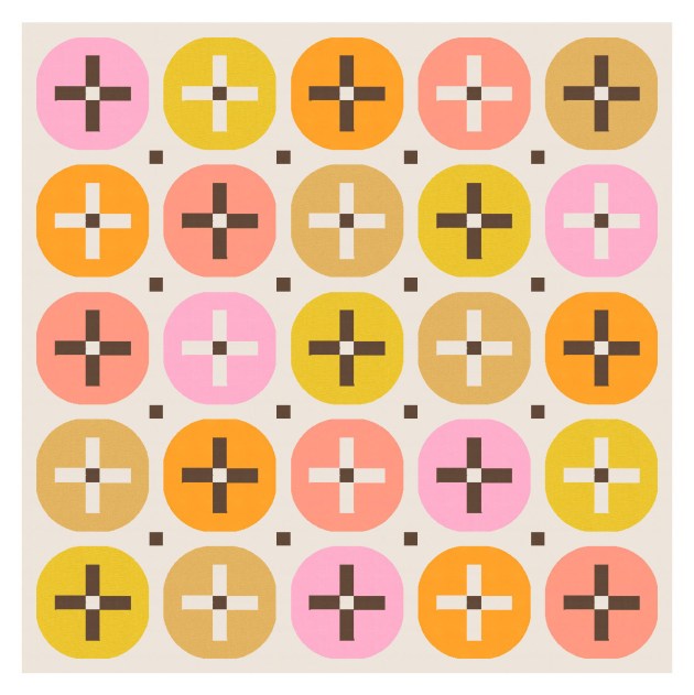
I’ve been doing a lot of (what feel like) fairly simple designs lately, but I’m enjoying playing with basic shapes and palettes. I’m big into sticking circles (or pseudo-circles) around stuff – this week, it’s crosses.
I used a similar shape in Sunday sketch #131 (way back in December 2018!), but haven’t really played with it since. But I really like it.
It’s not quite a circle, not quite a squircle, but 4 quarter-circles (or drunkard’s path units) around a cross shape. Using a centre square in the middle of the cross increases the opportunity for interesting colour placement.
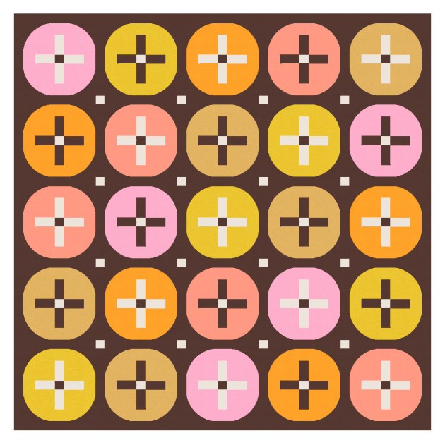
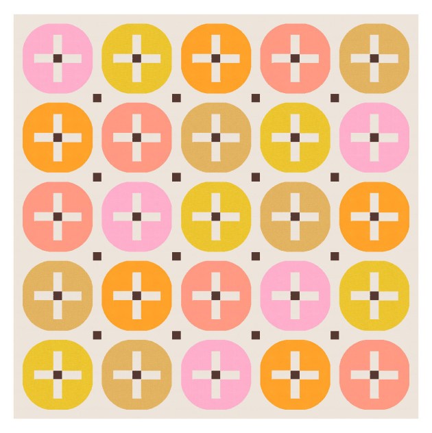
And those squares can be echoed in the sashing between the blocks, too. The design works without them, I guess, although it’s maybe not as interesting?


I’ve used a mixed palette here, but a more limited palette would work too.


I also removed some of the circles and retained the crosses – just to add some negative space and draw the eye around the design a bit.

There’s lots of potential with this design – lots of ways you could play with the palette and colour placement. I love simple, clean designs like this! They’re not earth-shattering from a design perspective, but very satisfying (to me, at least).
All you’d need are quarter-circles (or drunkard’s path units), squares and rectangles. I know a lot of people don’t like sashing, but I don’t mind it. I add it to a lot of my designs to break up adjacent blocks and avoid overcrowding. (Sorry!) But otherwise I think this week’s sketch would be a fairly easy make.
Sunday sketch #365
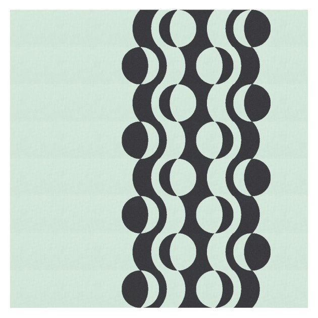
You might spot the similarities between this week’s design and last week‘s: the basic block has two circles in diagonally opposite corners that are each highlighted (or shadowed) by a half-circle. But this week, there are no relaxed curves; all the curves are full, half or quarter circles.

I’ve coloured that first version in a way that slightly obscures some of those full circles. Here’s the original, but I just don’t like those areas between 4 adjacent blocks where you get those sharp corners. They make the edges of the blocks a little too obvious, and introduce a hard edge amongst all those lovely soft curves.

An alternative solution is to introduce a third colour for those circles. I don’t mind this idea. (The palette isn’t great, but I ran out of patience while trying to find a three-colour palette that I liked!) Anyway, this one feels even more planetary/celestial. Especially with those interstitial stars!

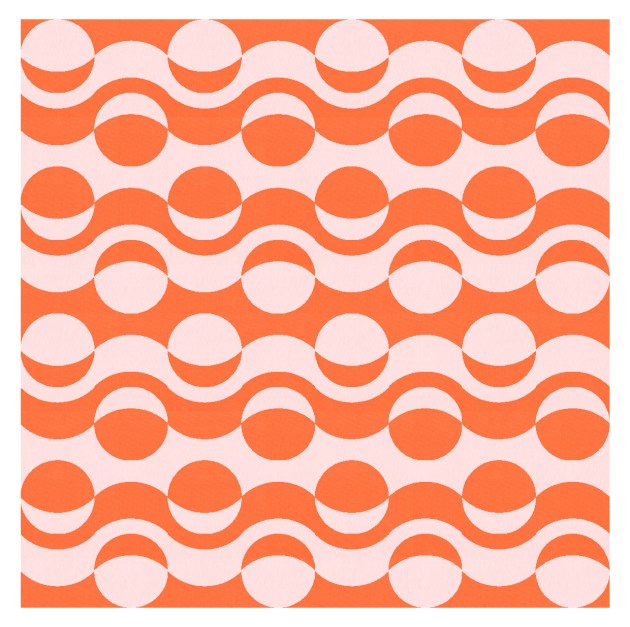
The same block can be rotated in different ways to make new shapes. These are a smidge too busy for me (hence removing some of the blocks around the edges in the first few versions, and introducing some negative space).


But this next version could be fun in lots of bright colours. A bit like Twister!

I think this week’s sketch could be easier to make into a quilt than last week’s, even though they’re somewhat similar. This one just needs full and half-circles, or lots of half-circles (or lots more quarter-circles). I feel like it’s been awhile since I made a curvy quilt, so maybe I need to put this one on my shortlist!
Sunday sketch #364
This week’s design came out of a design challenge that Tara Glastonbury’s been doing this year to help you kick-start your creativity. Tara’s been posting design briefs on her blog and in her column in Make Modern magazine. In Brief #5, called ‘Getting past a block’, Tara challenged participants to design a queen-size quilt using an analogous colour palette.
I love designing to ‘rules’, so I’ve enjoyed responding to each of Tara’s briefs. It’s a fun way to do something a bit different, and an excuse to post more designs to Instagram 🙂
It took me awhile to settle on an analogous colour palette that I was happy with (colour is always my nemesis!). Tara had also talked about William Morris as a design inspiration, so I started with curves and tried to come up with something floral/leafy.
I pretty much posted the first design I came up (even though I didn’t love it). But then I kept playing around with the idea of full circles bisected by more relaxed curves. Here’s where I got to.

This is a block-based design; you can see where the edges of the block are if I colour it a little differently….

I tried a few different two-colour combinations.

I also did my usual ‘modernising’ step by removing some of the blocks and block elements, introducing a bit of asymmetry, and adding some negative space.

I think I like the other version better, where the colours flow from one block to the next, obscuring their edges.
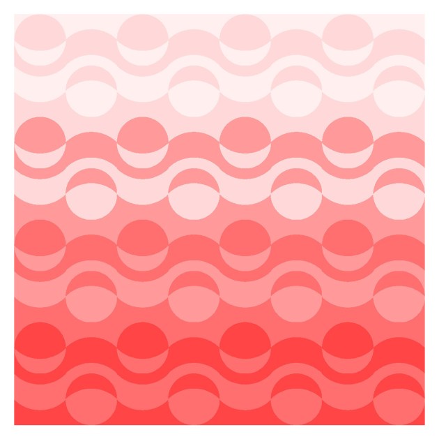
The design also works horizontally, where it’s a bit reminiscent of a rolling ocean with air bubbles on and under the water’s surface.
I also played a bit with the colouring of the layers, using darks at the bottom and lighter shades at the top. The light filters to the bottom while the air bubbles rise to the surface.
This week’s design could be made into a quilt using curves, curves and more curves. Specifically, half-circles or quarter-circles (drunkard’s path units), plus a more relaxed curve that might require a template. I’ve never sewn curves within curves before, so I’m not sure how easy it would be. I struggle making quarter-circles that are any smaller than about 4″ – they just come out all wonky – so I like the idea of a less curvy curve!
