Tagged: half-square triangles
Sunday sketch #233
This week’s design is related to Sunday sketch #171, which I posted back in October 2019. (I’ve been reworking that one recently, hence this one.) I set this sketch aside after making it, and now that I look at it again, I just see a fleet of TIE fighters 🙂

It’s hard to avoid using transparency effects in a design like this. Those big right-handed triangles just look like they want to be overlapped.

This design is mostly squares and half-square triangles. It could get a bit tricky with those teeny squares floating on point; I think the easiest thing would be to insert them into sashing between rows.
Sunday sketch #228
(Note: I just realised today, Friday 13 November, that despite being scheduled for publication last Sunday, this post never actually appeared. Oops! So here it is, almost a week late.)
Something simple to end a very stressful week! I’ve got blue on my mind, hence my colour choice for today’s sketch… 🙂

Even though this design is pretty simple – just vertical lines of half-square triangles, repeated across the page – it offers lots of possibilities in terms of colour placement. Here are a few versions with 3 colours instead of 2:


And, of course, you could add even more colours if you wanted to.
This design is actually made up of blocks… I started exploring a different idea and ended up with this one. But by rotating the blocks (easy to do in EQ8), I got a slightly varied design that I also liked. It ends up looking like a fairly common block (the name of which escapes me now…), a bit like the motif that I used in Sunday sketch #165 maybe?

These designs are all just half-square triangles, with some wide sashing/borders on either side of the quilt top. I guess you could use flying geese in some places, if you felt like saving a few seams.
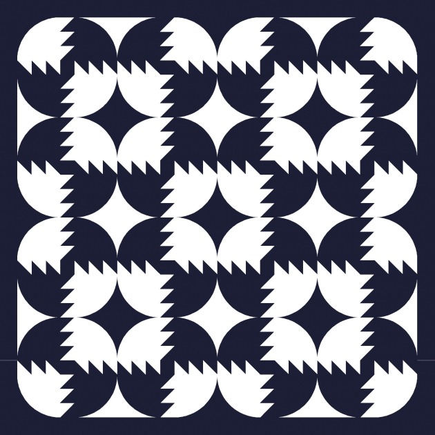
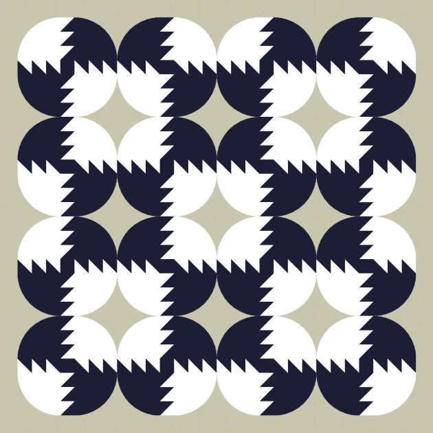
Sunday sketch #218
Back to some curves this week! With some half-square triangles to add a bit of zing.

I want to call this one ‘hairy squares’. It makes me think of those shaggy 70s throw rugs. Remember those?! Or maybe Chewbacca. Anyway….
As always, colour placement makes all the difference when it comes to pushing elements to the background or bringing them to the foreground.

Reversing the colourway and just using black and white introduces the 4 outer curves, which suddenly makes all the circles much more visible (to me, at least).

Flipping to a black background might make them clearer.
Or bringing in a third colour as a background. Now it’s just a stack of circles!
Depending on how you look at it, you might see the circles first or you might see the (hairy) squares. Or maybe the curvy diamonds? You could use a different colour to highlight those instead. Lots of potential for varying the look and feel of this design.
This design would be really easy to make into a quilt pattern. It’s all just drunkard’s path units, half-square triangles, and squares.
