Tagged: half-square triangles
Sunday sketch #344
The next few weeks’ Sunday sketches are all related – in fact, they all use what’s essentially the same block, just coloured differently and with some pieces removed or inserted. That process of addition or subtraction is one of the easiest ways to iterate a quilt design, particularly if you’re using software rather than paper and pen.
This week’s sketch isn’t what I started with, but it’s one of the versions in which the least number of block elements are coloured in. In the coming weeks, I’ll add to and subtract from the block using colour. Don’t worry – it’ll make more sense when you can see what I mean.

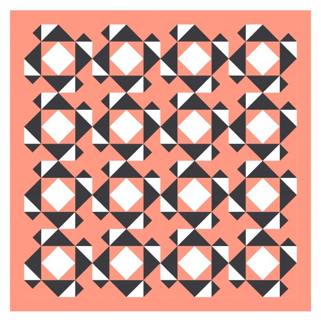
Don’t you love the curvy movement created by those outer triangle-in-a-square units touching at their tips? Round and round we go!
If you’ve followed me for long enough, you’ll know that I like to stick to certain rules when it comes to colour. In cases where the design can feel ‘busy’, I’ll use one colour for the same element in every block, for consistency. Here, I’ve coloured the inside star in white, the same as the background colour. (Does that inside star have a name…? It’s not a sawtooth star, but I’m not sure what it’s called.)
Anyway, I also like to select a colour palette that allows the right number of permutations for the design. In this case, I have 5 rows and 5 columns, with 3 ‘elements’ in each block (not counting the internal star, which I’ve already decided to leave white): the outside star, the octagonal surround of the inside star, and the centre block. So if I choose a palette of 5 colours, I can make sure that each different element appears in each colour only once in each column and row. It’s also nice if the colouring of any one block isn’t repeated. I don’t always manage it, and I didn’t completely succeed in this case. See if you can spot where I broke my own rules?
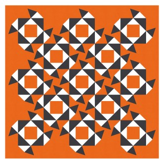
This combination of bright warm tones and dark blue is always a favourite. The reverse works well too.

This is a fairly basic design, using squares, triangle-in-a-square units, and half-square triangles. It’s got similarities to Sunday sketch #154 (the same triangle-in-a-square units and half-square triangles create the external star in this design) and #272 (replace the wedges with triangles and the two designs are very similar).
Often with designs like this, I’ll do a bit of a search to make sure there aren’t already a million designs like it. I can never be absolutely sure, of course – the internet’s a big place – but I don’t want to miss anything obvious. I don’t see anything like it on my ‘Quilts: Stars‘ or ‘Quilts: Triangles‘ Pinterest boards, but I haven’t added to them in awhile. Maybe I’m just reminded of my own sketches 🙂 As always, if you know of a quilt pattern that’s similar to a Sunday sketch, let me know and I’ll update the post accordingly. I like knowing what’s out there, and it’s fun to look at two designs and examine their similarities and differences.
Sunday sketch #343
I was digging through my old sketches and found this one, which I created when trying to come up with new half-rectangle triangle designs. It’s a bit like Sunday sketch #320, but sufficiently different to be worth posting, I think.
(This is maybe not a great colour combination to have chosen, as it can create chromostereopsis – a chromatic aberration where blue and red in proximity can give the impression of depth in an image or be harder to view. Or just seem a bit wonky. Sorry. I was too lazy to change it.)

Did you notice that the negative space within the design creates the same shapes in blue as there are in red? I love it when that happens.
So the half-rectangle triangle parts of the design are very similar to Sunday sketch #320, but the half-square triangles are oriented differently here, and the layouts are also different. It’s funny how such similar blocks can create designs that are quite unalike.
I’ve alternated the block colouring in the next version, so the four corners aren’t spiky anymore.

This design reminds me of a plant in Australia called Sturt’s desert pea, which has bright red leaf-like flowers that extend vertically from a black centre point.
Arranging the blocks on point helps to position the ‘flowers’ vertically. I like how all the lines from the HRTs create movement across and down the design.

The blue shapes in the middle might be easier to see in that last version.
This week’s sketch could be made into a quilt using 2:1 half-rectangle triangles, half-square triangles and squares. I’ve only shown two-colour versions here, but I guess it could work with a larger palette?
Sunday sketch #342
This week’s sketch is a direct progression of Sunday sketch #341. Instead of half-circles, I’ve used flying geese, and instead of larger circles in the inside of those black squares, I’ve introduced more squares. The colouring’s much the same, and there’s still a ton of movement, with lots of secondary shapes created by all those horizontal, vertical and diagonal lines.

The good thing about introducing flying geese is that their angles match those already in use in the design – so the sides of the geese are parallel to other lines in the design. Same with the central white squares. That helps to keep the whole design feeling coherent and less cluttered.
Here it is in a standard layout (with the blocks not on point).
I also tried replacing the flying geese with another shape – a triangle-in-a-square unit – but… nah. I don’t think it works well at all.

I’m not entirely sure why I don’t love these variations very much… they just feel a bit too busy and chaotic for me. The triangle-in-a-square units just add too many new angles that aren’t repeated elsewhere in the design, and it all feels very pointy and sharp. No thanks. But hey, I’m happy to share them anyway, because that’s what the Sunday sketches are all about: exploring design ideas, playing with shapes, and inspiring you to do the same.
These designs could be made using squares, half-square triangles, flying geese and rectangles. The standard layout above is an 8 x 8 grid, so 64 blocks total. Although you wouldn’t have to construct blocks before constructing the whole quilt – you could just make all the individual units and then piece them together in rows or columns. All the colouring is the same in all blocks, so you could chain-piece your way through them in no time.
