Sunday sketch #343
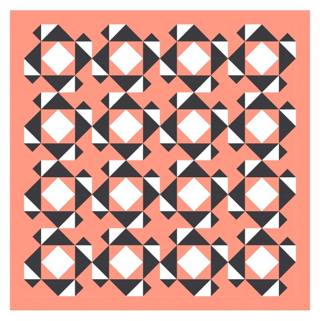
I was digging through my old sketches and found this one, which I created when trying to come up with new half-rectangle triangle designs. It’s a bit like Sunday sketch #320, but sufficiently different to be worth posting, I think.
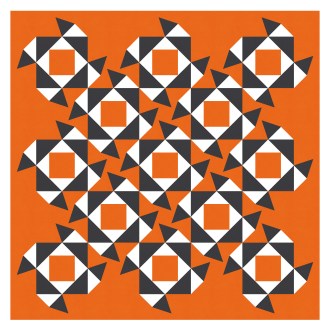
(This is maybe not a great colour combination to have chosen, as it can create chromostereopsis – a chromatic aberration where blue and red in proximity can give the impression of depth in an image or be harder to view. Or just seem a bit wonky. Sorry. I was too lazy to change it.)

Did you notice that the negative space within the design creates the same shapes in blue as there are in red? I love it when that happens.
So the half-rectangle triangle parts of the design are very similar to Sunday sketch #320, but the half-square triangles are oriented differently here, and the layouts are also different. It’s funny how such similar blocks can create designs that are quite unalike.
I’ve alternated the block colouring in the next version, so the four corners aren’t spiky anymore.

This design reminds me of a plant in Australia called Sturt’s desert pea, which has bright red leaf-like flowers that extend vertically from a black centre point.
Arranging the blocks on point helps to position the ‘flowers’ vertically. I like how all the lines from the HRTs create movement across and down the design.

The blue shapes in the middle might be easier to see in that last version.
This week’s sketch could be made into a quilt using 2:1 half-rectangle triangles, half-square triangles and squares. I’ve only shown two-colour versions here, but I guess it could work with a larger palette?