Tagged: rectangles
Sunday sketch #383
It’s been aaaages since I used Excel to create a Sunday sketch – I think the last one was Sunday sketch #335, which I posted almost a year ago. But I had an idea recently that I knew would be too hard to do in EQ8 (not impossible to do; just too time-consuming/annoying for me at my level of expertise), and because it’s all lines and squares, Excel is a perfect alternative.

The inspiration behind this week’s sketches was a similar motif that I saw on a bedspread in a photo for a real estate listing (inspiration is everywhere!). The original design was much more complicated; the arms extending from each hashtag joined up to create new shapes. But I didn’t want that. I just wanted to see how it would look to connect the arms of adjacent hashtags.
I started off small (and with a limited palette), just to explore the motif and its layout. Obviously, joining the bottom-right arm of one block to the top-left arm of the next one will create a stepped layout, which eventually resembles a slightly off-kilter square. All those intersecting lines create some shapes to colour in, too.


I liked the idea of extending those arms off to the side of the quilt. I’m not sure I’d make this design in real life; I’m not great at sewing (or keeping) long lines that straight. (I’ve never used starch, but maybe I should?)
So instead I tried packing the design from edge to edge with the hashtags, and playing instead with colour palette and placement. Excel doesn’t have a huge selection of pre-set colours, although you can input RGB colours if you want. I’m too lazy for that, so I just picked some bright, neon-y shades.


(I even like how those four look together!)
I’m not sure of the easiest way to construct this design, particularly for those versions where lines cross over or under lines of other colours. I guess there would be a lot of careful seam matching to obscure the joins between adjacent blocks. Otherwise, it’s just all squares and rectangles.
I know that the hash (#) symbol has been used in other quilt patterns, so I dug around to try and find some. If you like this motif and you want to use it in a quilt, check out these patterns:
- the #Hashtag quilt block and quilt pattern from Sew Can She
- the Ella quilt pattern from Kitchen Table Quilting
- the Hashtag paper-pieced quilt block pattern from Patch and Dot
Sunday sketch #381
One of the things I’ve always loved about my Sunday sketches are the outlines – the thin black lines around the shapes. When I used to hand-draw all my sketches, they were all lines; now that I create most of my designs in EQ8, I don’t always show them. But sometimes I purposely make the black lines a feature (see Sunday sketches #265, #269, #277 and #348, for example), even though I’ve never really made a quilt with skinny strips (apart from Sketch).
Anyway, this week’s sketches are the by-product of a sketch that I haven’t shared yet. You’ll see the connection in the coming weeks, but for now, it’s fine as a standalone design.
And yes, I’ve done my usual sudoku-style colouring where each colour appears only once in each row or column 🙂
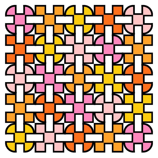
This is a block-based design using a standard layout, plus thin sashing. I used black to delineate the shapes in the first version, but colouring the same lines in the background colour means I can highlight some of the secondary shapes – those light grey rectangles. They definitely feel like they’re in the foreground, overlapping and connecting the coloured circles and squares.

Here’s a reverse colourway where the shape outlines are still the same colour as the background, and the connecting rectangles are in white instead.
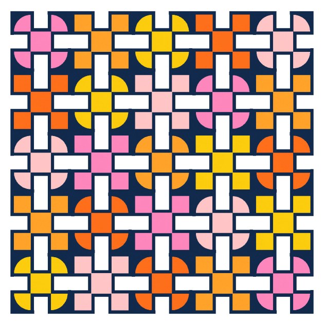
There is thin sashing between the blocks, just to give a smidge of space between them. Here’s what happens without the sashing – this is just a bit too crowded for me!
And the same design works without any outlines. Here I’ve coloured each block’s outlines in the same colour as the rest of the main shape(s). That just makes the shapes look a little fatter. I quite like the connectivity in this one too.

This week’s sketches could be made using thin strips, squares, rectangles and quarter-circles (or drunkard’s path units).
I feel like there may be the potential to iterate this design a little more, but first I need to show you the designs that led to this one! That’s next week.
Sunday sketch #376
I’m still using the same block as the past two Sunday sketches, but I’ve removed some parts this week. (This is easy to do when designing; I just make bits ‘disappear’ by colouring them the same as the background. Obviously if I were making these blocks, I’d revise the design so there were fewer pieces in the block to begin with.)

So how did I get here from there?
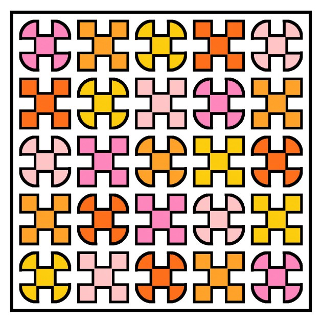
Last week, I ended on a layout in which the blocks were set on point. Both the rounded and the squared corners in each block were coloured the same as the background, and the block had a leaf shape (also in the same background colour) in the middle. I didn’t love those versions.So this week, I’ve removed that internal leaf shape and replaced it with the square that was there originally. I left the curved corners coloured in, but the squared corners are still gone (coloured as background). And then I mixed up the colouring to highlight a different set of shapes within the design. I really liked these retro Xs, with their arms separated by the sashing in between blocks.

The four ‘arms’ of each X come from four adjacent blocks; each block has two arms in two different colours.
It’s quite a busy design when it’s multicoloured, so I tried a two-colour, alternating layout instead.

I liked that one, but I felt that the retro nature of those Xs really cried out for a standard layout.

And then I added some more space just to let the shapes breathe a bit. This layout’s reminiscent of Sunday sketch #373, too – two grids of 3 × 3 overlapping.

As always, I kept iterating this design, although that first version is my favourite. I tried colouring the sashing between the blocks, which ends up creating a plaid-ish effect.

That added colour removes the retro feel and gives this a more traditional feel. I still like it though!
Like the past few weeks’ designs, this week’s sketch could be made using squares, rectangles and quarter-circles (or drunkard’s path units). The curves would need to be pretty small – something I still struggle to do well – but the rest of the piecing would be pretty straightforward.
