Sunday sketch #505
This week’s sketch spawned two others that I’ve already shared (and a few more that I haven’t). I’m obviously in a real recycling mood lately!
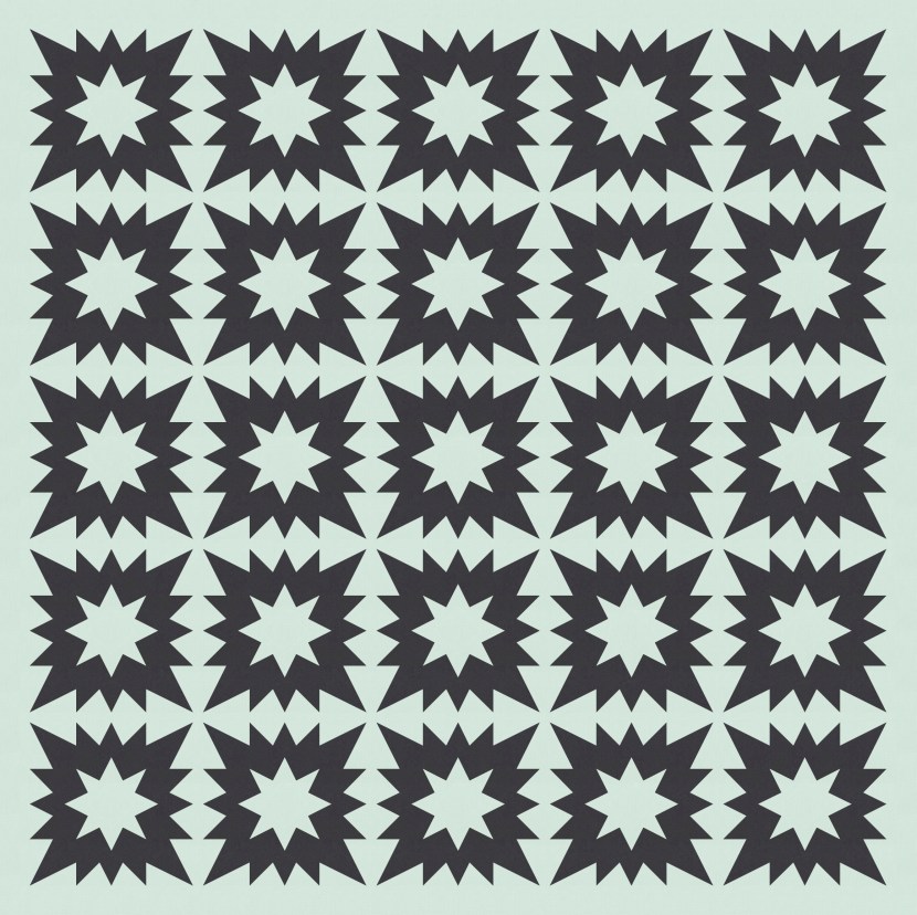
I started with a spiky-edged block, and just tiled it to start.
I like the concept of a zig-zaggy edge, but I don’t use it enough. I feel like I’ve played with this idea a fair bit, but I don’t see many Sunday sketches that use it, so perhaps I never get it quite where I want it? I keep trying.
Anyway, I felt like the blocks needed a smidge of breathing space, so I added some thin sashing.
I kinda like this, but it’s not quite enough, if you get what I mean. I felt like the blocks needed something in their middles.
Now, I won’t walk you through the hundreds of designs where I tried different middles, but let me show you a few of the contenders (see image below).
After starting with the basic block, I tried adding a star-ish shape in the middle. The smaller star fits into the square in the centre of the block. And… meh. I mean, it’s OK, but it didn’t feel as zig-zaggy as the block’s outer edges. I felt like it kinda dragged down the energy of the original block.
Then I tried a blockier shape: a kind of modified nine-patch. It extends beyond the middle square into the rectangles around the edge of the block. I don’t really know why I tried this, because it’s an incongruous shape in this space; it’s all horizontal and vertical lines, which don’t feature anywhere else. So I didn’t feel like it worked in this design, but I kinda liked the shape itself, especially those half-squares around the edges. Do you recognise them? That shape ended up on its own in Sunday sketch #503.
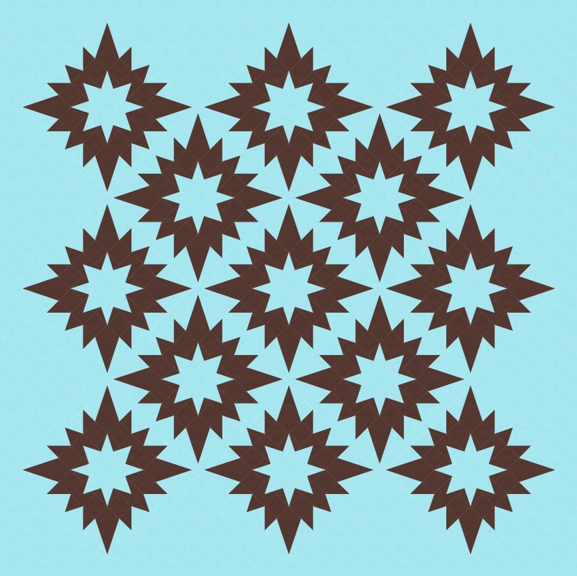
Anyway, then I tried a sharper star in the middle. Instead of being contained by the square in the centre of the block, it extends into the side rectangles too. That lets the top, bottom and side arms of the star be pointier. Do you recognise that star? It featured in Sunday sketch #502!
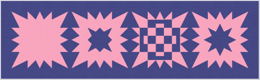
(As an aside, here’s the block with the modified nine-patch in the middle. I like it a lot, but it is busy. I’ll revisit it one day though. I think it’s got potential.)
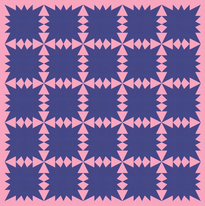
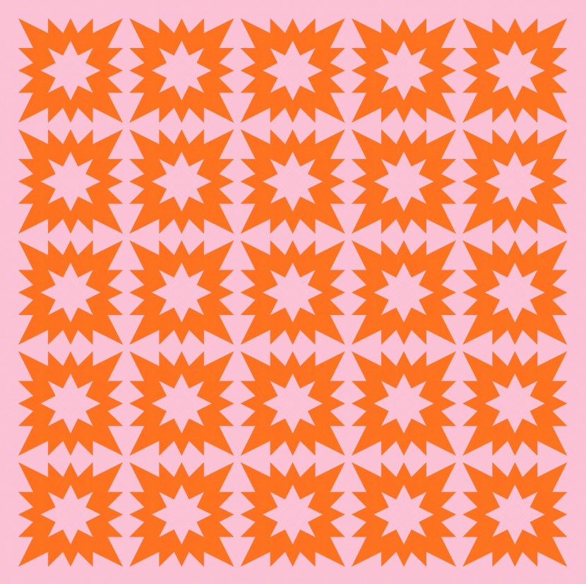
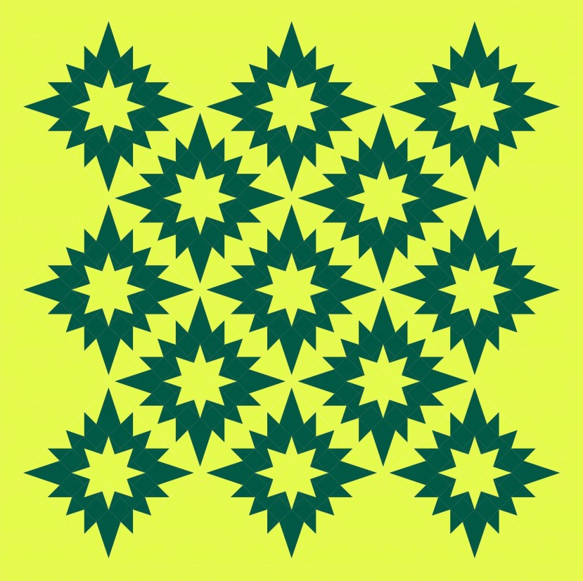
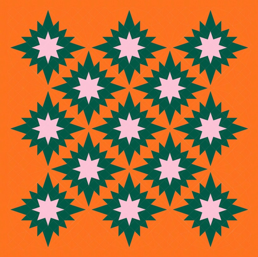
OK, back to the block that I settled on. Here it is, tiled again, with a smidge of space (thin sashing) between the blocks. This is starting to feel more interesting! I like the happy energy.
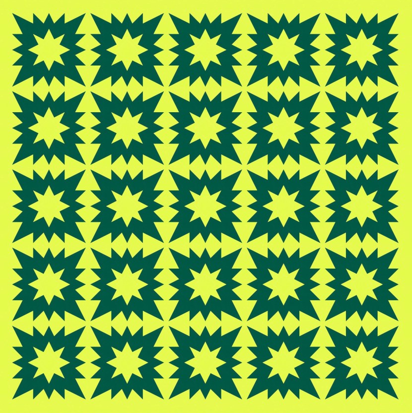
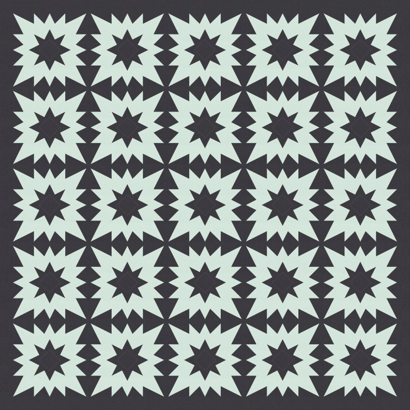
I can also remove a few bits and pieces to focus on the zig-zaggy bits, which form a nice grid for capturing those smaller stars. It’s a fun play on negative space too.
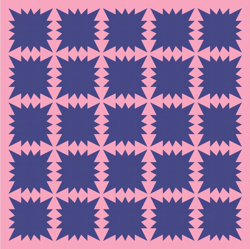
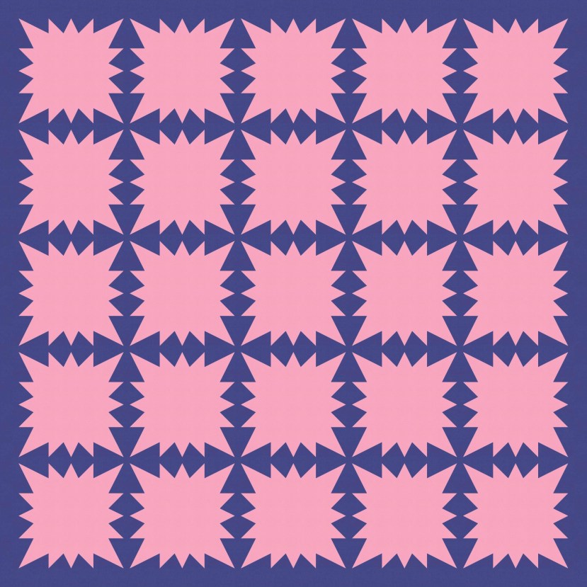
And of course there’s more potential for removing blocks or parts of blocks to focus on those shapes even more.
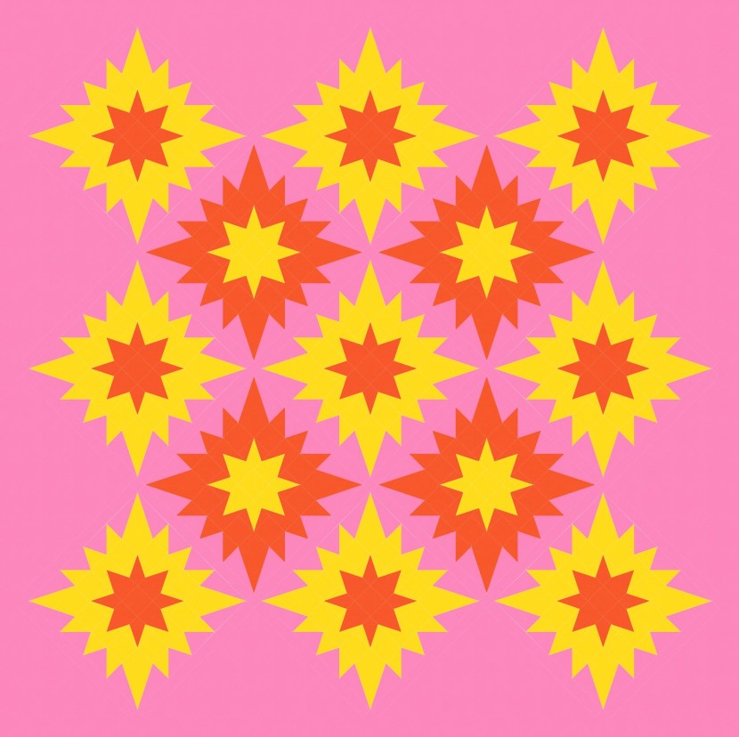
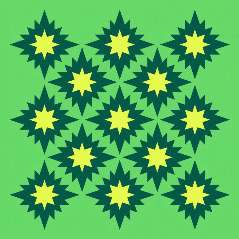
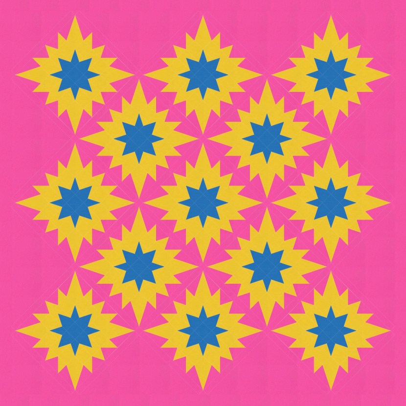
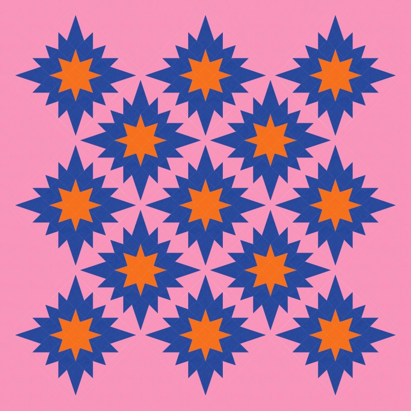
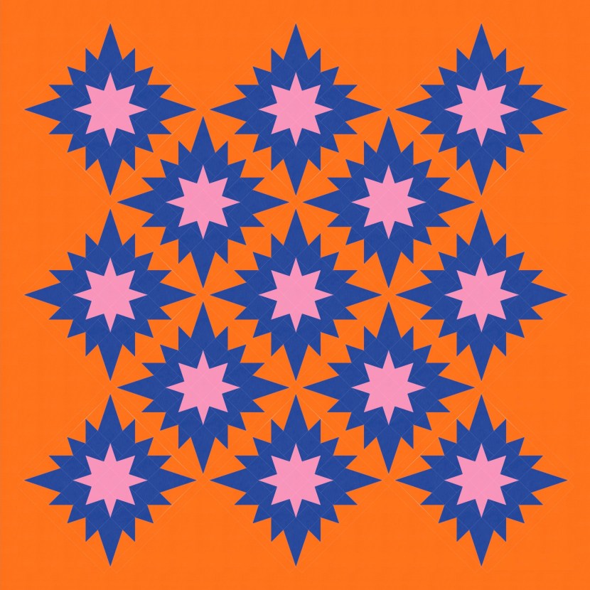
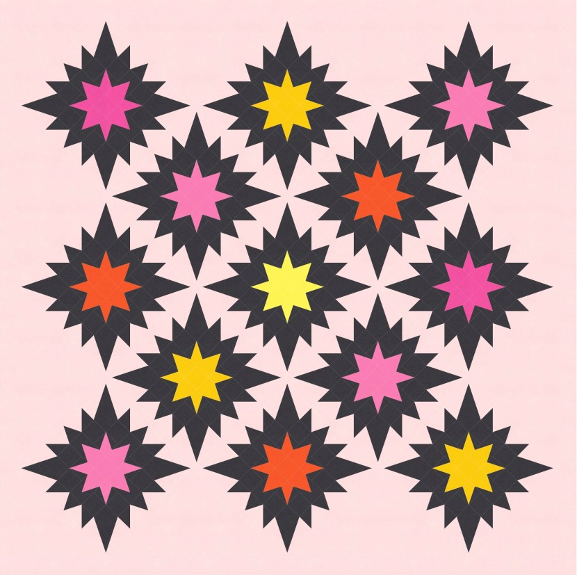
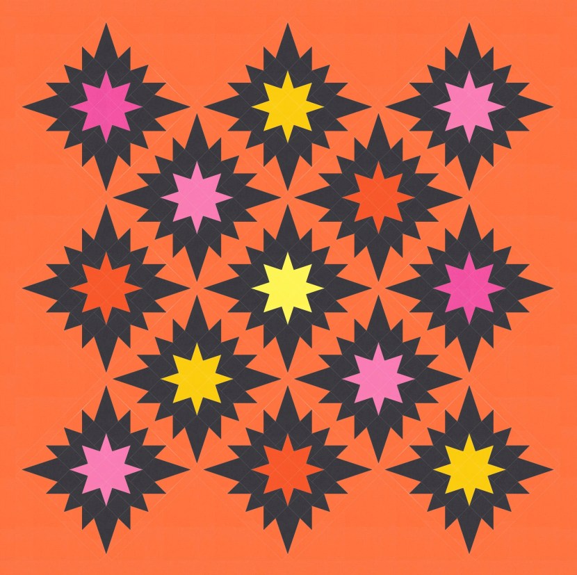
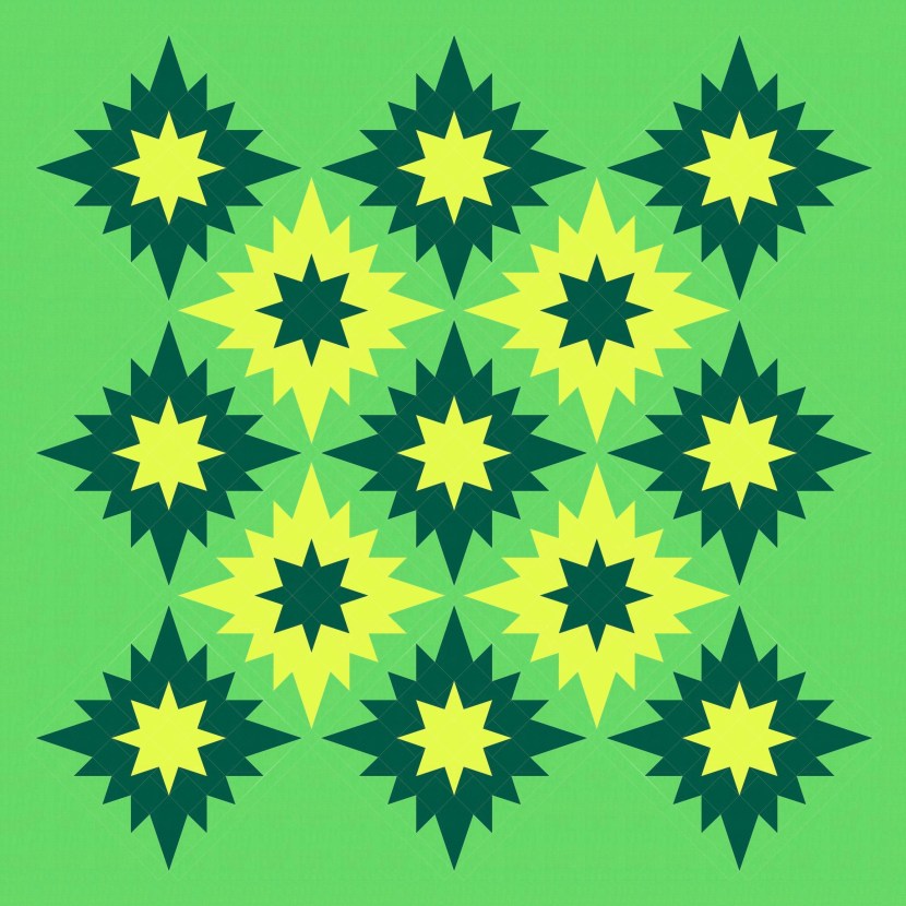
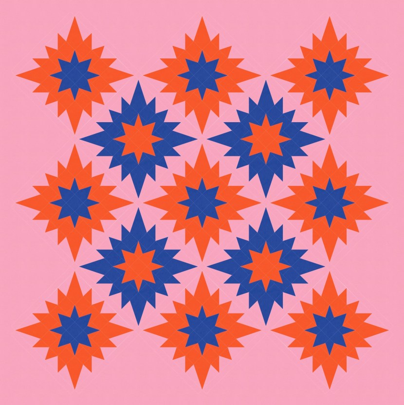
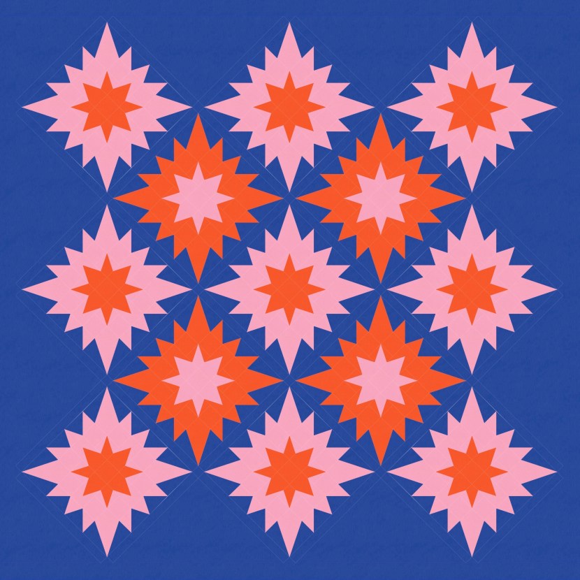
The standard layout looks pretty good in a multicolour palette too. A bit fireworks-y!
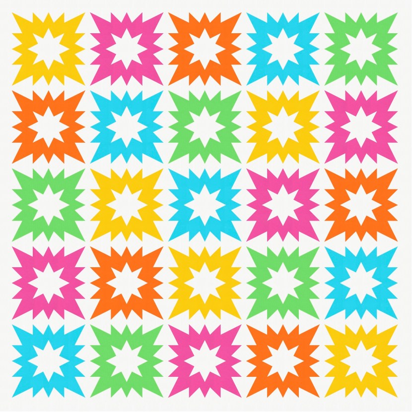
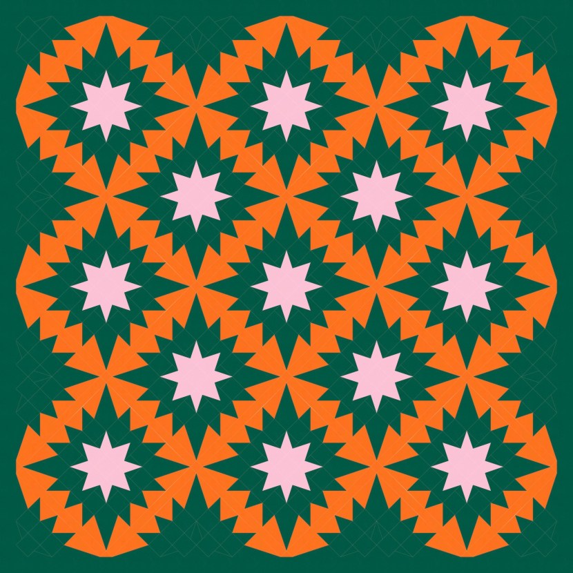
The next step was to try a different colour for the smaller stars. I like this too! (So many exclamation marks this week 🙂 )
I like the idea of using a traditional layout with a more modern block; with the right fabrics, this simple arrangement could work really well. But… you know I had to keep playing, right?
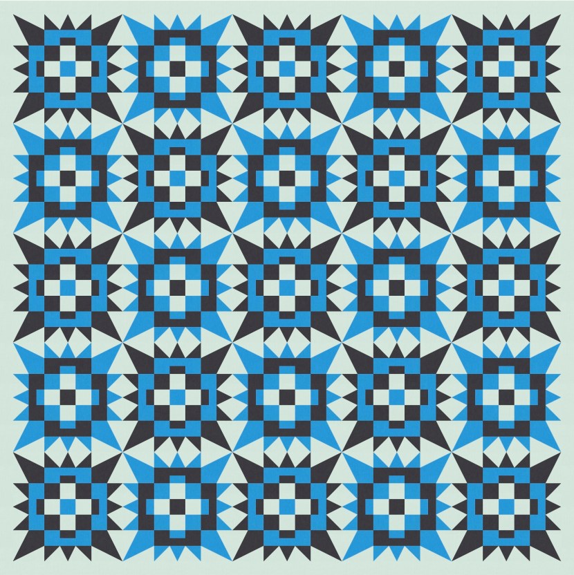
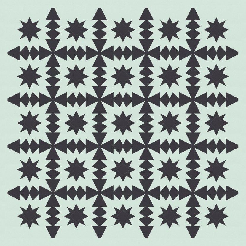
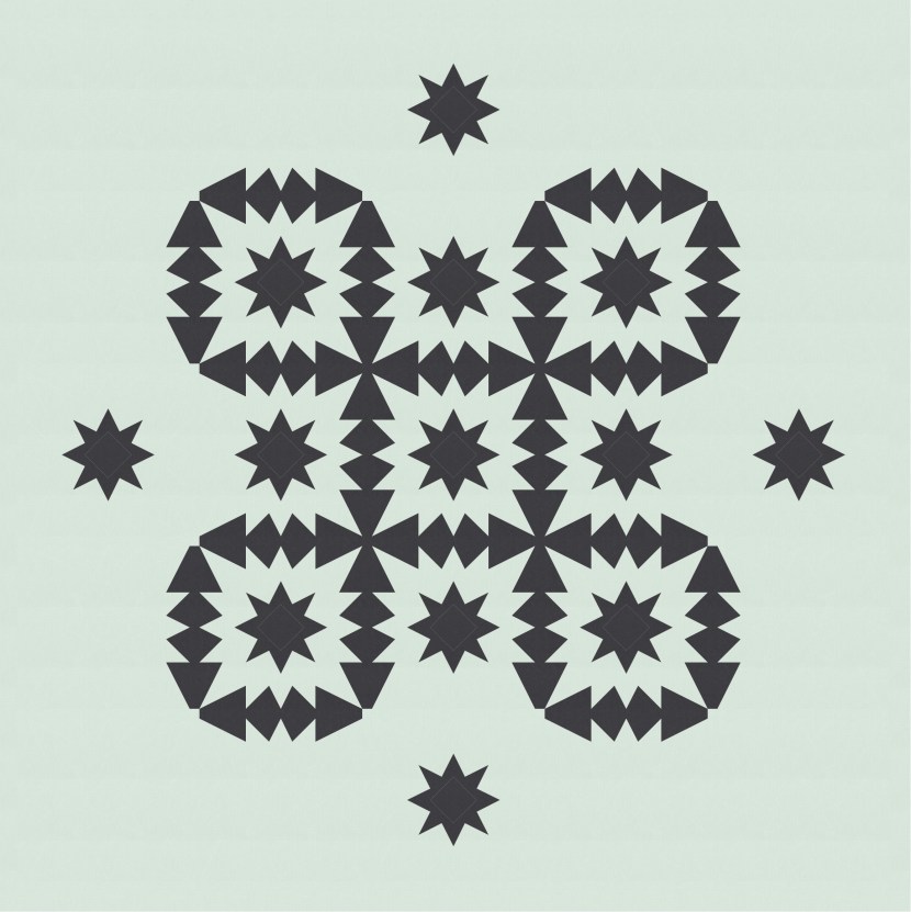
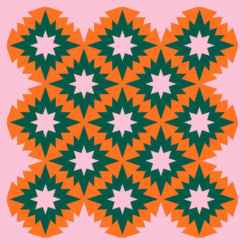
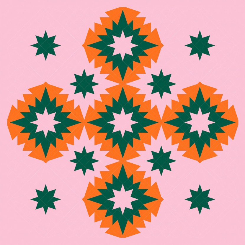
As always, when I’m pretty happy with a design but something (I never know exactly what) is missing… I turn my head 45 degrees to see what it might look like arranged on point instead of in a standard layout.
Ohhhhhhhhh!
This instantly feels MUCH more interesting to me. The zig-zaggy edges create almost-circle shapes, like a halo around each star (they were there before, just less obvious). I feel like there’s lots more movement, and because of the layout of blocks, the whole design now feels like it has zig-zaggy edges too.
All that’s left to do is play with colour!
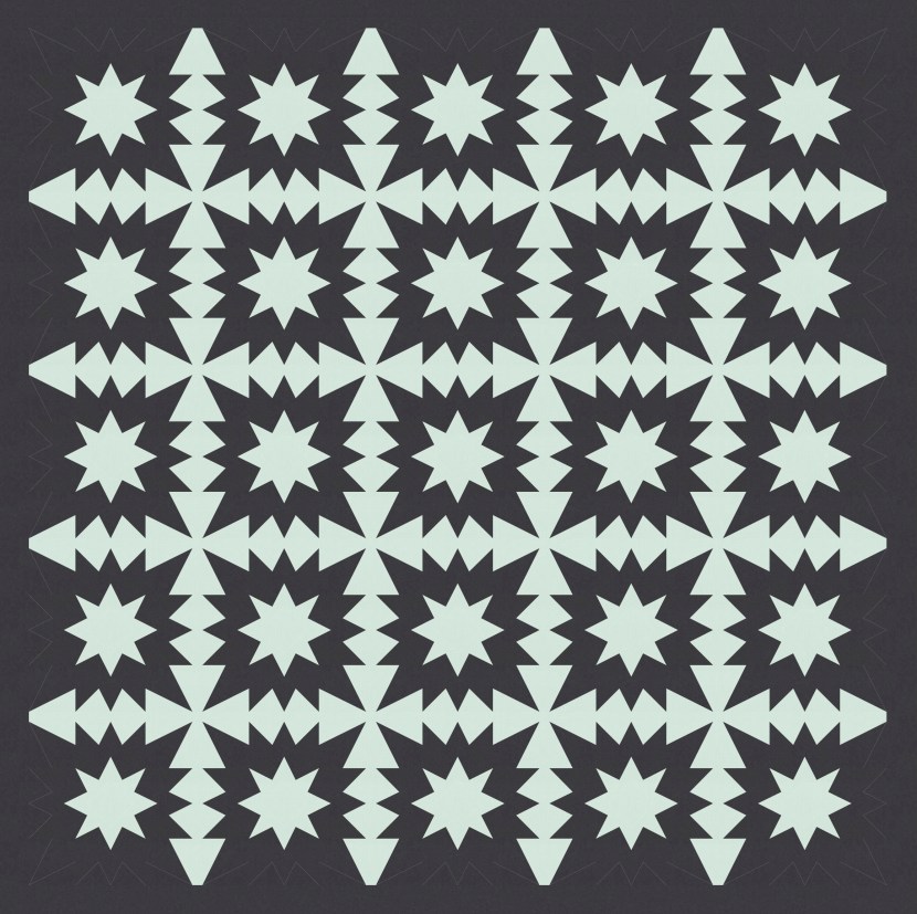
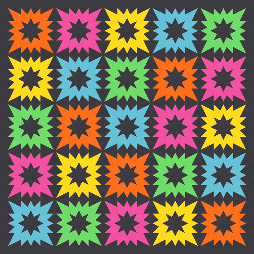
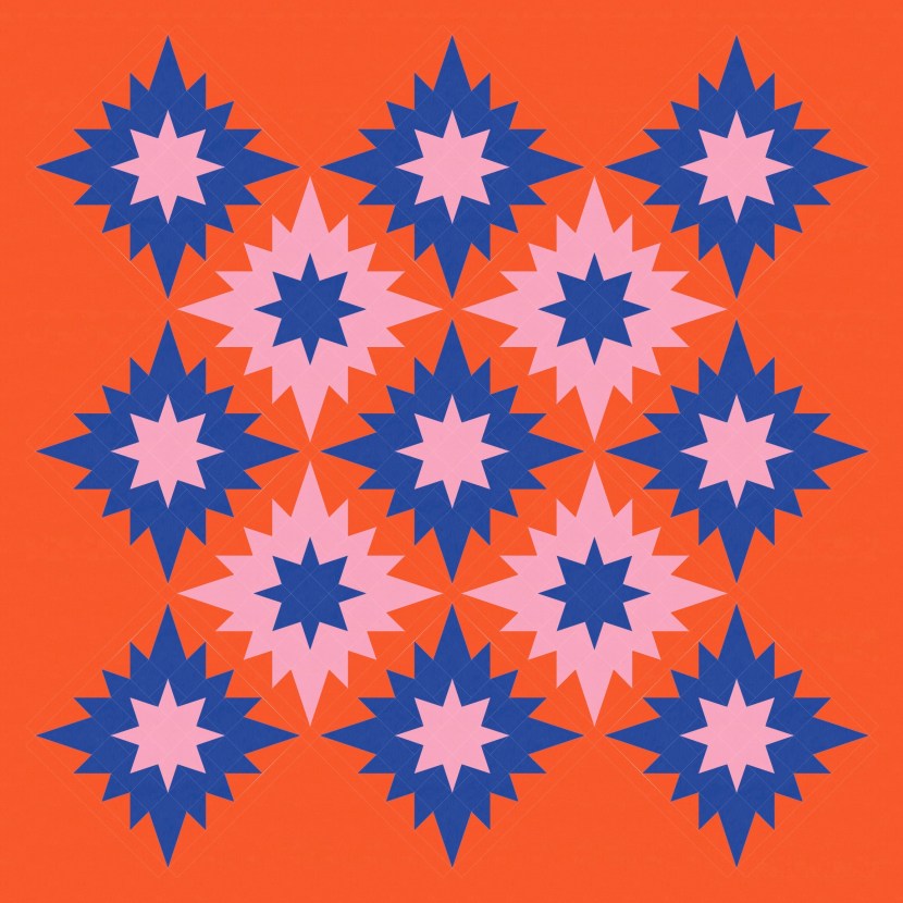
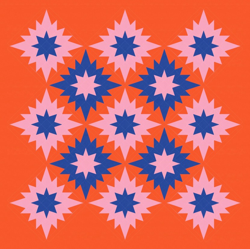
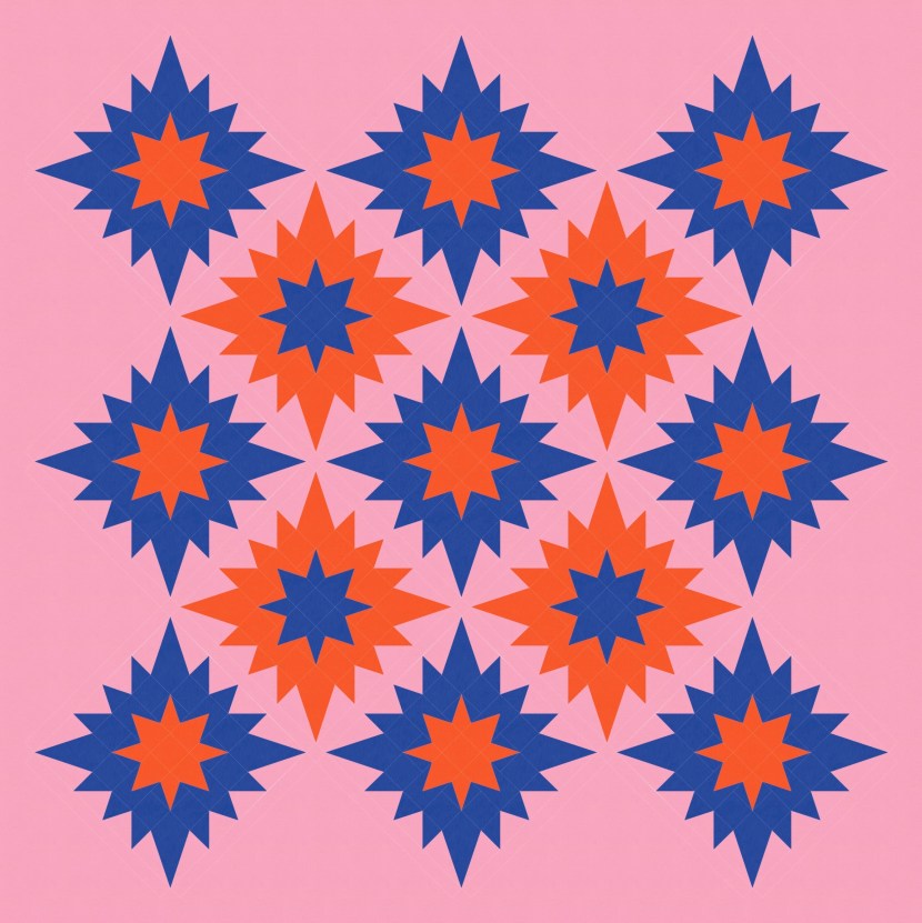
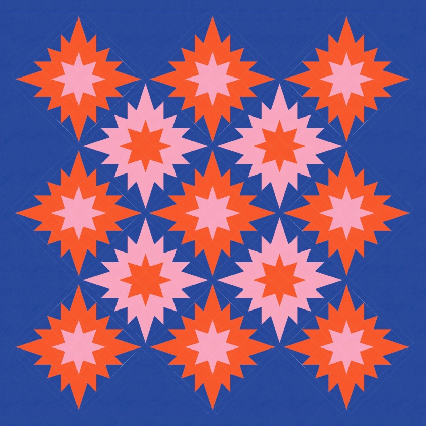
(And in case you were wondering, the same layout also looks pretty good in a two-colour or multicolour palette.)
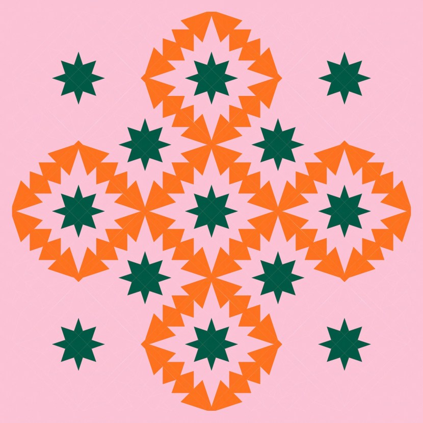
I can also use this layout to play with the blocks’ edges as the feature, too. Here’s the beginning layout…
…and here’s a few ways I can play with colour to emphasise the spaces between the stars.
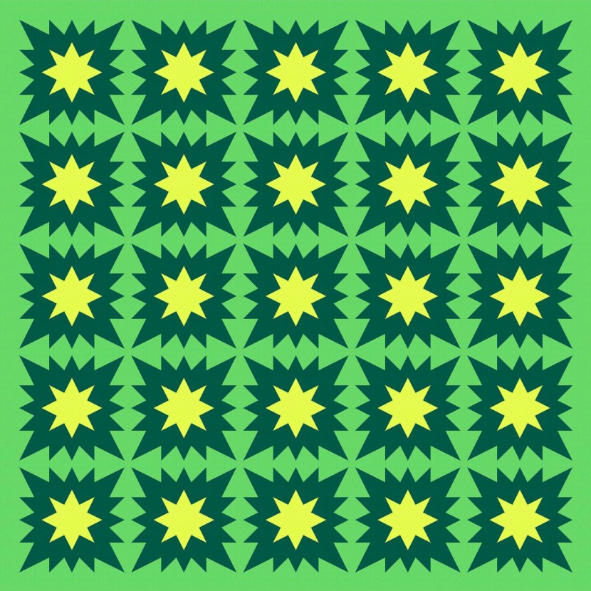
I can strip things back even further to make the focus even clearer.
And to take things a little further, I can play with colour in alternate blocks.
With a three-colour palette and three elements (big stars, little stars, and background), that’s six possible colour combos.
As always, I would struggle to pick a favourite!
This week’s sketch uses kite units, triangle-in-a-square units, half-square triangles, squares, and some rectangles for sashing (and borders). Each block has quite a few bits in it, so I mocked it up as 14″ (finished); any smaller would leave you with some pretty teeny units. With 1″ sashing and a 3″ border, that would make the above layouts about 70″ square (or so Electric Quilt 8 tells me).
I’m keen to make one of these blocks, just to see if it looks as good in fabric as I think it does on screen. I’m not sure I want to commit to a whole quilt, but who knows what’ll happen once I get started?
Discover more from Geometriquilt
Subscribe to get the latest posts sent to your email.
