Category: Sunday sketch
Sunday sketch #382
I talked about lines last week, and here they are again.

Last week’s design emerged from this week’s – and you might be able to spot the similarities (hint: look at those curved nine-patches). But it took me a few steps to get there….
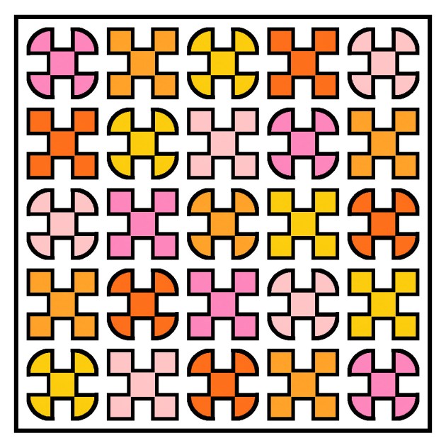
I’ve been thinking lately about the possibilities of combining two alternating blocks in a design, rather than tiling a single block across an entire design. So I started with a nine-patch and alternated it with a block in which all four corners have a curve pointing towards the centre, making a kinda fat cross shape (which I’ve coloured in warm tones here). In the next version, the blocks are laid out on point. Can you see where one block ends and the next begins?

Separating the arms of each shape (or maybe just the hands?) with a black line presents some alternative colouring options for the squares in the nine-patches.


I felt like making those thin lines more of a feature, so added a border around the nine-patch blocks. Now do you have a better idea of where each block ends and the next one begins?

As usual, I tried a standard layout instead of an on-point one, just to see if the design becomes more interesting. Hmmm… I don’t think so?

As before, those lines create lots of opportunities for playing with colour placement.


Even if I pare it back to a two-colour palette, you can see how many variations there could be.


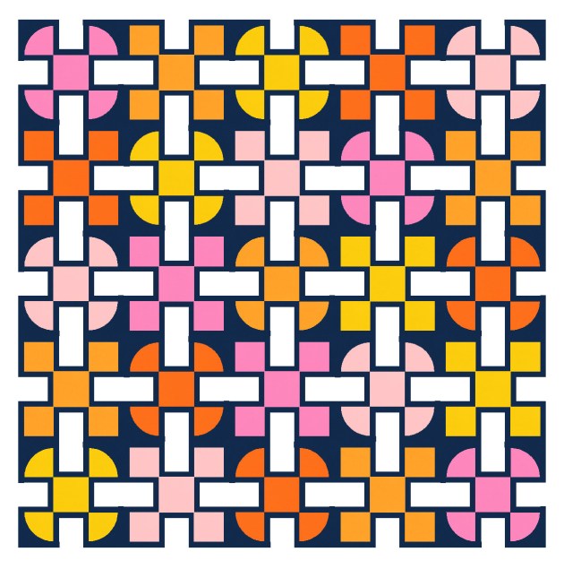
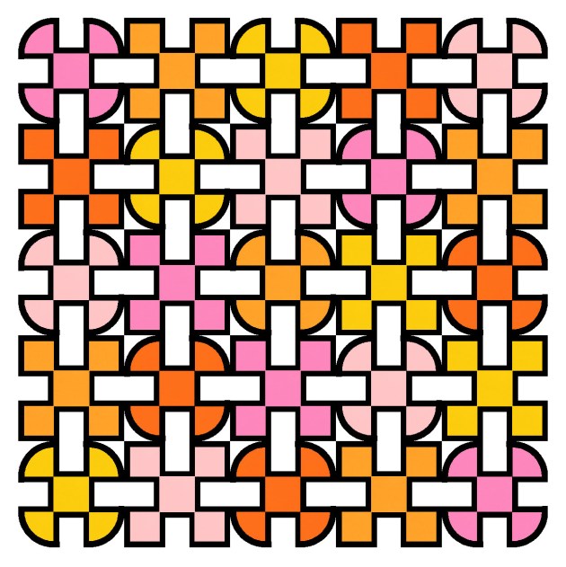
But I decided that the design didn’t really benefit from those straight lines. Instead, I could echo the curves in the main shapes by surrounding the nine-patches with a squircle (a square-ish circle).

For some reason I prefer the cross shapes on point, but the squircles in a standard layout. So I opted to make a feature of the squircles, and used the standard layout.


As much as I love that multicolour palette of warm tones, I think this design also lends itself to a much simpler palette. I feel like that makes it easier to see the shapes and how they play with each other.

Like last week’s sketch, this week’s could be made using squares, rectangles, drunkard’s paths (or quarter-circles) and skinny strips. I’d find it difficult to sew all those skinny strips evenly and smoothly, I think; it would take a bit of practice. I don’t usually post sketches that I’d struggle to make myself, but I’m treating this week’s sketch as aspirational – I’d love to be able to use skinny strips in this way! I know it’s possible, but it’s something I’ll have to work on.
Sunday sketch #381
One of the things I’ve always loved about my Sunday sketches are the outlines – the thin black lines around the shapes. When I used to hand-draw all my sketches, they were all lines; now that I create most of my designs in EQ8, I don’t always show them. But sometimes I purposely make the black lines a feature (see Sunday sketches #265, #269, #277 and #348, for example), even though I’ve never really made a quilt with skinny strips (apart from Sketch).
Anyway, this week’s sketches are the by-product of a sketch that I haven’t shared yet. You’ll see the connection in the coming weeks, but for now, it’s fine as a standalone design.
And yes, I’ve done my usual sudoku-style colouring where each colour appears only once in each row or column 🙂
This is a block-based design using a standard layout, plus thin sashing. I used black to delineate the shapes in the first version, but colouring the same lines in the background colour means I can highlight some of the secondary shapes – those light grey rectangles. They definitely feel like they’re in the foreground, overlapping and connecting the coloured circles and squares.

Here’s a reverse colourway where the shape outlines are still the same colour as the background, and the connecting rectangles are in white instead.
There is thin sashing between the blocks, just to give a smidge of space between them. Here’s what happens without the sashing – this is just a bit too crowded for me!
And the same design works without any outlines. Here I’ve coloured each block’s outlines in the same colour as the rest of the main shape(s). That just makes the shapes look a little fatter. I quite like the connectivity in this one too.

This week’s sketches could be made using thin strips, squares, rectangles and quarter-circles (or drunkard’s path units).
I feel like there may be the potential to iterate this design a little more, but first I need to show you the designs that led to this one! That’s next week.
Sunday sketch #380
Recently I created a bunch of designs in response to a specific brief: design a quilt using only circles, squares and rectangles. This week’s sketch is not one of the designs I submitted in response to the brief (for a project that I’ll be able to talk about more soon), but it’s one that I like so I’m sharing it here.

This approach of bisecting circles to create new shapes is one that I’ve used before: see Sunday sketches #224 and #275 (and, kinda related, #288).

This kind of design lends itself to transparency effects. You can also play with the colour palette and placement to emphasise different parts of the design. In the second version below I’ve filled in those empty spaces at the top right and bottom left, although I don’t love this version – it feels too crowded.


Back to a bit of negative space. Just changing one area of the design alters how you perceive those overlaid shapes… on the left, my first impression is of two lighter rectangles and one smaller square laid over those green circles. But on the right, I see two green squares overlapping over white circles.


These designs could be made into a quilt using lots of quarter-circles, half-circles and full circles. I’d probably just make a million quarter-circles rather than trying to wrangle half-circles or full circles, but that’s only because I’ve never made a half-circle or full circle. I know there are ways to do them, but I’ve just never tried them.
I was fortunate enough to have 2 designs selected for this project, which means I need to make 2 quilts by mid-November. Both of which feature lots and lots of circles (which means even more quarter-circles!). One of the designs also plays with transparency using the supplied colour palette, so it will be interesting to see if my design looks as good in fabric as it did on screen.
