Sunday sketch #496
In the midst of writing last week’s blog post, I realised I could tweak that design just a little bit more. You can probably see the similarities – I’m still following a floral theme 🙂 – but I figured this new version’s different enough to be worth sharing.
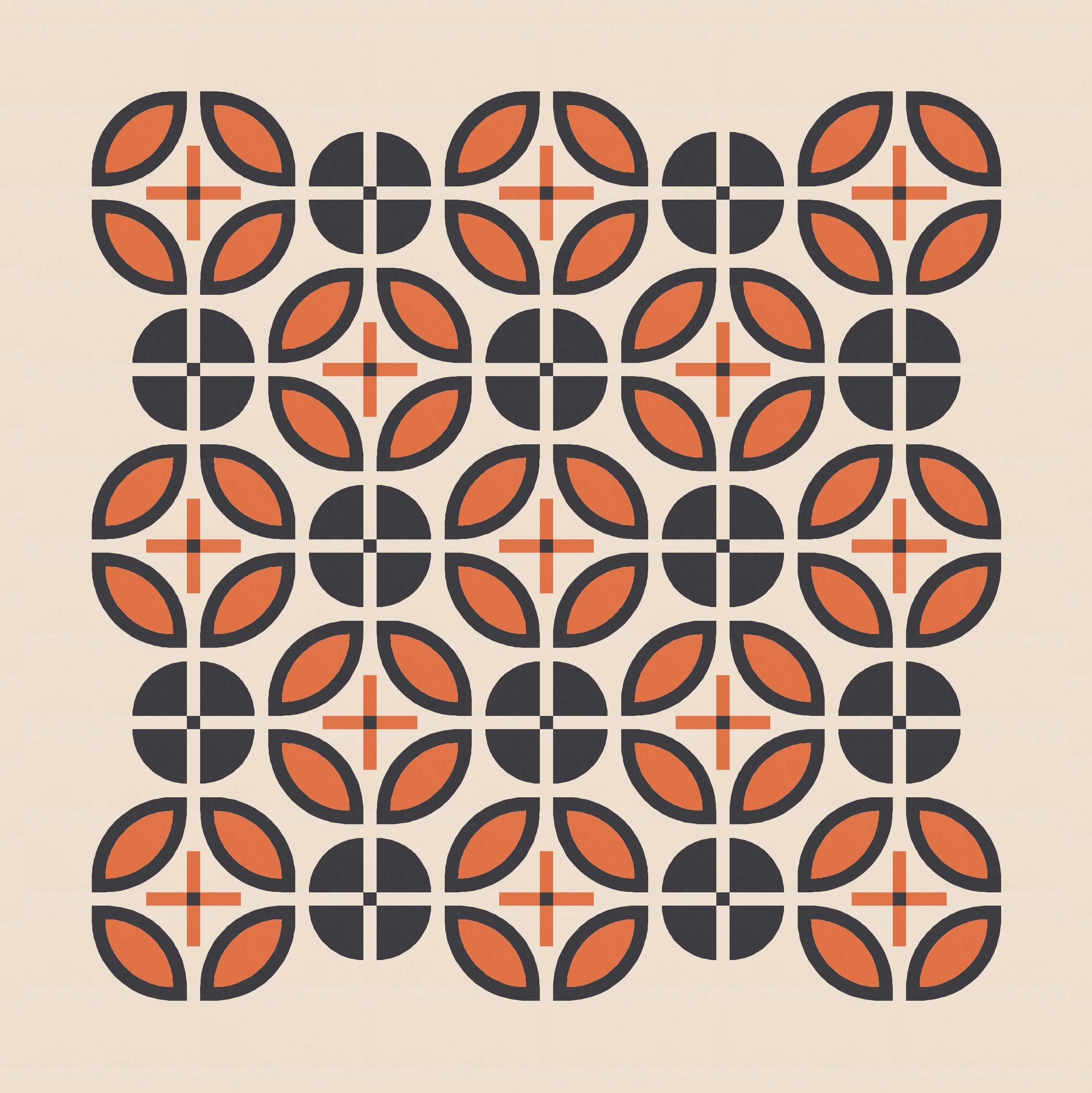
So you might remember that last week’s poinsettias were based on a small block featuring mostly curves (below left), which was an iteration on a (not particularly interesting) square version. The straight lines in that design helped to create squares within sawtooth star-like shapes that created the overall effect of flowers. But I also wanted to try a fully curvy block (below right), to see what would happen to the same design if those straight lines were removed.
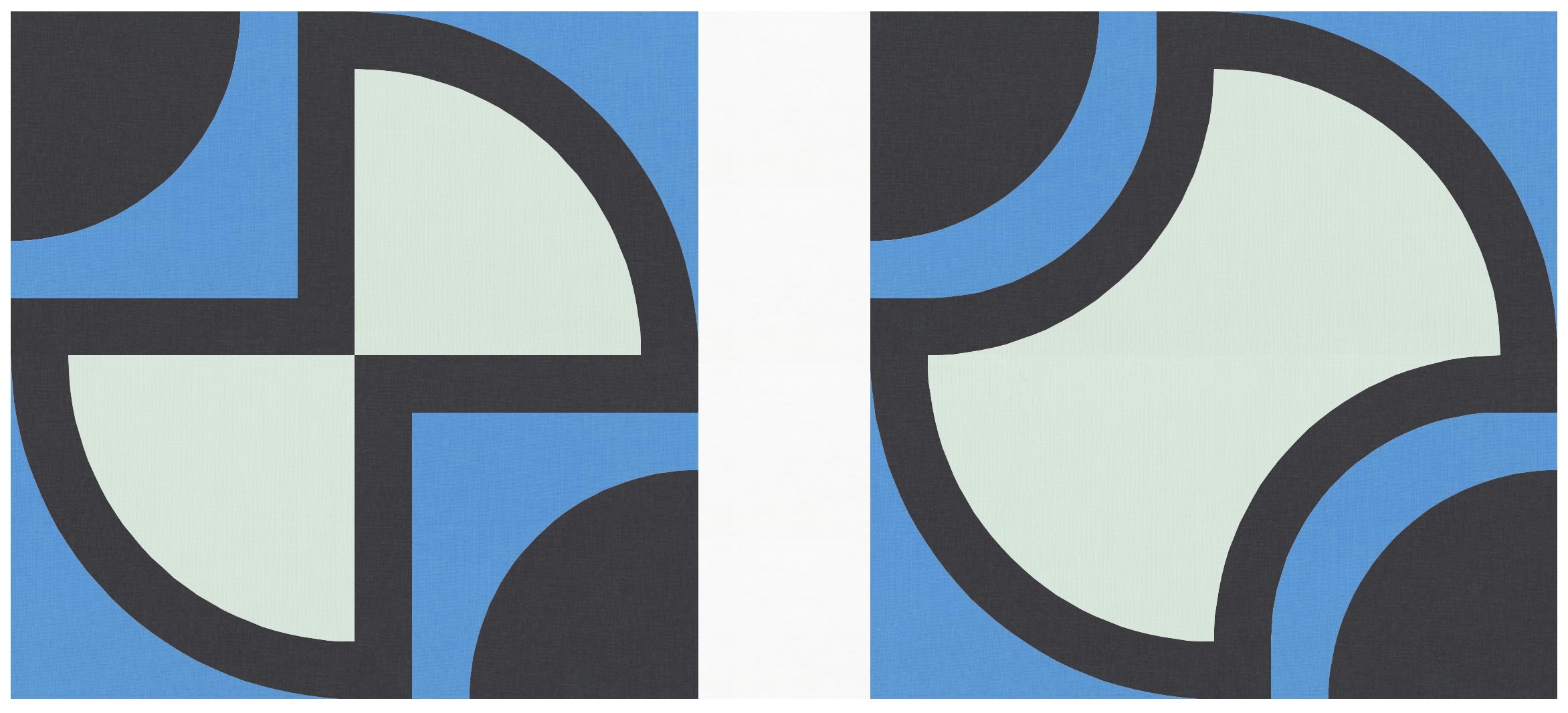
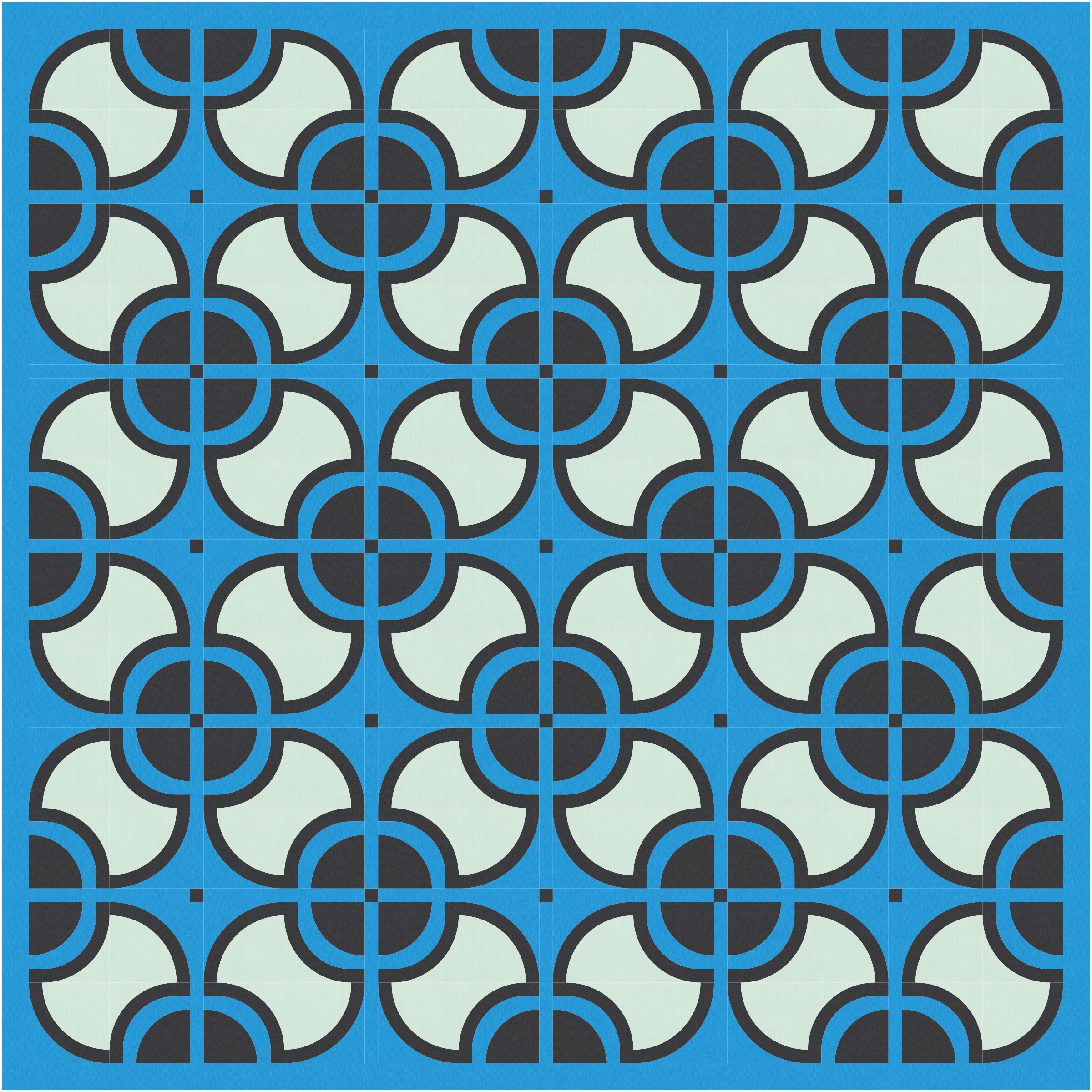
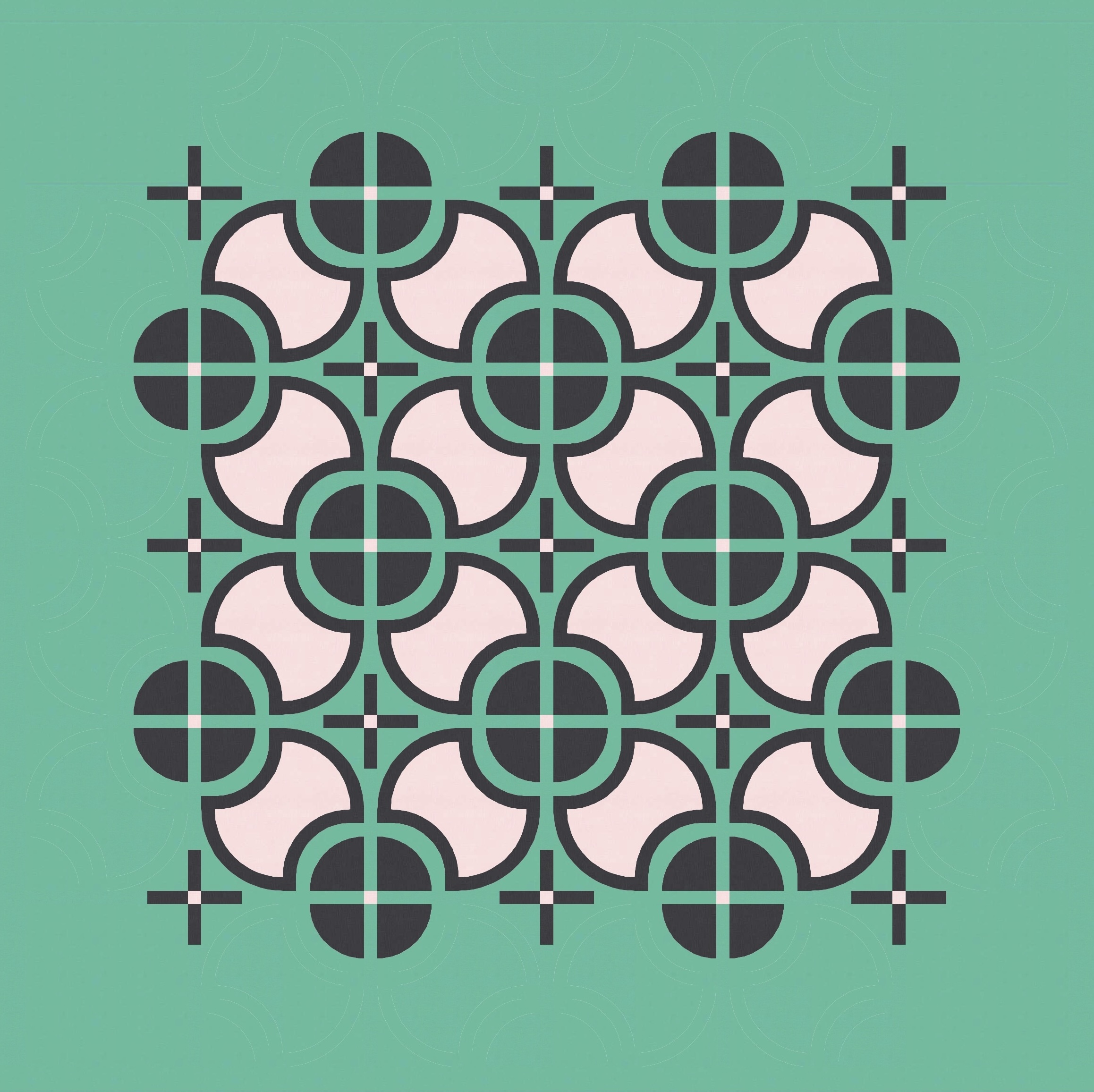
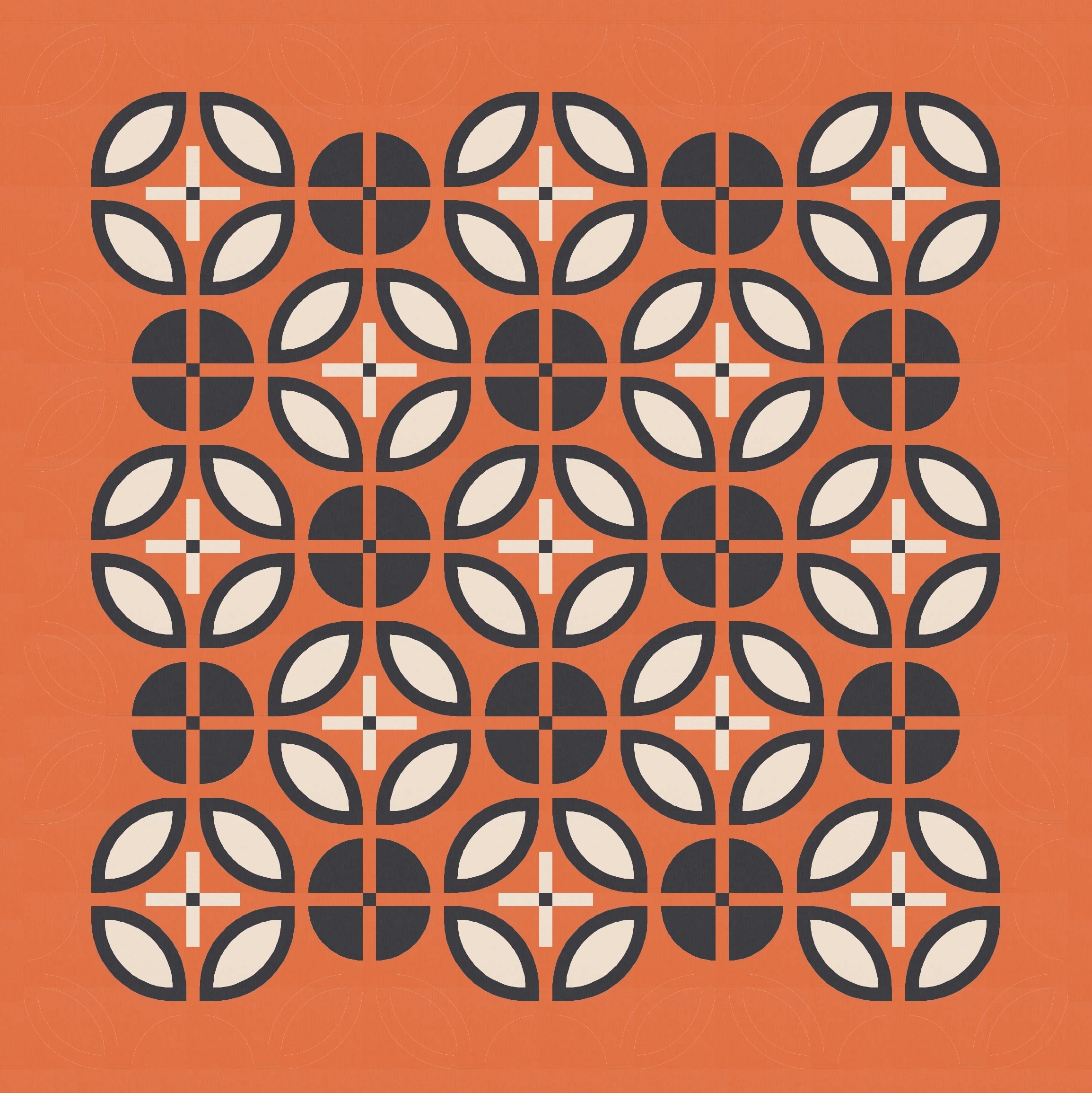
So now I’ve got an apple core unit in the centre, flanked by two solid quarter circles. When the blocks are repeated and rotated (and separated by thin sashing), I get this bulbous diagonal grid of curvy connections.

You might notice that the two curves in the corners of the blocks aren’t concentric – because of the way I’ve designed the block, they’re a little off. The convex curve of the solid drunkard’s path / quarter-circle doesn’t fit perfectly into the concave side border of the inner apple-core shape.
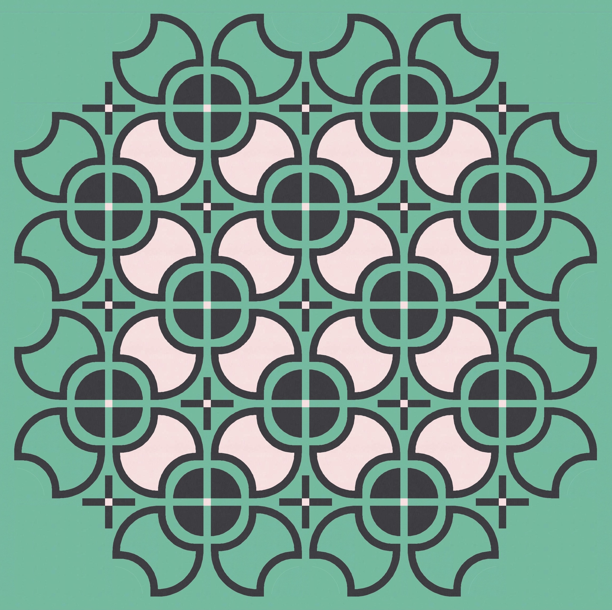
Does that matter? Well, here’s a version using a slightly different construction, where the curves are concentric.
I much prefer the first (slightly off) version. I don’t know why, exactly… I think it’s just got an element of wonkiness that feels a little more endearing than the second ‘perfect’ version. I guess also because the second version is more like a squircle than a circle, because of the way I’ve designed it (I try to design things in a way that would be feasible to make, so I tend to avoid weird/unusual/pesky construction methods). All the subsequent designs that I share in this post use the former ‘wonky’ block, but you could easily replace that with the ‘perfect’ block if you preferred it.
Anyway, back to the designs!
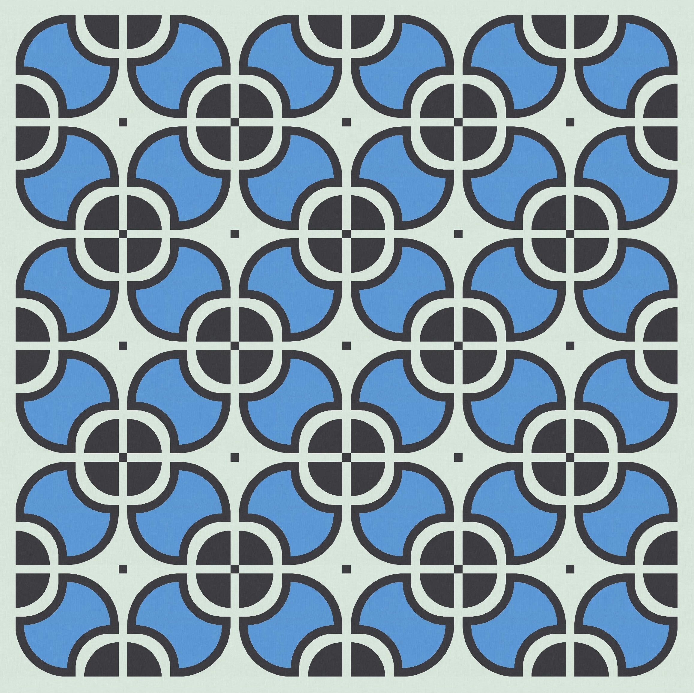
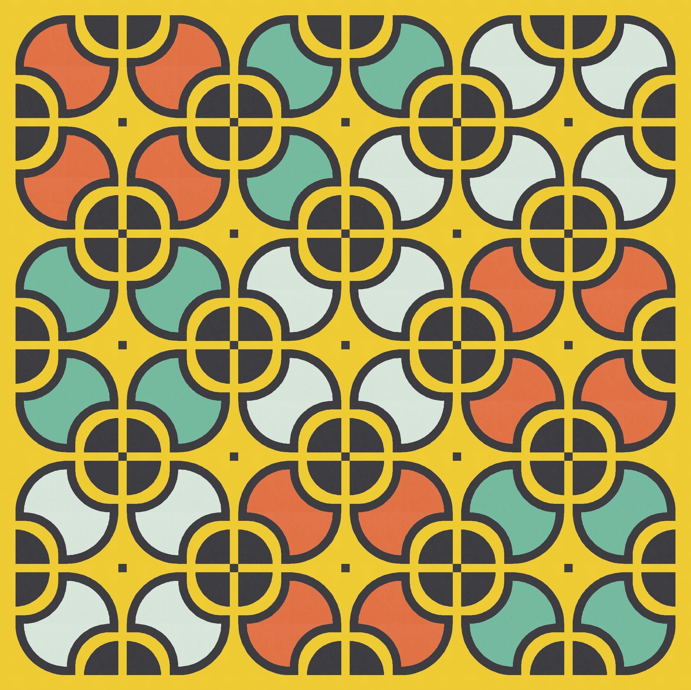
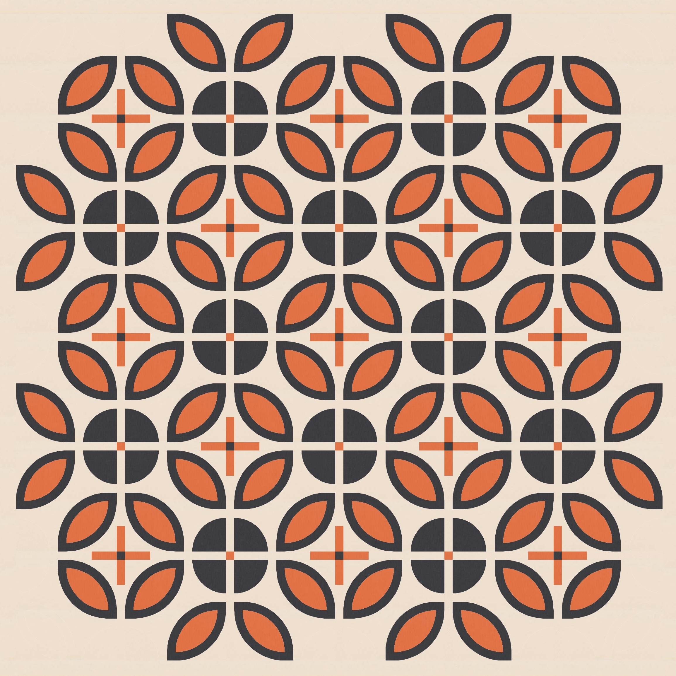
I’ve used a three-colour palette here, and picked three discrete areas for colouring: the background; the border of the apple core and the quarter circles; and the inside of the apple core. That’s really four areas, so I could’ve chosen a four-colour palette. Or coloured the quarter-circles within each block differently, which would require at least a five-colour palette.
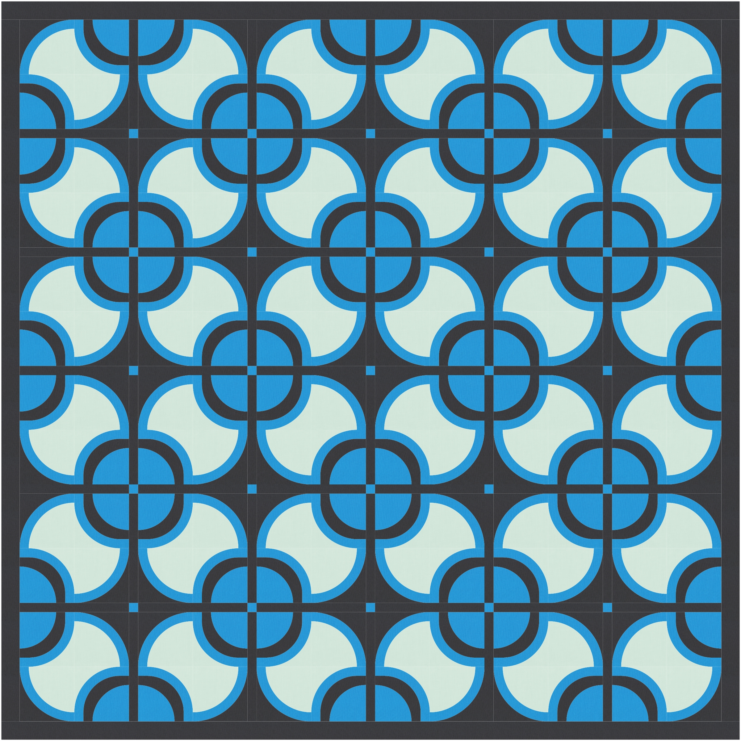
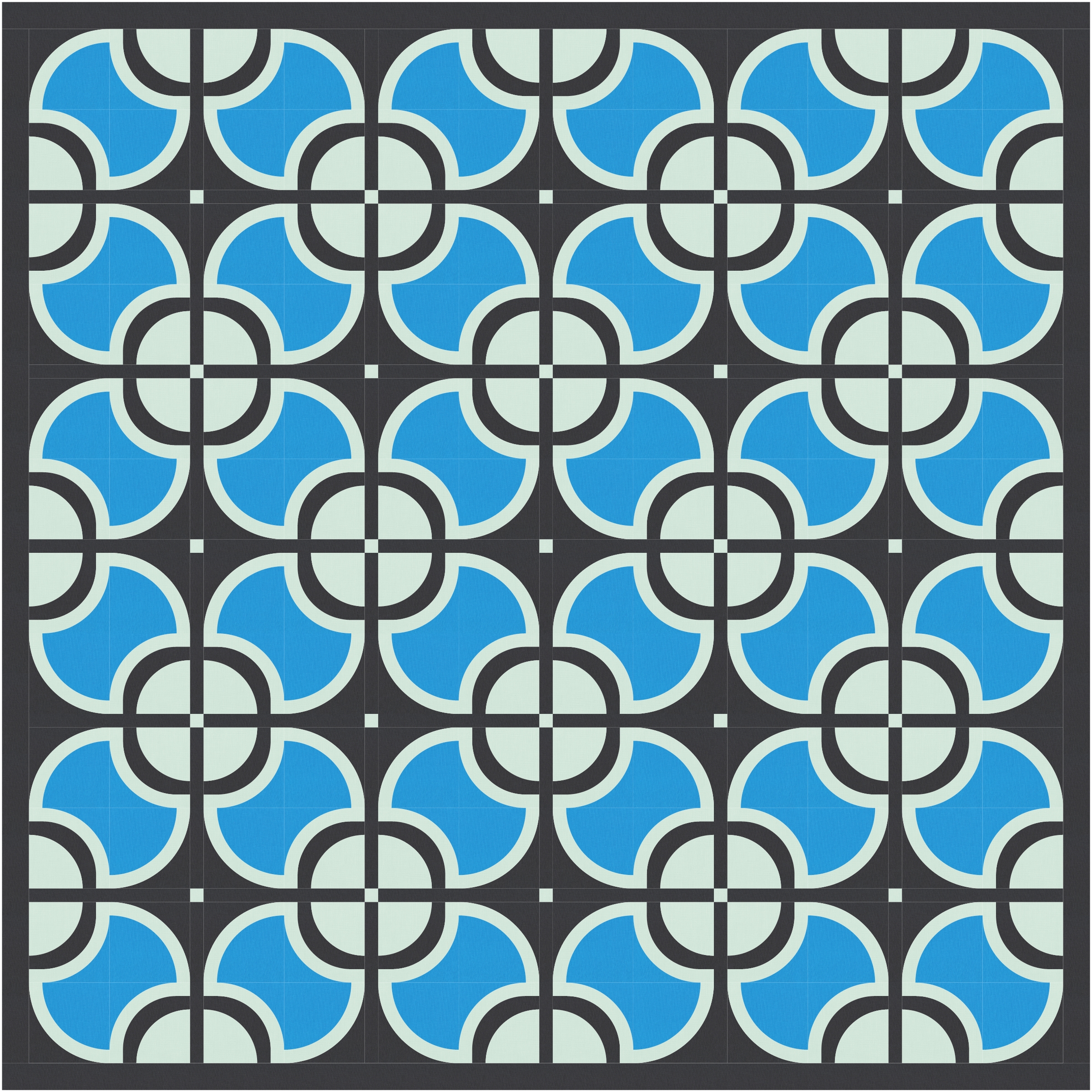
I did try a larger palette just to group some of the blocks together and create some bigger shapes.
(I only realised after drafting this blog post that I messed up the colouring on the last and next versions; I’m too lazy to fix it!)
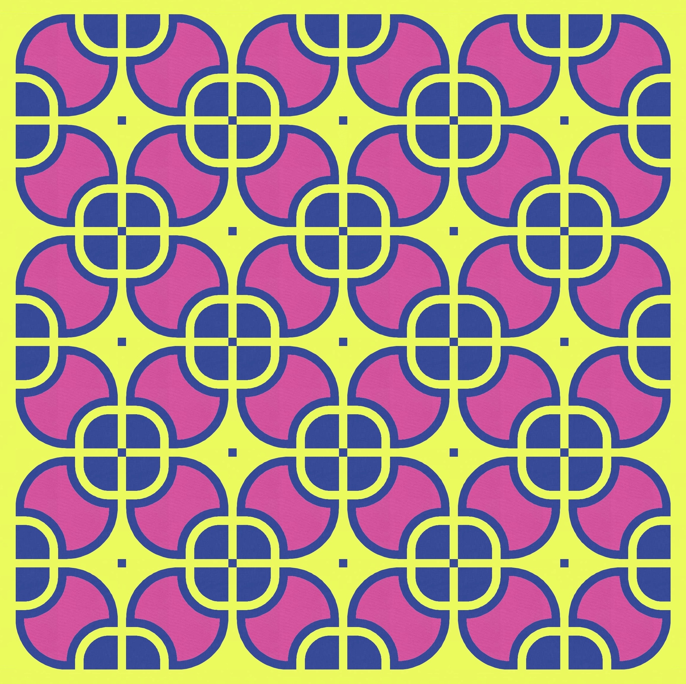
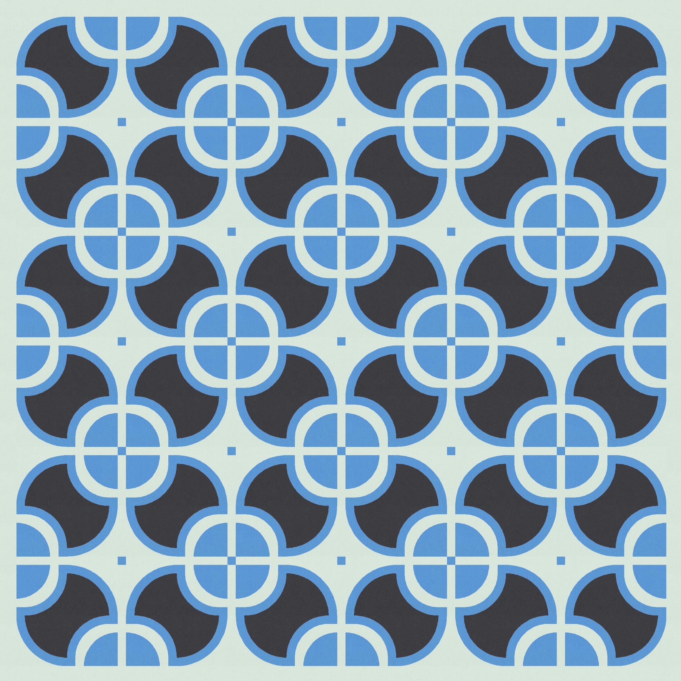
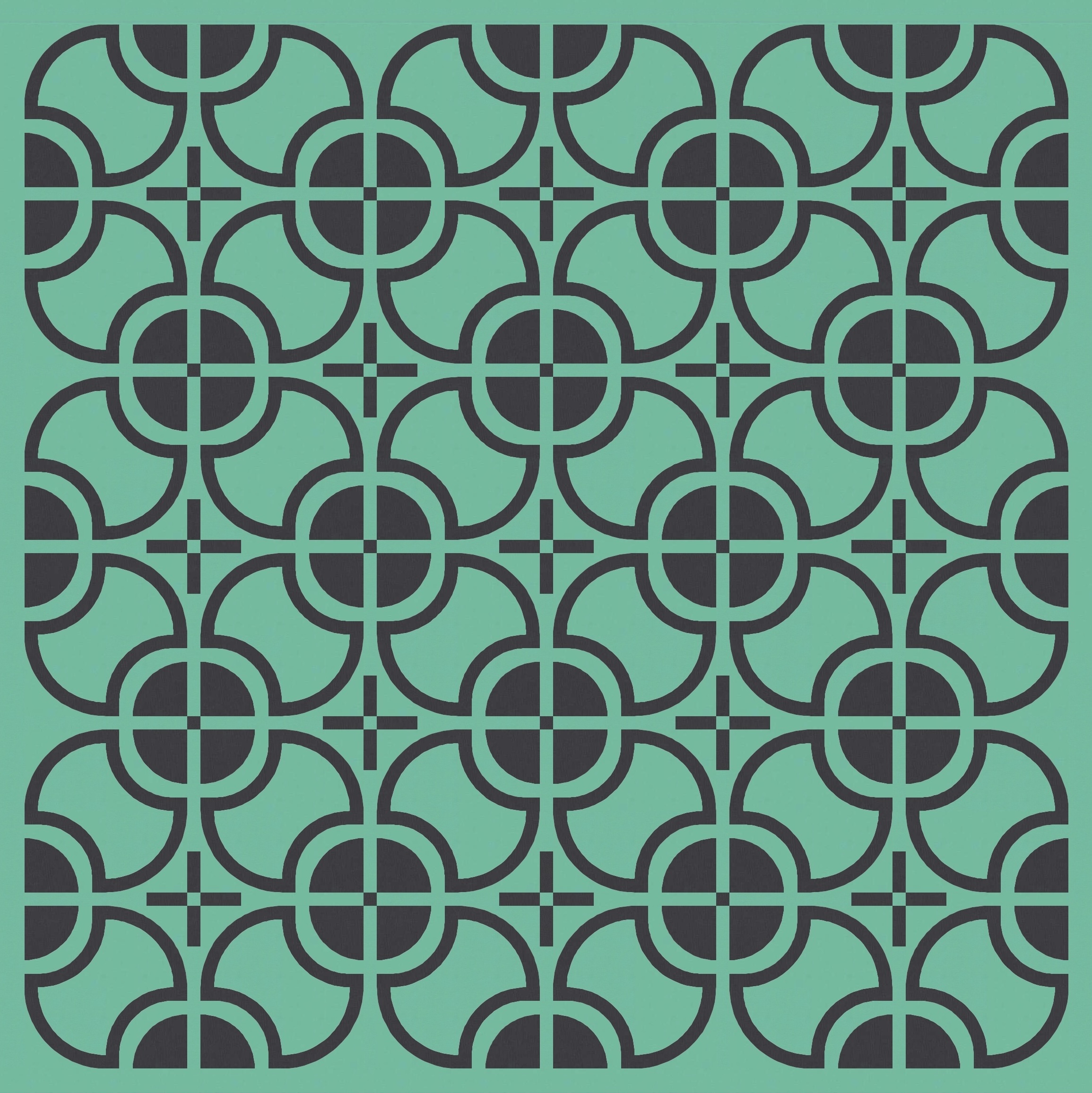
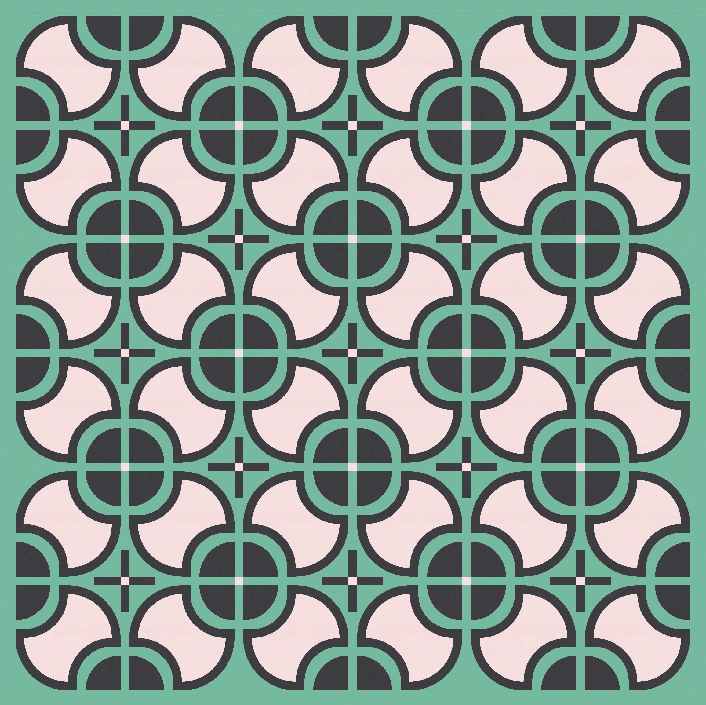
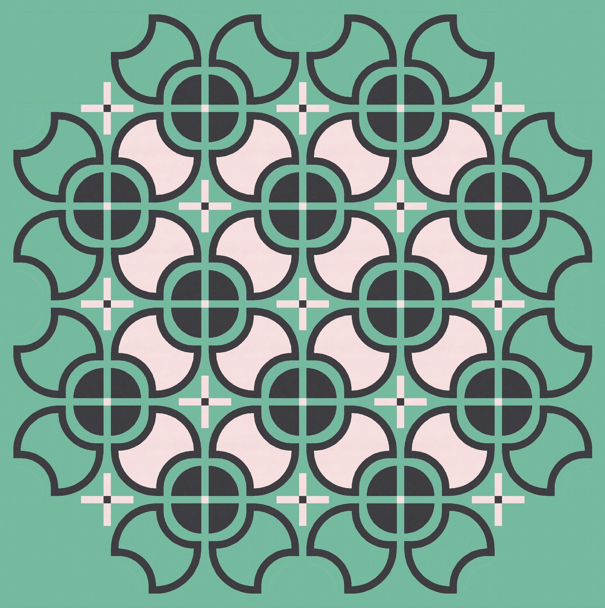
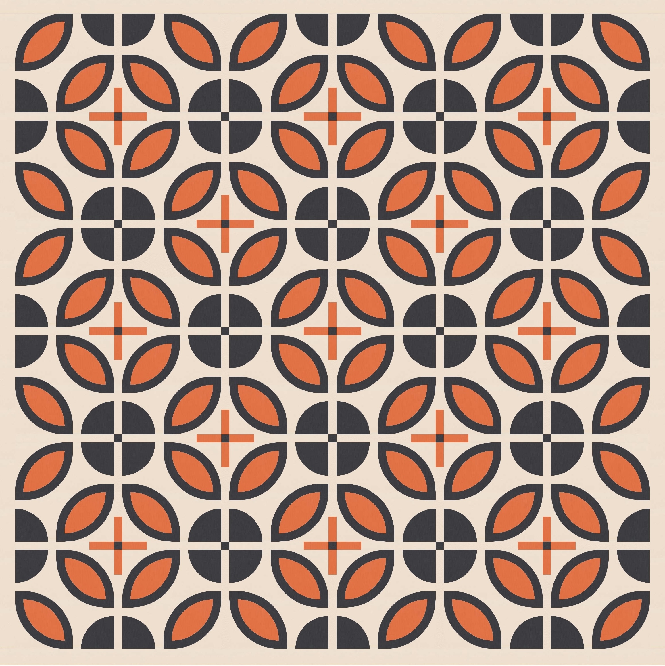
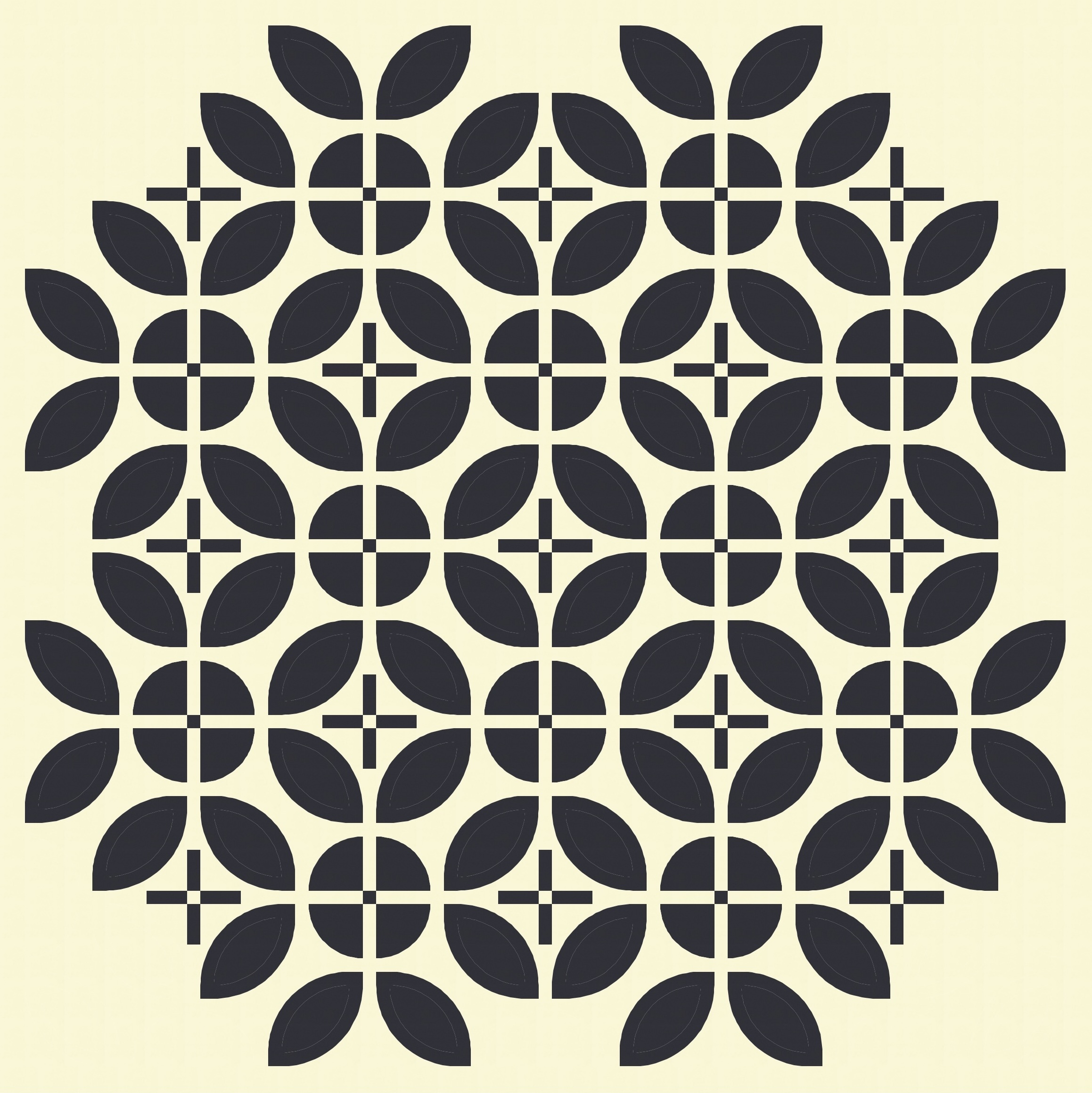
It was around this point that I started to think that the empty shapes between the blocks – where those small sashing cornerstones are floating alone in a sea of background colour – were just a little too empty. I tweaked the sashing to create some small crosses in those spaces, echoing the crosses that appear elsewhere in the design (within the circles that are created by the solid quarter-circles from four adjacent blocks). I’ve reversed the colouring too: whereas the crosses in the circles are in the background colour, with the cornerstone in the same colour as the circles, the other crosses are in the solid colour, with the cornerstone in the same colour as the background. The two types of crosses aren’t exactly the same size, but close enough. Overall, I think this feels much better!

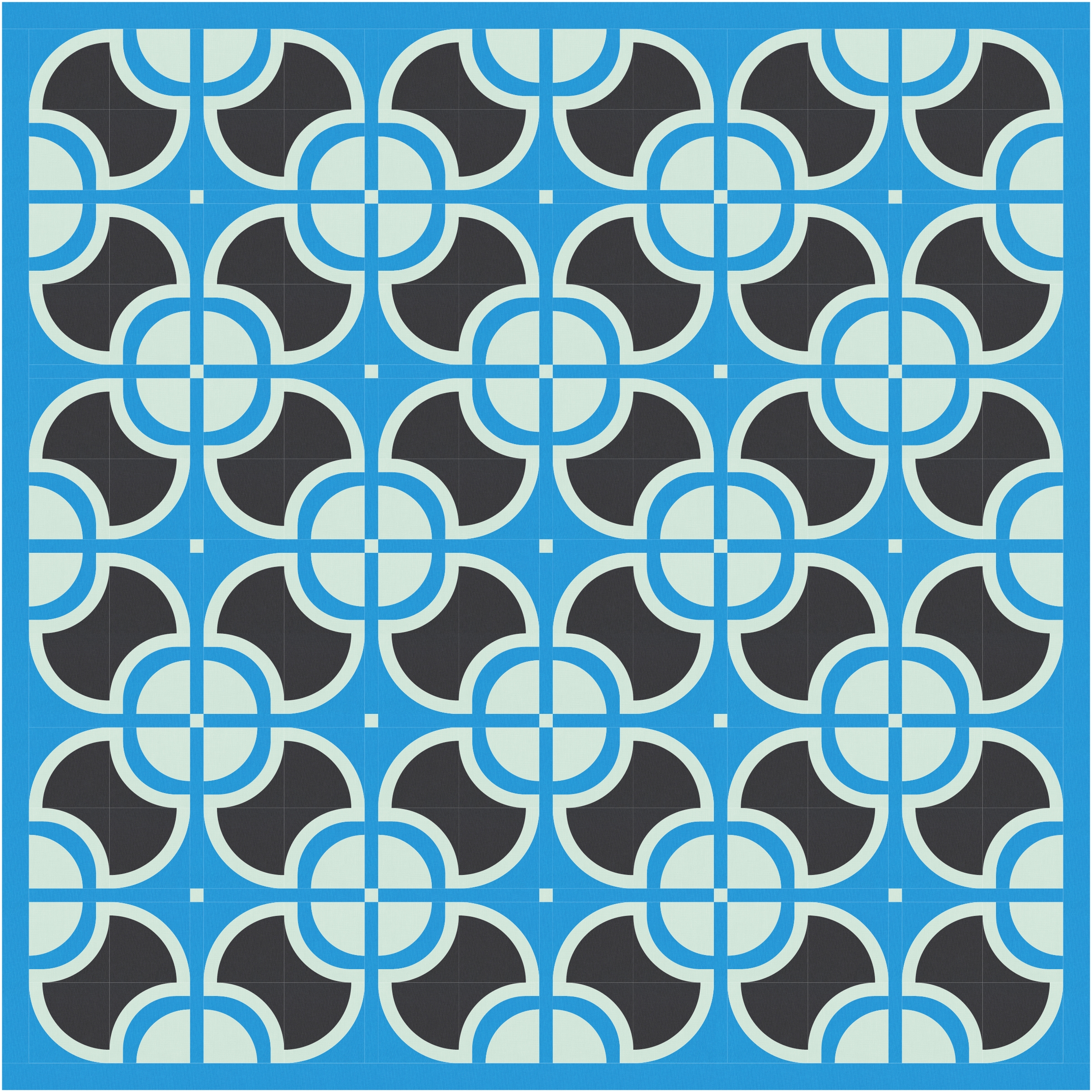
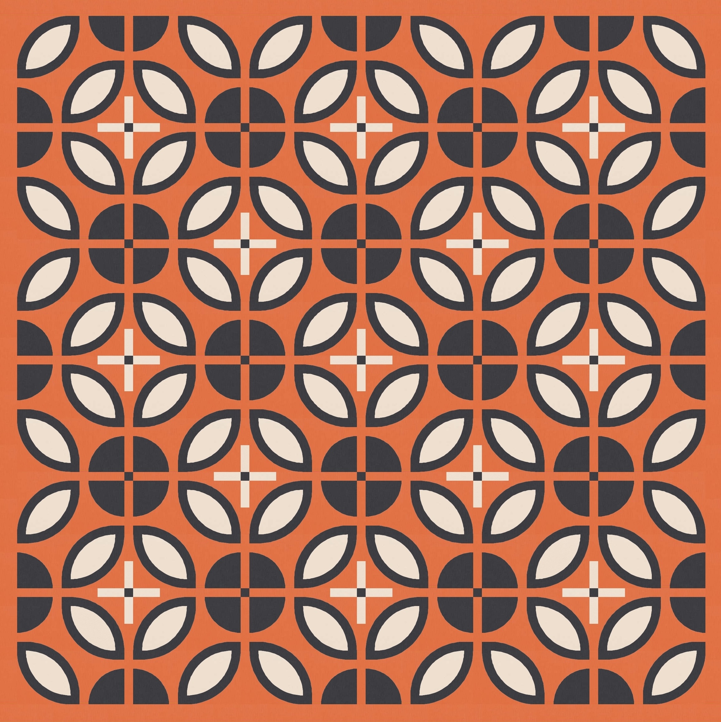
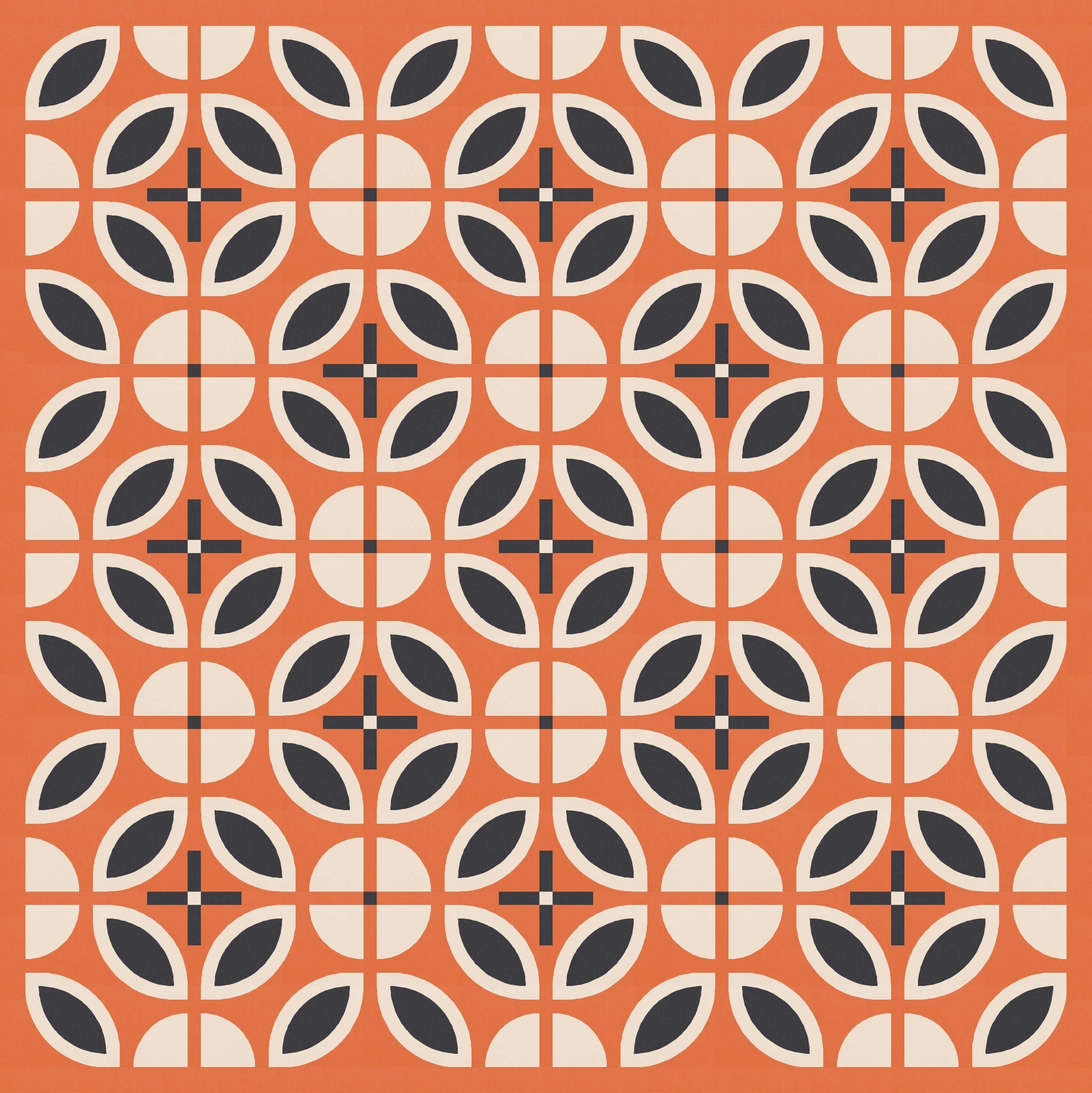
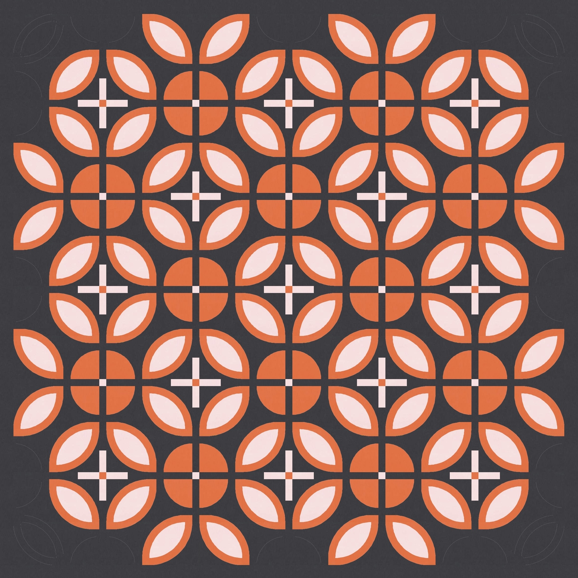
And then I subtracted and added, as usual, to see how things change and/or improve.
I also tweaked the colour placement a bit; changing the colour of the sashing strips/cornerstones can help to lighten things up too.
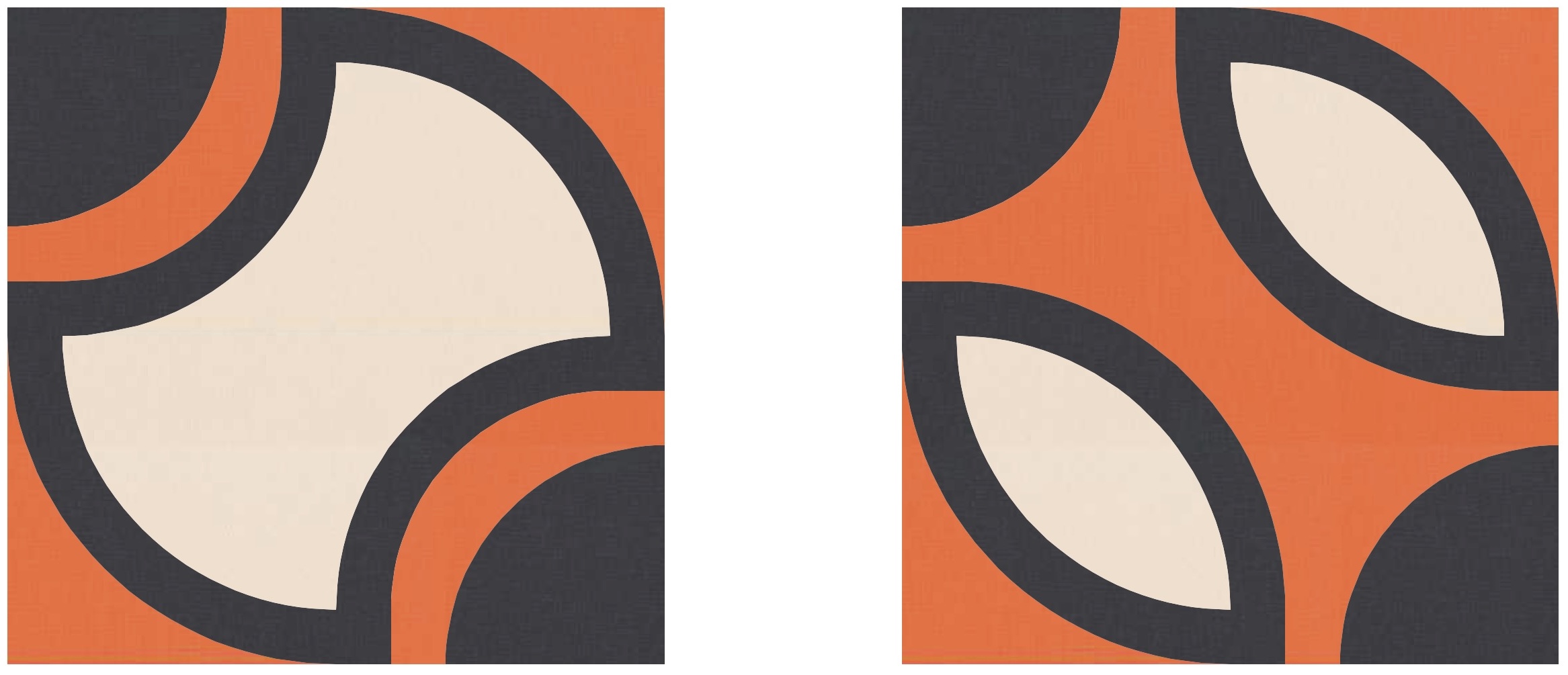
I still felt that this design was a bit too similar to last week’s though. Maybe I could tweak the underlying block a bit more? I decided to keep things curvy, but just change the placement of the curves. I moved the two concave parts of the apple core (below left) to create two orange peels instead (below right).
Let’s see what happens when I tile that block!
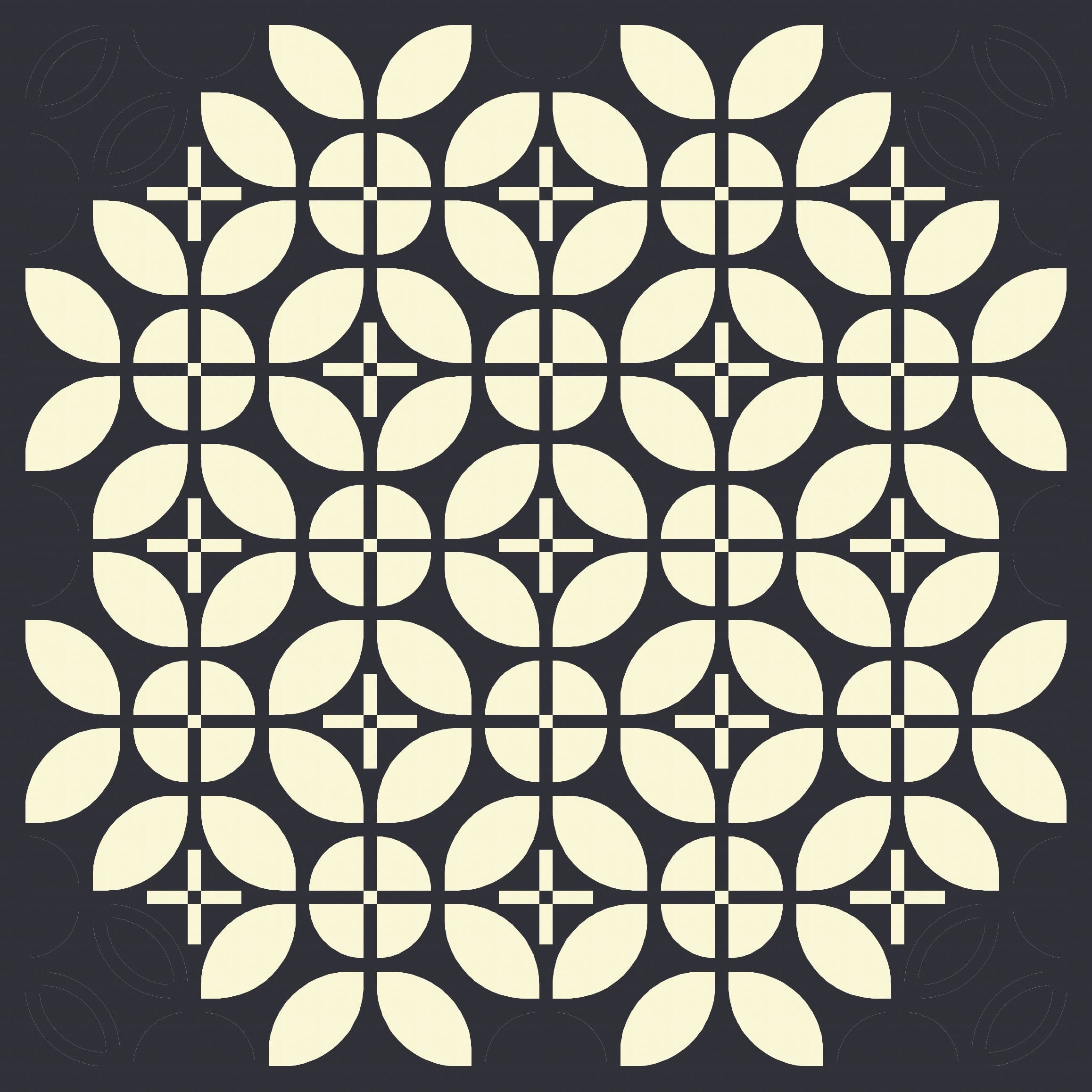
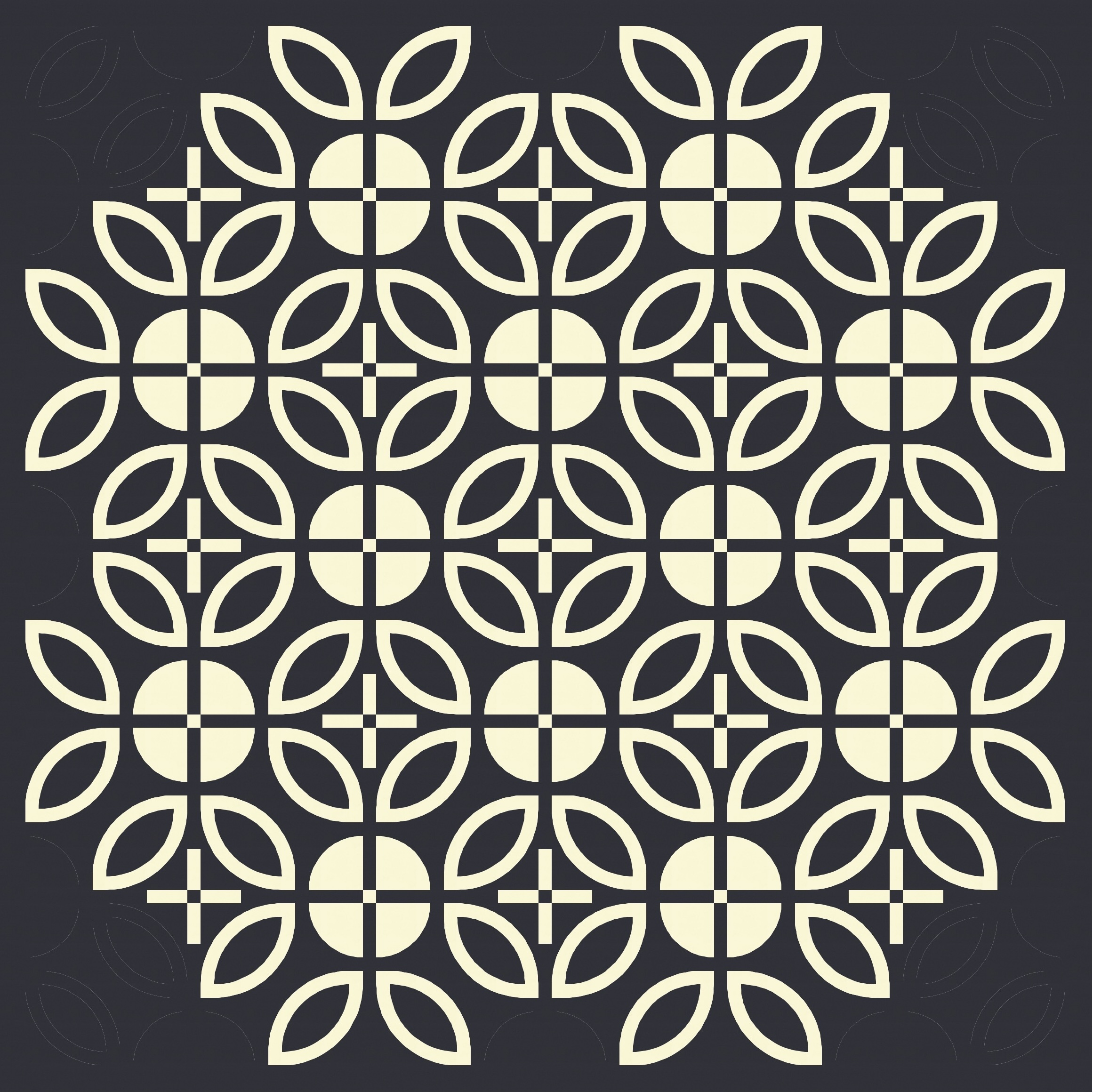
Some shapes naturally seem to group together (even across blocks), which leaves some bits and pieces feeling a little extraneous – like the half-circles created around the outside of the design, or the leaves (orange peels) that aren’t part of a full circle. Removing them leaves only circles.
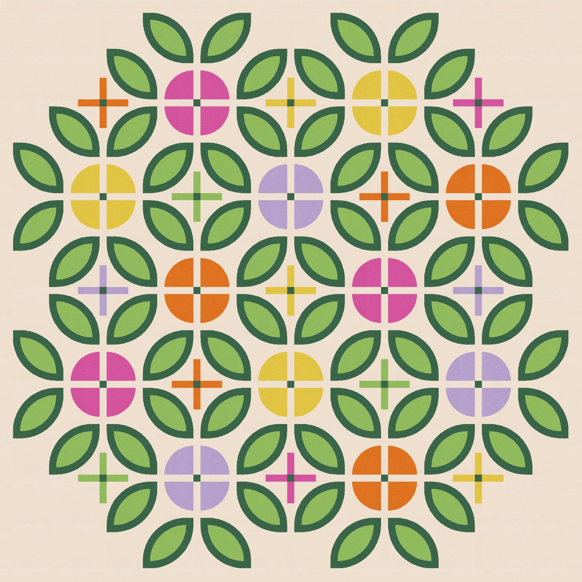
But I do really like those leafy shapes…
…so much so that I just had to colour them as leaves. Which I guess makes the circles the ‘flowers’, which is then a great excuse for some pops of colour.

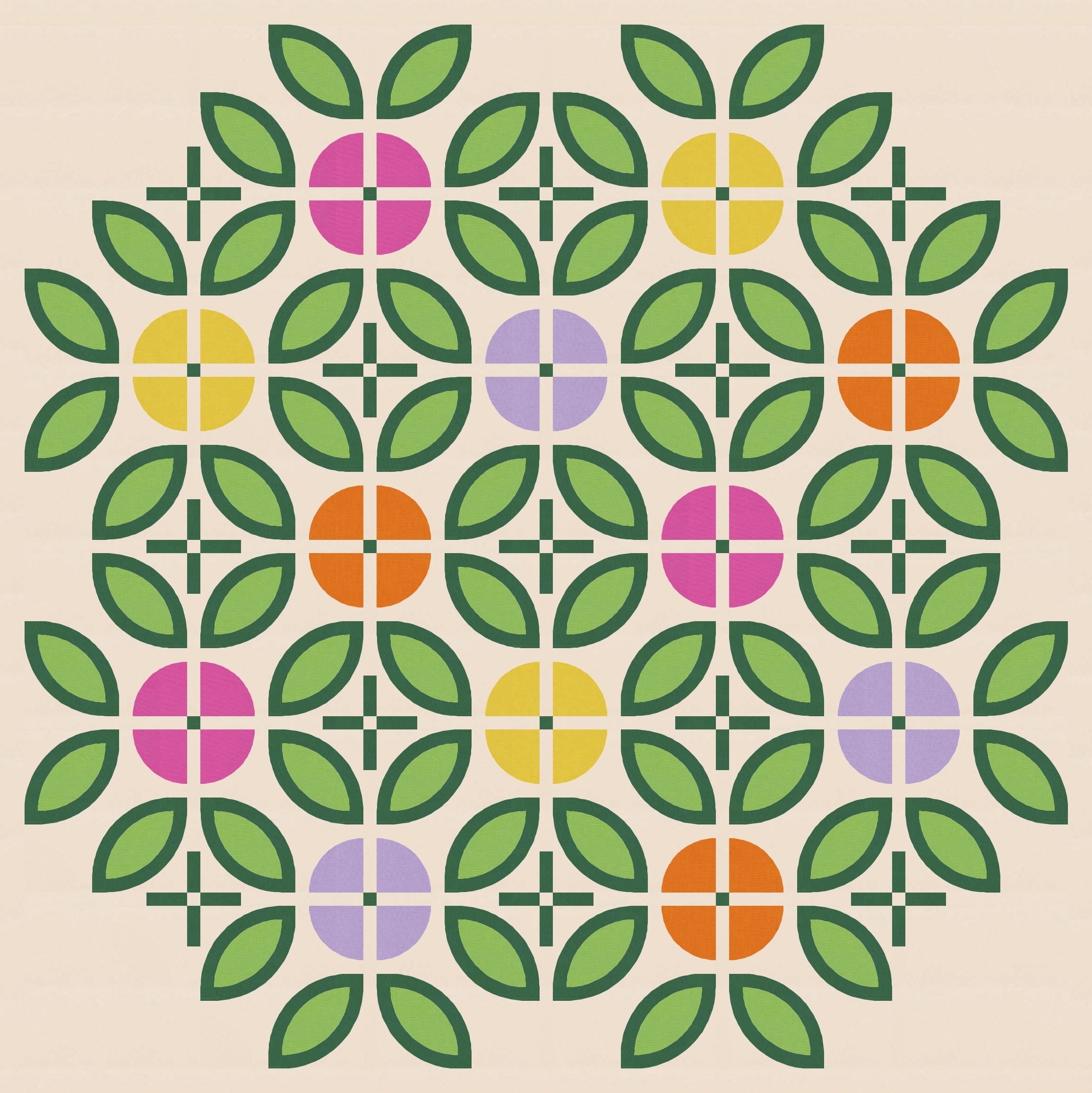
The only difference between those two versions is the colour of the sashing crosses. (The version I posted up top has the sashing crosses in the same colours as the flowers.)
This week’s sketches have a ‘Scandi’ feel, and there are other designs out there that combine orange peels with quarter-circles. These sketches are also reminiscent of a double wedding ring design, where full circles overlap to create bordered orange-peel shapes (see examples of Victoria Findlay Wolfe’s double wedding ring quilts). But the addition of sashing here makes a difference, I think.
I did try leaning into the simplicity of Scandi designs a little more by filling in some of the orange peels, which I think makes the horizontal and vertical sashing feel more prominent (along with the larger squircles that emerge as secondary shapes).
And then that prompted me to scale back to the earlier version but just using a two-colour palette (which I hadn’t actually tried yet).

I really like these last few versions, and I was very tempted to use one of them as the ‘feature’ image this week instead of the leafy flower version. You can consider them your reward for reading to the end of this blog post 🙂
If you wanted to make this week’s sketch into a quilt, you’d need orange peel shapes, quarter-circles, small squares, rectangles, and some curved strips to outline the orange peels. I’d make templates for the blocks; I’d actually consider cutting out squares that were slightly larger than the final block size, then subcutting in to them to add the orange peels and the quarter-circles (a bit like the approach I used to make the double-curve blocks in Fizz). It might take a bit of trial and error. Normally I avoid that – I hate making blocks I might never use; it feels like I’m wasting fabric. But I’m getting better at experimentation!
Discover more from Geometriquilt
Subscribe to get the latest posts sent to your email.
