Sunday sketch #470
This week’s sketch is a variation of last week’s (which itself was a variation of Sunday sketch #467). First there were drunkard’s path units, then kites, and now triangles (mostly).

I actually designed this week’s sketch before last week’s; I figured Sunday sketch #467 might look good with triangles instead of drunkard’s path units. They’re not quite triangle-in-a-square units, because I’ve left a bit of space between the points of the triangles and the edges of the units. That leaves a gap like there is in the other two related Sunday sketches.
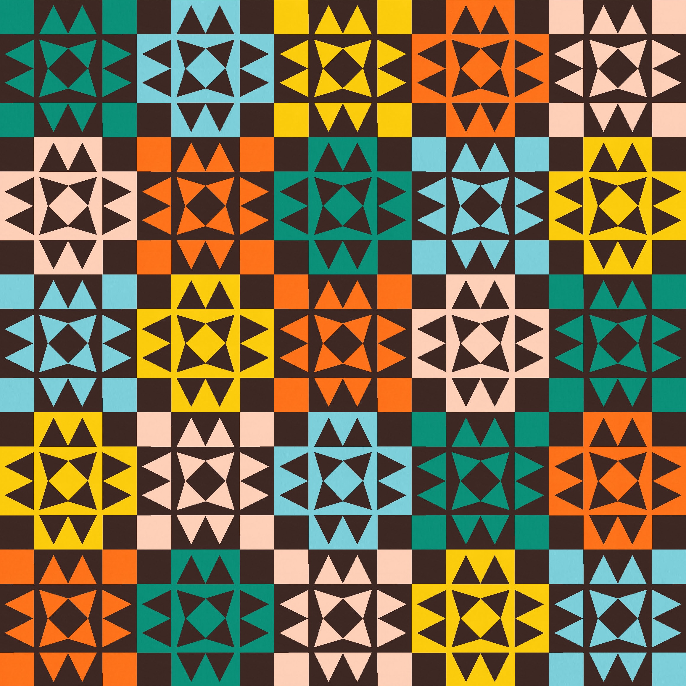
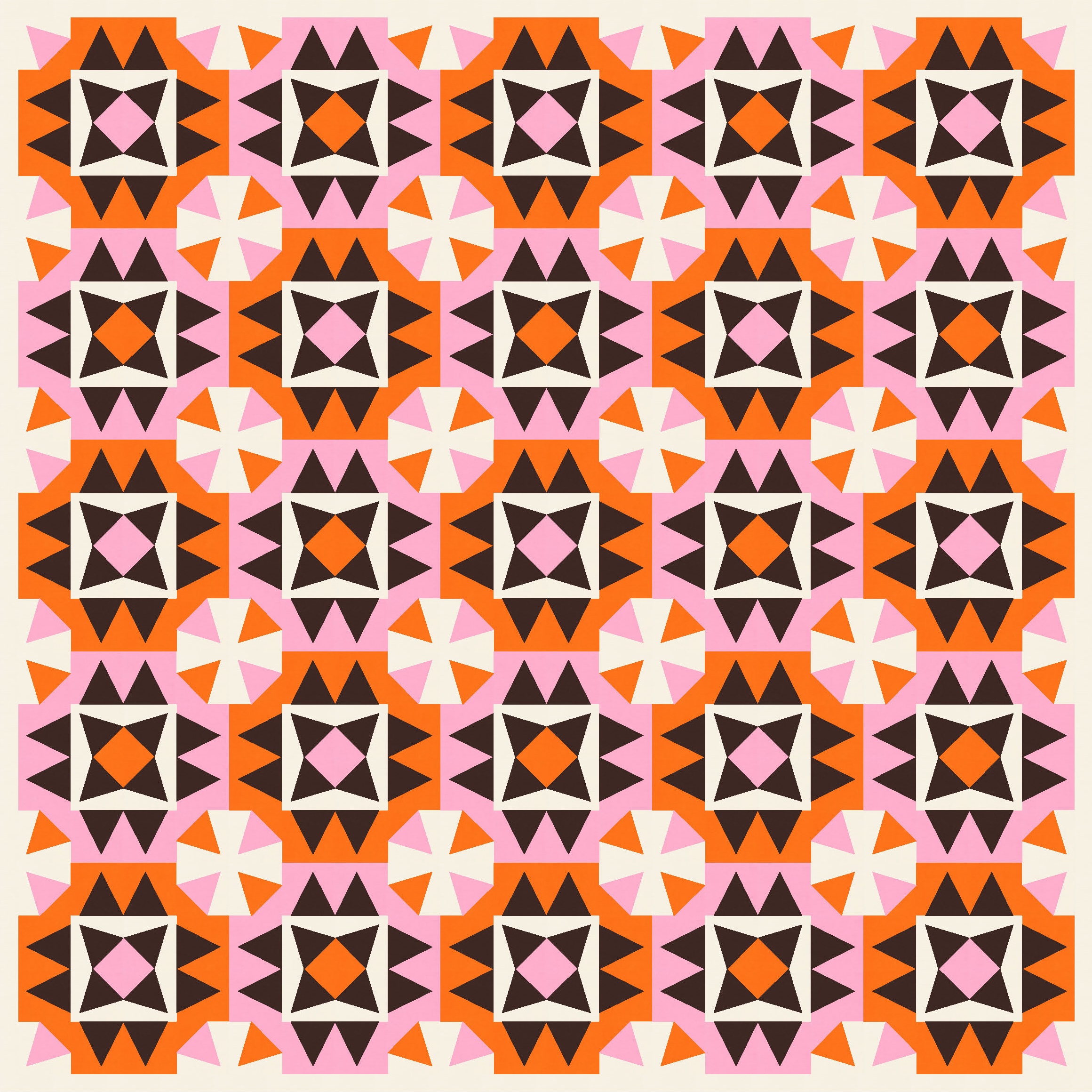
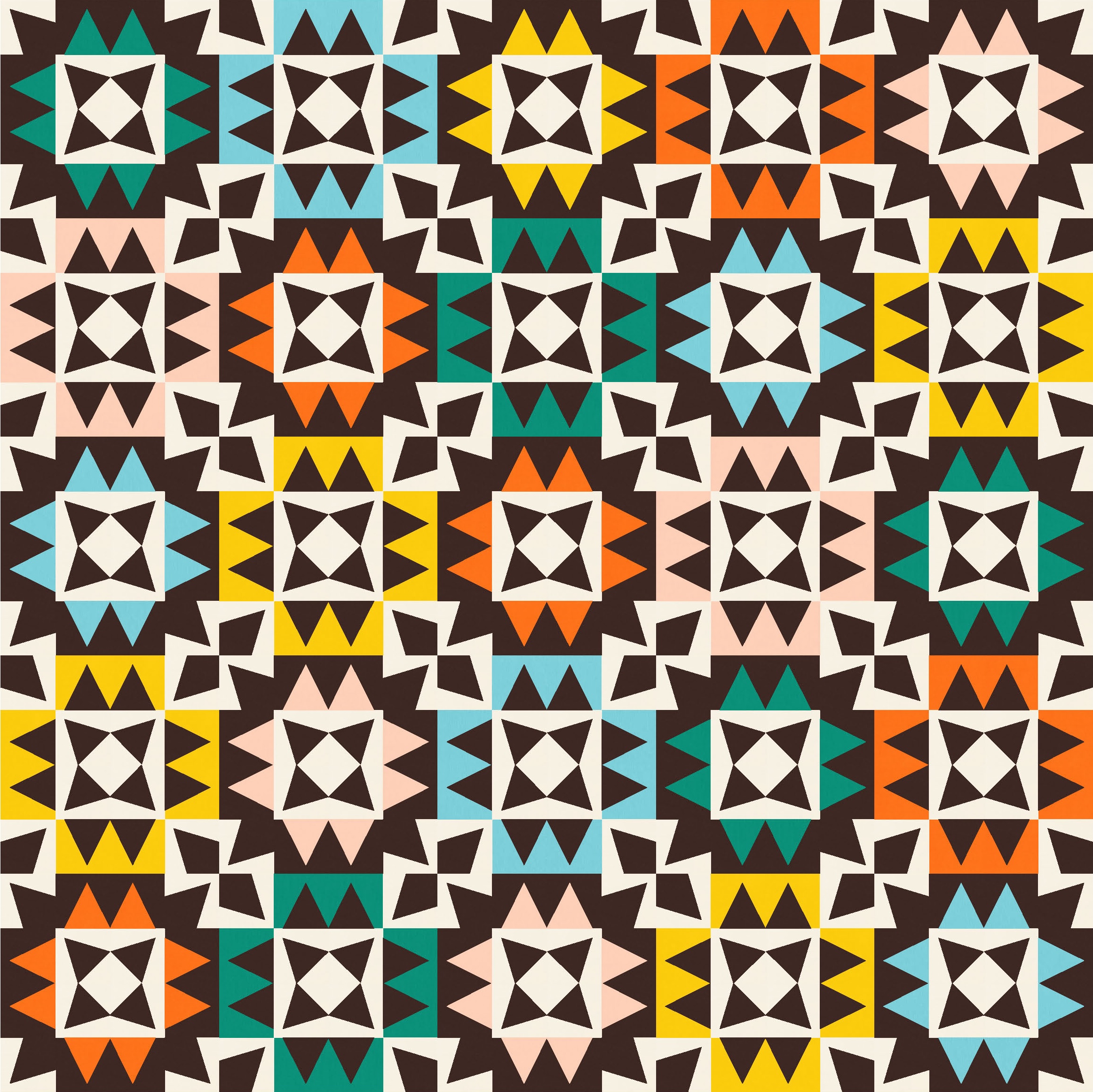
I started with the basic block and just alternated the colouring to differentiate them. In the first iteration, I didn’t have anything in the corners of each block (just a blank square).

I had to angle the four triangles in the middle to make them work, so they’re not exactly the same size as the triangles in the pairs on the four sides of each block (but close enough). Their blunt ends combine to create a small square in the middle of the block – a nice added element that presents more opportunities for colour placement.
That first version feels a little blocky, maybe. Changing up the colour placement slightly (just in the centre of the blocks) removes some of the horizontal and vertical lines. I feel like this next version has a bit more movement.

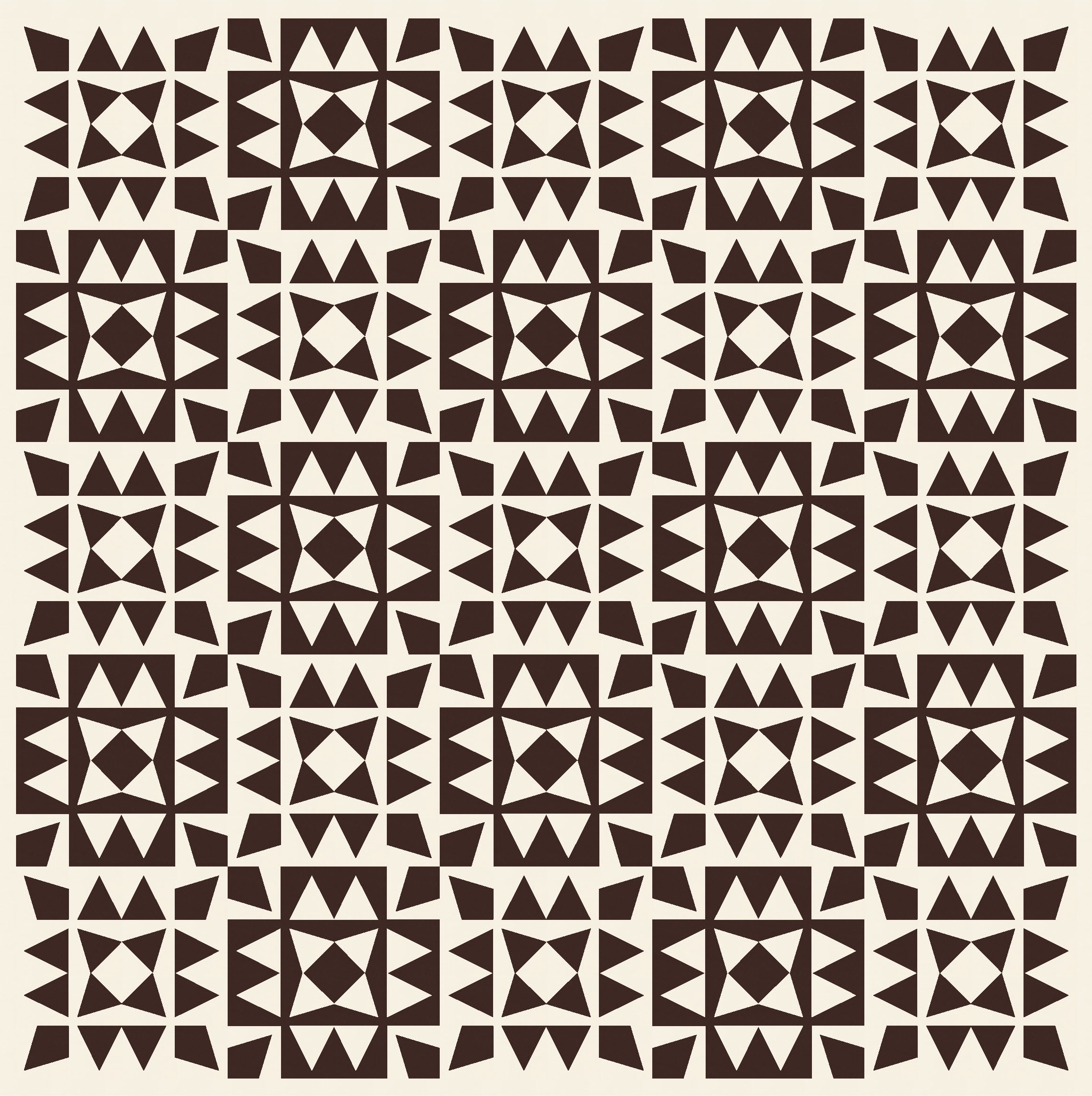
The design’s a bit more interesting with a larger palette…


…but I still felt like it needed something more.
In the previous two related Sunday sketches, the corners of the blocks had more of the same shapes in them too (drunkard’s paths or kites). So I filled them with triangles here. Ahh, that’s a bit more interesting. Loads more movement!
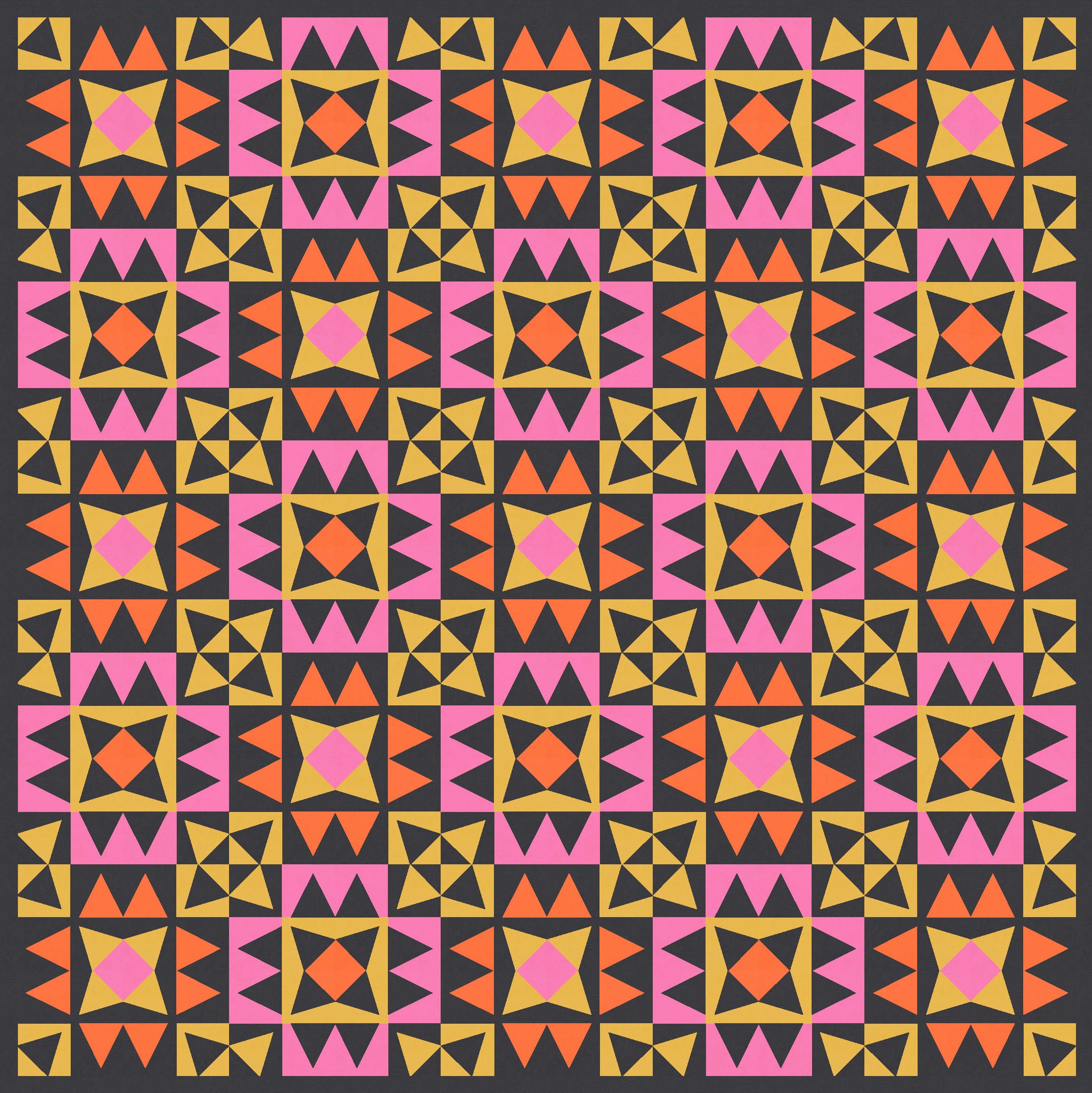

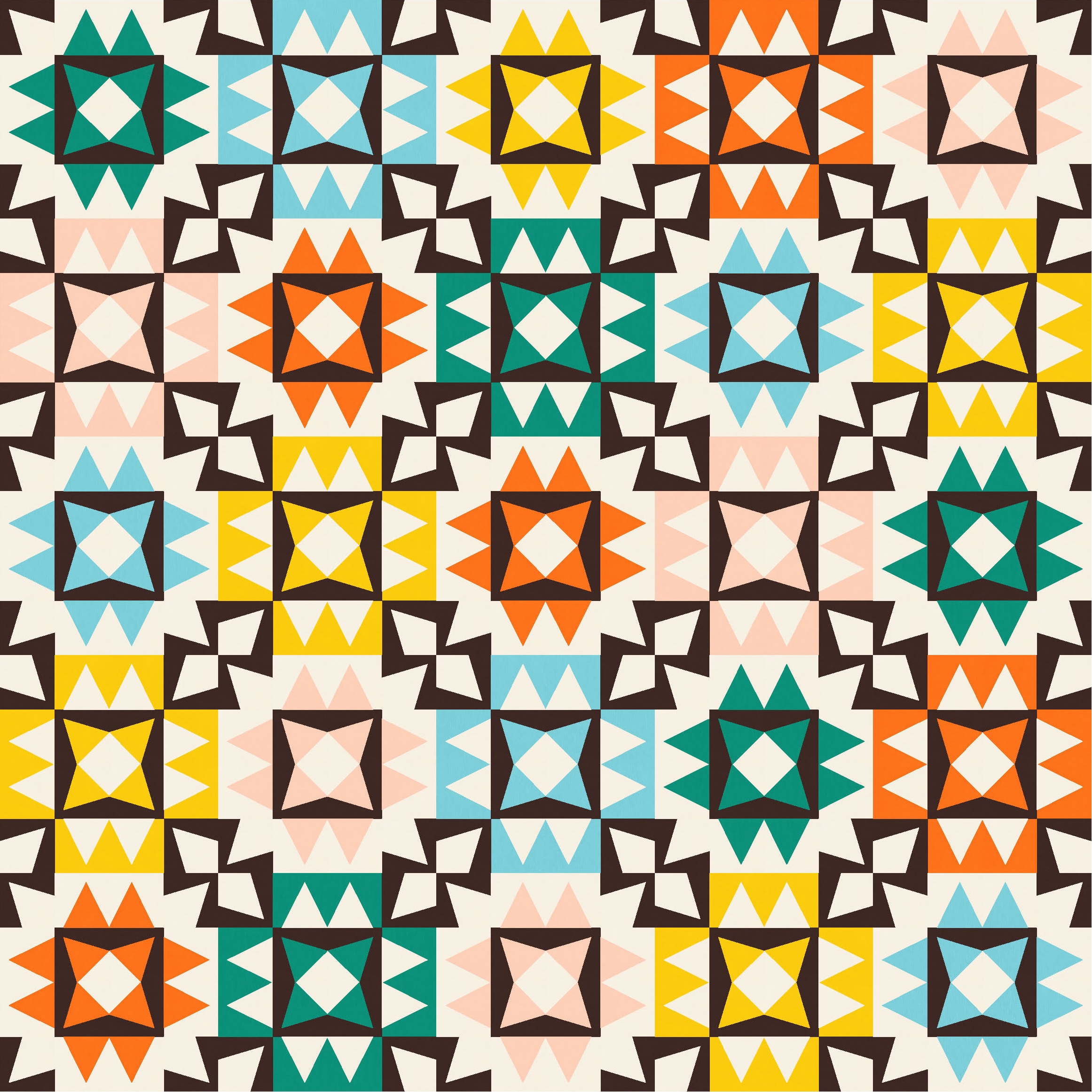
I really like these two versions (probably because of the palettes too….). But they feel a little traditional maybe. Not that these designs fit the description of ‘modern’, but I wanted to get them closer to contemporary. So I kept going.
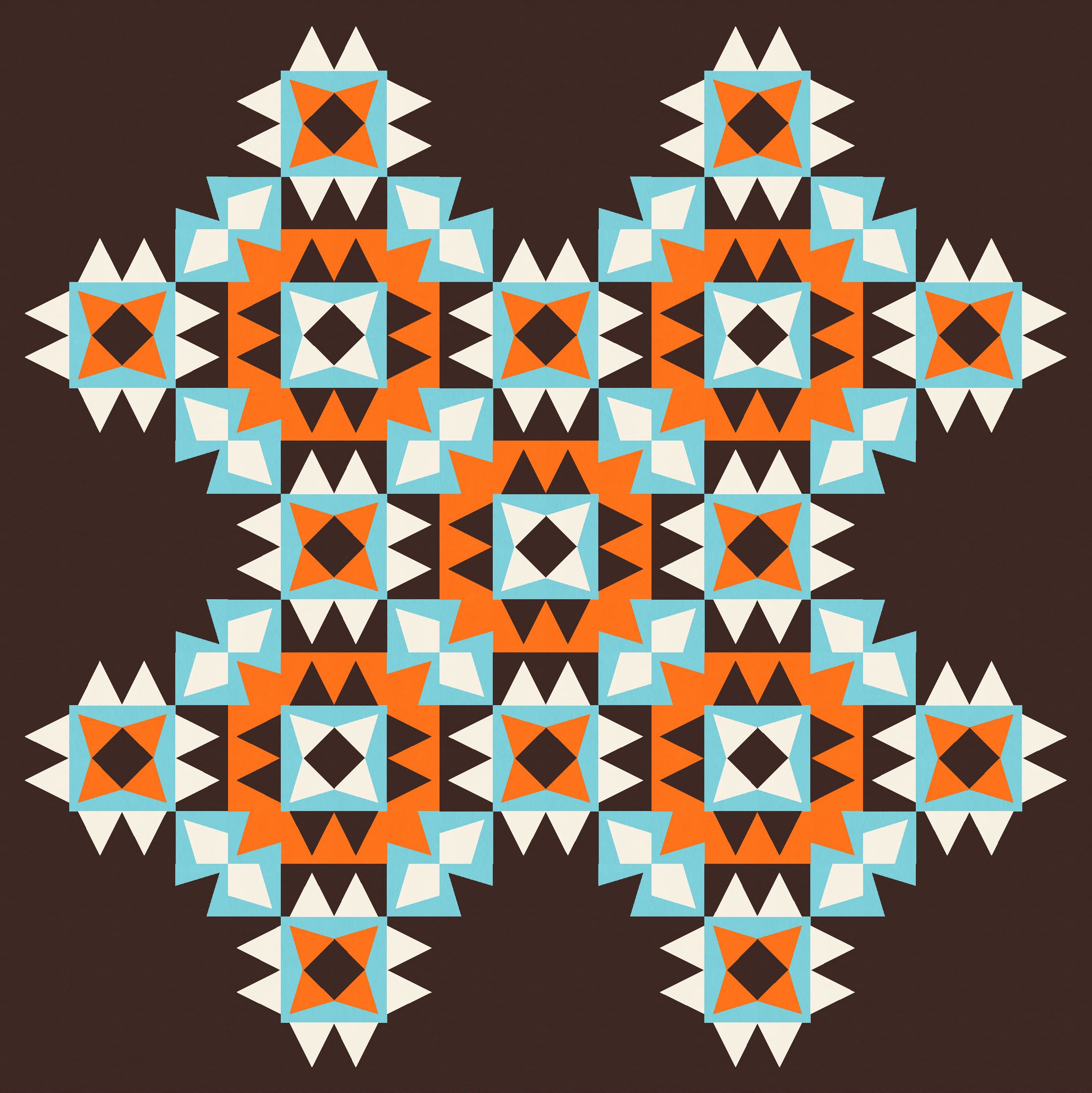
Last week, I had kites in the corners that changed direction in alternate blocks (pointing either in or out). So I did the same here with the triangles. But as you can see below, they don’t really work.
Using a bit of colour doesn’t help much; the corner triangles are just kinda floating there, untethered, with nothing to do. They don’t make much sense in the context of the whole design.
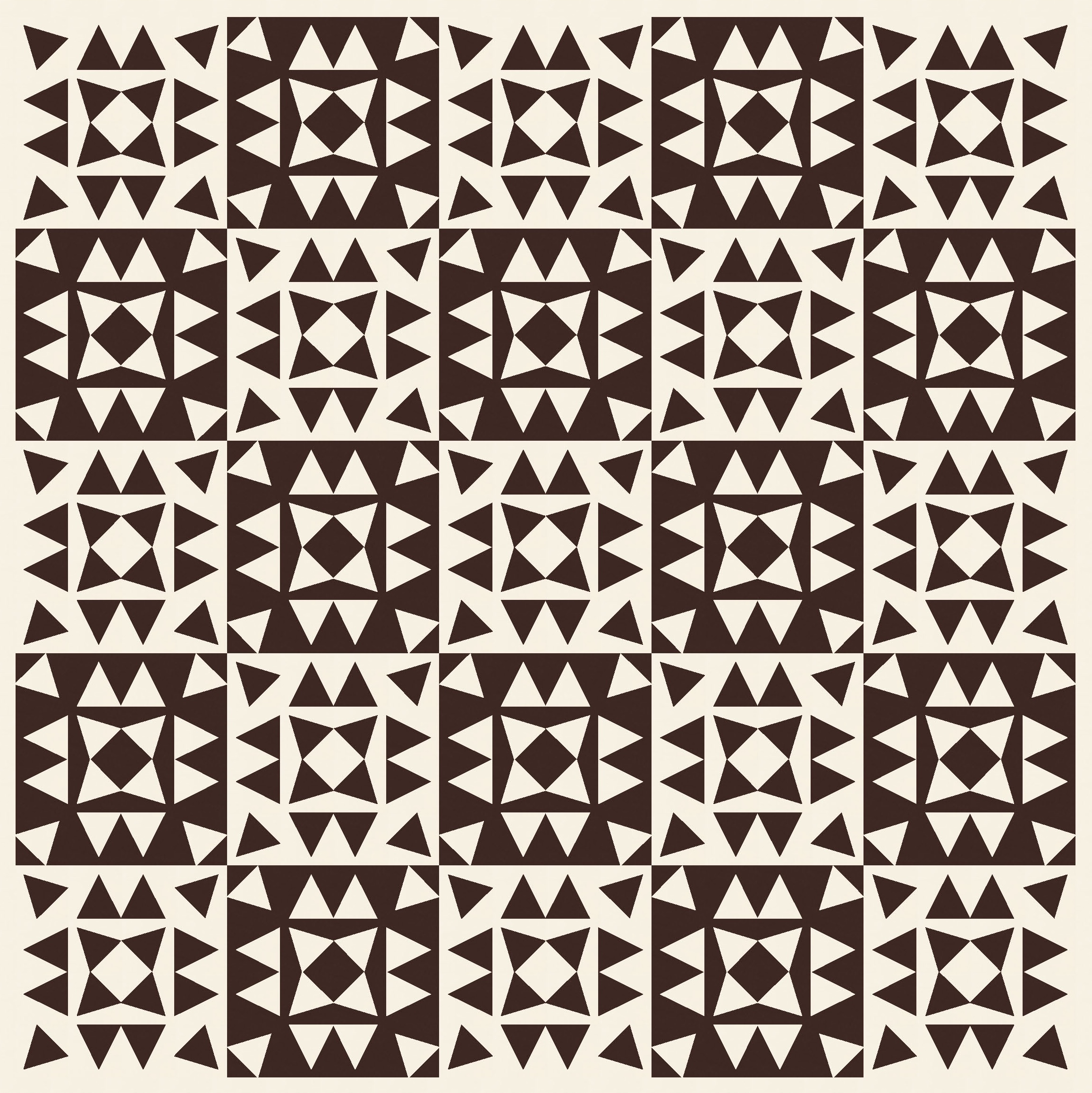
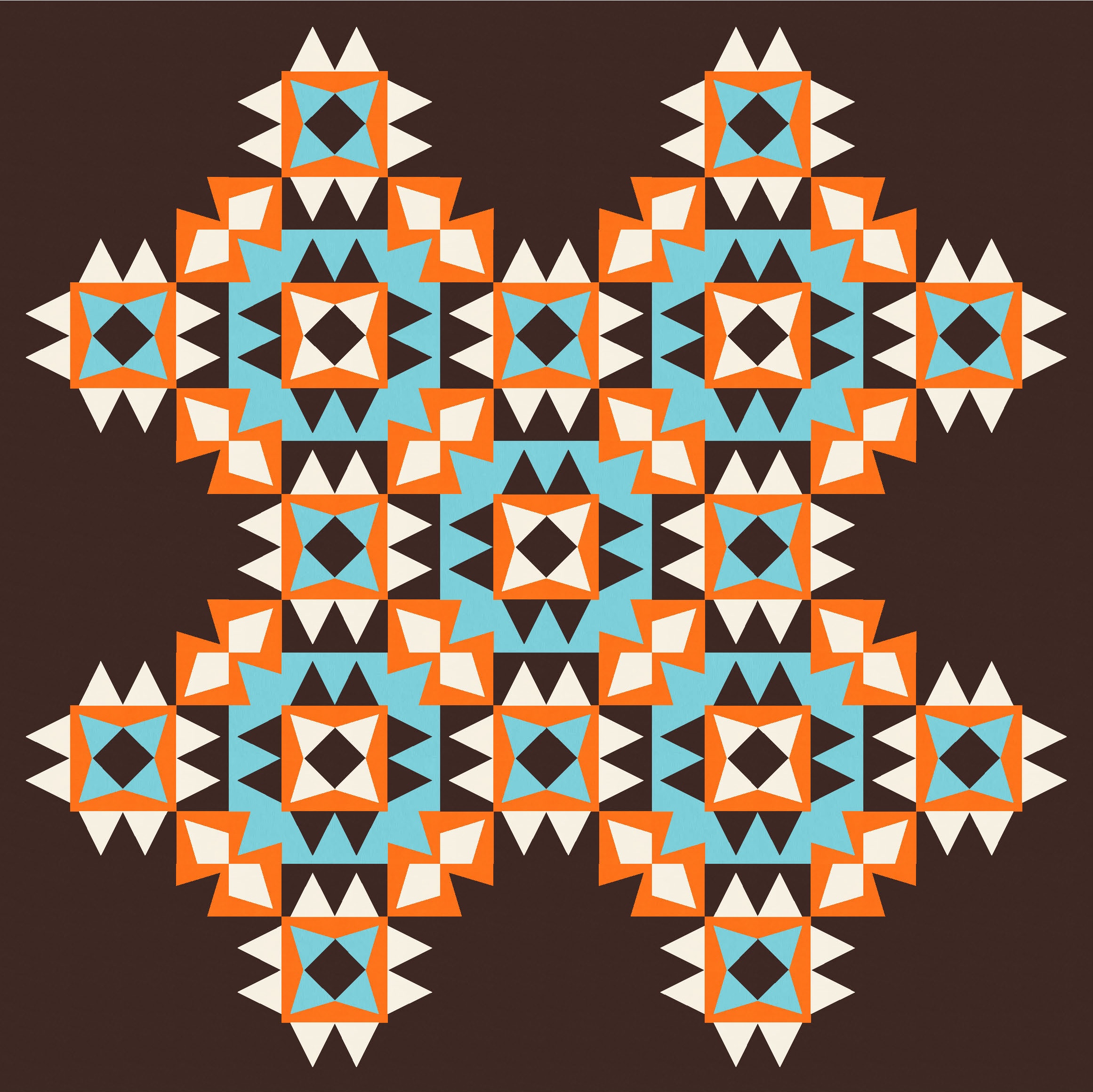
I could make them all face the same direction in all blocks (pointing outwards), and colour in their butts so that they’re not just floating aimlessly. That works, in that they’re now attached to something, but it’s not really the look and feel I’m going for. Colouring in their butts (for lack of a better description) creates an octagon shape between four adjacent blocks that feels a little incongruous to me. It doesn’t really go with anything else in the design; there are no other 45-degree lines, for one thing. It’s kinda cute, but also kinda doesn’t work?
So what other options are there? Well, I caved and tried kites in the corners, like last week. It feels a bit like cheating, since I really wanted to use only triangles. But sometimes you have to break the rules (and when you create them yourself, you can do whatever you want!)
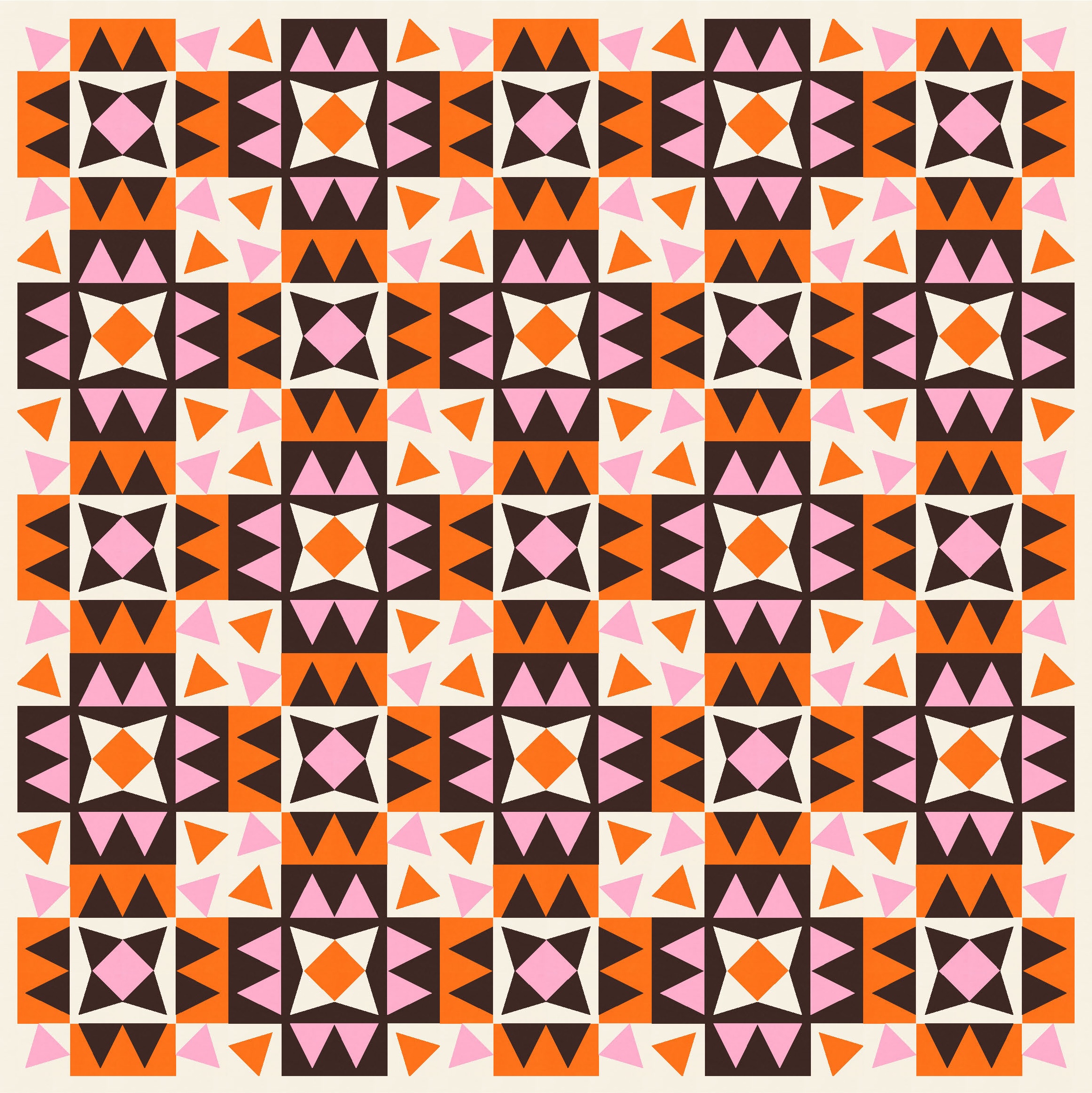
Here I’ve tried kites in alternating directions, then also played around with colour placement.


Using a broader palette really shows off the potential of this design. Apart from the fact that I LOVE this combination of colours (a new favourite, for sure), these next four versions are probably my favourite. I’d be happy making any of them!

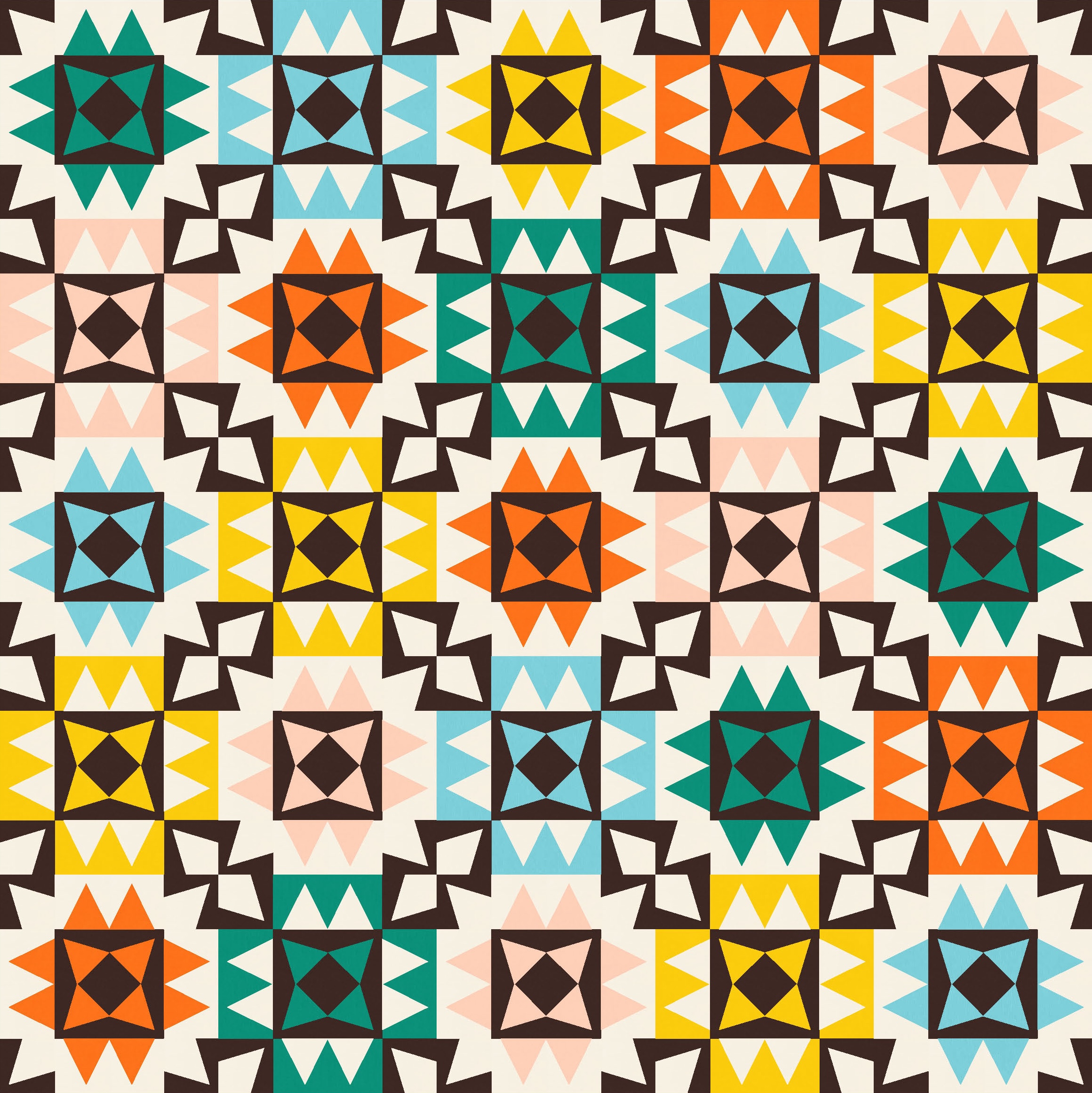
Having said that, I then tried the following colour combination and decided that it’s my new favourite.


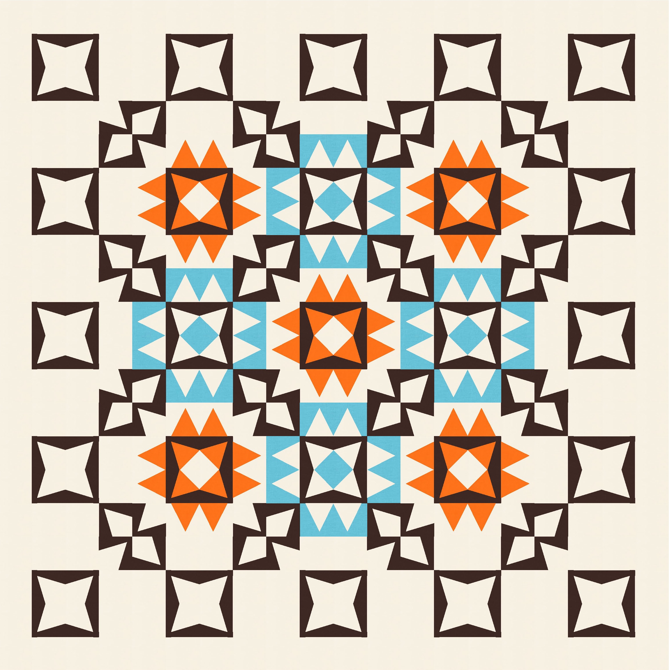
For some reason, this palette in particular prompted me to wonder what the design would look like if I started subtracting elements. That’s something I often try, but it hadn’t occurred to me until now with this design. I took away edge and corner blocks and related elements to focus on this prickly centre.


There are so many permutations just with four colours!
I also tried taking away different elements – here I’ve left in all the dark edges and just popped in a few coloured stars. You could mix up which parts you added or subtracted. I’ve got another version not shown here that feels more ‘modern’ and might work for a show like QuiltCon. (Not for submission this year! I’d say maybe next year, but then I know I’ll have many more ideas before then….)
Because I’ve used slightly unusual triangles in this week’s sketch – either straight or angled, and with a bit of space between the edge of the triangle and the edge of the unit – the best approach for making any of these designs into an actual quilt would be to create some templates and then just chain-piece to your heart’s content. The pairs of triangles (that form the four sides in each block) could be paper-pieced to save at least one seam.
And yes, before you ask, I have added this one to my ‘to do’ list! 🙂
Discover more from Geometriquilt
Subscribe to get the latest posts sent to your email.
