Sunday sketch #420
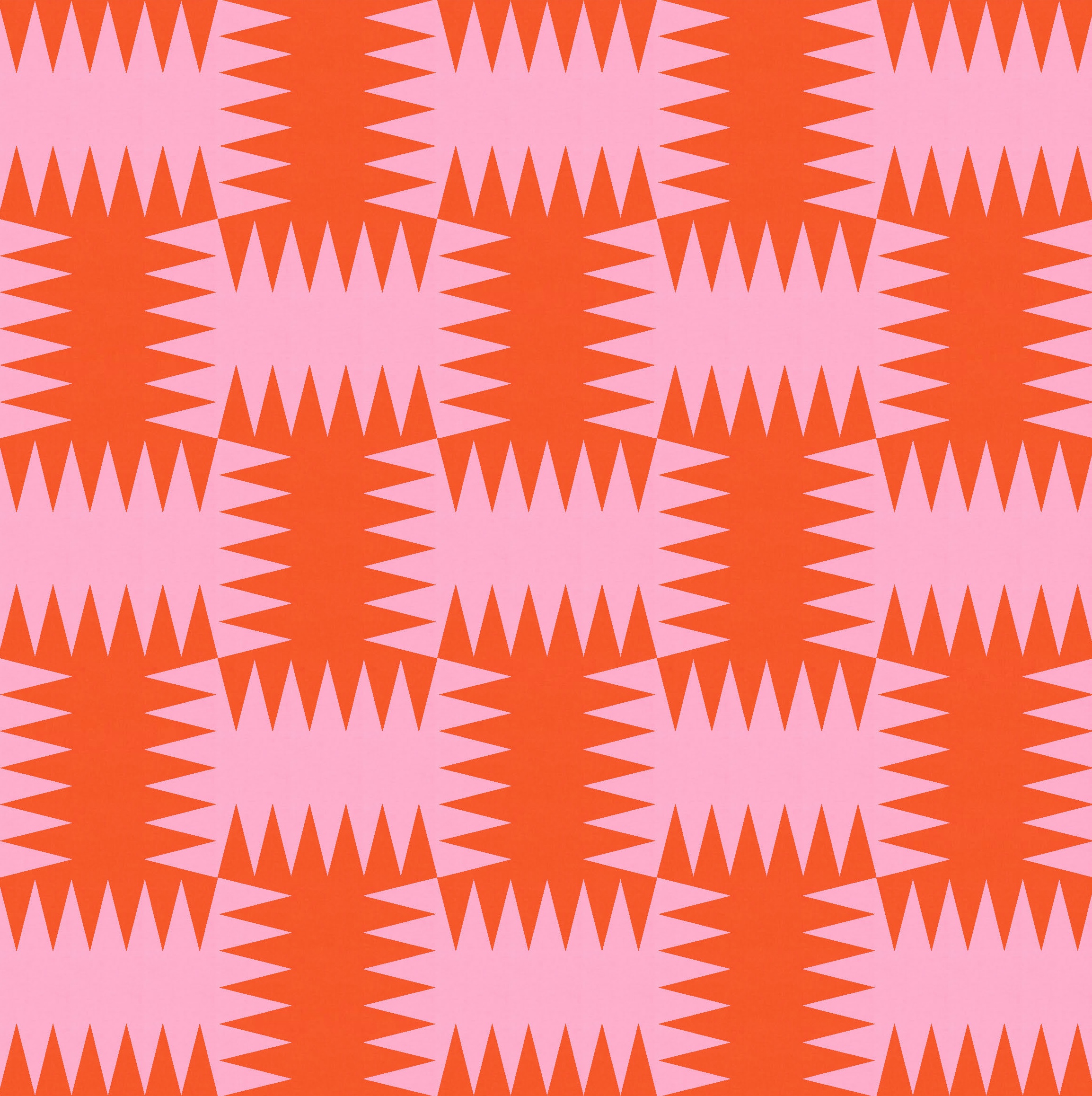
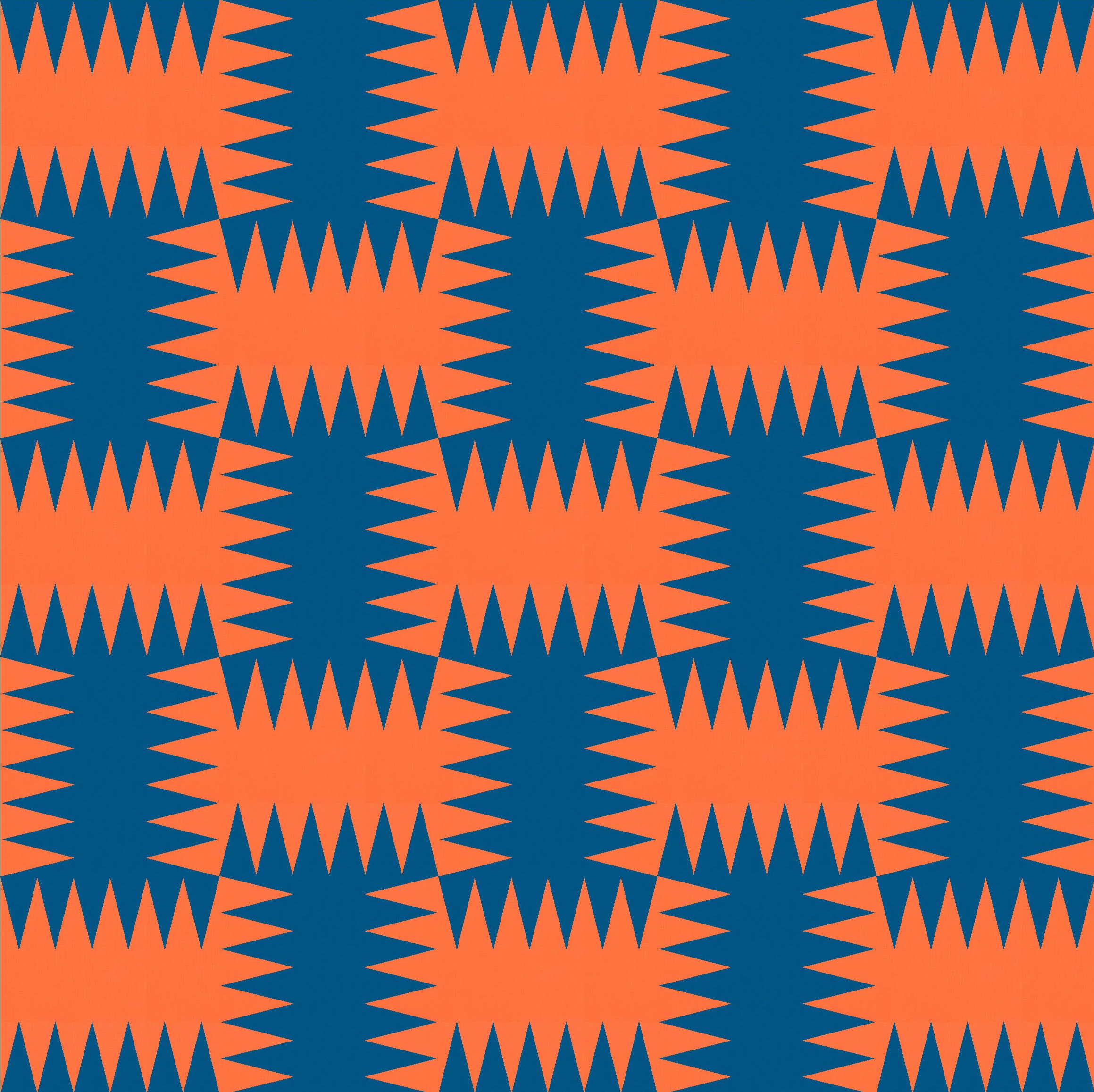
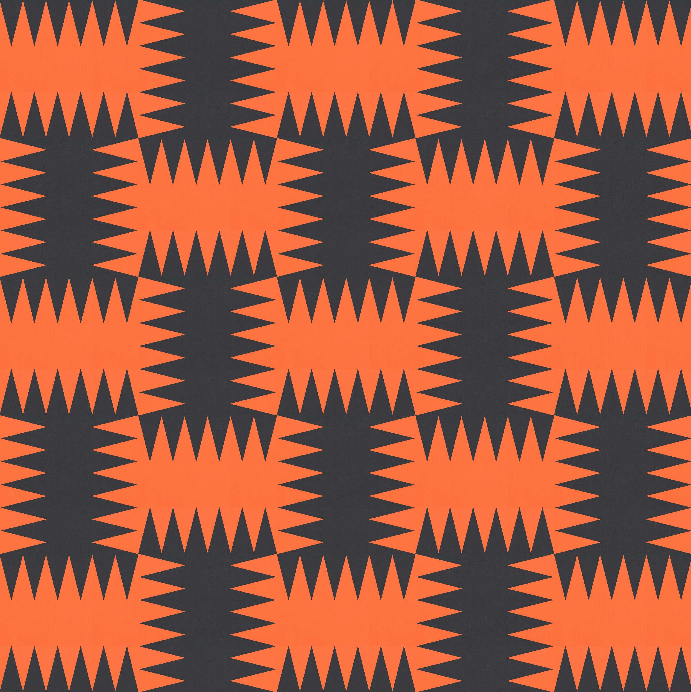
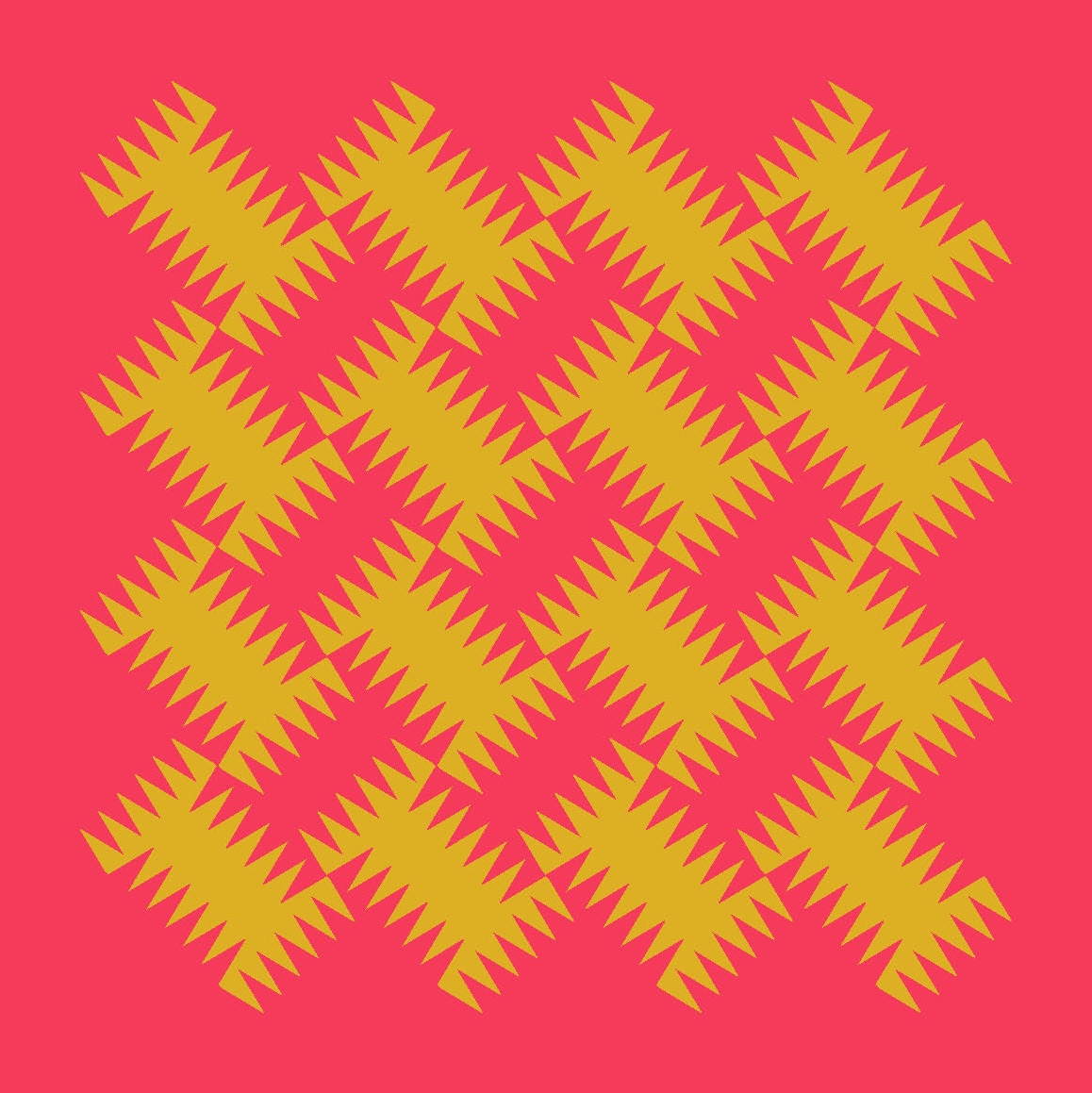
Another two-colour design this week, this time using a spiky block whose shape changes depending on colour placement.
(As an aside, I think it’s time I made a bright green quilt!)
As is often the case, I’m showing you one of the later versions of this design. I actually started with a standard layout (not on point), which emphasises the woven effect of this block arrangement.

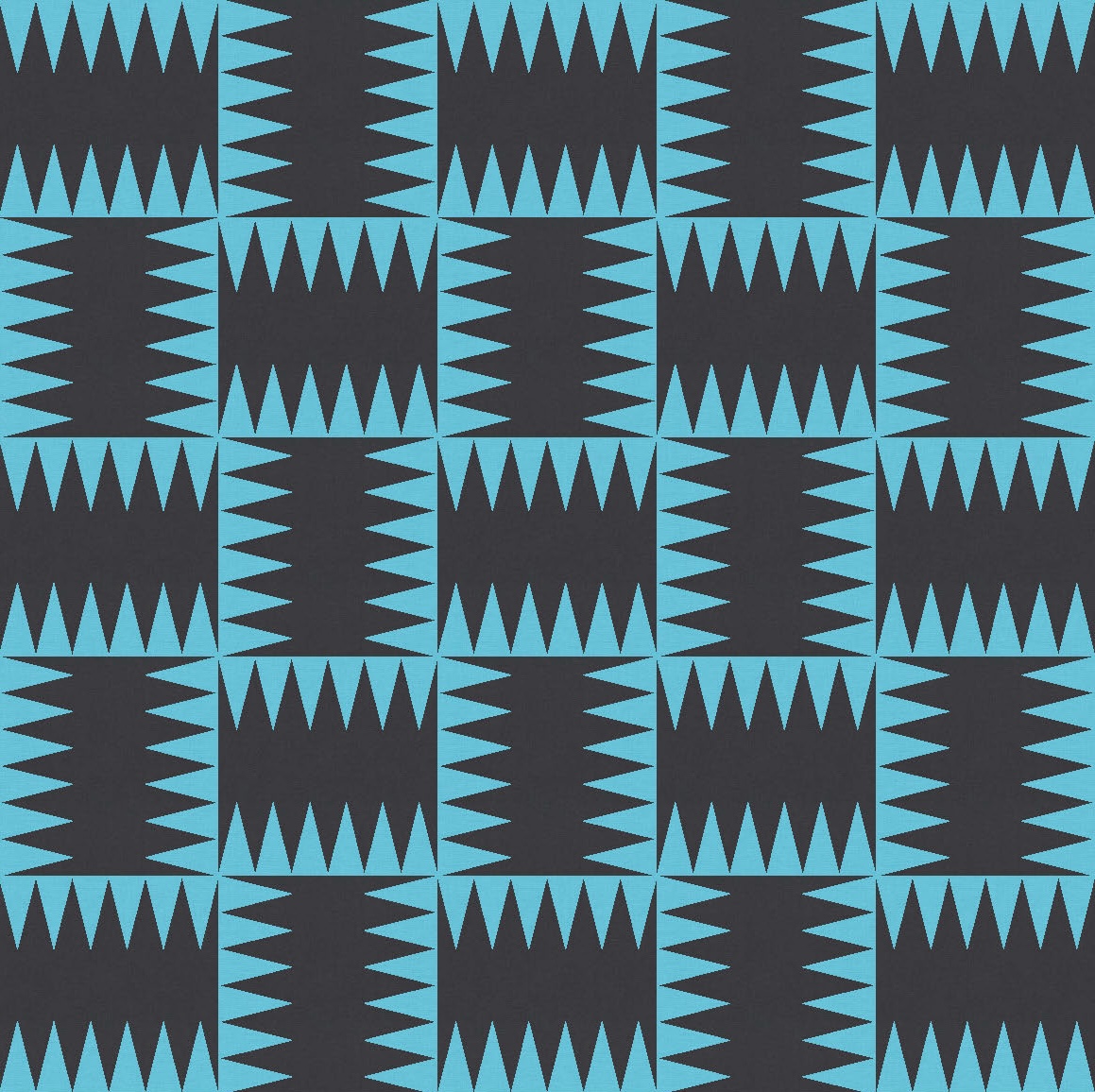
In that layout though, there’s no obvious ‘background’: in each of the examples shown above, you could be looking at blue shapes on a black background or black shapes on a blue background – it’s just not clear at first glance. I decided to play with that more, emphasising the edges of the blocks rather than their middles.
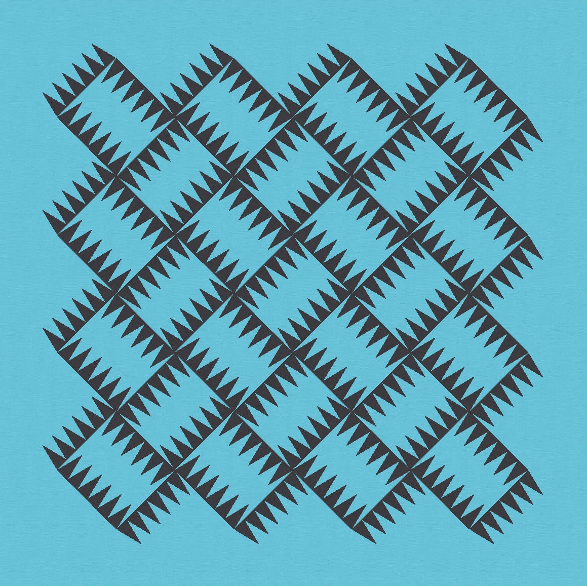

I like these versions too. They feel a bit lighter than the first sketches above, but with the same energy and movement.
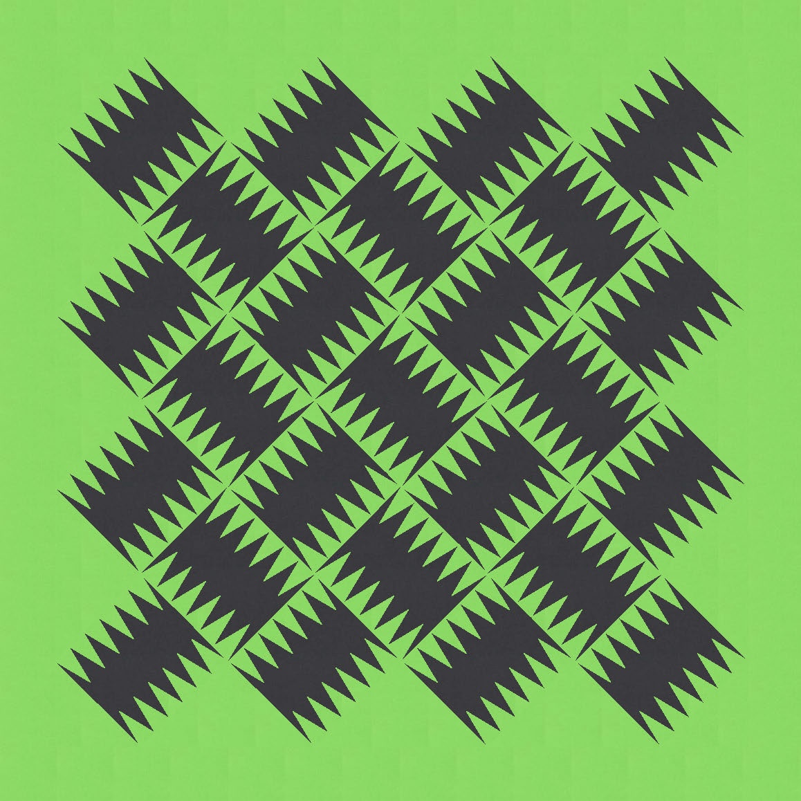
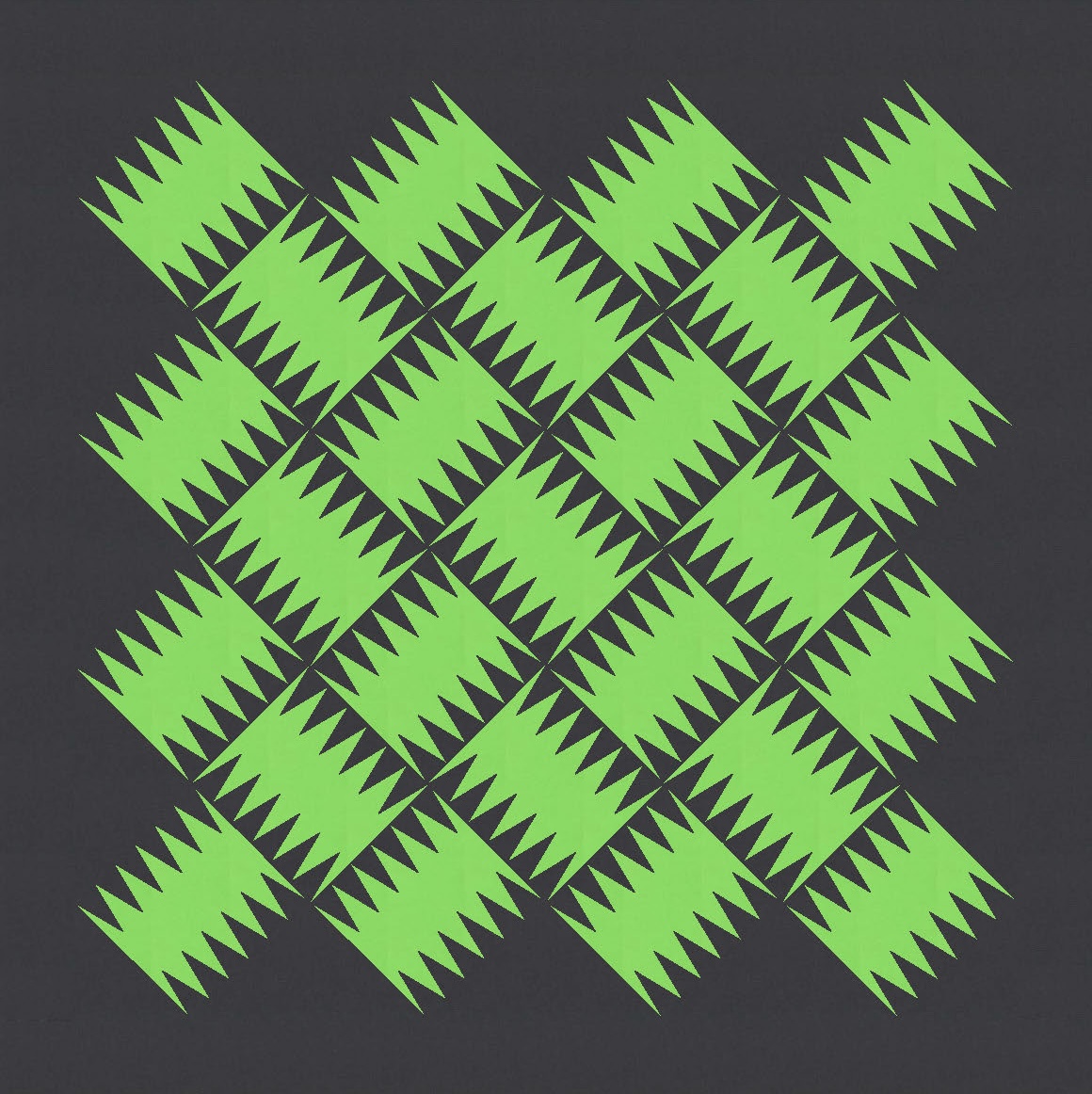
But I didn’t start out colouring the blocks in this way. My first approach was to alternate the colour placement in adjacent blocks, so that the two sides of one block interacted with the blocks next to them. This creates an interesting tessellation.

I love playing with tessellations like this – using adjacent blocks to create shapes that are bigger than any single block. The last time I posted one of these was a while ago now: I think maybe Sunday sketch #316? (In 2017!) Obviously I need to play more with this concept.

Again, though, as interesting as these are… I wanted to try a different layout. Sometimes I think the obvious horizontal/vertical arrangement of blocks in a standard layout can take attention away from other things happening in the design.
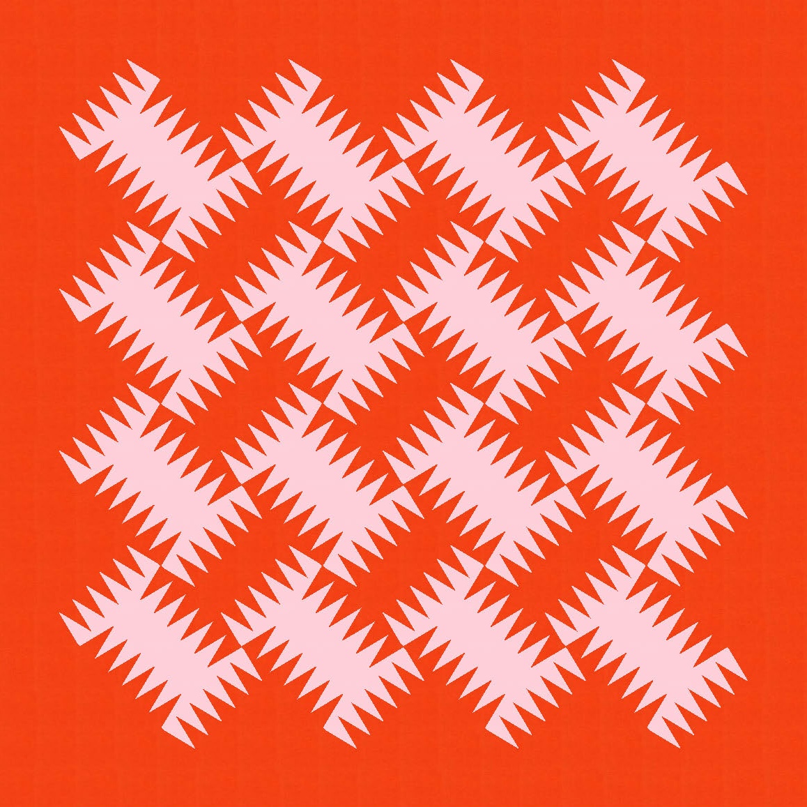
I like how your eye might first see the non-background shapes, but then realise that the shapes between them are the same. It leads to a great push/pull effect, drawing your eye in and around.


I ended up posting the non-critter* version as the main pic in this week’s post, but I like this one just as much. (*I can’t help it; those shapes look like weird little critters to me 🙂 )
With two-colour tessellations like this, it’s tempting to try an Escher-like arrangement that starts the shapes in one colour on one side of the design and ends up on the other side in the other colour. See MC Escher’s Sky and Water I, Sky and Water II and Regular Division of the Plane for some examples of how he did this. This is just my first attempt: horizontal green critters marching against a blue background, meeting up with vertical blue critters that came on a green background.

If I were going to make that version, I’d probably scale it back a bit in terms of the number of blocks, and think more carefully about block/colour placement (as well as the palette). It’s a fun experiment though!
Anyway, I think the easiest way to make one of these designs into a quilt would be to use paper piecing for the triangles. A long stretch of paper would keep things nice and straight and avoid the need for templates. Remember that the blocks themselves are square; it’s just colour placement that makes some of the triangles look like they belong to adjacent blocks.
I also like the idea of doing a scrappy version with lots of different colours for the triangles, but I think that’s just cos I’m feeling the urge to use lots of really bright colours lately. It’s hard to mock up ‘scrappy’ in Electric Quilt 8, so I’ll just have to leave it to your imagination.
Discover more from Geometriquilt
Subscribe to get the latest posts sent to your email.
