Tagged: square
Sunday sketch #253
I’m posting a little out of order this week. If you’ve been following for awhile, you know that one sketch will often spark an idea for a second sketch, which will morph into a third sketch, which can lead off in another direction to a fourth sketch… and so on. When this happens, I usually post the designs in order of creation, so I can easily tell the story of how they evolved. But not this week.
You’ll see this ‘pinwheel flag’ motif (for lack of a better description) in an upcoming sketch, where it first started. But I like the simplicity of this variation, so I’m posting it first.

I tried to inject a bit of bright colour into this one, because my default palette with this dark blue is often white and grey….

In the variations above, there are secondary squares created by the closest quadrants of four adjacent blocks… so four white ‘flags’ create a white square, and four blue flags create a blue square.
But the flag colours can be mixed up to avoid creating those squares. I like to create designs that offer choices for colour placement, particularly with a limited palette.
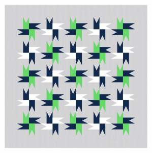

I’ll do a bit more with this block next week. But in the meantime, here’s another variation, created by colouring in the secondary squares with the alternating colour. I also flipped the orientation of this one, to avoid potential problems.


I like how these two versions look almost chaotic and improv-y but are actually very controlled and rule-based.
All these designs could be made into quilts using a triangle-in-a-square block and squares. That’s it!
Sunday sketch #244
This week’s design is almost identical to last week’s, but with one small change. That tweak has created a whole new design with much more movement and colouring opportunities. Can you see what’s different?

I tried a few other colour combinations, and used transparency in each one.


The difference is that instead of using a simple square as the middle block in each ‘flower’ shape, it’s now a square-in-a-square block.
Remember last week’s chonky flowers? Here they are with square-in-a-square centres:

(Also, I’m in love with that blue and dark grey colour combo.) Here’s some more flowery palettes.


I prefer the chonkier flowers from last week; they’re less refined but just strike me as happier and funnier (and more fun).
But this new design creates opportunities for moving away from ‘flowers’ into other more abstract shapes. There’s now a connection between the different ‘arms’ of each shape – instead of the north/south/east/west arms being separate from each other, they’re now connected to adjacent arms through that centre piece. This creates a bunch of 90-degree ‘V’ shapes that can be coloured separately.
I’m still playing with these shapes, so I may have more related designs to share next week!
Sunday sketch #241
What do you think of the 2021 Pantone Color(s) of the Year? (Me? Meh.)
The Pantone Color Institute picked yellow (‘Illuminating’) and grey (‘Ultimate Gray’) for its colours this year. (It’s not the first time they’ve chosen two instead of one; in 2016 they selected baby pink and baby blue (sorry… ‘Rose Quartz’ and ‘Serenity’). Ugh.)
Anyways… I figured I’d try the yellow/grey combo in a design! I’m always on the lookout for new colour combinations. (And the first quilt I ever made was in yellow and grey prints, so I have a soft spot for this palette.)
I’ve been experimenting with block-based designs based on only two blocks – it’s an interesting visual exercise, and a good way to find unexpected secondary shapes.

I’m always fascinated by how colouring a design differently can give a quilt pattern a whole new look. But what’s great about this design is that colouring the pieces in the same way, but in a different palette, also produces a different effect. In the version above, the grey diamonds create a ripple effect of concentric (almost) circles. But in the version below, when the colours are switched, the white diamonds don’t have quite the same effect.

But this design is also a perfect example of how colouring the pieces differently can create a completely different look and feel. I added another 2 rows and columns of alternating blocks to the design below, but it’s the same checkerboard arrangement of only 2 blocks. It somehow seems a bit more complicated when colours are split between blocks, pulling some together and pushing others apart.

And we can complicate things even further…
Look at all that movement! And all of it comes from colour placement; it’s the exact same design as the version before it. I love it!
This design could be made into a quilt quite easily, as it’s just 2 square blocks repeated in an alternating arrangement. One block comprises 2 diamond shapes (or 4 triangle-in-a-square units). The other block is a cross block with a square in the middle, which could be constructed in a number of ways.
