Tagged: square
Sunday sketch #376
I’m still using the same block as the past two Sunday sketches, but I’ve removed some parts this week. (This is easy to do when designing; I just make bits ‘disappear’ by colouring them the same as the background. Obviously if I were making these blocks, I’d revise the design so there were fewer pieces in the block to begin with.)

So how did I get here from there?
Last week, I ended on a layout in which the blocks were set on point. Both the rounded and the squared corners in each block were coloured the same as the background, and the block had a leaf shape (also in the same background colour) in the middle. I didn’t love those versions.So this week, I’ve removed that internal leaf shape and replaced it with the square that was there originally. I left the curved corners coloured in, but the squared corners are still gone (coloured as background). And then I mixed up the colouring to highlight a different set of shapes within the design. I really liked these retro Xs, with their arms separated by the sashing in between blocks.

The four ‘arms’ of each X come from four adjacent blocks; each block has two arms in two different colours.
It’s quite a busy design when it’s multicoloured, so I tried a two-colour, alternating layout instead.

I liked that one, but I felt that the retro nature of those Xs really cried out for a standard layout.

And then I added some more space just to let the shapes breathe a bit. This layout’s reminiscent of Sunday sketch #373, too – two grids of 3 × 3 overlapping.

As always, I kept iterating this design, although that first version is my favourite. I tried colouring the sashing between the blocks, which ends up creating a plaid-ish effect.

That added colour removes the retro feel and gives this a more traditional feel. I still like it though!
Like the past few weeks’ designs, this week’s sketch could be made using squares, rectangles and quarter-circles (or drunkard’s path units). The curves would need to be pretty small – something I still struggle to do well – but the rest of the piecing would be pretty straightforward.
Sunday sketch #371
I mentioned last week that I love sticking stuff in circles, so – surprise! – here’s the next iteration of that design. I’ve increased the size of the central crosses and sashing so that I can squeeze in some eight-pointed stars where the crosses were.

Also, I think this might be my new favourite two-colour palette. Electric Quilt 8 says it’s Kona Oyster and Kona Torch, although I’m not sure they’d look exactly the same in real life.


The interstitial stars – the ones between the circles – are made from the sashing between the blocks. So they can go around the edges of the design too, and the centre squares can be coloured the same as the star or different. Lots of options!


I quite like a limited palette for simple designs like this, and I always love that dirty yellow with an off-black.


Or this dusky raspberry with the charcoal black. Yum.


The arms of the stars are long and thin, so I’d probably use templates (or the forthcoming HuRTy 2 ruler from Latifah Saafir, which will do 1:3 and 2:3 half-rectangle triangles). I’m not sure how small I could make triangles like that (and still have them be nice and crisp and straight). I should try it and find out!
Otherwise, this week’s design would be as easy to make as last week’s: a bunch of quarter-circles (or drunkard’s path units), some squares (for the middle of the stars) and rectangles for the sashing. You just need to pick your colours! 🙂
Sunday sketch #370
I’ve been doing a lot of (what feel like) fairly simple designs lately, but I’m enjoying playing with basic shapes and palettes. I’m big into sticking circles (or pseudo-circles) around stuff – this week, it’s crosses.
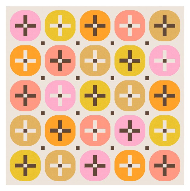
I used a similar shape in Sunday sketch #131 (way back in December 2018!), but haven’t really played with it since. But I really like it.
It’s not quite a circle, not quite a squircle, but 4 quarter-circles (or drunkard’s path units) around a cross shape. Using a centre square in the middle of the cross increases the opportunity for interesting colour placement.
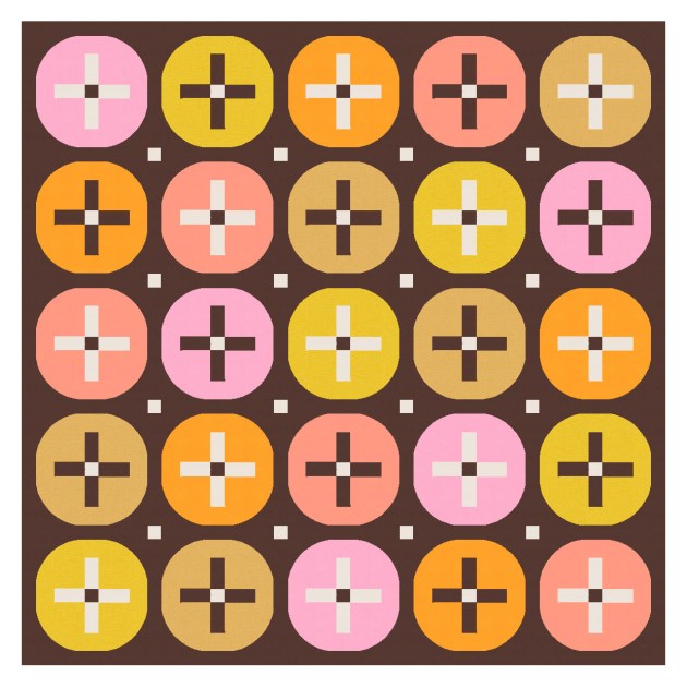
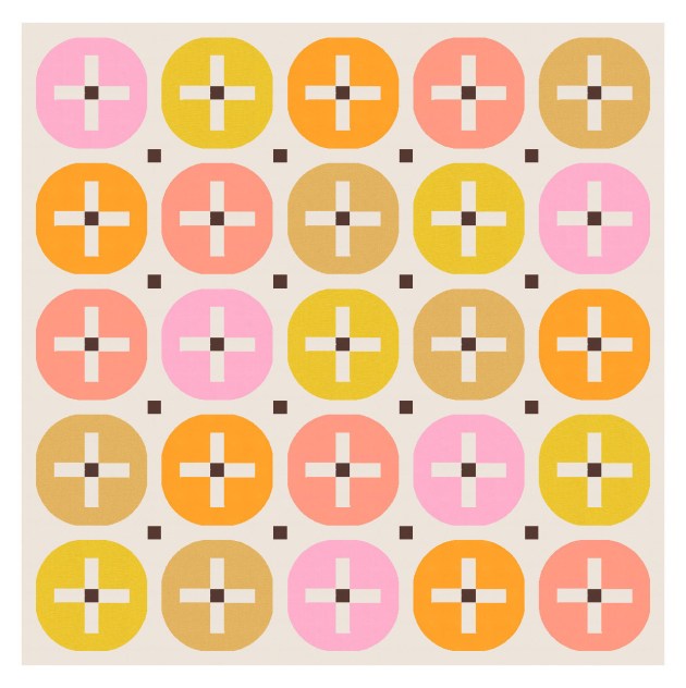
And those squares can be echoed in the sashing between the blocks, too. The design works without them, I guess, although it’s maybe not as interesting?


I’ve used a mixed palette here, but a more limited palette would work too.


I also removed some of the circles and retained the crosses – just to add some negative space and draw the eye around the design a bit.

There’s lots of potential with this design – lots of ways you could play with the palette and colour placement. I love simple, clean designs like this! They’re not earth-shattering from a design perspective, but very satisfying (to me, at least).
All you’d need are quarter-circles (or drunkard’s path units), squares and rectangles. I know a lot of people don’t like sashing, but I don’t mind it. I add it to a lot of my designs to break up adjacent blocks and avoid overcrowding. (Sorry!) But otherwise I think this week’s sketch would be a fairly easy make.
