Tagged: drunkard’s path
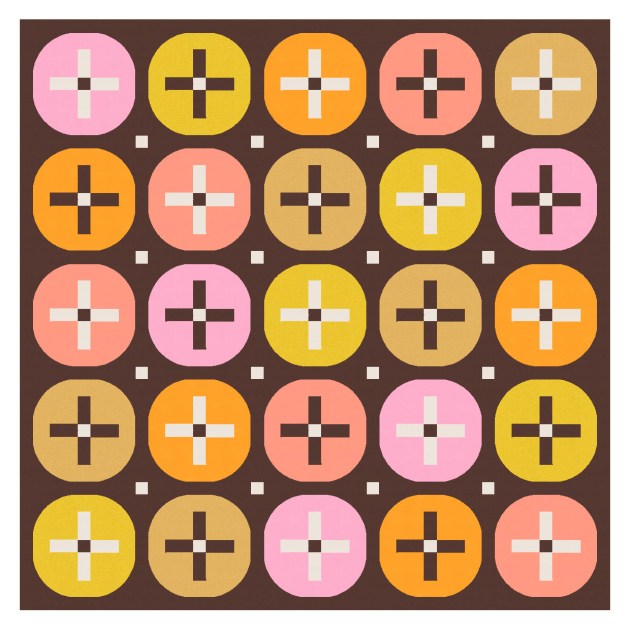
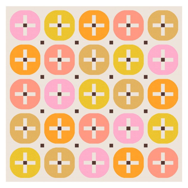
Sunday sketch #371
I mentioned last week that I love sticking stuff in circles, so – surprise! – here’s the next iteration of that design. I’ve increased the size of the central crosses and sashing so that I can squeeze in some eight-pointed stars where the crosses were.

Also, I think this might be my new favourite two-colour palette. Electric Quilt 8 says it’s Kona Oyster and Kona Torch, although I’m not sure they’d look exactly the same in real life.


The interstitial stars – the ones between the circles – are made from the sashing between the blocks. So they can go around the edges of the design too, and the centre squares can be coloured the same as the star or different. Lots of options!


I quite like a limited palette for simple designs like this, and I always love that dirty yellow with an off-black.


Or this dusky raspberry with the charcoal black. Yum.


The arms of the stars are long and thin, so I’d probably use templates (or the forthcoming HuRTy 2 ruler from Latifah Saafir, which will do 1:3 and 2:3 half-rectangle triangles). I’m not sure how small I could make triangles like that (and still have them be nice and crisp and straight). I should try it and find out!
Otherwise, this week’s design would be as easy to make as last week’s: a bunch of quarter-circles (or drunkard’s path units), some squares (for the middle of the stars) and rectangles for the sashing. You just need to pick your colours! 🙂
Sunday sketch #370
I’ve been doing a lot of (what feel like) fairly simple designs lately, but I’m enjoying playing with basic shapes and palettes. I’m big into sticking circles (or pseudo-circles) around stuff – this week, it’s crosses.
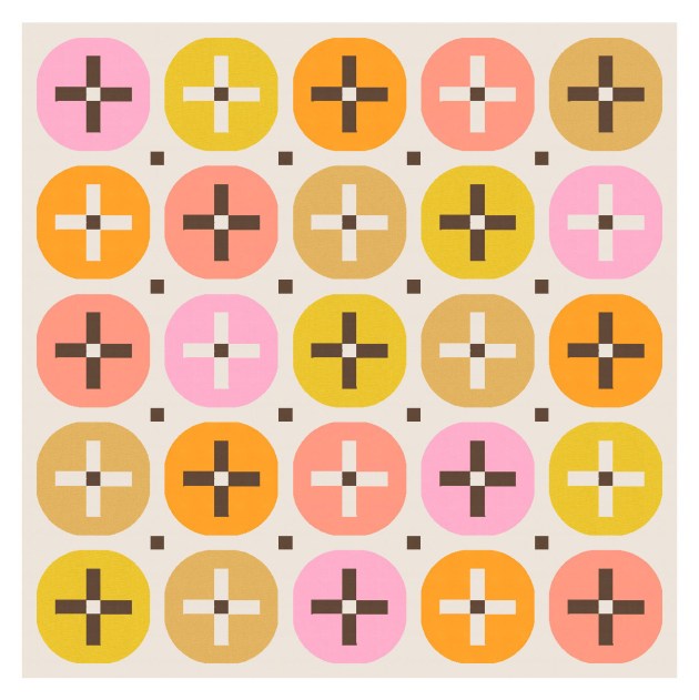
I used a similar shape in Sunday sketch #131 (way back in December 2018!), but haven’t really played with it since. But I really like it.
It’s not quite a circle, not quite a squircle, but 4 quarter-circles (or drunkard’s path units) around a cross shape. Using a centre square in the middle of the cross increases the opportunity for interesting colour placement.
And those squares can be echoed in the sashing between the blocks, too. The design works without them, I guess, although it’s maybe not as interesting?


I’ve used a mixed palette here, but a more limited palette would work too.


I also removed some of the circles and retained the crosses – just to add some negative space and draw the eye around the design a bit.

There’s lots of potential with this design – lots of ways you could play with the palette and colour placement. I love simple, clean designs like this! They’re not earth-shattering from a design perspective, but very satisfying (to me, at least).
All you’d need are quarter-circles (or drunkard’s path units), squares and rectangles. I know a lot of people don’t like sashing, but I don’t mind it. I add it to a lot of my designs to break up adjacent blocks and avoid overcrowding. (Sorry!) But otherwise I think this week’s sketch would be a fairly easy make.
Sunday sketch #366
This week’s designs are the last in a series that were prompted by Tara Glastonbury’s ‘design from a brief’ challenge, which she’s doing this year on her blog and in her column for Make Modern magazine. Check it out if you haven’t already – it’s a fun way to play with quilt designs and cultivate more creativity.
The basic block in this week’s design is the same as last week’s, with one minor tweak. Can you spot it?

In two diagonally opposite corners, I’ve added a new curve that cuts into the full circle there. In the version above, those new curves create the centres of the flowers; the other corners of the block create those interstitial stars.
I removed some blocks in the version above, so you could see them a bit more clearly. Here’s the version with the block tiled across the full design. It’s a bit busy for me, but I still kinda like it!

A two-colour palette is possible, but then you get those areas where the interstitial stars are a checkerboard colouring, which I don’t like.

Or the design can be rotated so that the interstitial stars are all one colour, and it’s the flower centres that are checkerboard-coloured. I don’t mind this version, actually! It’s busy, but energetic and fun.

Here’s the three-colour version again, but where the flowers have petals of two colours.

There are enough elements in this design to provide a lot of colour play. You could use a ton of colour (it could get kinda psychedelic) or stick to a smaller palette. And like last week, the construction would just require a lot of half-circles and quarter-circles (or drunkard’s path units).
I love a good flower design – they always make me happy!
