Category: Sunday sketch
Sunday sketch #253
I’m posting a little out of order this week. If you’ve been following for awhile, you know that one sketch will often spark an idea for a second sketch, which will morph into a third sketch, which can lead off in another direction to a fourth sketch… and so on. When this happens, I usually post the designs in order of creation, so I can easily tell the story of how they evolved. But not this week.
You’ll see this ‘pinwheel flag’ motif (for lack of a better description) in an upcoming sketch, where it first started. But I like the simplicity of this variation, so I’m posting it first.

I tried to inject a bit of bright colour into this one, because my default palette with this dark blue is often white and grey….

In the variations above, there are secondary squares created by the closest quadrants of four adjacent blocks… so four white ‘flags’ create a white square, and four blue flags create a blue square.
But the flag colours can be mixed up to avoid creating those squares. I like to create designs that offer choices for colour placement, particularly with a limited palette.
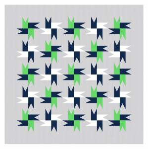

I’ll do a bit more with this block next week. But in the meantime, here’s another variation, created by colouring in the secondary squares with the alternating colour. I also flipped the orientation of this one, to avoid potential problems.


I like how these two versions look almost chaotic and improv-y but are actually very controlled and rule-based.
All these designs could be made into quilts using a triangle-in-a-square block and squares. That’s it!
Sunday sketch #252
I have a sneaking suspicion that I’m going through a bit of a dry spell when it comes to designing. I’m trying to stop calling these periods ‘slumps’, because I think it’s natural for creativity to ebb and flow. But also, creativity begets creativity, and I haven’t been sitting down to sketch much. So rather than panic about the lack of new ideas lately, or worrying about where the next idea is going to come from… I’m just trying to do better when it comes to practice. I’m trying to sit down and sketch more often. Even if it doesn’t lead to anything, it’s a good reminder of the importance of creative play.
Anyway, as is often the case when I’m feeling a bit lost design-wise, I started playing with stars this week. And warm colour palettes. Yellows and oranges and pinks always make me happy.

When I create block-based designs, I try to ensure that individual blocks can accommodate multiple colours as well as a single colour. I think this one works!

It also works with a dark background…

…and in a greeny/yellowy palette.

I also like to see if block-based designs work with blocks coloured in an alternating palette or combination of colours. And, again, I think this design gets the OK!

To position the stars as close to each other as possible, without too much interstitial space, I’ve arranged these blocks on point with sashing. That could make them a little more difficult to piece (although I can see a workaround…).
Removing the sashing keeps the same general arrangement, but the blocks are now touching. This version would be much easier/quicker to piece, as the quilt top could be assembled in rows or columns of deconstructed blocks instead of joining whole individual blocks.

Connecting the blocks does give quite a different feel to this quilt design though. This three-colour version feels much busier to me. I find it harder to see each block on its own, without interference from its neighbours. This might just be a result of the colour scheme I’ve used here. It’s a bit easier to discern each block in the multicoloured version.

I like how the ‘connected’ version created secondary shapes between the blocks – stars within stars!
These designs could be made into quilts using basic units like triangle-in-a-square blocks, squares and rectangles.
Sunday sketch #251
I made so many versions of this week’s Sunday sketch that I don’t know which one to start with…! Usually I pick the one that feels the most ‘finished’ or that pleases me more than the others (for whatever reason). But this week I like a lot of them for different reasons.
I’ve been playing a bit with curves lately, and with block-based designs. Even though this looks like it’s two different blocks, it’s really just one block with a slight variation. Oh, and I’ve been making a bunch of designs lately with squarish curves like this (squircles?) – I love them! I’m surprised there aren’t more quilt patterns with these shapes. Maybe I need to remedy that….?

Anyway, let’s start with the three-colour version (black, white and that light khaki/mushroom-y colour). Here are a few of the possible permutations with those colours. (I kinda wish I hadn’t put a border on the second pic, but I’m too lazy to redo it without.)


This is a relatively uncomplicated design, and it looks great in just two colours too.


Ooh I think that second red/mushroomy one might be my favourite. Back to three colours… I like how the diagonal lines (of squares on point) can be more or less obvious depending on the colour choice and placement.

And now with four colours… Again, those diagonal lines seem prominent in this one.

I said before that the blocks were much the same, with one a slight variation (basically every second block is missing the curves). Here are a few versions with all the blocks the same. I added sashing because I didn’t like how crowded the design looked with all the curves bunched together.

It’s funny how the sashing kinda interrupts the flow of those diagonal lines and makes them kinda kinky. I notice that more in the version above than the one below.

And a few more versions in a calmer palette. The movement in the design, and the way the eye travels over the design, is quite different depending on the colour placement (for me, at least!).


And finally, one more tweak to the design. Instead of each block having a square on point in the centre, I coloured the design so it looks like there are notches – or, that the middle motif is more of a cross. I like this idea more in theory than in practice – I feel like it’s just a bit too busy now. Having said that, I do like the second version, because (again) those diagonals pop out nicely.


These designs are all based on a single block, which is made up of basic quilty units/shapes. I’m not sure how the design would work with prints, but I think there are loads of colour combinations worth trying in solids – whether it’s two colours, three or four (or more!).
