Category: Sunday sketch
Sunday sketch #356
OK, this week’s sketch is admittedly a bit wacky, but it’s just one variation of a block-based design that I thought was worth sharing.

The block itself is made up of one large and five small drunkard’s path units. On its own, it looks a bit like a UFO or some kind of sea creature (although it also reminds me a bit of the Shine Dome. Or maybe Thing from the Addams family!). But when one block is positioned next to another block, those drunkard’s path units combine to create interlocking crochet-hook-like shapes. Can you see them?
Rotating the blocks creates a different kind of movement, but those interlocking hooks are still there.


I simplified the design to highlight those hook shapes, although I don’t like this version as much; the balance of the small and large drunkard’s path units adds to the design, I think.

I do have a soft spot for two-colour designs where the same motif or shape appears in both colours.
This week’s design could be made using lots of drunkard’s path units – not quarter-circles, but the ones where there’s a bit of a gap between the curve and the edges of the square.
Sunday sketch #355
This week’s sketch is the last in a series of related sketches that started with Sunday sketch #353 (although the first one really started with Sunday sketch #306).
I’ve replaced the horizontally bisected circles with diagonally divided ones. The angle of division isn’t the same as the angle of the tops and bottoms of the elongated diamond shapes (which are formed from half-rectangle triangles), so the resulting grid is diagonal rather than square.

Here it is in a bright palette.
As with the previous weeks’ designs, I think the choice of colour palette is important. I’ve chosen a mix of dark, medium and light values. The design is balanced enough that the placement of colours doesn’t seem to make a huge difference.
Here are 4 of the 5 possible colour combinations of that last version of the design (the only one that’s missing is the pink background with the red and white switched):

I think they all work quite well!
I thought last week’s sketch was my favourite, but the more I look at this one, the more I love it (and I loved it quite a lot to begin with haha). I’m not entirely sure how I’d make those diagonally bisected circles – I guess by making the circle and then just insetting it on the diagonal, making sure to get the points lined up exactly at 45 and 135 degrees in the surrounding square? Then it’d just be a case of chain-piecing a bunch of them. I absolutely love the repetitiveness of designs like this one – the thought of being able to cut out everything beforehand, batch-sew a bunch of similar units, then piece together multiple units of the same type makes me very happy 🙂 I know that would bore the hell out of a lot of quilters, but it’s my happy place.
This week’s sketches are the last in this series of related designs, so there’ll be something new next week. I can’t guarantee I won’t revisit this design in future though!
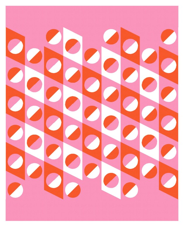
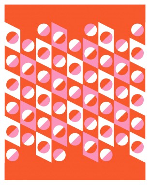
Sunday sketch #354
The similarities between this week’s sketch and last week’s should be clear; basically the only difference is that the elongated diamonds (and their internal circles) are now bisected horizontally. That change provides an opportunity to colour things a little differently and to introduce a bit more movement.

I’m using a palette I’ve used before, but I think it works well here. Dark blue, hot orange, a peachy pink, with white. I think this colourway works with this design because it has a good range of values: dark, medium-dark, medium-light, and light.
Here’s the first version with the white and peach swapped:

Like last week’s sketch, there’s downward movement (the lines created by the tops and bottoms of the elongated diamond shapes), upward movement (created by adjacent blocks stepping up across the page), horizontal movement (as your eye tracks across the lines bisecting the circles), and vertical movement (ascending/descending each column).

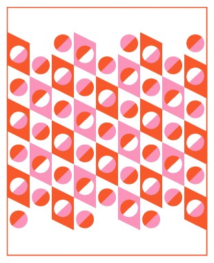
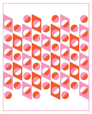
There are lots of different layout and colouring options. In this next version, I’ve only coloured half of each diamond, with the other half taking the background colour. All the same movement is there, with an added meander from circle to circle: up, down, up, down, across the page.

This is such a fun design, and I feel like it’s quite different from last week’s design despite the small tweak.
This week’s design could be made using half-rectangle triangles and half-circles (which might be a smidge easier to make than whole inset circles).
The right colour choice would make all the difference, particularly with the overall movement; choosing different colours could make certain elements stand out more (or less). It would take a bit of experimentation to get it right, I think.
