Sunday sketch #501
This week’s sketch is the last in a series of Irish chain-inspired designs. But I’ve tweaked the design so much that it’s hard to see any Irish chain-iness left 🙂
Usually I post my favourite version up top, although sometimes it’s really hard to choose a favourite! You’ll see what I mean later on.
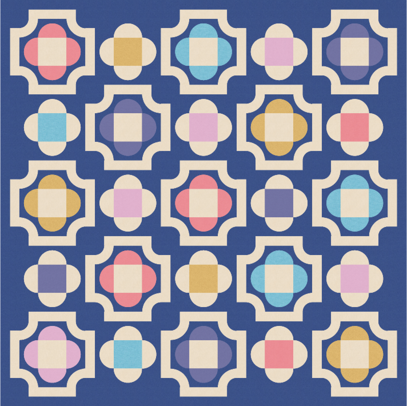
Note: I’m using colours from issue 12 of Curated Colour from Tara Glastonbury (Stitch & Yarn). The last palette of 2025 includes lots of bright colours too, but I chose more of the softer tones. (Some Kona colours don’t look quite right after I export PDFs from Electric Quilt 8 and then convert them to JPGs for uploading to the blog. I also recently changed which software I use for conversion, which seems to affect the colour saturation too.)
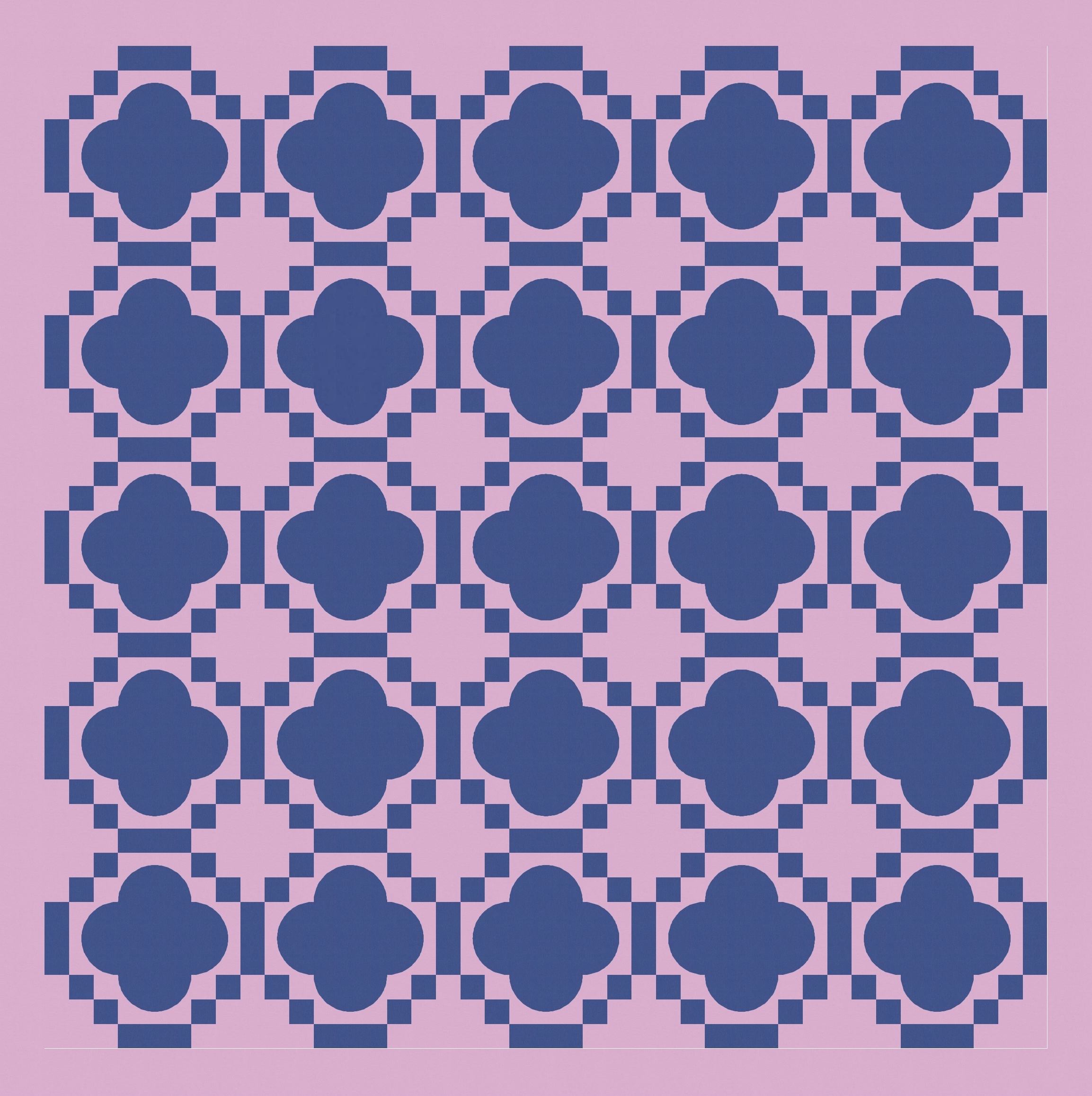
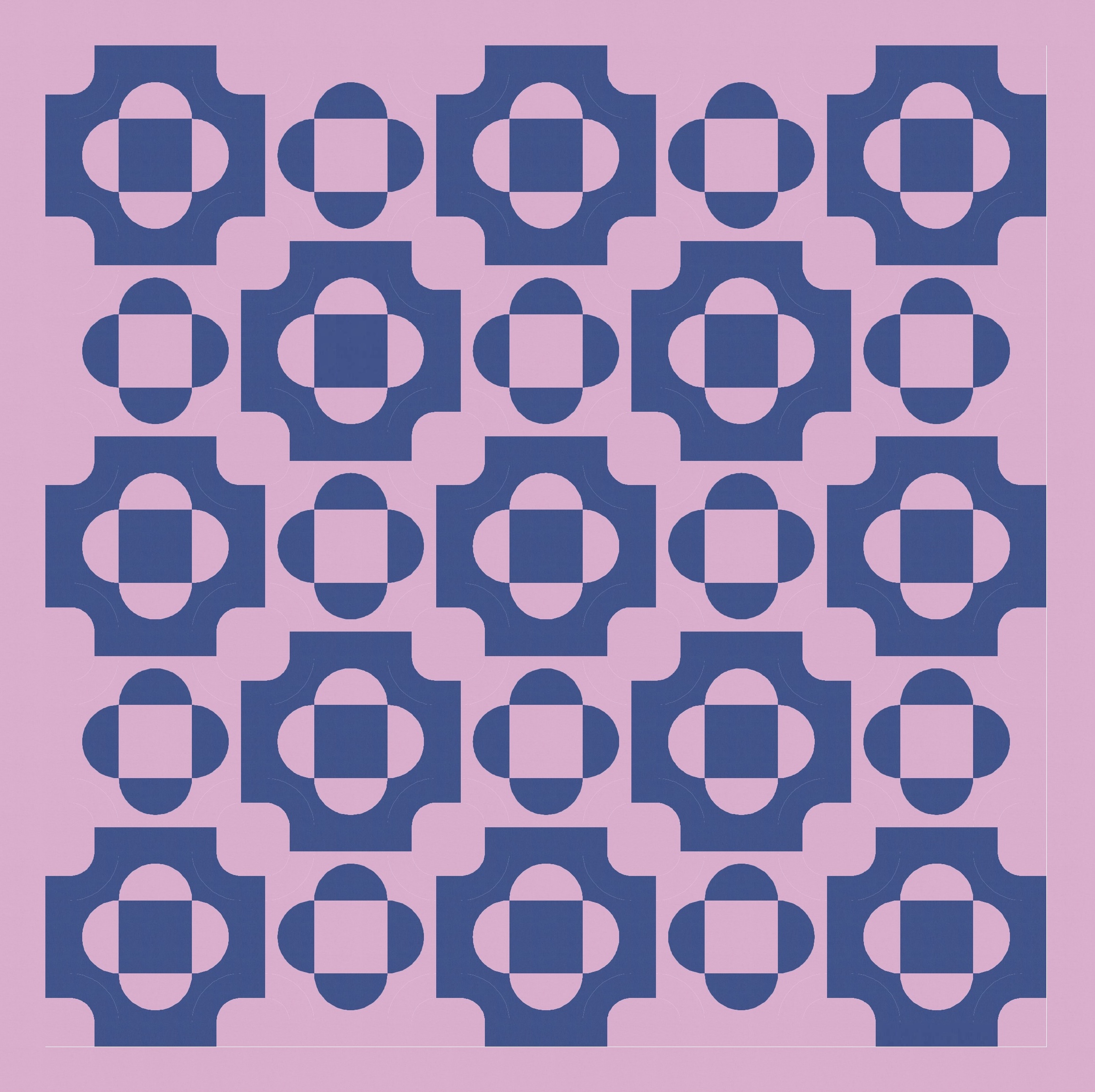
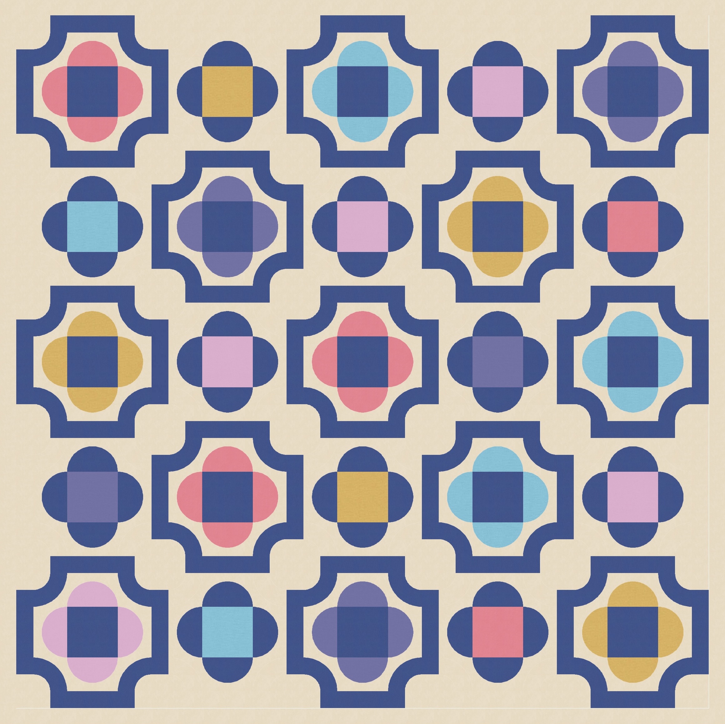
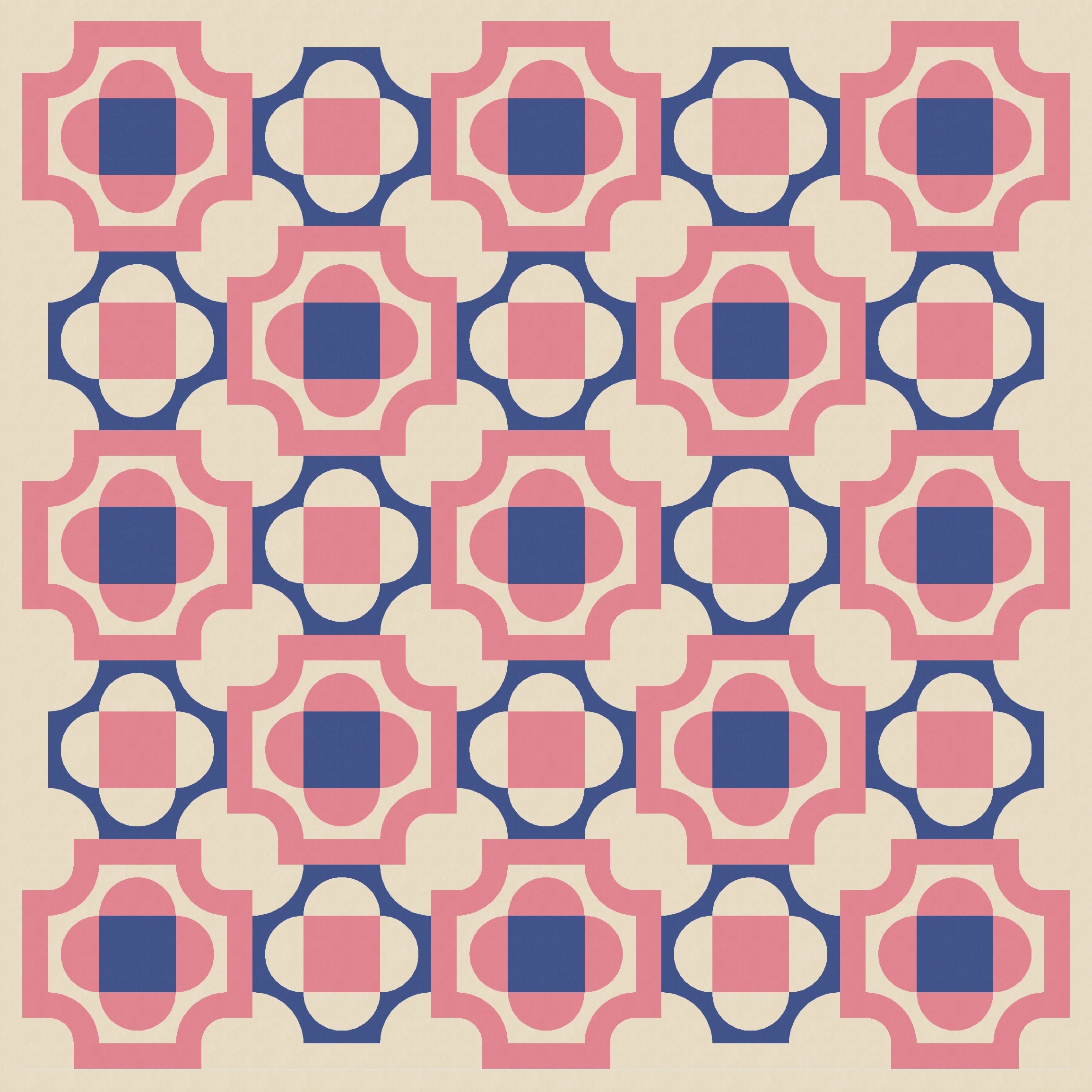
Anyway, as I mentioned in last week’s post, I’ve been working with a modified Irish chain-inspired backbone and filling in spaces with other shapes. I added in a quatrefoil, which is basically a square surrounded on all sides by a half-circle.
I like this shape, but it sorta doesn’t make any sense in this design. It’s all curves, and there are no other curves in the design – the ‘backbone’ (basically the darker lines and squares that connect across the entire design) are all straight lines. So I tried revealing the straight lines within the quatrefoil, by colouring the central square in the background or the backbone colour.
That’s a little better, but the design still felt a little… wrong. So, back to the drawing board.
I decided that the problem wasn’t the quatrefoil, but rather the backbone. The diagonal layout of squares came from the Irish chain design that was my original inspiration, but really, there’s no need to hang on to it when it’s no longer working. I realised that if I replaced those stepped squares (below left) with a small curve instead (below right), I’d solve my problem.
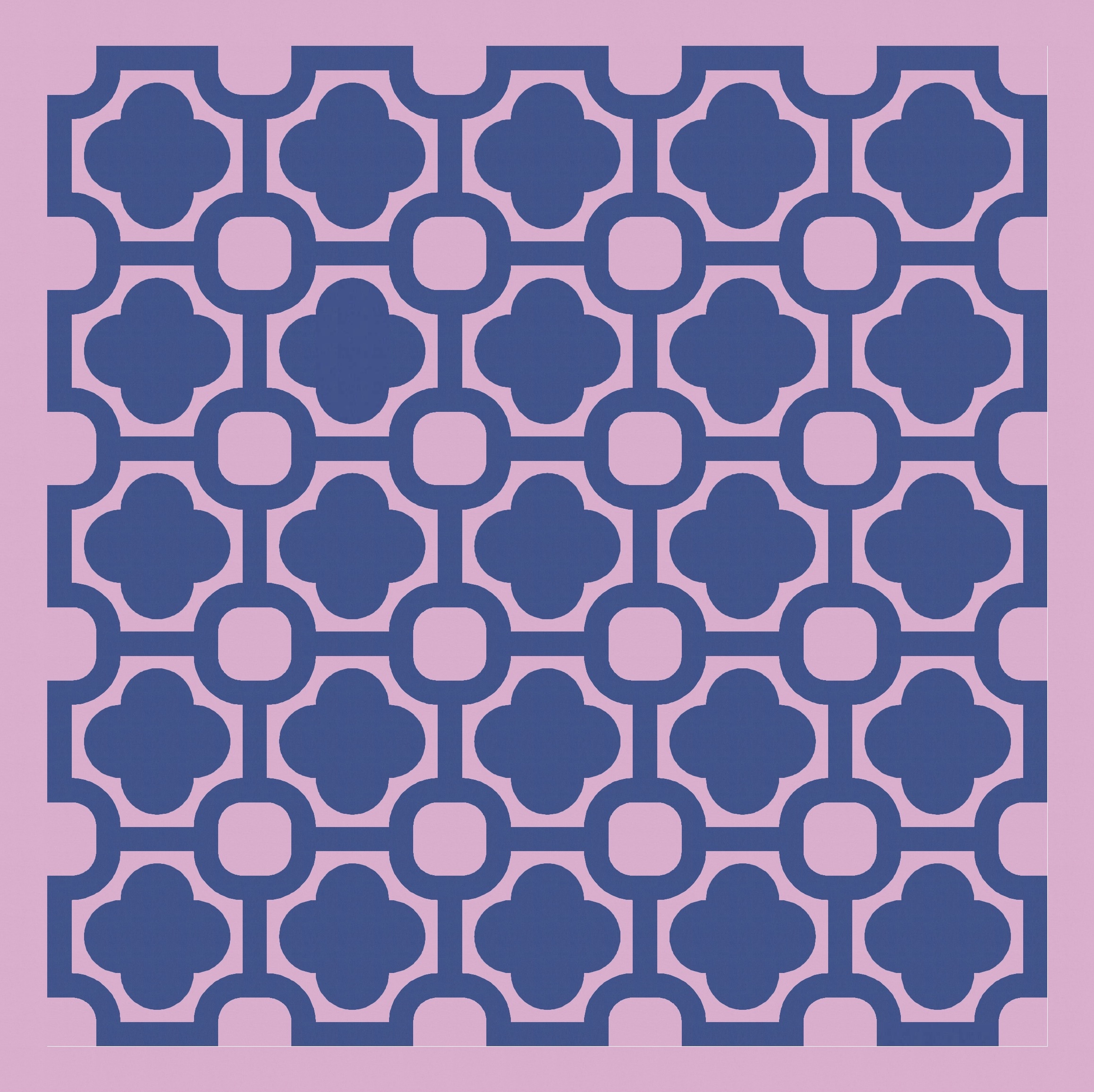
Ahh, now we’re getting somewhere!
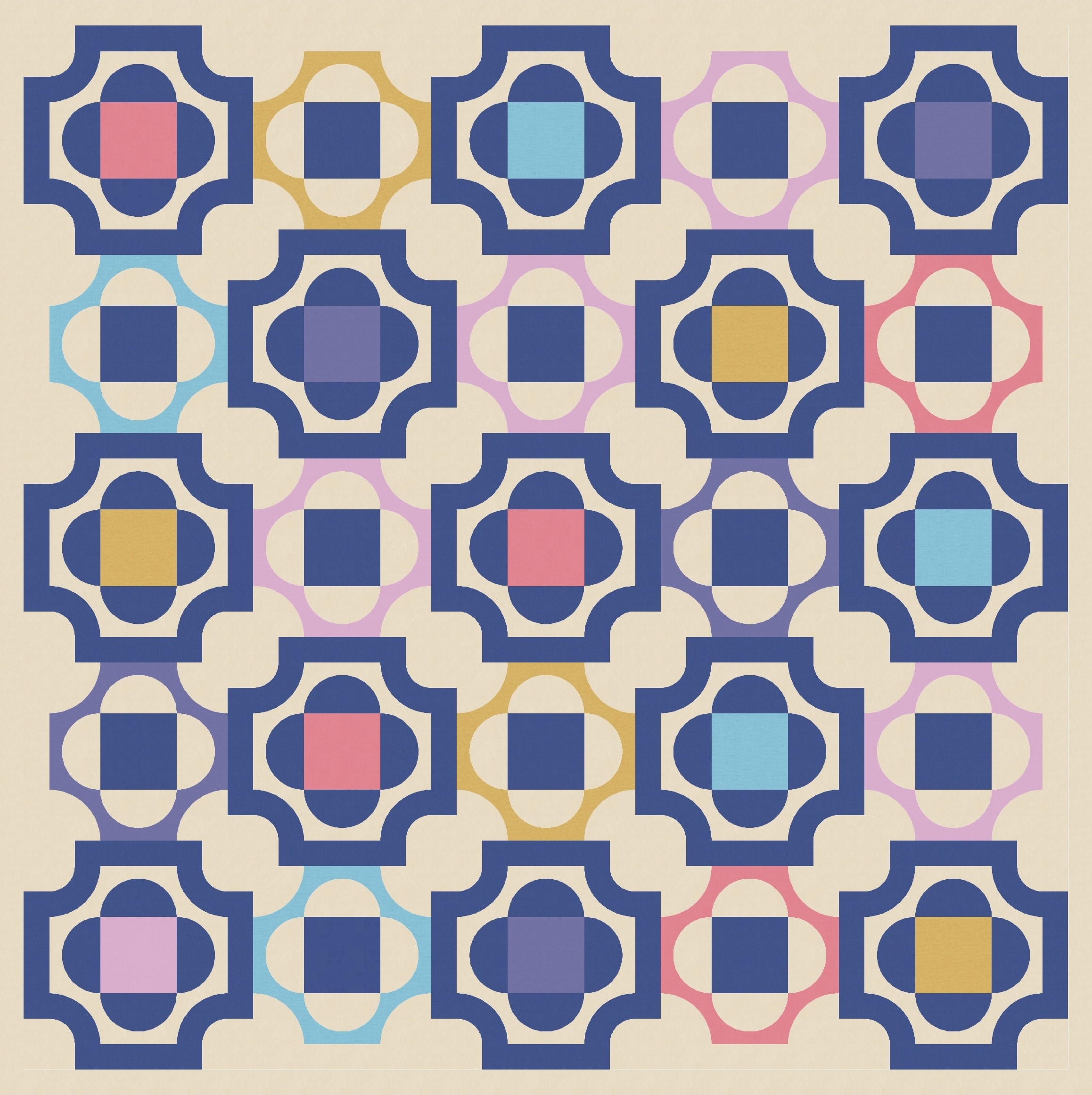
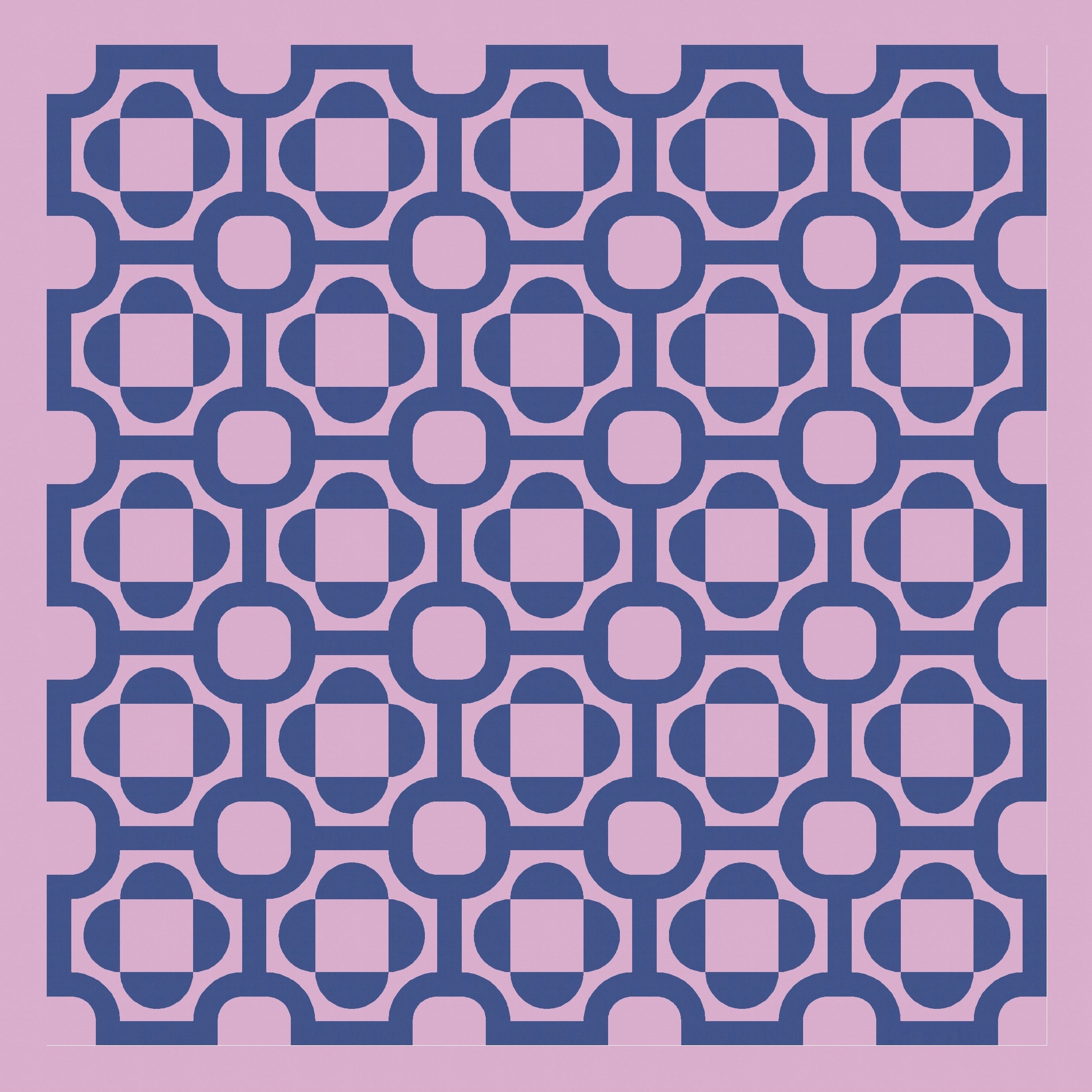
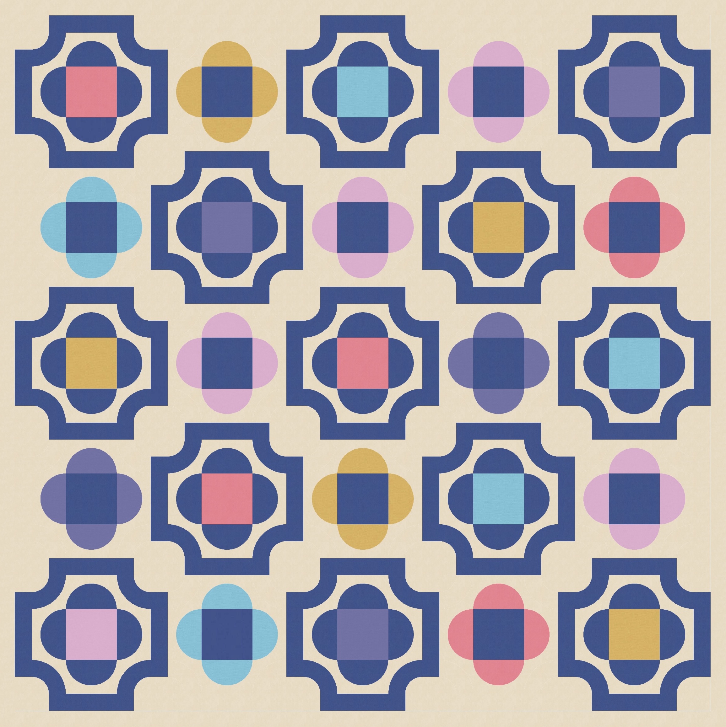
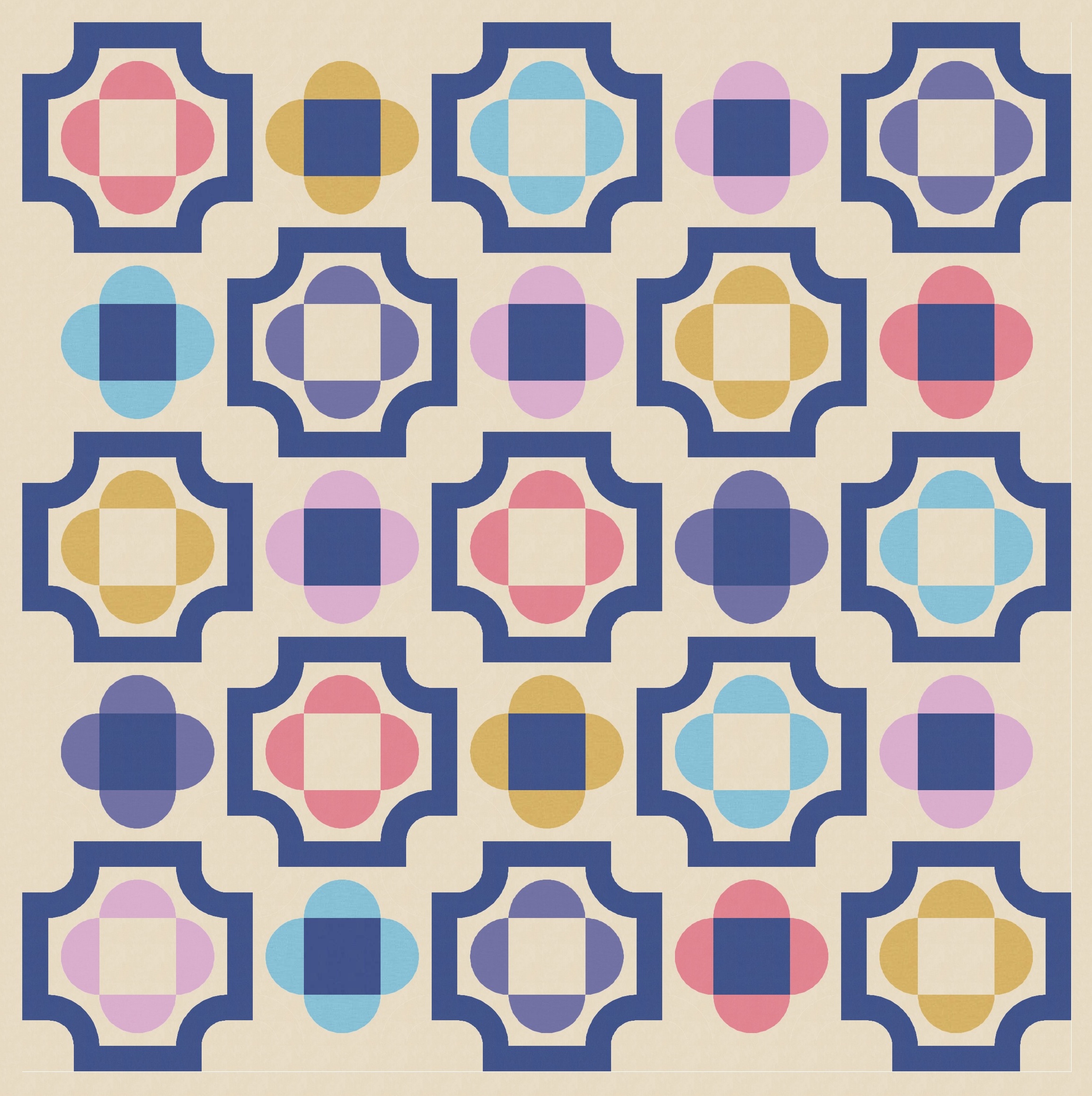
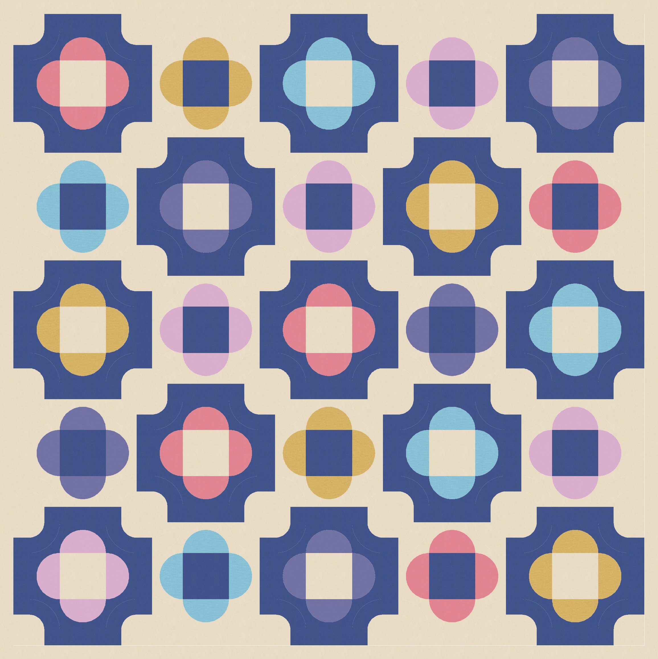
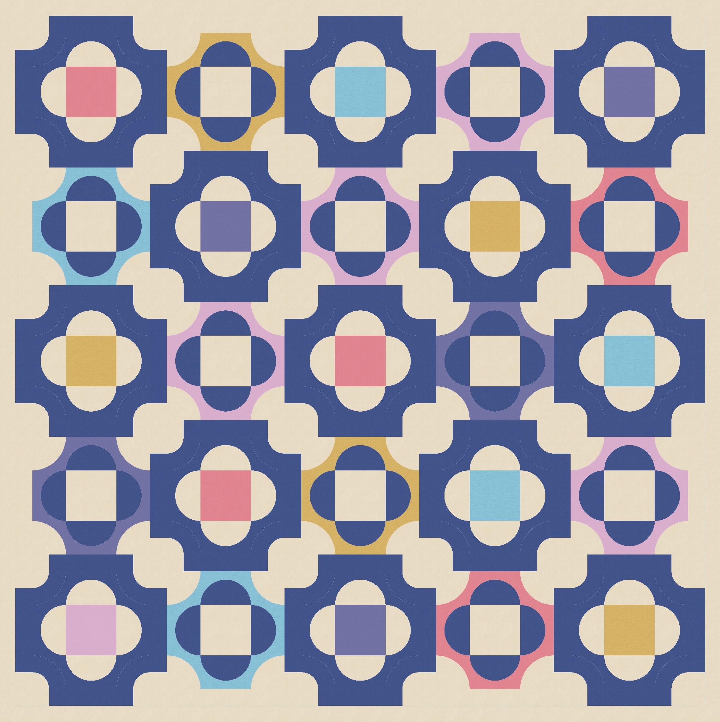
This version reminds me of the perforations on stamps. And although I can definitely see potential in this design, it’s currently a bit too busy for me – there’s nowhere for the eye to rest. Even if I lighten things a bit by emptying out the central squares in each quatrefoil, the design is still not quite what I’m after.
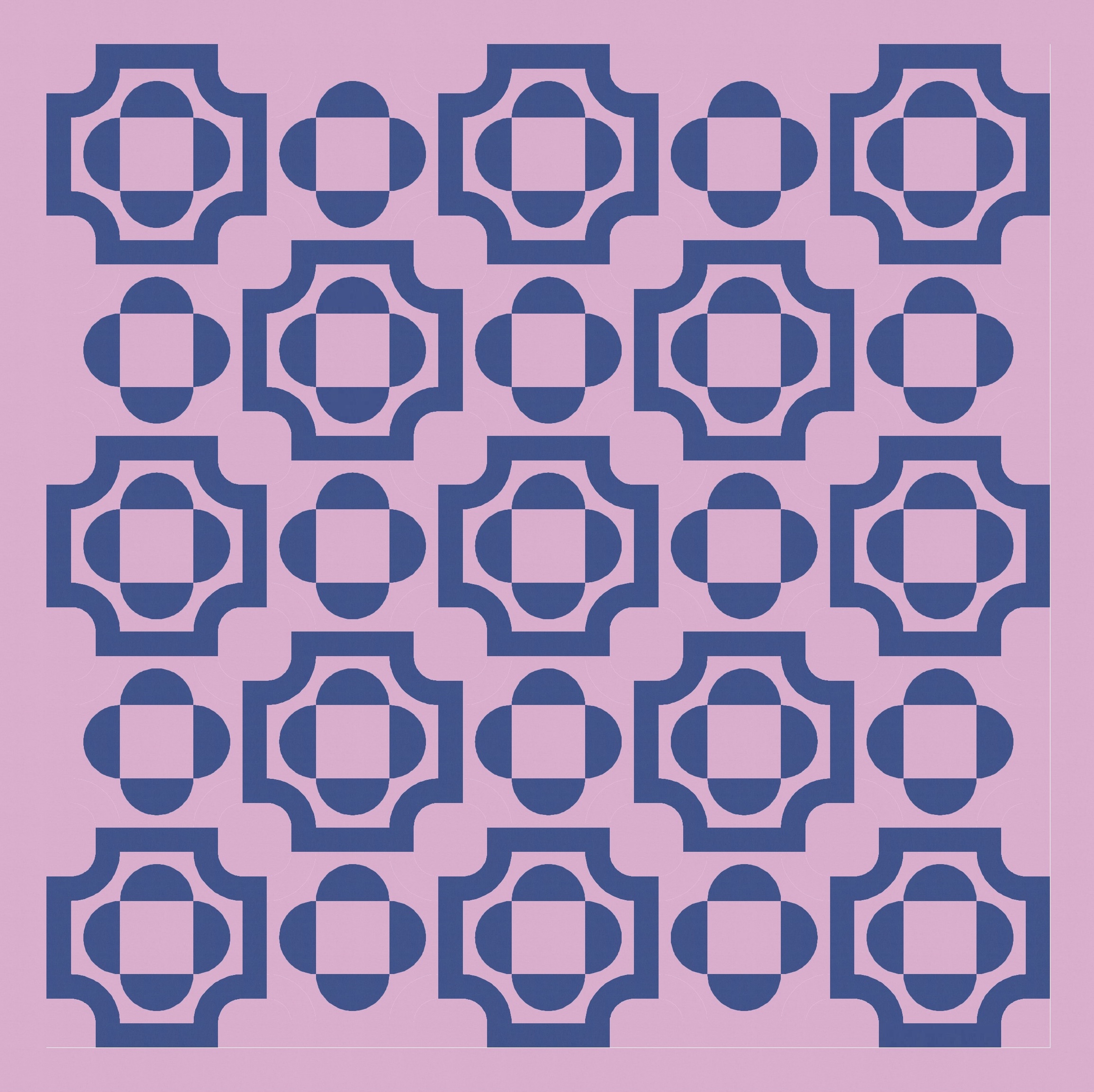
In these sorts of situations, I often try to alternate how I treat the blocks. So here, I removed the backbone surrounding every second quatrefoil. This brings in more diagonal movement, plus areas for the eye to rest and a bit more visual interest. I also tried solidifying (for lack of a better word) the bordered quatrefoils, so they’re in the reverse colourway of all the others.
Now it’s time to try out a larger colour combination! I had all my designs ready to go for this blog post, but as soon as I saw Tara’s latest palette, I re-coloured them 🙂
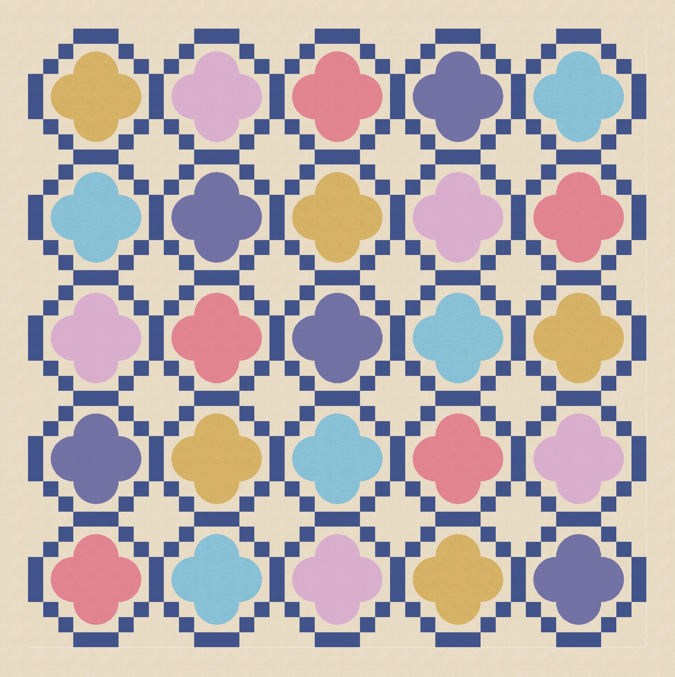
With a few elements in each block, there are lots of combinations of colour placement – solid or ’empty’ (i.e. background colour) central squares or quatrefoil curves, and colours or ‘shared’ colour (that is, the complementary colour used across all blocks)? Here are just a few examples.
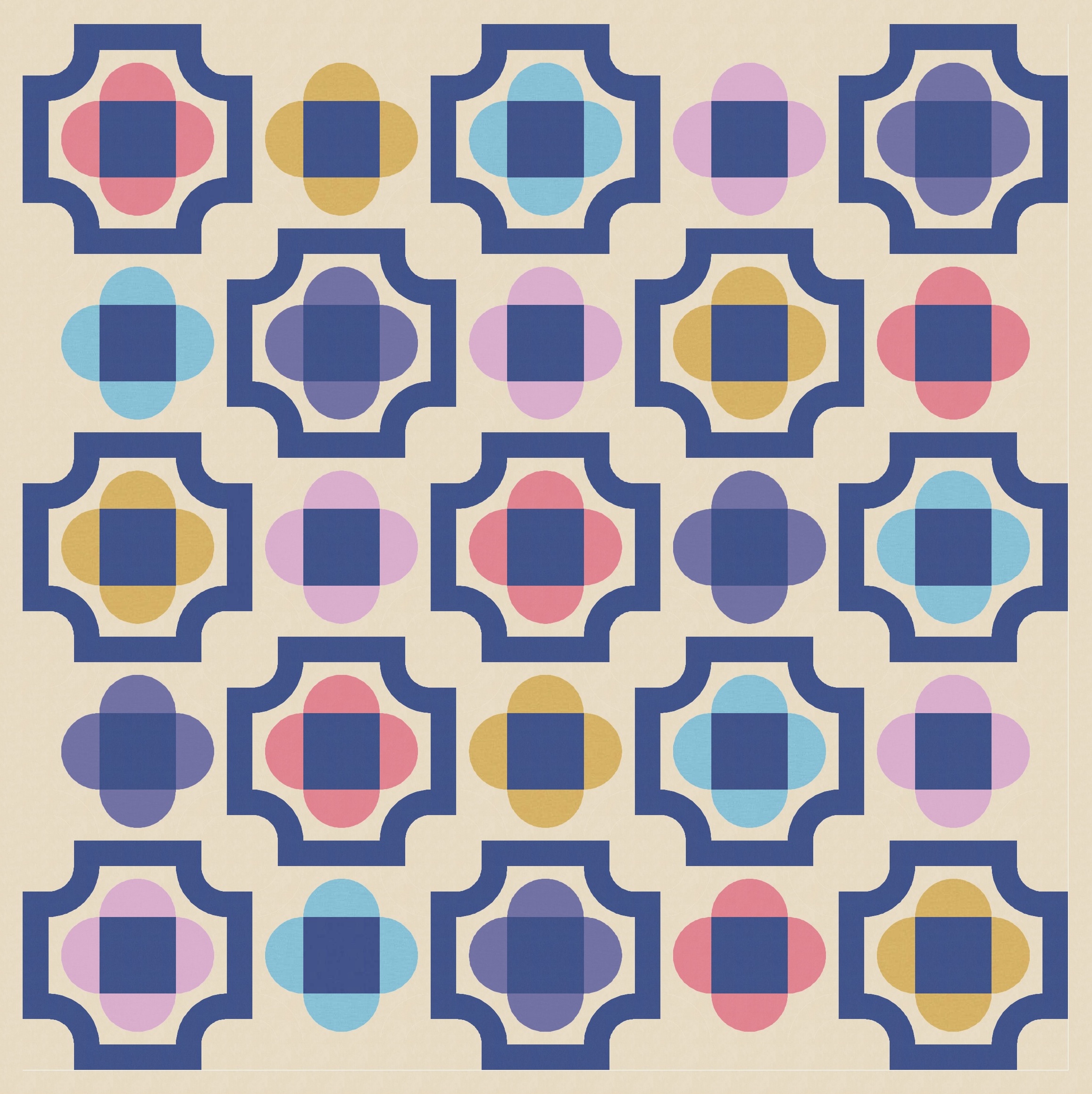
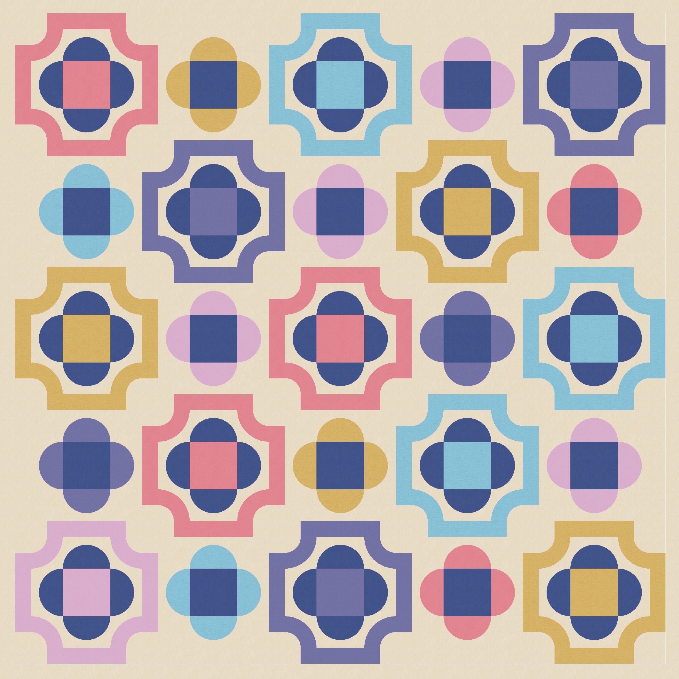
I also tried colouring in the background of those bordered blocks, making them solid. This next version was a top contender for my favourite version of the week… and looking at it again as I write this blog post, I’m wondering if I made the right decision! It definitely has a different feel from the other versions, but there’s something about the basic chunkiness of it that makes it feel really endearing to me.
Ultimately though, I decided I prefer the versions where the border is a feature.
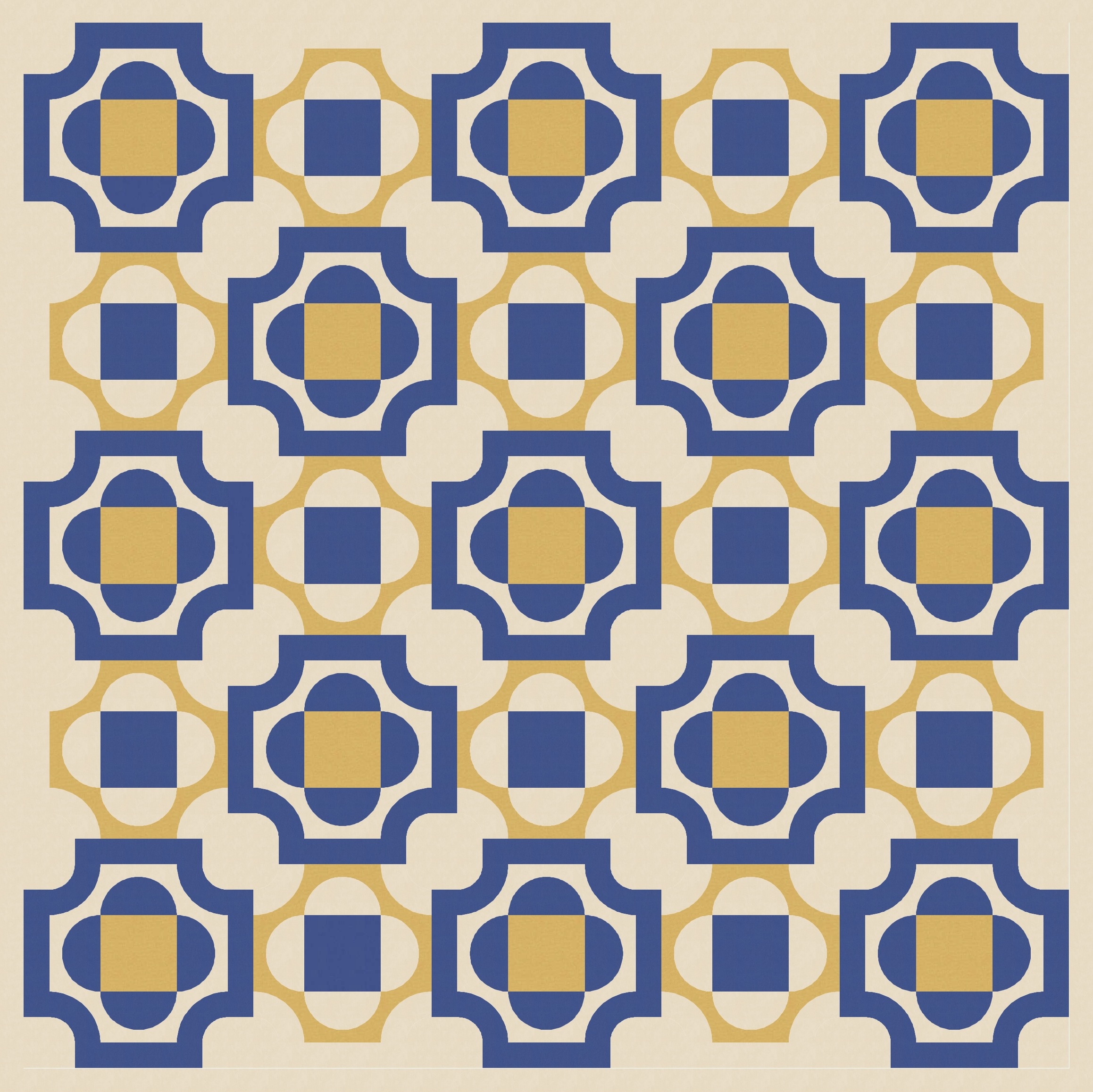
This version also works with colours in the border. Fun!
I could’ve ended there, because I’m really pleased with these designs and could happily make one into a quilt. But… since when has that stopped me? 🙂
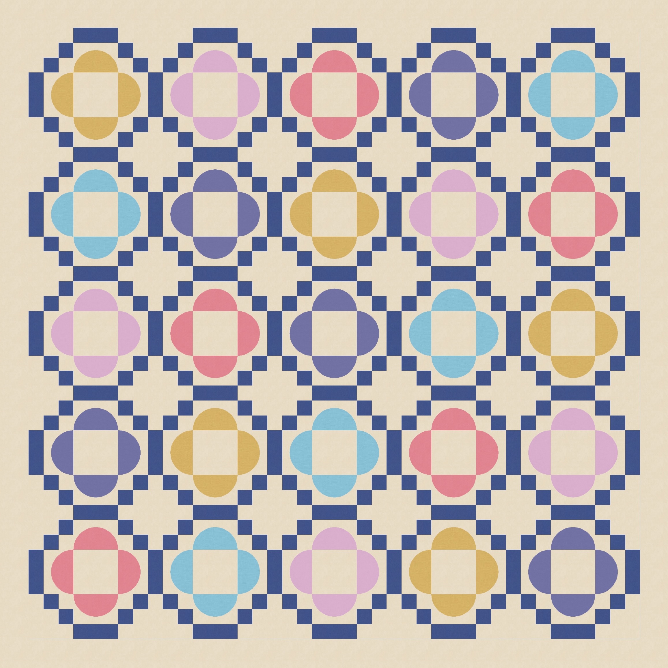
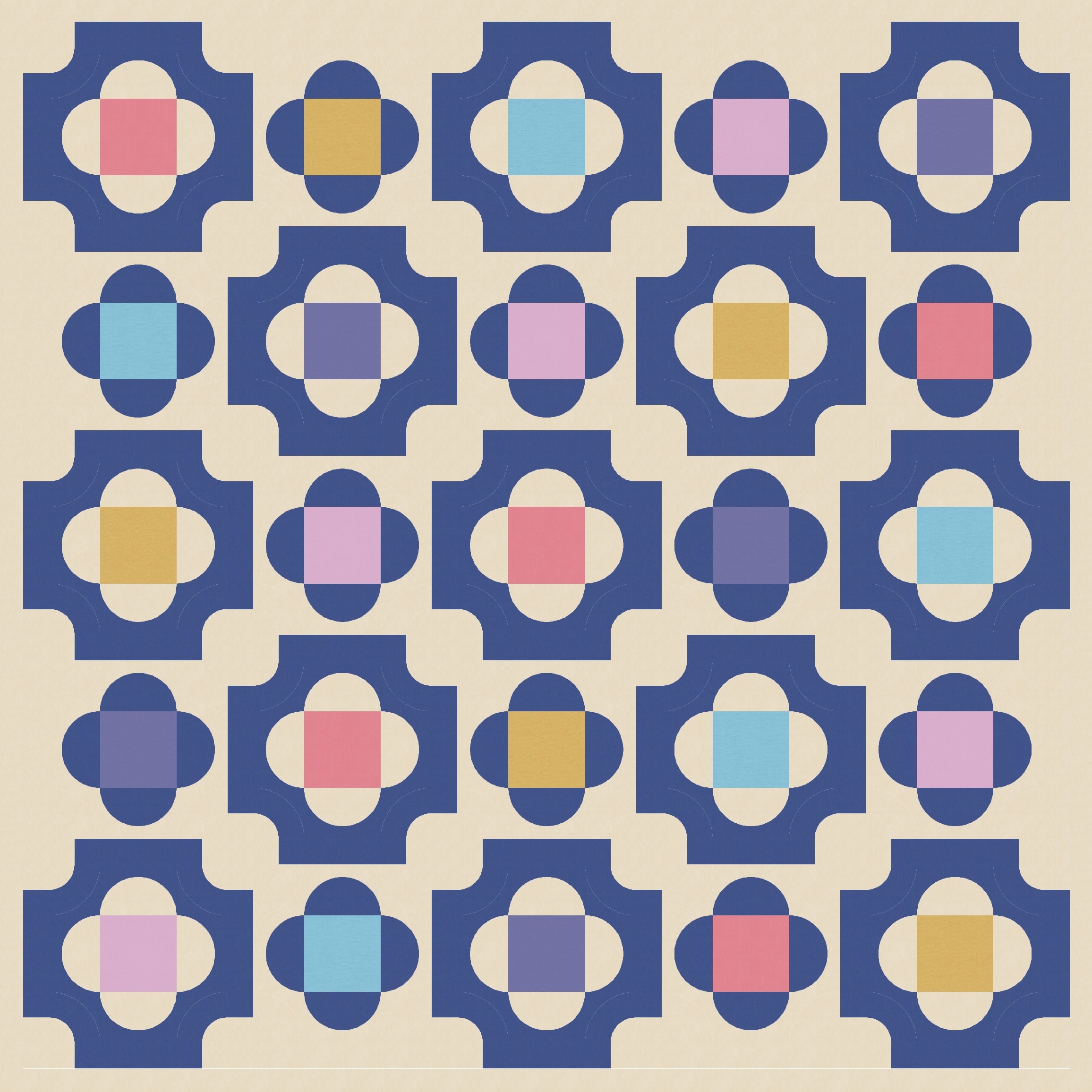
Remember that I removed the curvy borders from alternate blocks, to free up some space and make the design less same-y. But the curves are still there (just coloured in the background colour, so effectively blending in). I can colour in the background of those blocks, revealing those curves but avoiding the heaviness of more block borders.
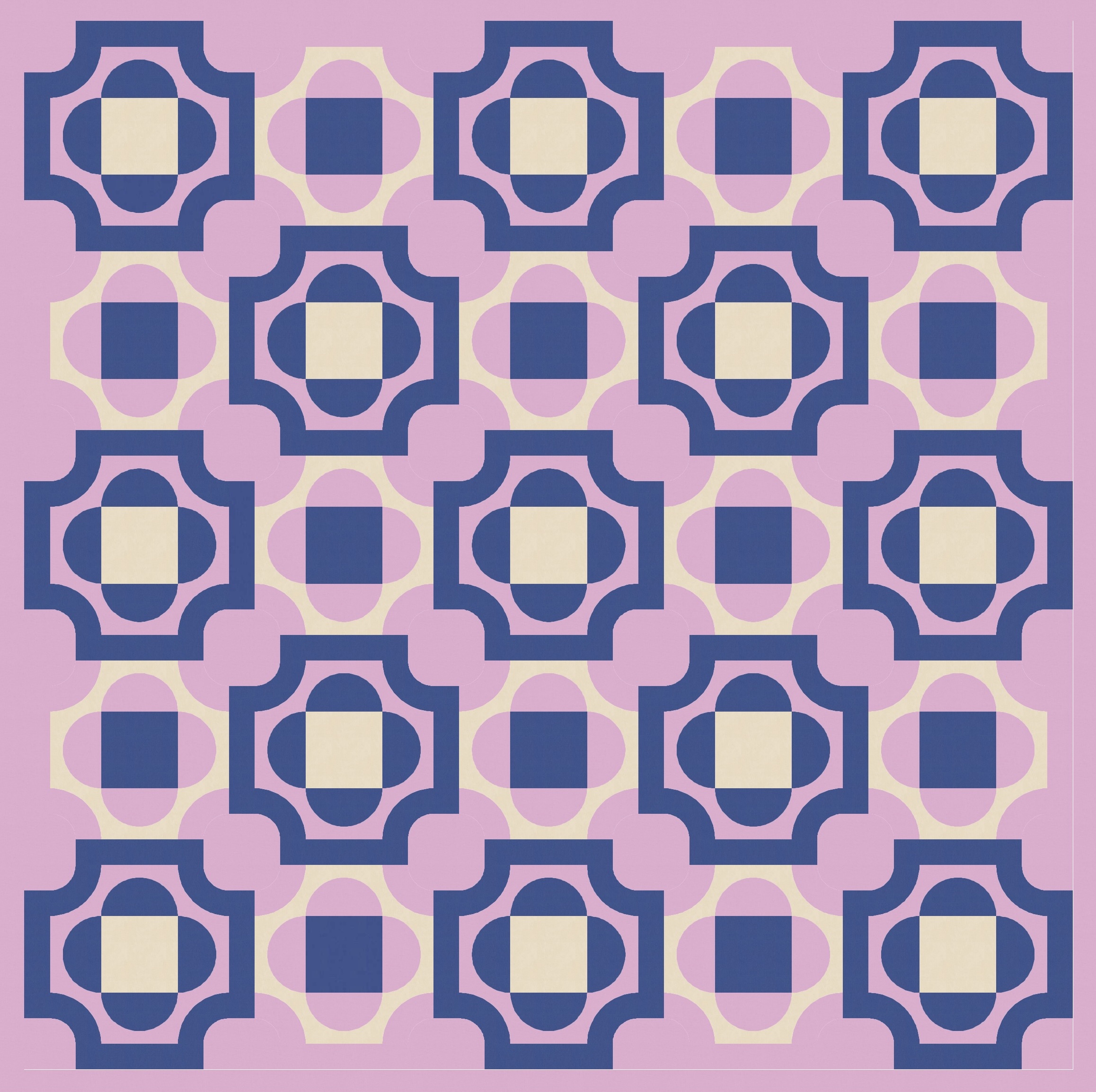
This approach lets me connect the blocks (which were otherwise standing apart) and can make the whole design feel a little more cohesive.
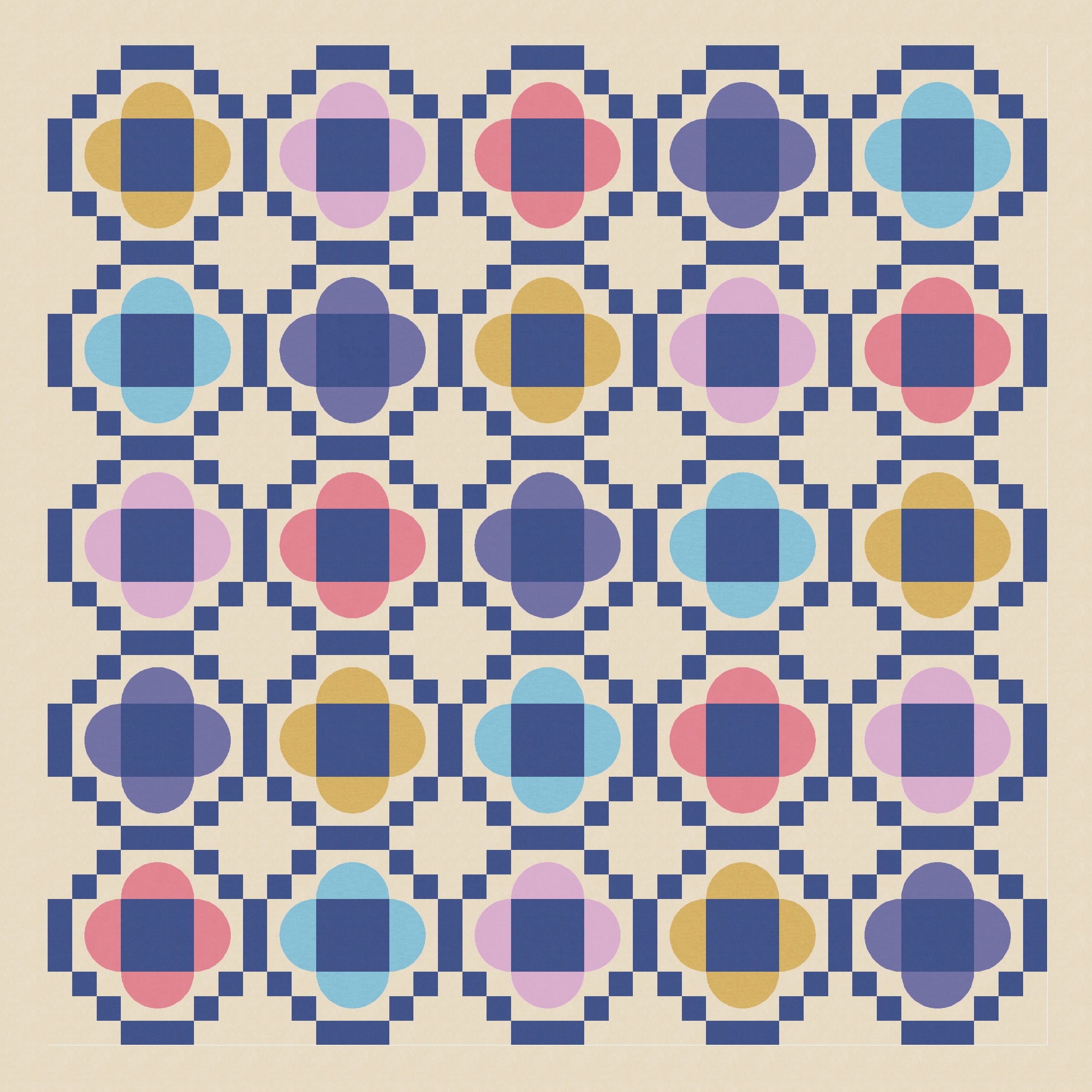
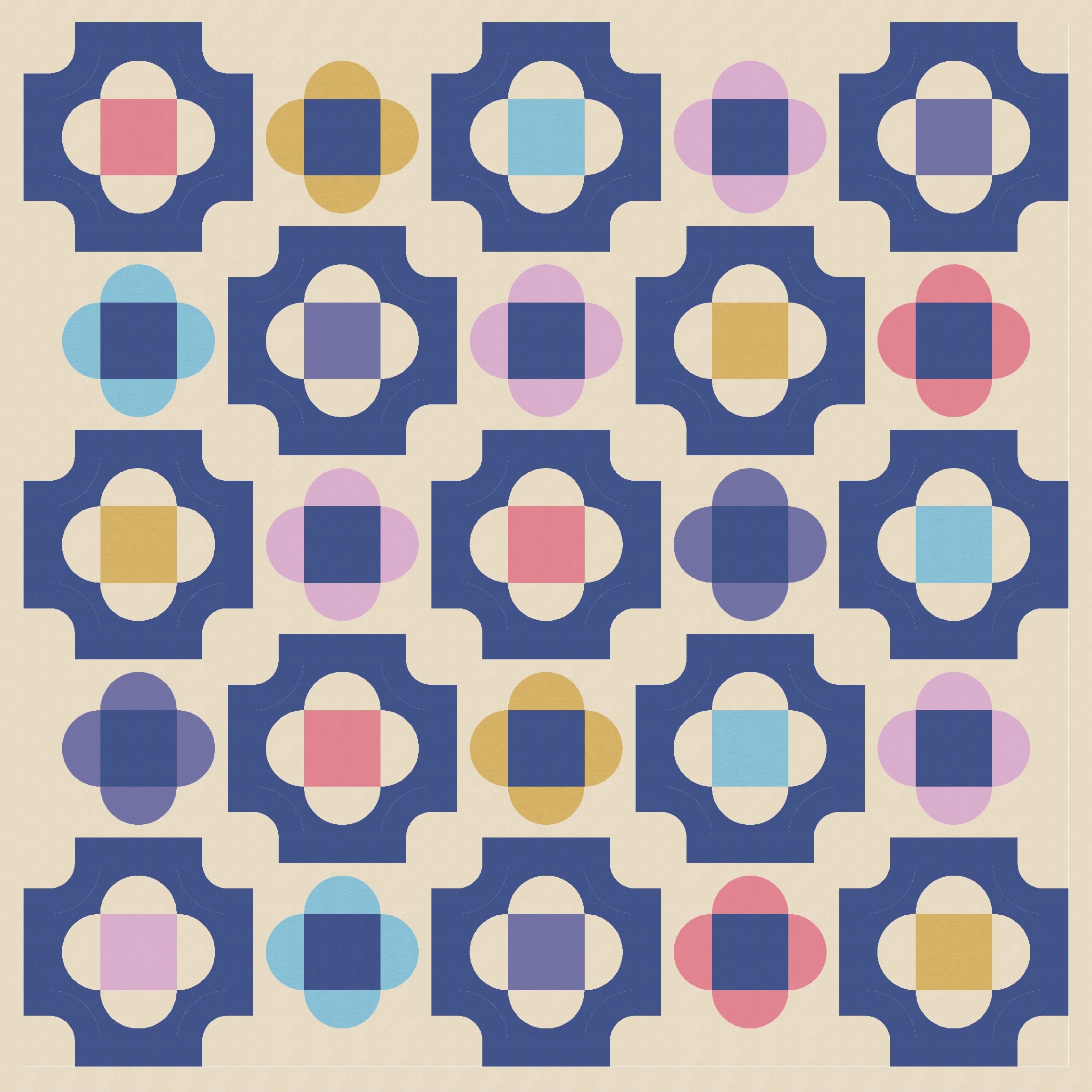
I tried filling in the bordered blocks too, which adds a bit of heft to those blocks and more clearly differentiates them from the lighter, unbordered blocks. (The difference between the two versions below is just the colour placement within each block.)
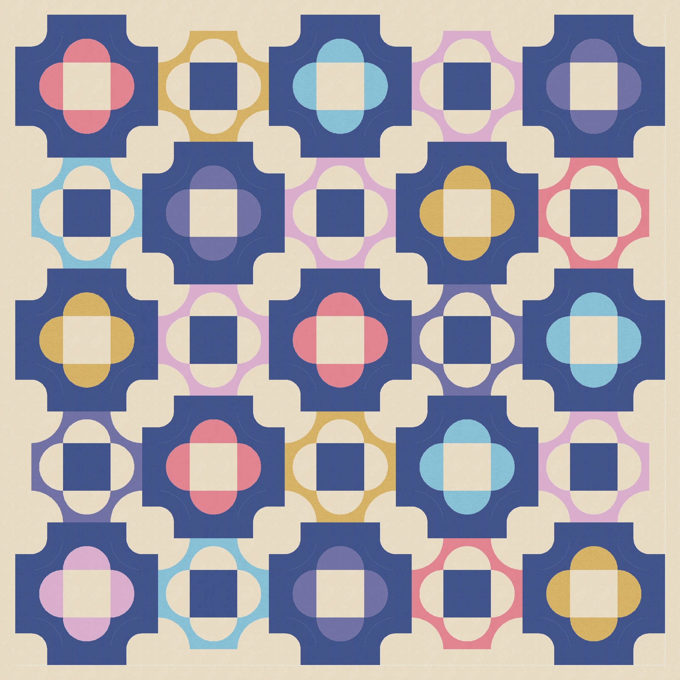
In the end though, I still prefer the versions where the border is apparent. It’s a sorta unusual / uncommon shape, so I like to feature it. I also love how it highlights the wonkiness of the circles created at the vertices between four adjacent blocks.
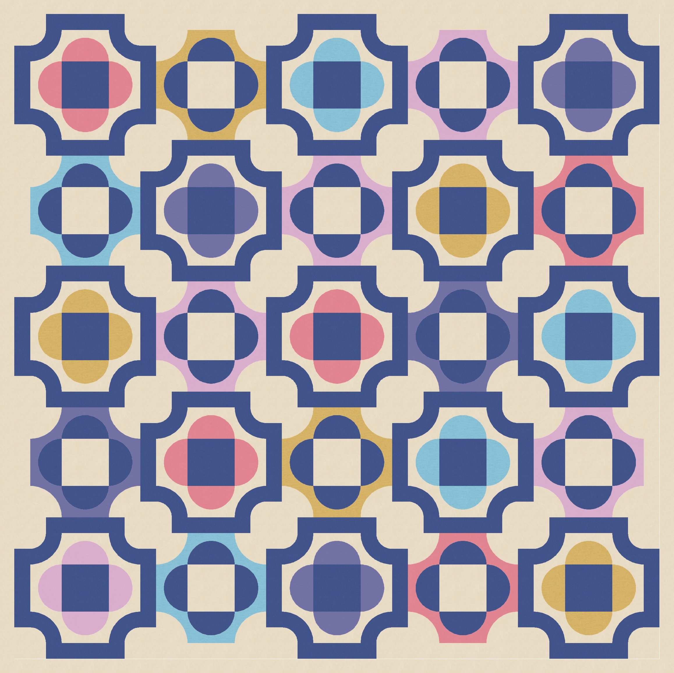
So this is still a fairly energetic design, with lots of movement and not a ton of room for the eye to rest, but I love it. It’s got lots of features that make me happy: a fun palette (thanks Tara!), alternating block treatment, echoing shapes and lines, and interesting secondary shapes. Oh, and a Sudoku colouring layout haha!
If you wanted to make this week’s sketch into a quilt, you’d need squares, half-circles (or quarter-circles or drunkard’s path units), strips/rectangles, and some small corner curves. (The drunkard’s path templates from Papper, Sax, Sten would be helpful for those.)
This is the last in a series of related designs, all based on an Irish chain, which started with Sunday sketch #497. It just goes to show (a) how traditional quilt designs are still inspiring modern and contemporary quilting and (b) how much fun you can have when you set yourself a brief. By constraining yourself, you can actually expand your designs much further than you would have otherwise. How cool is that??
Discover more from Geometriquilt
Subscribe to get the latest posts sent to your email.
