Sunday sketch #492
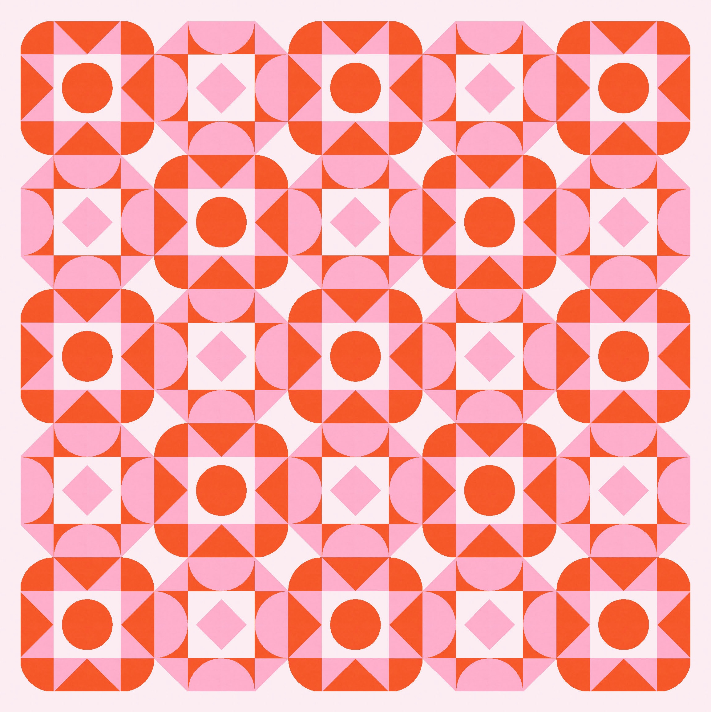
A few weeks ago, I shared a block-based design featuring alternating blocks that used straight lines and curves in complementary ways. I’m revisiting that concept this week, using some chunky shapes from a while back.

Whenever I create a design using two alternating blocks, I like there to be some connection between the blocks – in terms of their shapes, lines and/or colours. I don’t think it makes sense to throw two very different blocks together; designs that do that just feel very disconnected and incoherent to me.
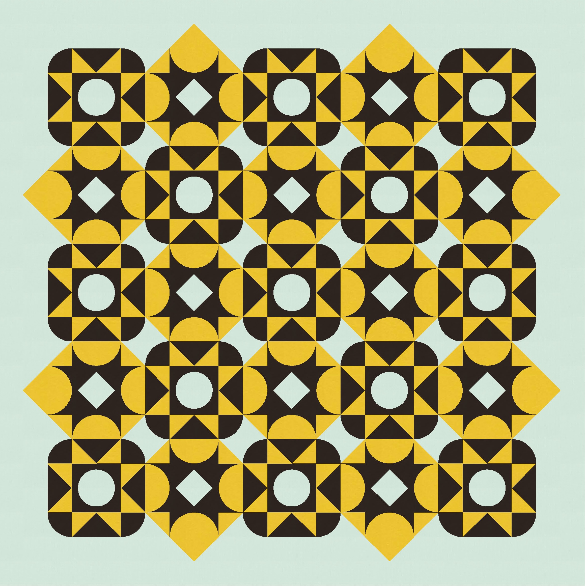
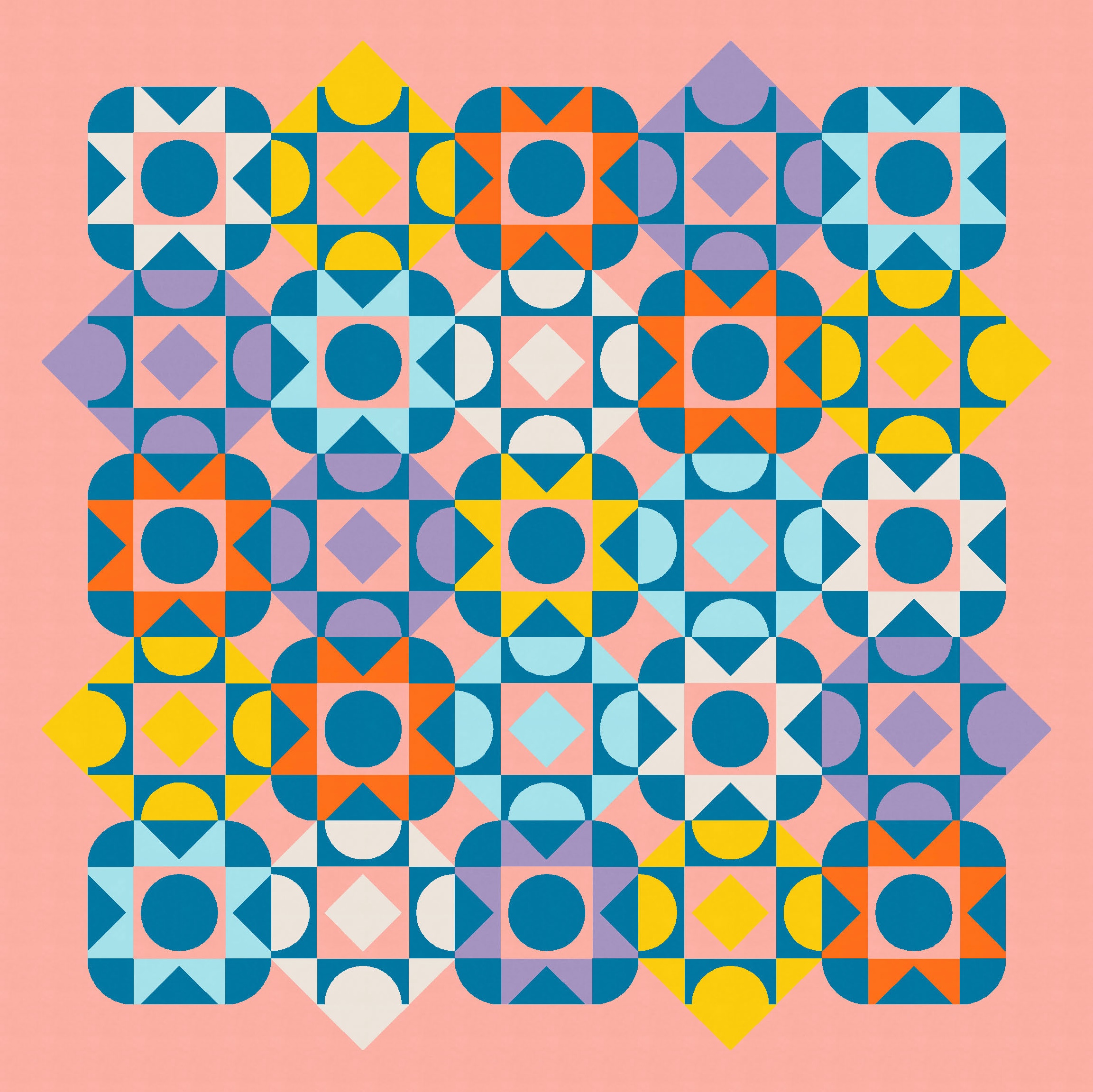
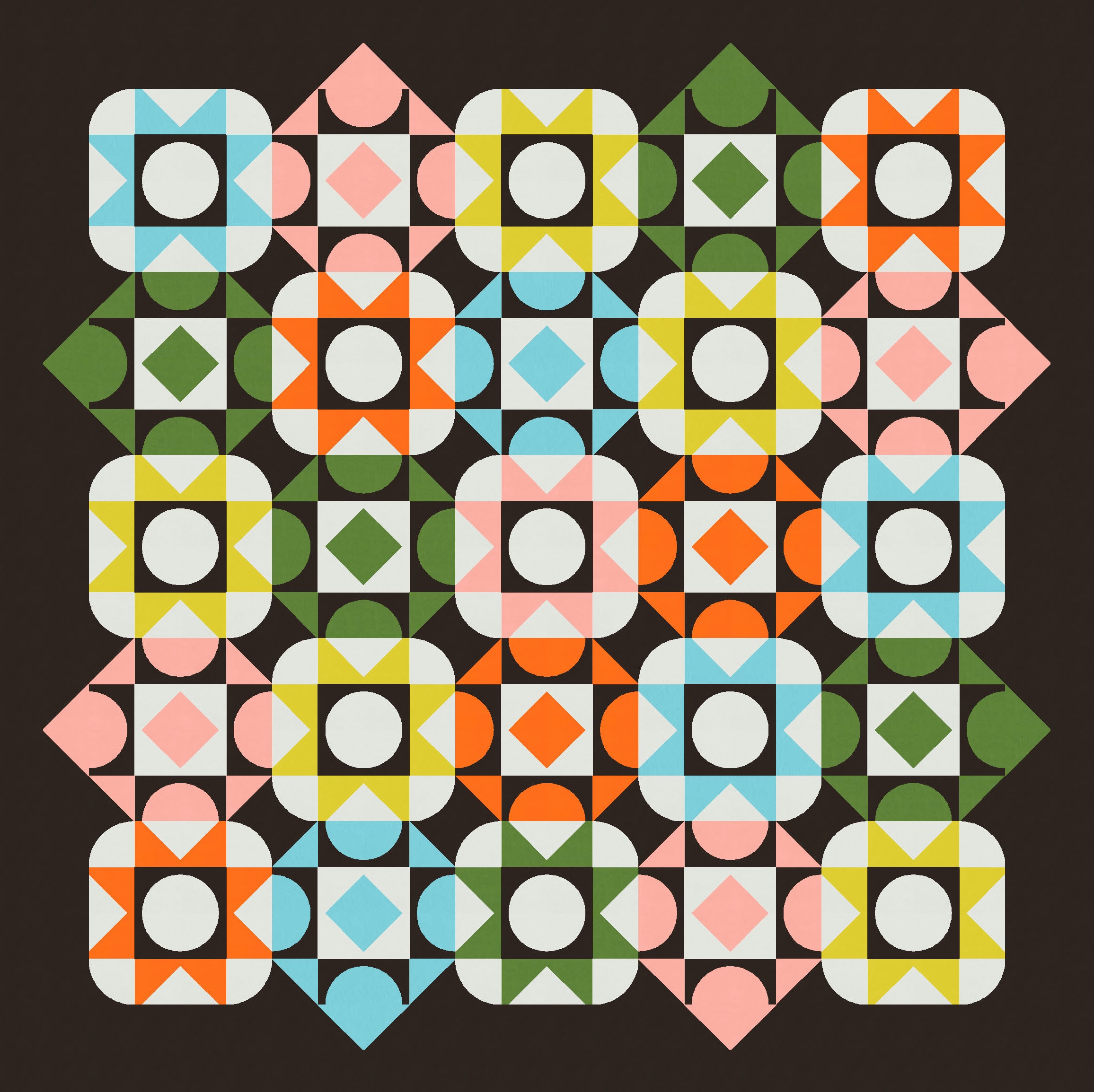
So here, both blocks feature a sawtooth star, but one’s made using straight lines (with a curvy outer edge and a circle in the middle) and the other’s made using curvy lines (with a square (arranged on point) for the outer edge and the same shape in the middle). Same same but different!
You might notice that the shapes I’ve used in the first pic are quite chunky, with blunt ends on the corners of the triangles and at the ends of the curves. I used similar shapes in Sunday sketch #457 (posted in June), which I really liked. But I didn’t start this design like that…. I used ‘normal’ sawtooth stars and curves first.
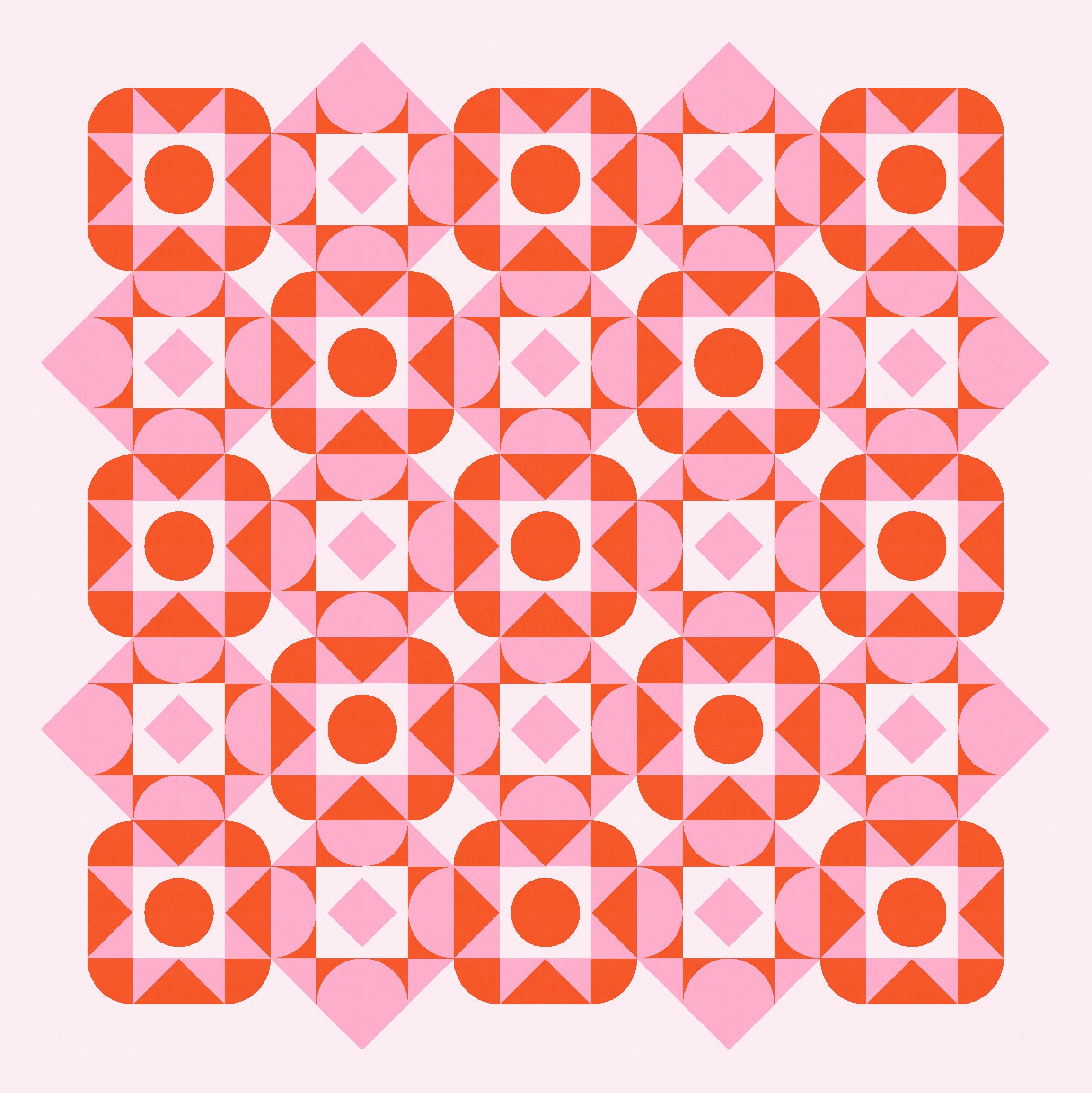
As soon as I created that first layout, though, I knew I had a problem. The blocks are great, and they work well together. I love how the diagonal lines from the outer edges of the curvy sawtooth blocks extend into the straight sawtooths in adjacent blocks – it creates the impression that the blocks are larger and overlapping. But… those same blocks stop dead at the edges of the whole design, because there are no more blocks to interact with. They look like their pointy corners have been cut off. Ugh.
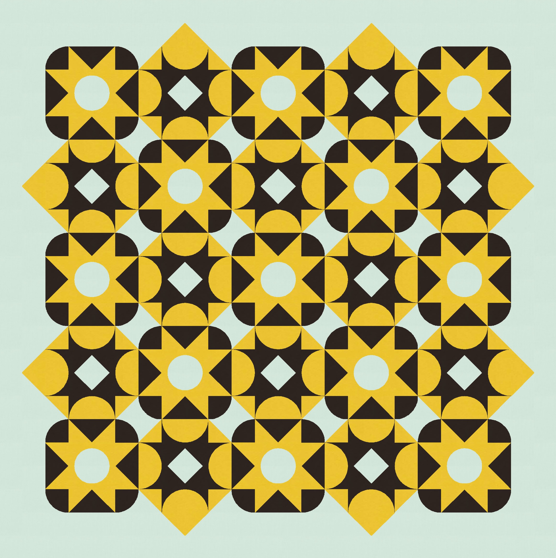
So I added a border around the whole design that has space for slotting in some flying geese to ‘complete’ those larger shapes. (Plus another plain border around that, to give the design a little breathing room.)
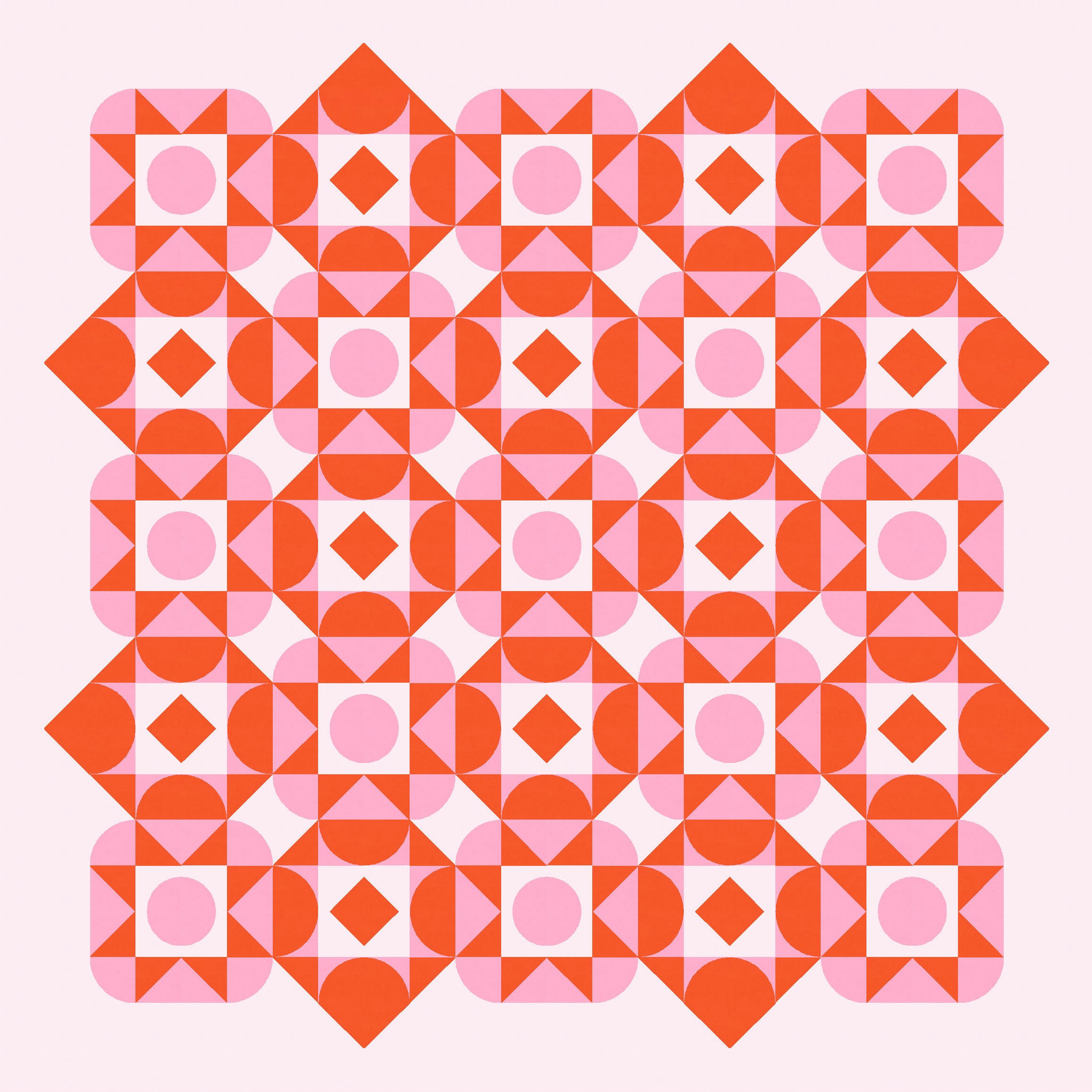
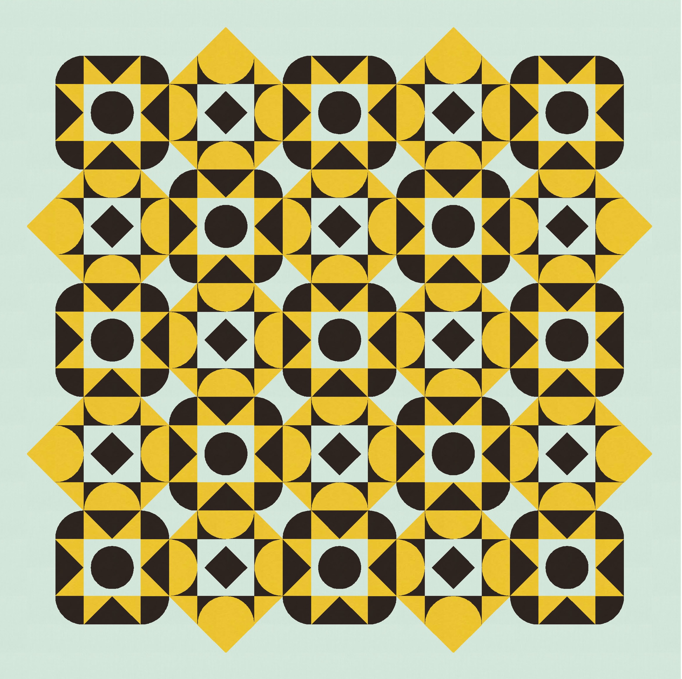
There are lots of ways to play with colour placement too.
But even though there’s lots of interactions between adjacent blocks, with lines continuing beyond the blocks’ borders, I wasn’t completely happy with this design. I wanted the connections between the blocks to feel a bit more solid / substantial. Also, and this is one of those weird personal things that I can’t adequately explain, I really don’t like (like, really don’t like) the thinness and pointy-ness of the ends of an inverse half-circle. The eight points created by the ends of the curves in the curvy sawtooth stars? Uggghhhh. For some reason, they just feel icky. So I switched to chunkier shapes, which solved both problems. Yay!

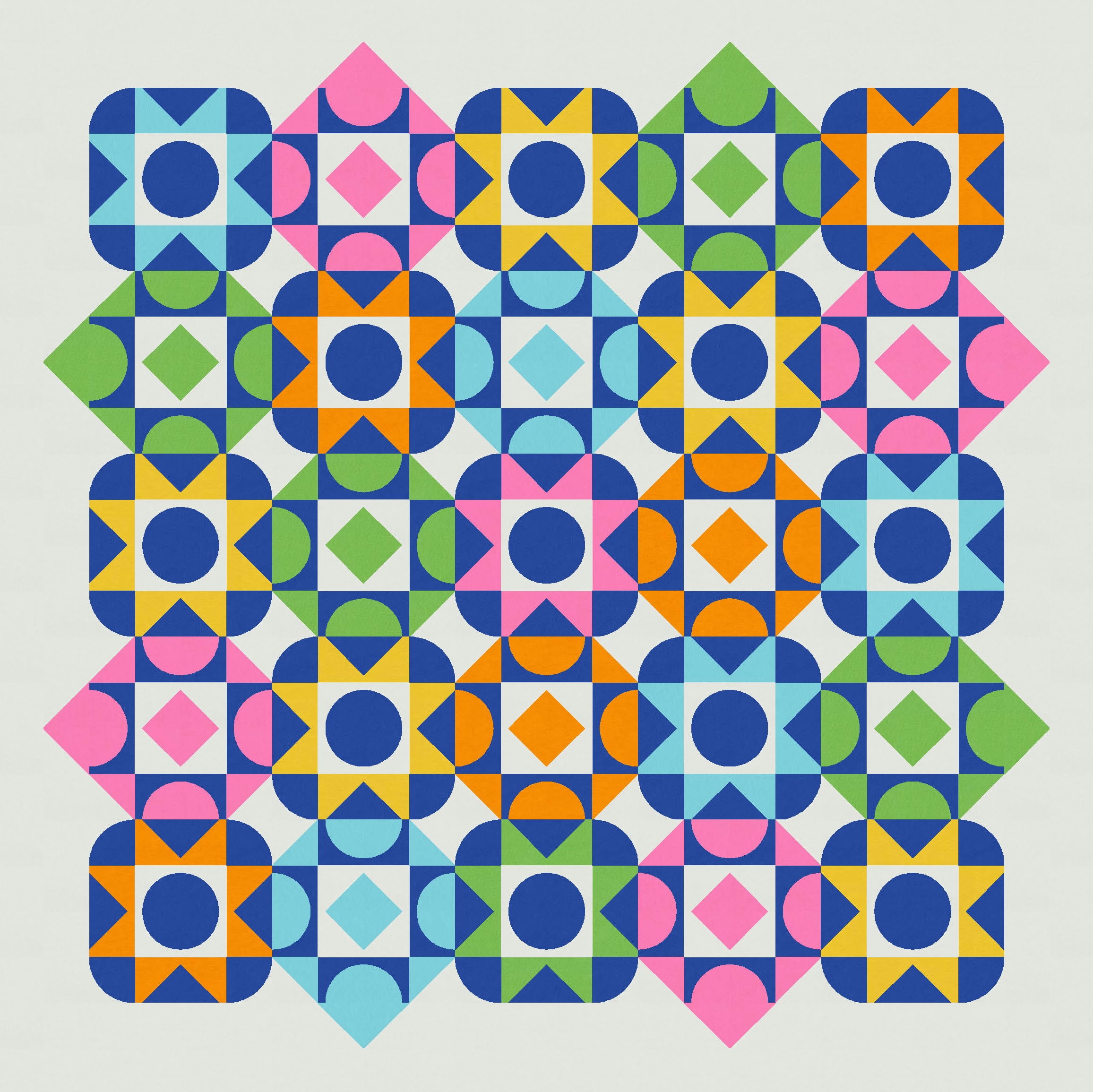
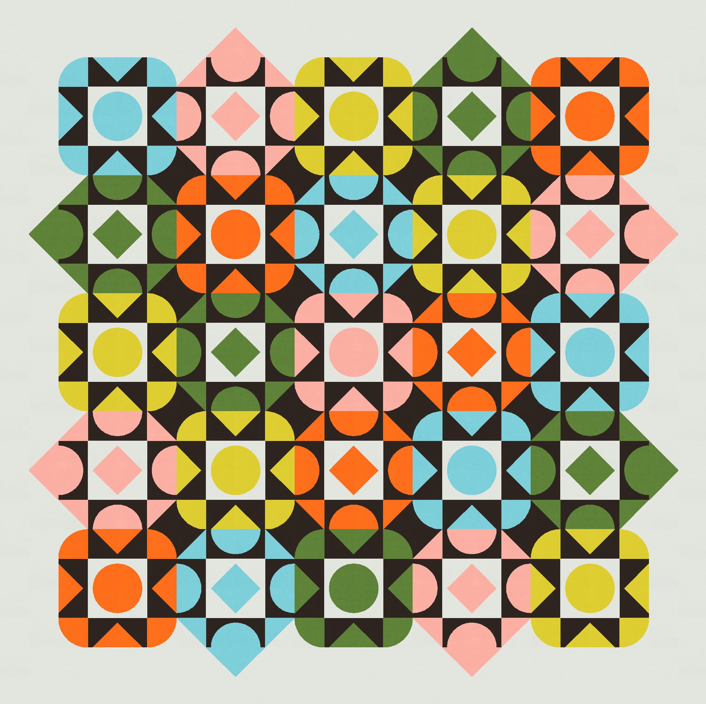
That three-colour palette’s fine, but this design is great for a larger palette too. Here are a few seven-colour combos: a background colour; a shared colour across all blocks; and then five block colours, each of which features only once in each row and column.
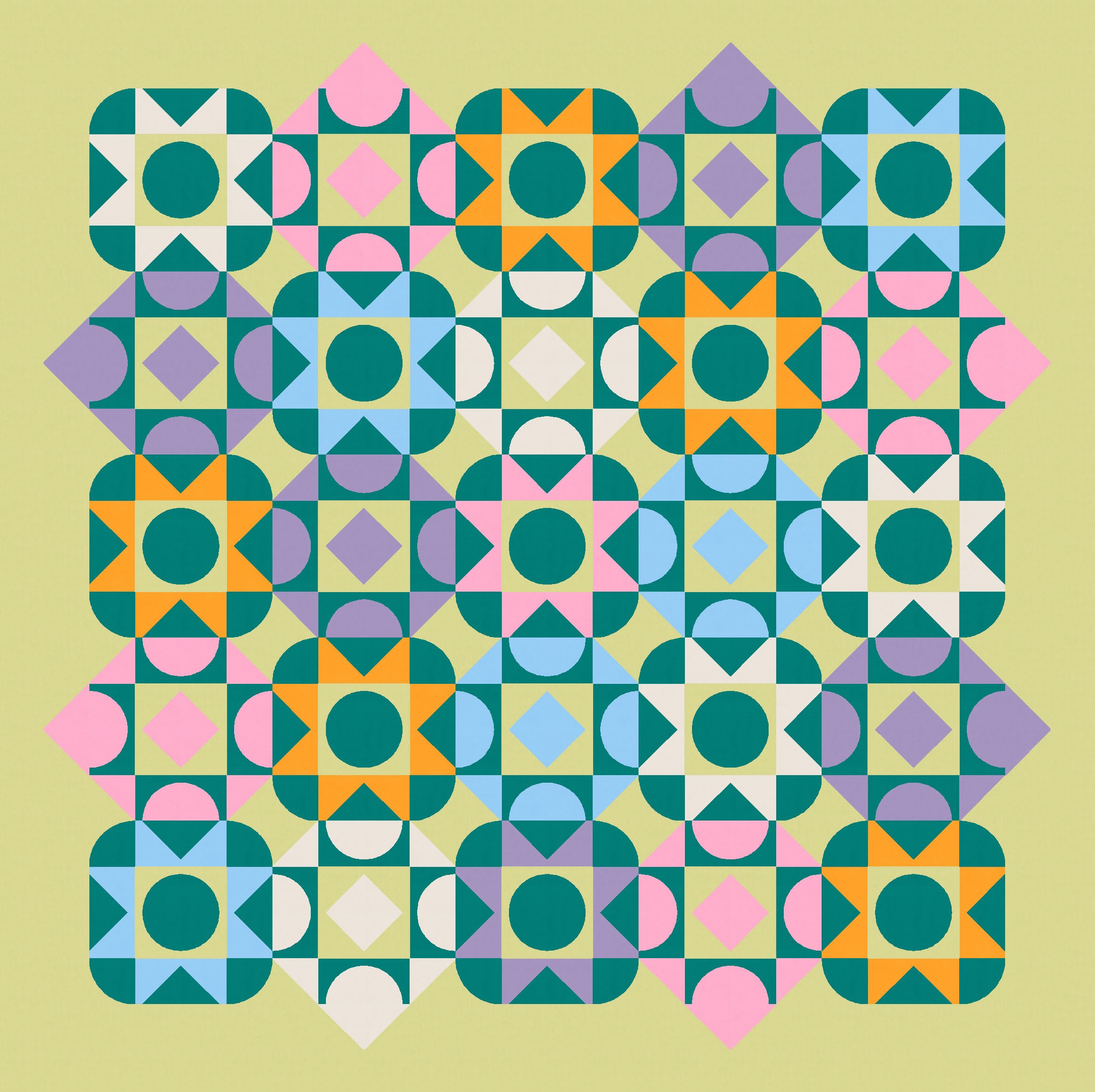
Again, there’s lots of opportunity for changing the colour placement.
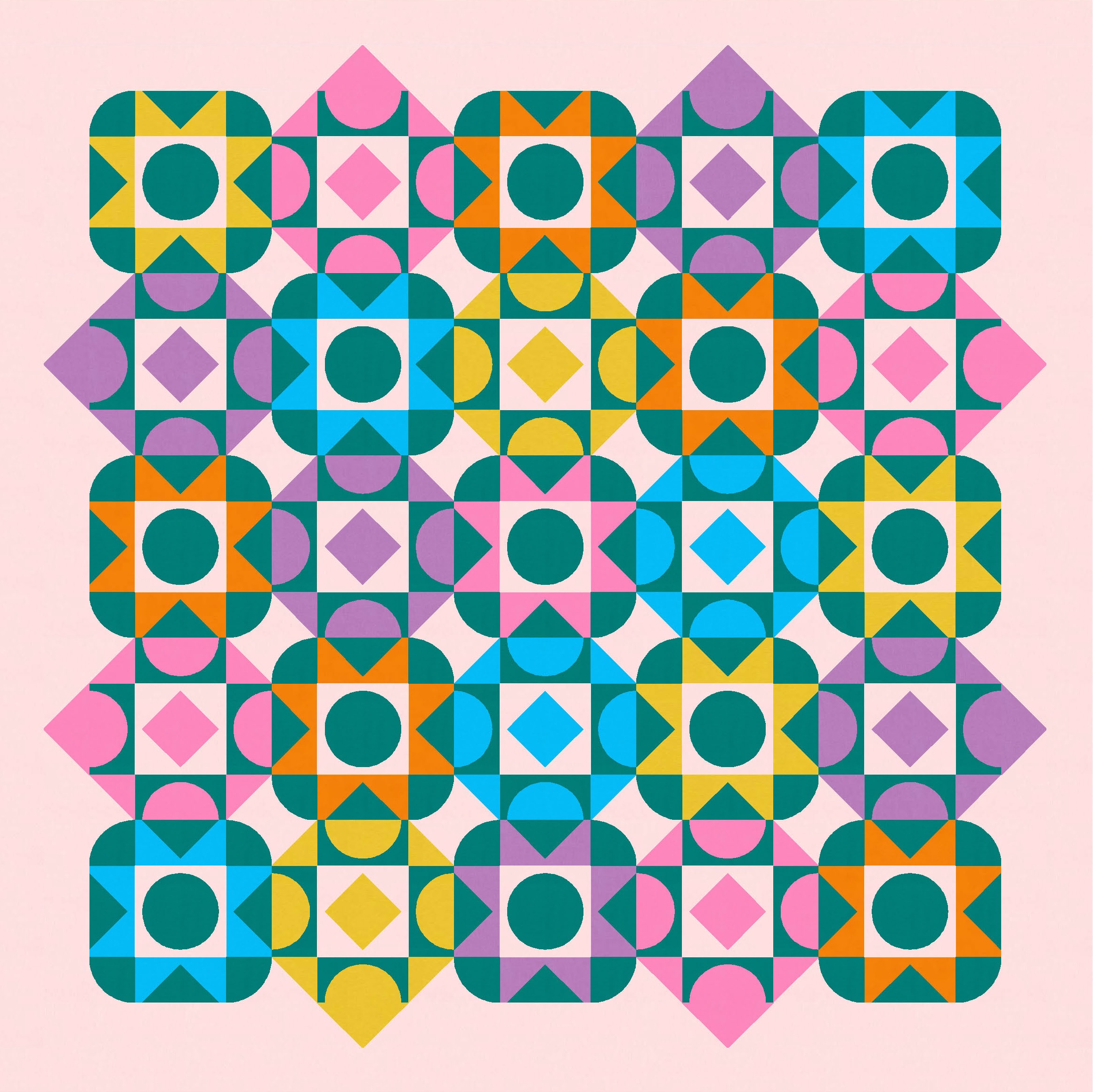

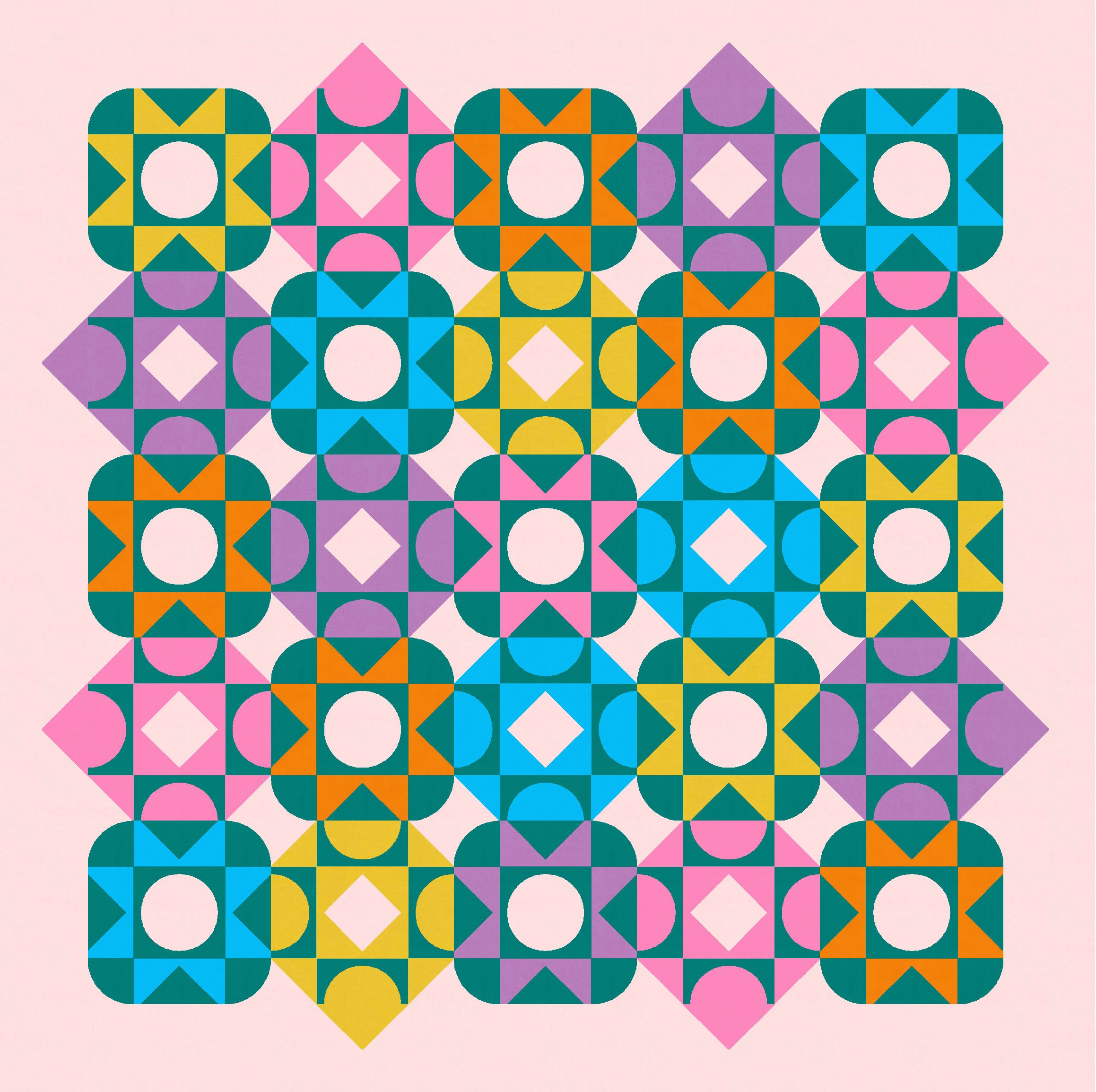
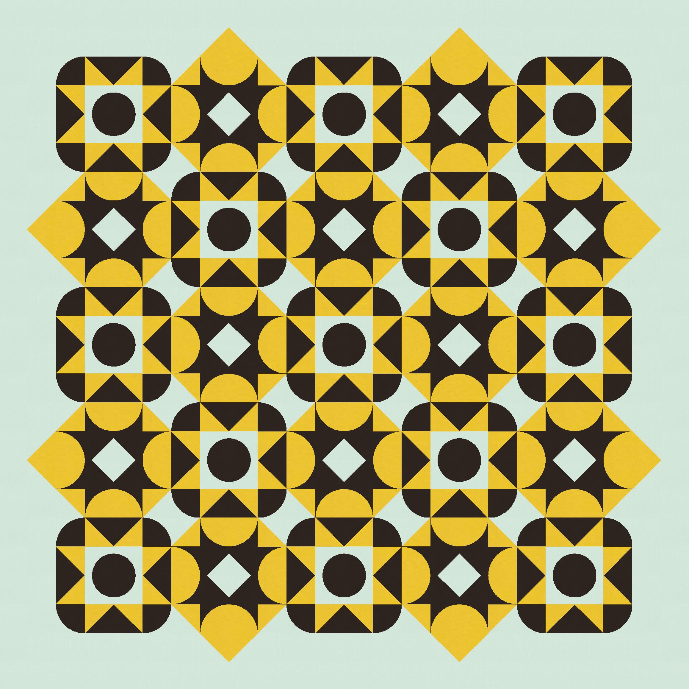
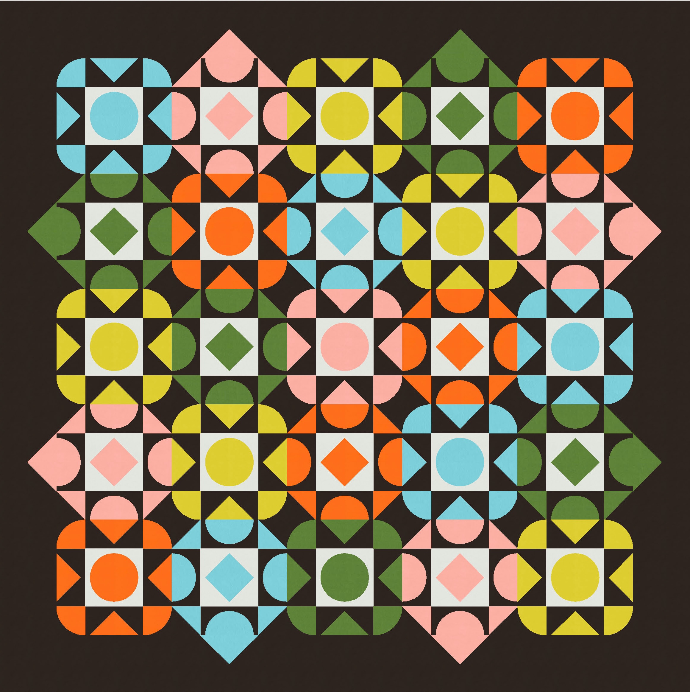
I also changed up the location of the ‘common’ colour – the non-background colour that I’ve used in all blocks. It helps to tie them together and avoid colour overload. But where I’ve put it really makes a difference to the overall look of the design. Here are a few examples (note that the two versions in row 1 have the darkest and lightest colours inverted, but in each of rows 2 and 3, the two versions feature the exact same blocks/colours with just the outer (border) colour changing).

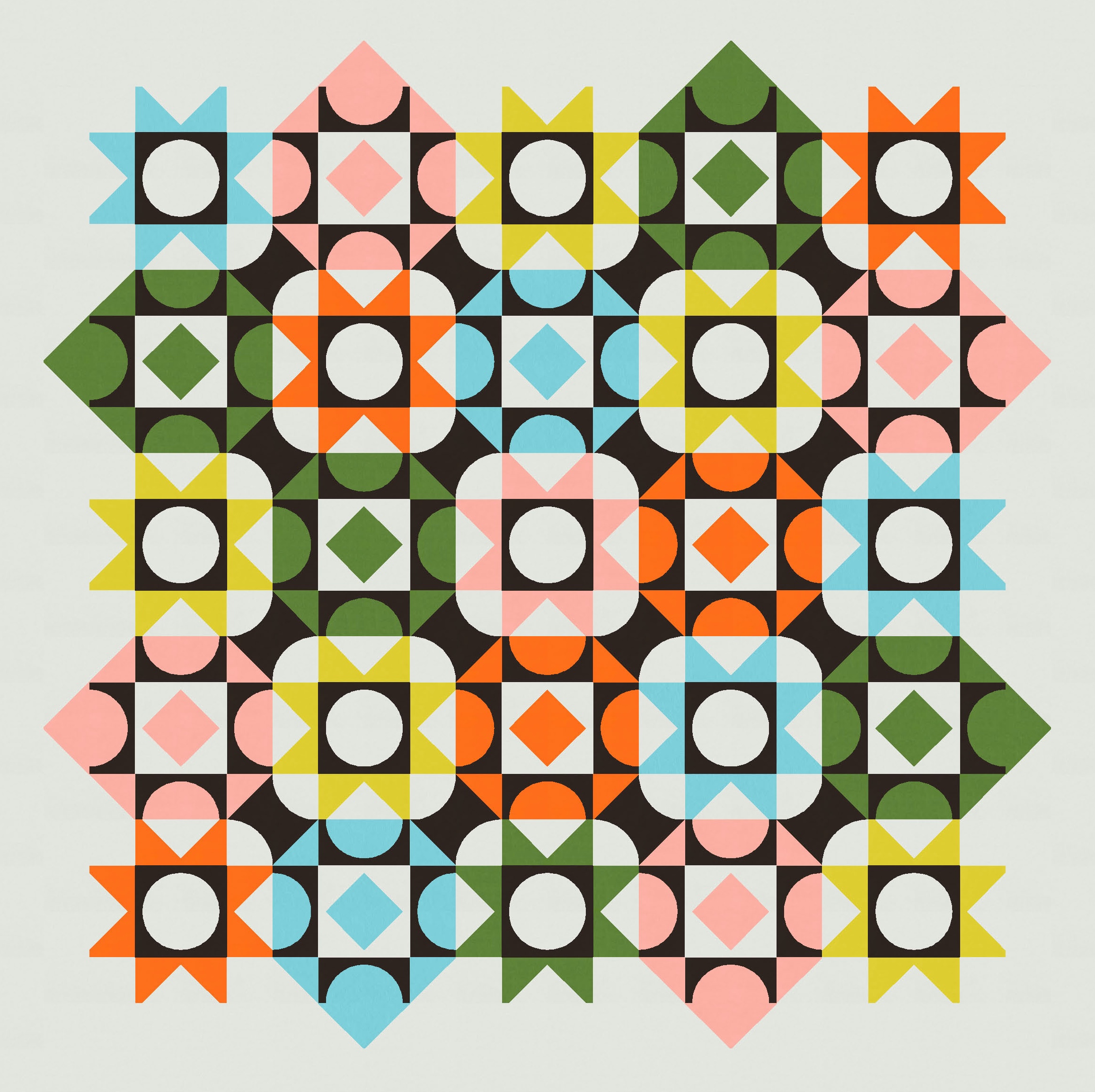

That’s my absolute favourite colourway, and it took me ages to decide which version to show you up top. I love them all!
To make this week’s sketch into a quilt, you’d need a bunch of chunky (and some normal) flying geese, quarter-circles (drunkard’s paths), squares and economy blocks. I’d probably make templates for the chunky units, just to make sure they were the size I wanted. But I think it would generally be a fairly straightforward make.
I have a few more designs that are directly related to this one, so stay tuned for something similar next week (and the week after)!
Discover more from Geometriquilt
Subscribe to get the latest posts sent to your email.
