Sunday sketch #481
It’s been a minute since I shared a series of related sketches. This week’s (and at least the next two weeks’) sketches feature a recurring motif that I’ve been calling (in my head) the ‘robot’. Even though it doesn’t really look anything like a robot.
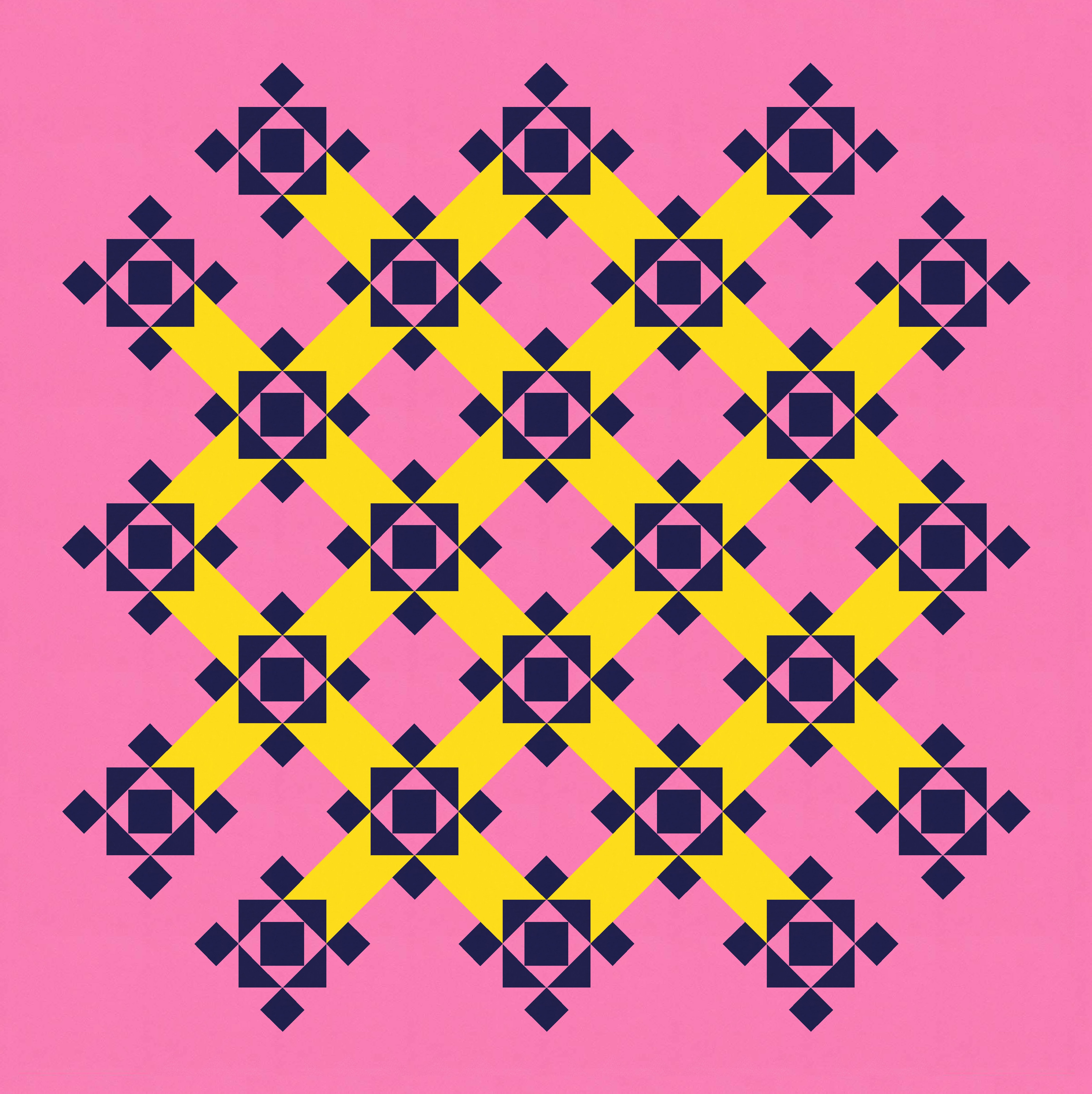
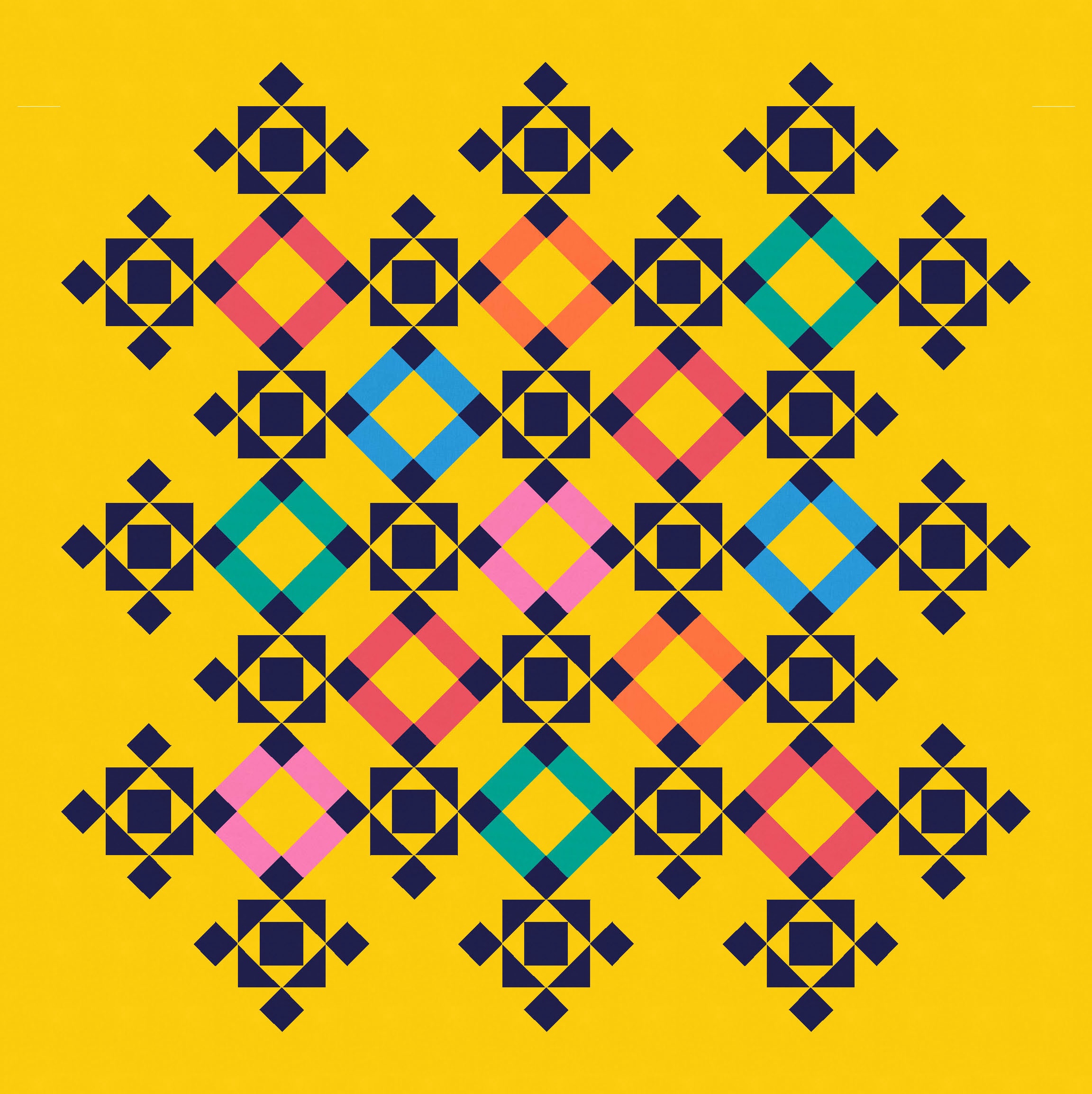
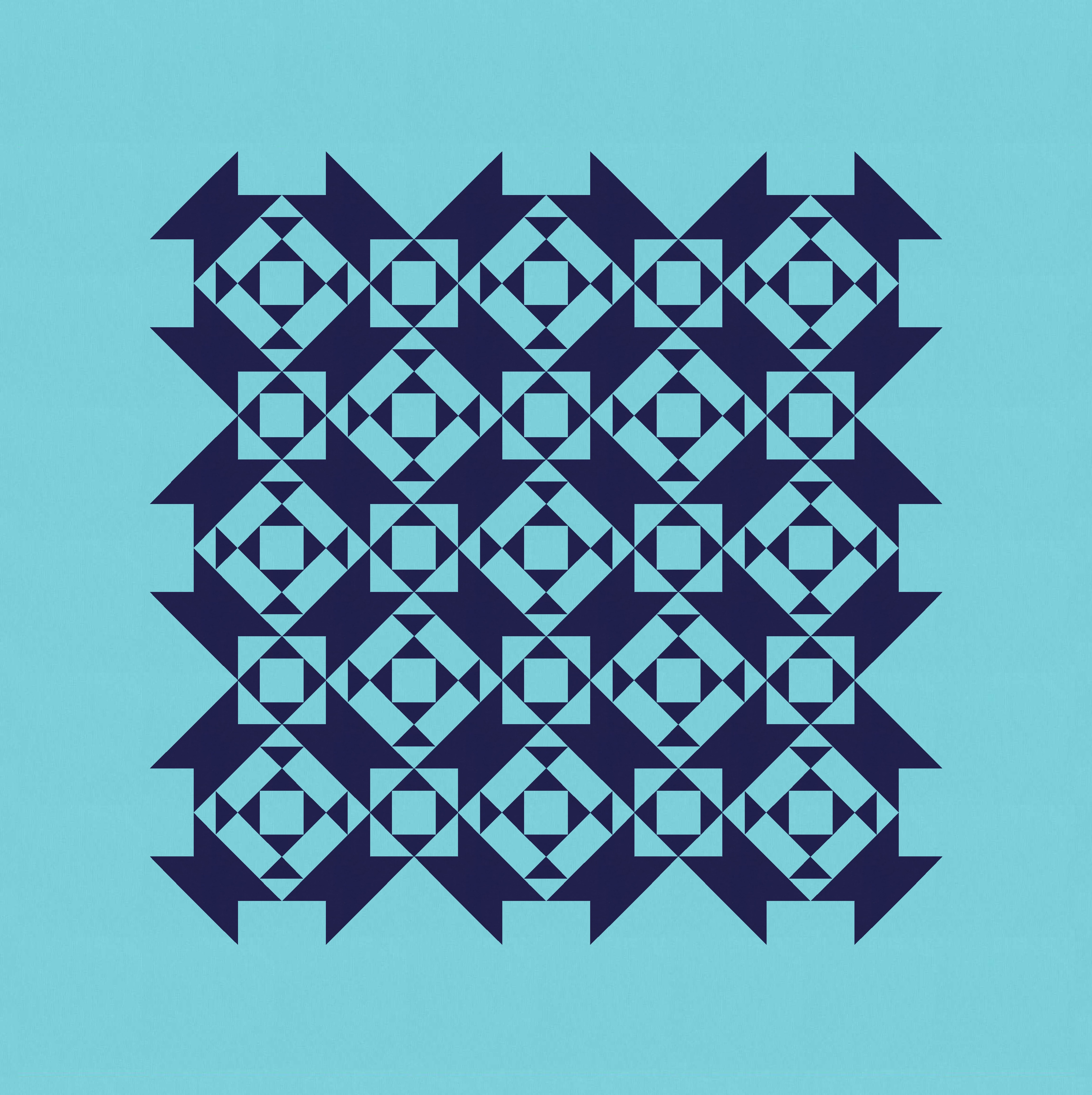
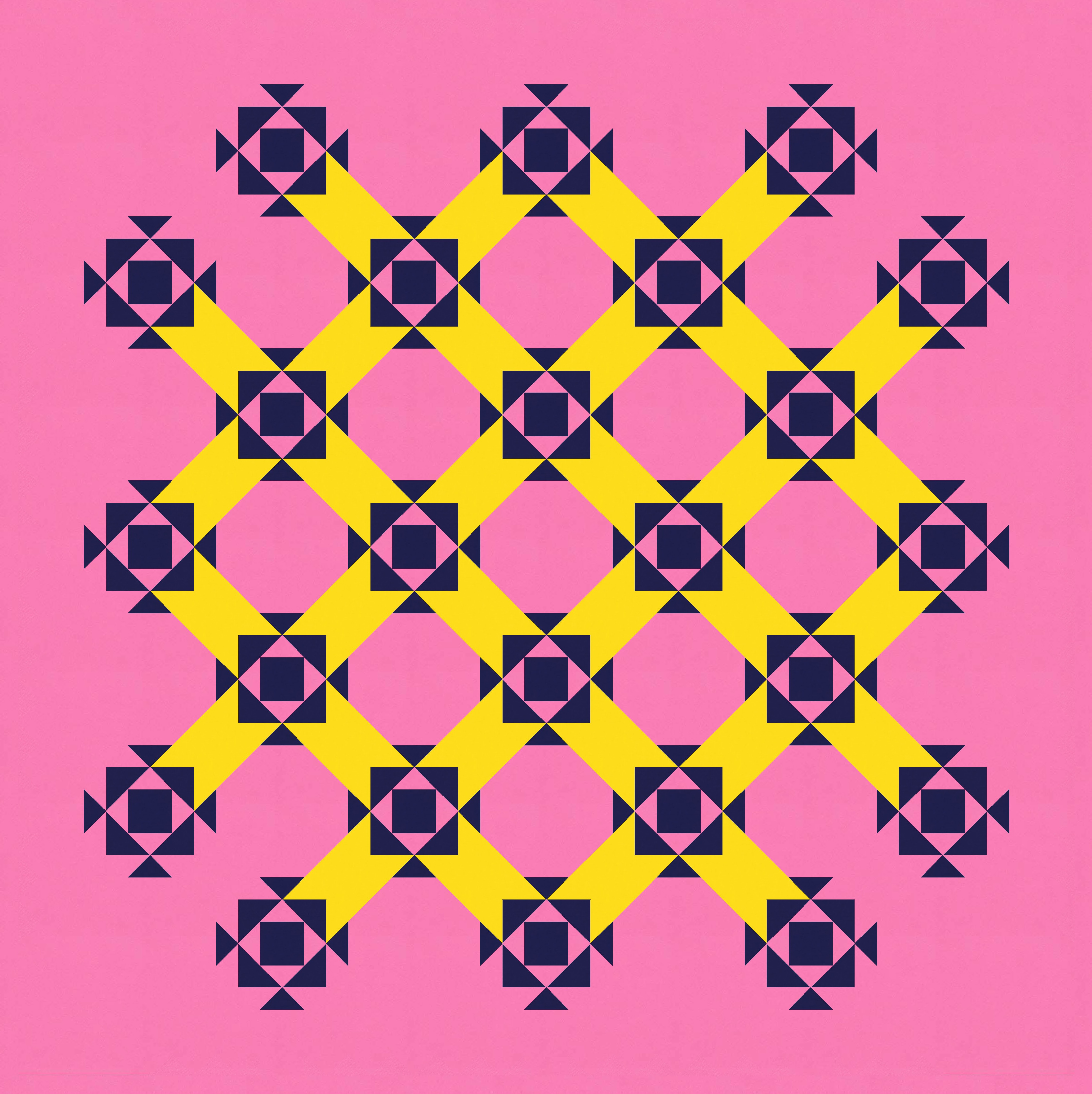
The motif I’m talking about is the darkest shape in the design – basically that two-layered economy block with four small squares attached by their corners to its top, bottom and two sides. The sketch is designed on point, so the motif would really be a square-in-a-square unit bordered by four flying geese, with four squares in the corners. (I didn’t design it that way originally, but that would be the most sensible way to do it.)
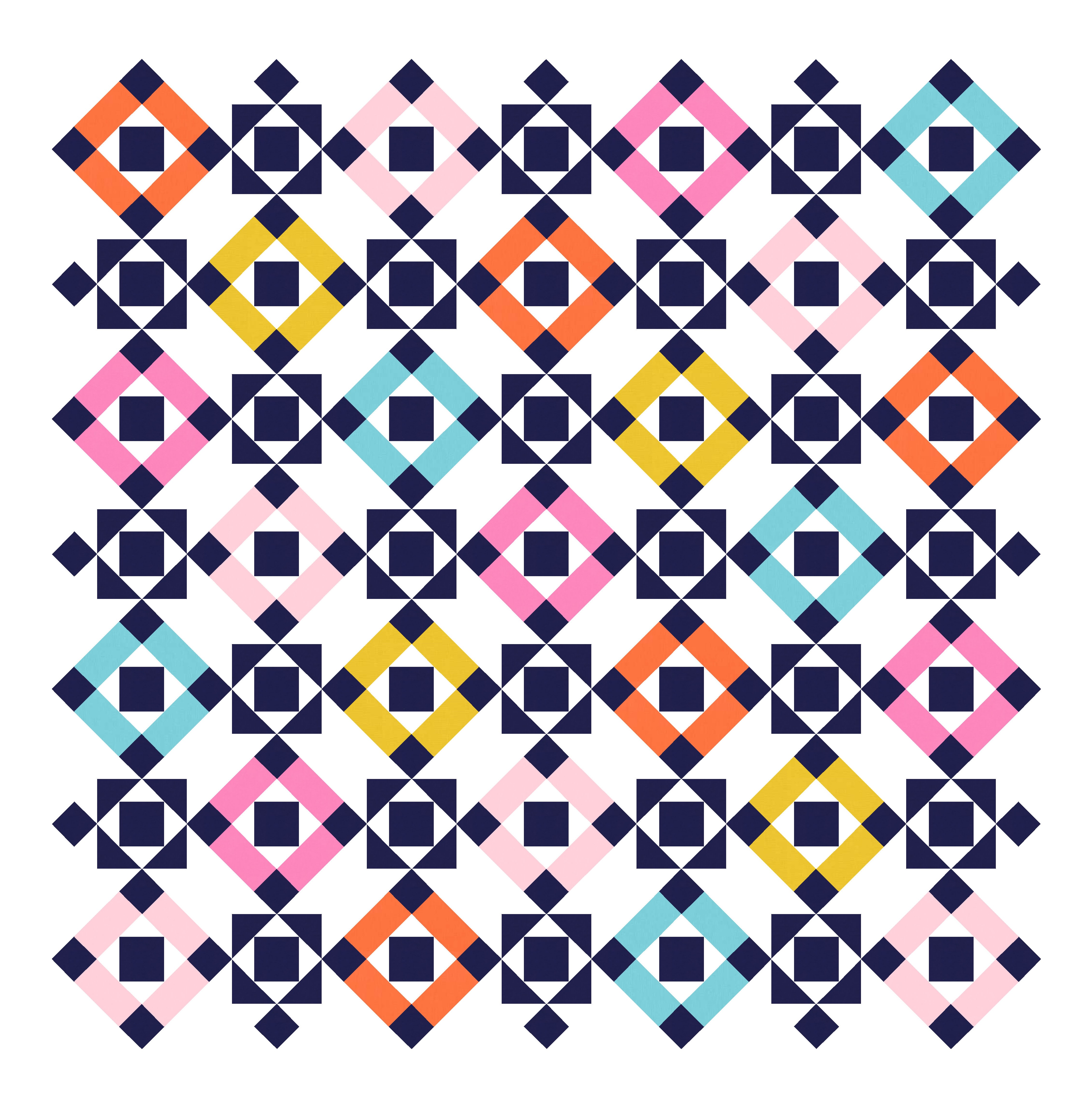
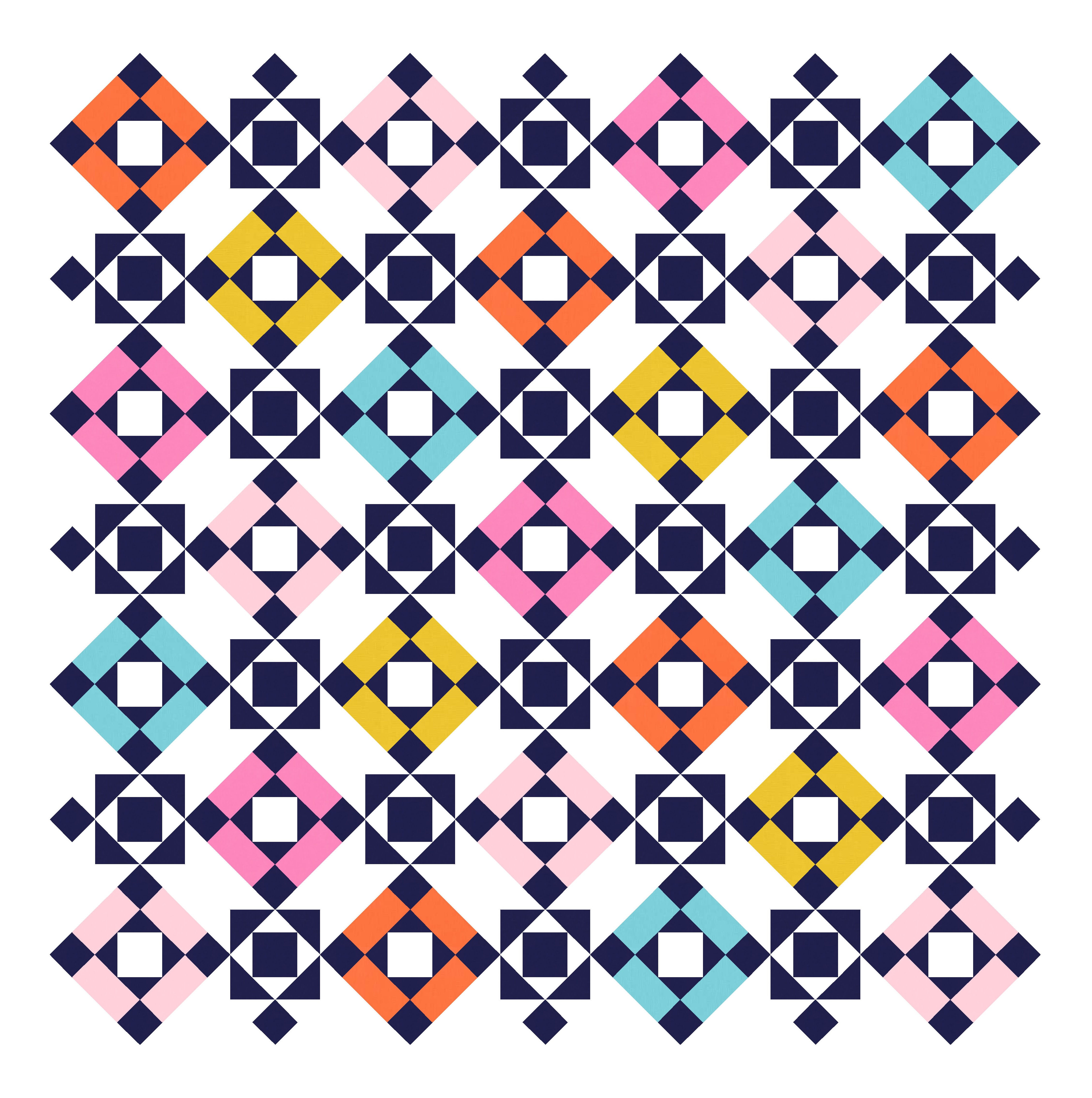
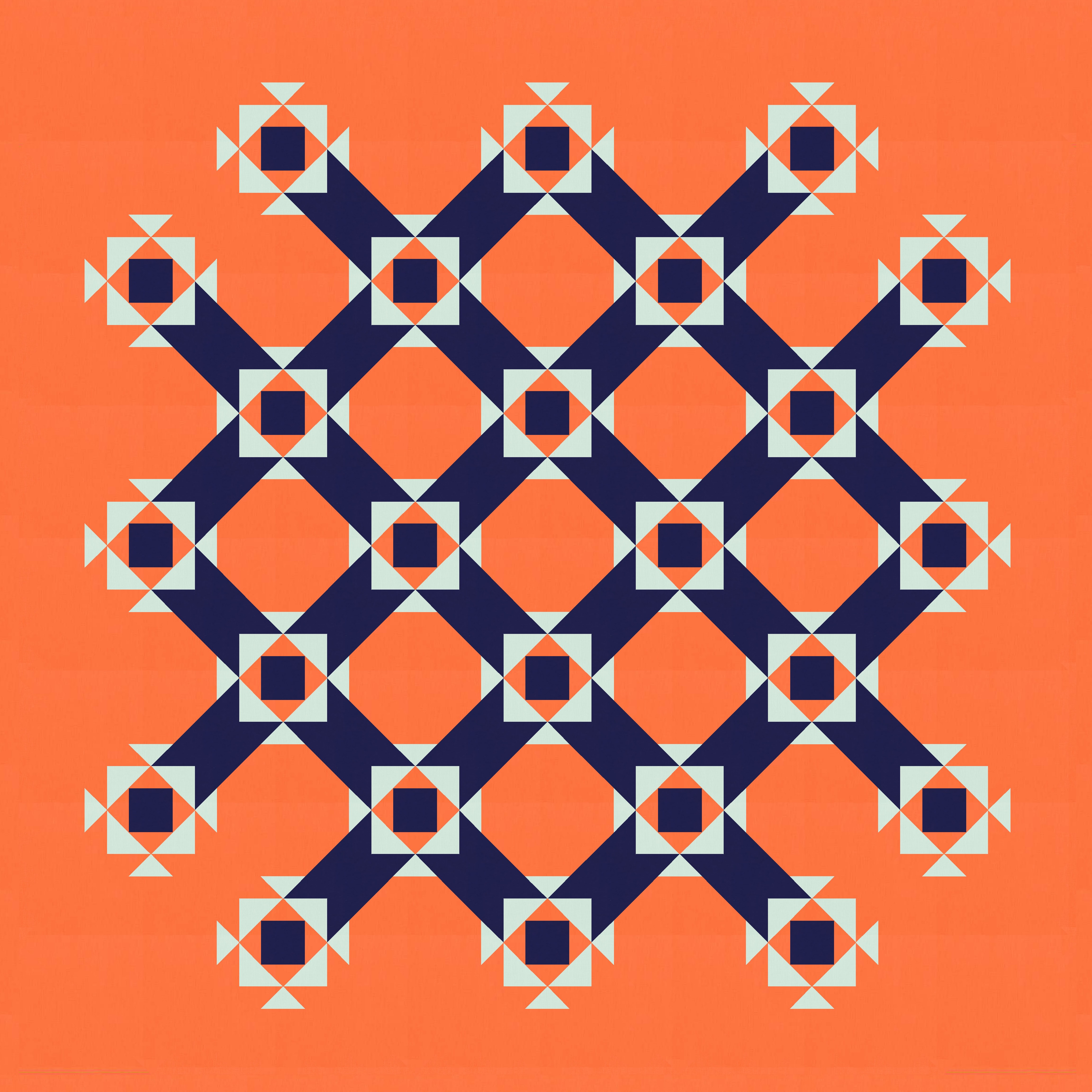
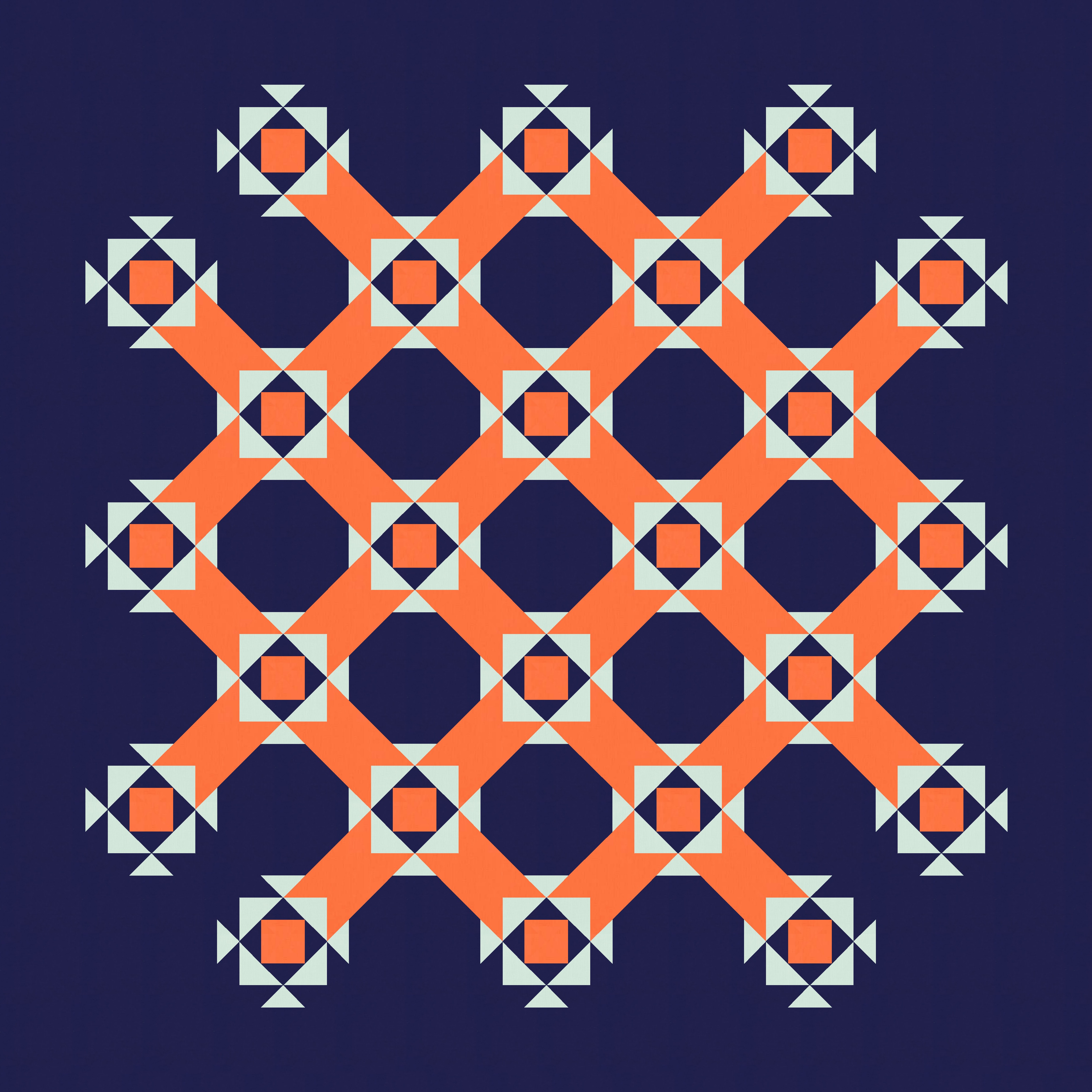
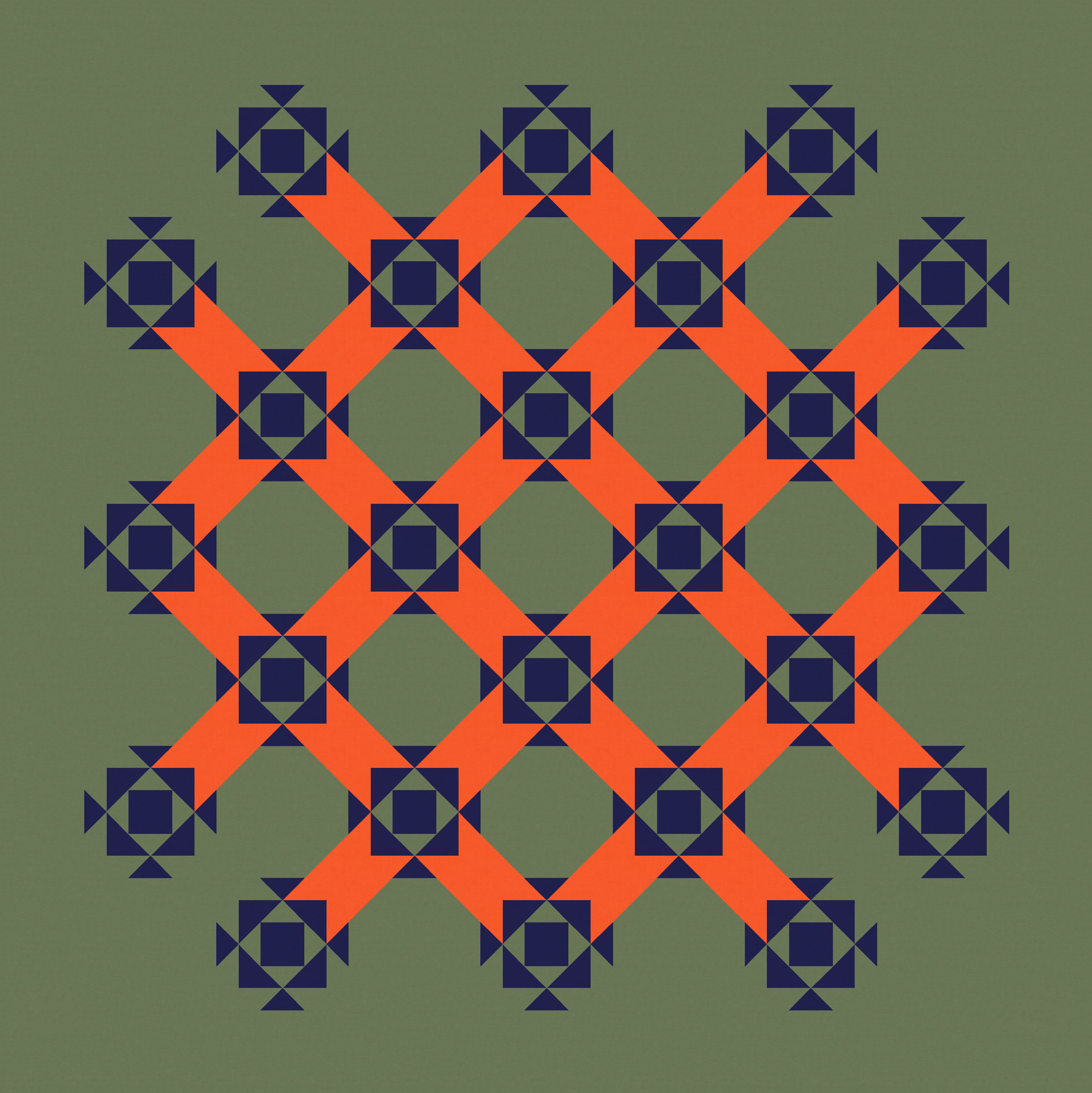
Anyway, I started out with a more multicoloured effort, which I like a lot (in my usual palette of happy colours). This version uses colour to highlight different connections between the dark motifs, focusing on the squares within four adjacent blocks rather than the bulky strips between two adjacent blocks.
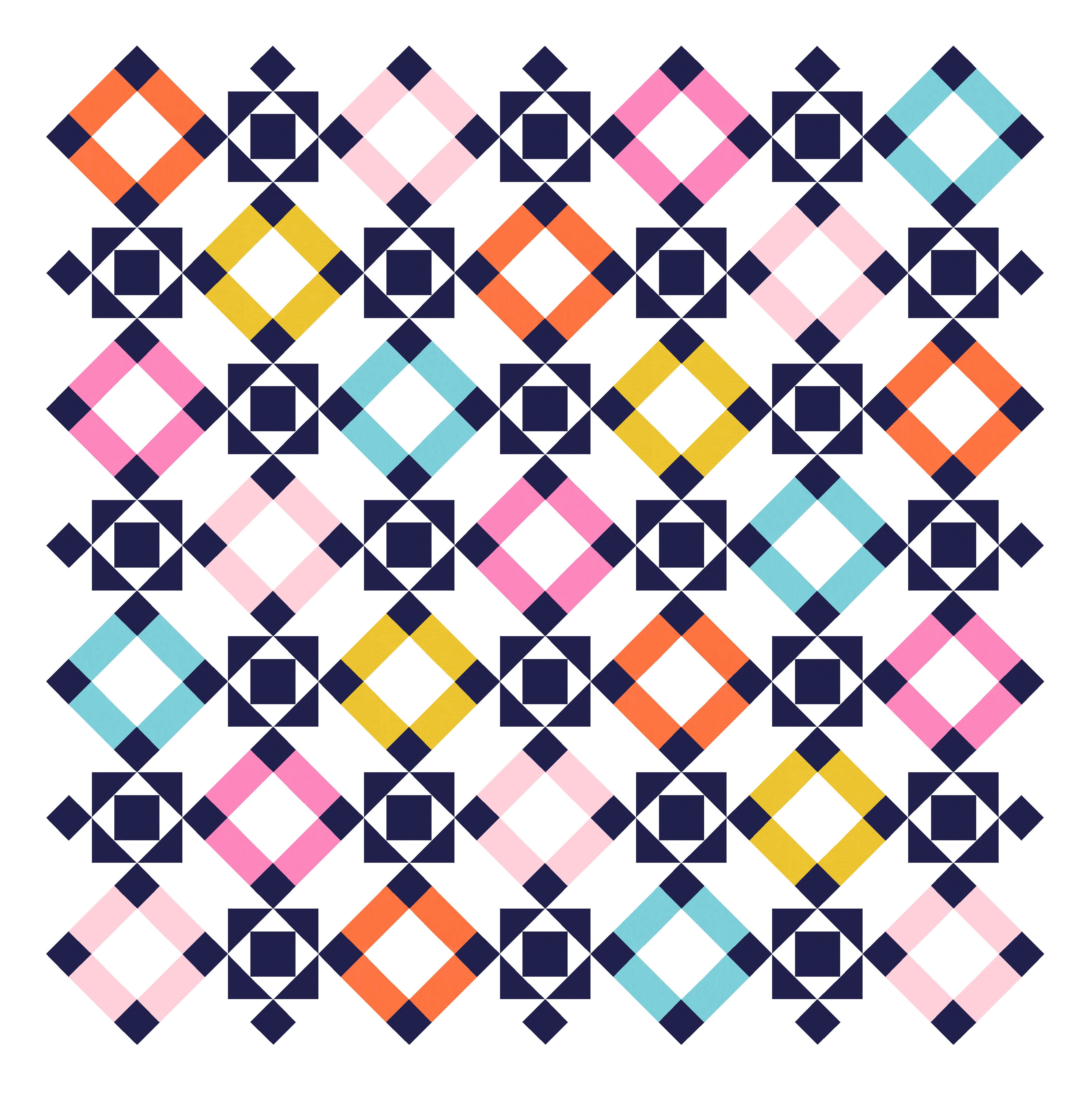
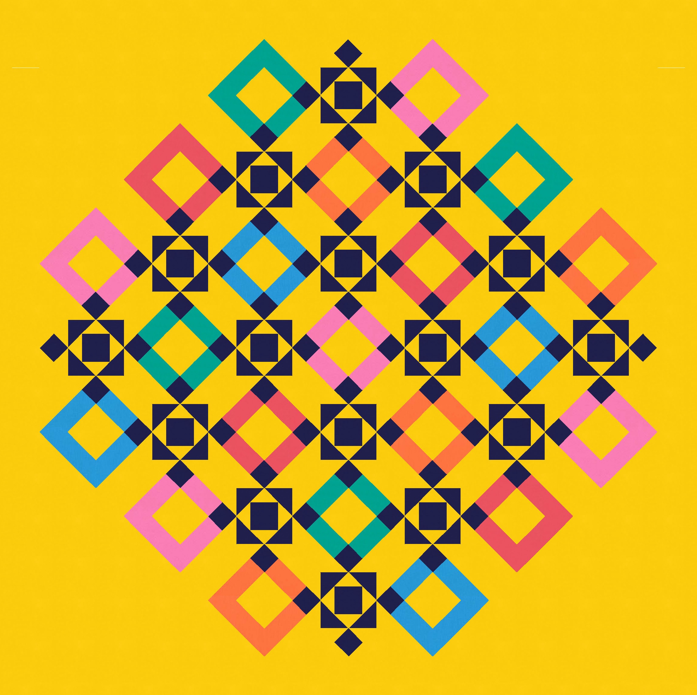
There’s scope with this version to play around with whatever’s inside those coloured squares. Notice in the version below right how much ‘clearer’ those thick white connections between the coloured squares are. Nothing’s changed within those connections, but the changes inside the coloured squares somehow emphasise that part of the design more. I guess the version on the left balances out the background white more across the whole design, whereas the version on the left retains most of the white in the thick connections. (Though having said that, the amount of white within the coloured squares in the same in both designs.)
It’s also fun to remove parts of the design to change the outer edges, emphasising either the dark motifs or the coloured squares.
When I started playing around with this design, the dark motif didn’t have squares in the corners – it had half-square triangles. I’m not sure that this looks any more robot-y than the previous version, but that’s what prompted the name in my head. The HSTs on the left and right of the dark motif look like little robot hands; the bottom one is like a little robot pedestal foot, and the top one is the head I guess. (Or maybe I’m thinking of Tinky-Winky?!?)
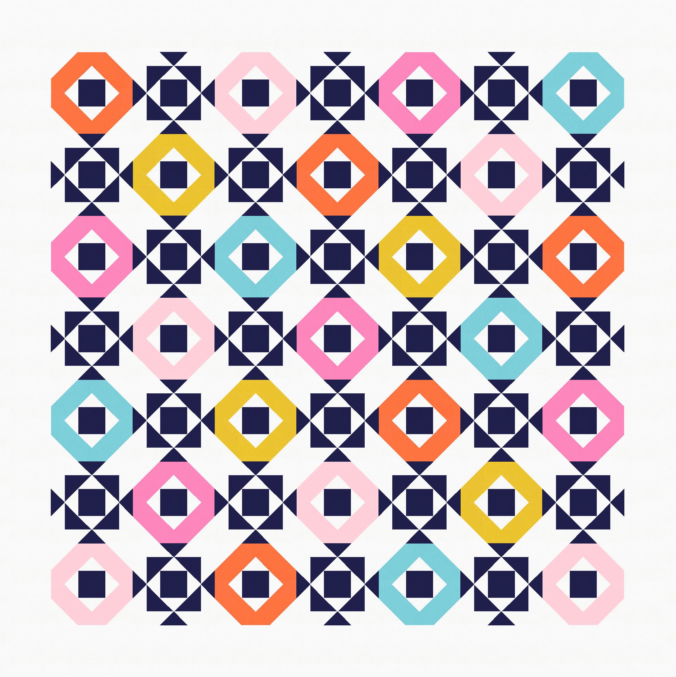
Anyway, changing the small squares to HSTs gives a bit more room for including more colour and playing around with the shapes inside those coloured squares. (I did create a million versions along those lines, but I’m not sharing them here because I’d rather move on to the next sidetrack….)
I even tried replicating a robot-like motif in the middle. (Things were getting pretty busy, so I opted for a two-colour palette for these versions.)
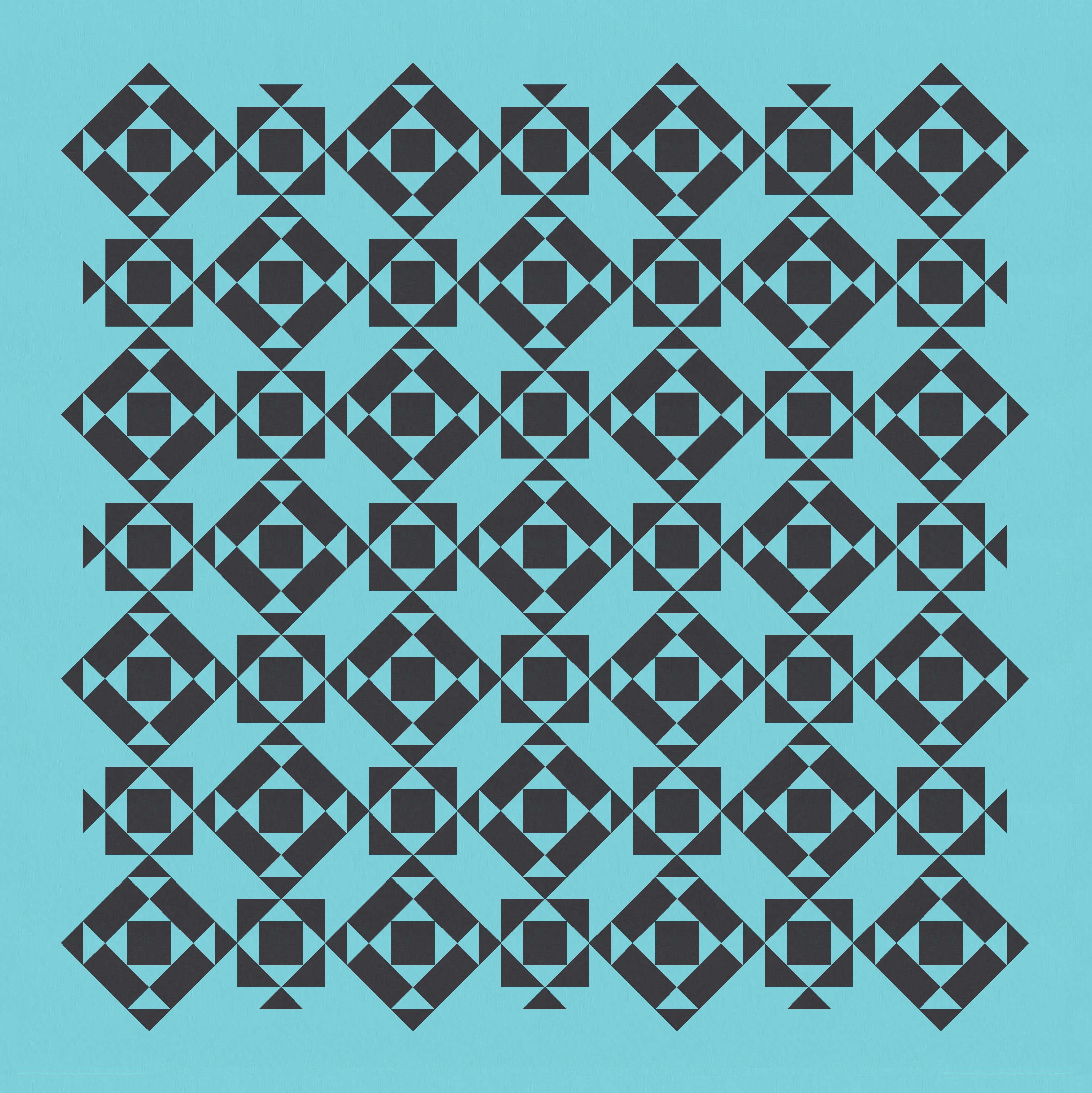

I really like the regular grid-like appearance of the versions above, but it’s still tempting to play with the outer edges to see how that can alter the whole look and feel of the design.

That last version really highlights those chunky connections between the blocks – the sort of thick sashing with spiky ends. I had to try making that more of a feature.

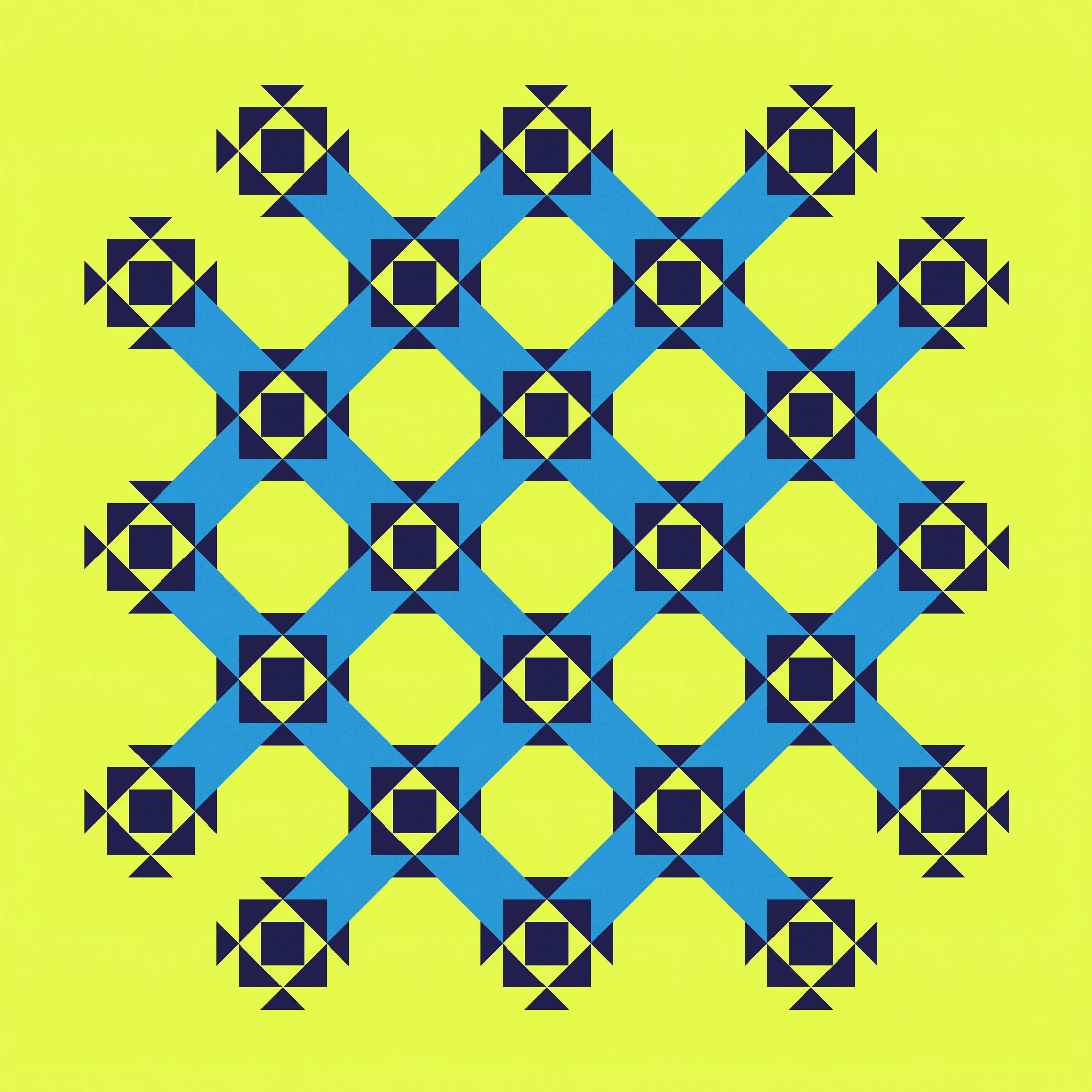
You might have noticed that I didn’t colour in the connection between the two blocks in every corner of the design. For some reason, I really preferred it without. Colouring them in made the design feel ‘closed’, whereas I would rather get that kinda woven effect of the ‘open’ version.
Also, sticking with the HSTs as the head/feet/arms (for lack of a better description!) helps to create hidden circles in the empty spaces. OK, not circles, but octagons that feel kinda circular. A bit like the shapes made in a lattice of rattan cane webbing.
The diagonal sashing-ness of this week’s sketch is somewhat reminiscent of Sunday sketch #463, which had double stripes between adjacent motifs (also dark, also featuring HSTs). I really like it as a feature.
The design itself is straightforward and would be easy to make into an actual quilt. You could get away with using just half-square triangles, squares and rectangles. Or you could save a few seams and replace some of the HSTs with flying geese and square-in-a-square units.
It’s definitely leaning more traditional than modern, although I think you could modernise it through colour palette and placement. And maybe introducing some asymmetry, etc.
Next week, I’ll show you how I iterated this design in a different direction.
Discover more from Geometriquilt
Subscribe to get the latest posts sent to your email.

I am always inspired and amazed by the difference that the colour placement has on all your amazing designs