Sunday sketch #480
I had stripes on my mind a few weeks ago, and this is one of the designs I created. (Another one was Sunday sketch #478; I’ll share some others in a few more weeks!)
And, thanks to Tara Glastonbury / Stitch & Yarn and issue #8 of Curated Colour, you don’t have to look at my same old palette of 5+ pinks and oranges – I’ve got some new colour combos to use!
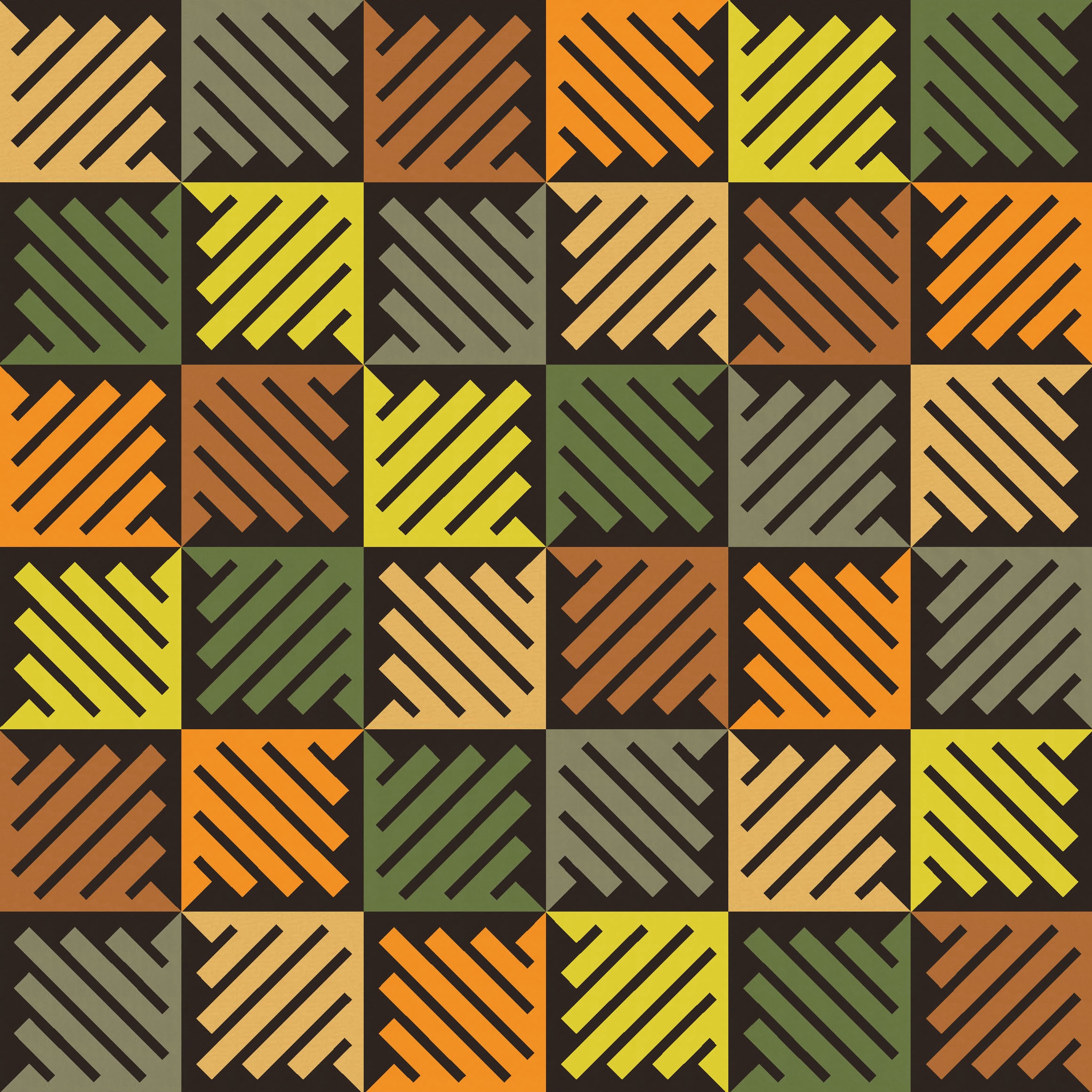
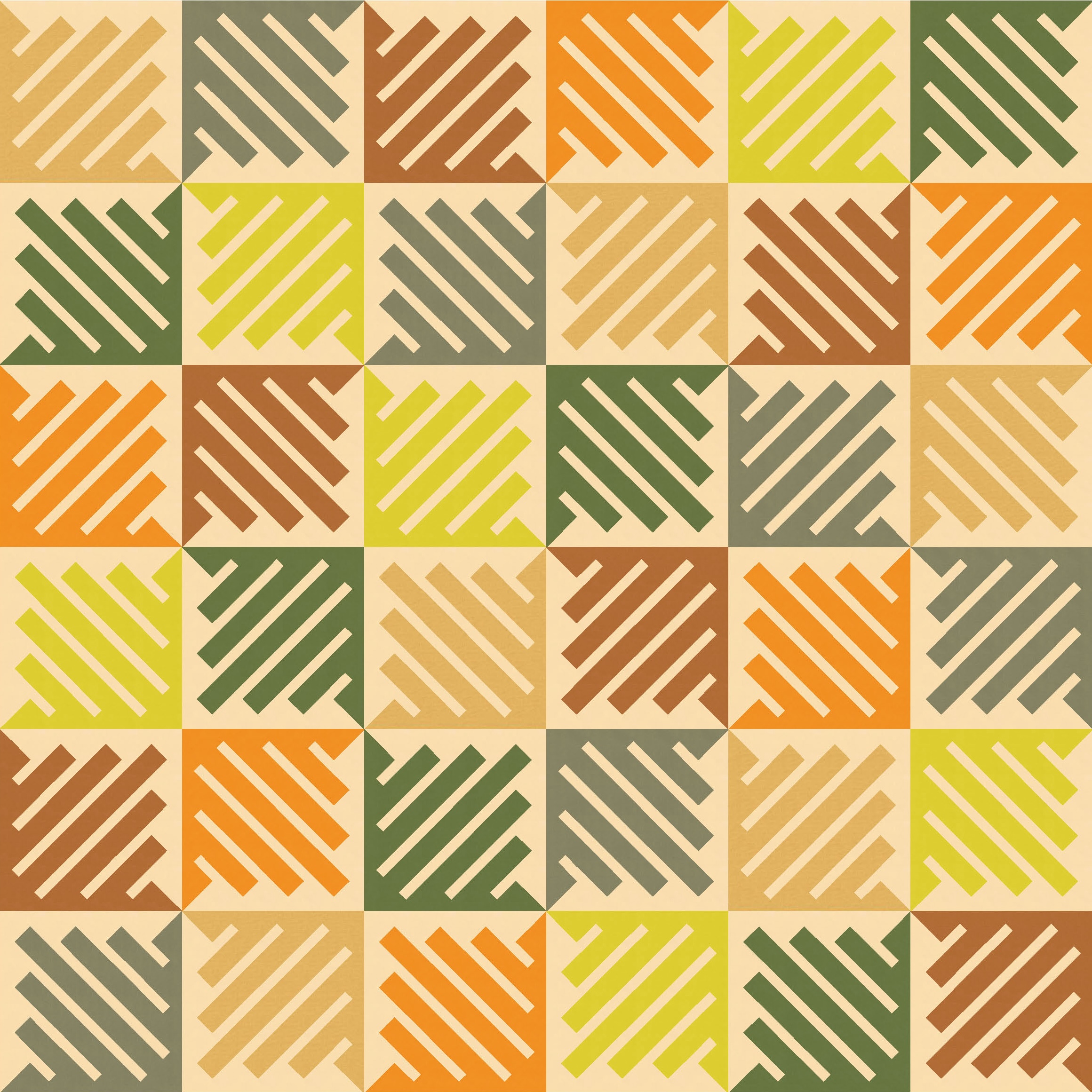
I love this month’s selection of colours. As usual, I’m opting for the Kona palette of 12 colours (Tara also shows the equivalents in Devonstone solids and in Painter’s Palette Solids by PBS Fabrics). They’re a lovely mix of earthy tones, with a few pops of lighter colour for a bit of brightness. With Melbourne in the midst of a cold and rainy spell at the moment, this palette feels a bit autumnal/wintery but with a hint of sunnier days to come.
And the design itself feels a bit windy too. As soon as I recoloured my original designs in Tara’s palettes, I could see swirling leaves and garden rakes!
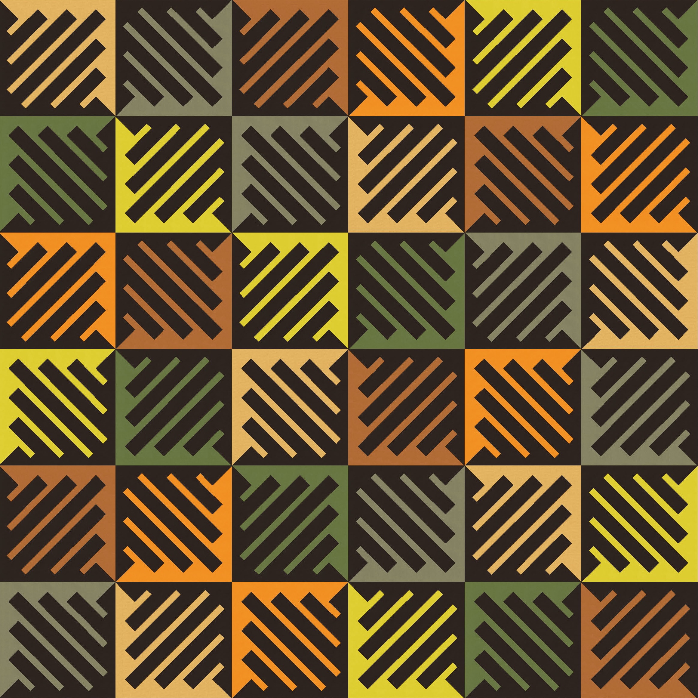
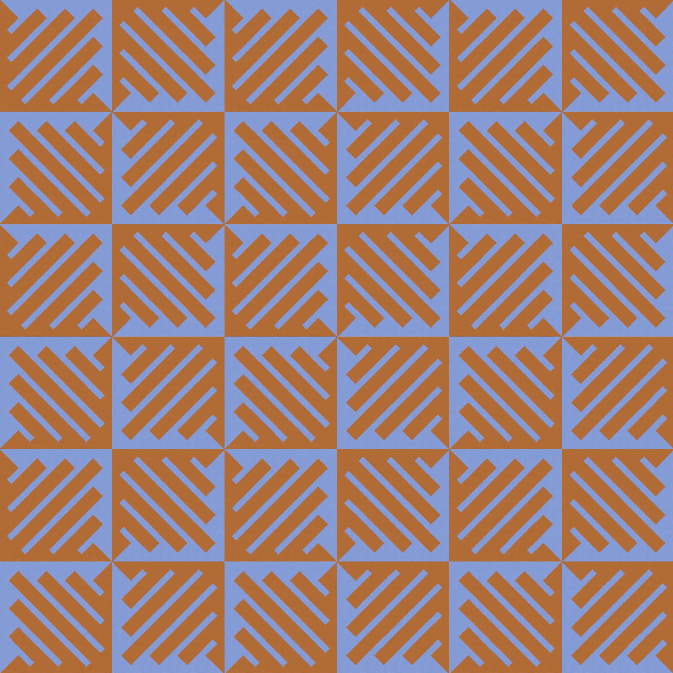
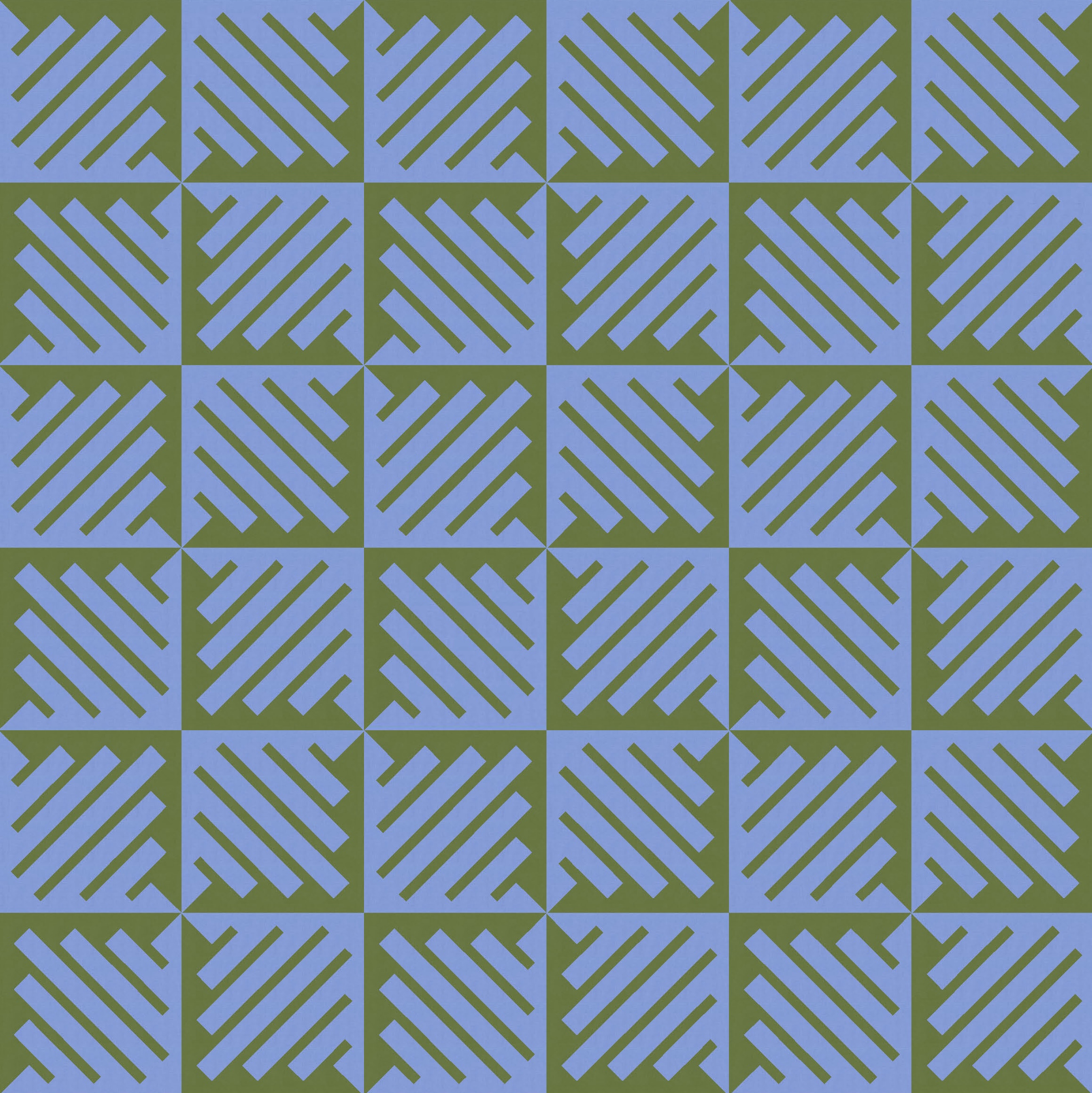
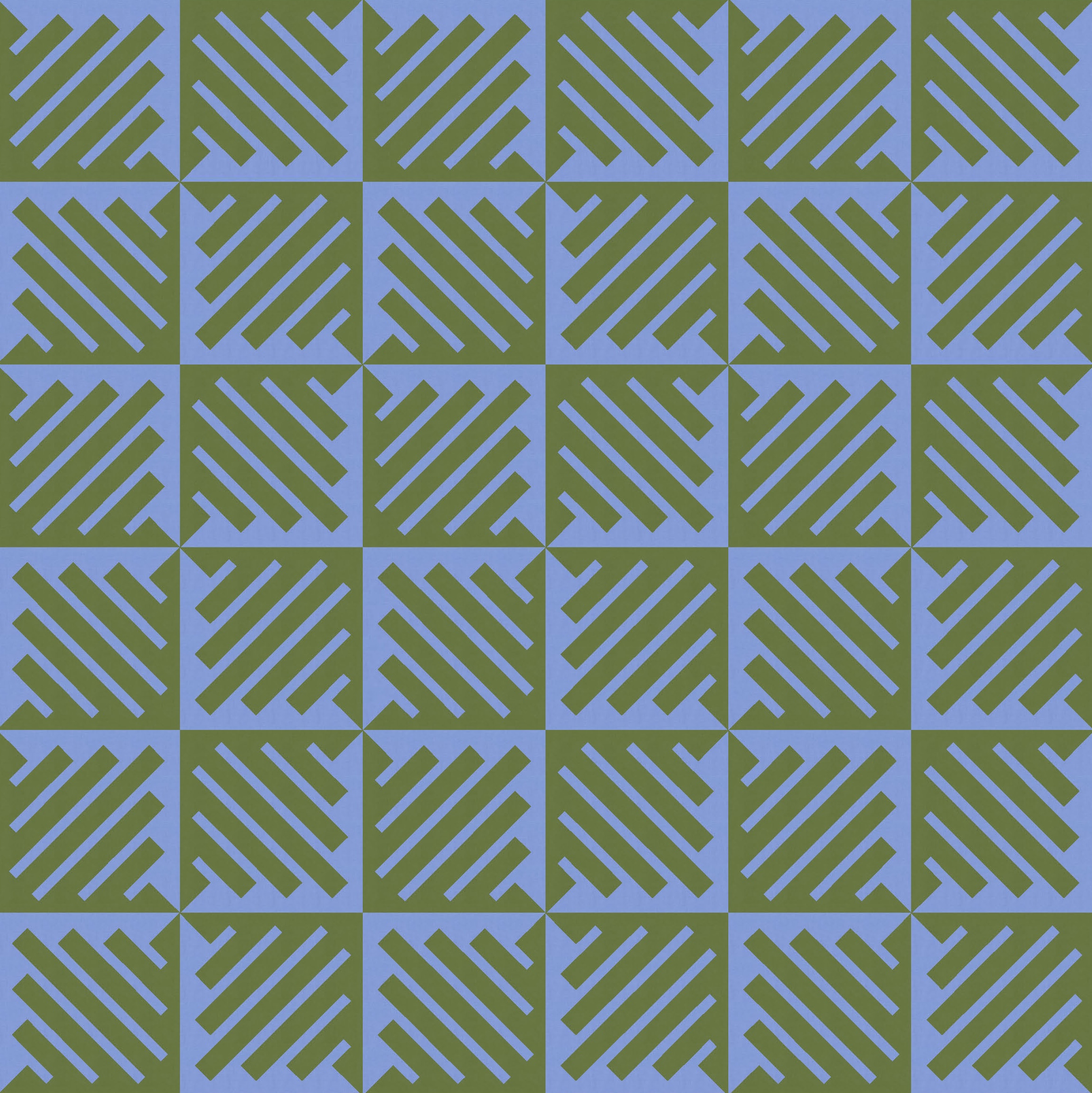
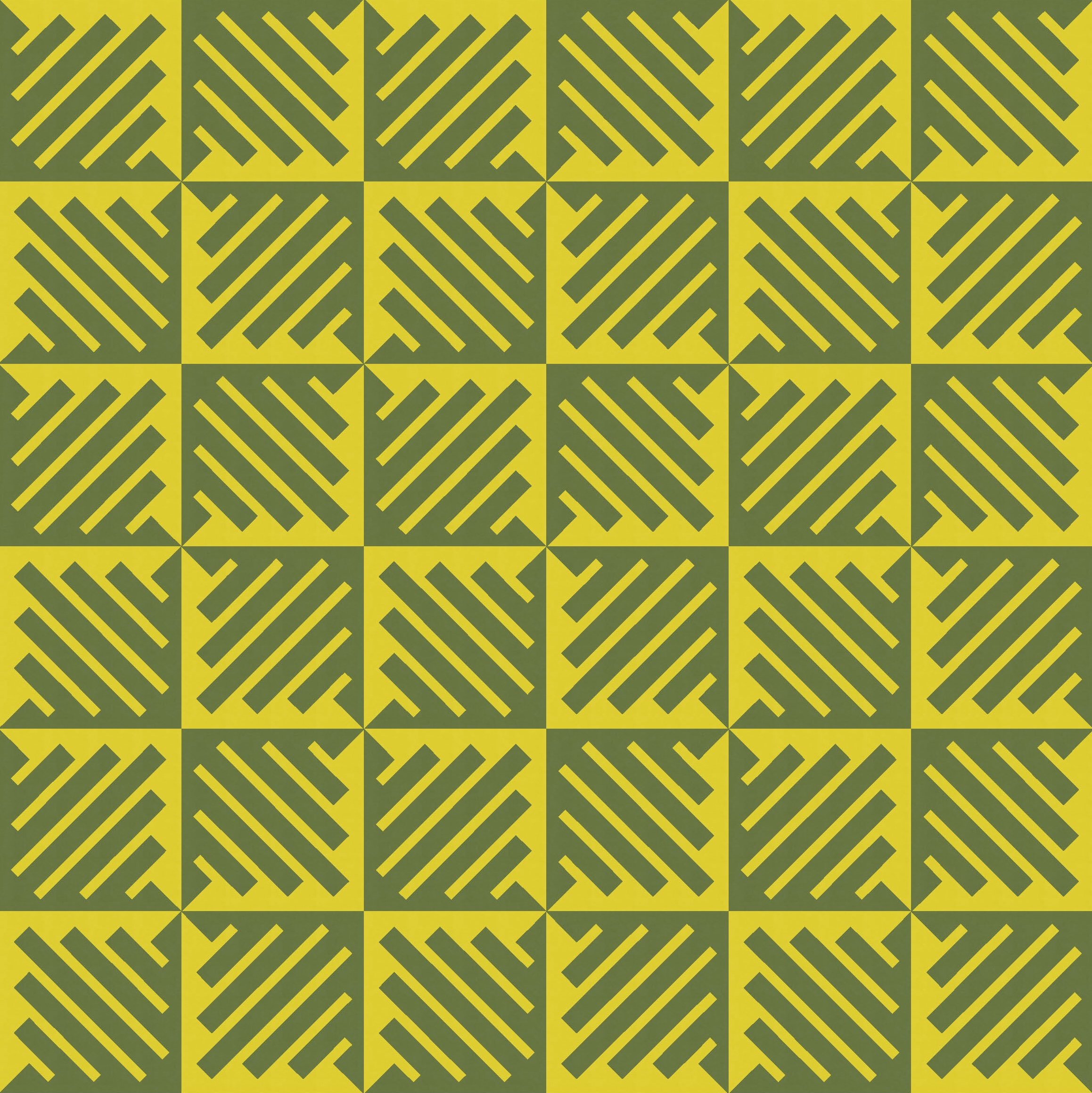
You can see that the design’s a 6 × 6 layout of a single block that’s repeated and rotated. The block features a single line that extends from one corner to the opposite corner, meandering back and forth to create thin and thick lines. The thin lines within each block all point in one direction (and are coloured above in a dark brown), while the thick lines point in the other direction (and feature a different colour).
I can flip that though, so the thick lines are the ones in dark brown, and the other colours are used to highlight the thin lines instead. Kinda the same, but kinda different.
If I just use two colours and put the two versions side by side, you can get a better idea of the difference that switching the colour placement makes.

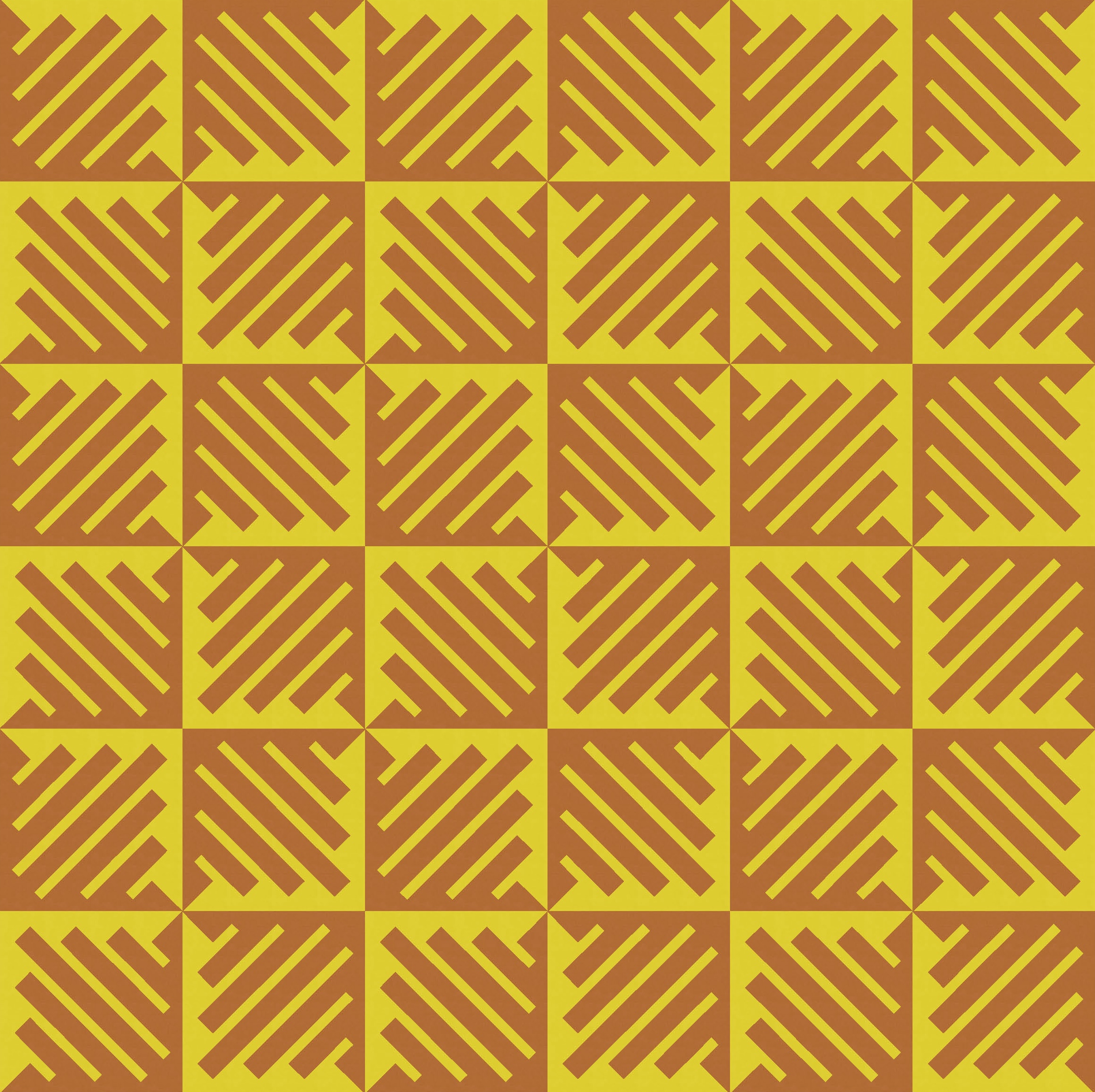
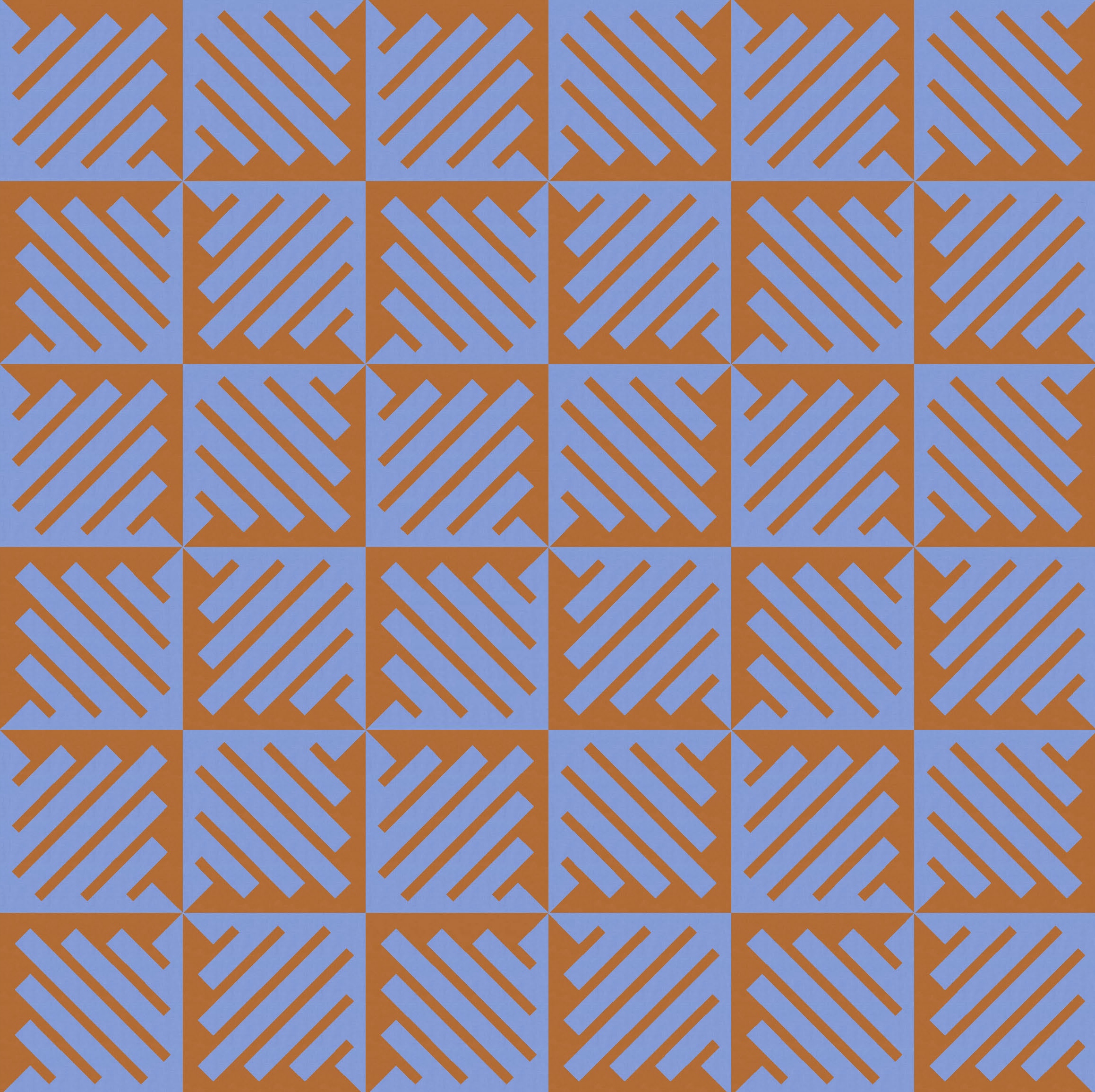

Did you notice that each pair of designs uses one colour from the previous pair? And then did you notice how the colours look slightly different depending on what else they’re paired with? I know that’s a standard exercise when learning about colour theory – pair a colour with a dark or a light colour and see how your perception of its hue, saturation and value change – but it’s still fun to see it in action. I find the orange looks quite different when paired with the yellow than when next to the blue. And the green looks stronger against the yellow than against the blue. You’re lucky I’ve only shown you four pairs; I could’ve made a million more. (Well, 62 more, but who’s counting.)
A two-colour block often offers the potential for a two-tone quilt that starts on one colour and ends on the other. Here I’ve removed a few blocks in opposite corners and filled the space with solid colour instead. The only difference between the two versions in each row is how I’ve coloured those spaces; the blocks themselves are exactly the same. On the left, the solid colour butts up against the solid edges of the adjacent blocks; on the right, it melds with the background colour of the adjacent blocks.
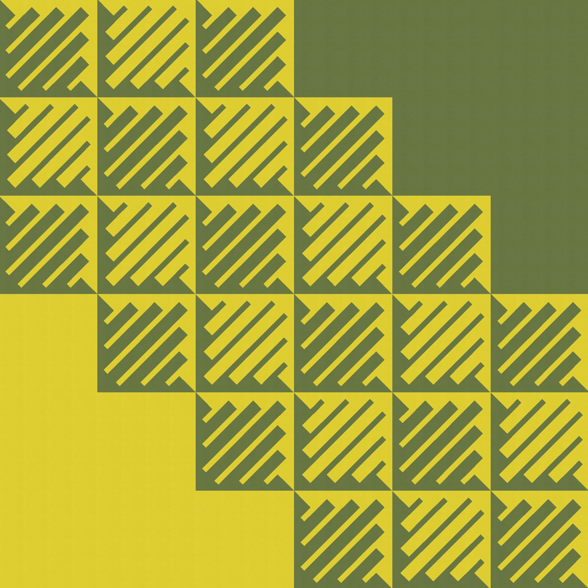
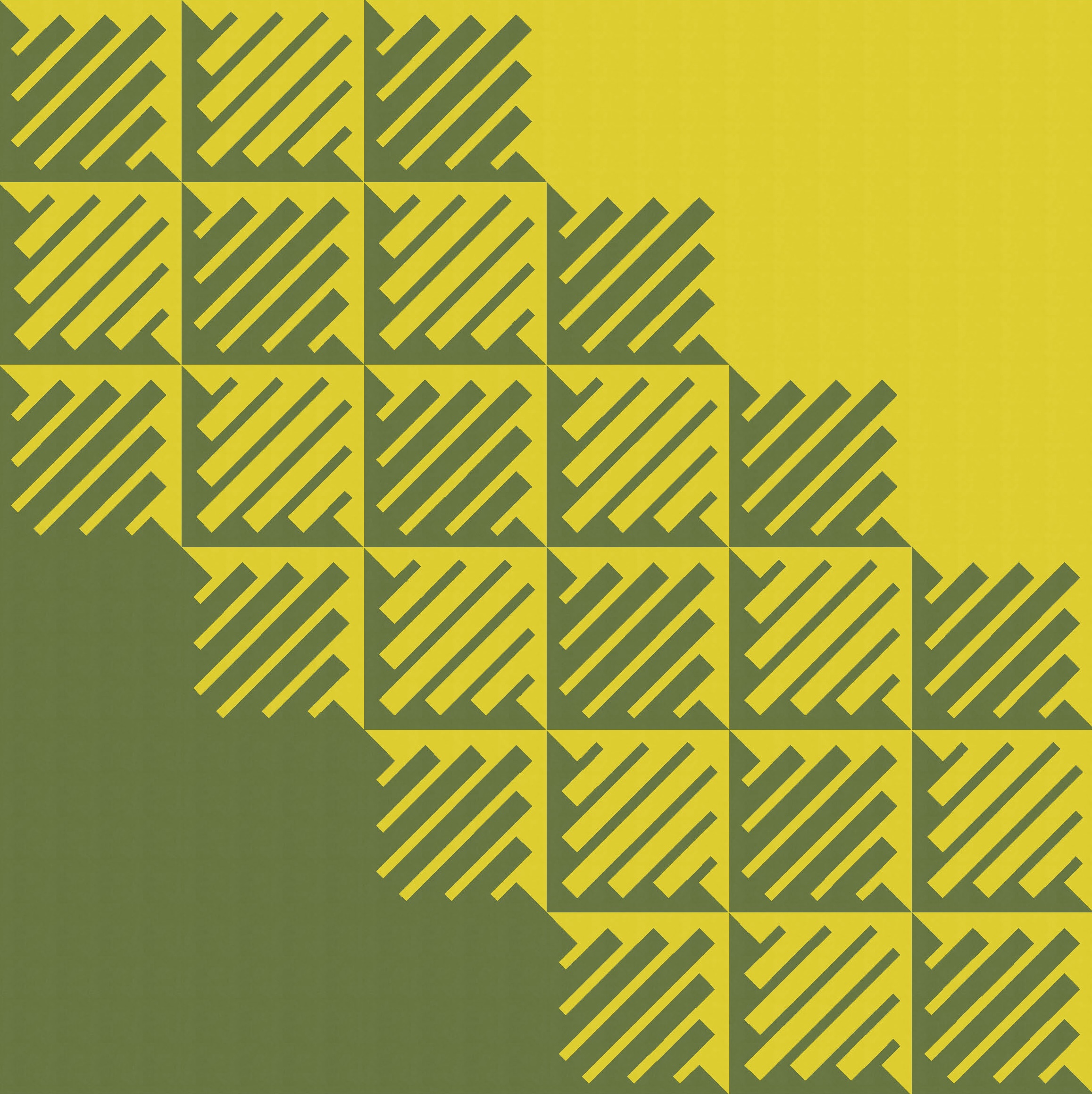
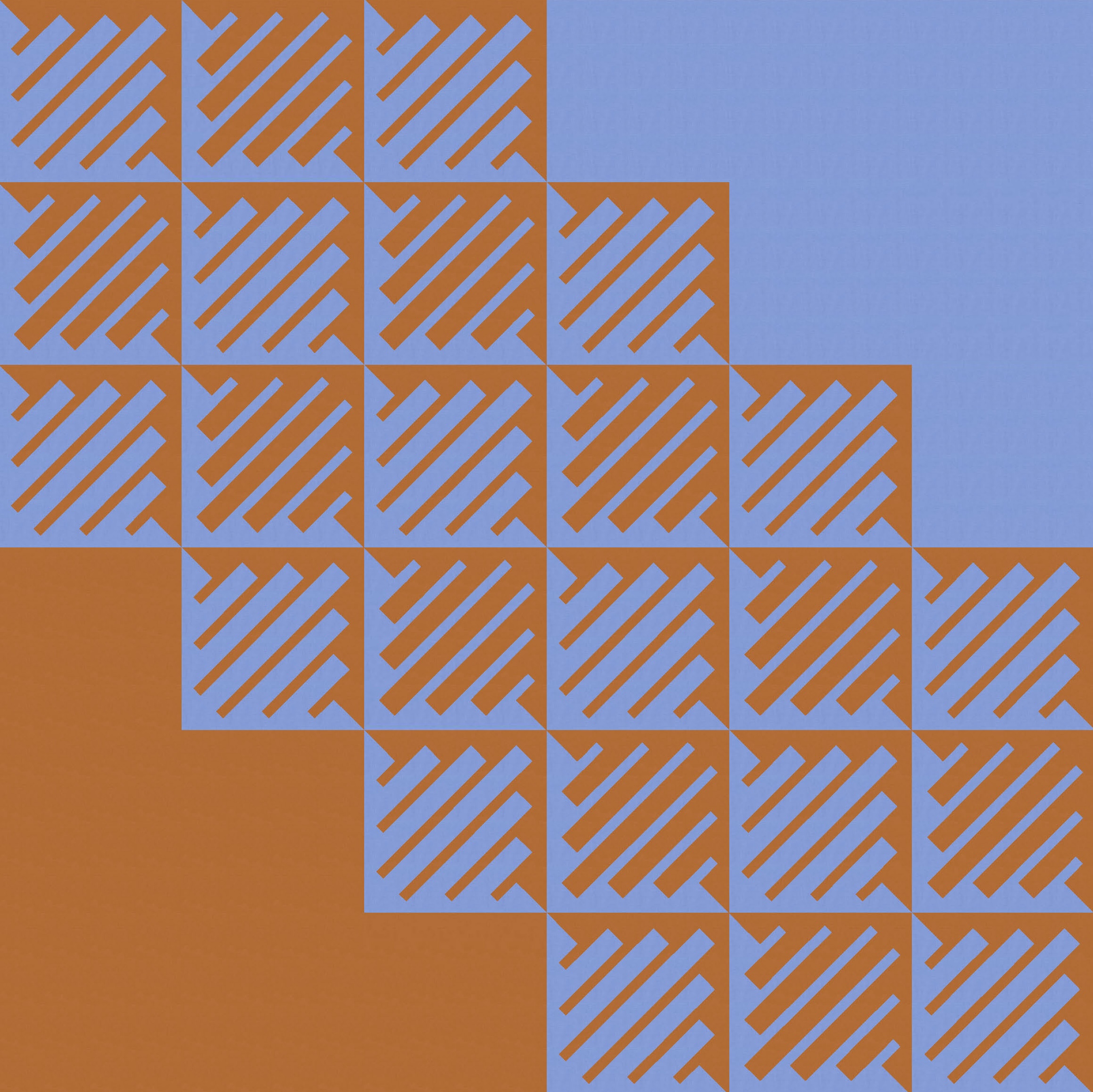
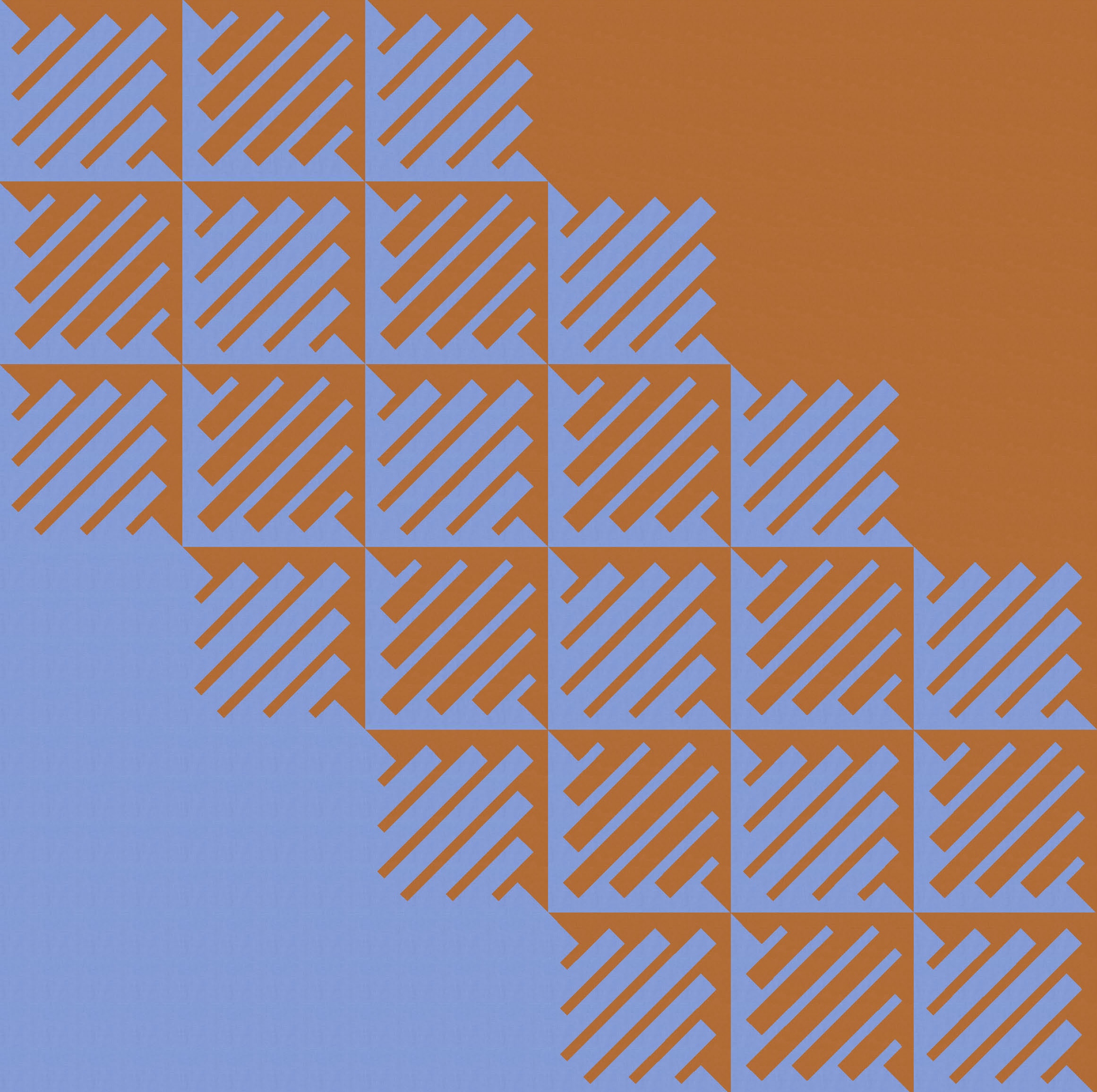
Now that I think about it, the versions on the right might look better with the blocks set on point. I’m too lazy to do that in Electric Quilt 8, so just tilt your head to the left by 45 degrees to see what I mean 🙂
And because each block features only two colours, there’s potential for a bit of colour play across the design – separating out the colours and letting them overlap. I might do something like this if I were making a ‘modern’ version of this design.
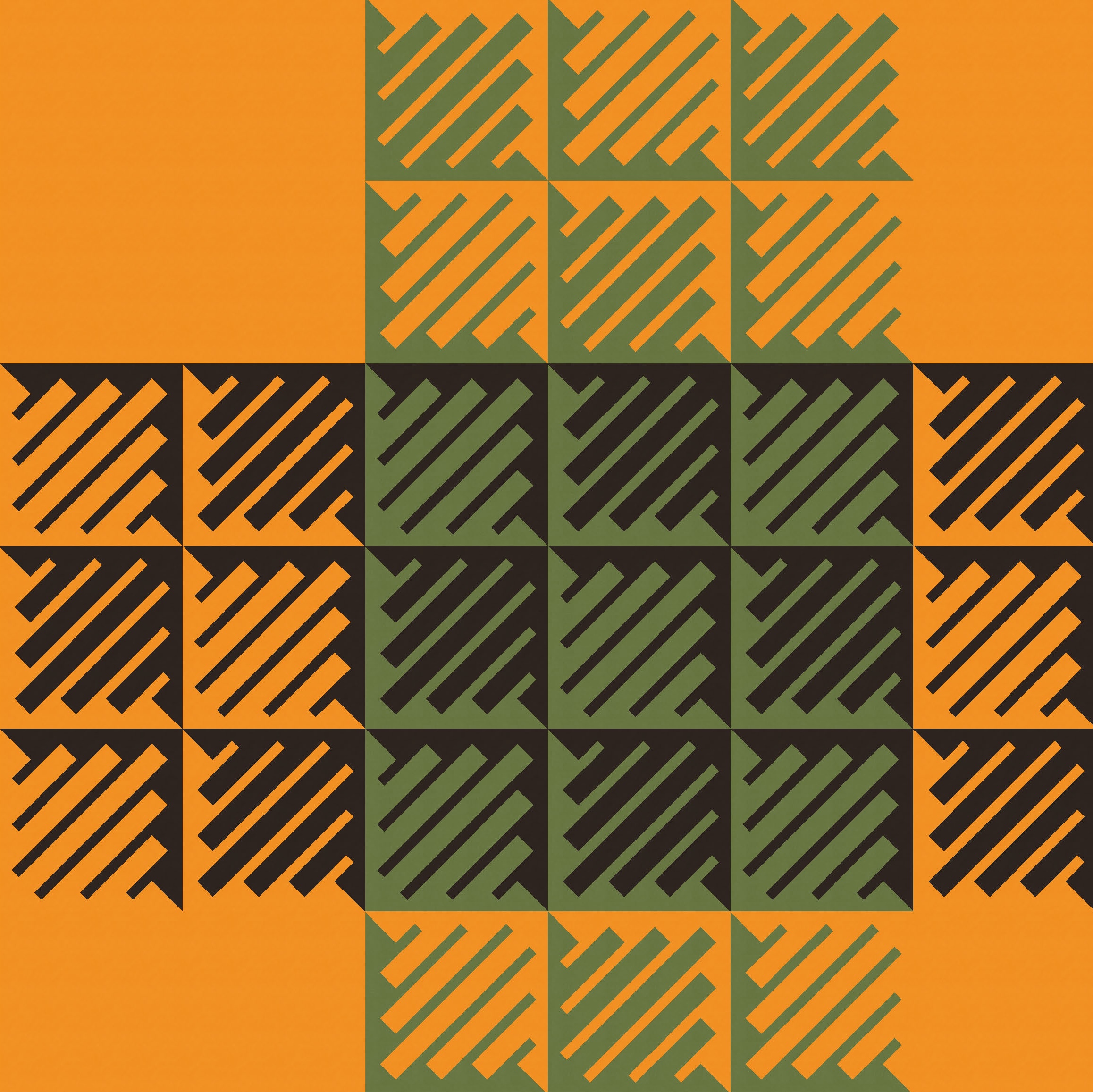

But ultimately my favourite version is the first one – a standard layout in a seven-colour palette (which is a lot for me!). I tend to go with either the darkest or the lightest colour as the background (some habits die hard), and in this case I don’t have a preference (or at least it changes every two minutes). And I like both versions of each one, where the background is used either for the thin strips or the thick ones.

To make this week’s sketch into a quilt, I think the best approach would be paper piecing. There are probably ways to cut thin and thick strips, add ends of different colours, then join them along their long edges to create the stacked diagonal bars in each block. But honestly, I think paper piecing would just be easier. I’m fairly (like 99%?) sure you could create each block from only two templates. But I’d have to try it to be completely sure. There’d be a lot of seams running parallel and perpendicular to the stripes you see here, and I’m not sure how good that would look in real life. You can tell I’m talking myself into making a block just to try this out, can’t you 🙂
Discover more from Geometriquilt
Subscribe to get the latest posts sent to your email.
