Sunday sketch #479
This week’s sketch reminds me of hopscotch – jumping back and forth between squares.
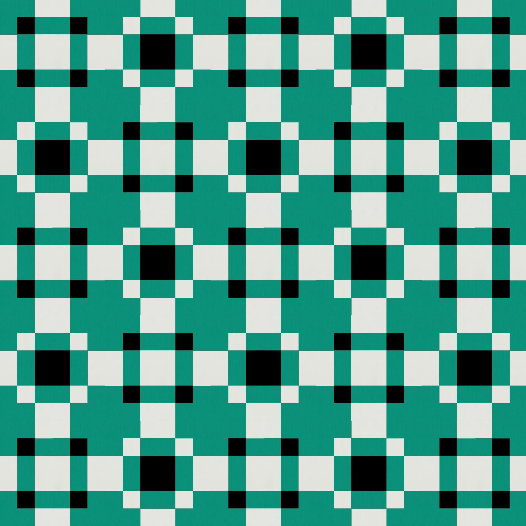
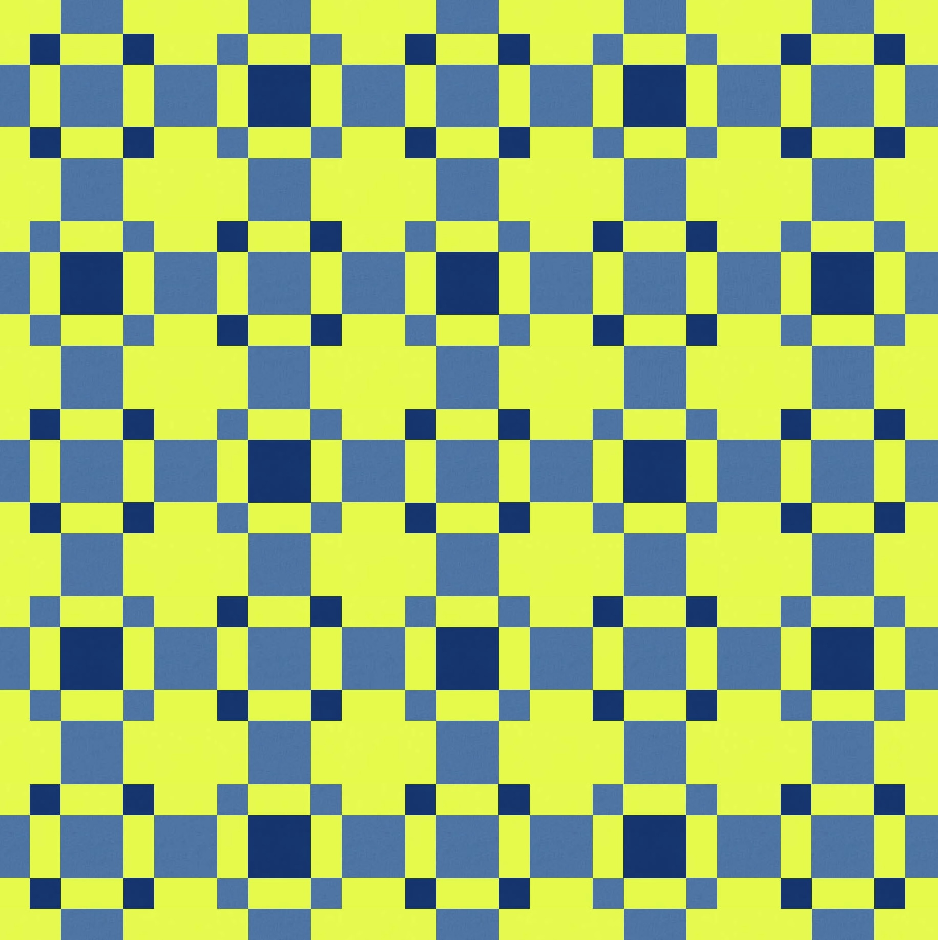
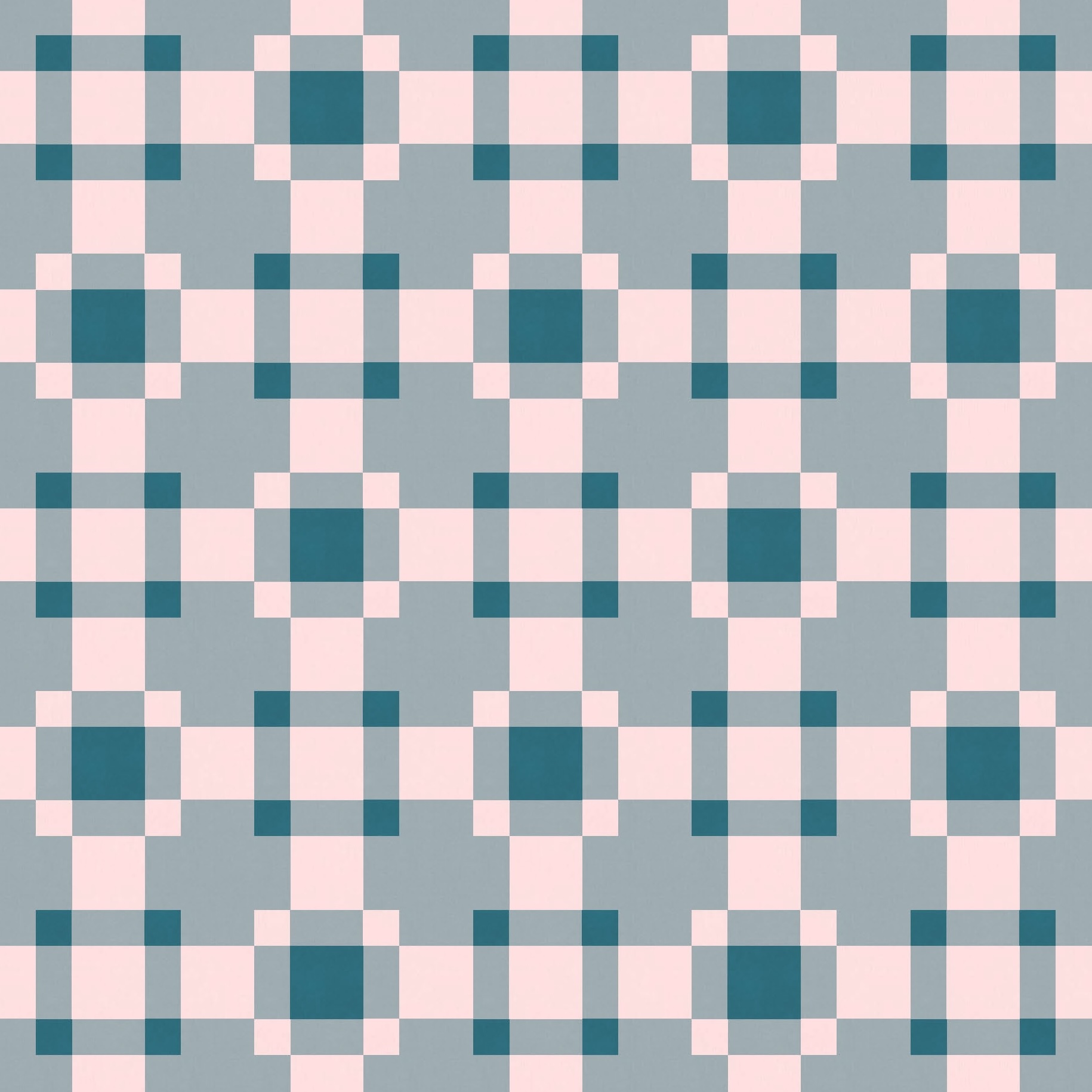
I really like that green; it’s sorta blue-y, but not too much. I guess that’s teal? (I’m not always great with colour names….)
I tried this design with a few more palettes, some of which lean into the transparency effect, and others that just benefit from it sorta indirectly.


This is one of those designs where colour placement really matters. Or, at least, it has a big influence on the overall look of the design.
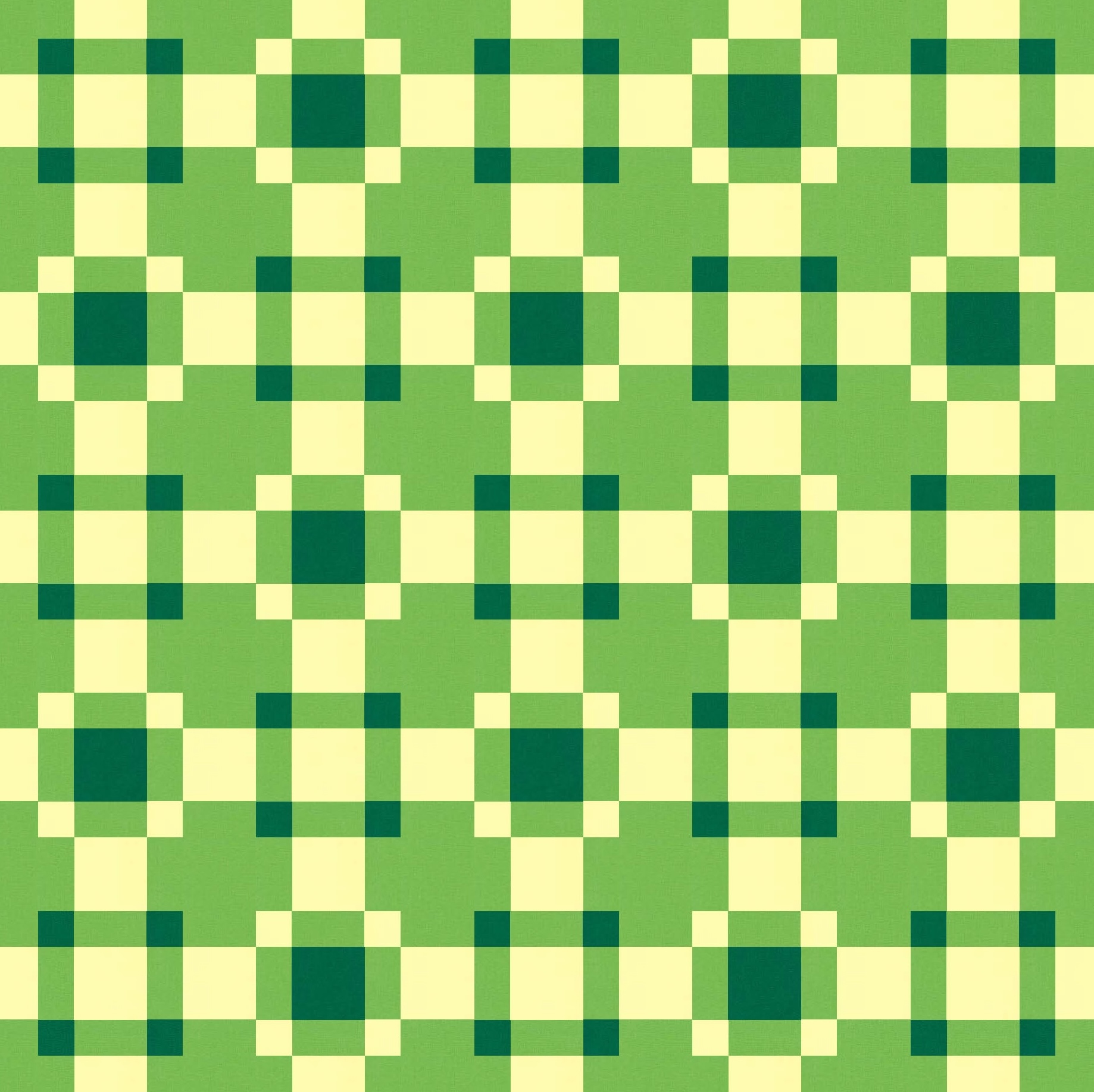
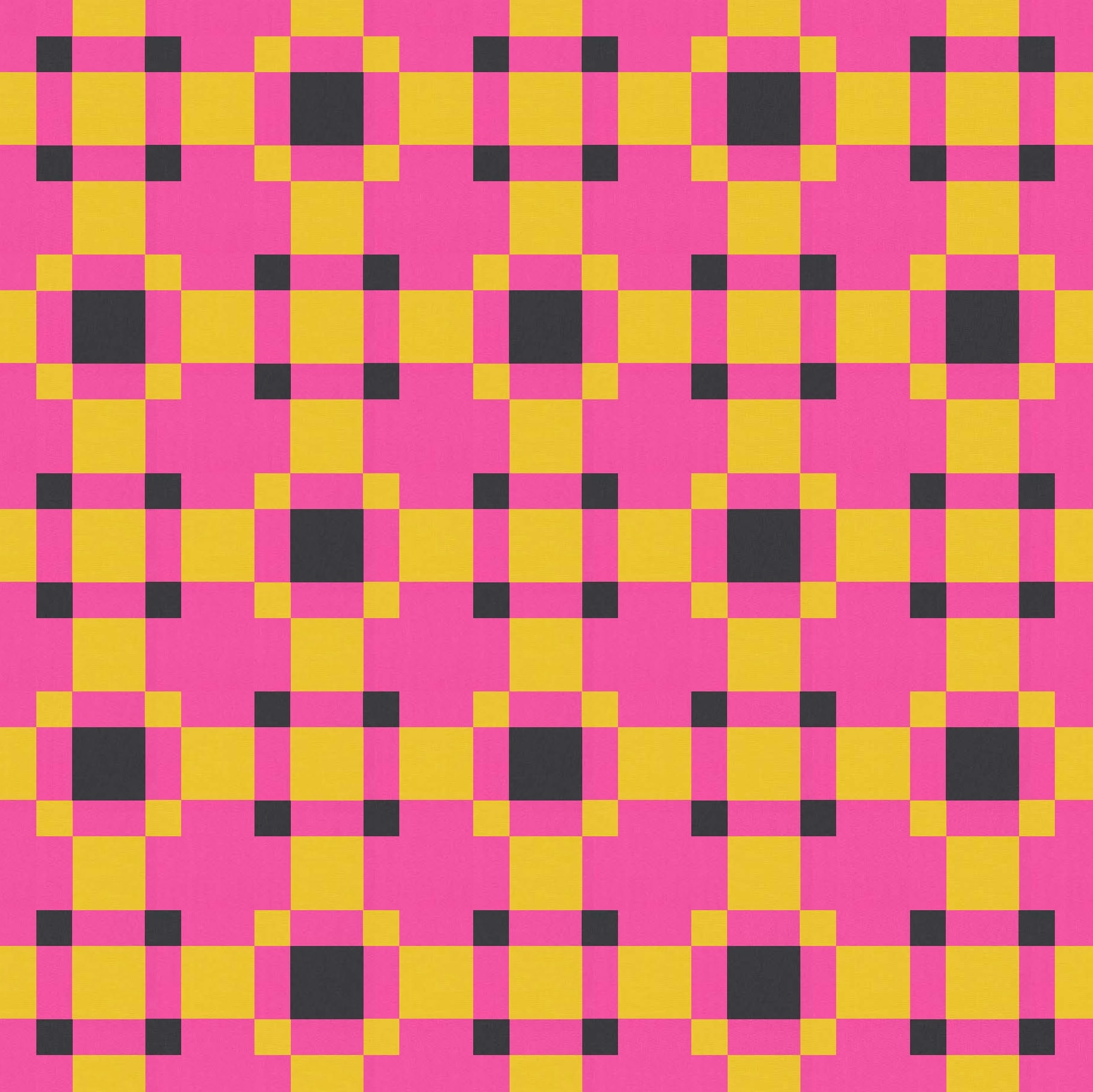
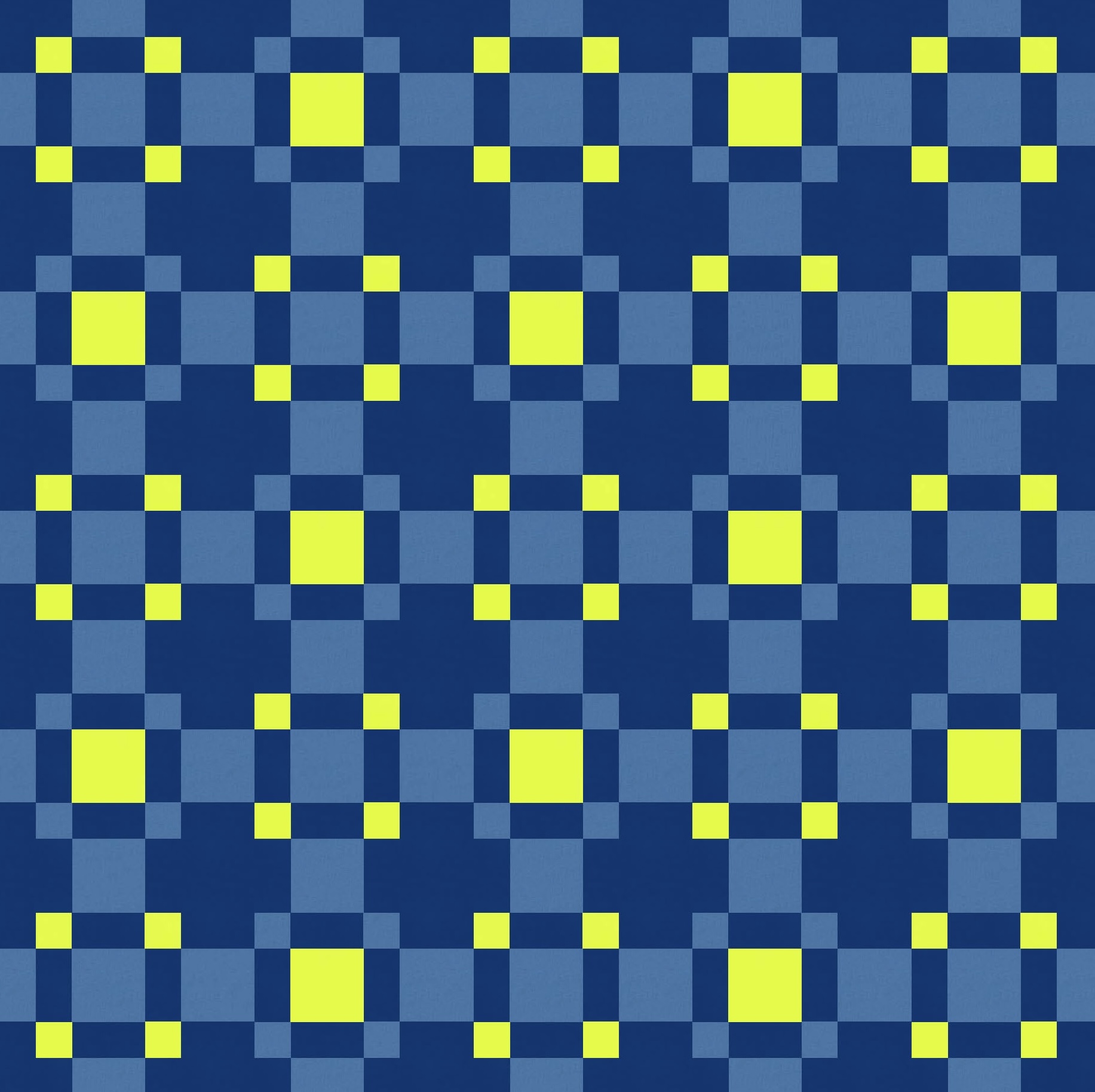
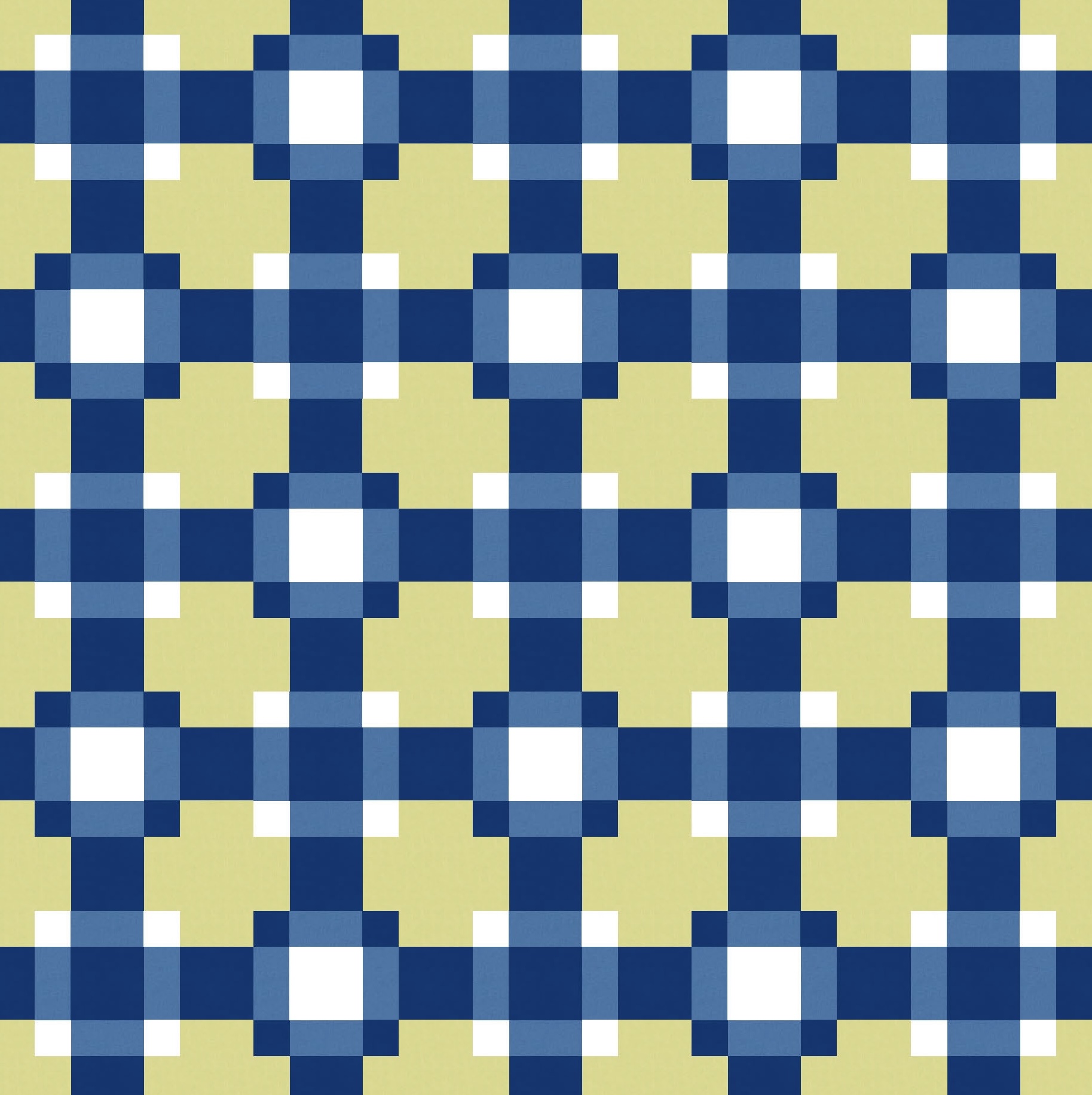
I’ve used a trio of colours where there’s a clear distinction between the light, mid-range and dark colours. And by that I mean you can tell which one’s which (I can’t always!). This design works best when the mid-range colour is used as the background colour. You get that transparency effect, and the design just has a bit more movement and feels a little more coherent.

But if you move the darkest or lightest colour to the background, the design instantly feels a little flat. There’s not as much definition to the blocks, your eye doesn’t move around the design in an orderly way, and overall the design just feels a little less coherent. A bit jumbly.

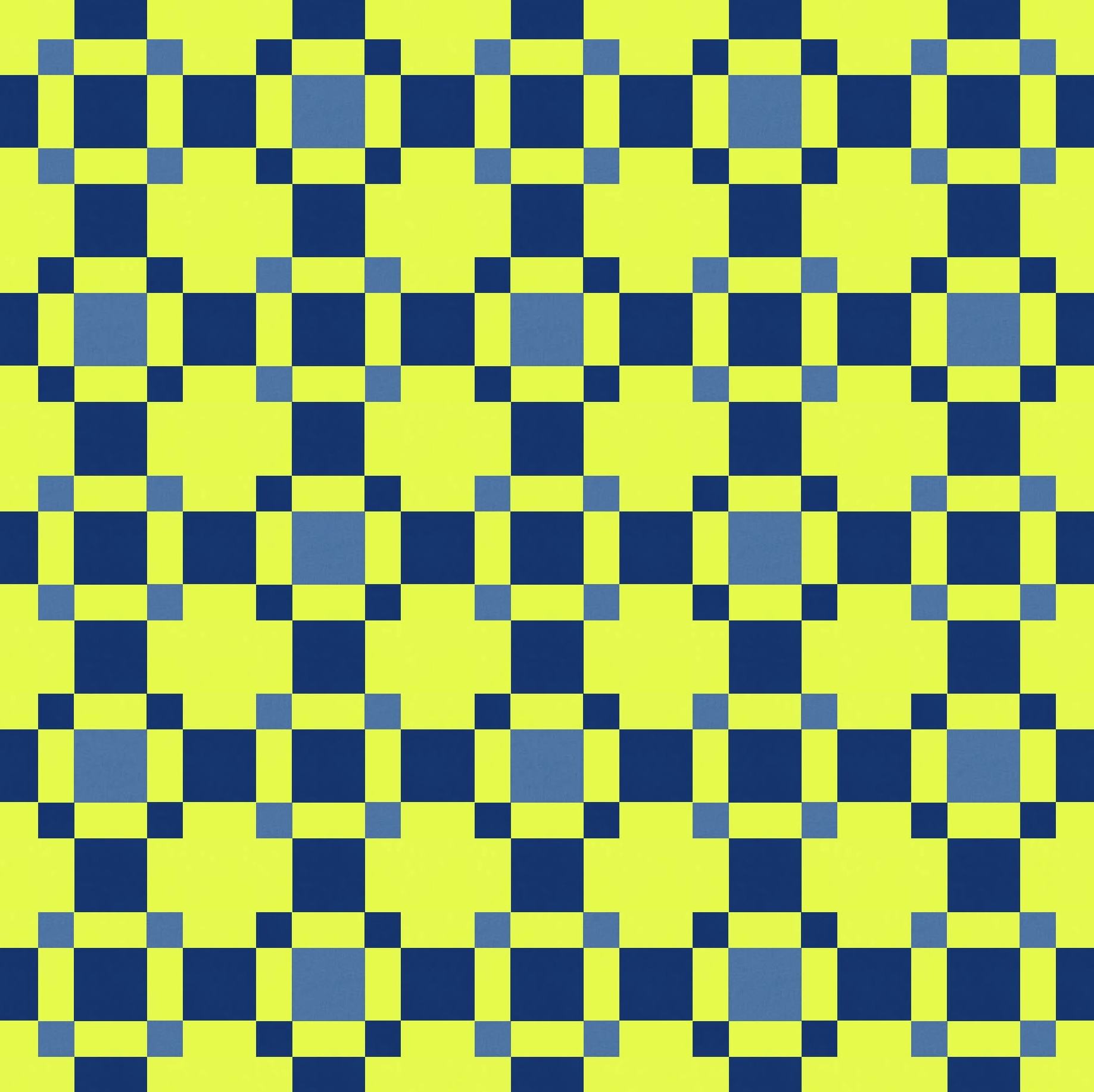
I mean, they might look OK with the right fabrics, but they’re not giving me the tingles or anything 🙂
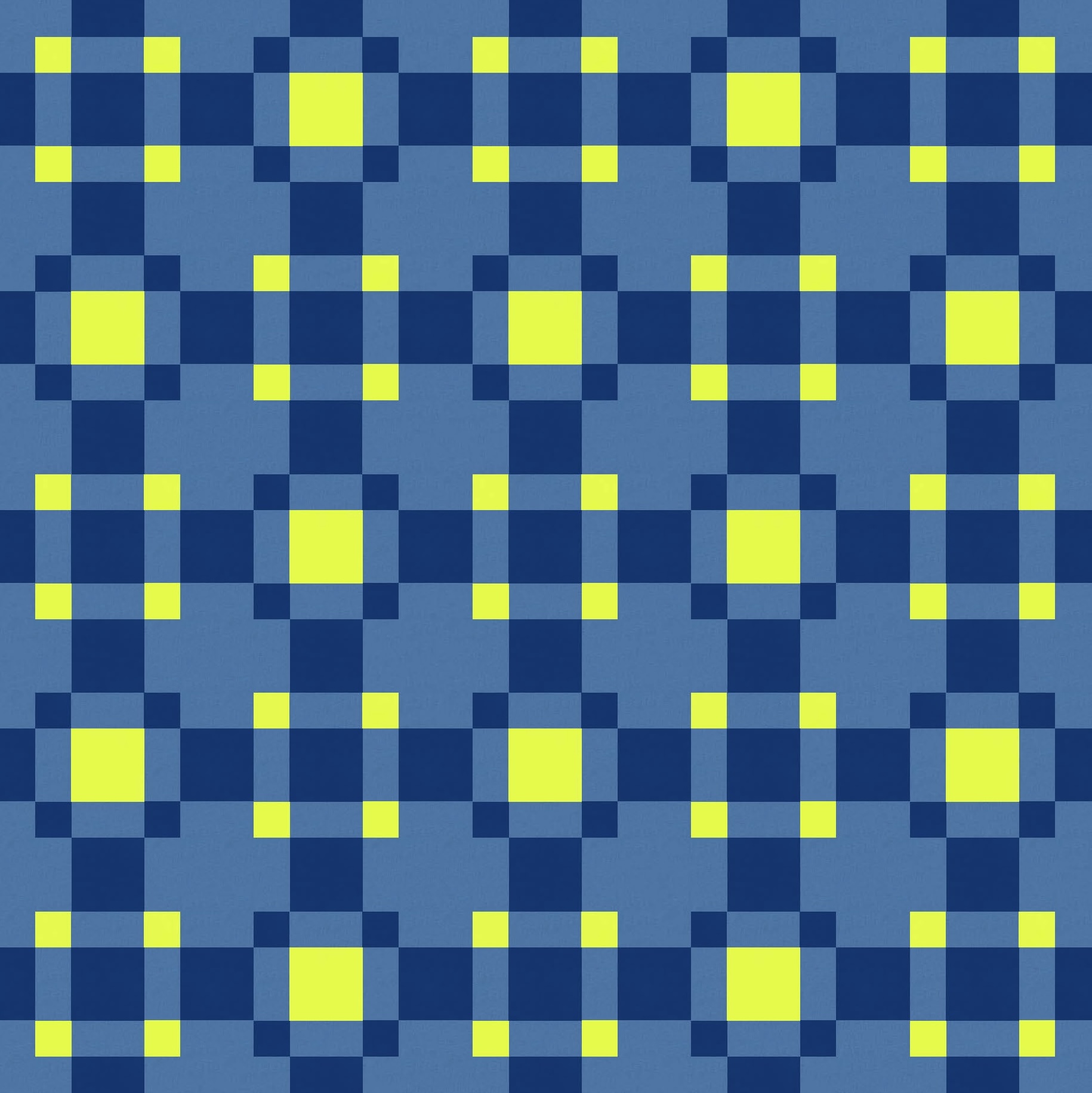
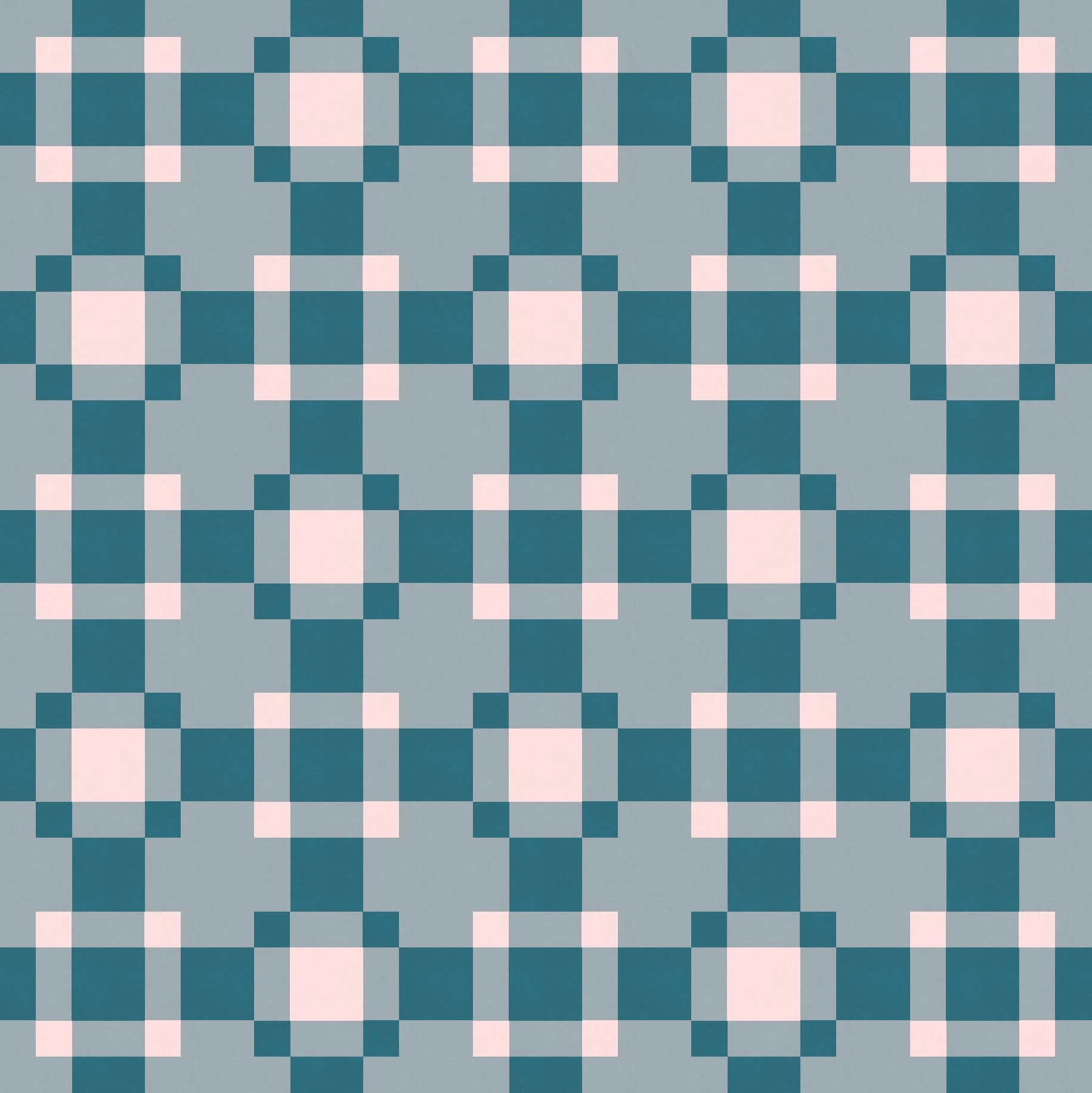
Put the mid-range tone as the background, though, and now we’re back to something a little more interesting. (With three colours, there are six possible colour arrangements – two per background colour.)
I tried the ‘Randomize’ feature in Electric Quilt 8 to try and discover some new colour palettes, but nothing great jumped out. (Despite the name, I don’t think the colours it spits out are random at all; they seem to be fed in a predictable order.) Anyway, I don’t mind this one (it’s quite mellow).
(It goes without saying that I am eagerly awaiting the next issue of Curated Colour from Tara Glastonbury / Stitch & Yarn!)
I tried introducing a fourth colour to the palette, which is easy enough.
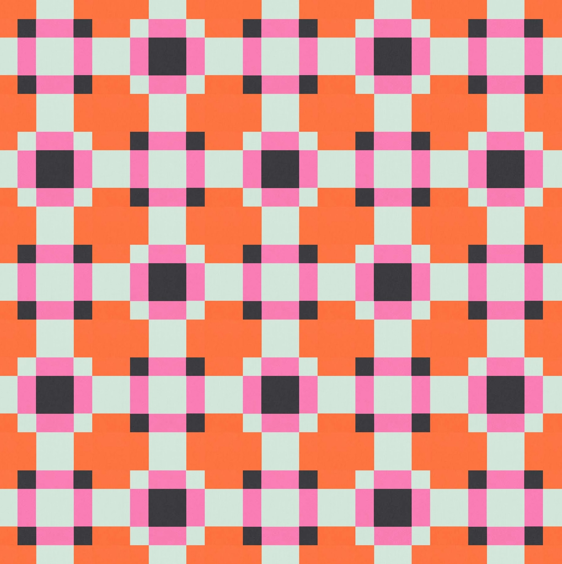
Beyond that, the design just felt like it was getting messier and less coherent. It’s a basic design, and I think it benefits from a fairly basic palette.
This week’s sketch would be super-simple to make into a quilt: it’s all squares and rectangles. I designed it as a 5 × 5 arrangement of blocks separated by wide sashing. The blocks are the 9-patches (centre square surrounded by four rectangles and four smaller squares) and the sashing is squares with a rectangle of background fabric on either side. The cornerstones of the sashing are just background squares. So you could sew strip sets to make the sashing, then just sub-cut the pieces you need.
You could alter the size of the sashing by lengthening or shortening the strips between the blocks. I’ve made it so the strips are the same size as the squares within the main 9-patch blocks. So if the blocks are e.g. 12″ × 12″ (finished), then the middle square is 6″, the side rectangles are 6″ × 3″, and the small corner squares are 3″. Then the sashing is 6″ × 12″, which is made up of a 6″ square with two 6″ × 3″ rectangles on either side. And the cornerstones of the sashing are 6″ squares of background fabric. (Note that I’ve trimmed the outer edges, so those sashing squares/rectangles there are chopped in half.)
I think the consistency between the sizes of the squares and rectangles helps to hold the design together. You may not realise it when you look at it, but it’s just one aspect that makes a design feel ‘right’ or more coherent than one where those features aren’t present. (When I type things like that out, I wonder if I’m the only person who actually believes that haha…. maybe no one else notices or cares?!)
Anyway, I think it would make a fun and simple three-colour quilt!
Discover more from Geometriquilt
Subscribe to get the latest posts sent to your email.
