Sunday sketch #454
I was all set to continue on from last week’s chunky arrow-based sawtooth stars, but then decided the designs were a little too similar to Sunday sketch #440, which I posted only 3 months ago. So instead I’m going to work with a slightly different block that follows the same principle.
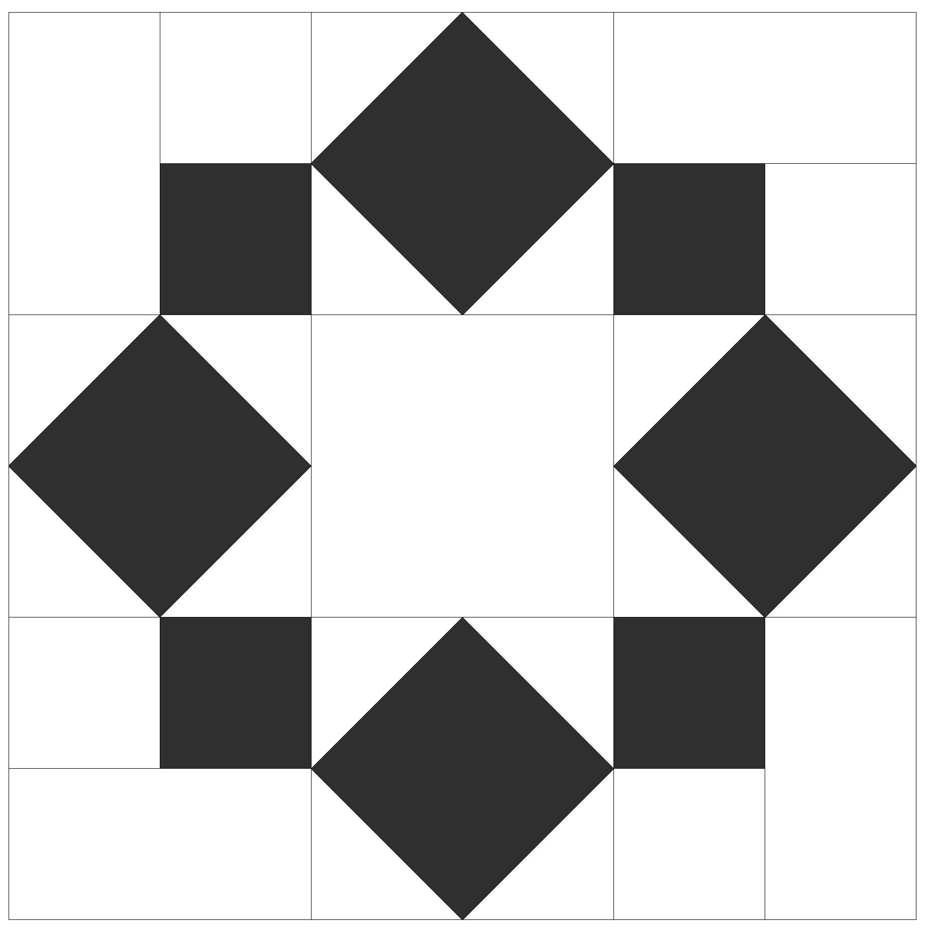
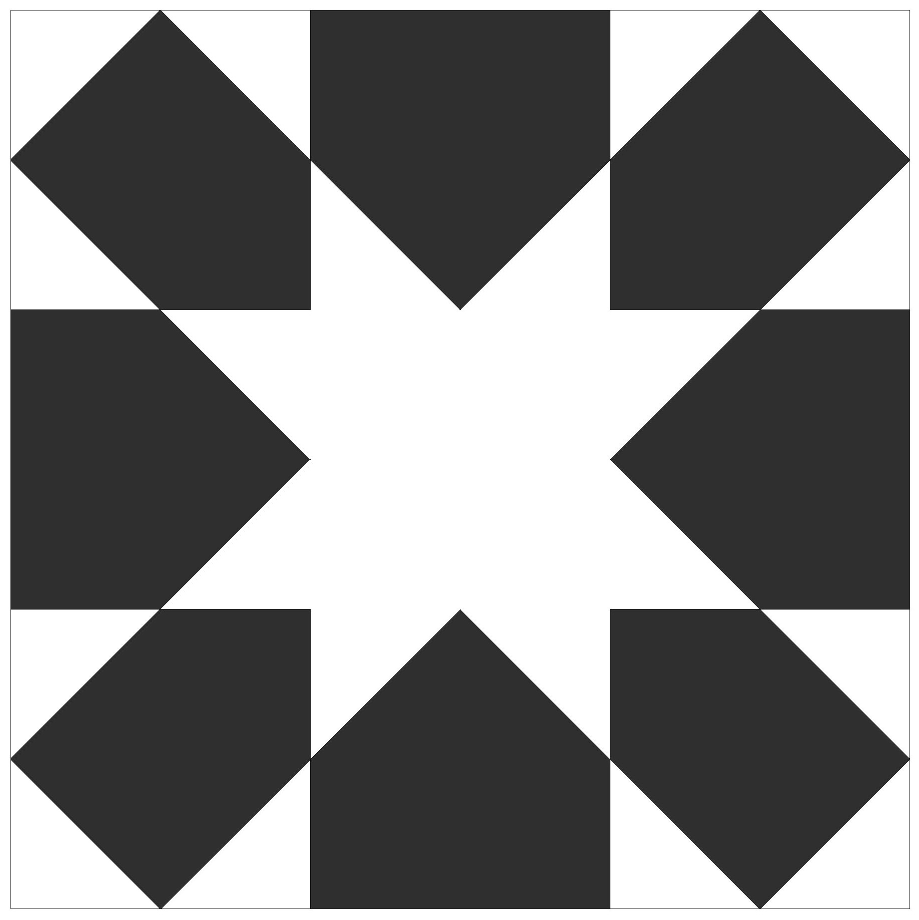
Here’s the block so you can see what I mean: a sawtooth star is formed in the space between 8 adjoining squares. (The block on the right is the sawtooth star created by chunky arrows, which is similar to the one in last week’s sketch.)
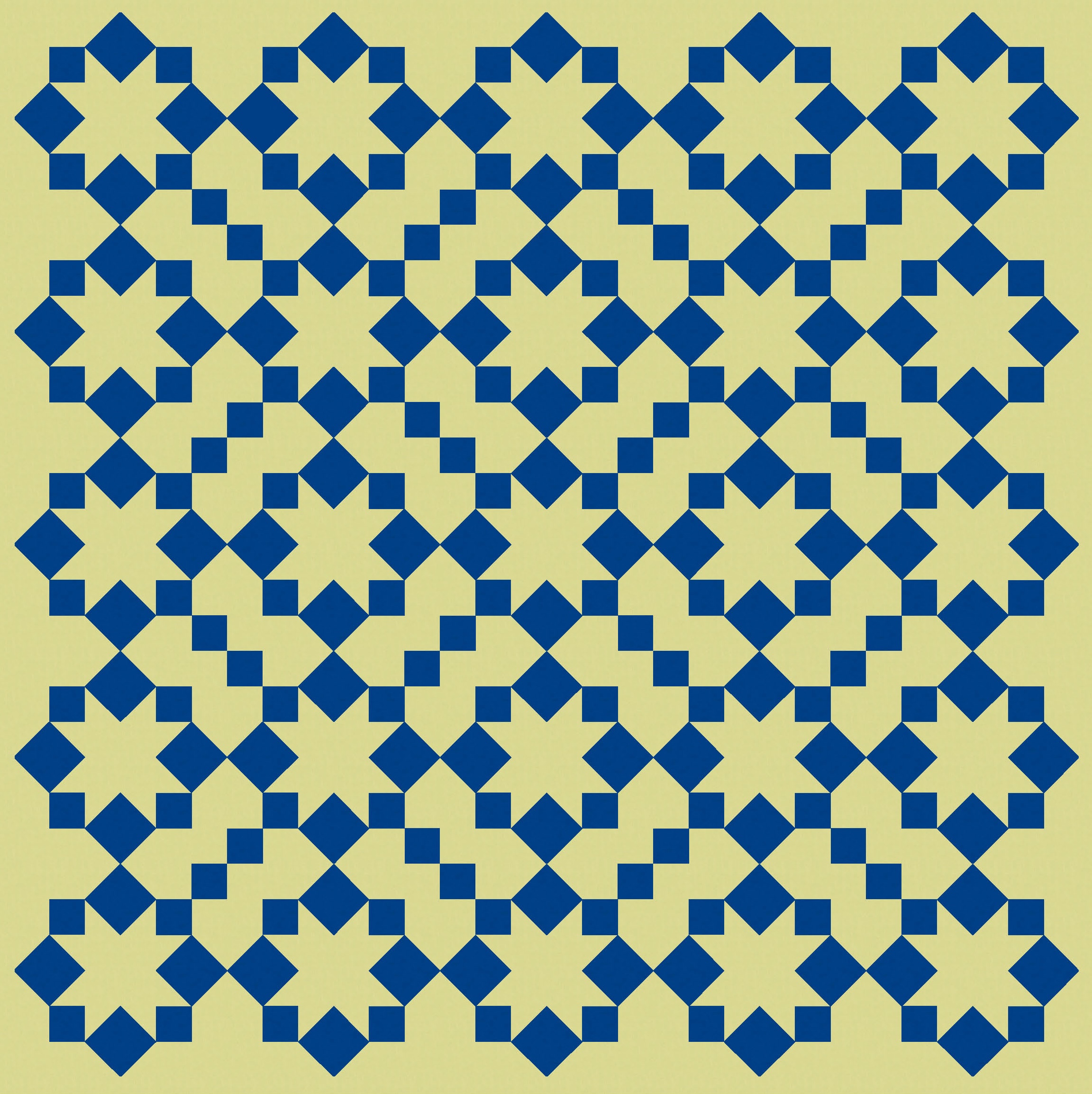
I started by repeating the blocks, which tile nicely and create cute little crosses in the spaces between. Still, it’s nothing special.

Adding some colour lifts it a bit, but I feel like the spaces between the blocks are a little too empty.
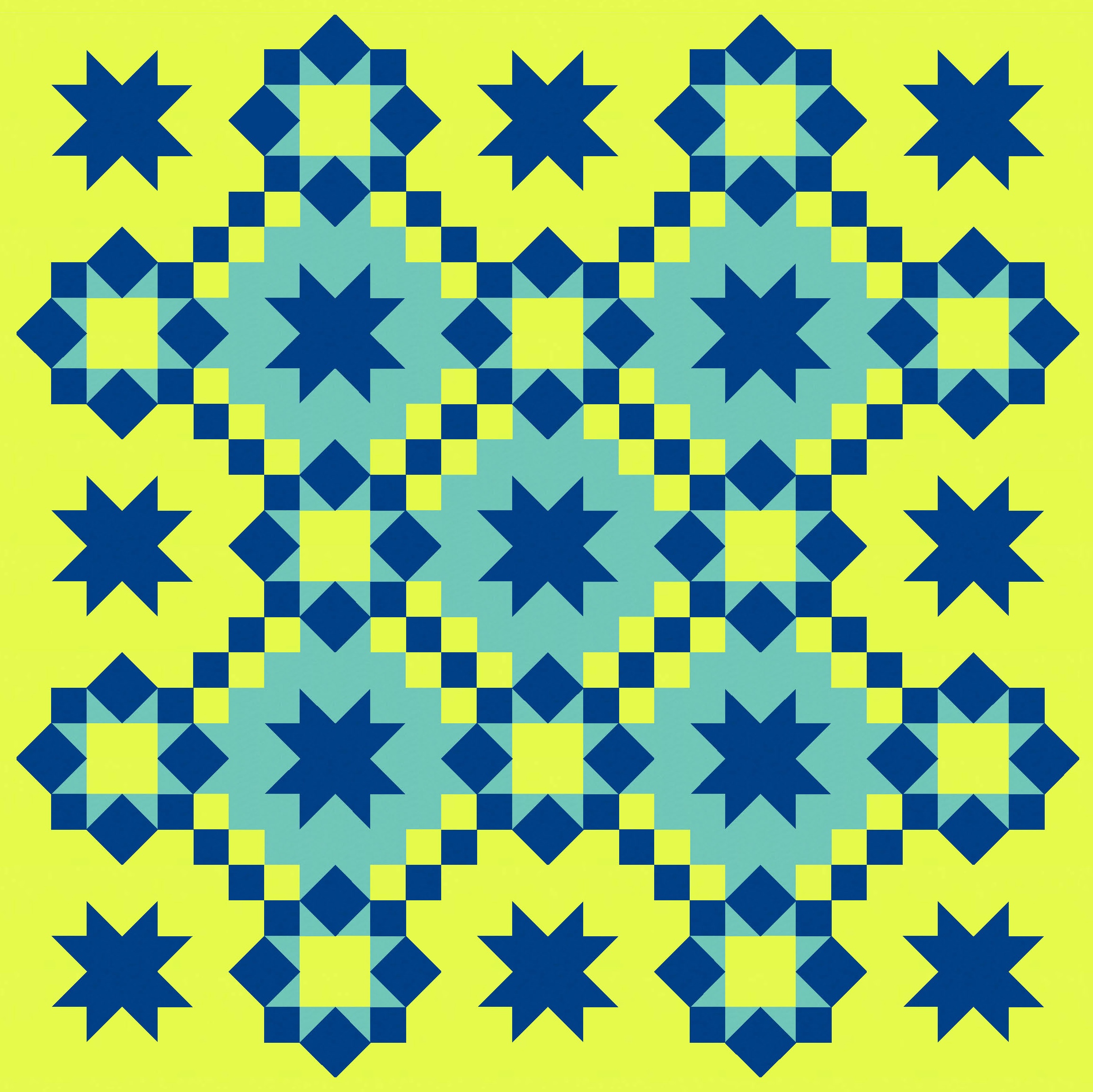
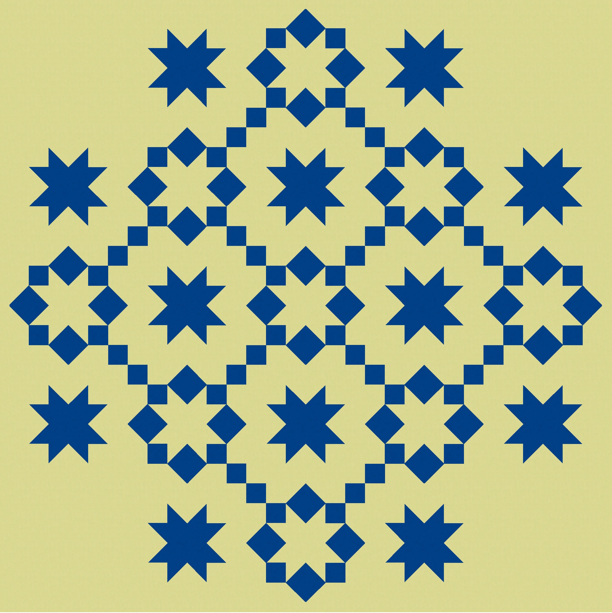
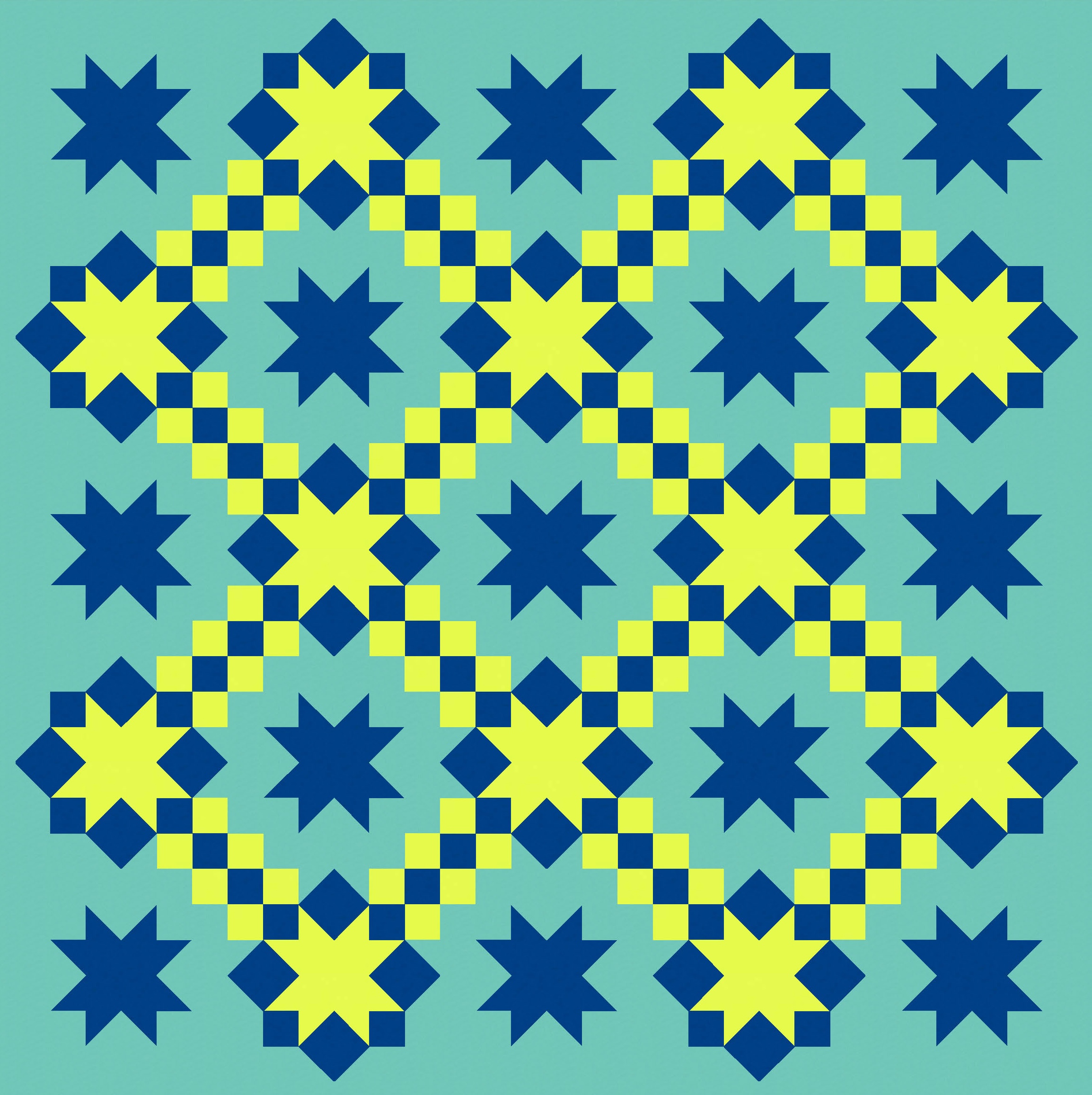
I filled the spaces by connecting diagonally adjacent blocks using the same small squares that help to form the sawtooth stars. There’s not enough space to connect the blocks in both diagonal directions – that would just create a big square from the 4 little squares that meet in the middle. Here it is with and without extra colour.
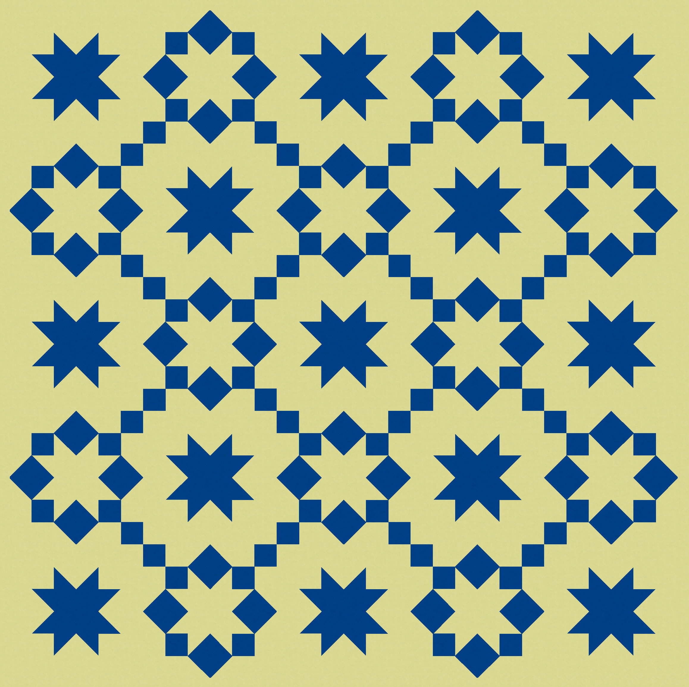
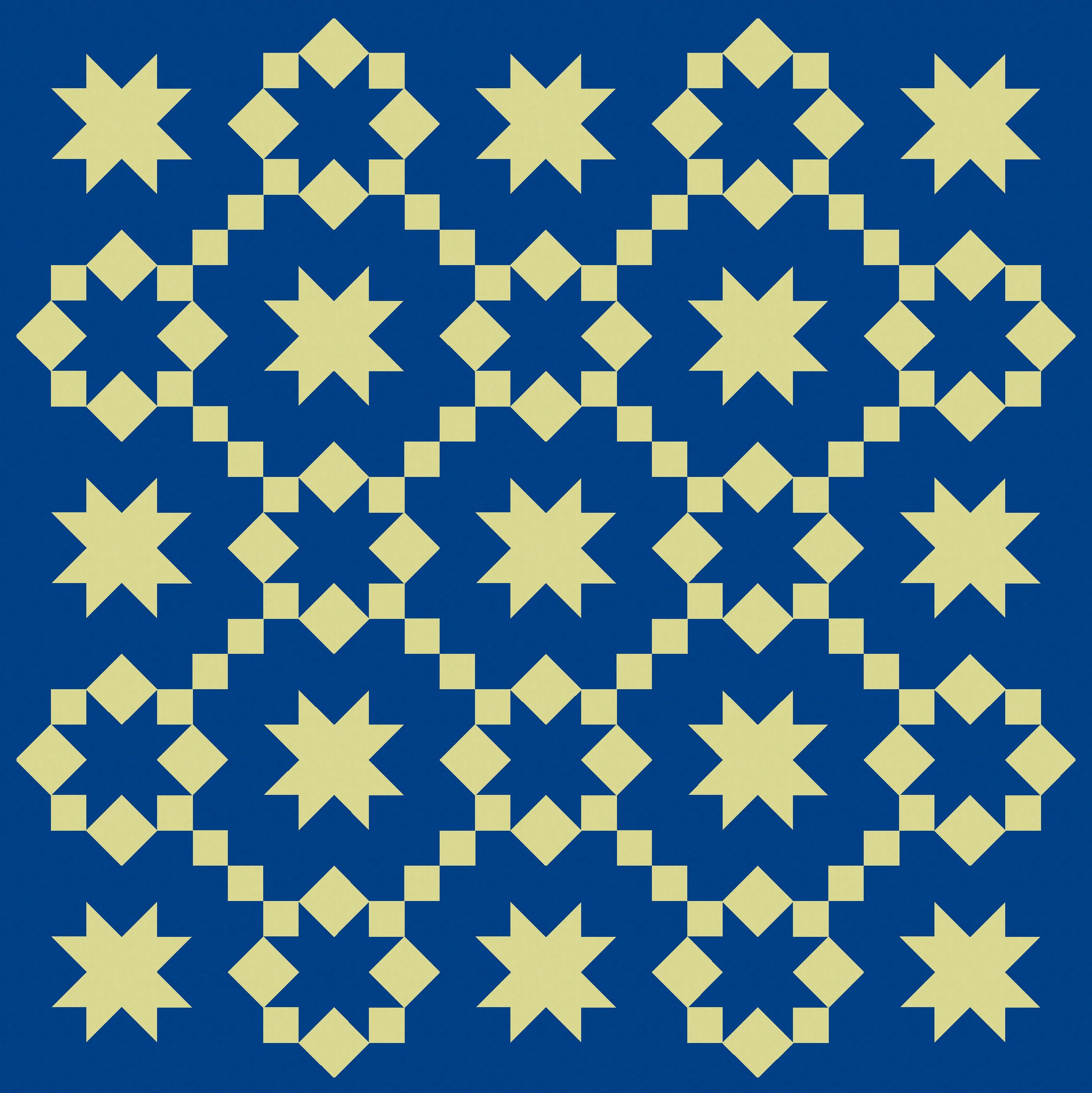
That’s a bit more interesting. I think the design on the right would work perfectly well in lots of multi-colour palettes, in solids or prints. Using one colour across all the blocks (the dark blue here) helps to tie things together while minimising busy-ness. So I could’ve stopped there. But where’s the fun in that? Let’s keep going!
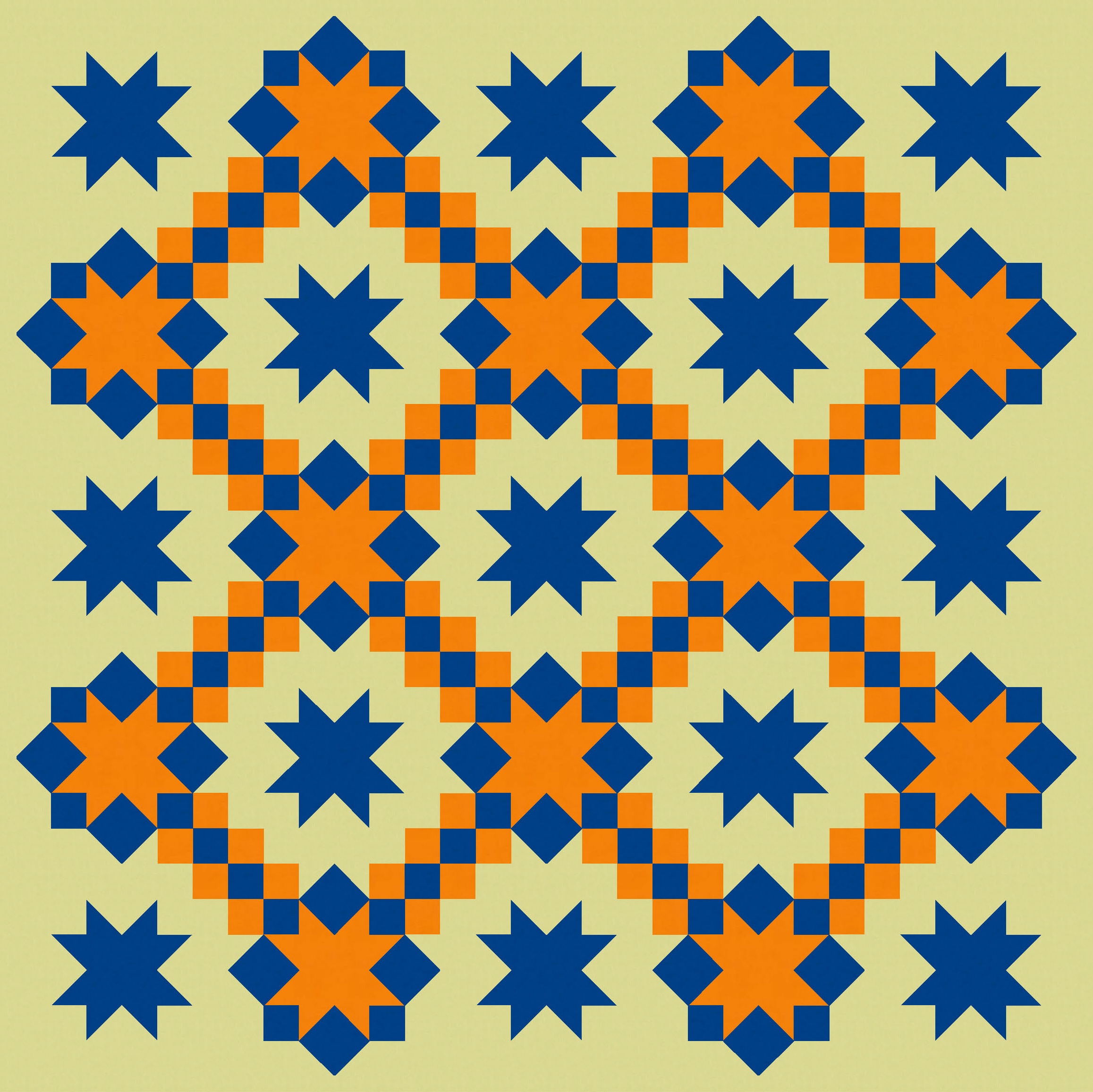
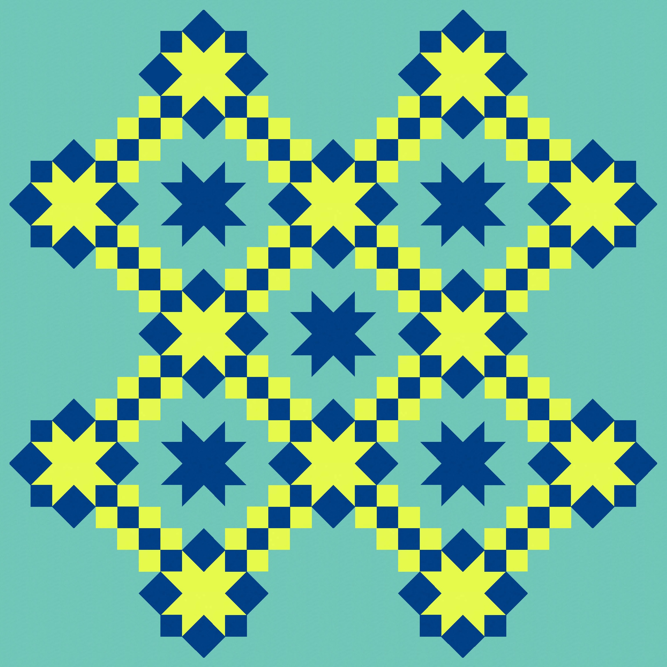
I feel like the small squares on the diagonal risk getting lost a bit, so I scaled back alternate blocks by replacing the 8 star-forming squares with an actual sawtooth star (so, the star in reverse). That helps to free up space, gives the eye lots more places to rest, and adds a bit of visual interest through the use of two different types of stars (full and empty, if you like).
I can take away elements…

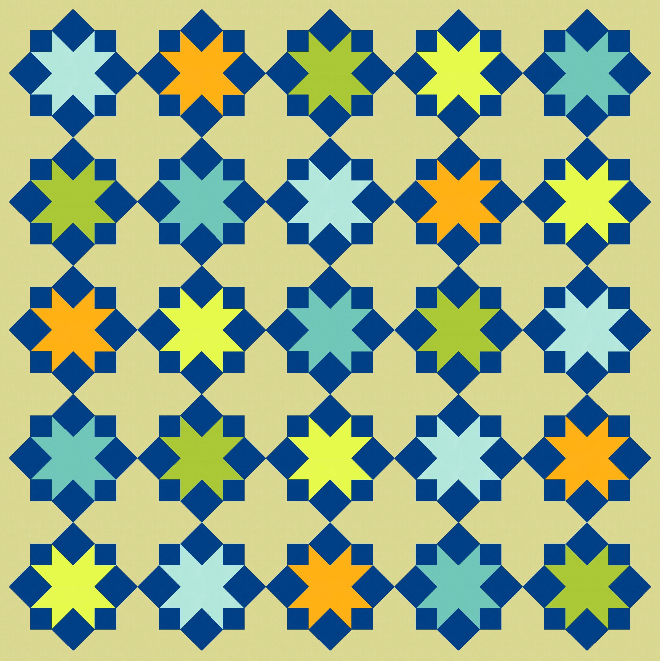
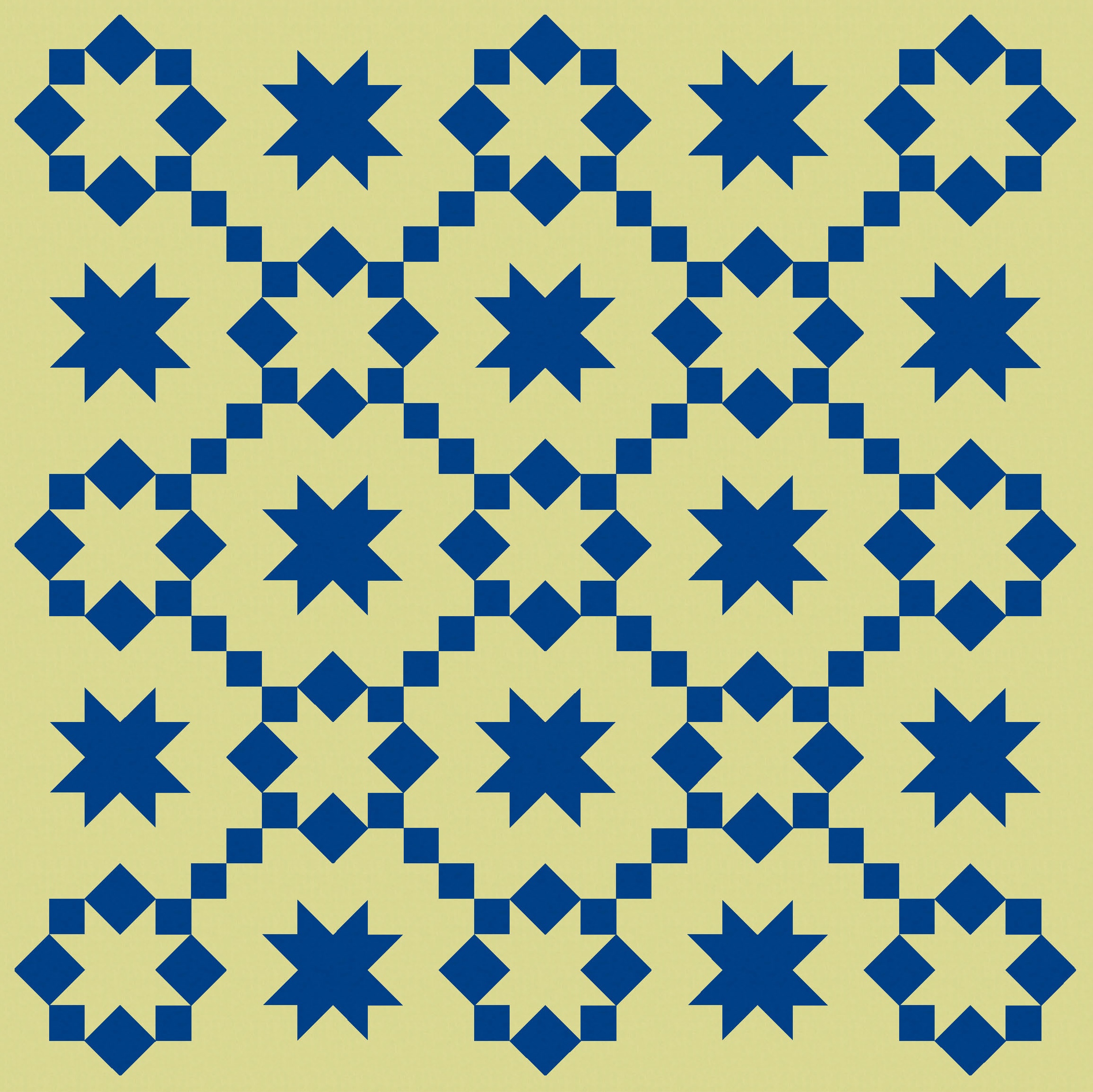
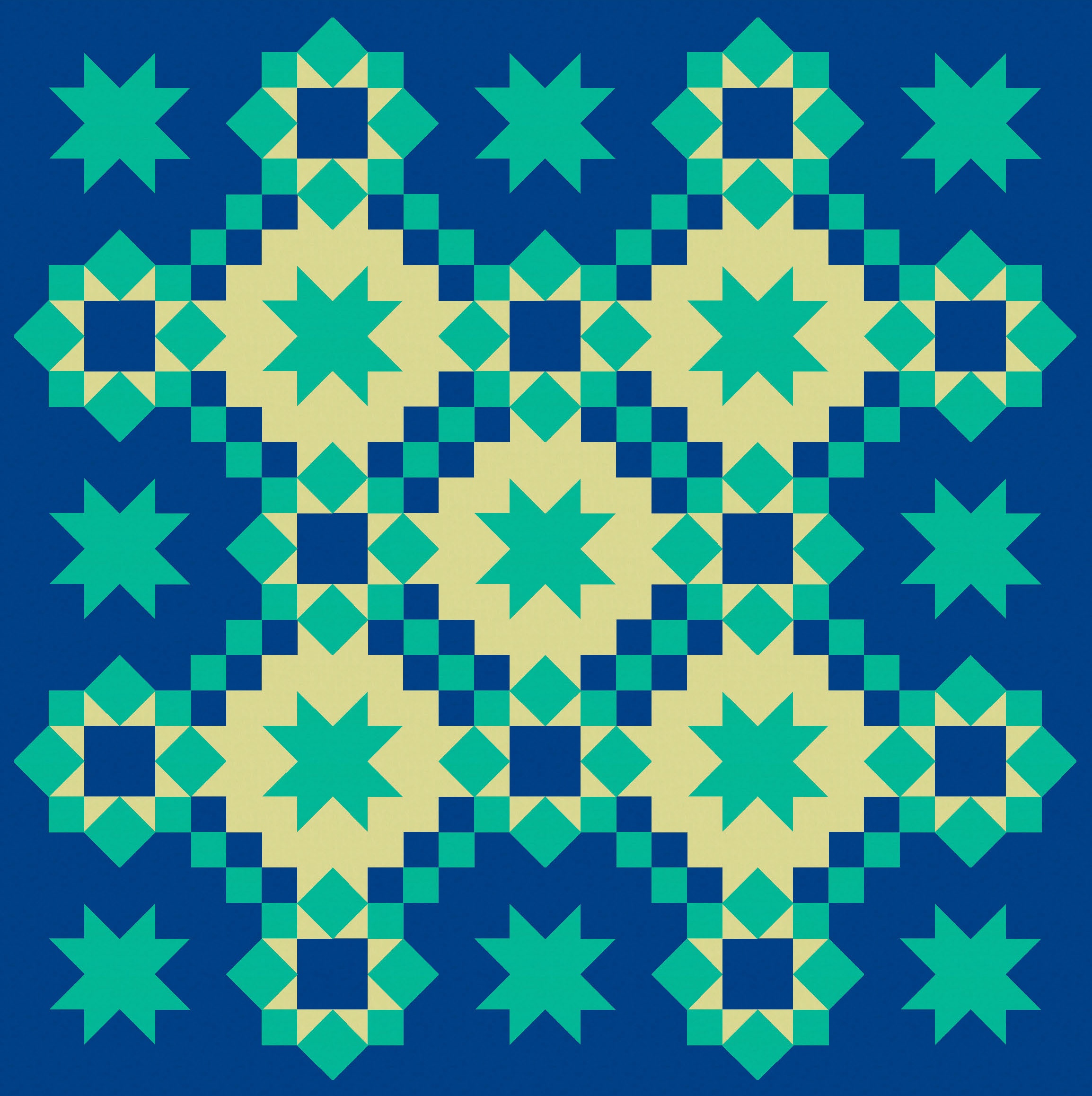
…or flip the order of blocks so the full stars appear in the corners instead of the empty ones. That also gives me 5 enclosed spaces, instead of 4, which I will play with later. (It also means I don’t have corner stars on stalks, which kinda irked me.)
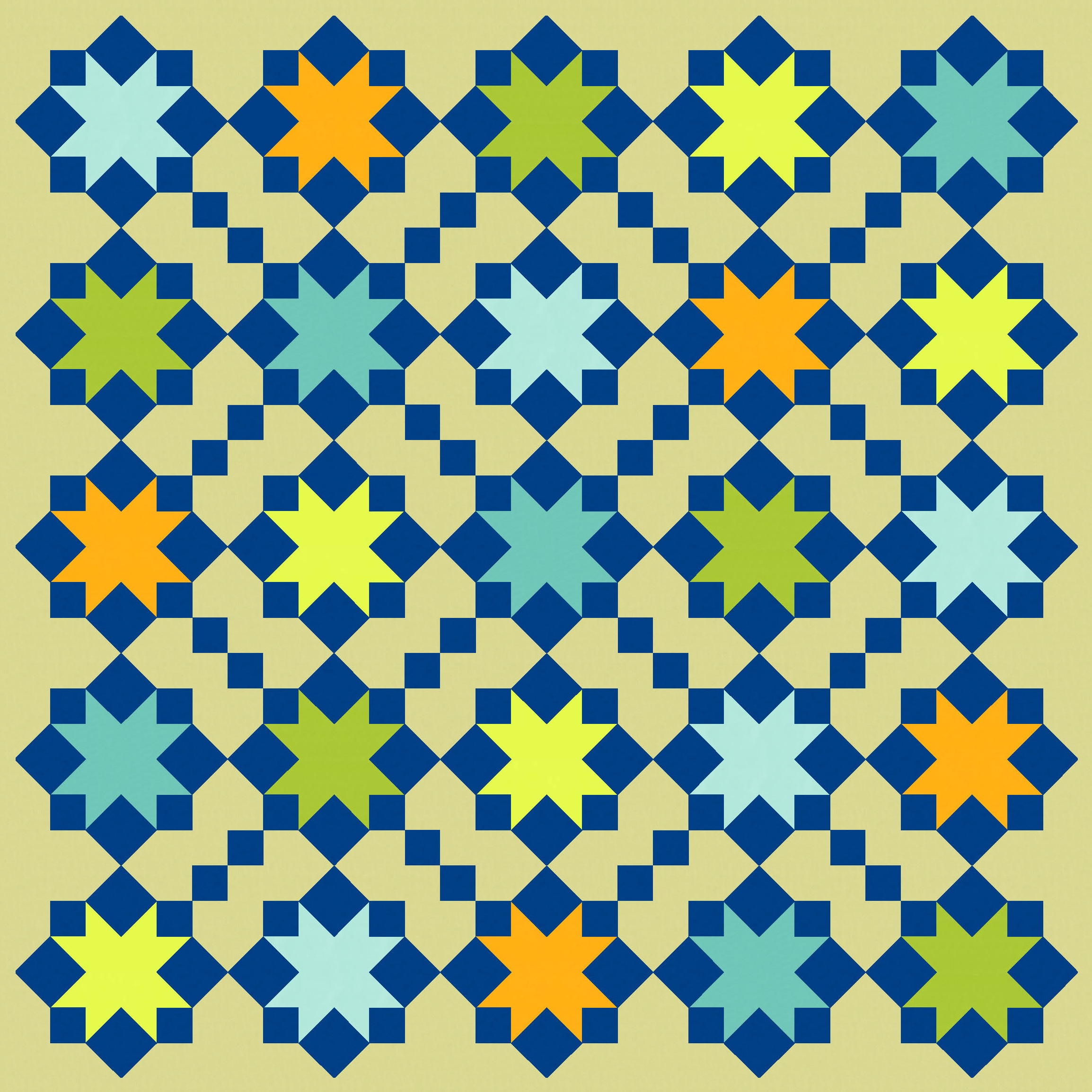
Now that I’ve got a bit more empty space, I can add colour back in and not get too overwhelmed. I feel like these versions with less ‘stuff’ actually have more movement.


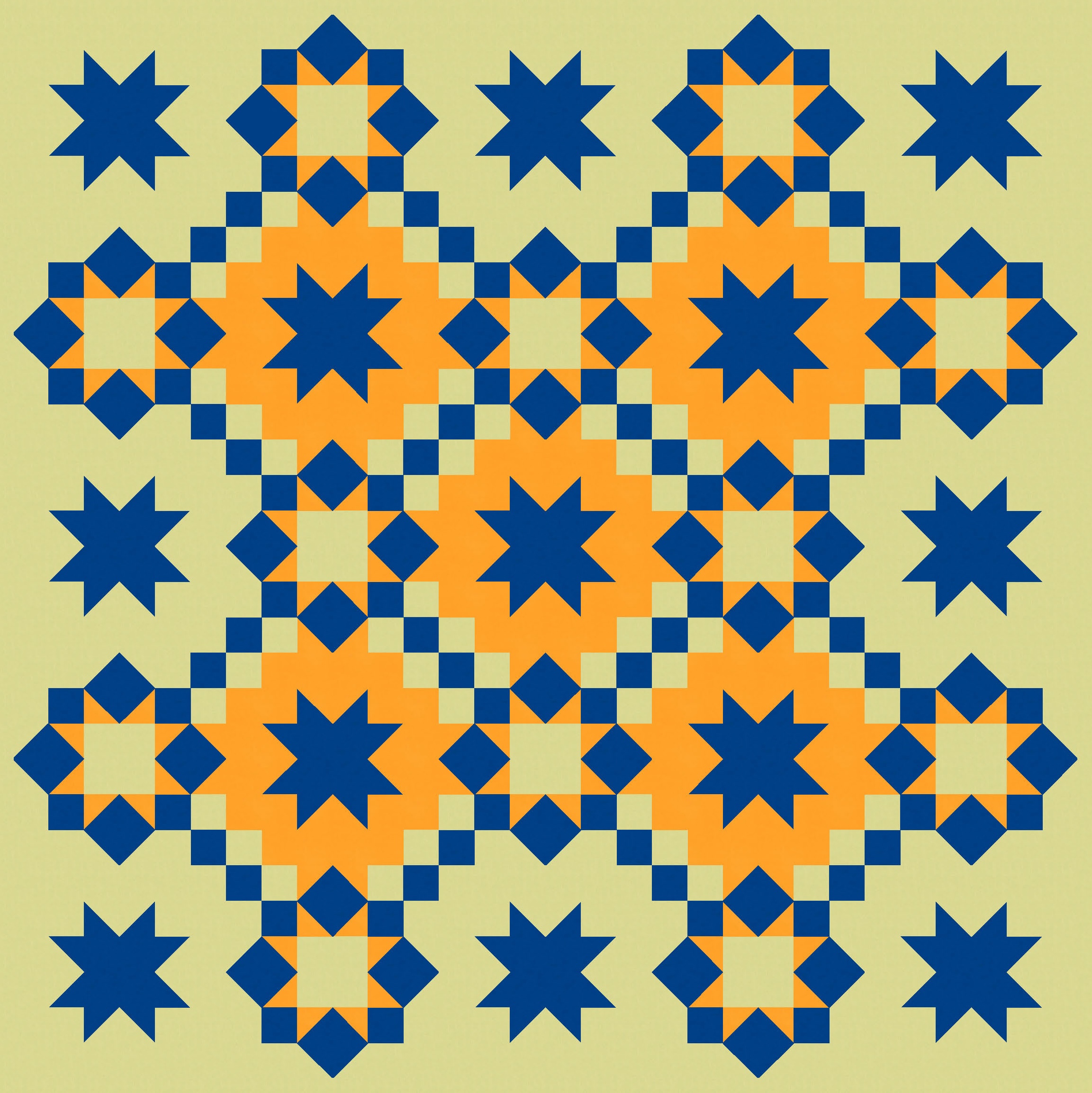
And I can colour other parts of the block; it doesn’t have to be all about the stars. These next versions would require a slight tweak to the block design I showed above: the corner units (previous featuring a rectangle and 2 squares) would need to become a 4-patch. But that’s easy enough.
I’ve limited myself to 3 colours here, but you could probably add a few more without too much difficulty. There are lots of elements within each block that could take on colour.
The version on the right here shows those 5 enclosed spaces more clearly – when the order of the blocks is switched in this layout, there are only 4 of these spaces.
Anyway, back to some different colourways.
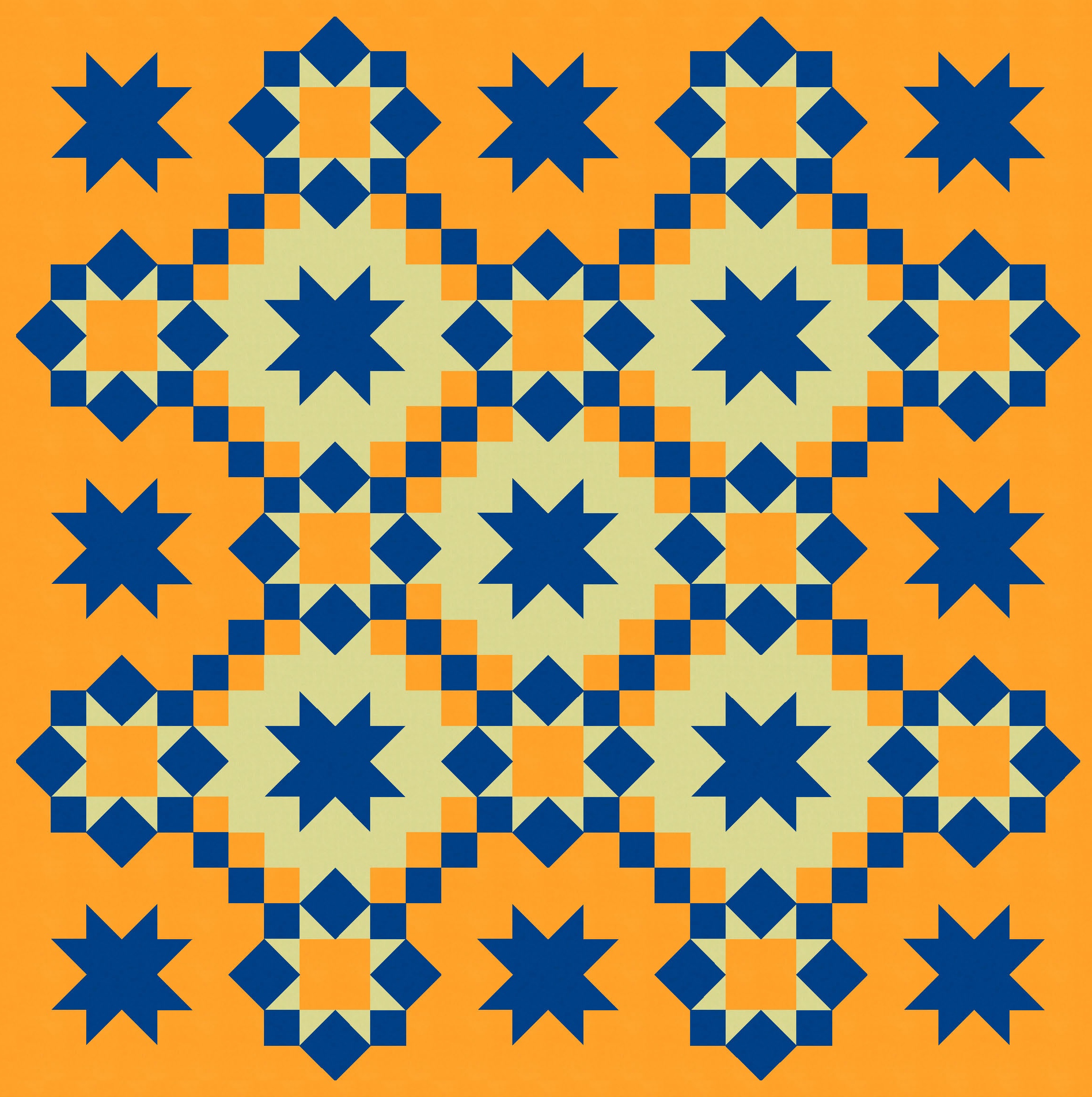
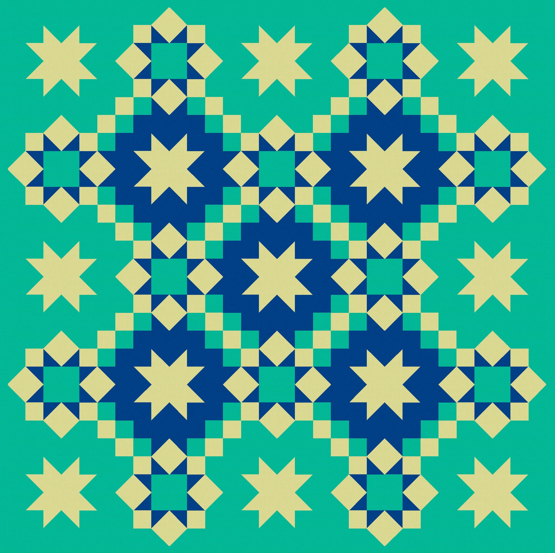
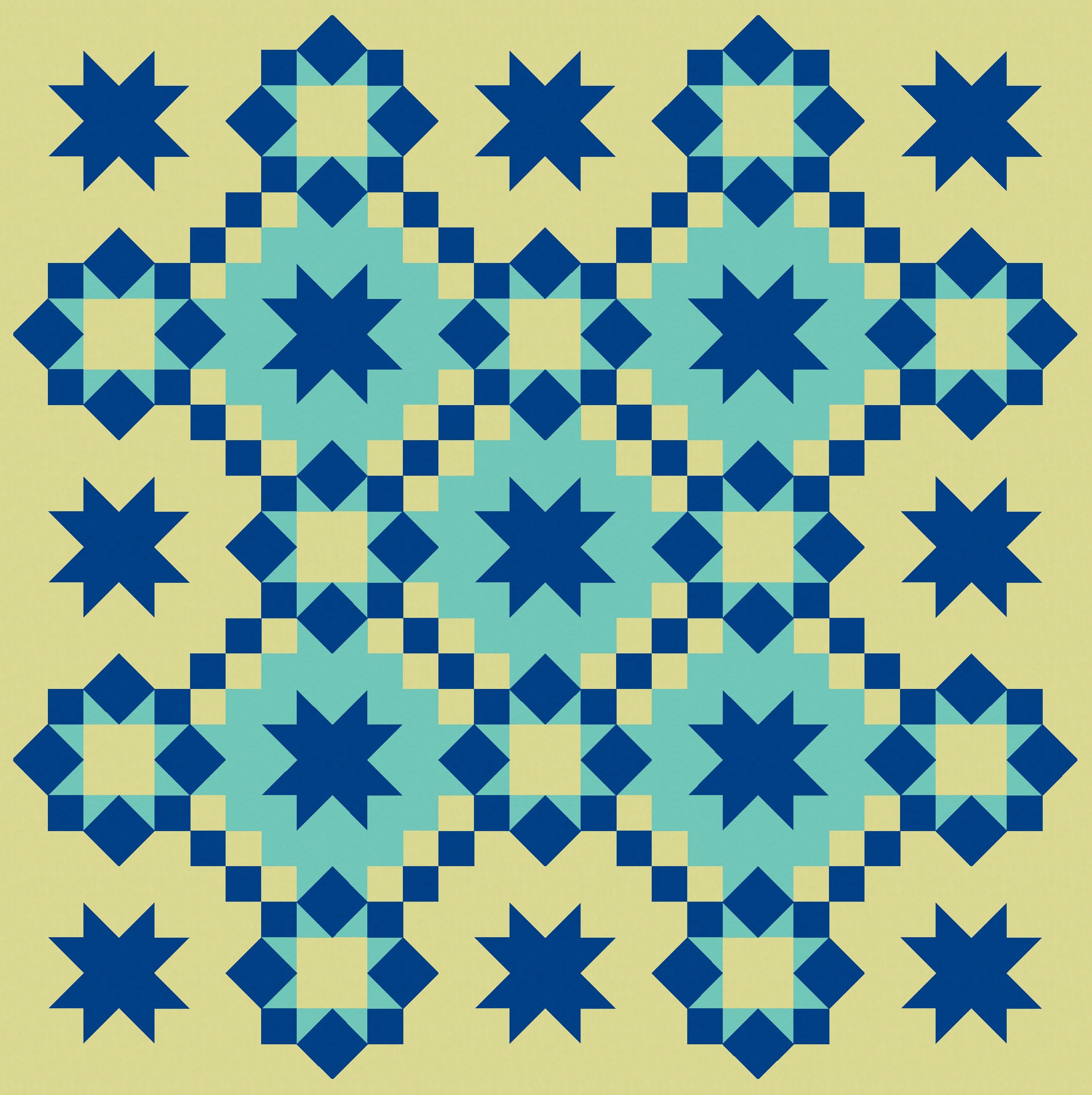
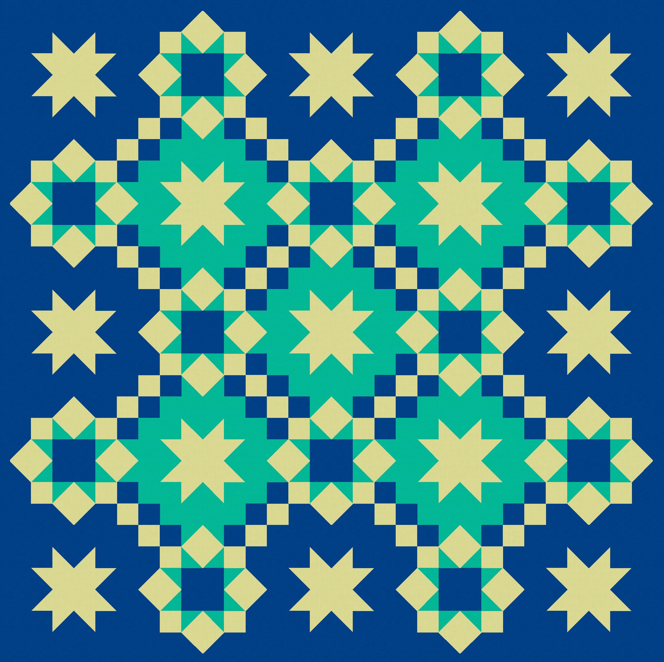
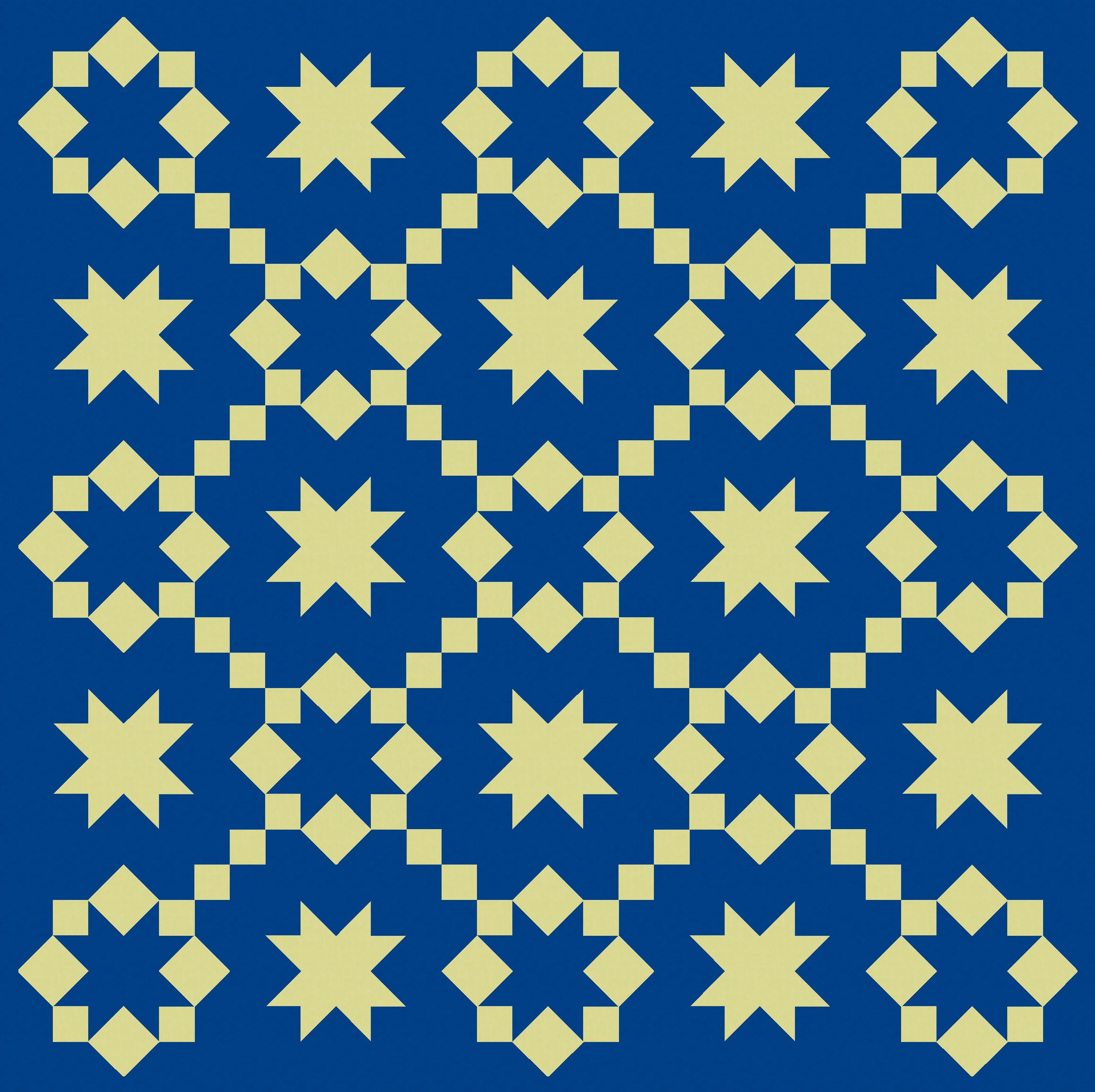
I think there are enough common elements across this design (the star shapes, the consistent colour across all blocks) to keep things under control. (But that’s not to say you couldn’t do a maximalist version with a million colours and less consistency!)
As explained above, the basic block used 8 squares to create the sawtooth star, so you’d make this quilt using squares, square-in-a-square units, half-square triangles and more squares. You could save a bit of time by using flying geese instead of half-square triangles to make the sides of some of the sawtooth stars. Probably the most time-consuming part would be choosing your colours! (Don’t I always say that?)
Discover more from Geometriquilt
Subscribe to get the latest posts sent to your email.
