Sunday sketch #448
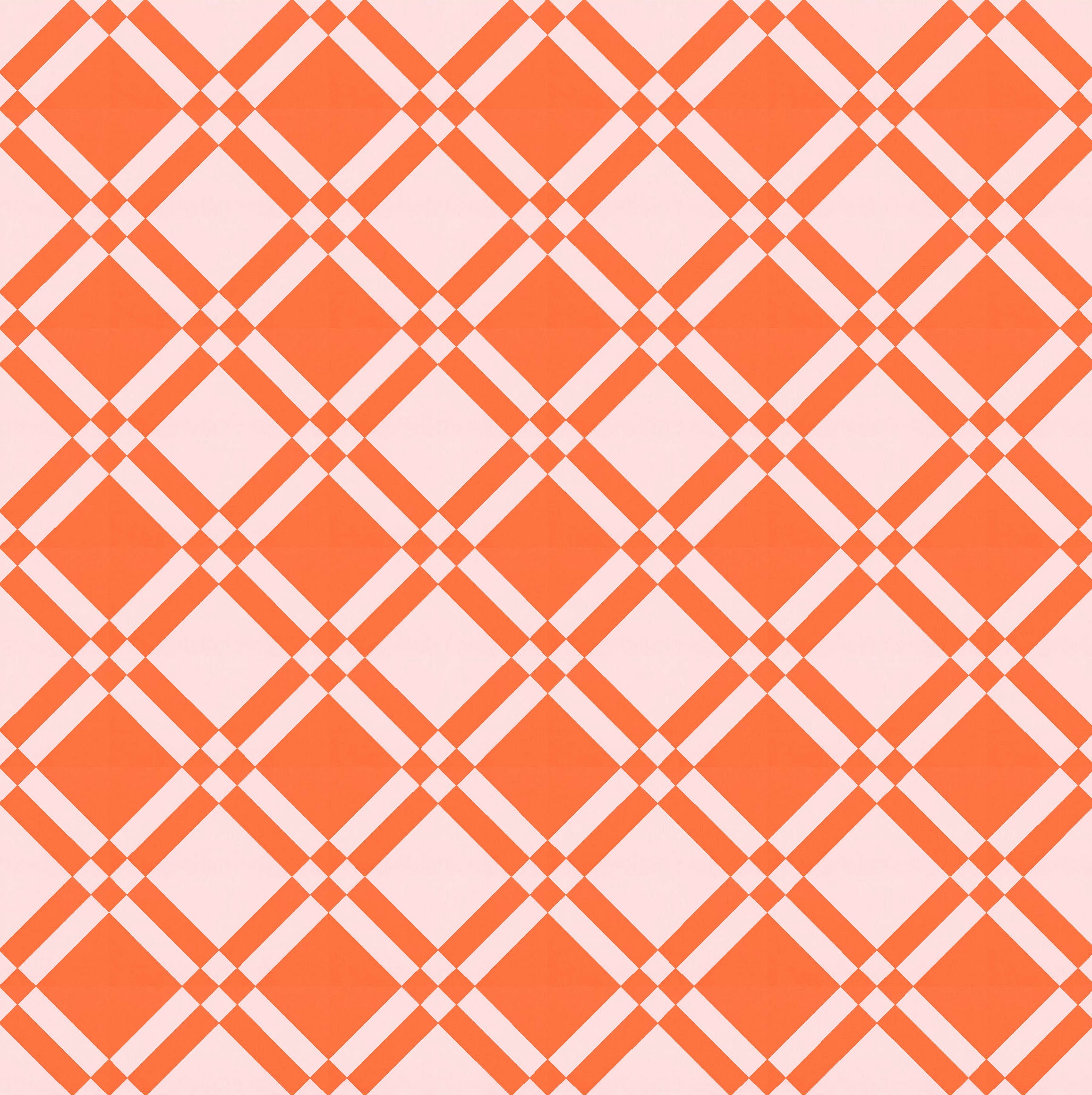
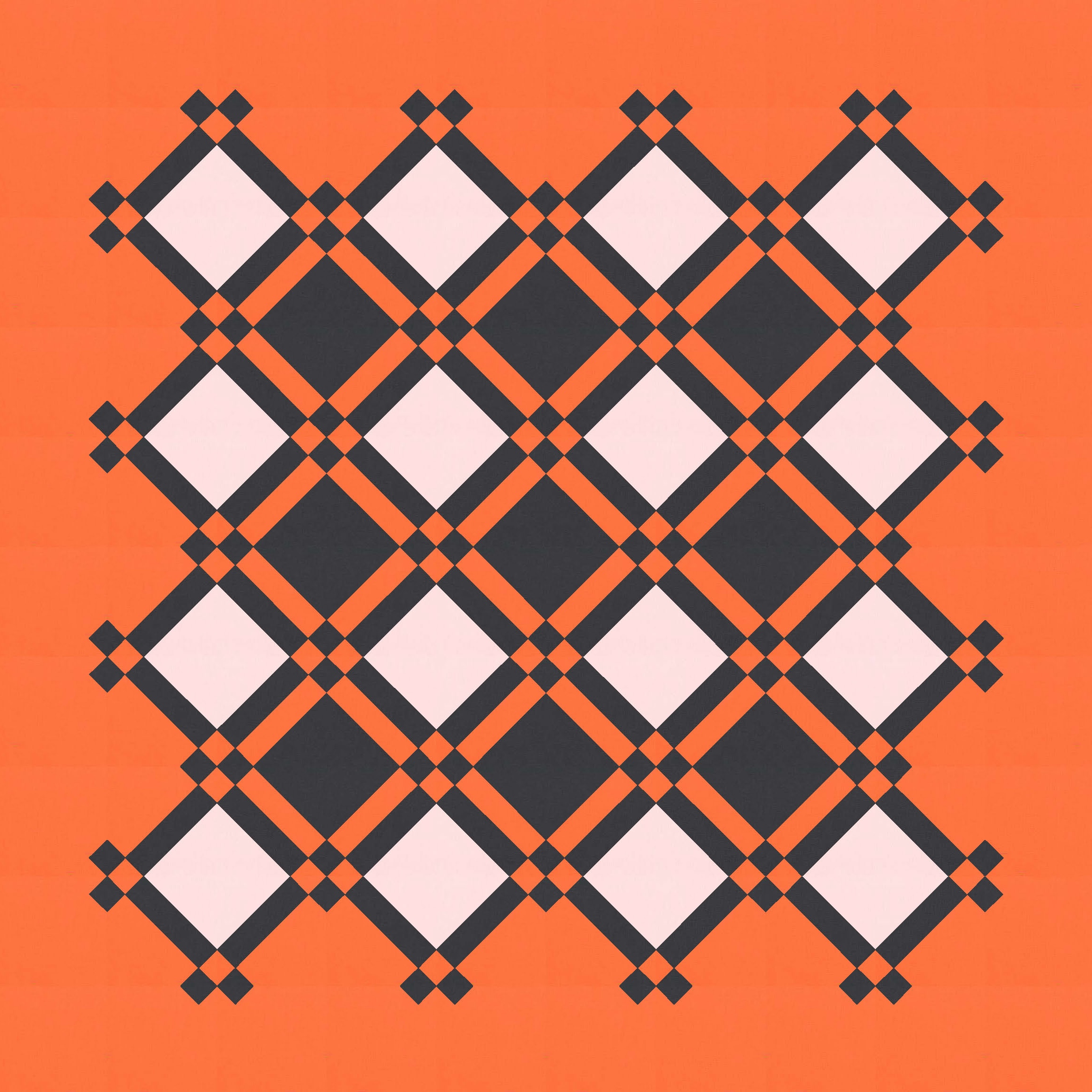
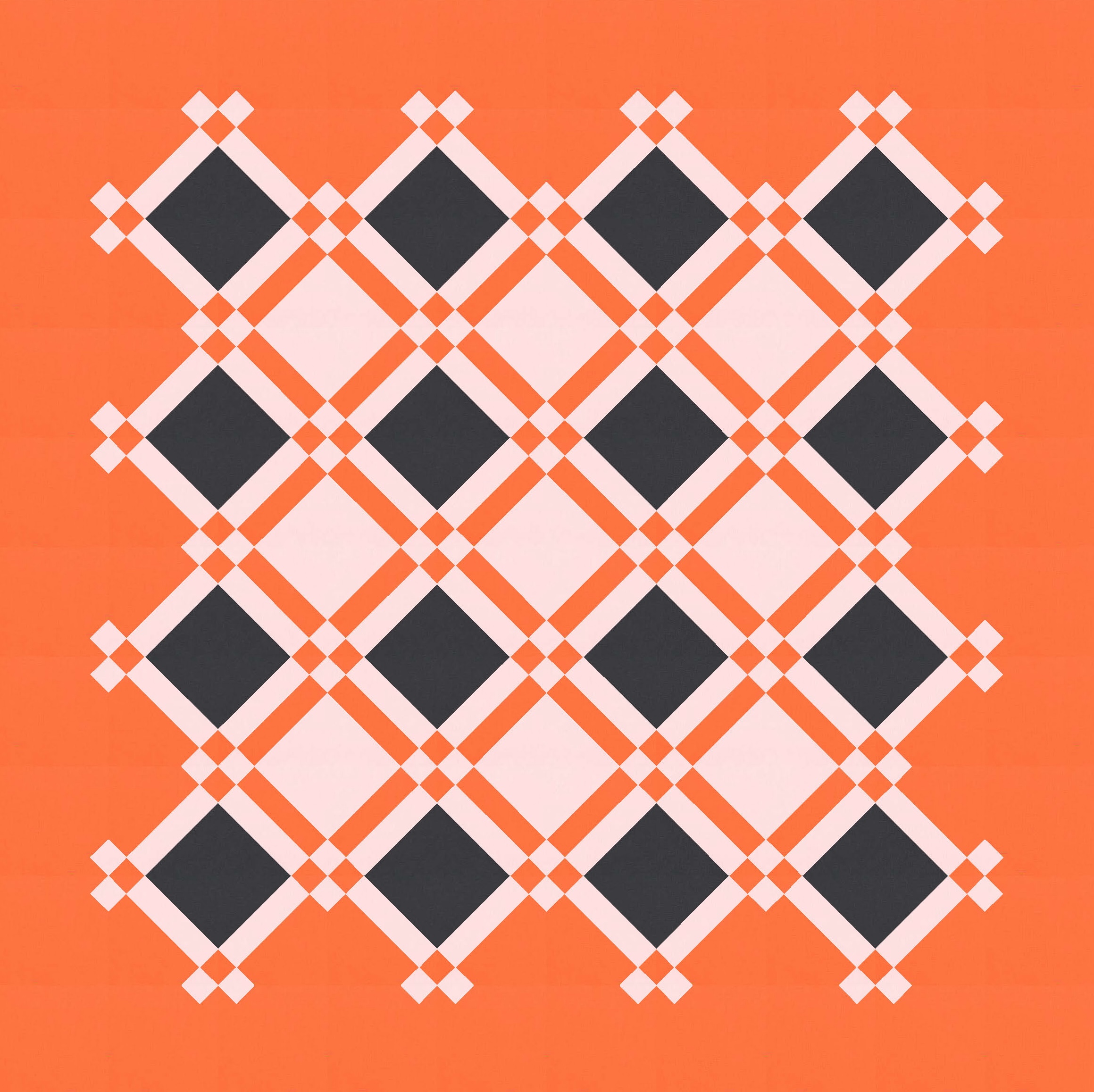
This week’s design looks like it’s laid out on point (the sensible approach!), but no, for some reason I designed these blocks using diagonal lines in a square block that’s arranged in a standard layout. I didn’t really think about the design as a whole when I drew the block; I was just playing.
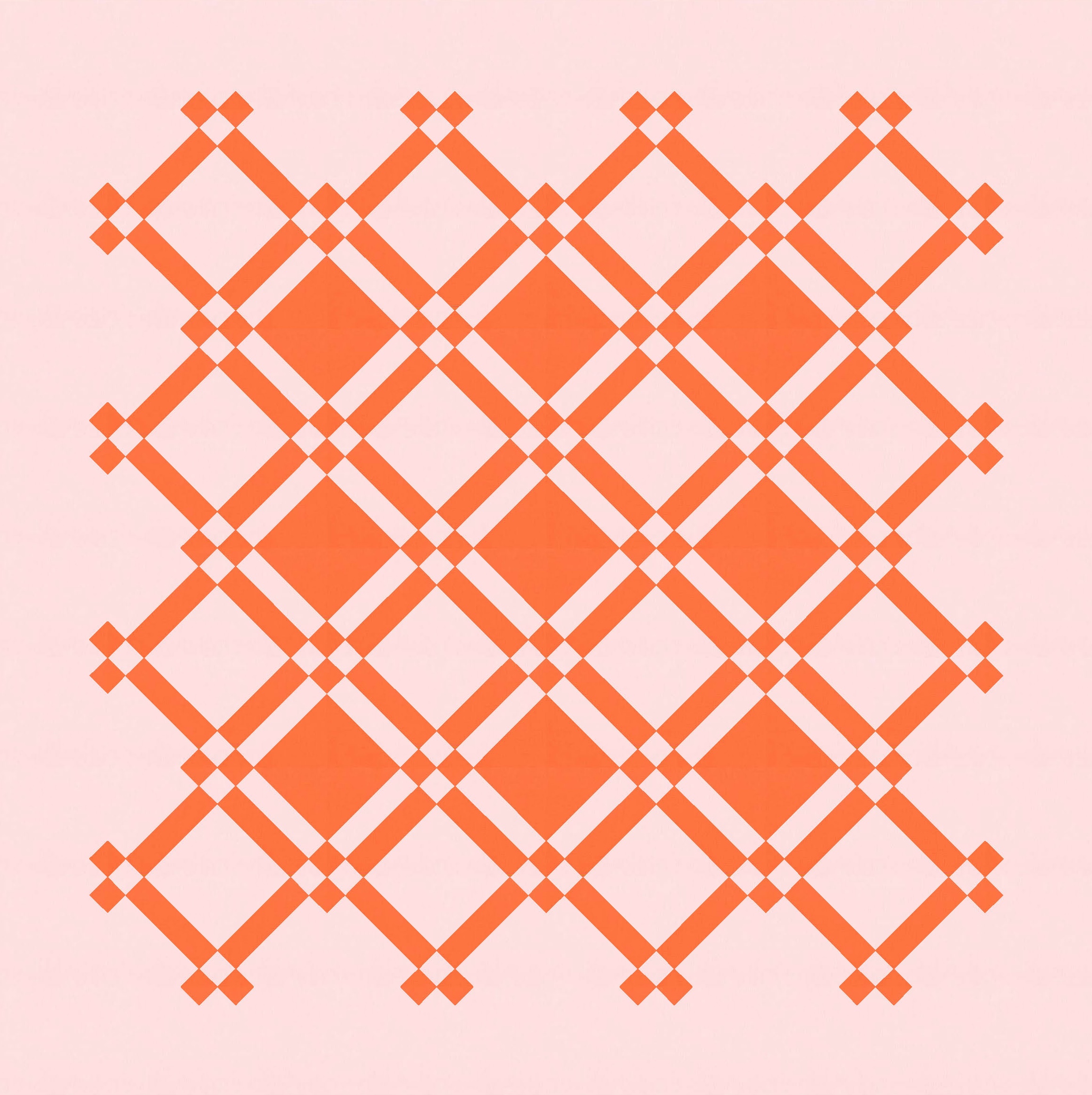
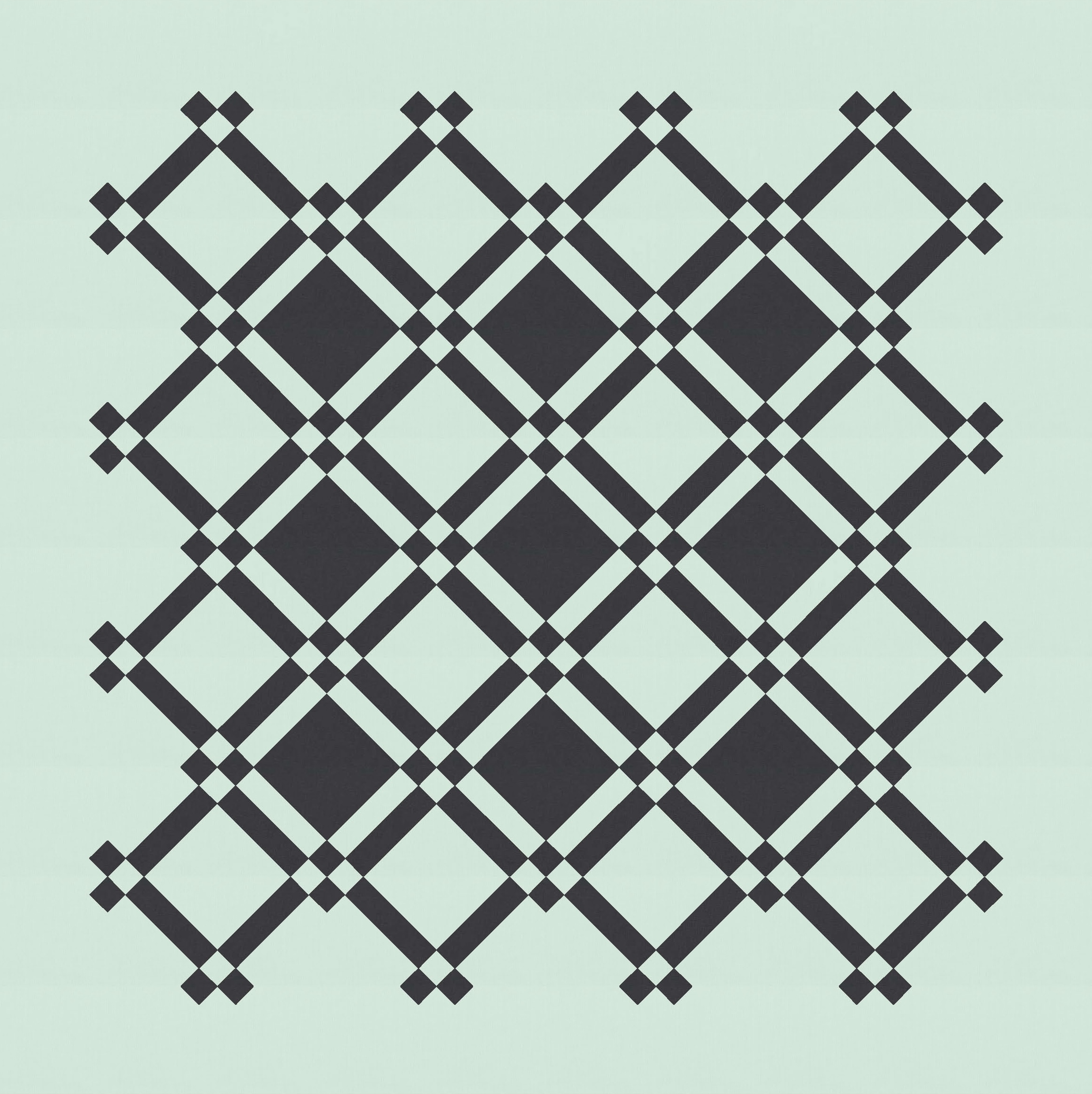
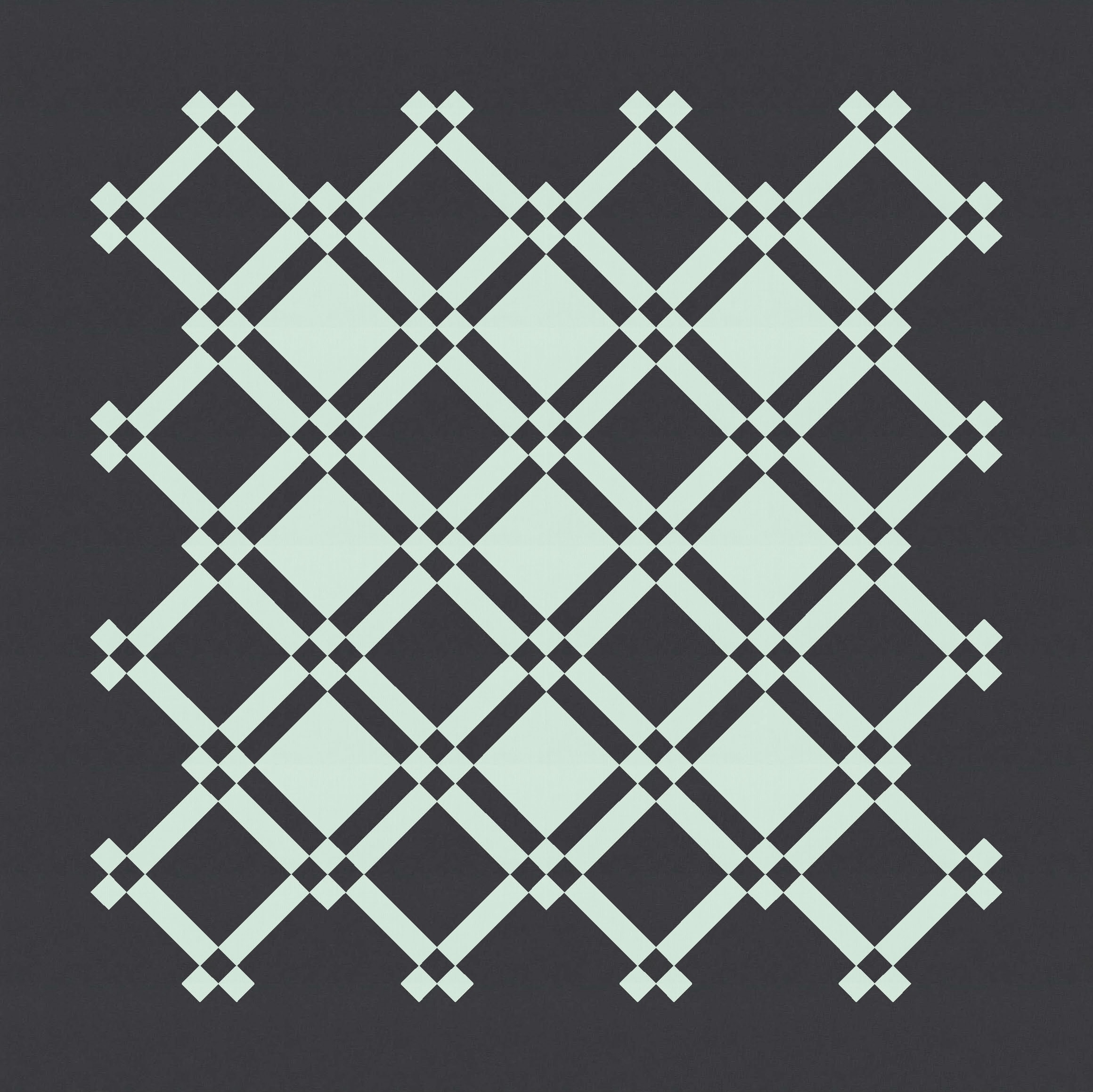
I don’t think I’ll ever tire of this two-colour palette: hot orange and pale pink. I probably won’t ever tire of two-colour quilt designs, either. Colour selection is one of the hardest parts of quilt-making for me, so keeping things simple is always a bonus!
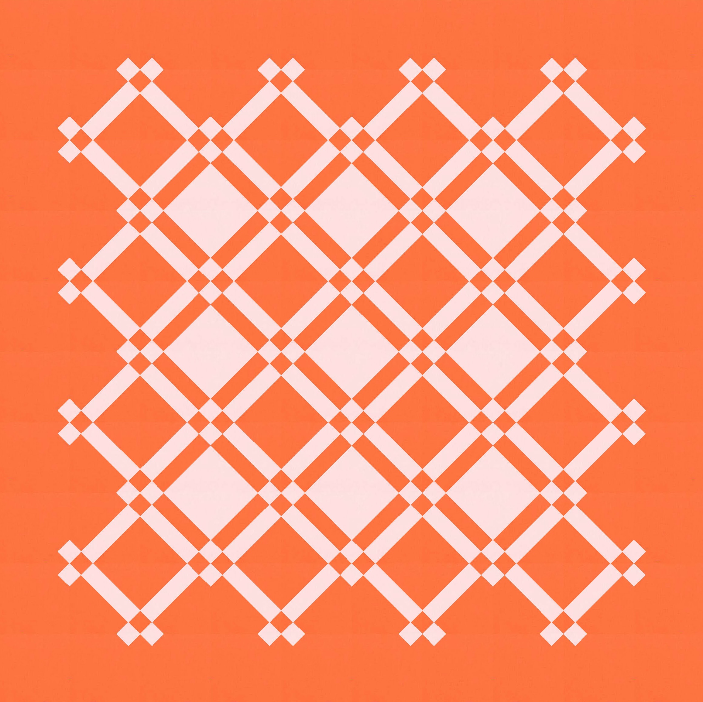
I like to pick two colours that have a good contrast, particularly for designs like this one.
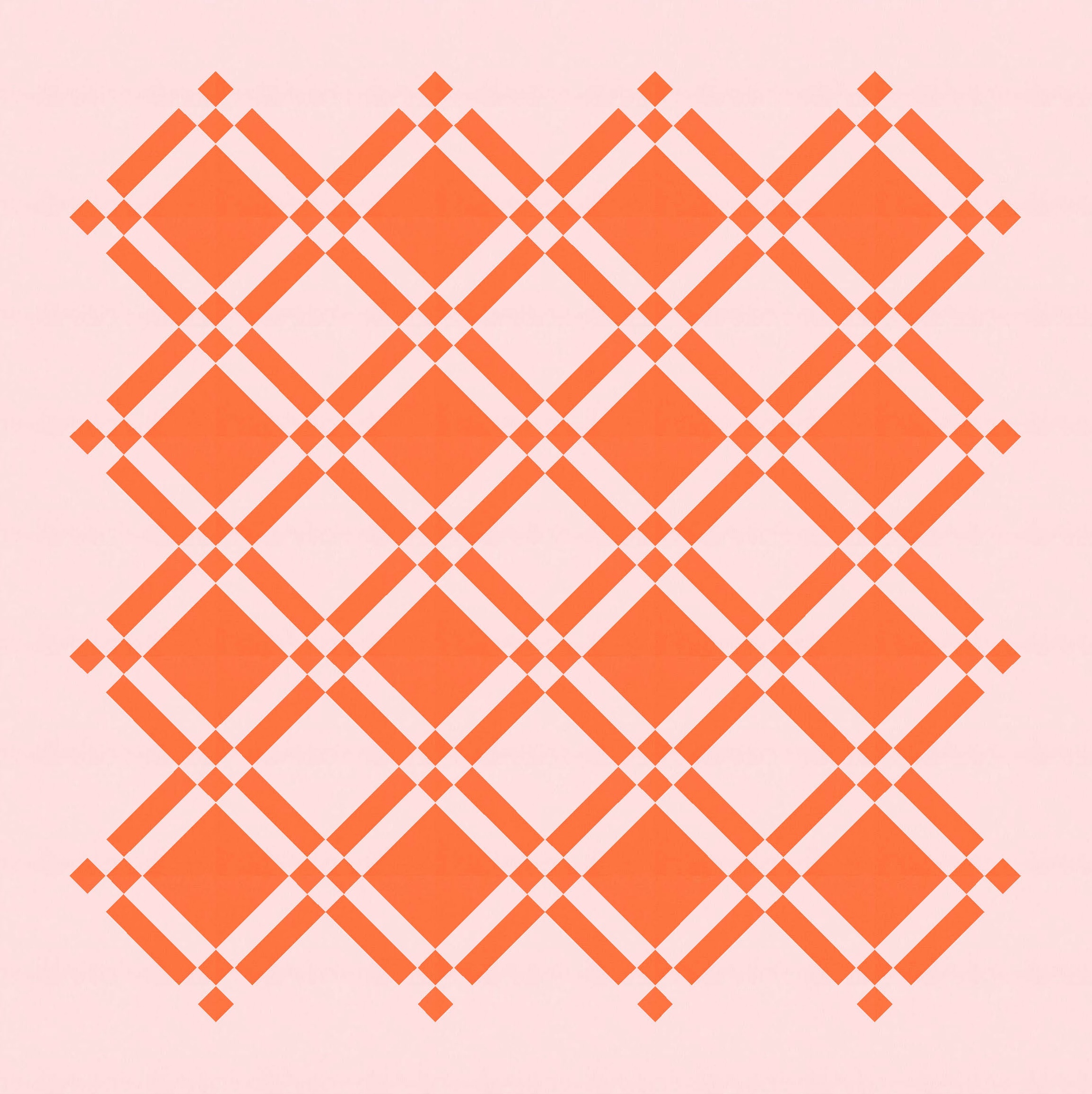
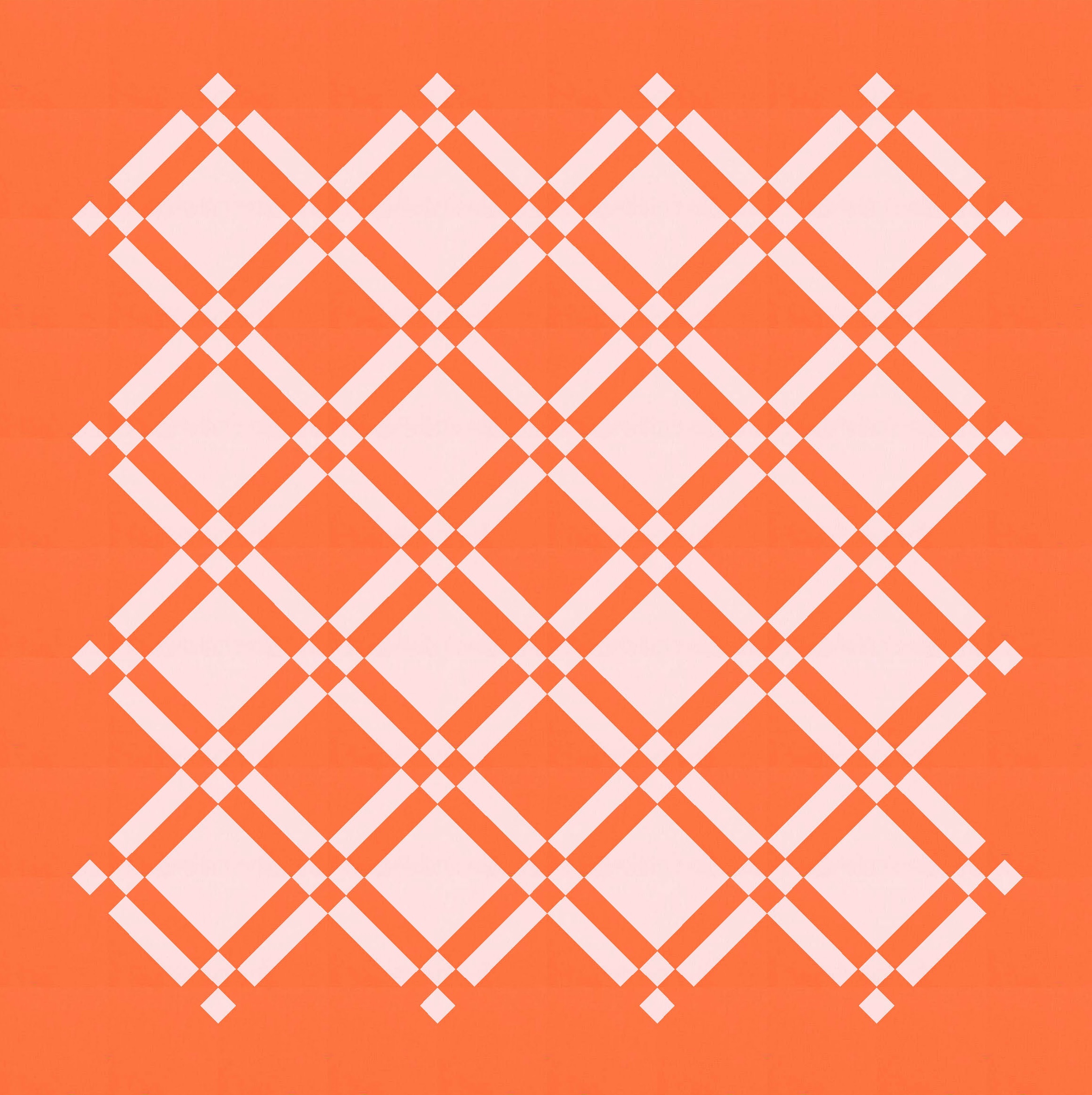
Filling the space with the blocks on repeat isn’t quite as interesting – I like floating a design in the centre of a ‘canvas’ so you can see the unexpected/fun things that happen at the edges (particularly when only parts of the blocks are coloured in).
Subtracting is a big part of modern quilt design (for me, at least).
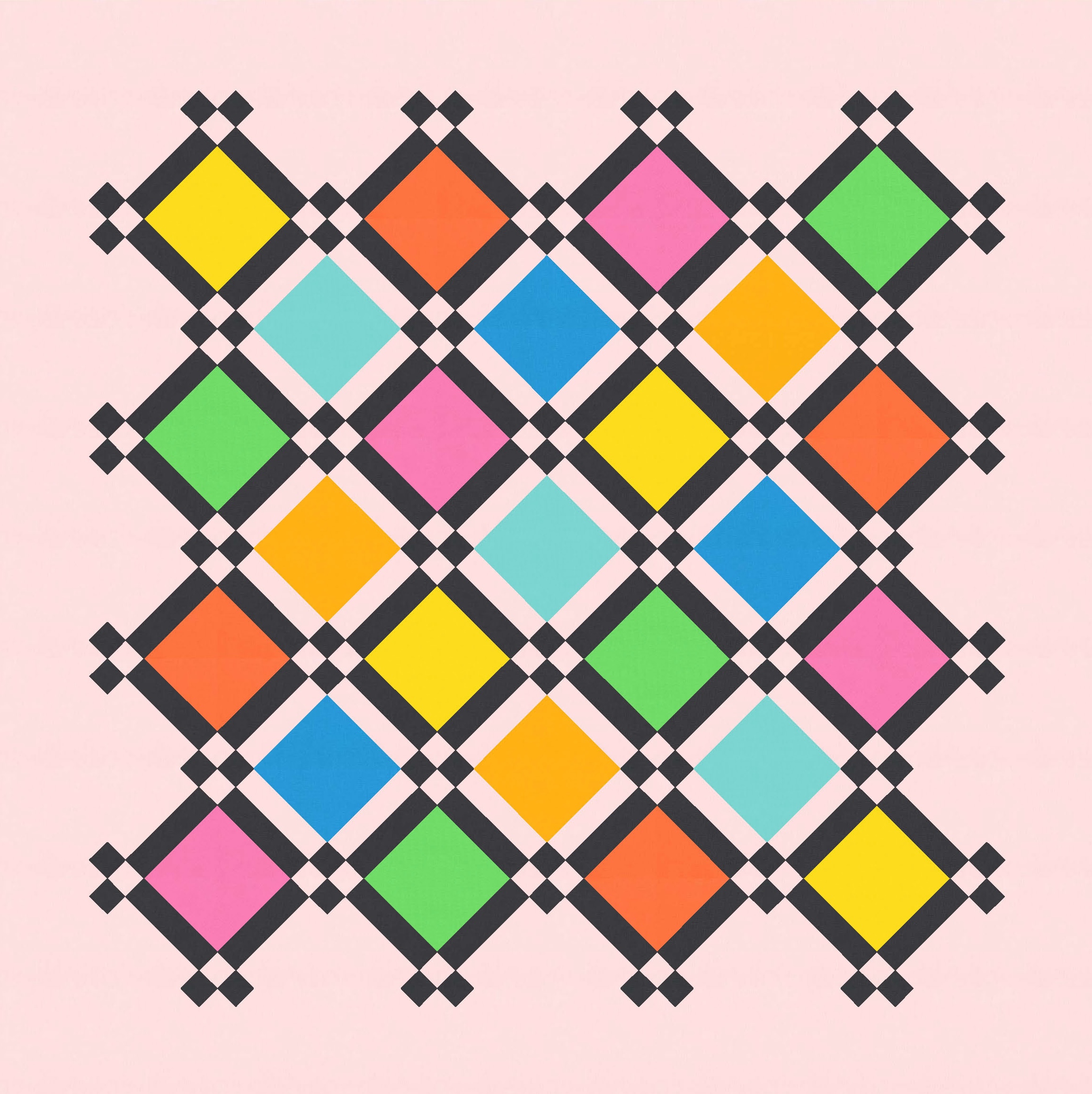
Because each block has several elements (the big central square, the outer rectangles, and the smaller corner squares), the whole design can accommodate more colours/fabrics. I tried it in three colours, but alternating blocks are still just in two colours.
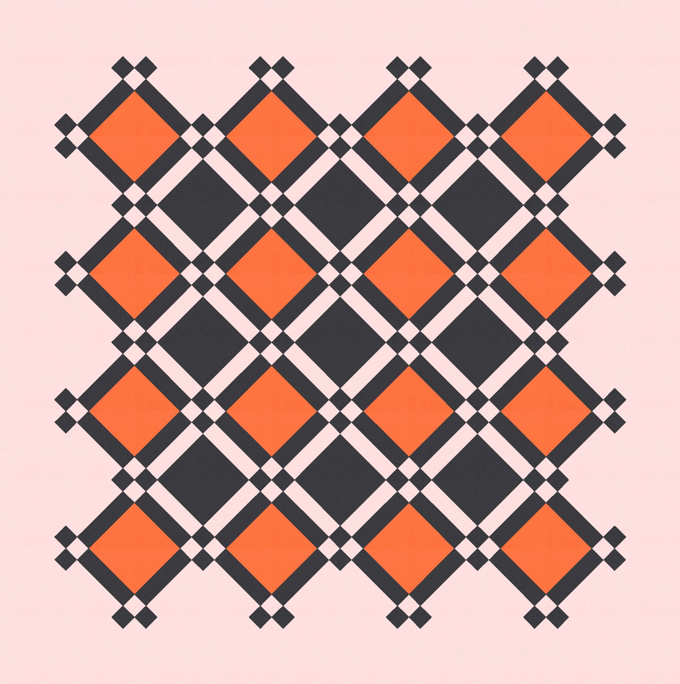
It works in three colours, but I don’t love these versions as much as the two colours, I don’t think. Maybe a different palette would make the difference? Or maybe introducing a print as one of the three fabrics would mix things up? A print that incorporated colours from the other two fabrics could be fun. Like a kitschy floral in those big squares that picks out the bright orange and pale pink. Hmm… maybe I don’t mind the three-colour versions after all…. 🙂
A multicoloured version looks OK… but I don’t find it that interesting. But maybe in a mix of prints instead?
So, back to a simpler palette for now.
Another thing I like to try with two-colour designs in particular is subtracting a bit more, and a bit asymmetrically, while leaving different background colours on each side of the design. It’s a fun way of playing with negative space and making a design a bit more ‘modern’.
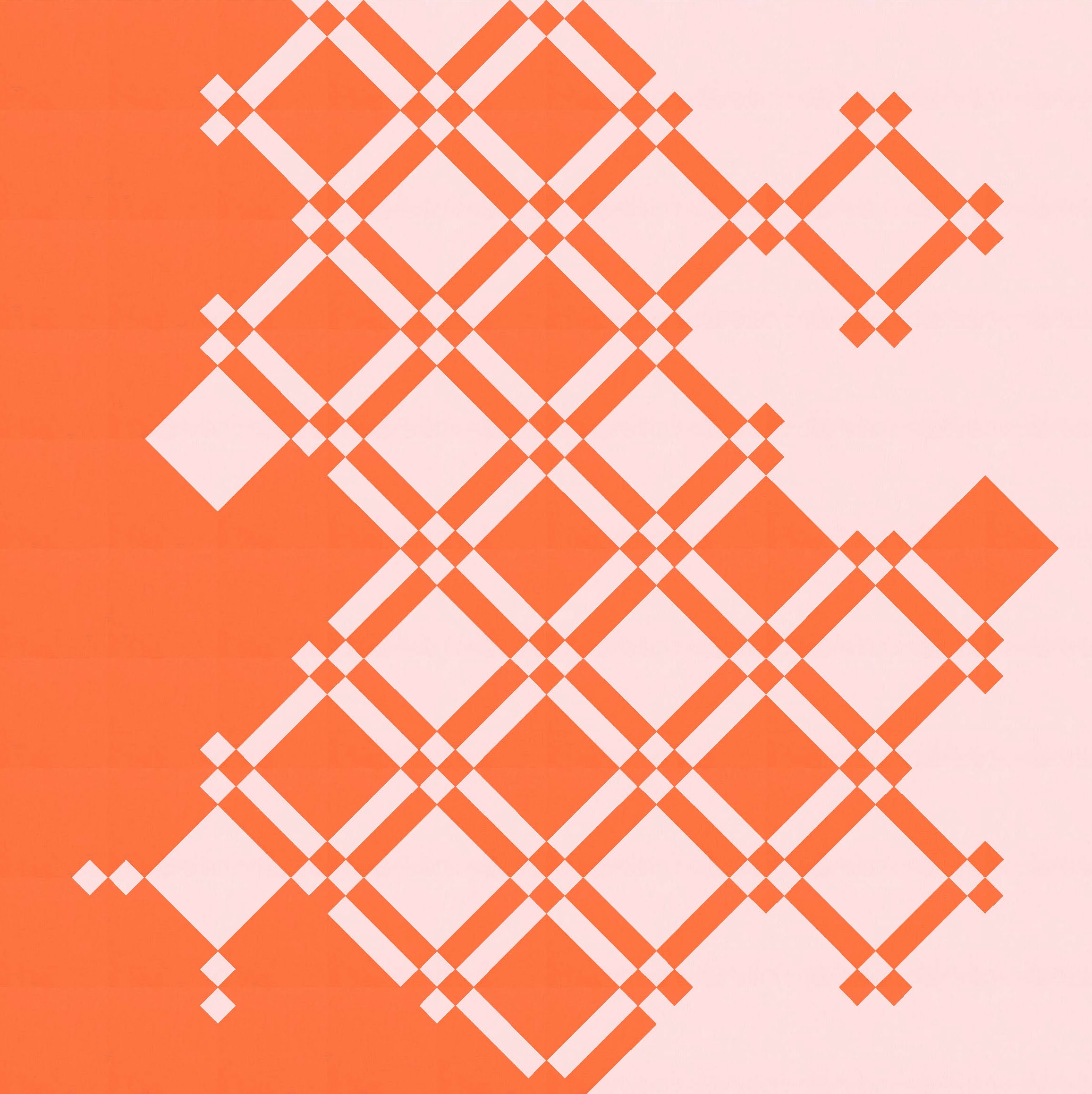
I’d probably tweak this one a bit more if I were going to make it into a modern quilt, but I like how the use of colour can draw your attention to different elements – the big squares, the little squares – around the design.
Speaking of making this one, like I mentioned at the beginning of this post, the actual design that I made in EQ8 isn’t very sensible. If you made a quilt by following the construction of the design itself, some of the squares would have seam lines running through them. Which would be daft!
If I wanted to make this one, I’d redo the sketch to use a simple block of squares and rectangles, set on point with some setting and corner triangles. It might mean that the dimensions are slightly different and the relative sizes of the strips and squares aren’t quite the same as shown here, but I’m sure I could get them close enough. (Of course, I could’ve done all that before I posted these images, but I couldn’t be bothered!)
Anyway, this one would be a chain-piecer’s dream to make. I had a dig around Pinterest to see if I could spot anything similar – it’s a pretty basic, contemporary quilt design using some fairly common motifs, after all – but I didn’t see anything. Let me know if you’ve seen a similar pattern or design, and I’ll update the blog post accordingly!
Discover more from Geometriquilt
Subscribe to get the latest posts sent to your email.
