Sunday sketch #381
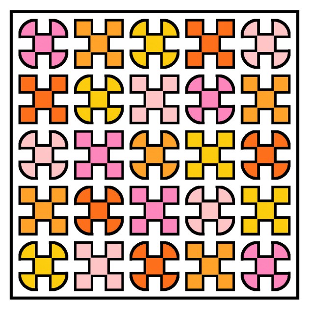
One of the things I’ve always loved about my Sunday sketches are the outlines – the thin black lines around the shapes. When I used to hand-draw all my sketches, they were all lines; now that I create most of my designs in EQ8, I don’t always show them. But sometimes I purposely make the black lines a feature (see Sunday sketches #265, #269, #277 and #348, for example), even though I’ve never really made a quilt with skinny strips (apart from Sketch).
Anyway, this week’s sketches are the by-product of a sketch that I haven’t shared yet. You’ll see the connection in the coming weeks, but for now, it’s fine as a standalone design.
And yes, I’ve done my usual sudoku-style colouring where each colour appears only once in each row or column 🙂
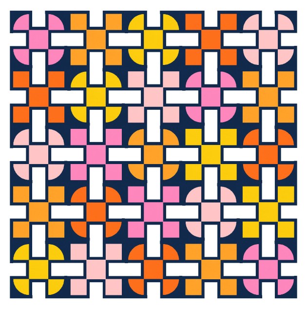
This is a block-based design using a standard layout, plus thin sashing. I used black to delineate the shapes in the first version, but colouring the same lines in the background colour means I can highlight some of the secondary shapes – those light grey rectangles. They definitely feel like they’re in the foreground, overlapping and connecting the coloured circles and squares.

Here’s a reverse colourway where the shape outlines are still the same colour as the background, and the connecting rectangles are in white instead.
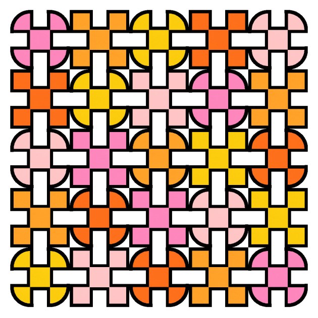
There is thin sashing between the blocks, just to give a smidge of space between them. Here’s what happens without the sashing – this is just a bit too crowded for me!
And the same design works without any outlines. Here I’ve coloured each block’s outlines in the same colour as the rest of the main shape(s). That just makes the shapes look a little fatter. I quite like the connectivity in this one too.

This week’s sketches could be made using thin strips, squares, rectangles and quarter-circles (or drunkard’s path units).
I feel like there may be the potential to iterate this design a little more, but first I need to show you the designs that led to this one! That’s next week.
Discover more from Geometriquilt
Subscribe to get the latest posts sent to your email.

I love them all, but the last one especially resonates, I don’t know why. The squares in the middle of the blocks look bigger in the last version, is it because what is sashing in the other version here is in the same colour? Does this mean that there is a skinny strip of colour at the short end of the white rectangles, or is this just an illusion?
Thank you so much for sharing your sketches!
Chiara
Yes, that’s it exactly! The skinny strips are still there, just in colours instead of black (or white). So the coloured squares/curves all become a little fatter.