Sunday sketch #482
It’s not too hard to see the common element in this week’s and last week’s sketches: that dark double-layer economy block with smaller angled squares on its top, bottom and sides. Now there are just more of them!
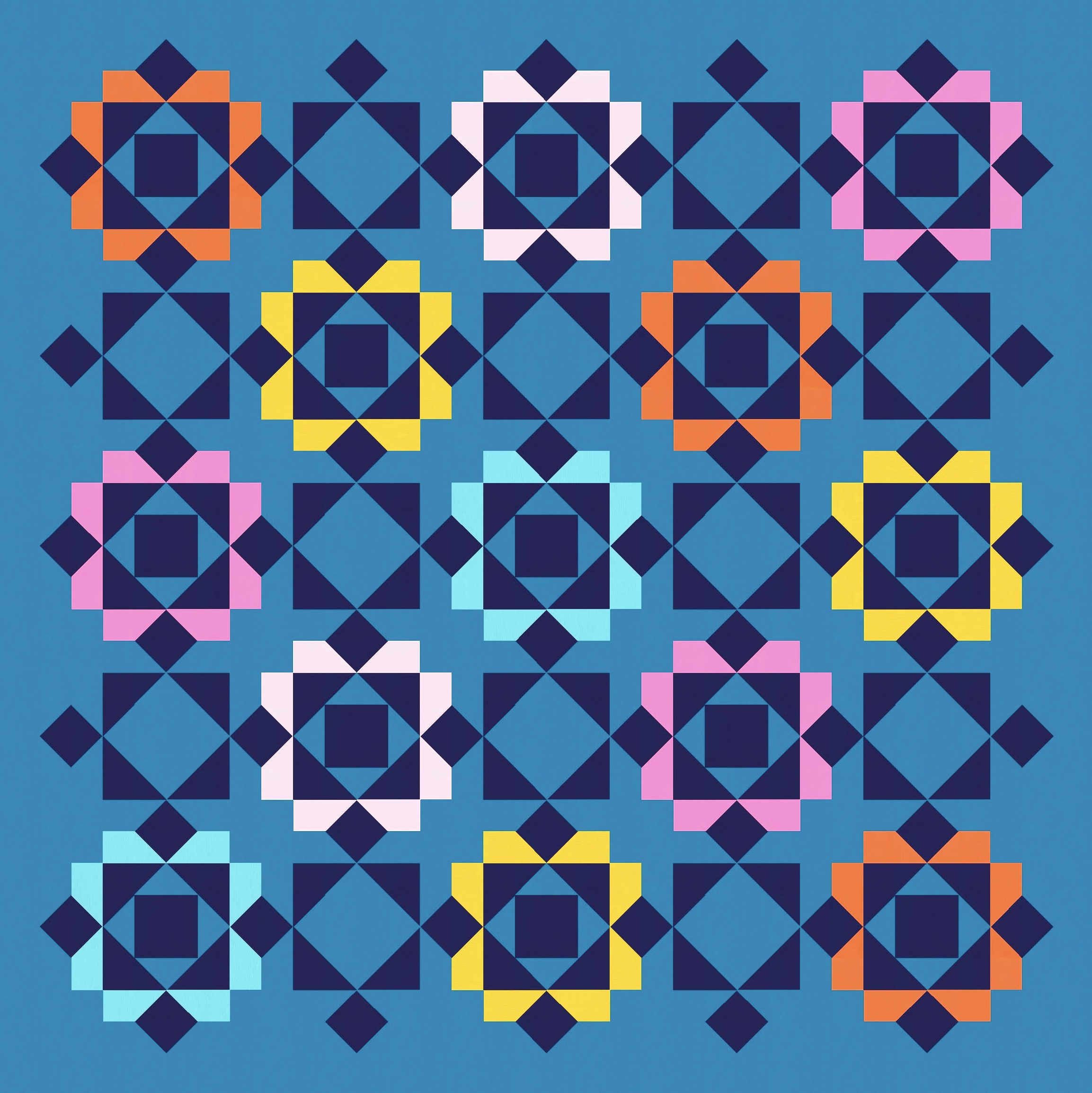
In last week’s sketch, there were spaces between these darker motifs (which I called robots (no, they don’t look like robots)). This week, I’ve filled those spaces with more robots. Adjacent ones share arms, heads and legs (those smaller squares). And those connections between adjacent blocks give the impression of larger overlapping squares. I love a good secondary shape!


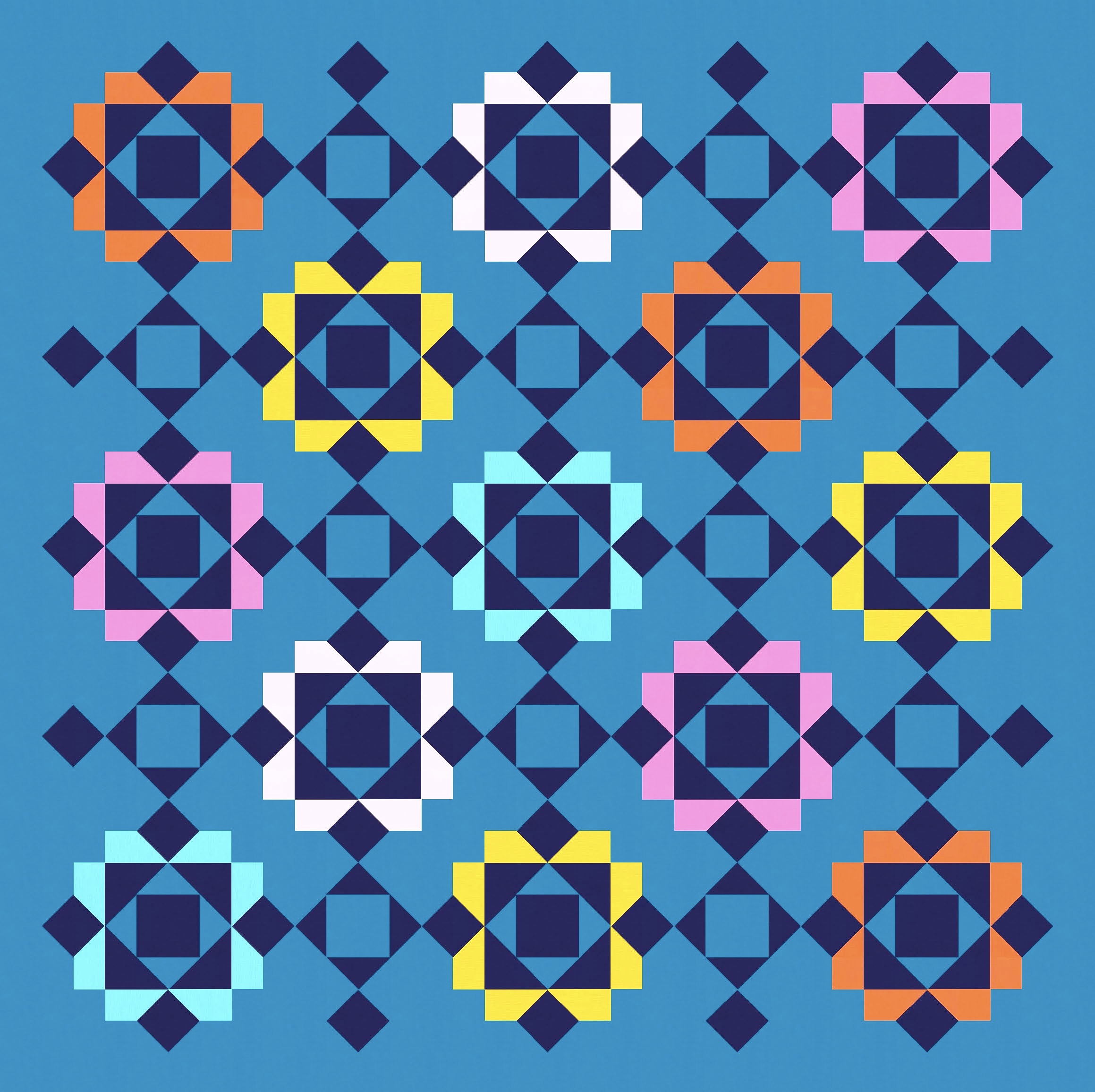
Notice that the coloured bits in the two versions above are squares, so the background of the design is a checkerboard of colour – in other words, the corners of the squares touch. I like the design, but it’s all feeling a liiiiiittle bit close to too busy (for me). I decided to make two small changes: lighten up every other robot, and chip away at the corners of those coloured squares. See the difference? Before is on the left (in a more limited palette); after is on the right.


To be honest, I think removing the coloured corners is enough to lighten the whole design – it brings in a bit more background and lets your eye move around a bit more, no longer constrained by those hard square edges.
So maybe now I can play around with the in-between robots, either changing up the colour placement or removing some elements (by colouring them the same as the background).


I like every one of these, for different reasons! I think the last one (bottom right) is my favourite though – I’m getting a few grids overlapping each other, but they don’t feel too heavy.
Speaking of heavy, I can show you what it looks like to have the ‘full’ robots but with the empty corners in the original palette from above.


And then just start taking away elements again…


…to arrive right back where I started! 🙂
There are lots of different ways you could construct this design as an actual quilt. In a standard layout, you could use economy blocks, large and small square-in-a-square units, and some squares. If you treated the layout as if it were on point, you could use square-in-a-square units, flying geese, squares and some smaller flying geese or quarter-square triangles. I’d probably opt for the former.
Check back next week to see where the robots go next!
Discover more from Geometriquilt
Subscribe to get the latest posts sent to your email.
