Sunday sketch #467
I like how this week’s sketch feels kinda wonky, even though all the straight lines in the design are horizontal or vertical. I think there’d be scope for being a bit lazy with accuracy if you made this into a quilt – letting a bit of ‘imperfection’ add to its charm.

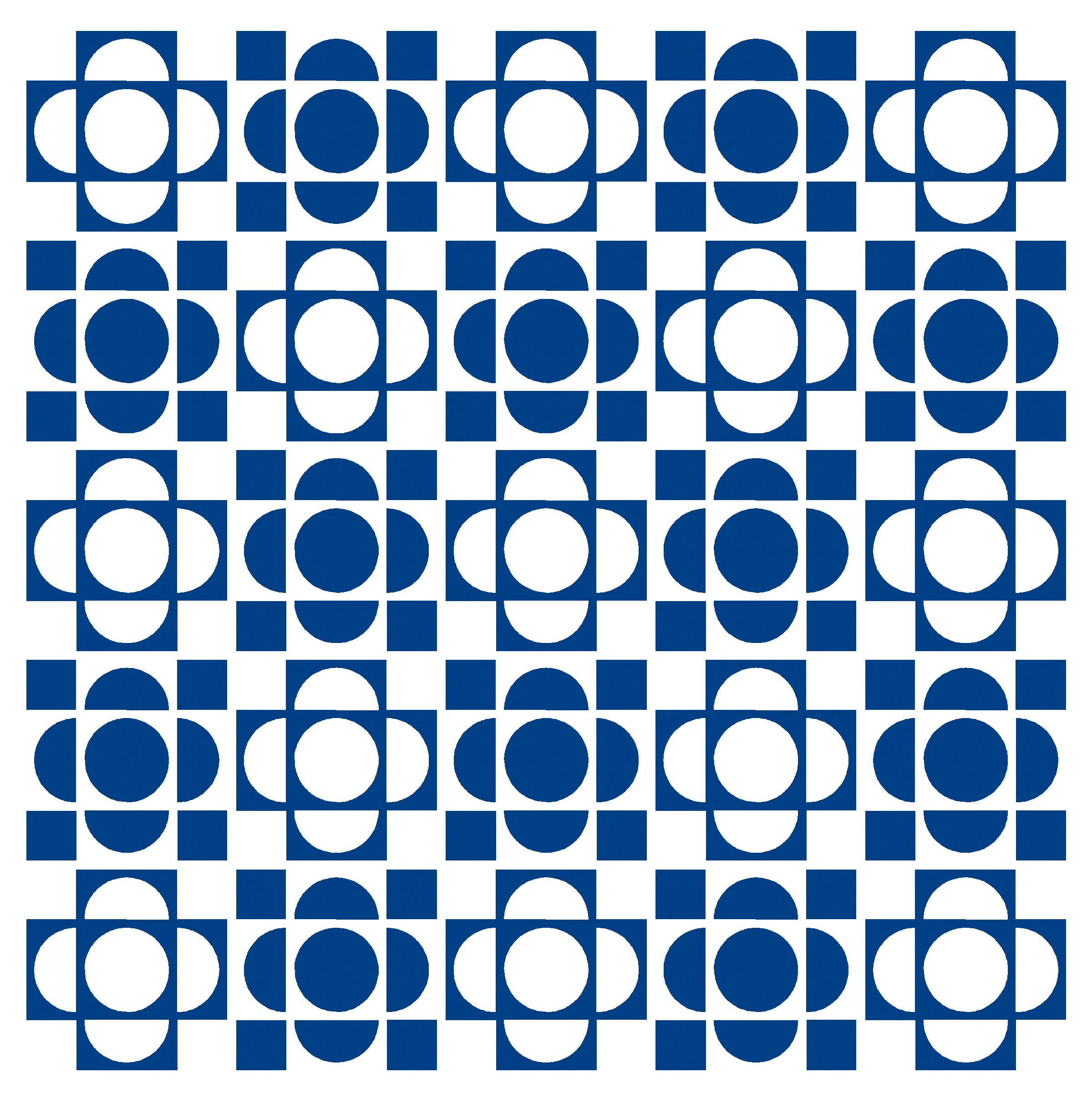
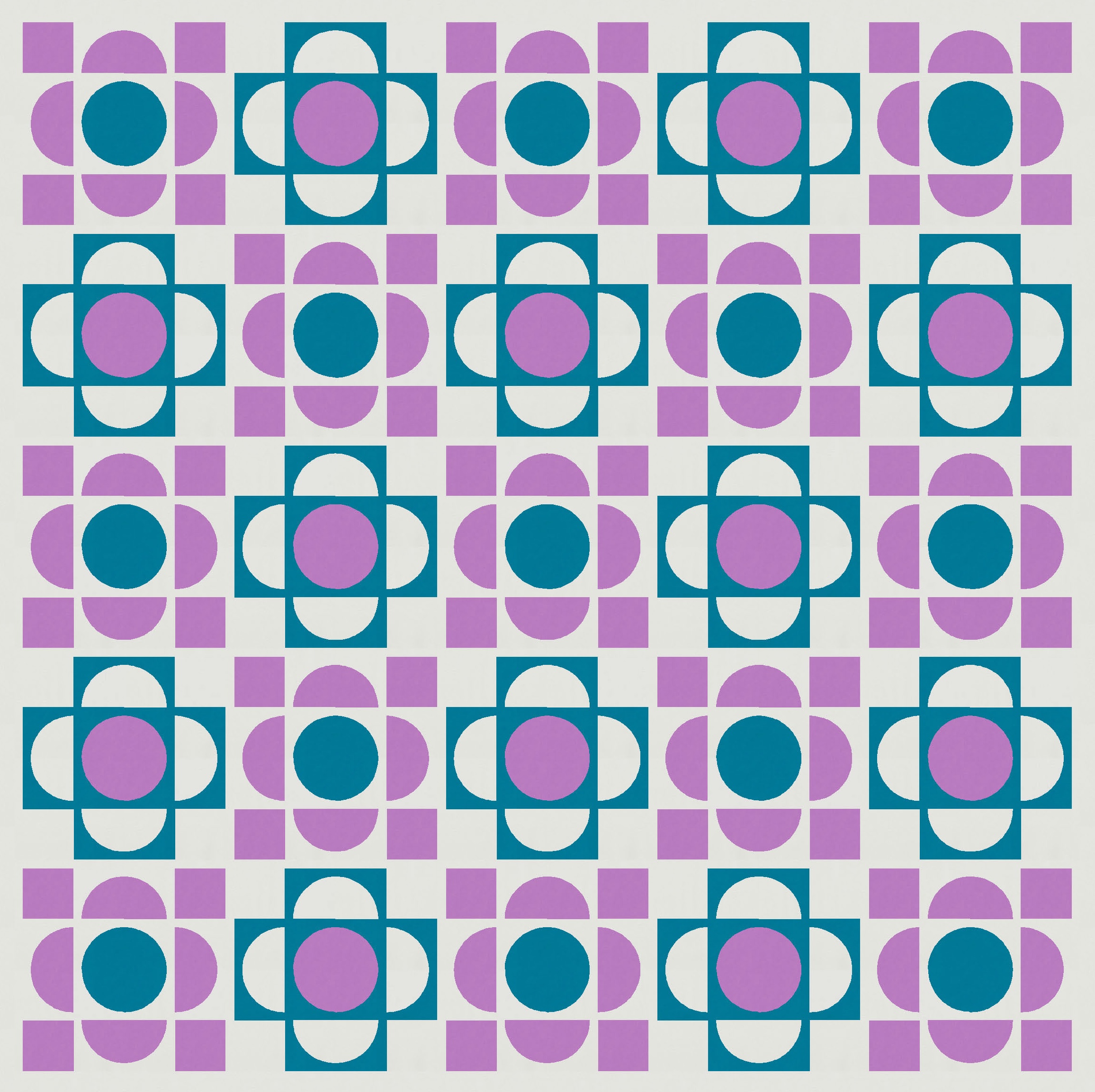
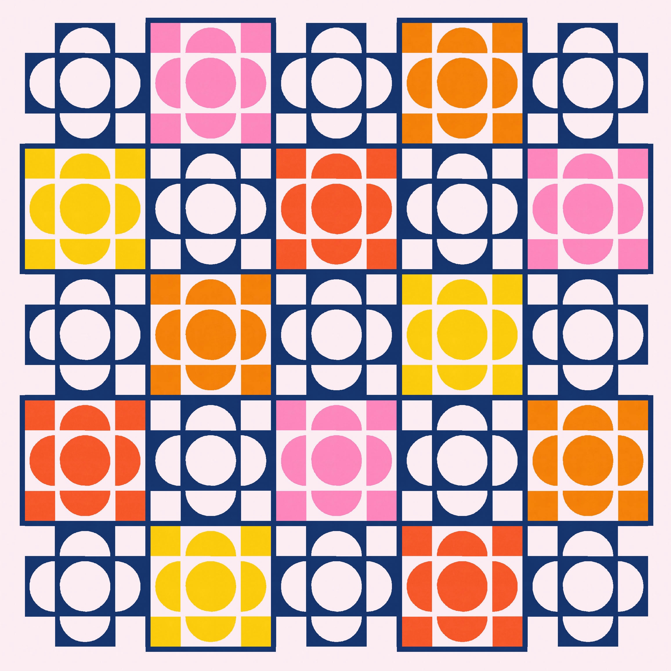
It’s another block-based layout this week, with the same block in two versions: one the inverse of the other. I started by alternating the two blocks without any sashing between them (below left), but things felt a little crowded. So I added some sashing of the same width as the spaces between the curves and the edges of the curved units (below right). That helps to ease the busyness, I think.


You’ve probably seen these shapes before. Brigit Gail’s Broadcast quilt pattern, for example, has a similar centre. And it’s essentially just drunkard’s path units repeated, with a few squares thrown in.
(I used to call any quarter-circle unit a ‘drunkard’s path block’, but now I think the drunkard’s path is the one where the curve doesn’t meet the edge(s) of the unit – instead, there’s a bit of space there, like the units shown here. But quarter-circles are just that – the unit is taken up entirely by one quarter of a circle. Is that actually true though, or am I making that up??)
Anyway… I originally imagined the design in just two colours. (I should maybe say ‘dreamt’, because this design popped into my head as I was falling asleep one day…. luckily I remembered it when I woke up! :-))


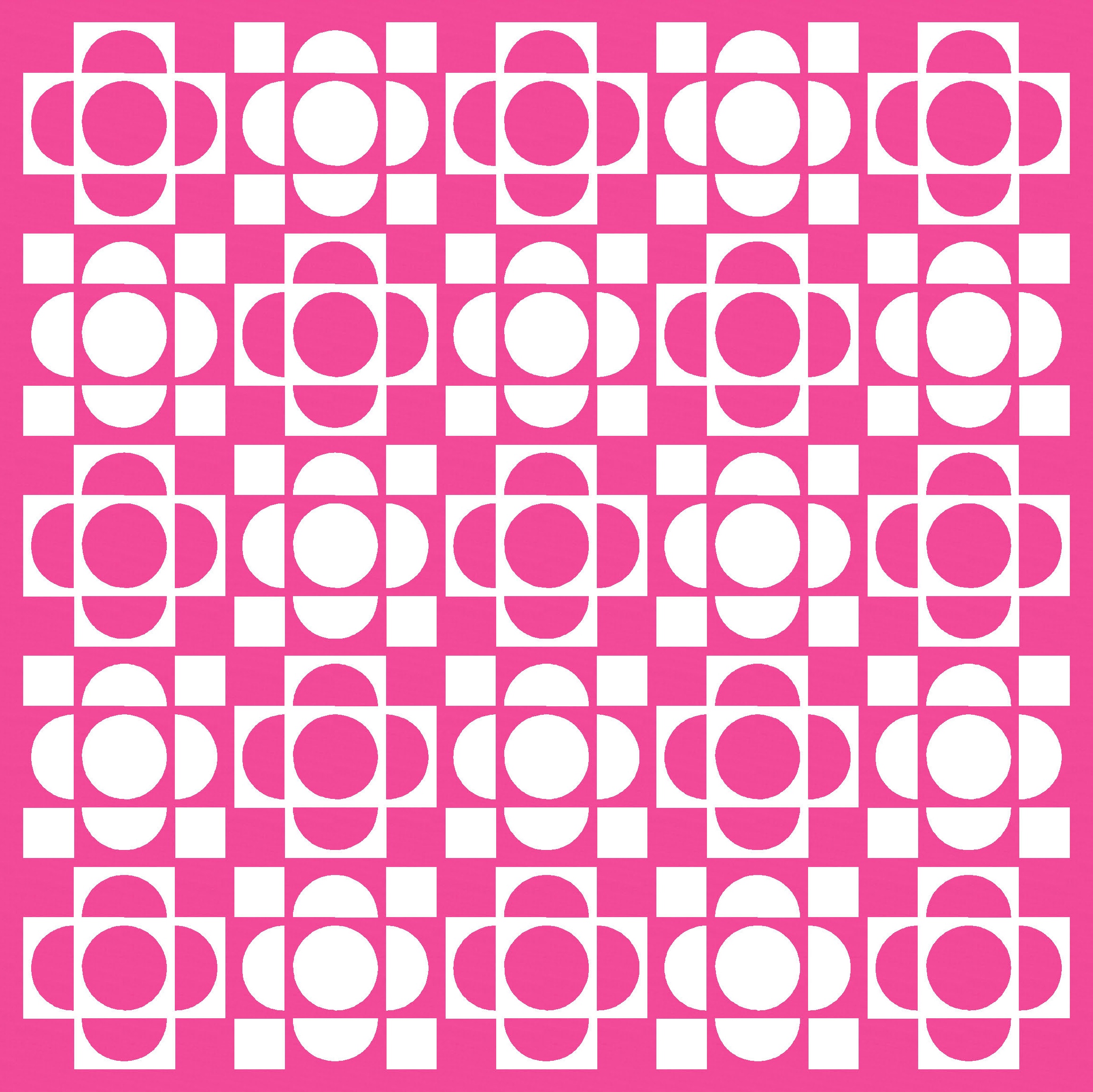
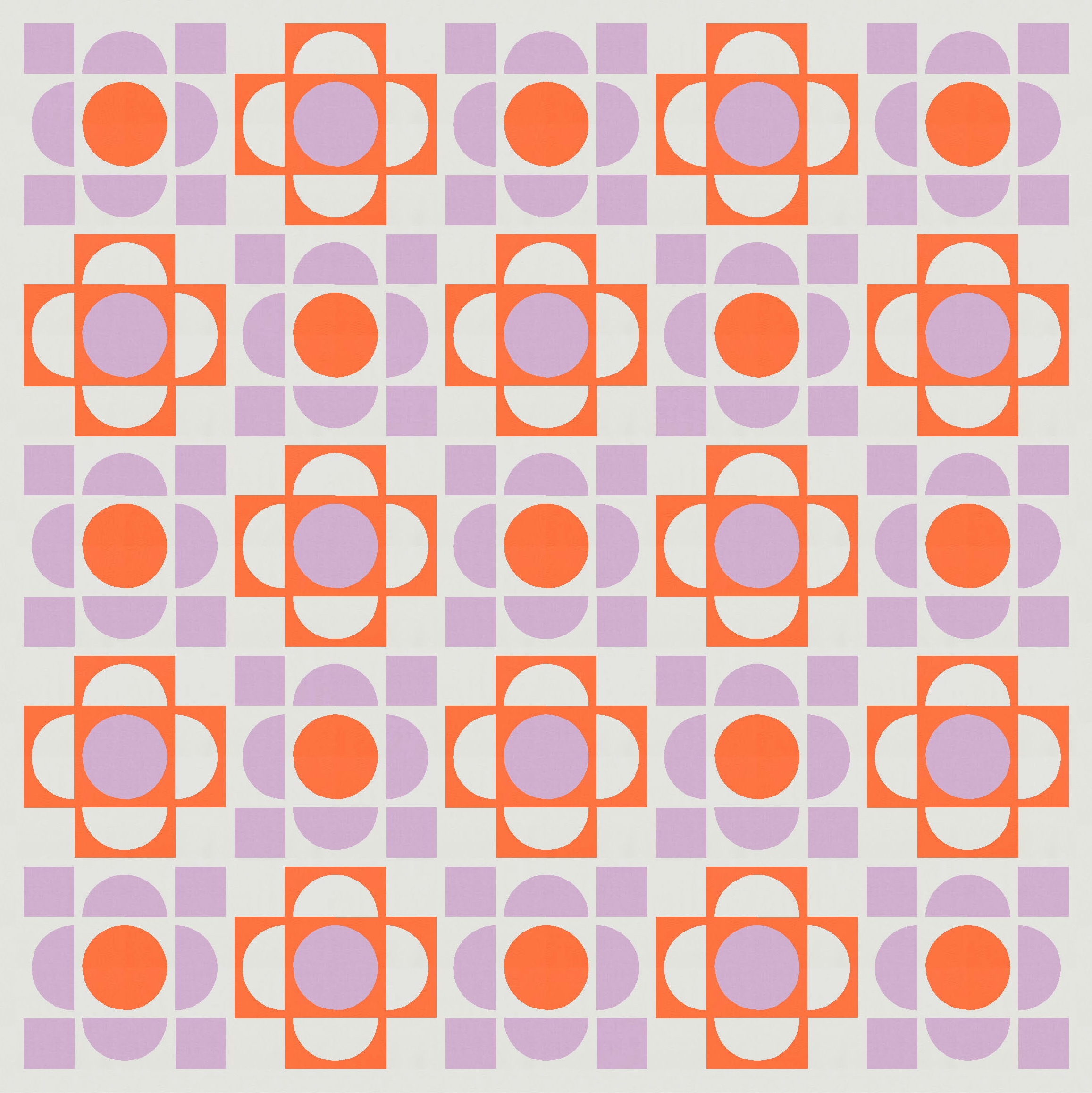
Colouring in the sashing around every other block helps to give a slightly different feel, too. The centre of the design looks like it has a different background colour than the outer edges.


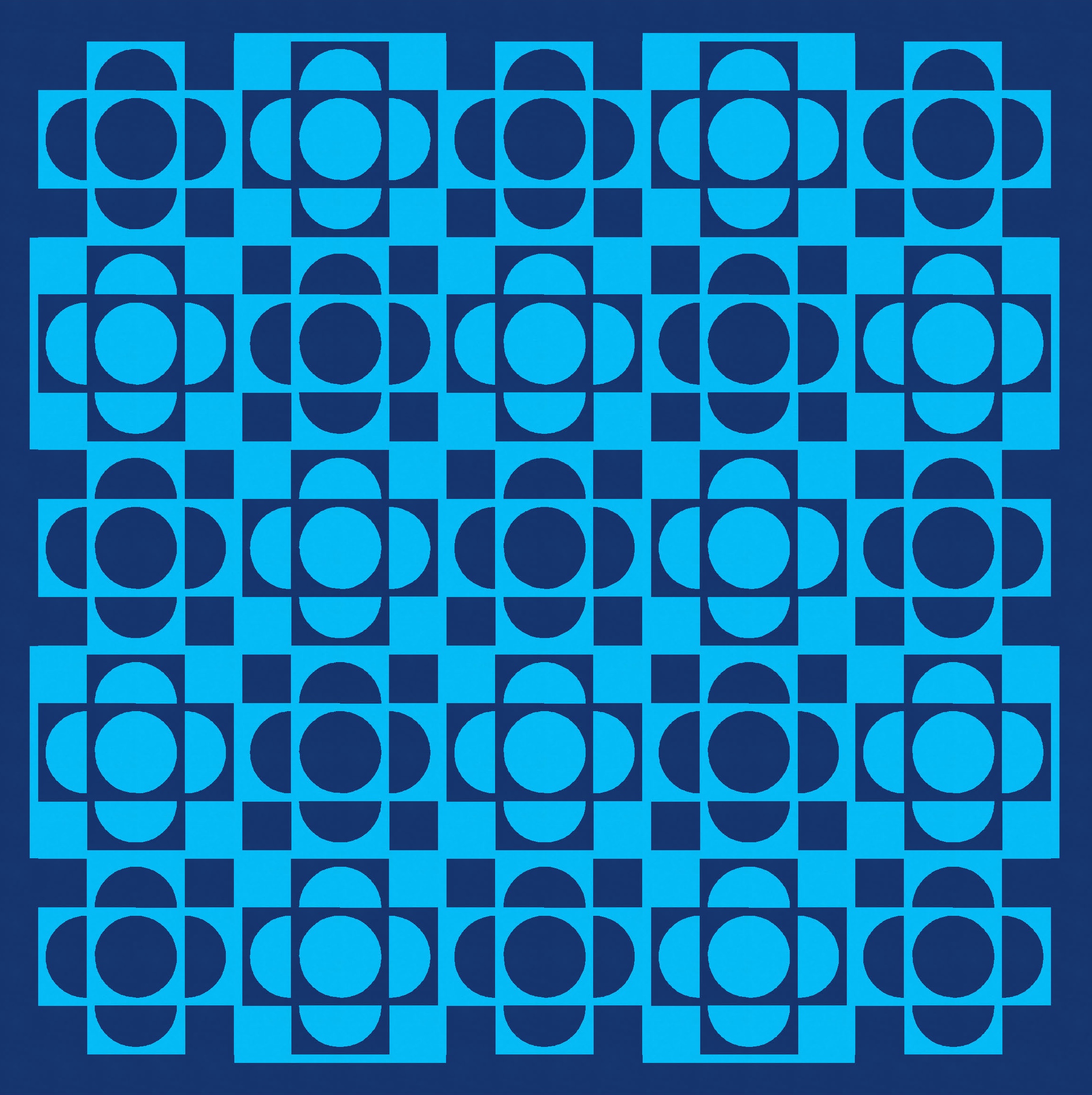

Colouring just the inner sashing (that is, not around the outer edges of the outermost blocks) gives a slightly different feel again. These are all minor changes, of course.


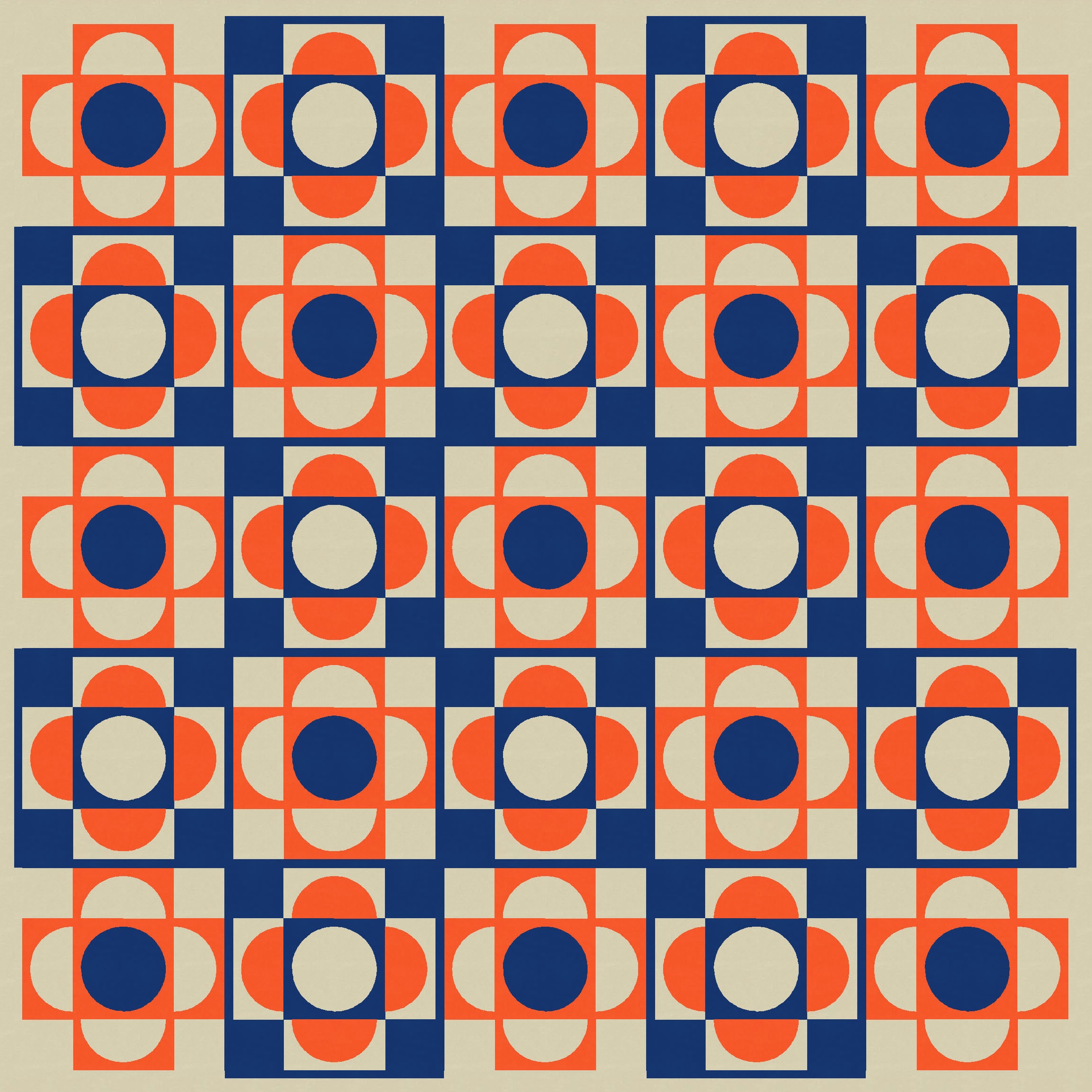
Depending on how you count them, the blocks have up to 5 different elements: the corner squares, the concave part of the half-circles, the convex part, the full circle in the middle, and its square border. So, lots of ways these blocks could be coloured. I stepped up to a three-colour palette next.
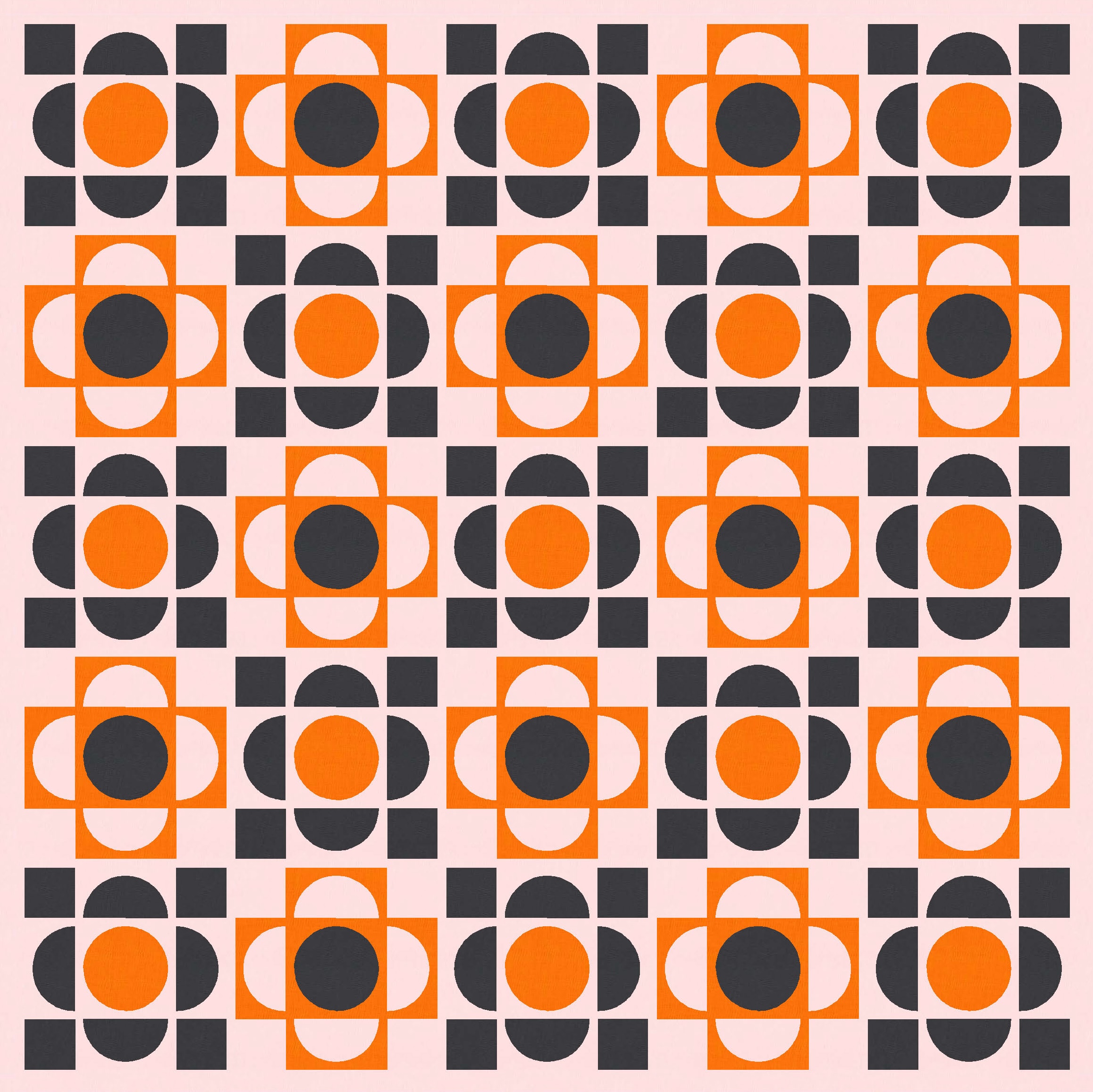


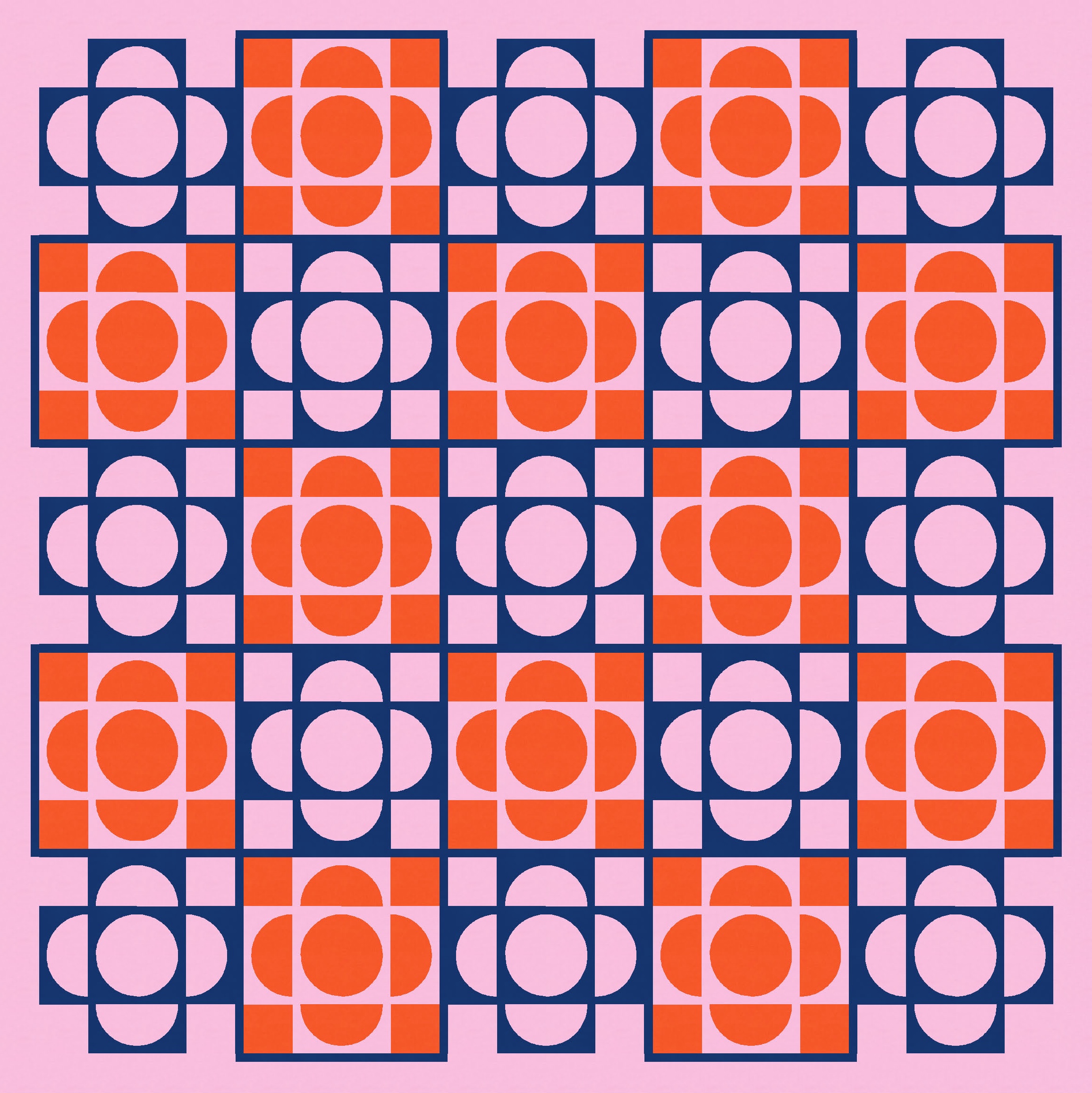
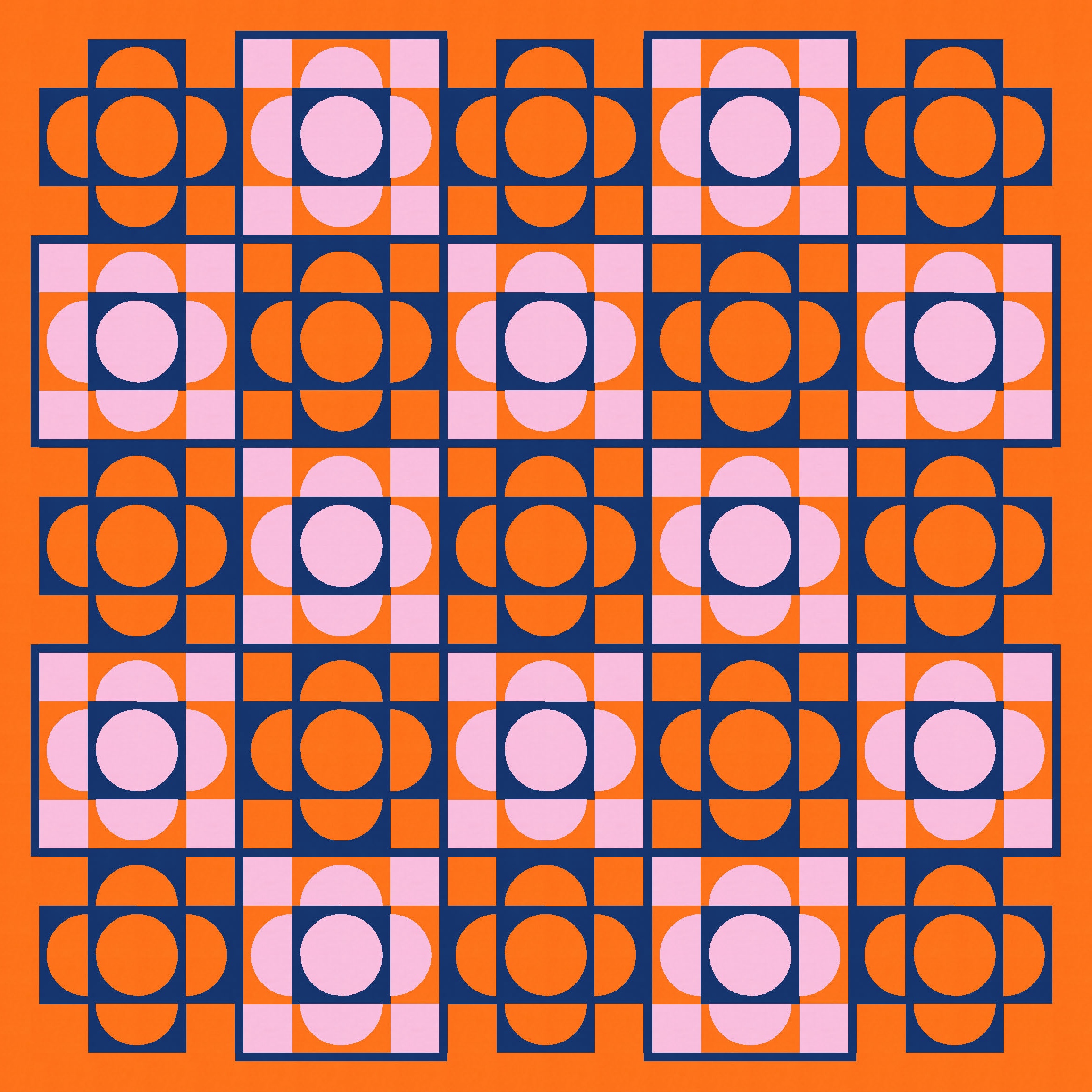
I’ve followed the same colouring ‘rules’ in all the three-colour versions above, but those rules can be mixed up too…


…or used with an expanded palette.
And even with the same three-colour palette, how/where the colours are placed can make a real difference to the overall look and feel of the design.


Of course, the blocks don’t need to be alternated; you could use the same block throughout. I don’t love this version, but maybe it will spark some ideas for you!

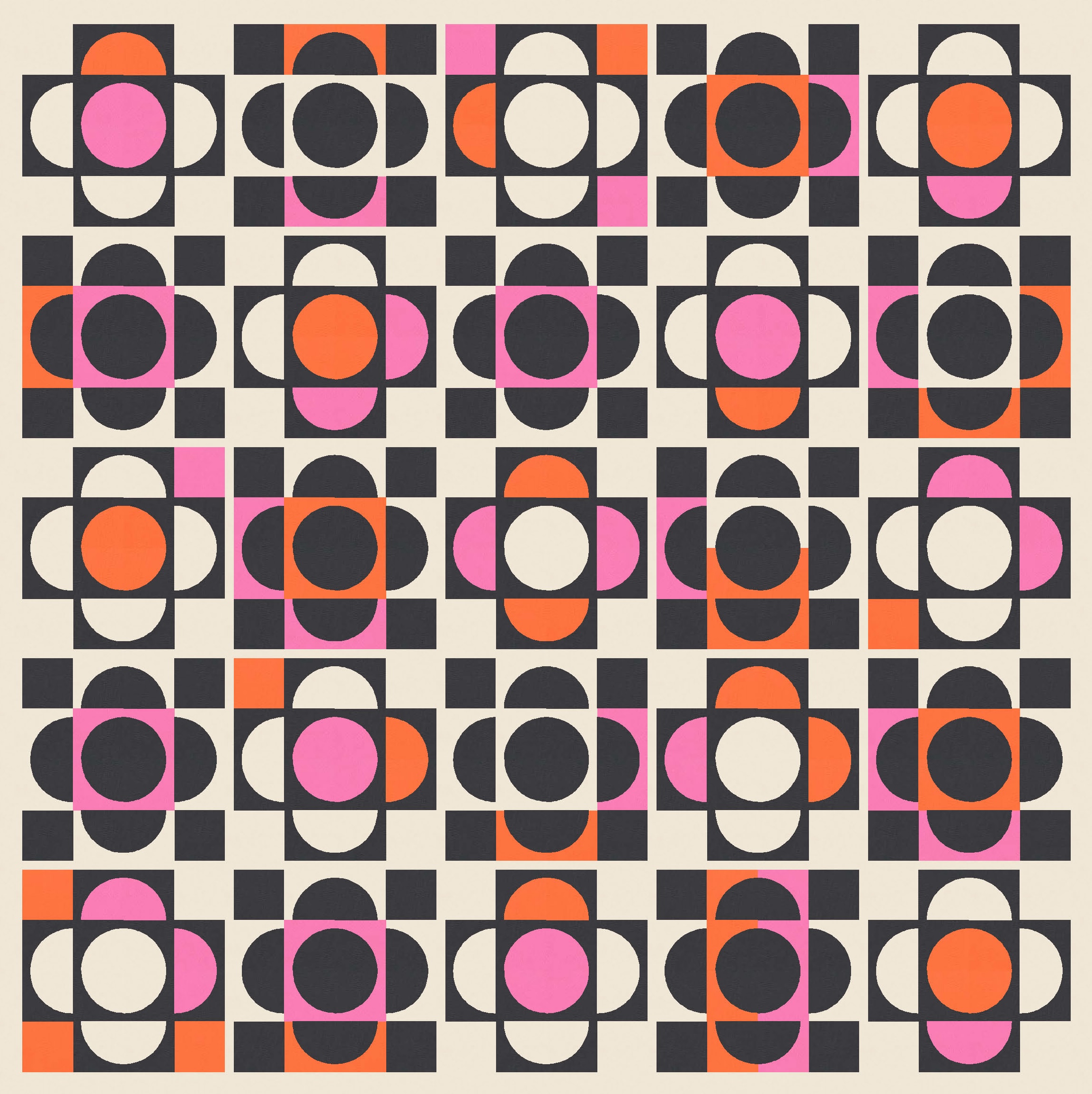
Apart from the first version I’ve showed up top, my favourite is a kinda ‘improvisationally coloured’ version. I started with a plain ol’ beige and black version, then added some bright orange and hot pink in random spots, only ever replacing the background colour, not the black. Then I decided to go one step further and add some yellow. Still my favourite colour combo!

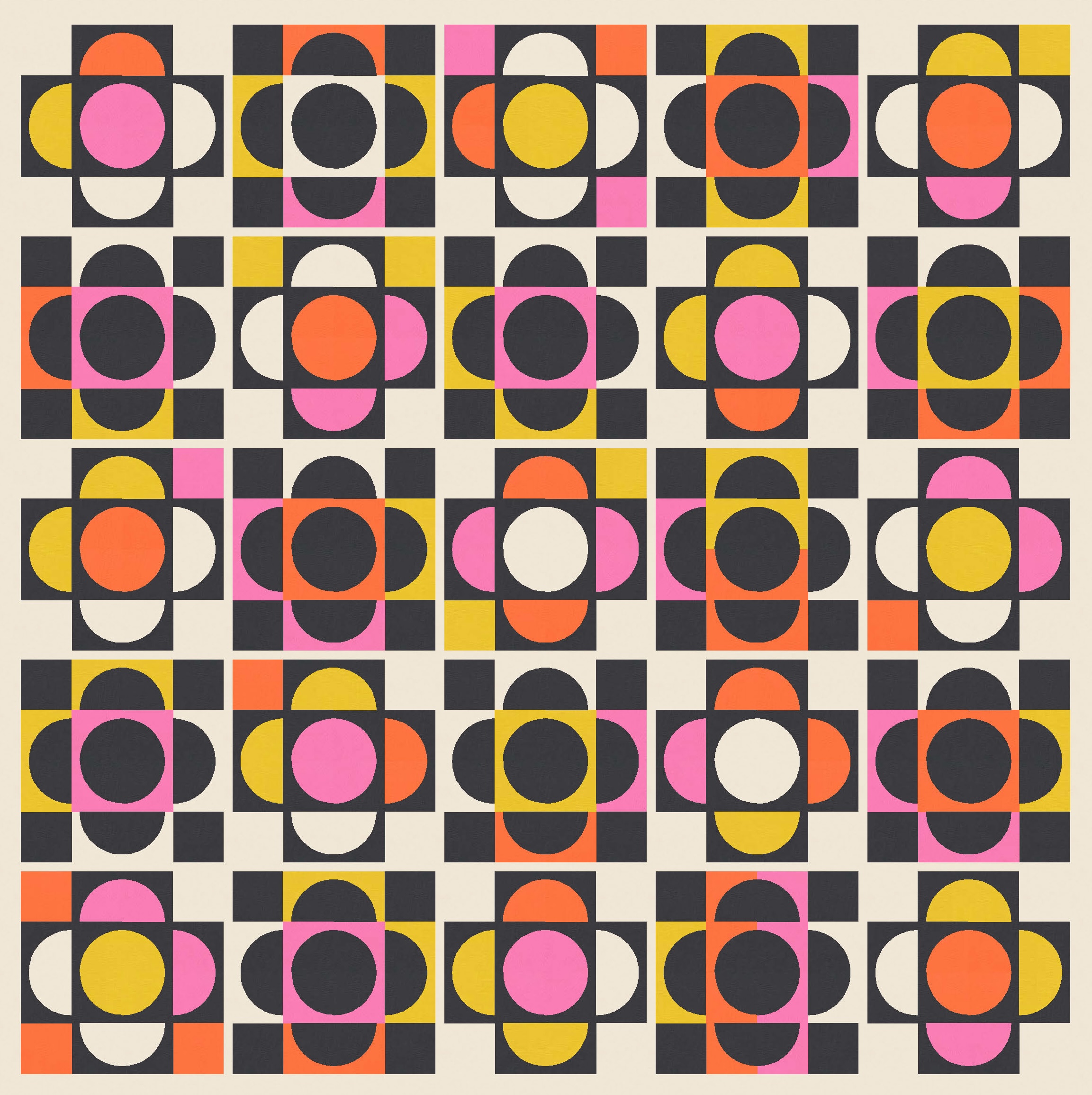
I love love LOVE this version. It’s definitely going to the top of my ‘stuff to make’ list! I think it could be fun in prints too.
I’d want to make sure that my drunkard’s path units all had that space between the curve and the edge of the unit, so I’d probably make up my own templates. (None of my current drunkard’s path templates have that space; they all leave only 1/4″ around the outside of the curve for the seam allowance when sewing to adjacent blocks.) And like I mentioned above, a bit of imperfection would fit right in with this design, so any wonkiness when sewing the curves would be just fine. Yay!
Discover more from Geometriquilt
Subscribe to get the latest posts sent to your email.
