Sunday sketch #442
A bit of fun with sawtooth stars this week, surrounding them in layers of colour that end up looking like little explosions.
This design uses only a single block on repeat, but the way I’ve coloured every other block makes them look slightly different.

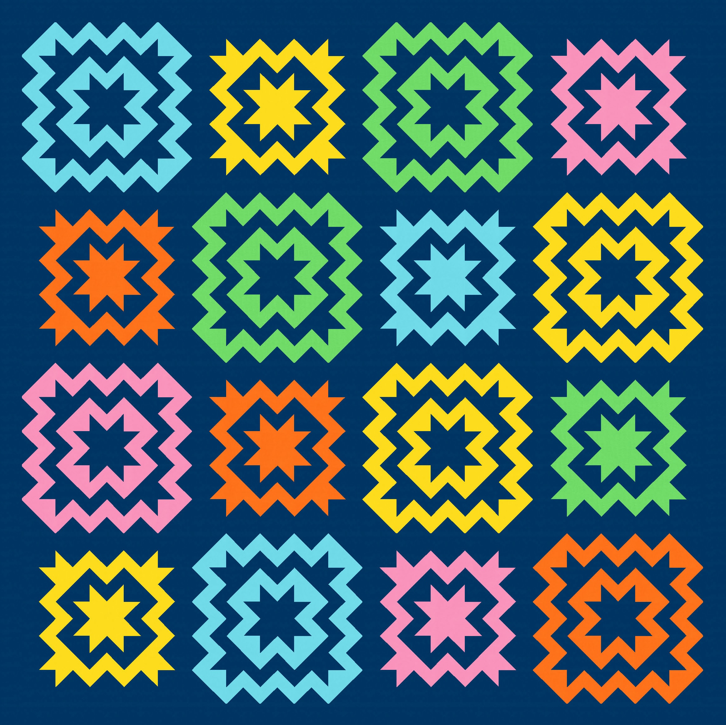
Here’s the blocks in colour against a white background, and you can see how they’re the same. But you can also see how changing the background to a dark blue would make the dark blue outlines of every second block effectively disappear (and the inside dark blue bits look ’empty’ against the background).
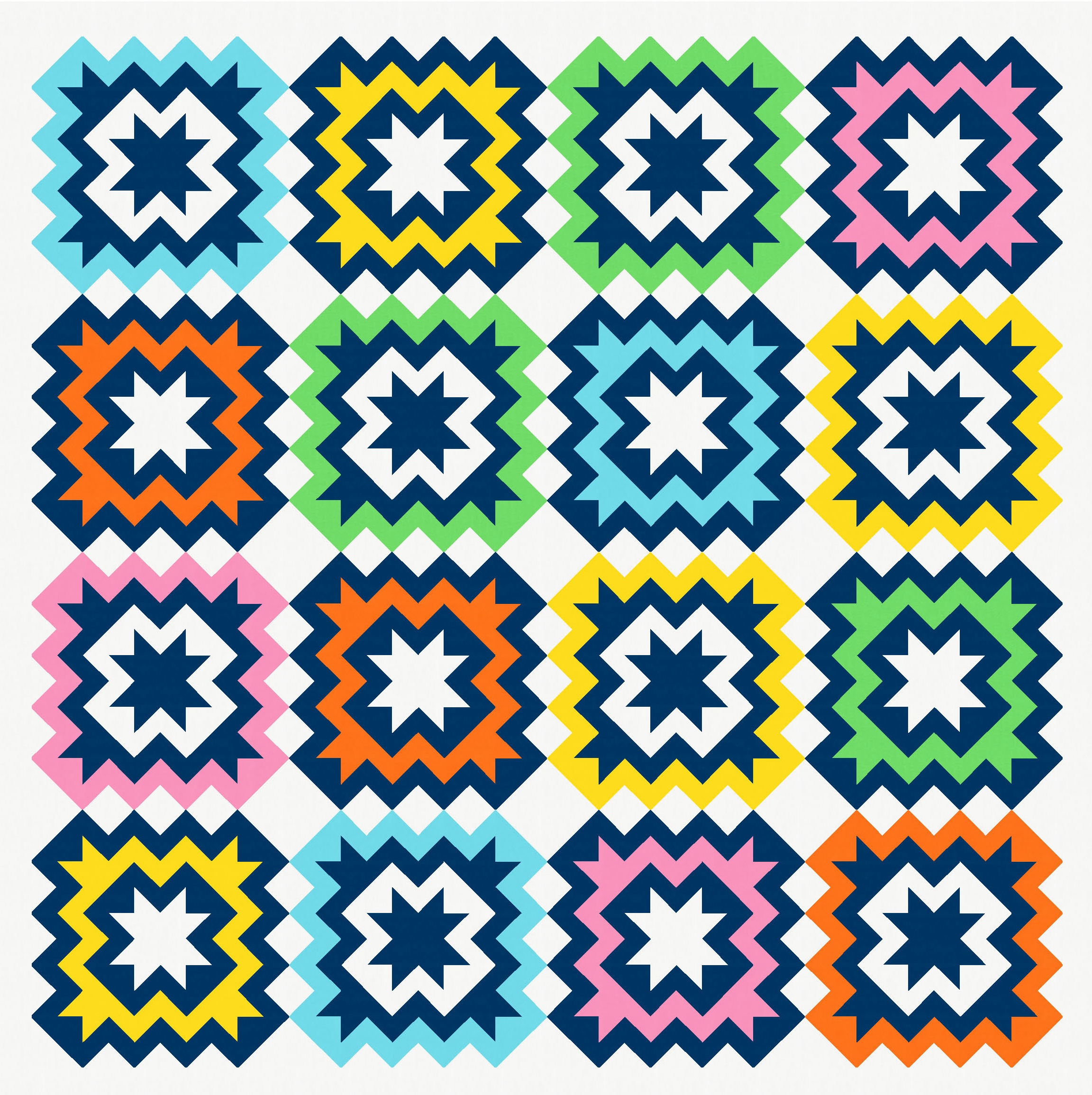
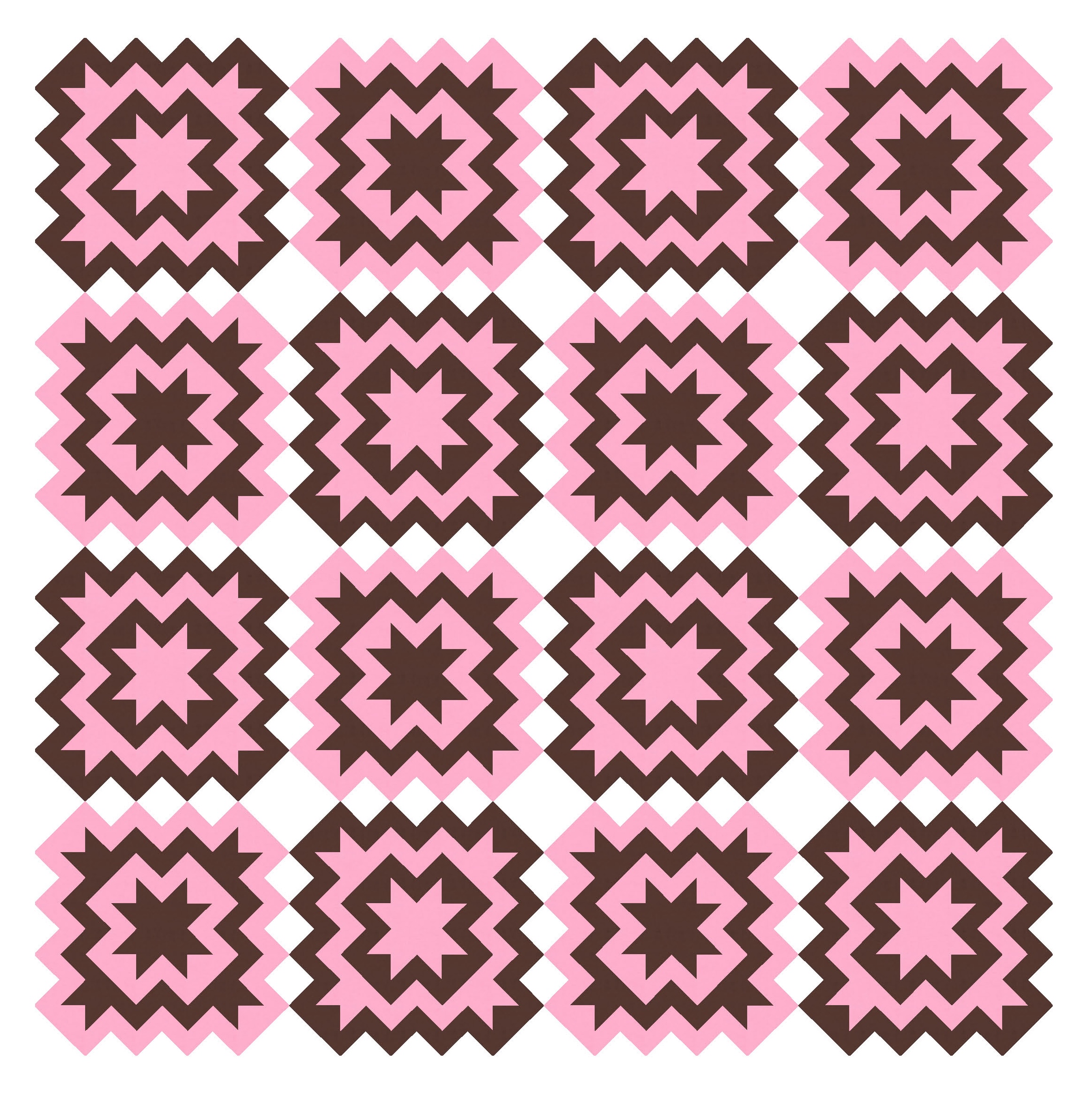
I much prefer the versions in which the blocks look slightly different. I think the change in size helps to bring a bit of action to the overall design. In this next version, I’ve used just a single colour for each block (combined with the background colour).
I don’t think the same blocks look quite as interesting against a different background.

A 3-colour palette also works:

Although not always. I find that designs like this look best if the darkest and lightest colours of the three are in the foreground, and the mid-range colour is the background. If either the lightest or darkest colour is used as the background, things end up looking a bit flat:

This colour placement also hints at transparency between the blocks, lending some diagonal movement between the blocks.

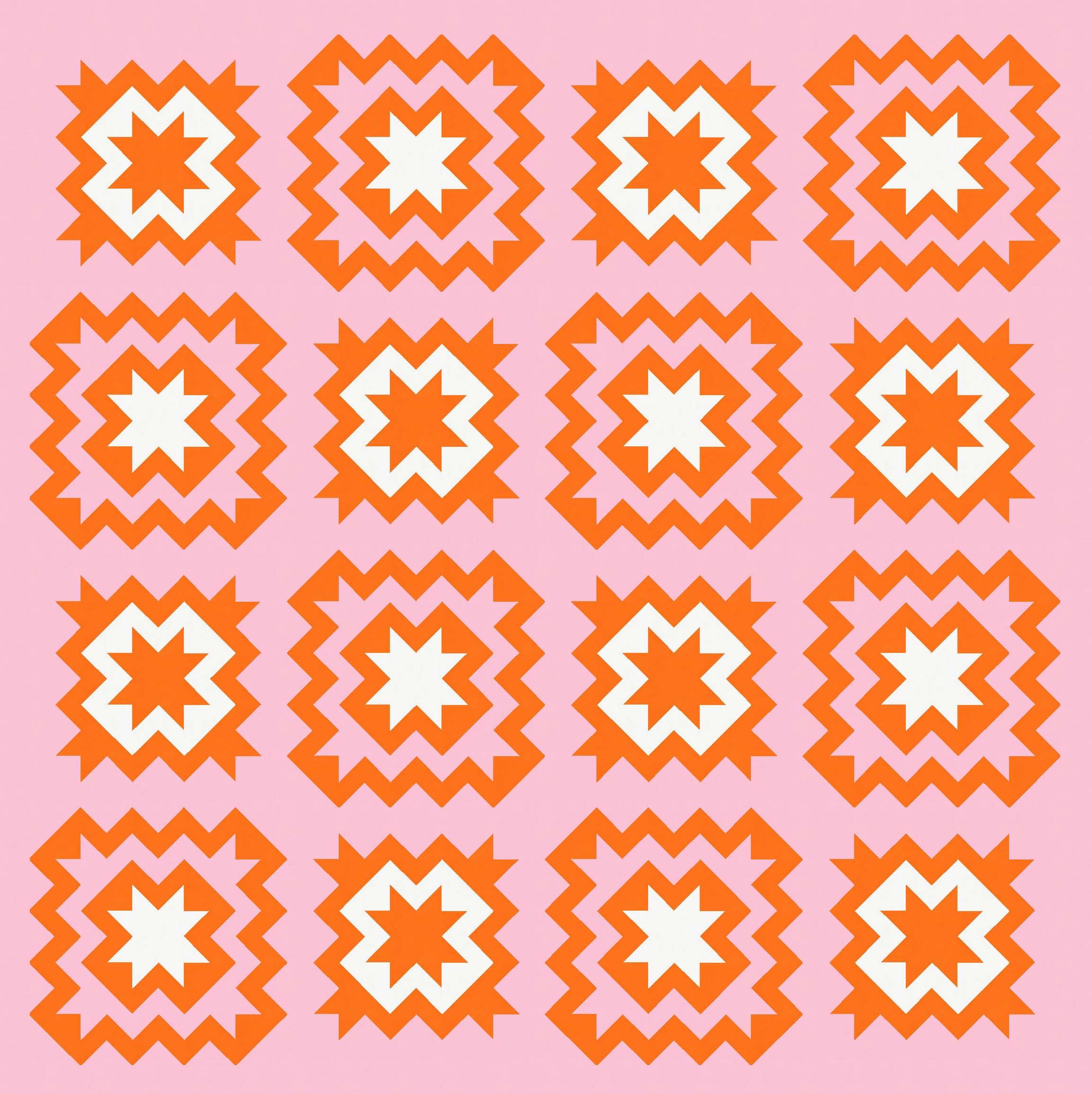
In the previous versions, the blocks were ‘solid’ – that is, the didn’t feature any of the background colour within the block. Adding a bit of background colour in the block itself can lighten things a little, and make the blocks feel less heavy. Here’s what I mean:

But using only two colours lightens things too….


I like keeping the ‘light’ version and introducing just a bit of a third colour into each block to tie things together a bit more. This is probably my favourite version.
I haven’t shown many versions with four colours, because I’m not great at picking four-colour palettes. But here’s one example. I find that using a bit of the background within the blocks helps to avoid too much busy-ness. (I kinda like this palette too!)

I designed this block originally using flying geese and half-square triangles. The blocks are in a standard layout (so, not on point). With so many diagonals within the block, it’s tempting to think that an on-point layout might be more efficient, but I don’t think so in this case. The standard layout just requires a few ‘layers’ of flying geese to create the sides of the block, with half-square triangles making up the corners. There are undoubtedly other ways to construct it, but that’s the way I’d do it.
I really like this design, so it’s on my list of potential makes for 2025. I just have to decide how many colours to use and then figure out a palette!
Discover more from Geometriquilt
Subscribe to get the latest posts sent to your email.

I want to make this one -so exciting!!! Love three and four color designs! Do you write patterns or just generate the designs and make them yourself? Not sure I would attempt this without a pattern, and you are correct that there are various ways to achieve the same effect. First one in a while with no curves, and I love the dynamic interplay of the blocks. If you do design a pattern, will be the first in line to purchase!!
Thanks! I haven’t written patterns in ages. You could sketch this out on graph paper, decide on a construction method and go for it!
I am looking for your stepping Stones pattern and cannot find it? Help, thanks.
stepping stones
It’s still available in digital copies of Love Patchwork & Quilting magazine: https://pocketmags.com/us/love-patchwork-and-quilting-magazine/issue-68#