Sunday sketch #417
I use hexagons so rarely in my designs that it took me a while to find the last one… I think it was Sunday sketches #291 and #292, which I posted in January 2022 (!). Those designs, like this week’s sketch, don’t use the regular hexie that you’re probably most familiar with – the one with sides of equal length and angles that are equal too. That shape’s a bit difficult (for me, at least) to create in EQ8, so I always end up using a different six-sided shape that’s probably a bit wonkier but feels more interesting to me.
This week’s designs all use a standard layout of a single block on repeat. It’s only colour palette and placement that change things up.
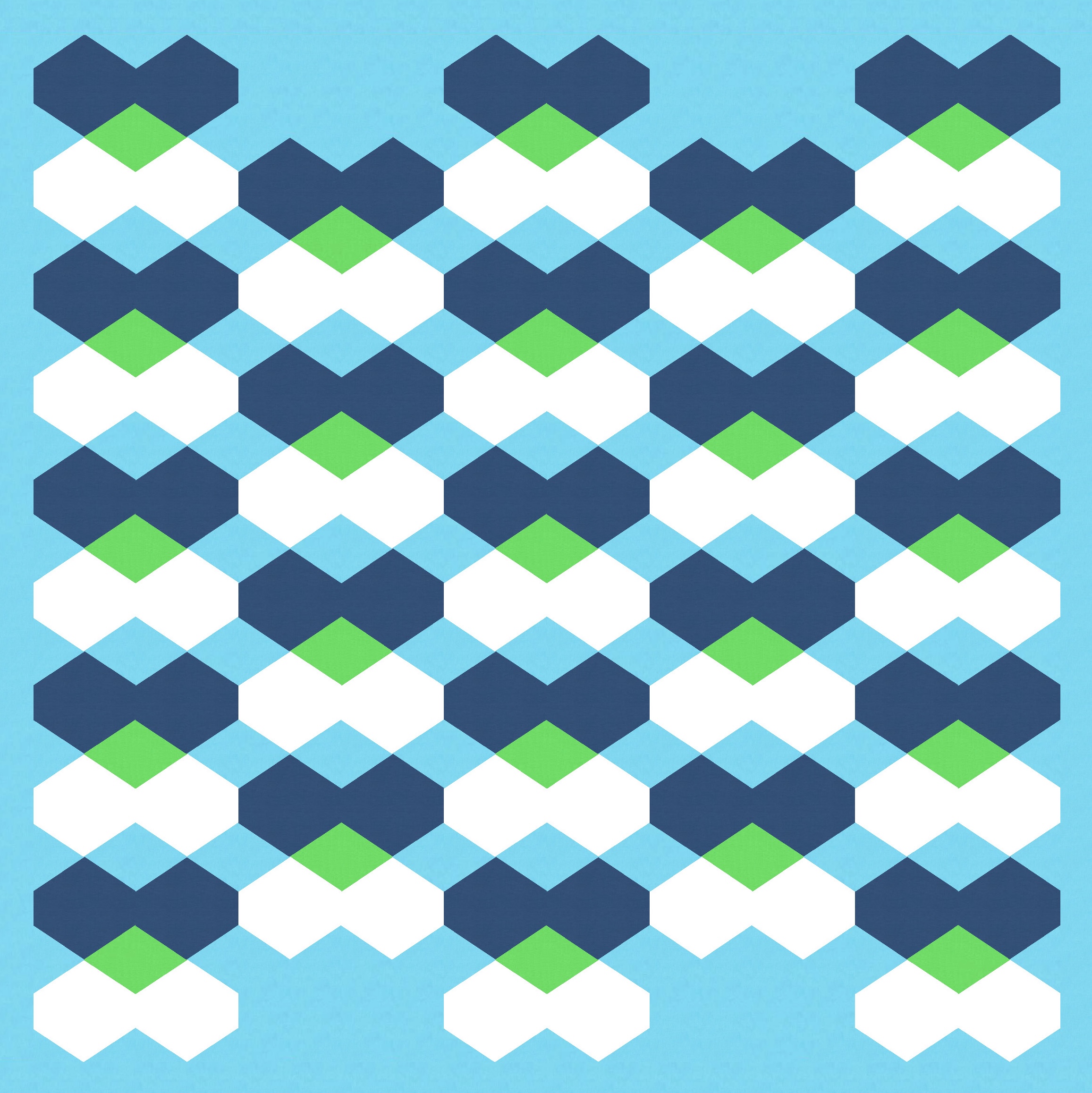
I’ve coloured the hexagons as pairs, and coloured some of the interstitial diamonds in a way that might suggest transparency (albeit with an unconventional colour – dark blue and white do not make lime green).
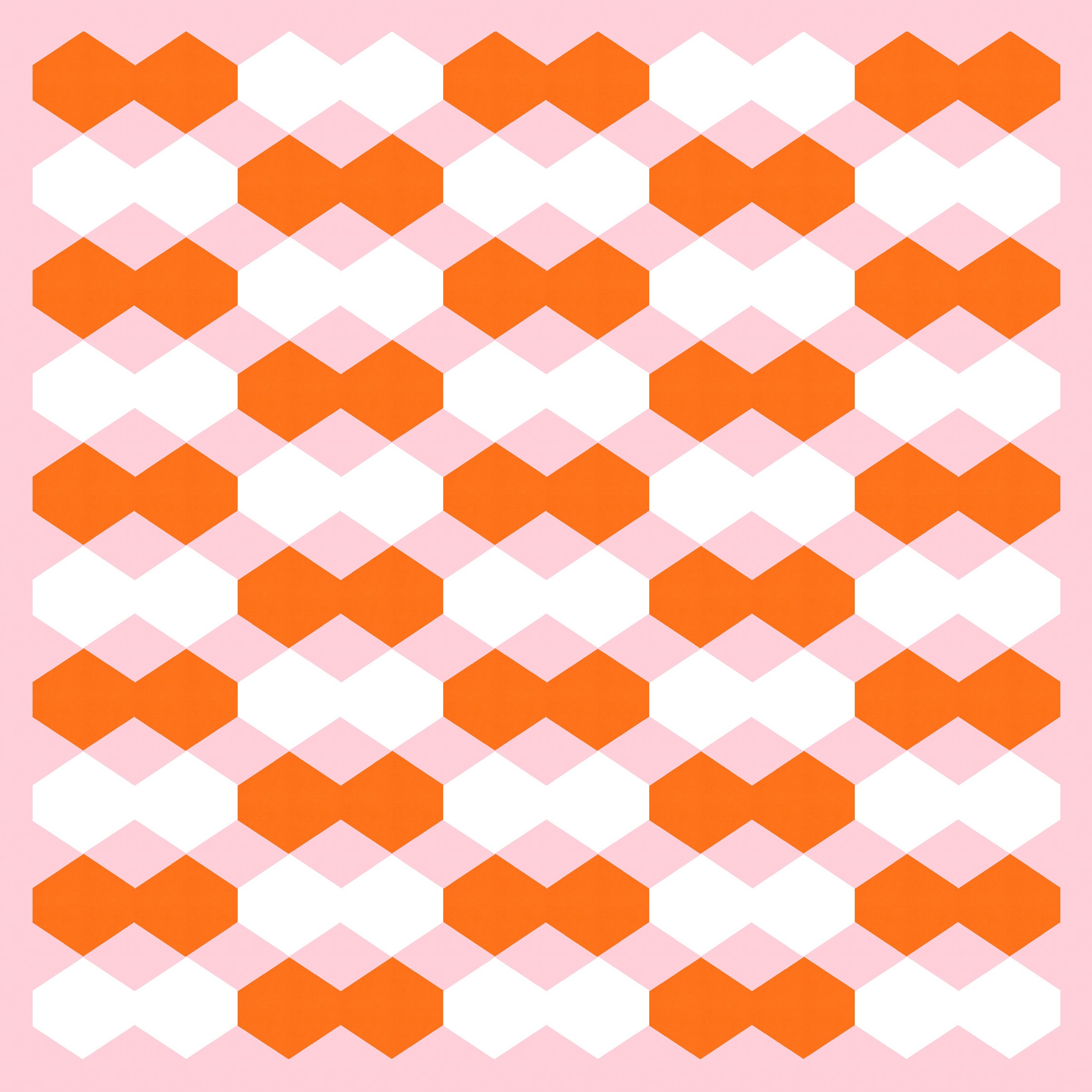
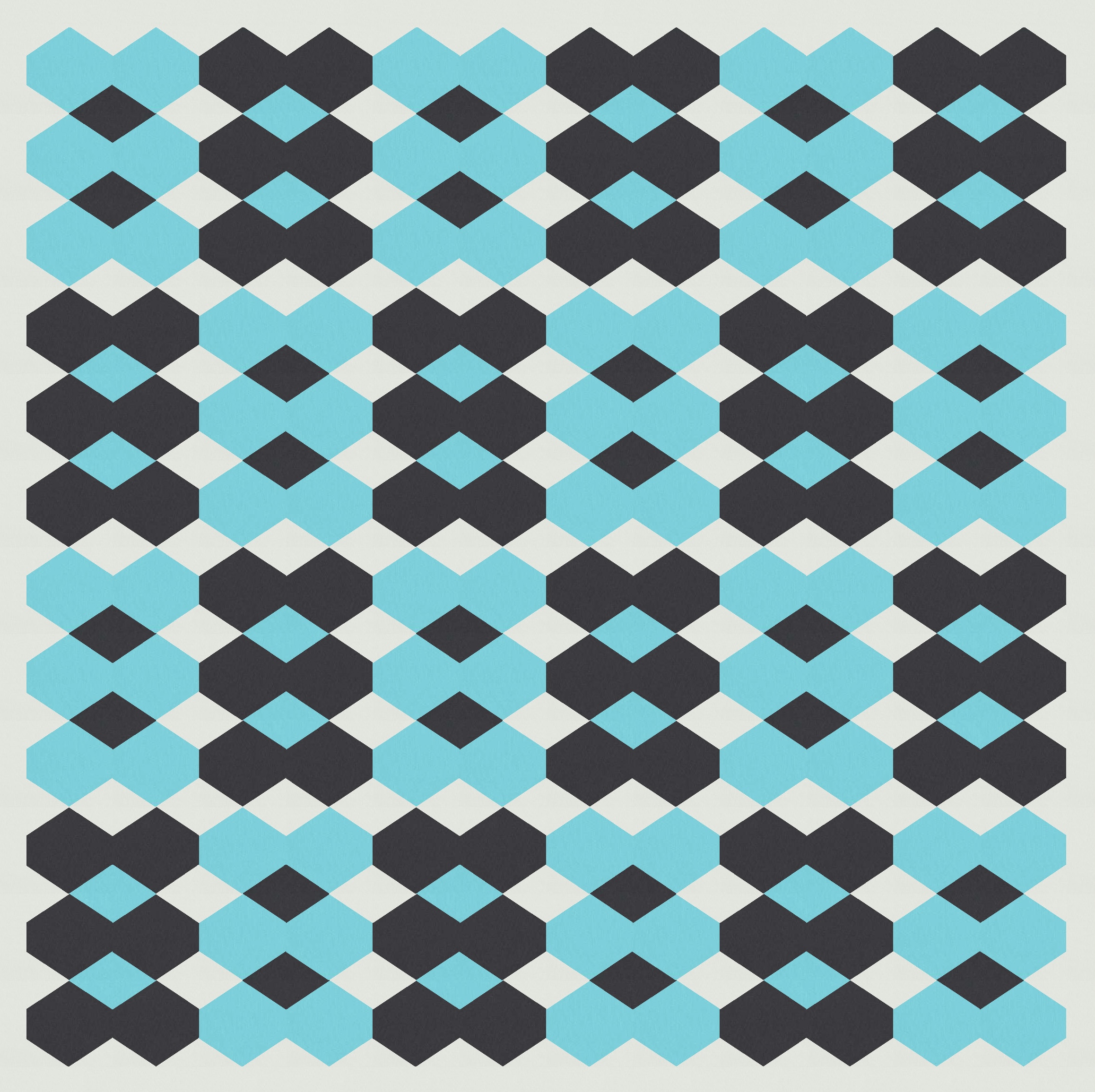
These first few versions of the design make use of the heart shape that’s created by two adjacent hexagons and a diamond shape, and then I’ve coloured the shapes so it looks like the pointy ends of two adjacent hearts are overlapping.
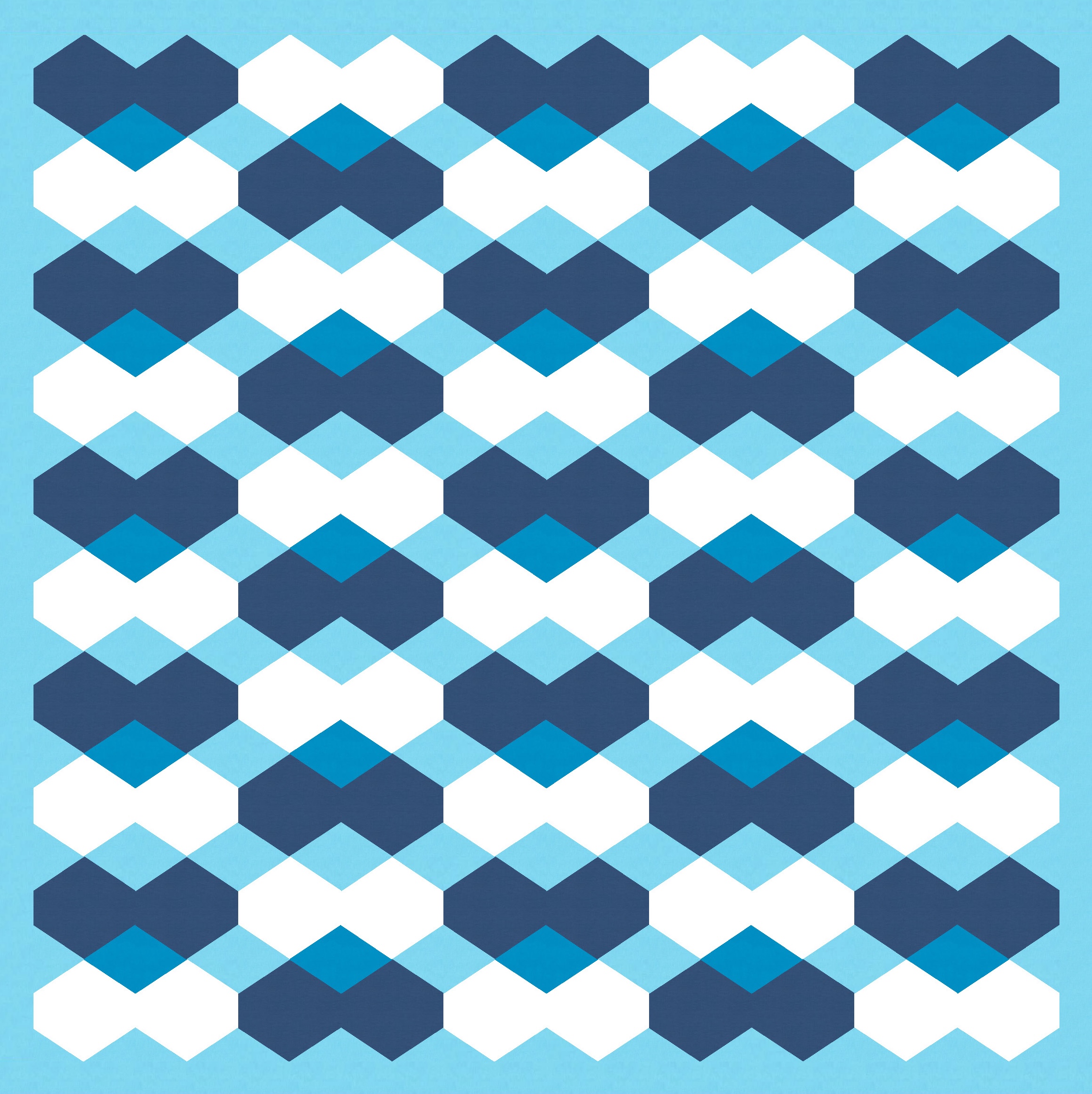
In the two versions below, I’ve staggered the overlapping hearts across the columns (on the left) or placed them in a straight line (on the right). That also changes where the coloured diamonds are. I think I prefer the version on the left. Those long horizontal strings of diamonds are broken up, and it’s a bit more visually interesting.

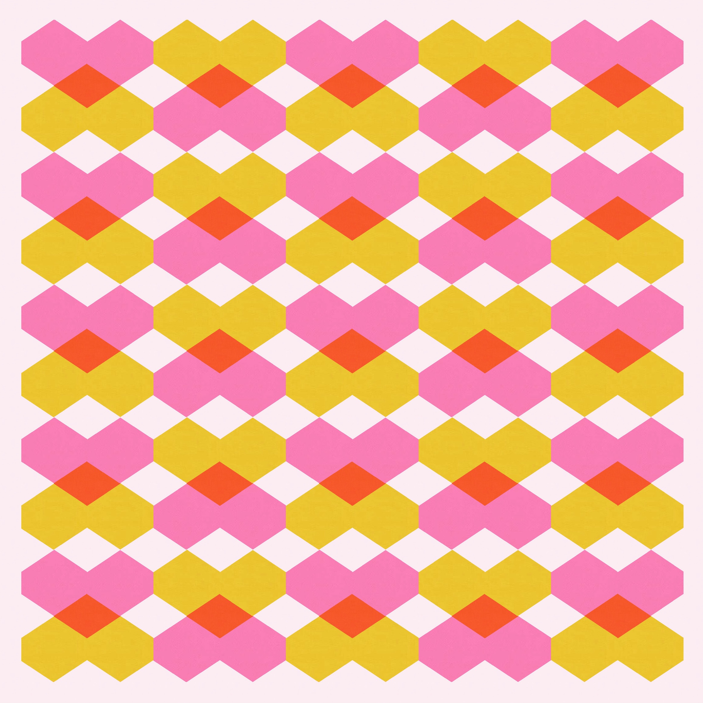
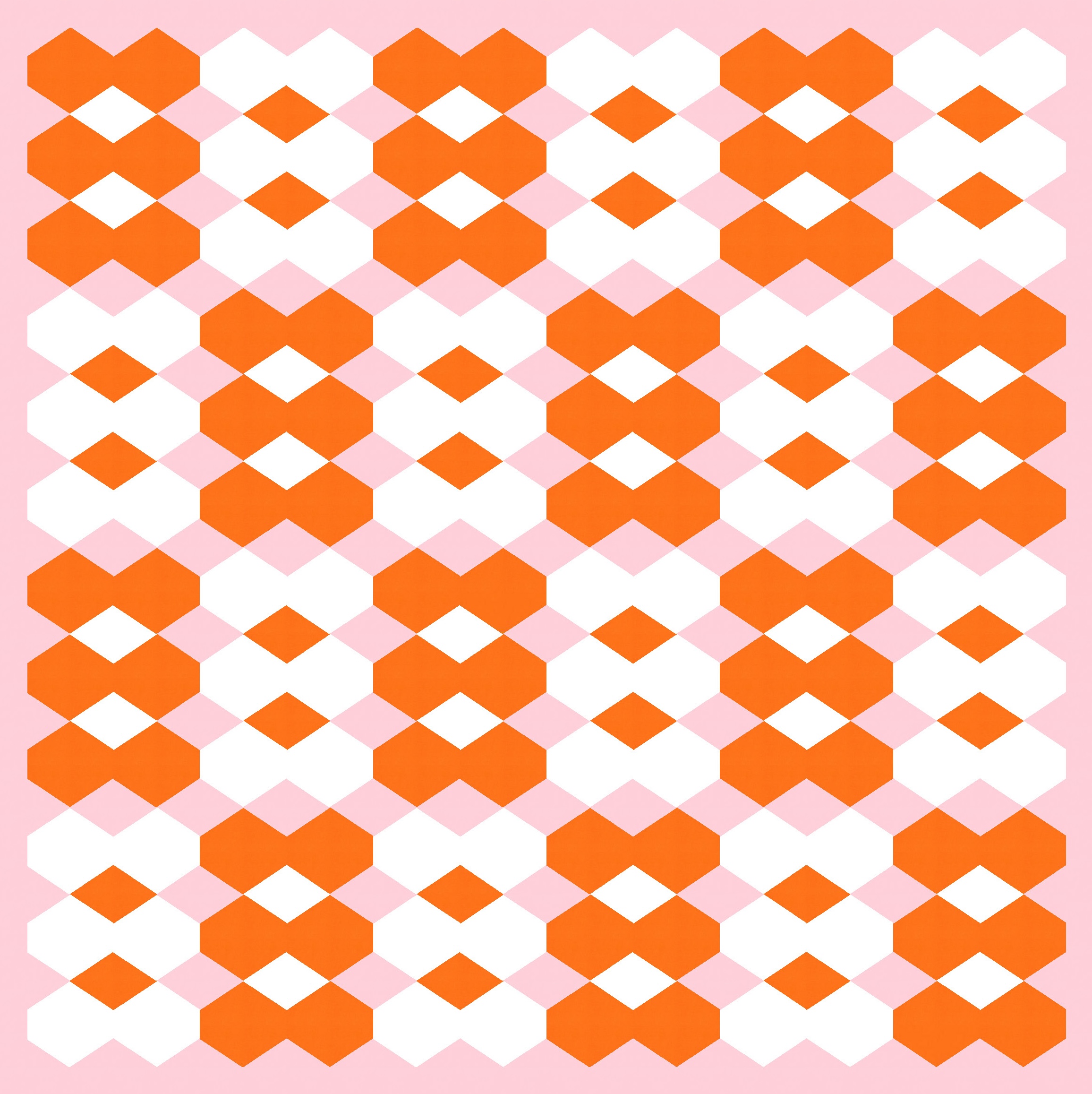
Colouring more of the diamonds creates more overlapping (secondary) shapes. Can you see the difference between the two versions below? The left one is the same as the pink, yellow and red one above right, but the right one suddenly appears to be larger six-sided dark blue shapes overlapping the white shapes.
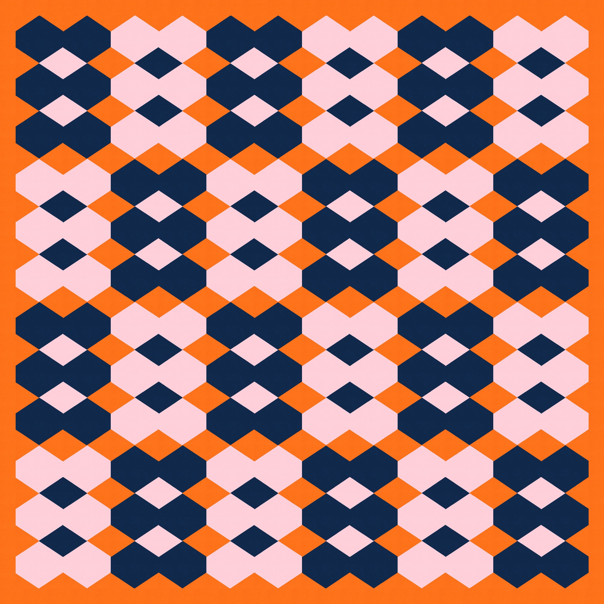
This is one of those designs that only seems to work in some palettes; I tried others and they looked downright boring or flat. I think the key is balancing where you put the three different values – using the mid value as the background and the light and dark values in the hexagons seemed to work best. But even that approach was a bit hit and miss.
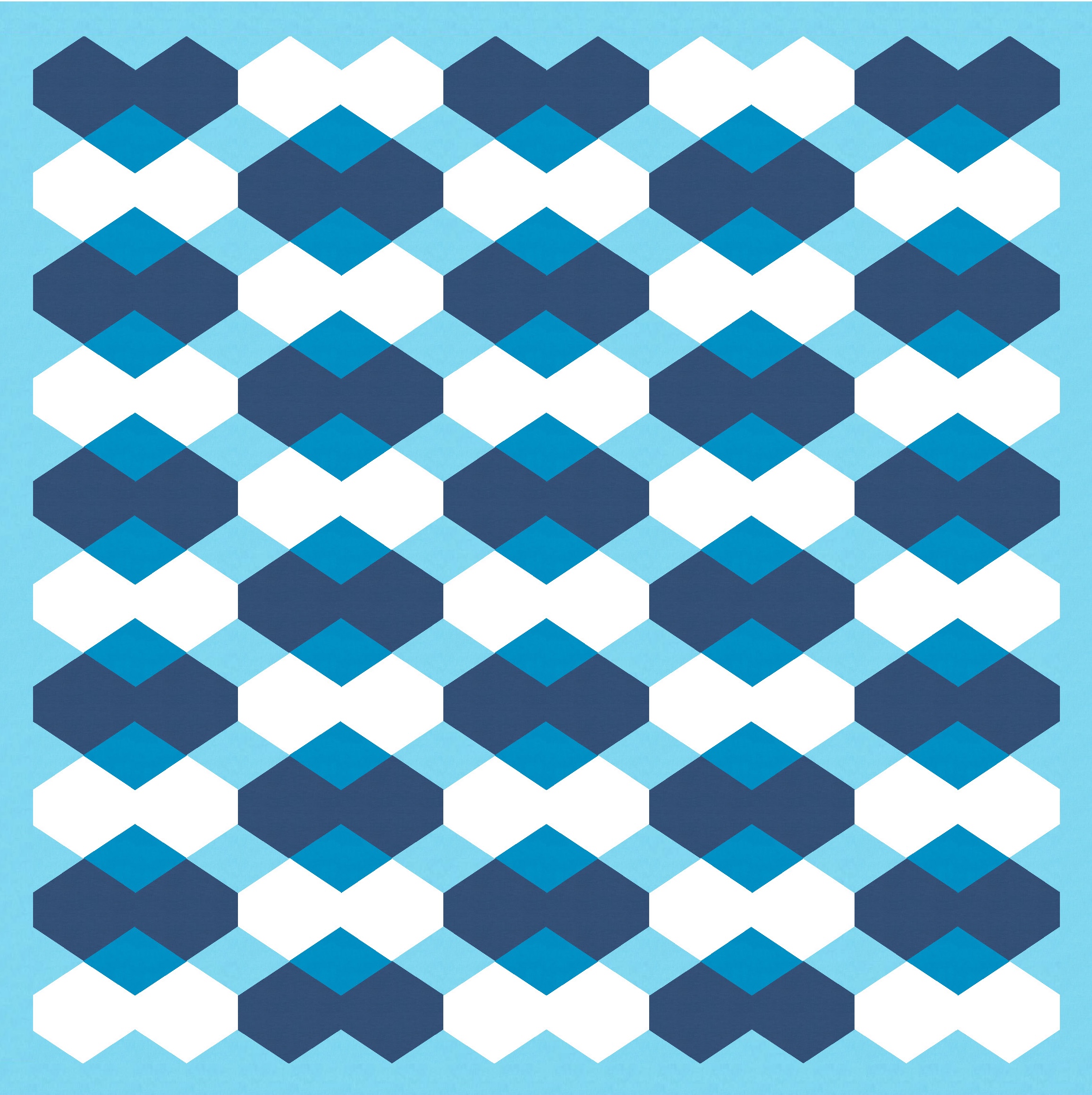
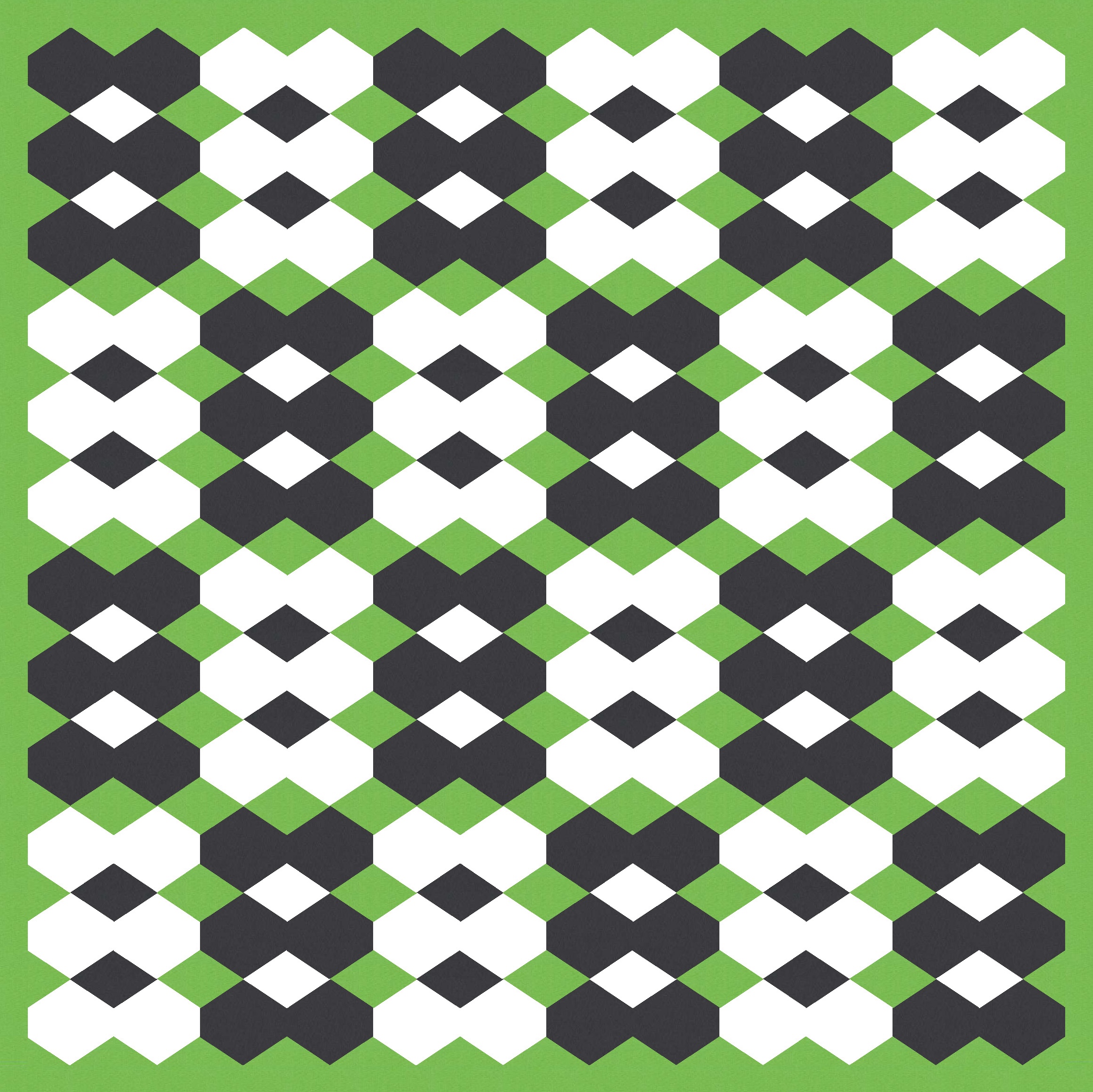
The palettes I like the most (and that I return to again and again) are the ones that seem to let you see shapes without needing to colour them in. (There’s a term for this effect, which I’ve since forgotten… possibly the Bezold effect?) Below I’ve only coloured the hexagons, not any of the diamonds. But still I feel like I’m seeing those larger shapes (like large horizontal diamonds with their pointy sides chopped off). Maybe because the background pink is the same colour that I might use to create a sense of transparency between the red/orange and the white.
I actually started out with slightly different designs for this week’s sketch, but detoured to the ones I’ve shared above. Again, the only difference is colour palette and placement; still 3 colours, but placed in a way that groups 6 hexagons together into larger shapes. For some reason these remind me of Arnott’s Iced Vovo biscuits 🙂
I created these hexagons in EQ8 by starting with a square and then just lopping the corners off (hence the unequal side lengths). You could do the same with fabric, either by measuring (using templates) or using paper piecing. That would mean that each diamond shape is actually made up of the 4 corners of adjacent blocks. I can’t see an easy way to avoid that – maybe using Y-seams? Actually, yes, this design would probably be much easier to put together, with fewer seams, if you were happy to use Y-seams! I really must try doing a Y-seam one of these days.
Discover more from Geometriquilt
Subscribe to get the latest posts sent to your email.

Very interesting about the various colorings.
Writing to say that you need a warning on that link to the Bezold effect that says “Rabbit Hole! haha
Chris Sass