Tagged: curves
Sunday sketch #338
I was telling someone recently that I’d never designed with an orange peel shape, cos I’ve also never sewn an orange peel shape, and the next time I sat down to sketch something, guess what shape came up?

It’s maybe not being used in the way that you’d normally expect to see an orange peel, but I think it works. It’s certainly fun in this colour palette (one of my all-time favourites). The checkerboard colouring helps to keep it fun too.
The main block in these designs has the orange peel in the middle, bisected by a straight line that also cuts the square block into two rectangles. But colouring some of the block in the same colour as the background lets the orange peels hang off the edge in some cases, or give a nice curvy edge at the top and bottom.
Here’s a simpler version (same design but less ‘busy’ colouring) – this one might be my favourite.

It works in the other direction too. I feel like those orange peels in the middle are giving me the side-eye 🙂

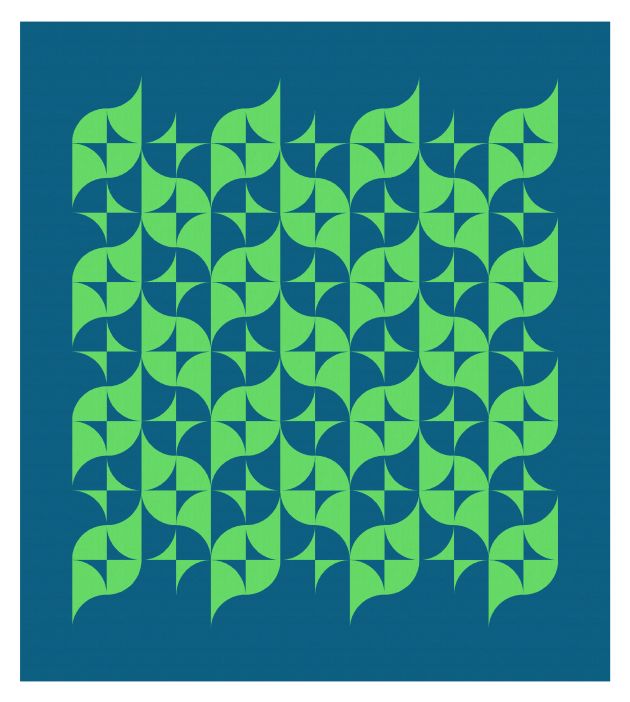
Here’s a more regular layout, where you might be able to see the basic block more clearly. Placing blocks in the middle of the design and then using one of the block colours as the background helps to ‘float’ the shapes a bit.
I also like colouring the edge blocks so that there are no hard vertical lines showing the outside borders of the block – just the curves of the orange peels undulating down the page.

On looking at the blocks now, I can see hourglass shapes too. I should’ve tried a design that echoed that shape. Here’s one with just a large diagonal instead.

These designs could be made into a quilt using templates of some sort (I’d probably just make my own). Once you got the hang of sewing these curvy shapes (and when I say “you”, I mean “I” 🙂 ), I think the quilt would come together pretty quickly.
I’m going to use these shapes in more designs, so keep an eye out for related sketches next week.
Sunday sketch #304
The last version of Sunday sketch #303 led me straight to the first version of Sunday sketch #304.
I took those undulating step-and-curve shapes, which look a bit like a cross between a clamshell and a Devo hat, and tiled them across the design.

As always with two-colour designs, I have to show the inverse colourway. (In one of my favourite palettes of Kona Gotham Grey and Seascape… I’m not sure how well they work together in real life, but I love how they look on my screen in Electric Quilt.)

Now, I’ve coloured those elements so they appear in the foreground, but they can also be coloured so that they appear in the background. That brings a different shape – the ones formed in-between – to the foreground. This is just making use of negative space.


I then introduced a new shape. Previously, each block was a circle that had two opposing quadrants replaced by a 9-patch. In the next versions, I replaced one of those 9-patches with two small concave drunkard’s path units. They combine to create a convex, curvy fleur-de-lis-like shape (for lack of a better description).


Isn’t that so pretty?
And again, I can flip the negative space so that the shapes are now created in the background instead of the foreground.


I love the combination of curves and sharp edges, but I wanted to try those curves on their own, too.


What a lovely outcome! The small curves bump along like clouds across the page, while the larger curves swoop up and down. I am smitten with this design. (Eagle eyes may notice that I used the wrong blue on the first of those two designs, but I was too lazy to redo it in Seascape!)
The thing I like about switching up the negative space is that it always takes me a minute to ‘find’ the shapes… in the first version below, I focus on the blue first, then my eyes finally find the black shapes. And in the second version, my eyes settle on the black shapes before seeing the blue ones. It feels like a secret being revealed.


Last week’s and this week’s designs show how easy it is to take one main shape and iterate through a bunch of related designs, ending up with something that looks nothing like the original (compare the last design this week with the first design last week). That’s probably my favourite part of quilt designing.
This week’s designs are made from quarter-circle (drunkard’s path) units and 9-patches, or just quarter-circles (large and small). I think all of the designs shown here are 8 x 8 layouts, so blocks of 8″ (finished) would make a 64″ square quilt. That means the smallest curves would be 4″ (finished), which isn’t too bad (at least, not for me). Or you could size up and do 9″ and 4.5″ curves (which would also make the calculations easier if you were making the version with the 9-patches, which could then be 9″ square (finished) as well). Which is basically a long-winded way of saying that even though the curvy design looks somewhat delicate, the curves don’t have to be super-small or finicky.
I also used curved corners on these designs; I felt like they just worked better. I’m determined to make a curvy-cornered quilt one of these days!
Sunday sketch #279
This week’s design is the logical evolution of Sunday sketch #278 – just extending the top and bottom of each ‘lemon’ shape using more curves.
I tried it in a bunch of two-colour palettes, and they all look good!


I didn’t try an expanded palette, so I’m not sure how I’d introduce a third or fourth colour into this design. I kinda like the simplicity of this version.
This week’s design is made up entirely from drunkard’s path / quarter-circle blocks. With a two-colour palette, you could make the entire quilt (minus borders) just by chain-piecing two block colourways.
