Sunday sketch #493
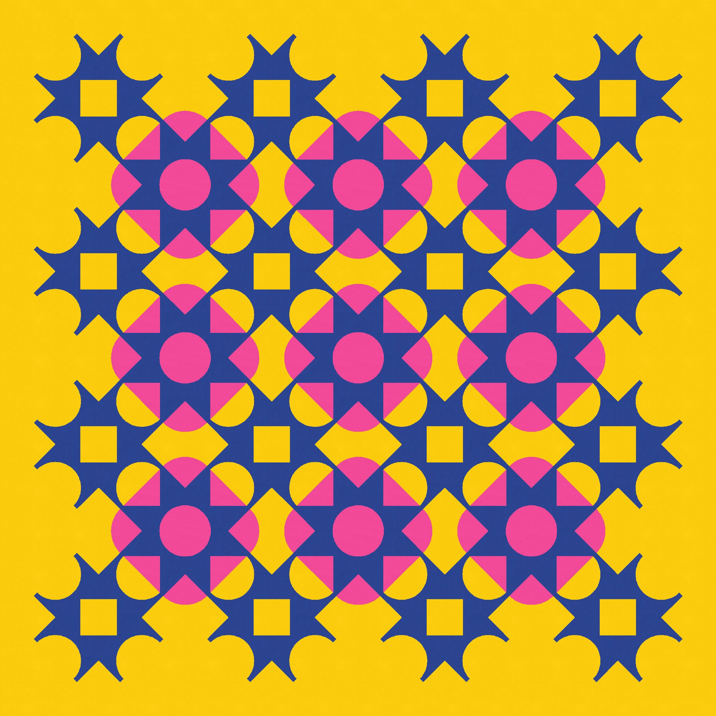
This week’s sketch is closely related to last week’s. Well, the underlying design is exactly the same – but I’ve changed the orientation, the colour placement, and the palette. I think of changes like that as cosmetic rather than structural, as they wouldn’t affect how you’d construct a quilt from this design.
One of the things I liked most about replacing ‘standard’ shapes with chunkier ones in last week’s sketch is how it made the connections between blocks a little clearer and stronger. Together, those connections help to create a lattice that appears to overlay the whole design.
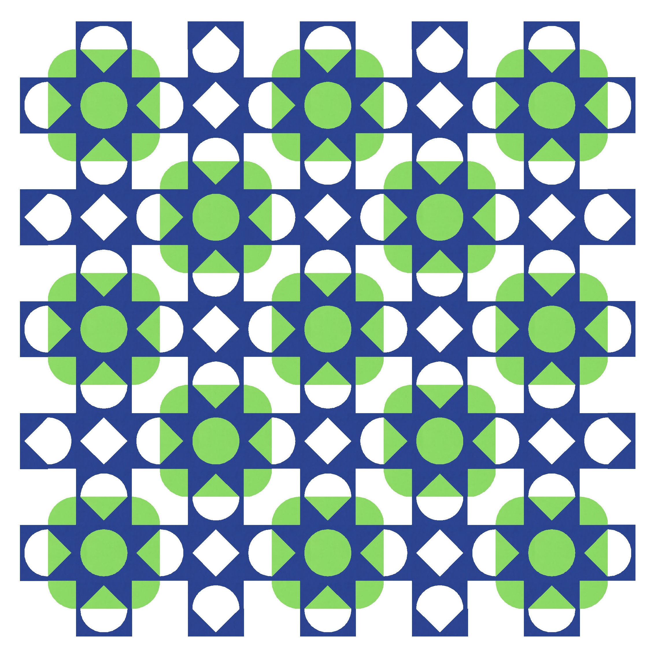
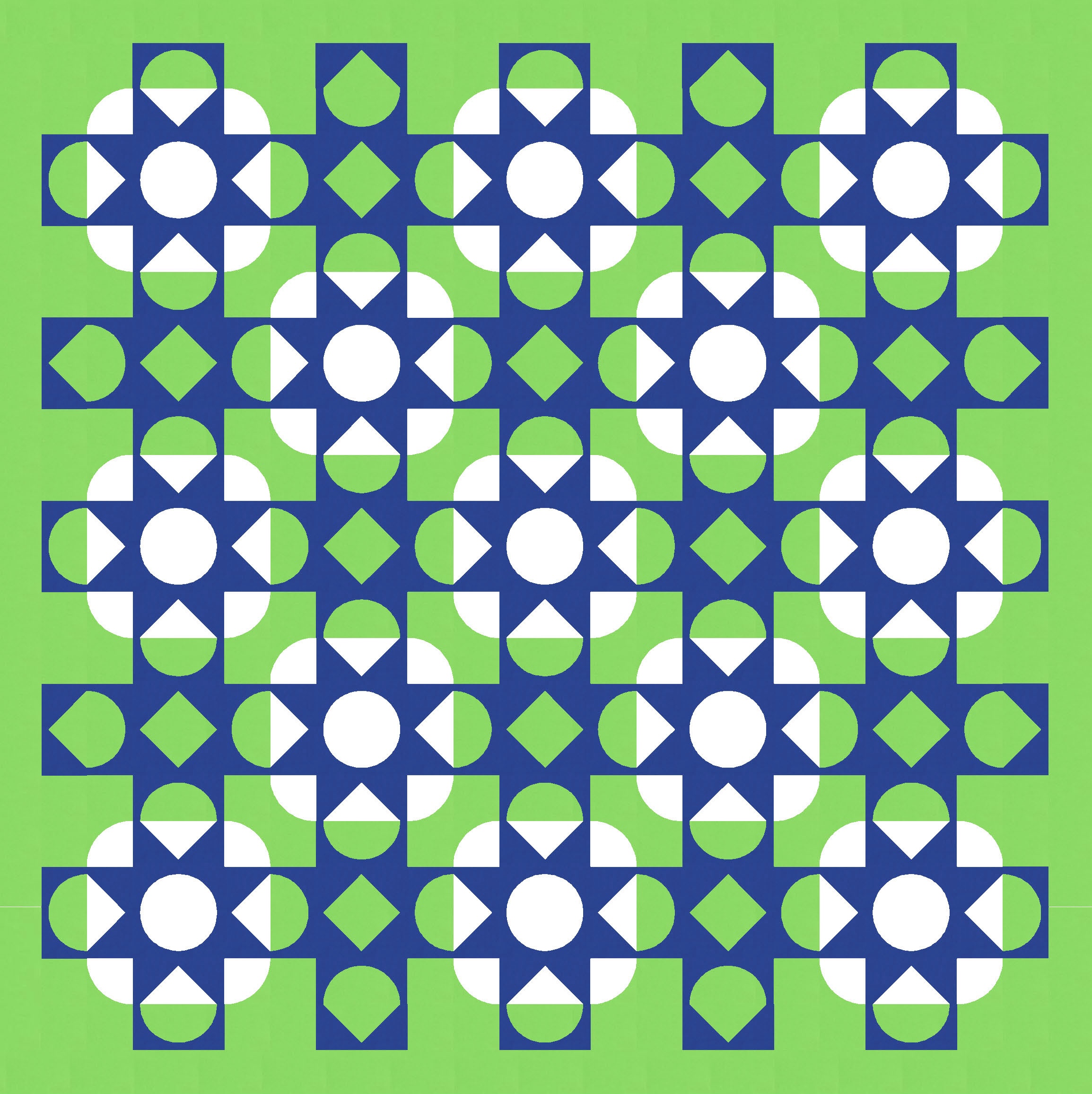
I started with a standard layout, like last week. The design still features an alternating arrangement of two block types: both sawtooth star-ish, but one with curves and one with straight lines. I’ve used a three-colour palette for all versions of the design this week, and I think I prefer the darkest colour as the lattice; it just seems to overlay more clearly.
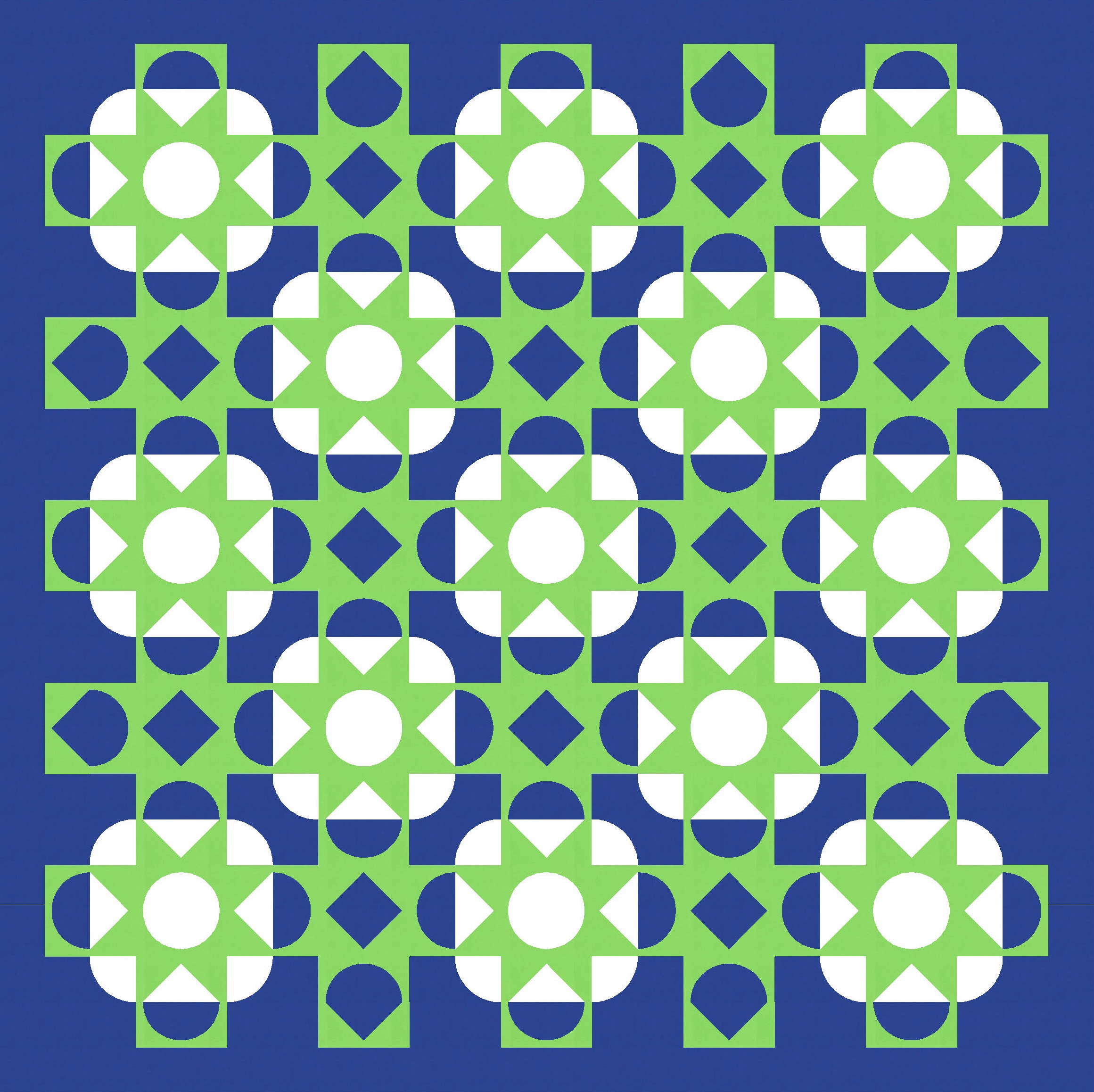
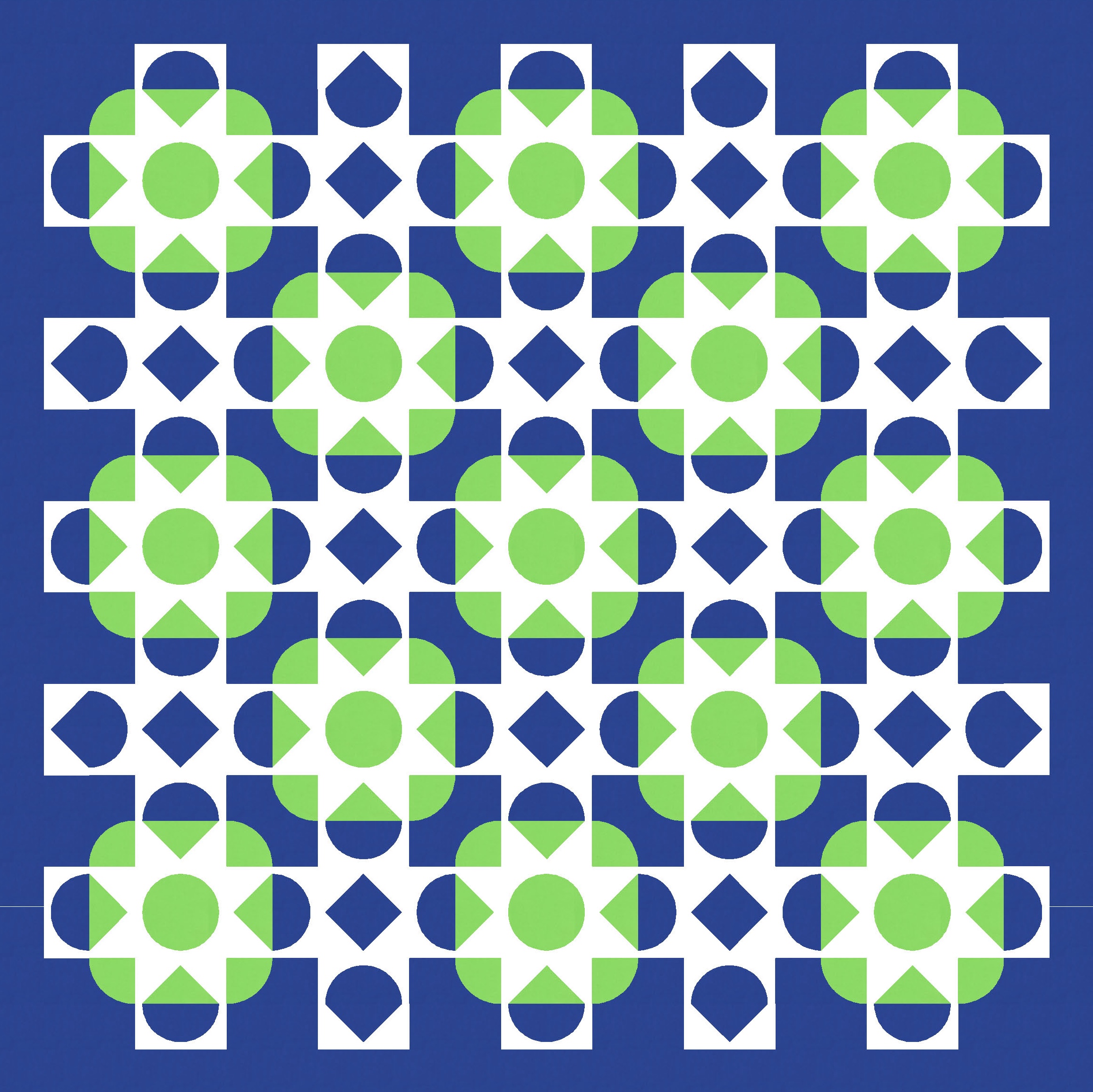
I played around with how much colour to add or take away from the lattice. I tried taking away colour from the underlying squircles by colouring the internal circles the same as the background, but that kinda defeats the lattice effect (below left). And I tried filling in some of the other shapes, like the internal square in the curvy sawtooth, but that also sorta detracts from the lattice (below right). Still, you’re allowed to make or break any rules when you’re quilt designing, so these are options you could use if you wanted to subtly change the look or feel of this design.


I thought I was completely happy with this standard layout; I even started writing this blog post with the intention of sharing that version. But then I did what I often do when I’m obviously not 100% thrilled with a design… I tilted my head to the left by about 45 degrees.

I had a feeling the design might look a little more interesting using an on-point layout – that is, one where the square blocks are laid out on the diagonal instead of a horizontal/vertical grid. I went back to Electric Quilt 8 and redid the whole design. Yep, I like that more!
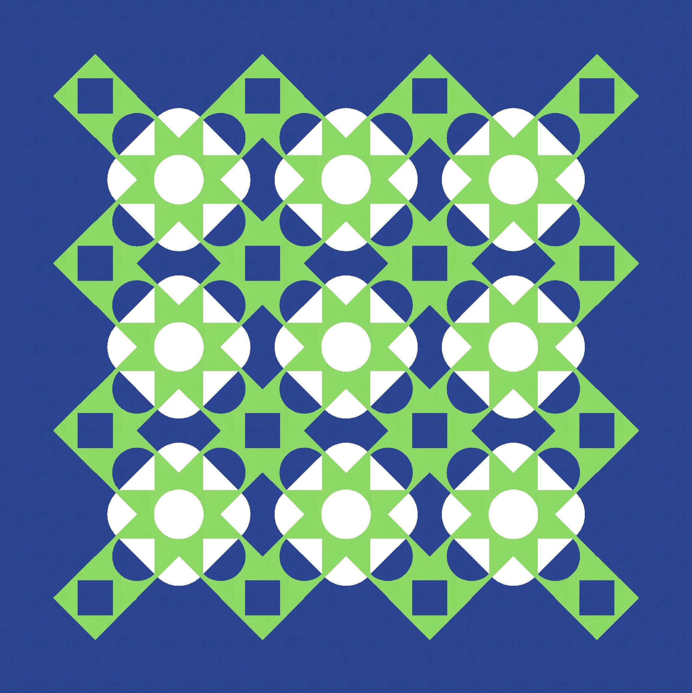
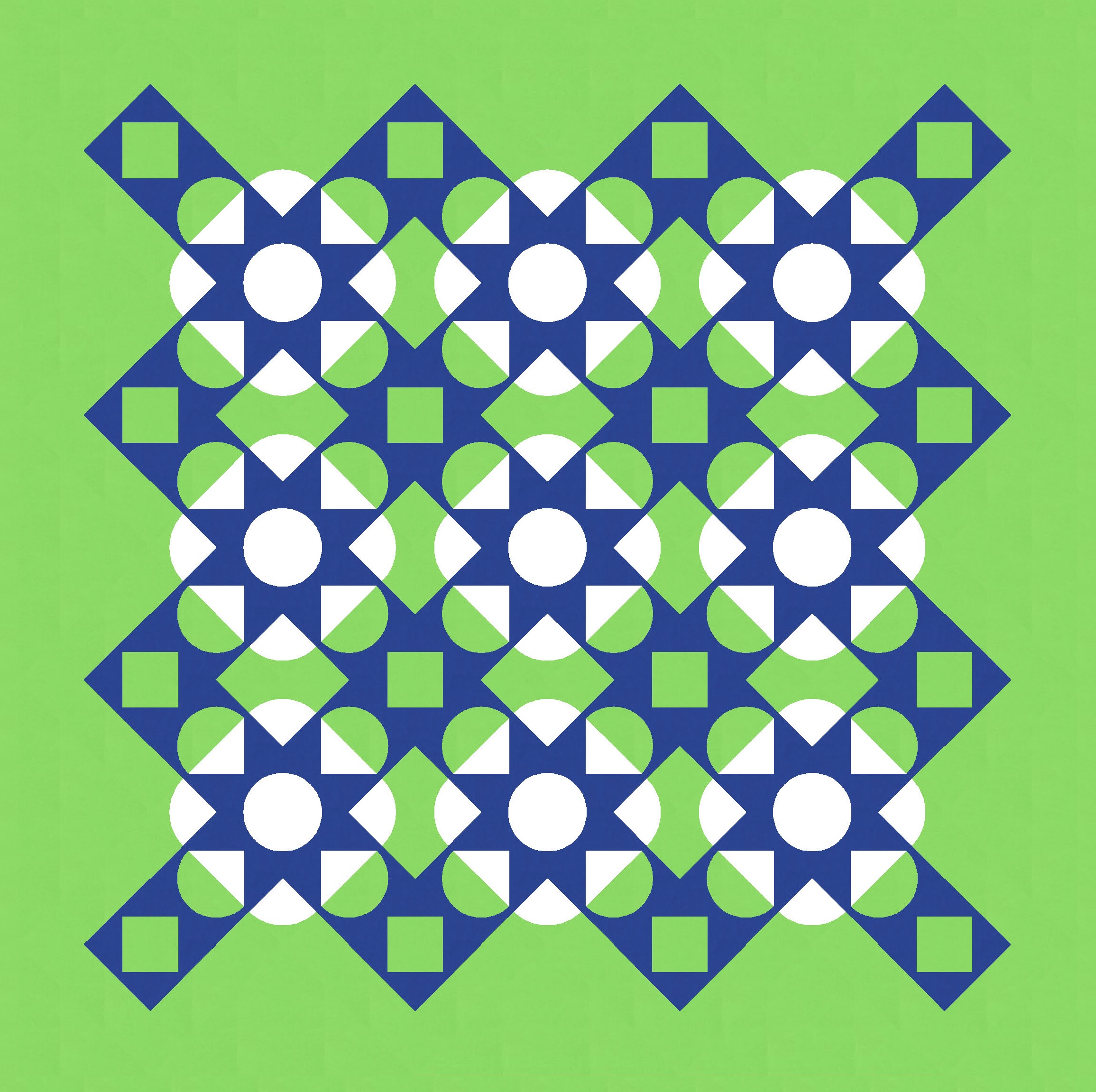
I spent a bit of time deciding how far to extend the lattice. Stretch it out a bit, or keep it close to the underlying squircles? I feel like that small change can actually make a big difference to the overall feel of the design.

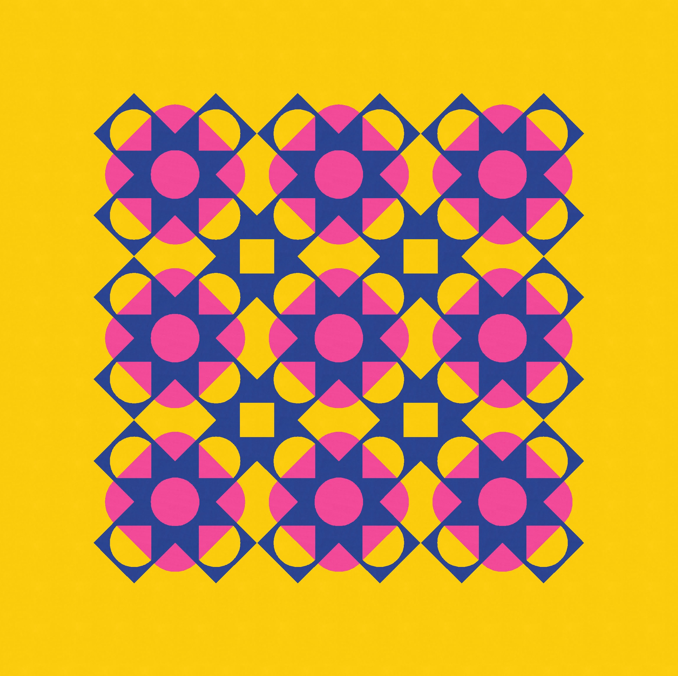
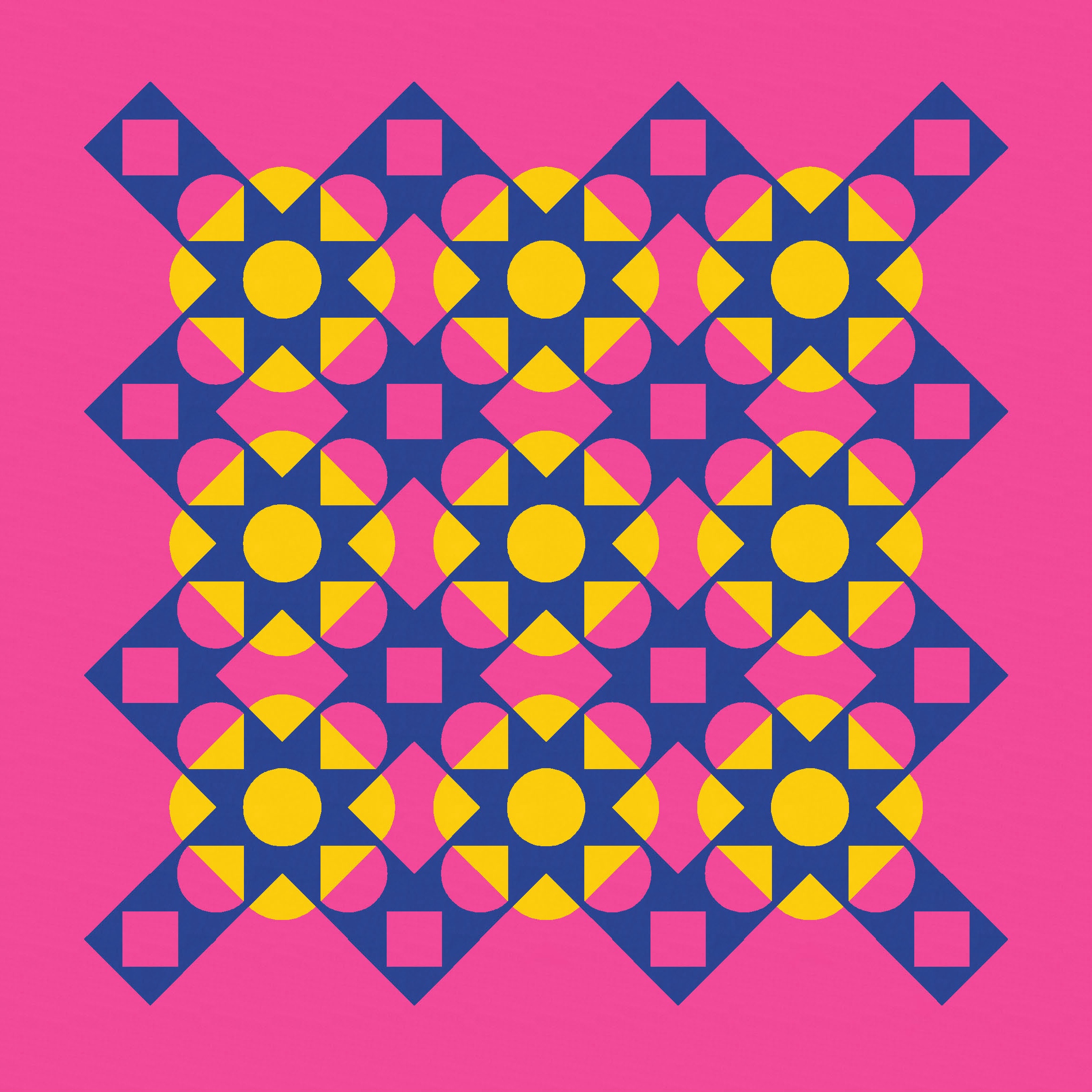
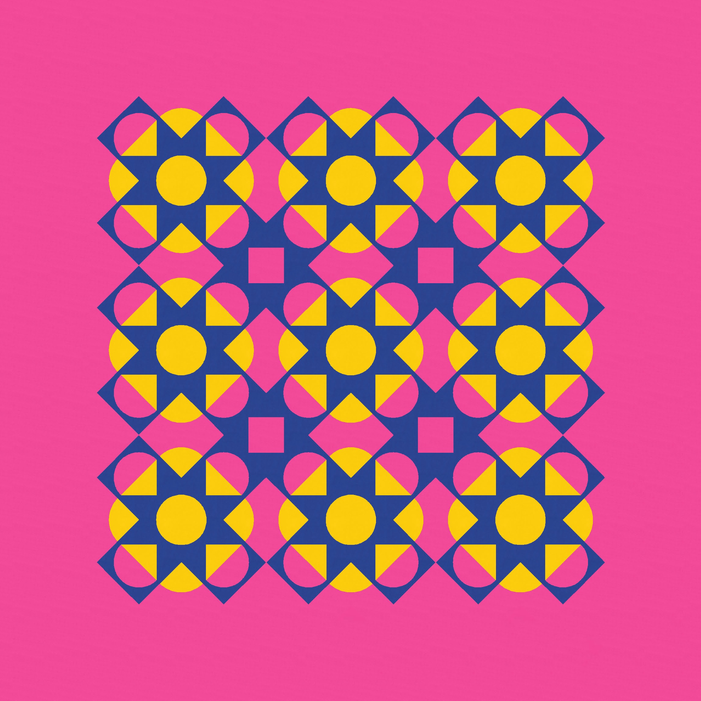
I like them both for different reasons. But in the end, I decided to go in the other direction: adding instead of subtracting. I like the shape of those angled, curvy sawtooth stars – their chunky arms feel a little like tentacles reaching out, feeling around for something to grasp on to.
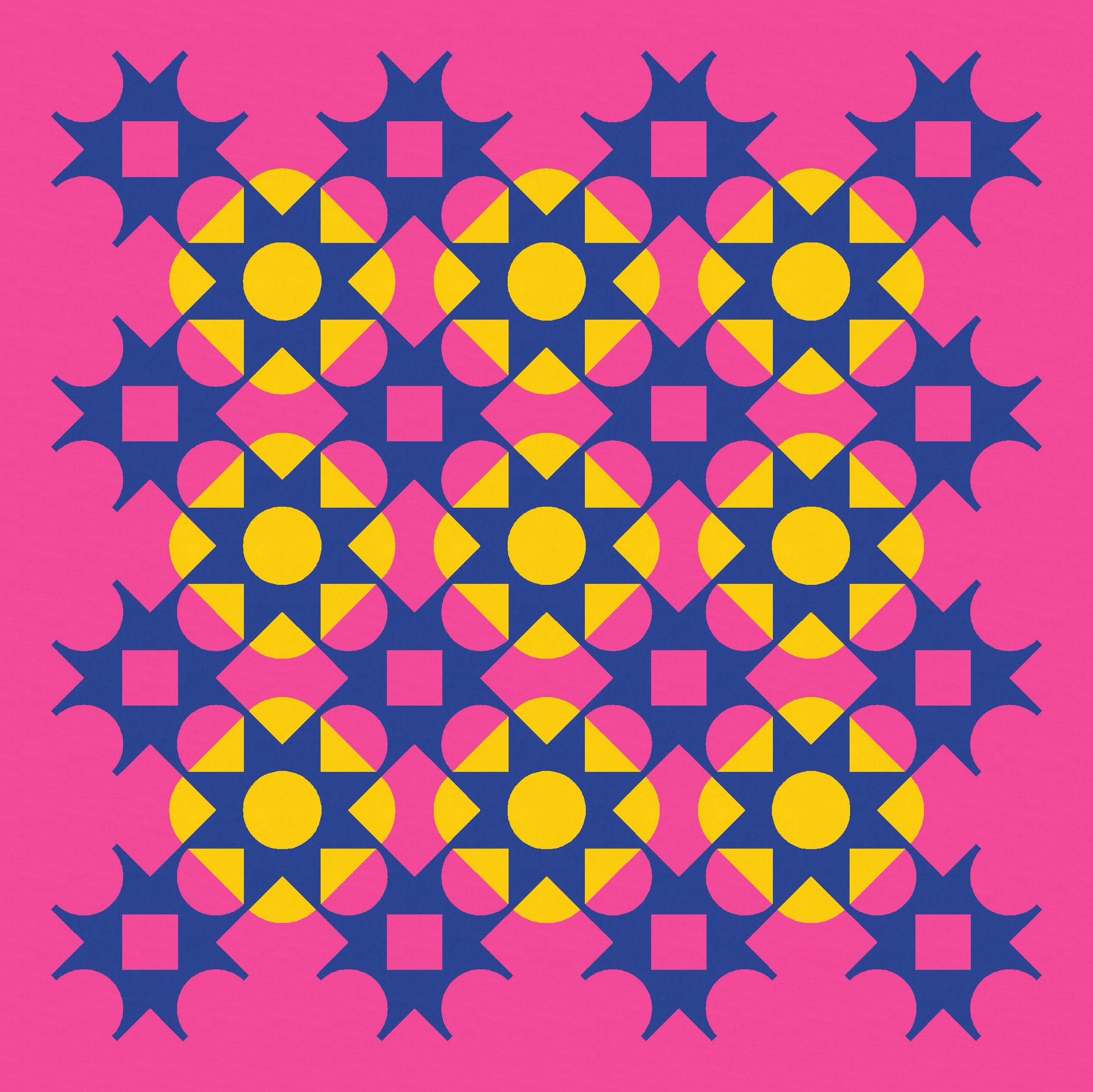
If you wanted to make this week’s design, you’d probably want to make templates for making those chunky curvy and straight sawtooth stars (like last week’s approach). Because I’ve used only three colours here, there’d be a lot of similar blocks to make (same shape, same colour). So if you’re into chain piecing, you’d fly through it.
I’ve got one more variation on this design to share, so check in next week!
Discover more from Geometriquilt
Subscribe to get the latest posts sent to your email.
