Sunday sketch #473
This week I’m reusing a little shape from two recent Sunday sketches (#469 and #470) – basically a set of four kite-in-a-square units where the kite’s point doesn’t quite meet the square’s corner.
I have to thank Kacie Grossman (@whoop_ingcrane on Instagram and Handmade by Kacie online) for prompting me to keep playing with this shape. She commented on my Instagram post for Sunday sketch #470: “This week and last I’m really struck by the shapes created in the corners. Could we call them “cornerstones”? Do you know what I’m referencing? I’m so curious to see what a design focusing on those shapes would look like.” I had played around with those shapes a bit, cos I liked them too, but I hadn’t quite reached any designs that I was happy with. Kacie’s comment was all the encouragement I needed to keep going!

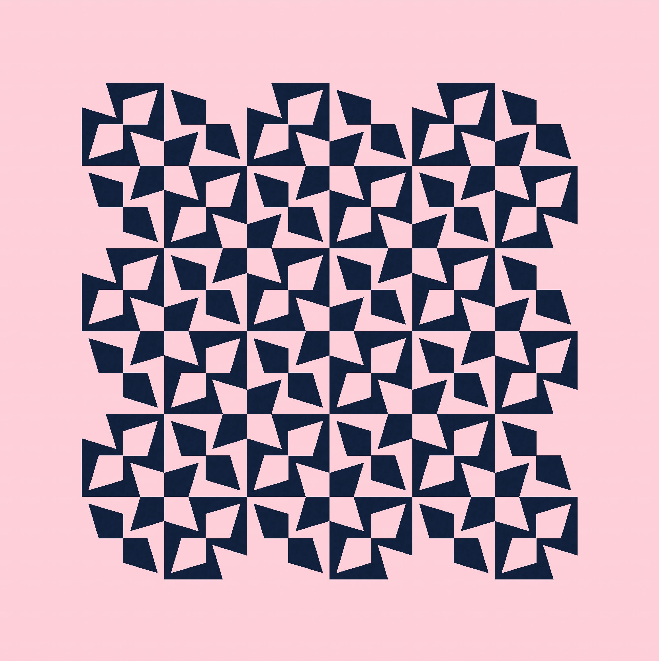
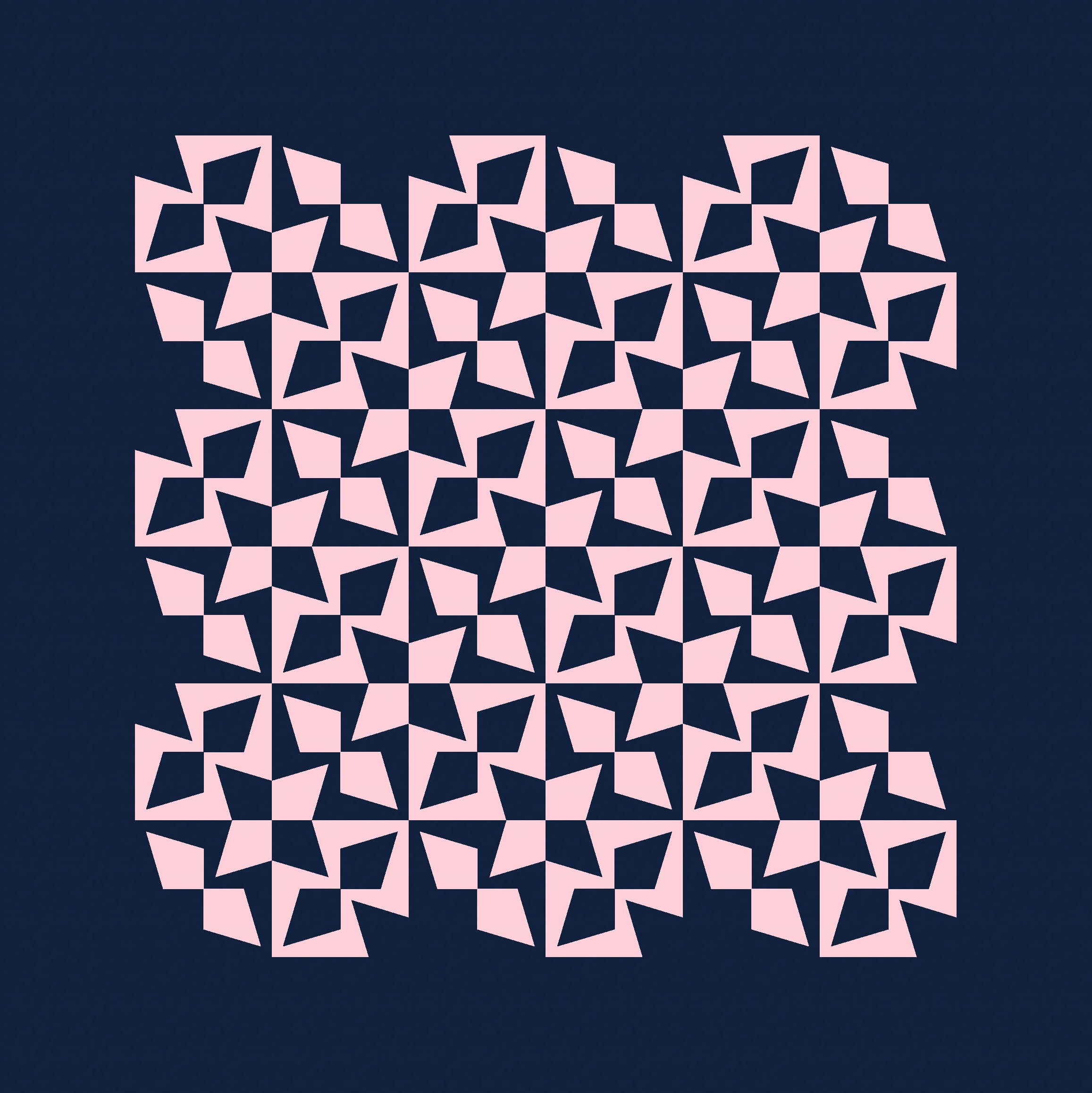
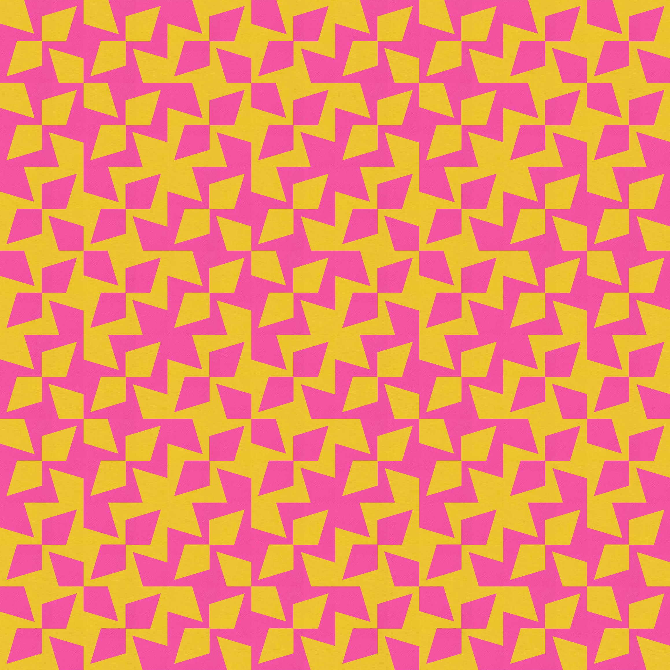
Each block has four of these units, but in the version above, I haven’t coloured all the pieces (just 2 kites in blue against a green background, or two kites in green that are bordered in blue).
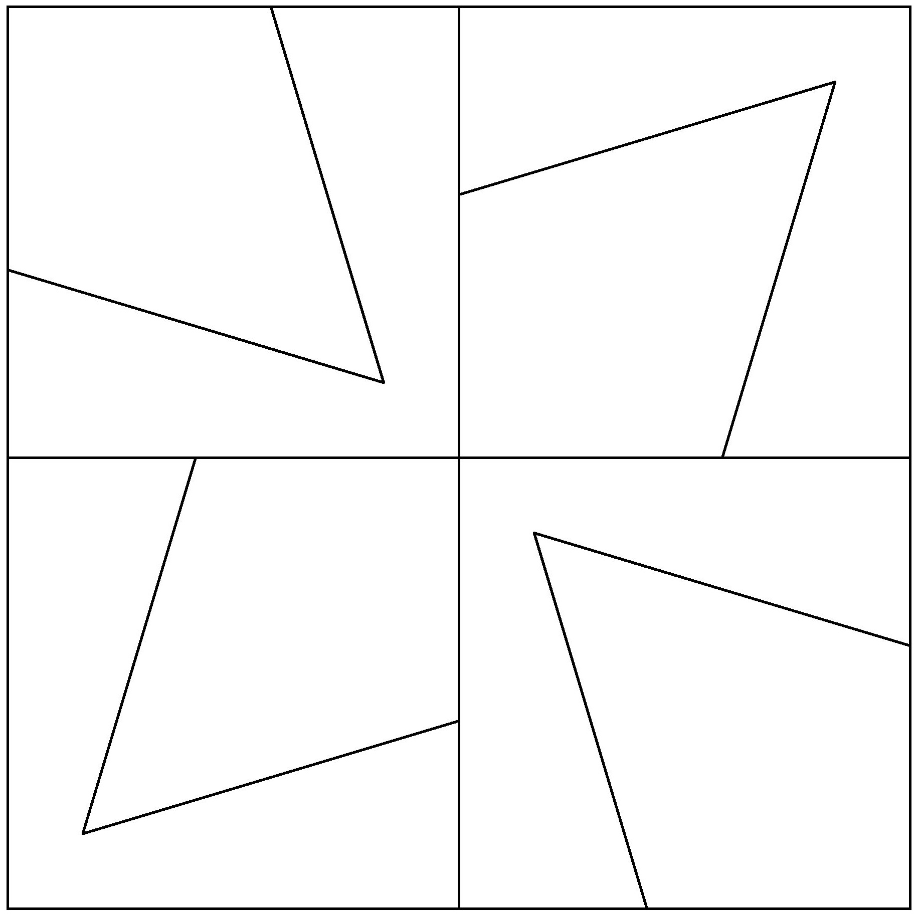
I don’t normally show block diagrams in my Sunday sketch posts (for no real reason other than laziness), but here’s today’s block so you can more easily see what I’m talking about.


There are four of the same kite units in each block, but two of the kites are facing inwards and two are facing outwards. There are lots of ways these pieces could be coloured, but I’ve used two main options for the designs in this post: colouring all kites in a block the same, so their borders create a kinda funky ‘8’ shape; or putting the opposing pairs of kites in different colours, so they create a kinda insect-like critter thing (for lack of a better description).
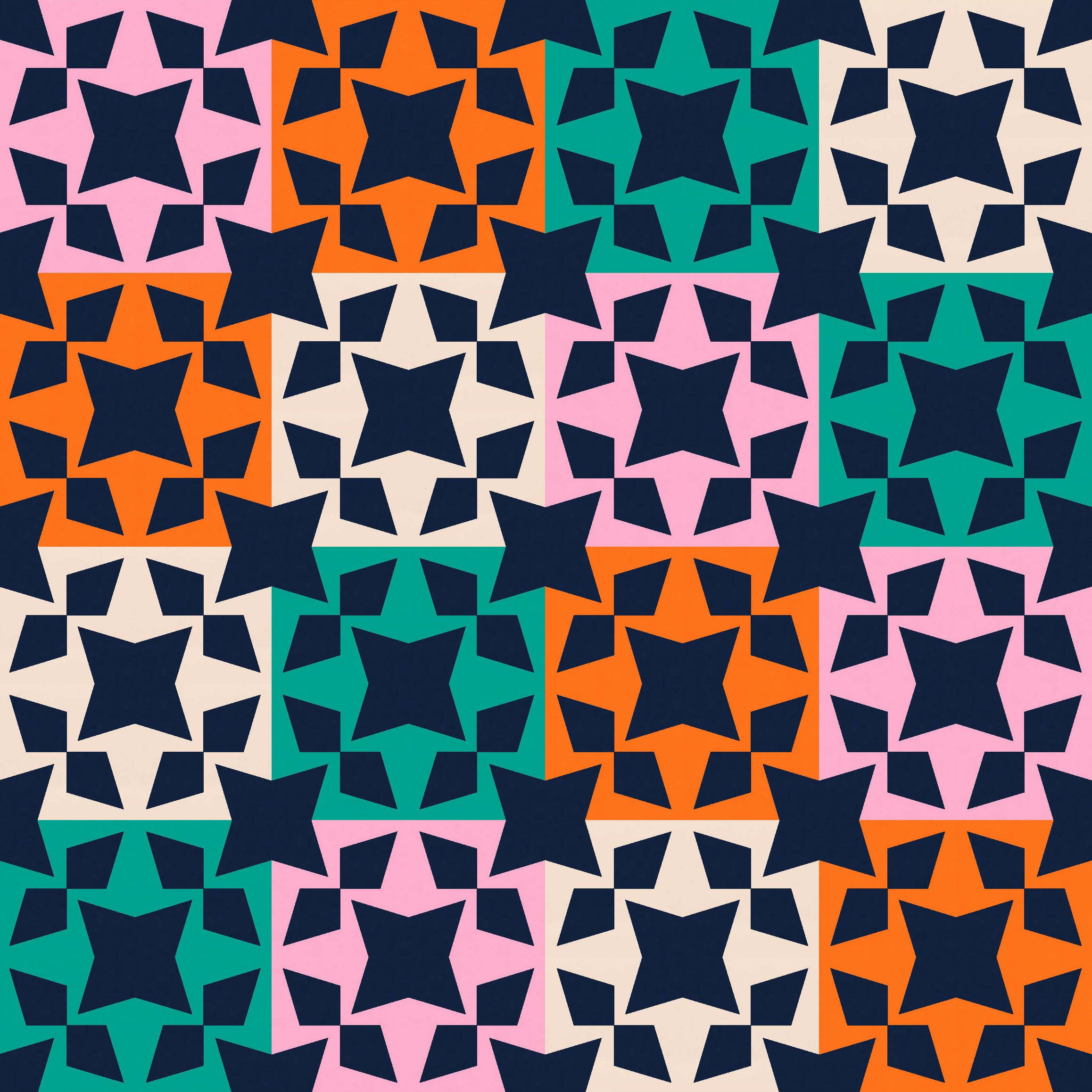
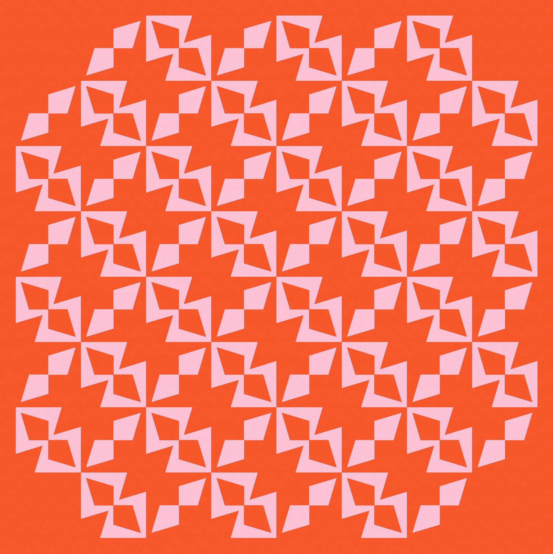
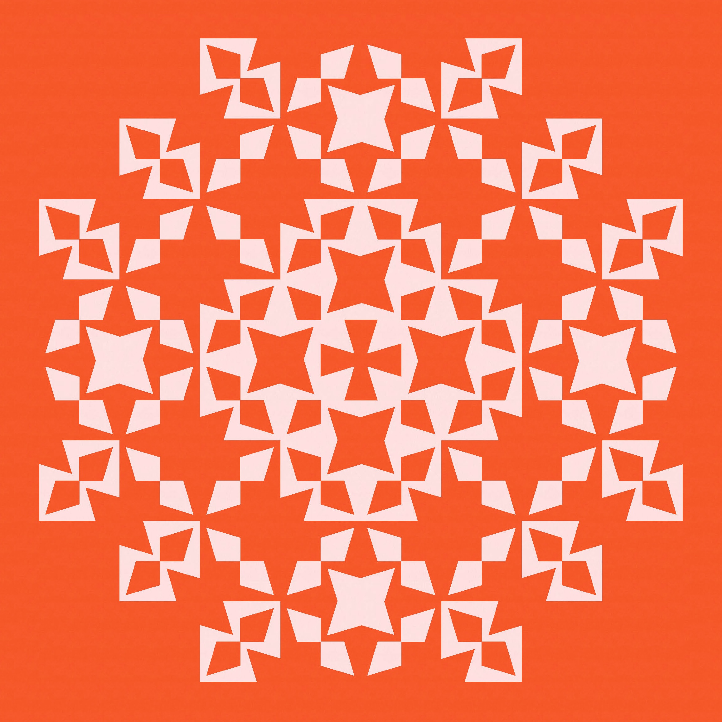
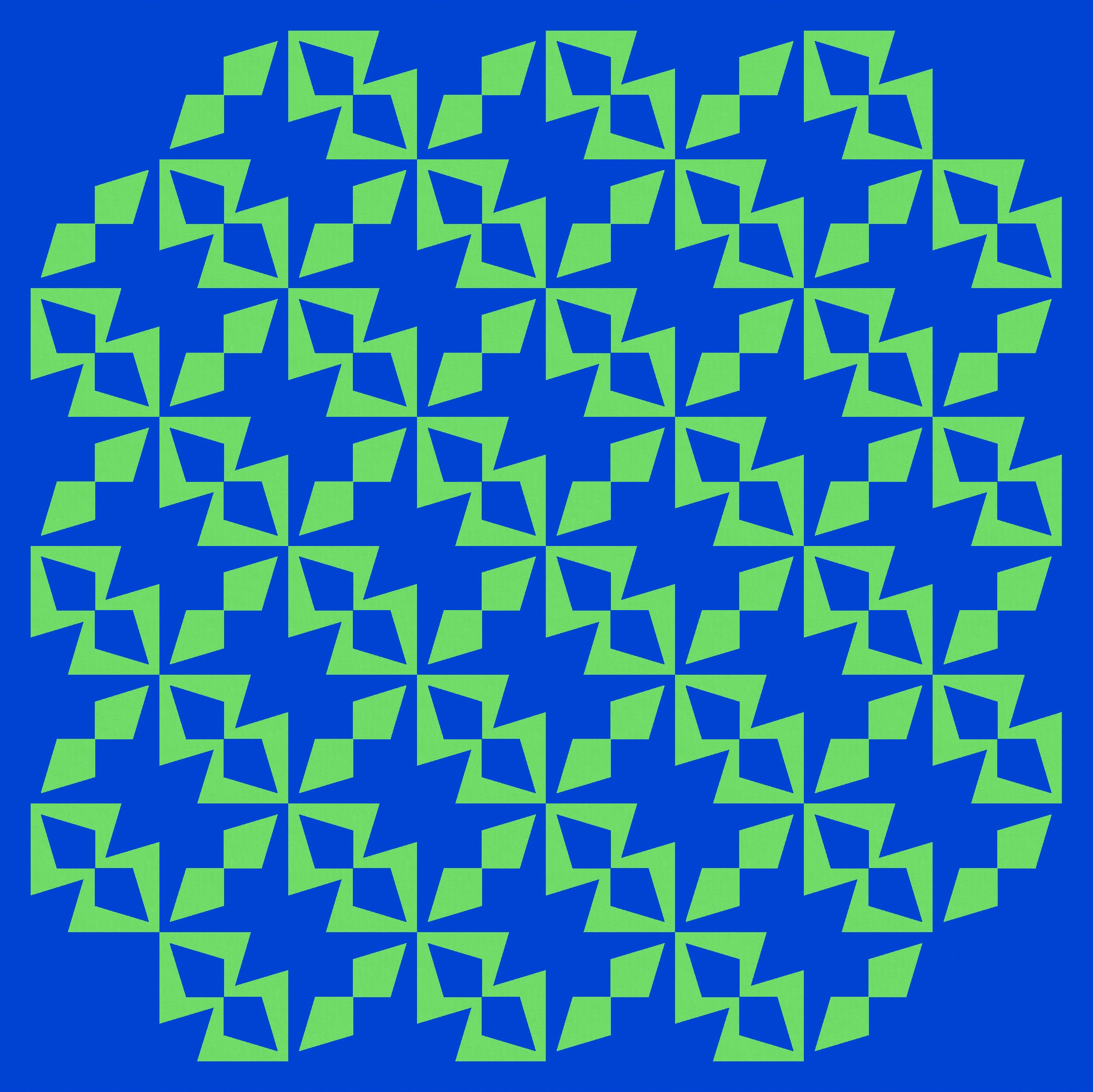
Tiling the first version, in an alternating colourway, reveals some fun new shapes… some circle-like shapes created by the diagonal kite pairs, and those stars in the corners between 4 blocks.

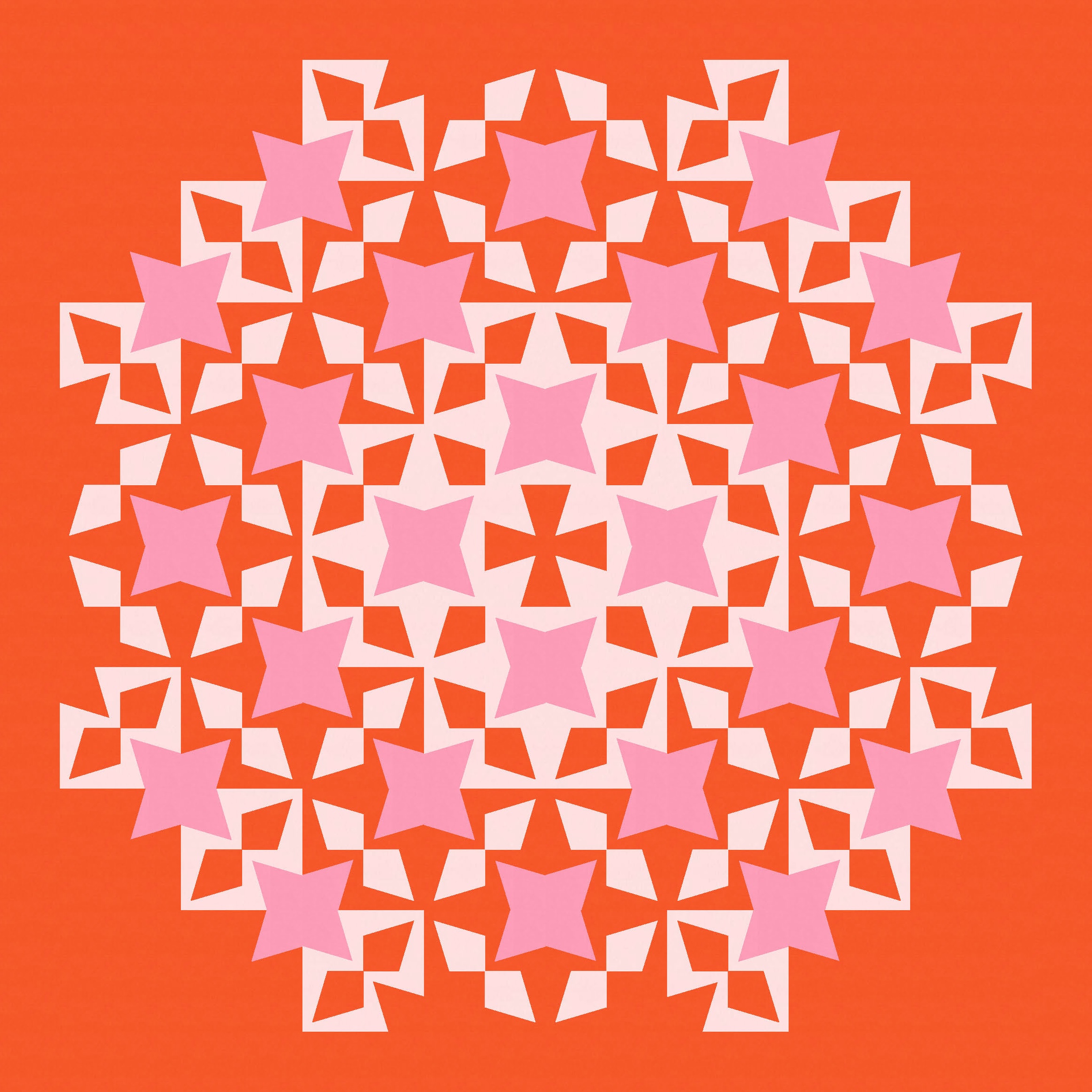
That’s all pretty busy though. Just paring back the edges helps to calm things down a bit.
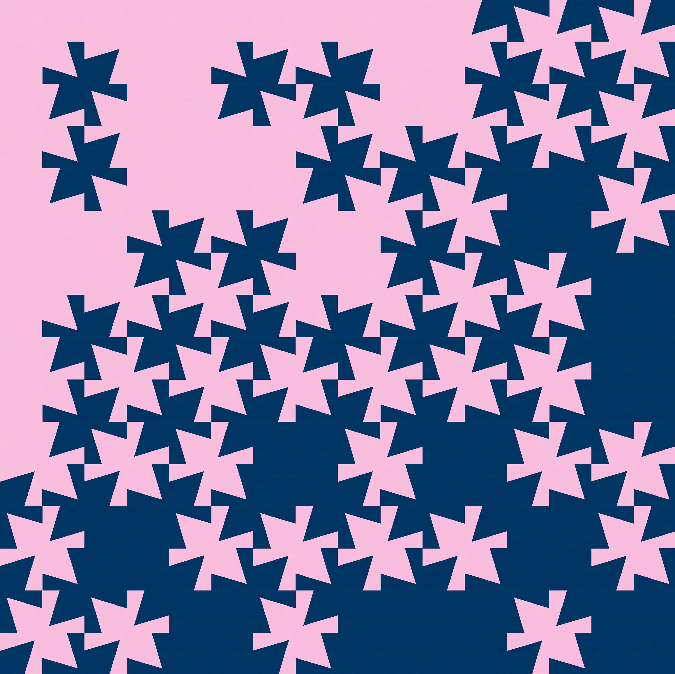
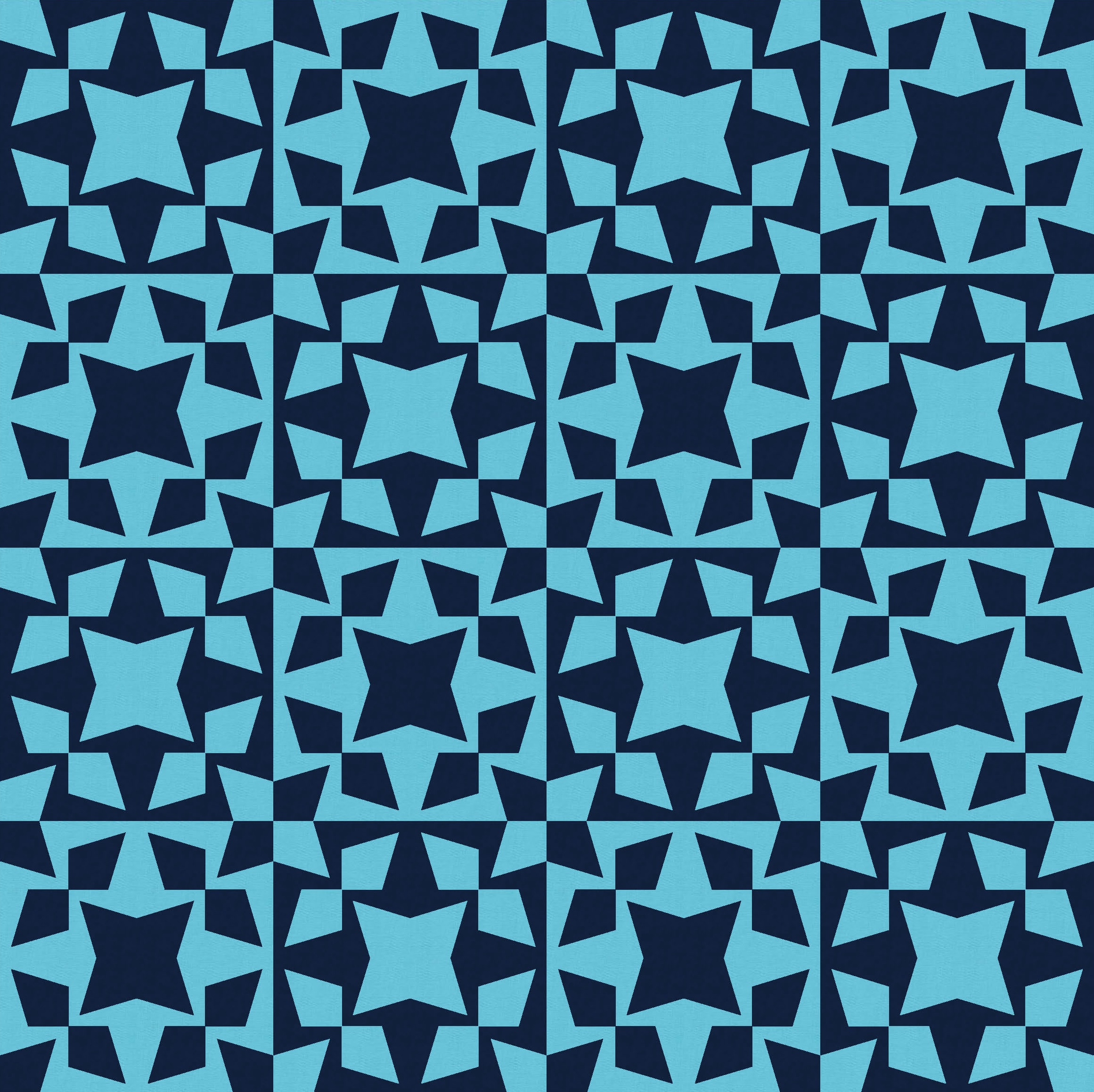
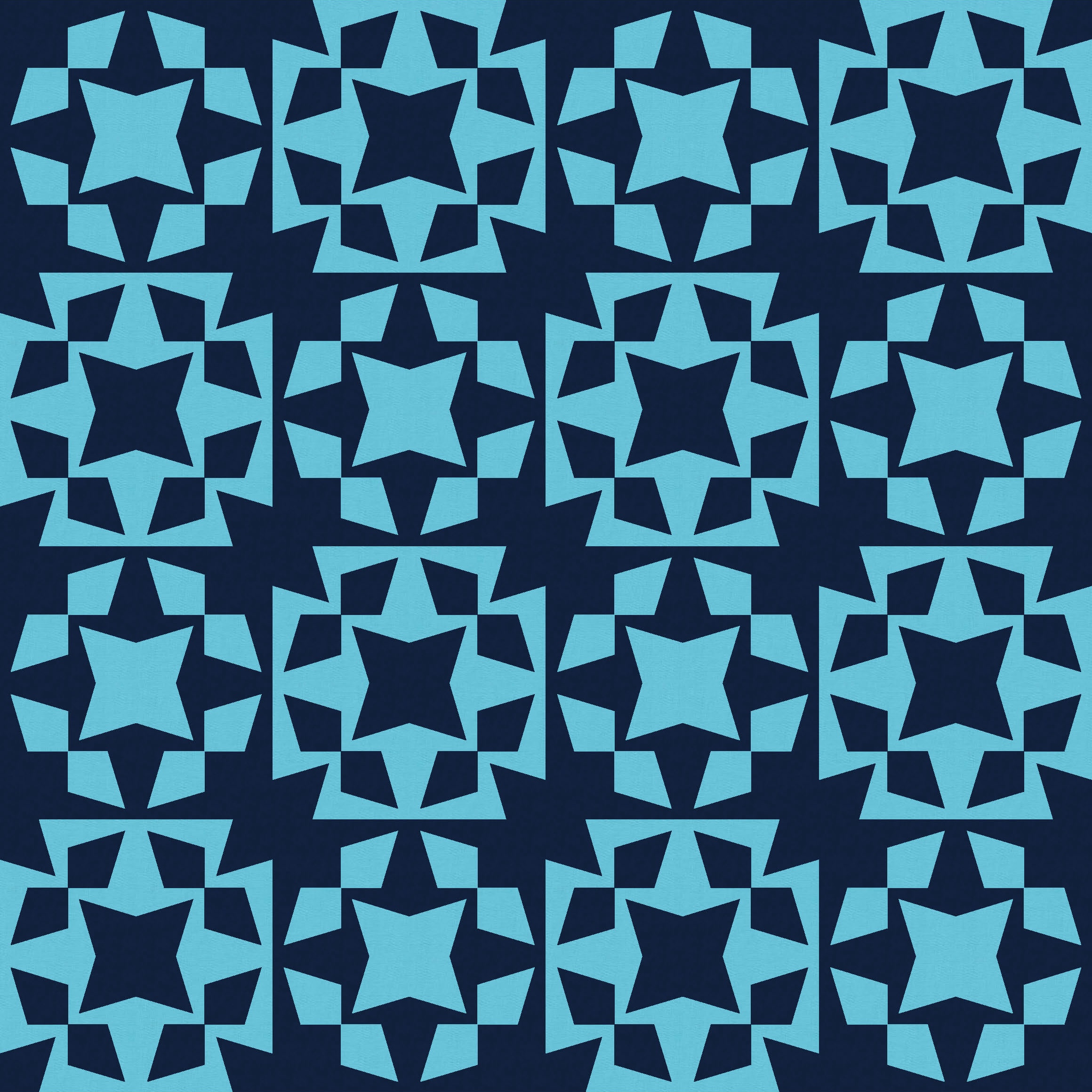
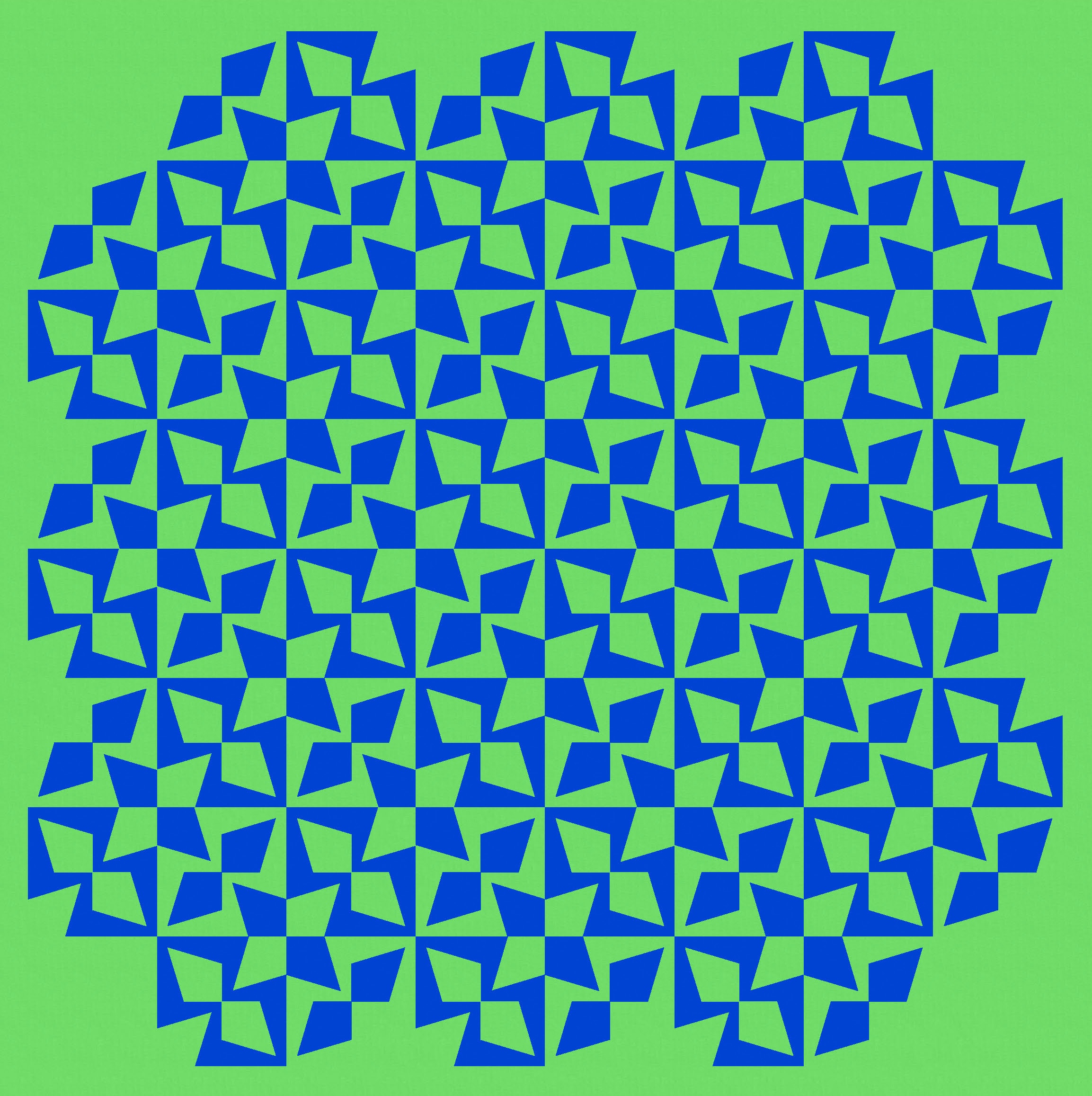
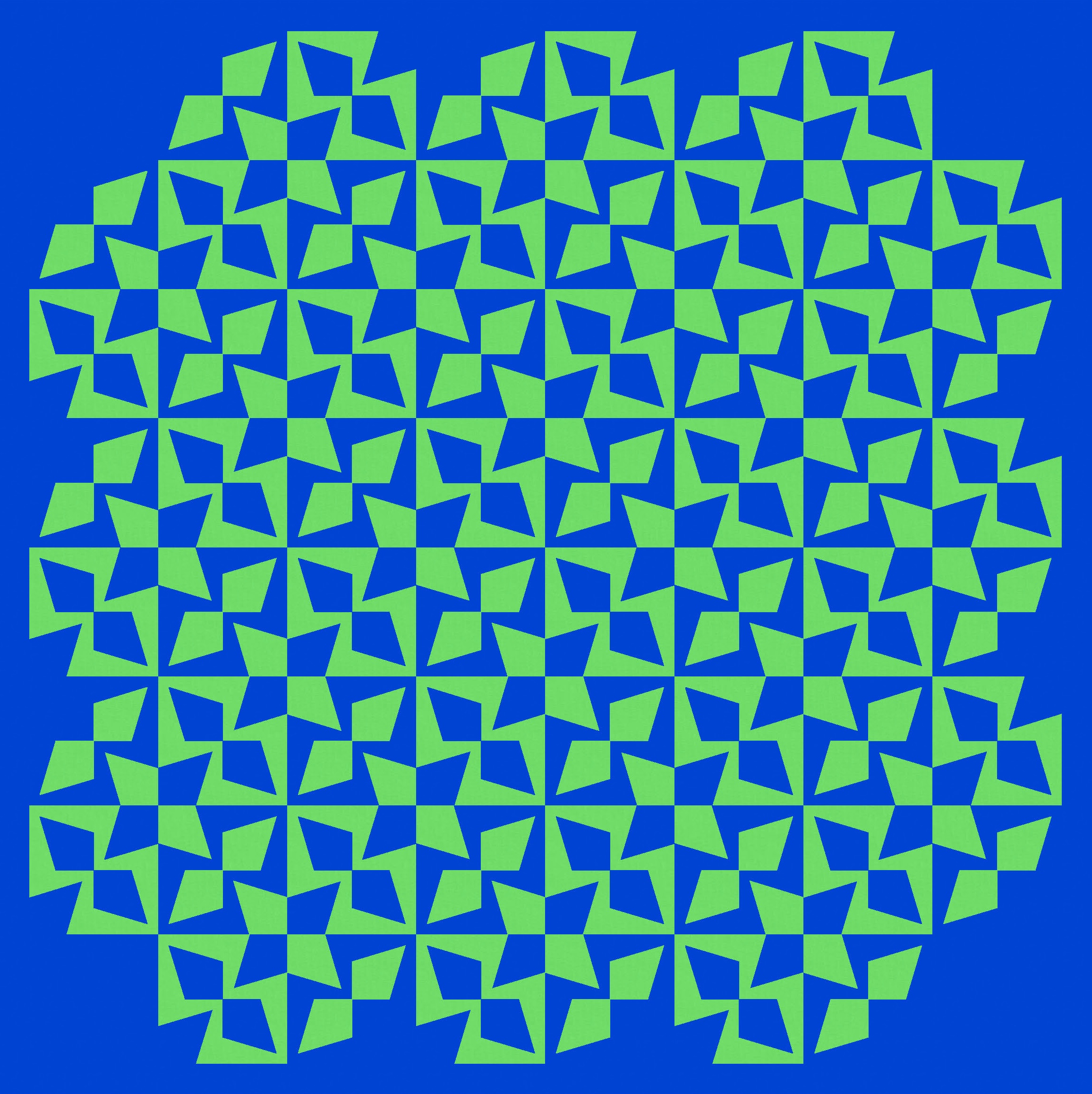
Using a colour placement that focuses on the critters instead also reveals some interesting secondary shapes. In the first version (below left), I’ve rotated every second block so they’re pointing in different directions. See the crosses and stars that are created in the background colour? But in the second version (below right), the critters all point the same way – now the negative space (blue background) is just more critters (also all facing the same way).


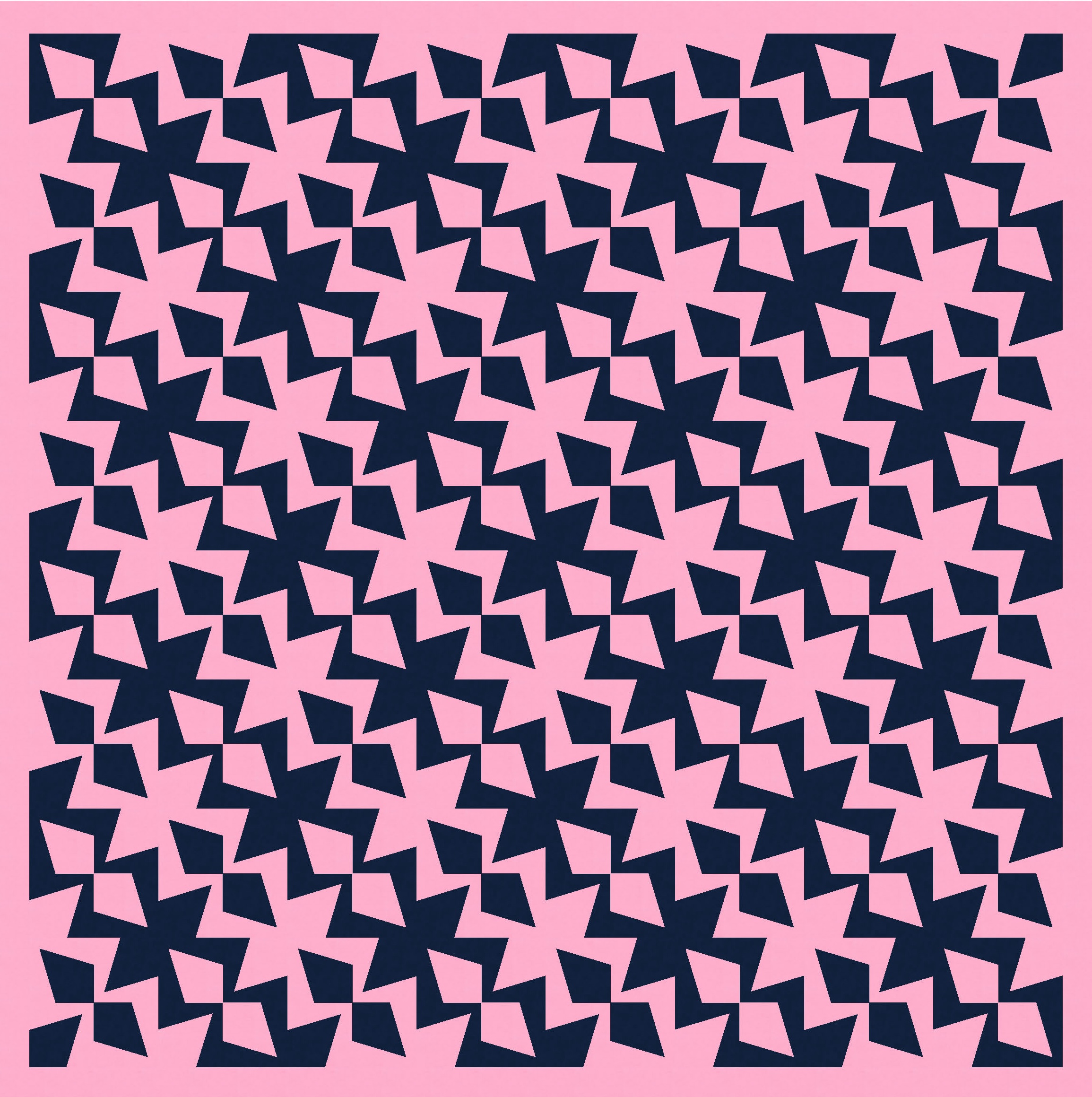
That second version’s the perfect opportunity for a little Escher detour… a two-colour design that plays on that tiling effect. Is it blue critters crawling on a pink background, or pink critters on a blue background?
Anyway… let’s keep playing.
Depending on how the blocks are coloured, they can create sets of larger shapes (that themselves look like individual blocks). This is actually an 8 × 8 layout, but it looks like it could be 4 × 4.
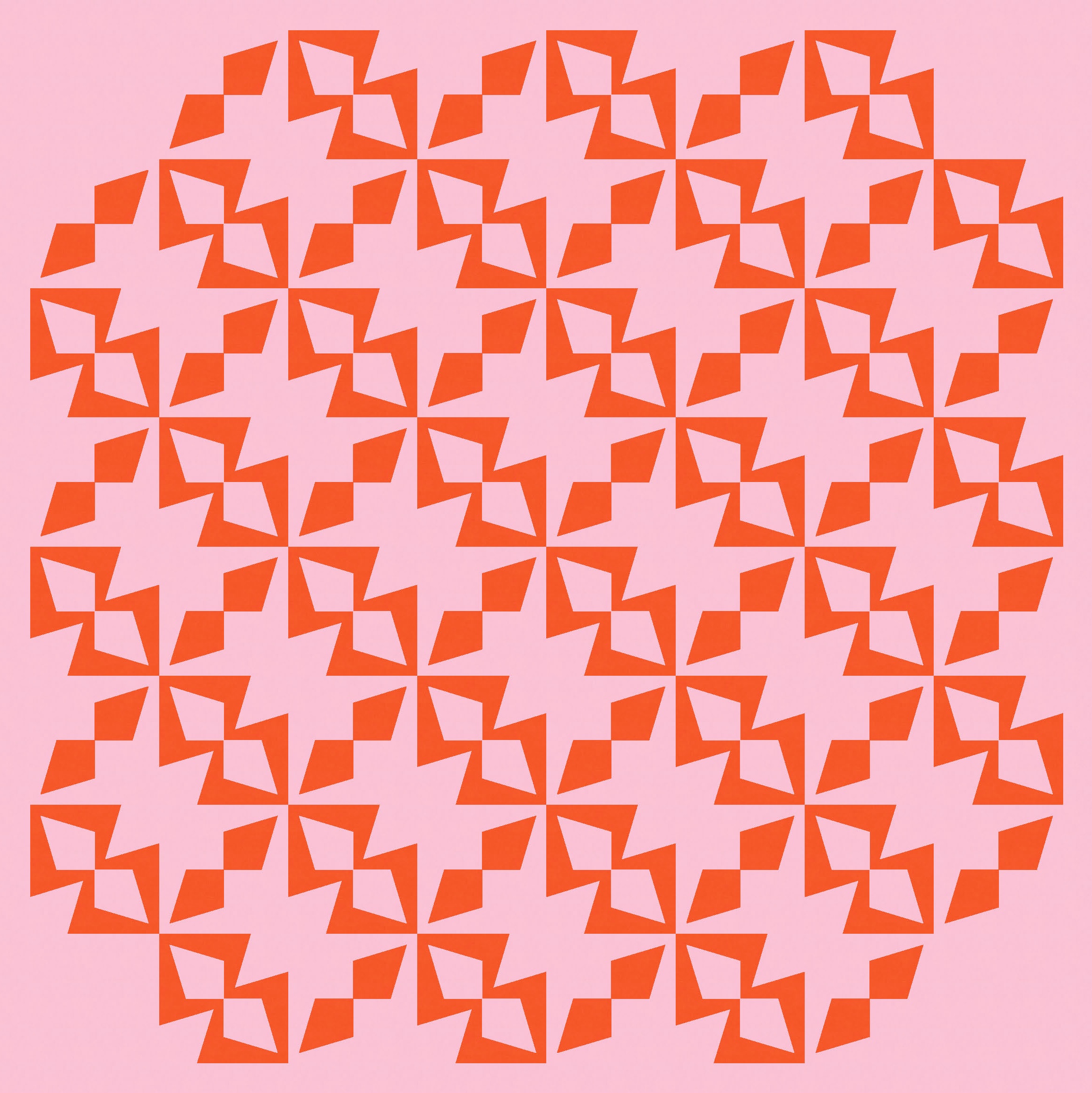
A two-colour palette also works, but I don’t love those stars at the corners between 4 blocks. That’s just a personal preference – I will almost always try to change a shape like that, cos I just don’t love it. I have no idea why! Something about the vertical and horizontal lines cutting through a shape… it just doesn’t do it for me. (I guess if I create a design where a shape extends beyond the block’s edges, I don’t want the edges to be obvious.)
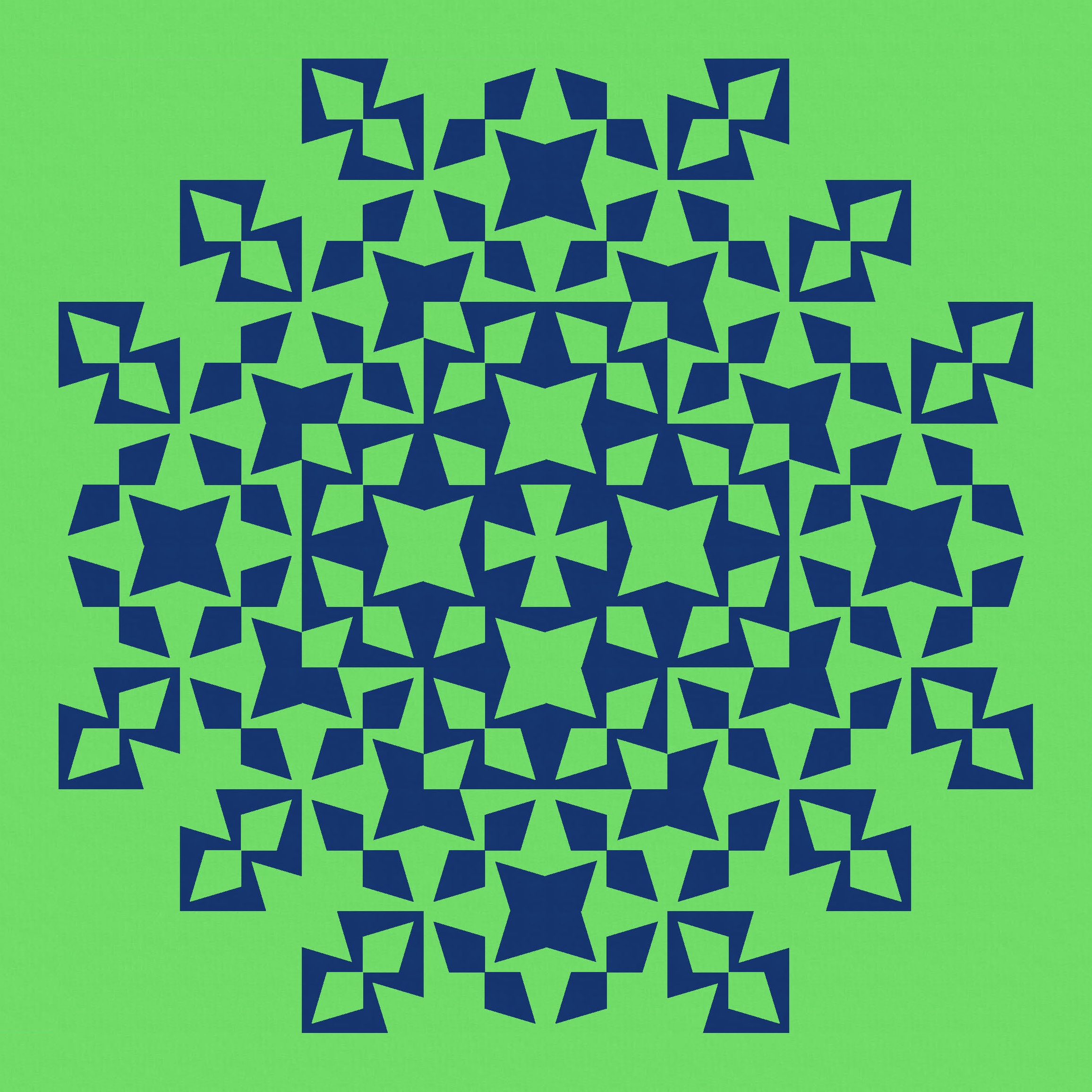
I can just remove those stars, of course. When in doubt, take them out! 🙂

I don’t mind the empty space left behind when those stars are removed – I kinda like the bit of breathing space and the new sharp corners of every second block.
That’s what led me to this even simpler version. Rather than switching the colouring in every second block, I just used the same colouring throughout. I love all the wonky energy in this one. There are some clear lines of travel for your eyes to wander along, but also a lot of action on the way.

I tried removing the corner units in the two versions above, just to give the whole design some rounded edges. I also tried adding back in those two-colour stars, too. I don’t mind these busier versions, but my preference is definitely the quieter ones.
Of course, there are lots of ways that the units can be arranged and coloured. Some crazier than others.

A bit of rotating and rearranging in Electric Quilt 8 gave me this next version, which I love… lots of weird secondary shapes emerging (monsters? faces?). It feels fun.
It’s also an opportunity to play with negative space again – something that’s often fun to do with two-colour designs. Without interrupting the design at all, you can use both background colours and play with the push and pull between foreground and background. I really like this version too.

And then I kept going, rotating and recolouring things here and there to create some more variations. I think for some of these versions, the relationship to Sunday sketches #469 and #470 is a bit clearer than for the earlier versions.


But I still love that first version, which really highlights this weird shape.
All these designs use the same basic block, which I’ve shown above. The block itself is made up of 4 kite-in-a-square units. Unlike standard kite-in-a-square units, the sharp tip of the kite doesn’t meet the corner of the square. So you’d probably need to use templates here to get the desired effect. I guess you could cut the kite piece the right size, then add the ‘arms’ and trim back to the correctly sized square. I’m a template kinda gal, but you have to use the approach that works best for you.
Discover more from Geometriquilt
Subscribe to get the latest posts sent to your email.

Wow!!!! Lots of stunning designs there. Love that you’ve shown the block too – makes it much easier to understand.