Sunday sketch #440
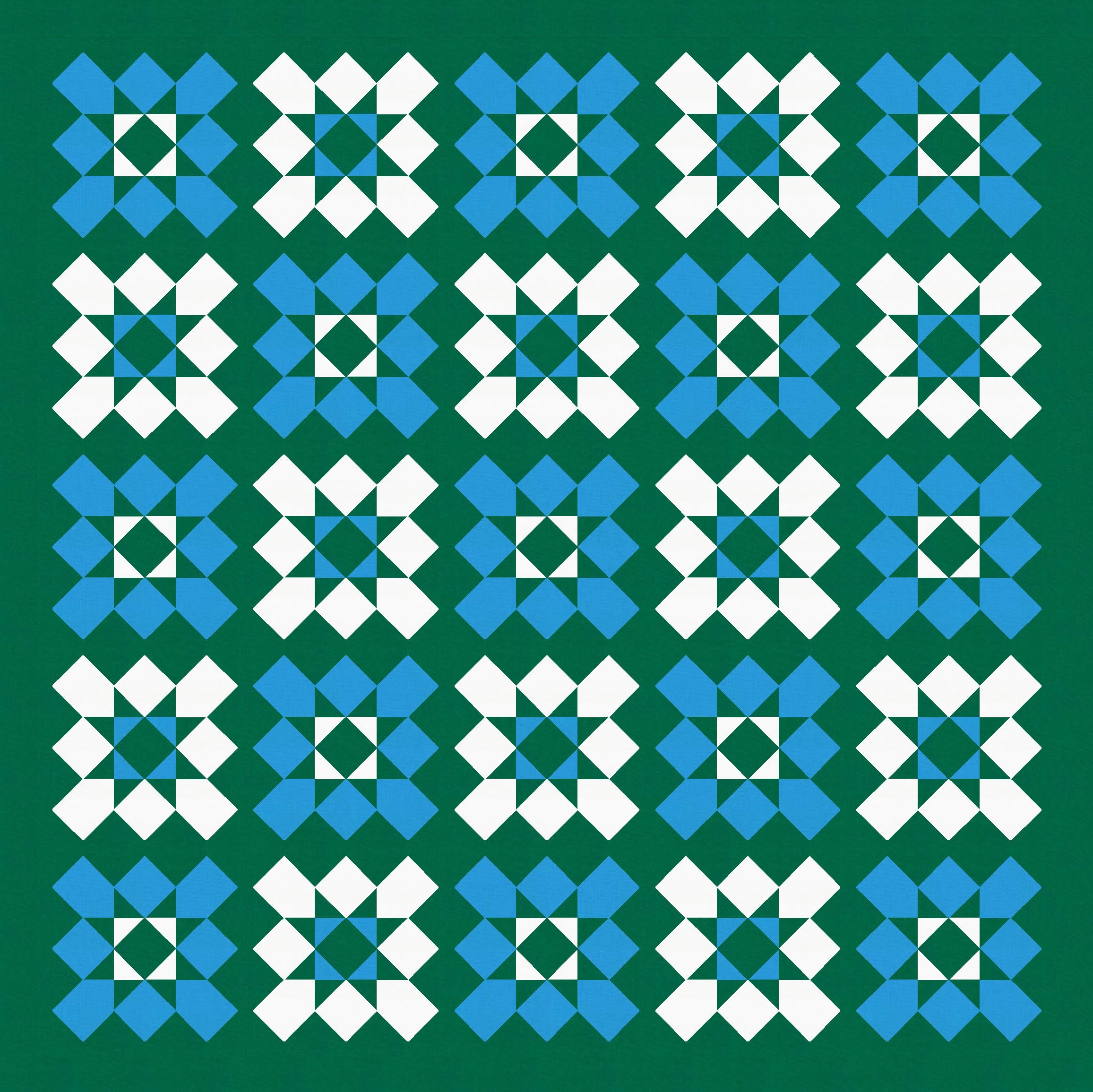
I realised quite soon after designing this week’s sketch that I’d just recreated a traditional block: the Kansas star block. When I’m designing with basic shapes like squares and half-square triangles, it’s not hard to stumble across something that’s been done before. Often I’ll just shelve those ideas, but occasionally I’ll post them, particularly if they’re a little different (in appearance or construction) from what I’ve seen elsewhere. In this case, I haven’t managed to find a version of this block where the outer squares are all one colour, like I’ve shown here.
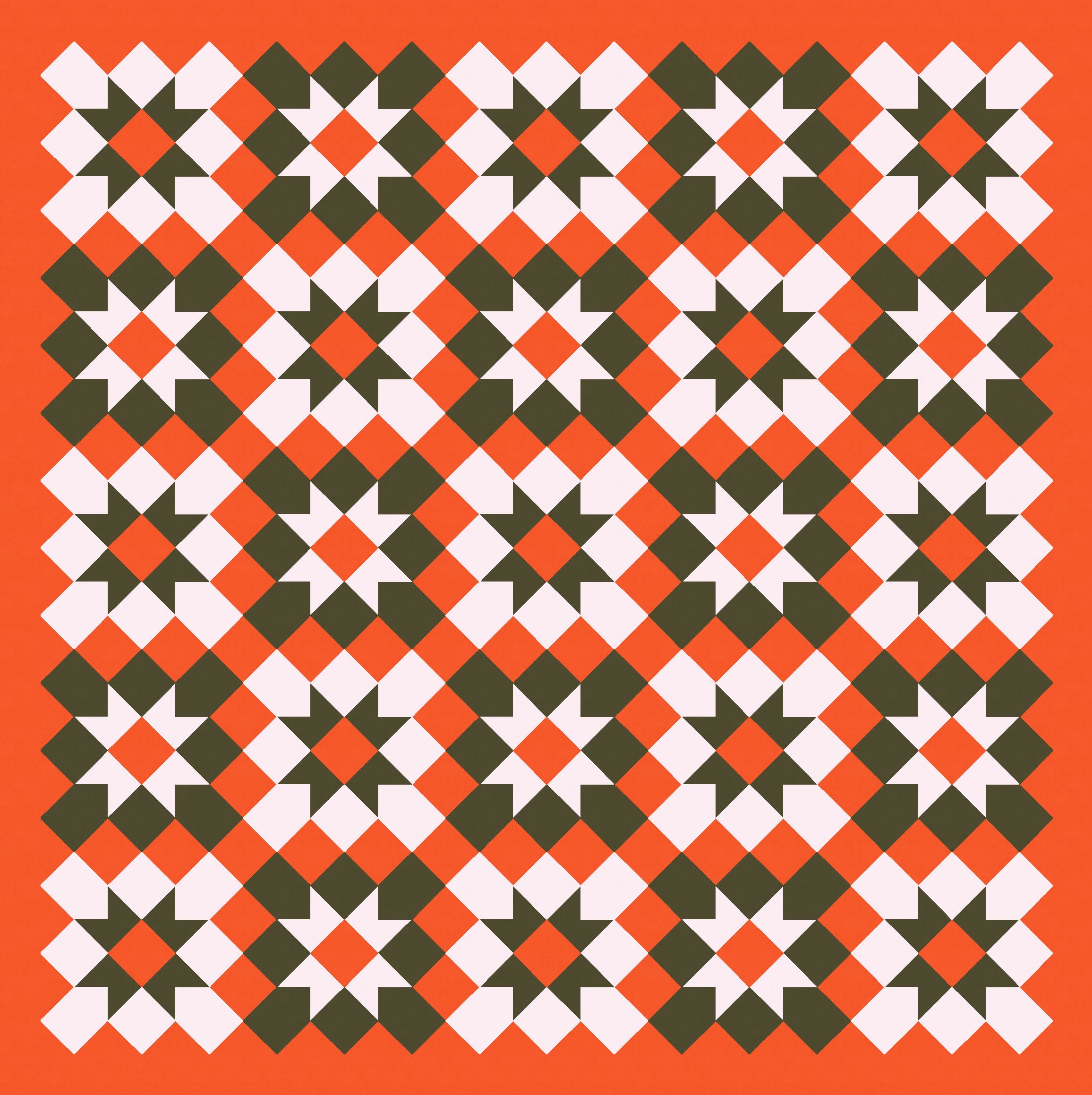
The Kansas star block is essentially a nine patch of square-in-a-square blocks, with colour placement responsible for creating the star in the centre. I love Wayne Kollinger’s blog post on ‘Which block is Kansas star?’, which shows how changing the colour placement can really change the look of this block. A quick search online also revealed a couple of tutorials, too; see here or here, for example.
Of course, if you used the design above, you could just set the blocks on point, and then you could construct most of the quilt using just squares and split quarter-square triangles, with triangles for the outside edges and corners.
Things can get a little busy with the blocks butting up against each other like this; there’s not much space for resting the eye. I tried adding some sashing between the blocks, which helps reduce the busy-ness but also interrupts the connection between the blocks a bit. Some other shapes emerge for me though; I can see larger circles in the background shadows, like halos around the individual blocks. Can you see them? (I bet if you can’t, I must sound like I’m losing it haha.)
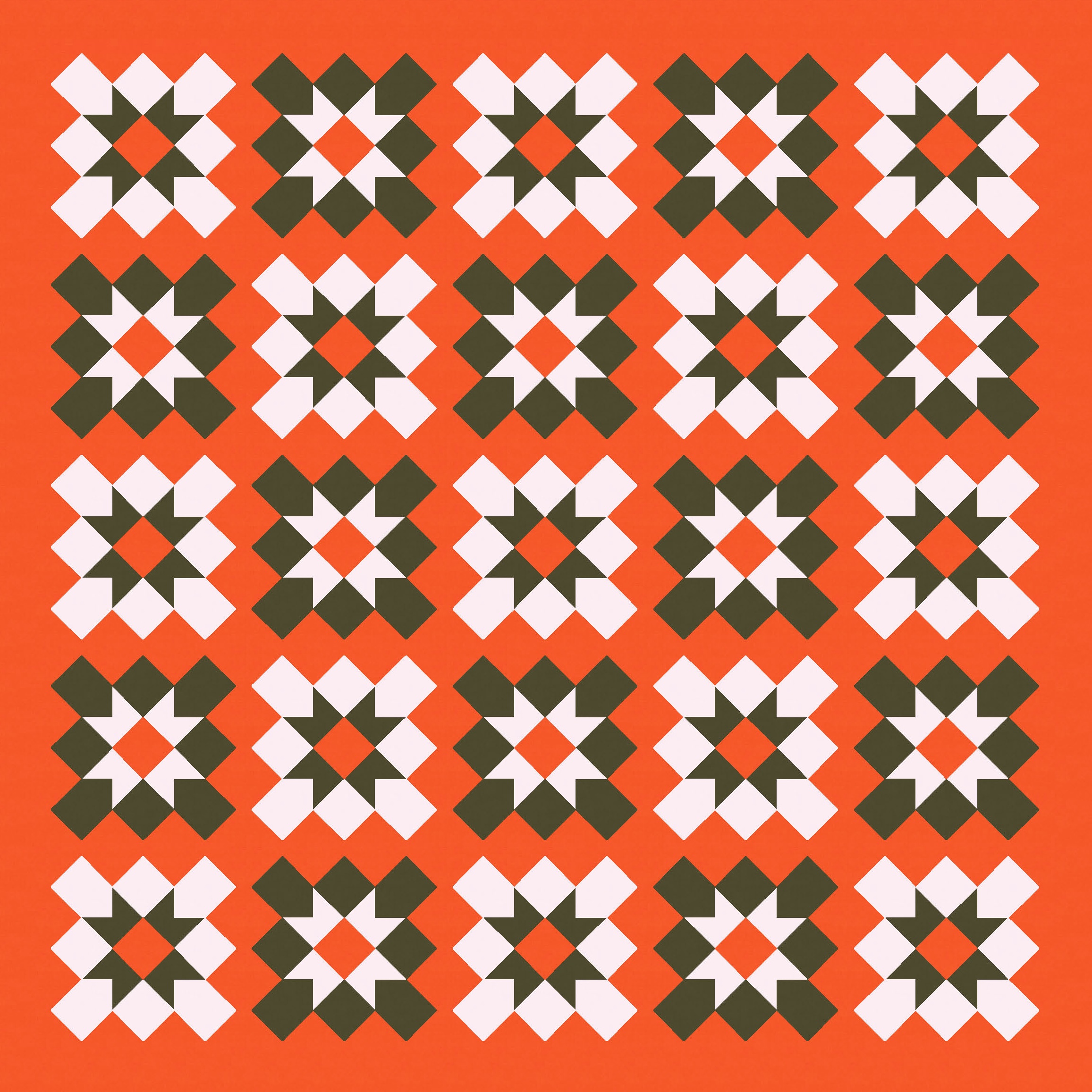
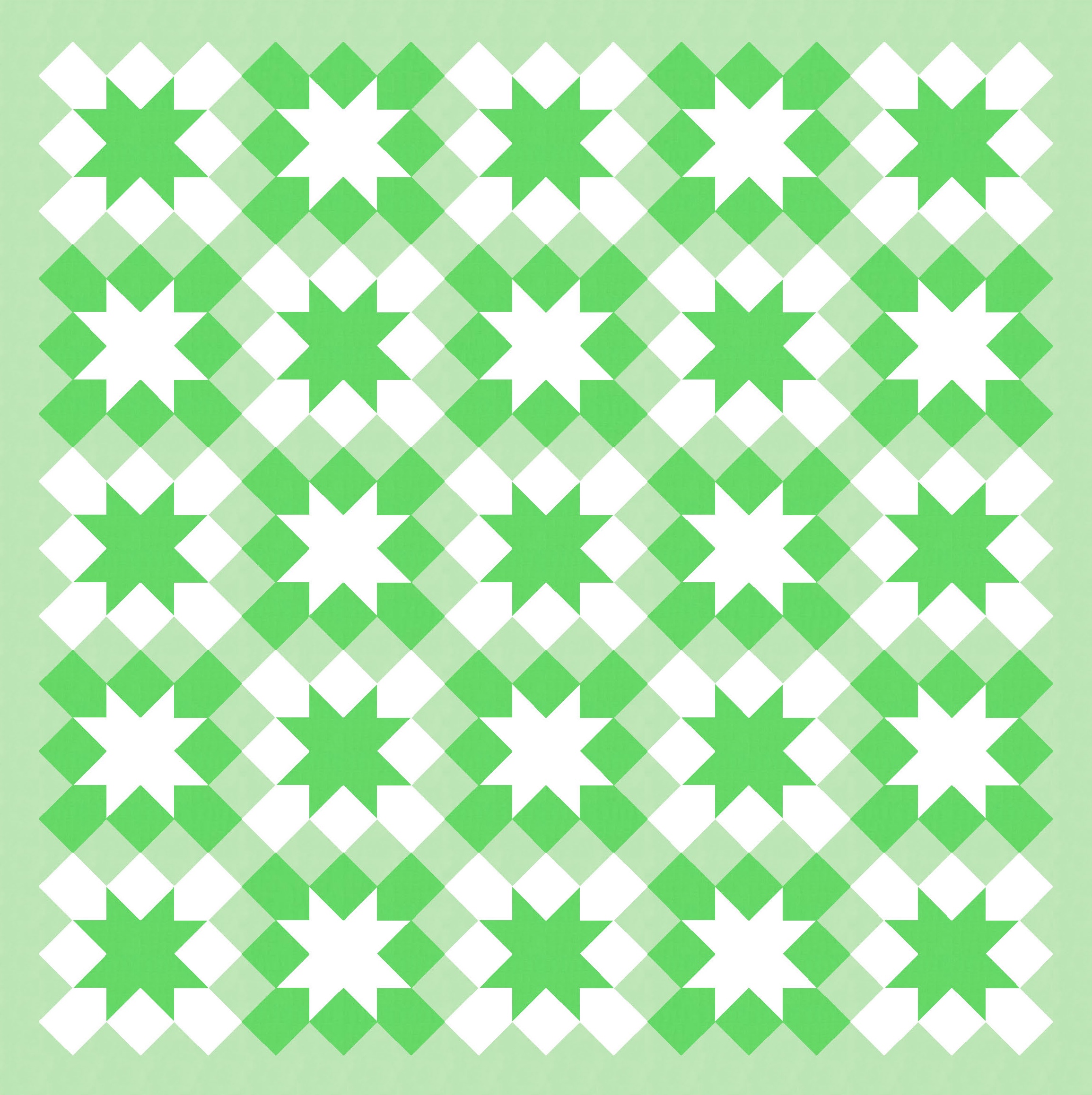
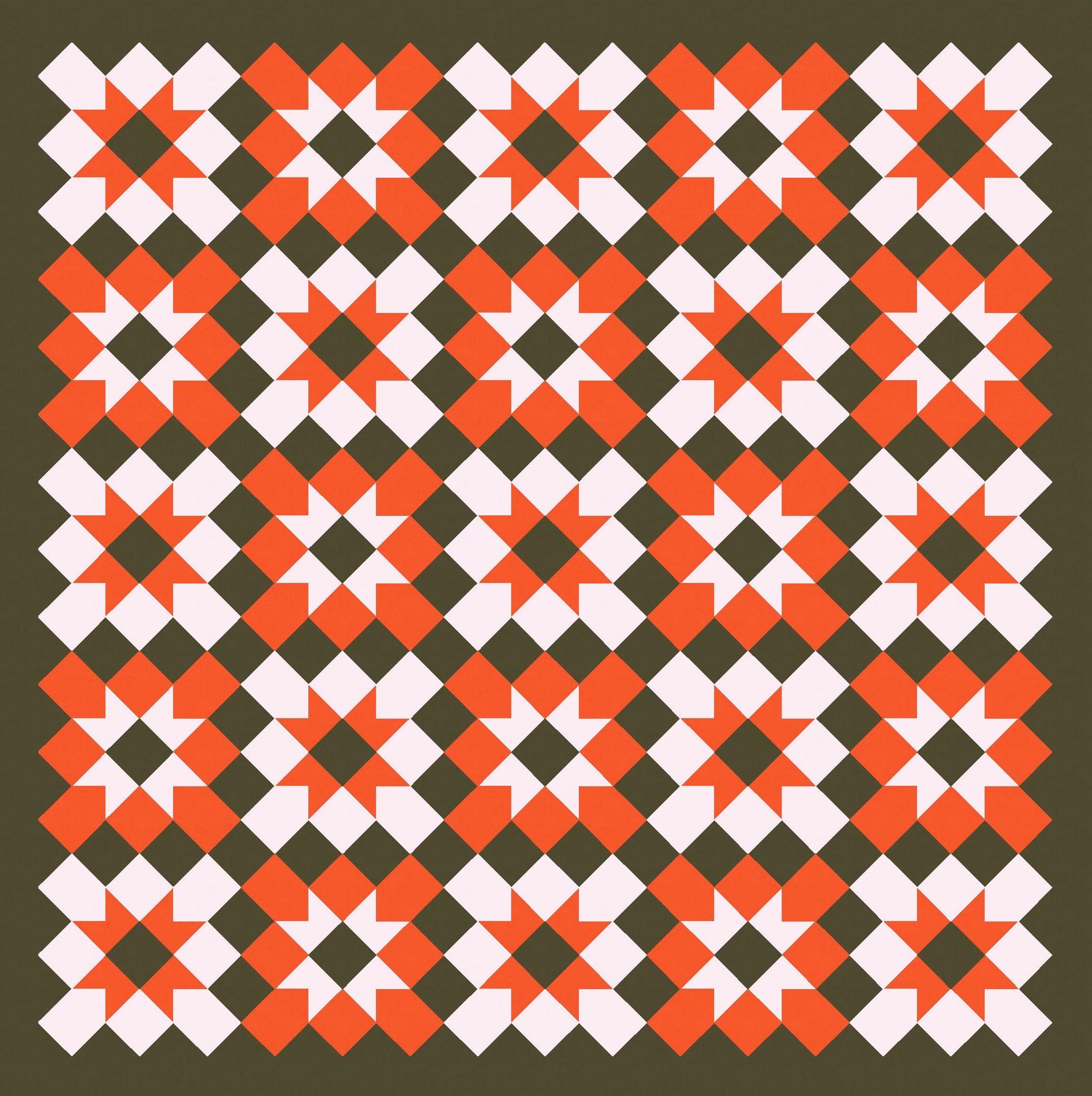
There’s scope for expanding the colour palette, of course. And there are lots of ways that the internal sawtooth stars can be coloured. I like them ’empty’, using just the background colour.

Or I can colour in the centres – in the same colour as the surrounding block, or in a different colour.

(If I remove the sashing again, you can see what I mean about things feeling very busy.)

I think a more limited palette helps to keep things calmer. I prefer a bit of emptiness in the middle of the blocks, but I also like a second colour. In a 3-colour palette, I like this layout the best:
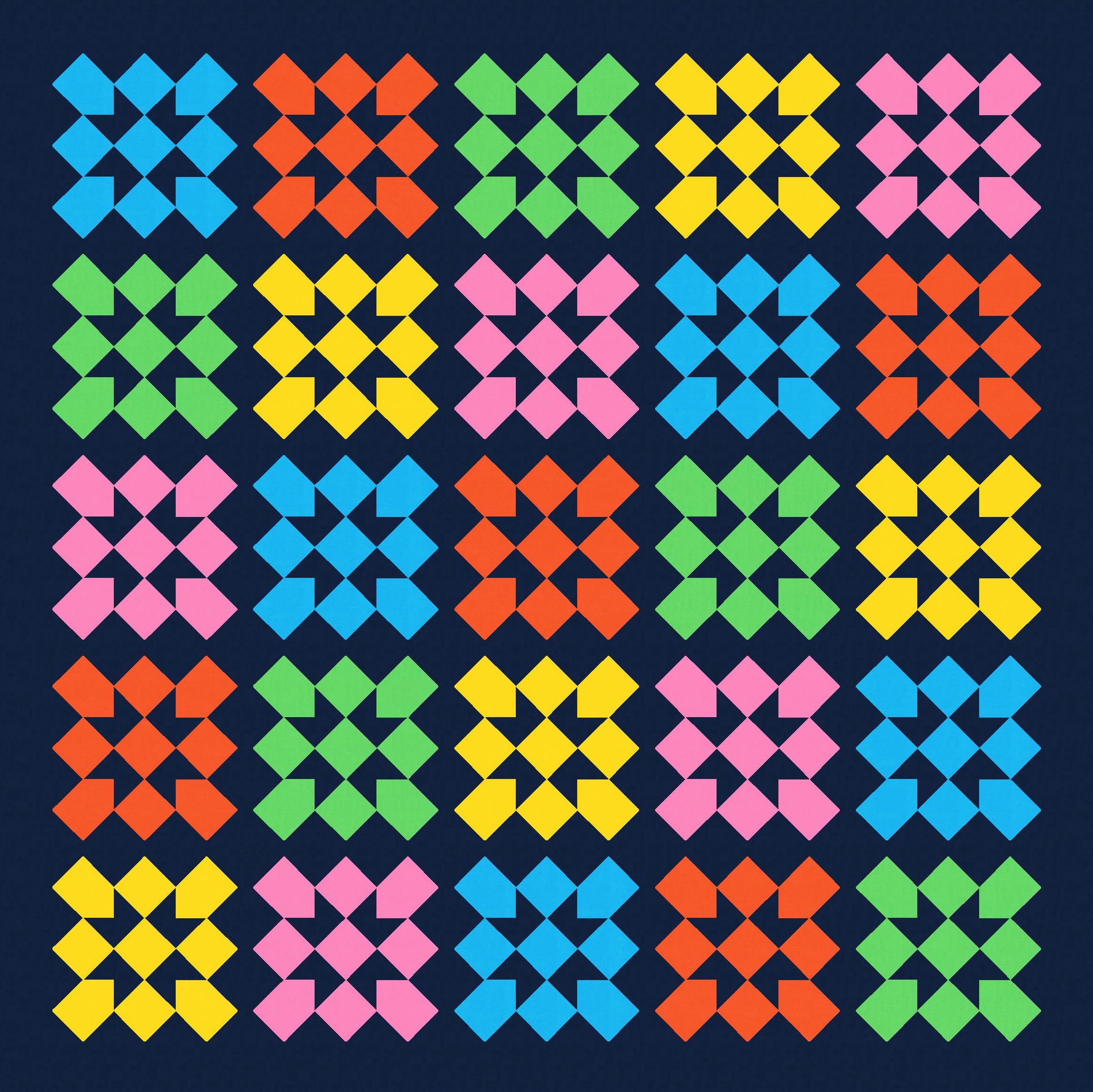
These other options in the same colourway feel a bit too ‘bitty’ or disjointed (left) and flat (right).
It’s funny how I don’t get that circle effect with any of these colourways, either. Many unintended effects like that arise purely from the colour placement; move things around, and they’re lost.
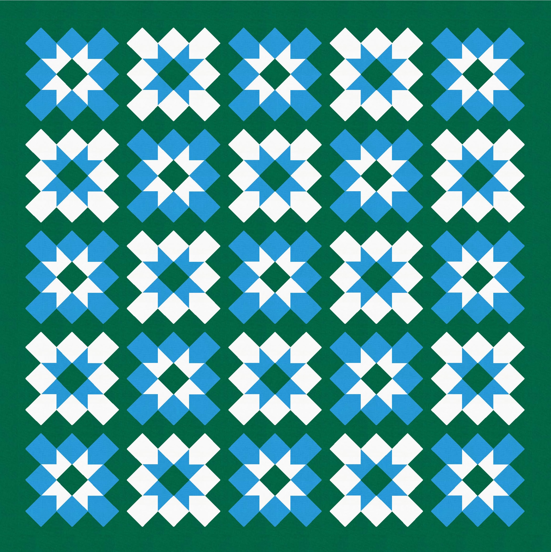
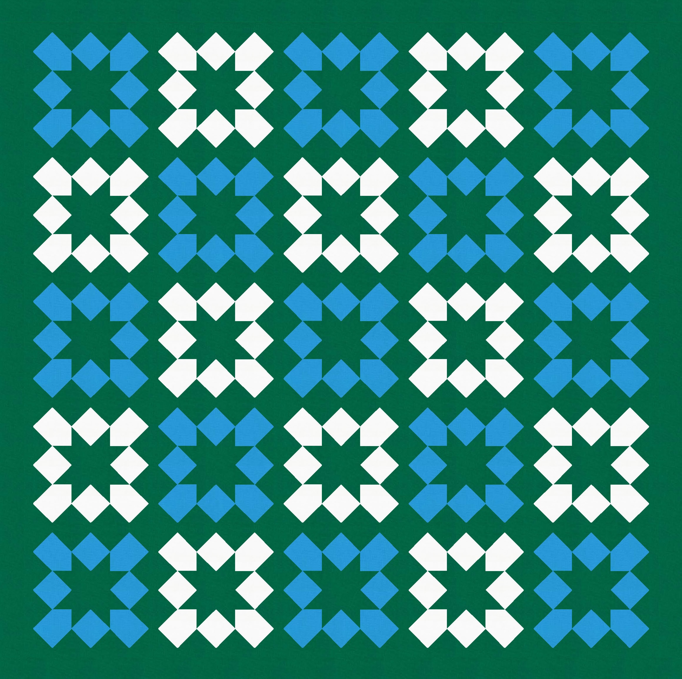
Case in point: there’s a nice transparency effect that happens in versions without the sashing, where blocks in an alternating colourway seem to connect diagonally via a criss-cross pattern.

I’ve found that this effect only seems to happen in a 3-colour palette when the mid-range colour is used as the background, and the foreground colours are the lightest and darkest in the trio.
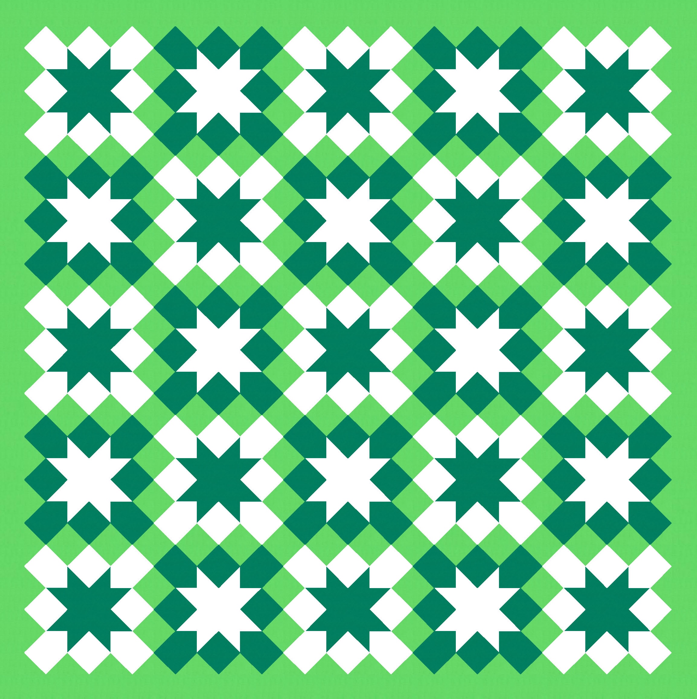
When I put the darkest colour as the background, and the mid-range and lightest colour are in the foreground, that effect disappears; the alternate blocks aren’t connected diagonally anymore. Maybe because those connections are lost, this version seems much busier and more chaotic to me.
Contrast this version with the first one I showed, which has the mid-range colour (red) in the background and the lightest (white) and darkest (charcoal) colours in the foreground. See the difference?
So I think if you were going to make a quilt like this, you’d have to think about your fabrics before you decided on your final layout (and whether or not you wanted to add sashing). I certainly would, anyway!
Discover more from Geometriquilt
Subscribe to get the latest posts sent to your email.
