Sunday sketch #427
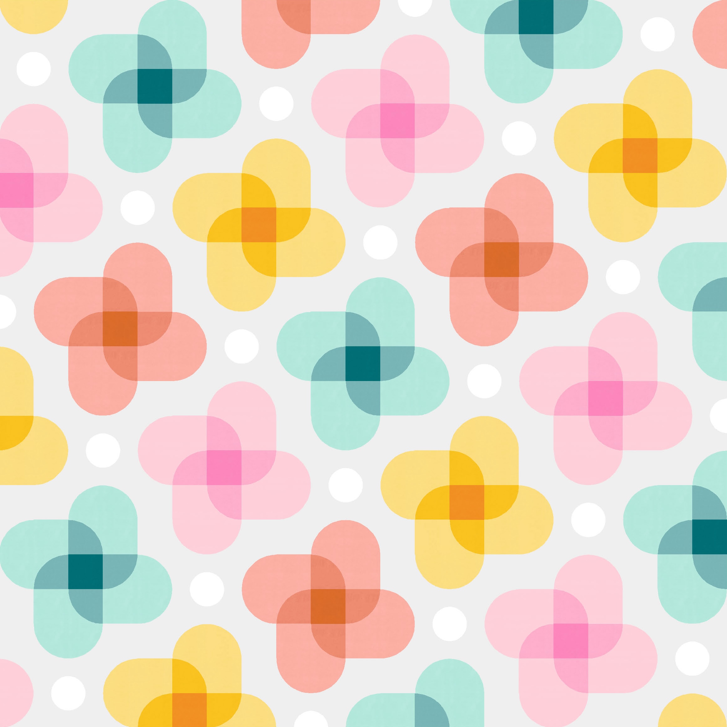
More transparency this week! This time I’ve gone for more curves, playing not just with colour but with shapes too.

This sketch reminds me a little of Jeff Koons’s Balloon Dog or the balloon animal print from Rashida Coleman-Hale’s Pop collection for Ruby Star Society – all those overlapping curves!
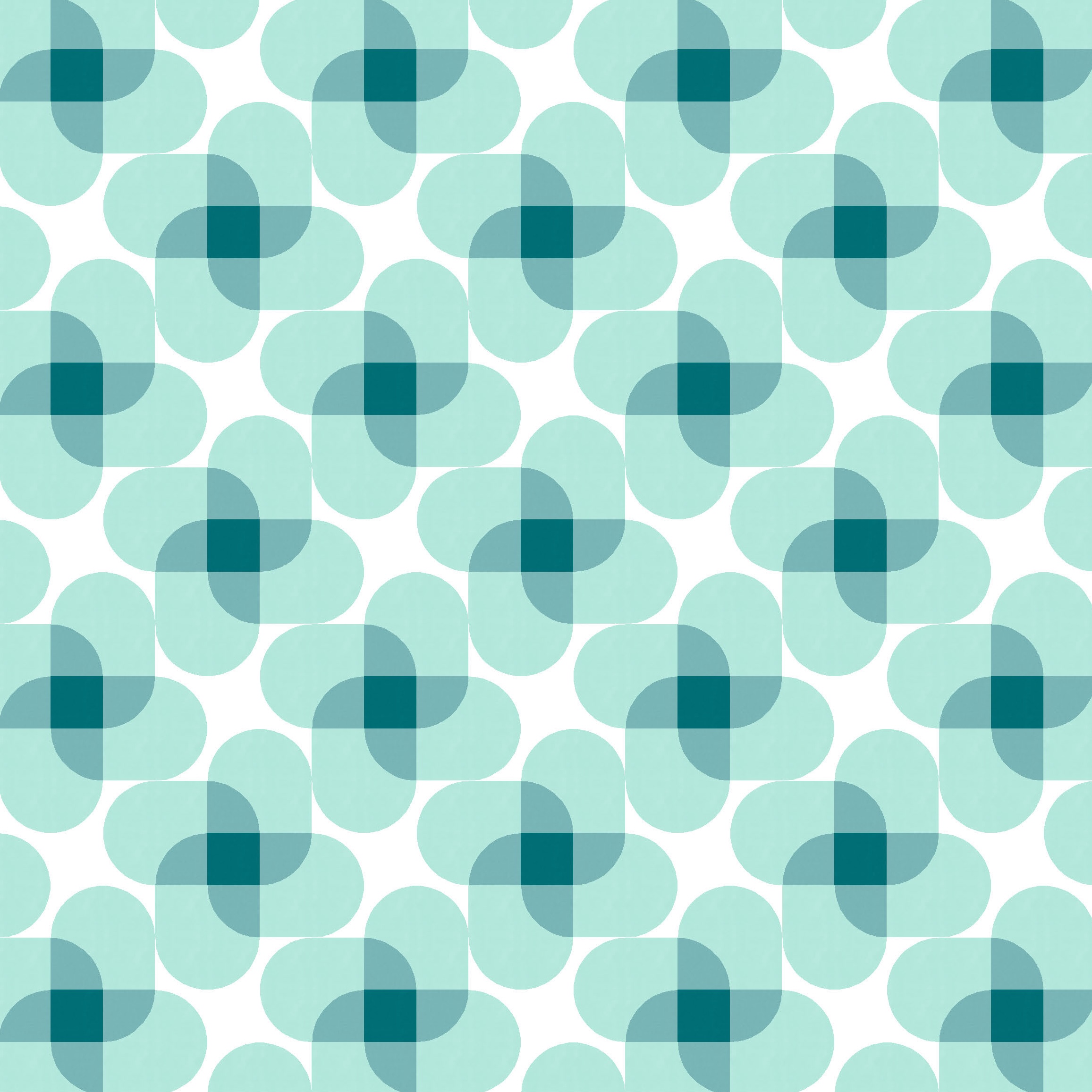
I started with a softer, multi-colour palette, but I think it works in a monochrome version too. There are two areas of overlap – one where two colours/shapes overlap, and one where four overlap – which means I need three shades: light, mid and dark.

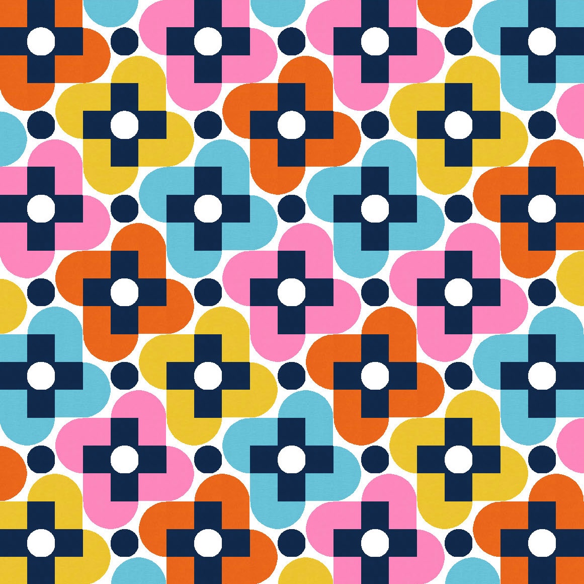
I tried a more crowded version, where there isn’t so much space between the pinwheel shapes, but to my eye these versions are just too busy. The whitespace in the versions above is perhaps a smidge too much (more on that later…), but the lack of whitespace in these next two versions just doesn’t work for me.
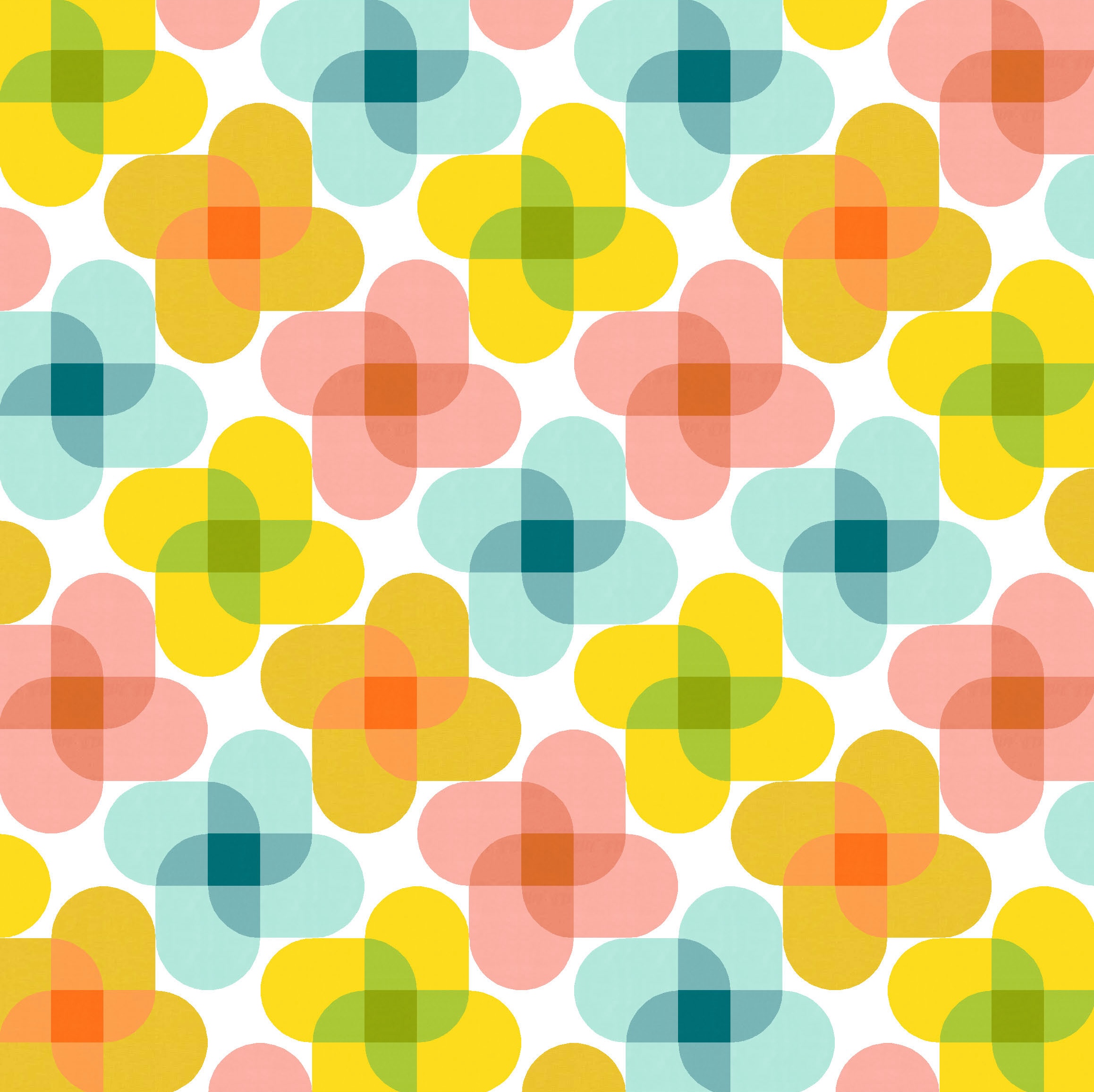
As is often the case, the version I decided to show first (which usually means it’s my favourite) was not the one I created first. This week’s sketch arose from another sketch I’ll post next week, but it started with more saturated colours, a different palette, that crowded layout, and some added elements.
I’ll walk you backwards through my design process…

Before those centre curves created the curved pinwheels (shown in a dark bluish/black here), I had crosses in the centre of the main shapes. (I can’t really call those shapes blocks, I guess; maybe flowers or stars?). I added circles in the middle of the crosses, just to introduce something different that echoed the curves used elsewhere in the design. And then added more of the same circles between the flower shapes, for some visual consistency. It was all getting a bit busy though.
I tried playing around with the shapes and the layout, but couldn’t really settle on anything that worked well.
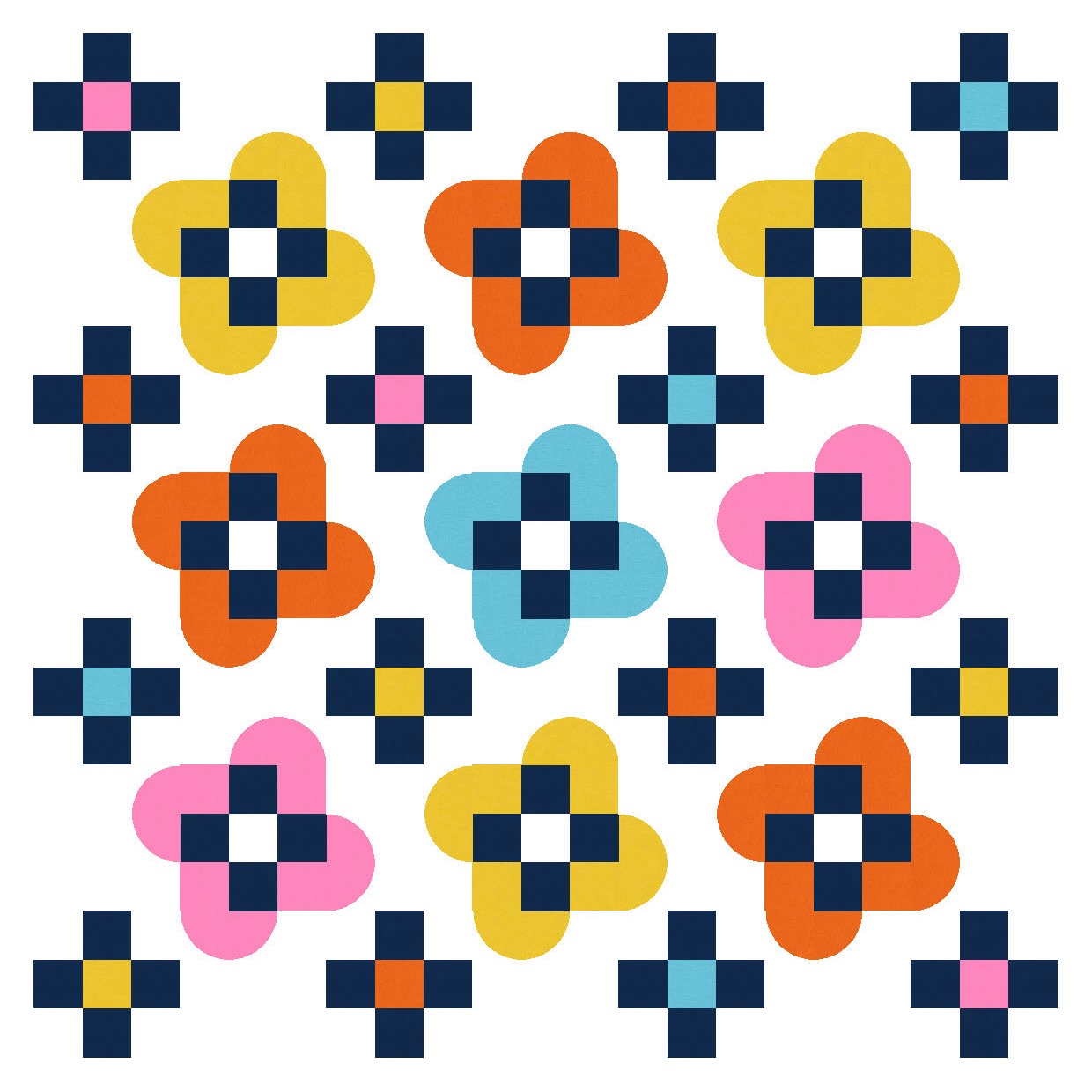
That’s when I decided to introduce some transparency, which required replacing the central squares with curves, and the central circles with squares. Oh, and using a new palette.
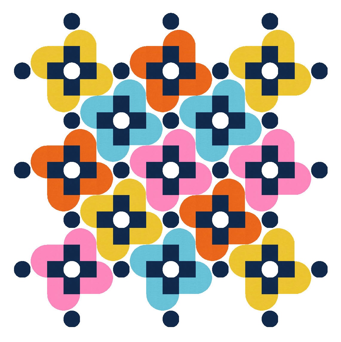
If the space between the flower shapes feels a little empty, it can always be filled by those circles again. Things feel less crowded when the flower shapes are spaced further apart.

I like creating designs where the different elements make sense together – so, for example, curves are repeated, or straight lines in one place are parallel with lines elsewhere. Little details like that help to make the design more cohesive and visually pleasing.
This week’s sketch would be easy to make into an actual quilt: it’s just quarter-circles (or drunkard’s path units), and squares or rectangles. If you created the flower shapes as blocks first, you’d need to use partial seams to join all the blocks together, Otherwise, you could assemble the whole thing in rows or columns. It all fits in a grid layout.
The main thing would be choosing the right palette to make the transparency work. Groups of three shades that go from light to dark seem to work best together. I love the palette I’ve chosen here, but what works on screen doesn’t always look the same in real life. I’d want to test out some swatches first before sewing anything, I think!
Discover more from Geometriquilt
Subscribe to get the latest posts sent to your email.
