Sunday sketch #426
More transparency this week, using an element from last week’s sketch.
The centre of last week’s sketches featured a cross or ‘Χ’ shape overlaid by a square (on point). If I treat those squares like stylised ‘O’s, I can imagine this design is a bit like noughts & crosses. There’s something about a noughts & crosses design that’s been in my brain for years – one of my earliest sketches was another simple take on Xs and Os. I’ve always loved the simplicity and familiarity of that pairing.
Treating the small overlaps between the two shapes as areas of transparency just provides an opportunity to kick things up a notch. Again, like last week, the actual colours don’t need to make perfect sense. I think it’s more about choosing the right value (saturation or intensity) than the right hue (colour).
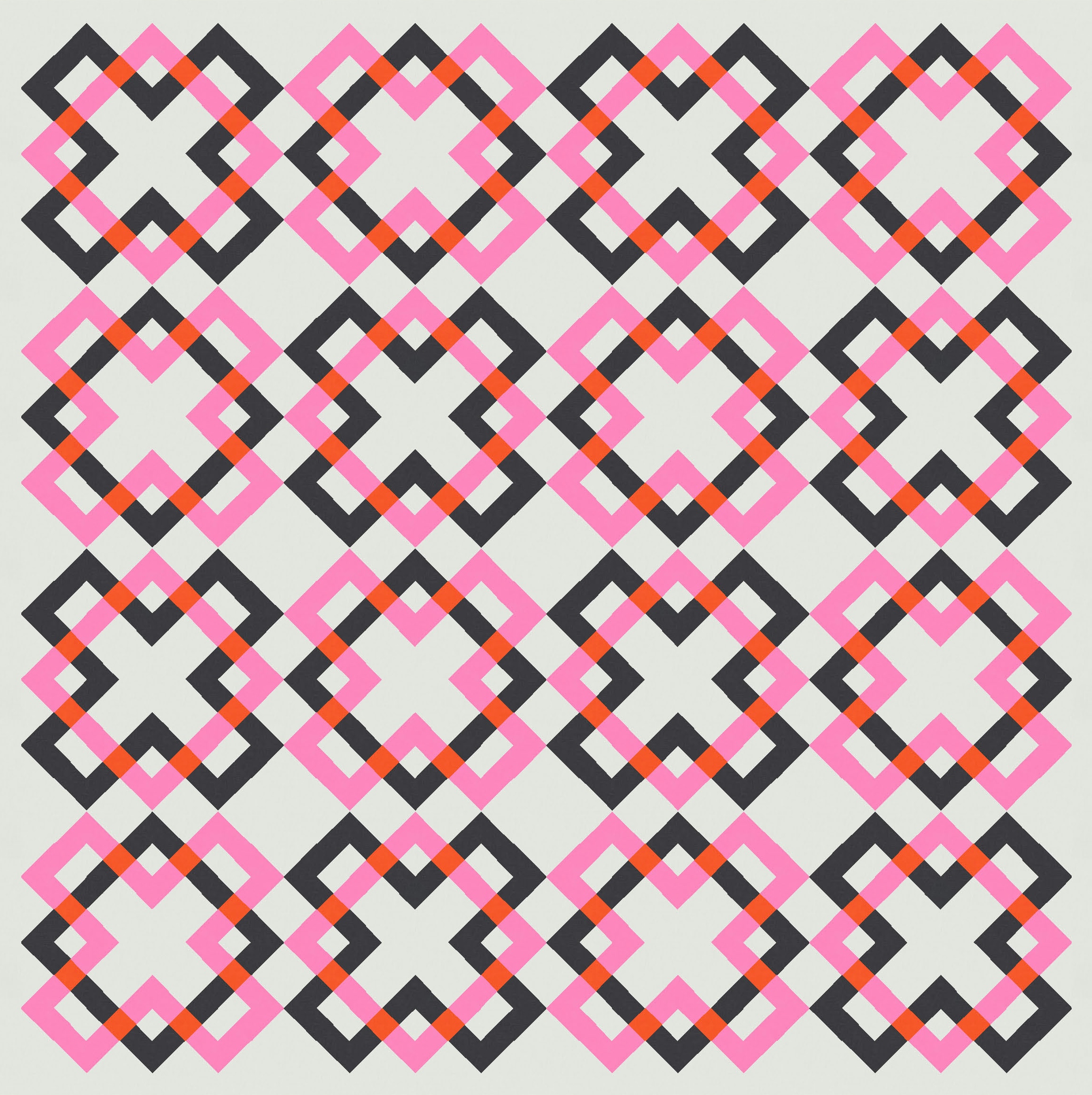
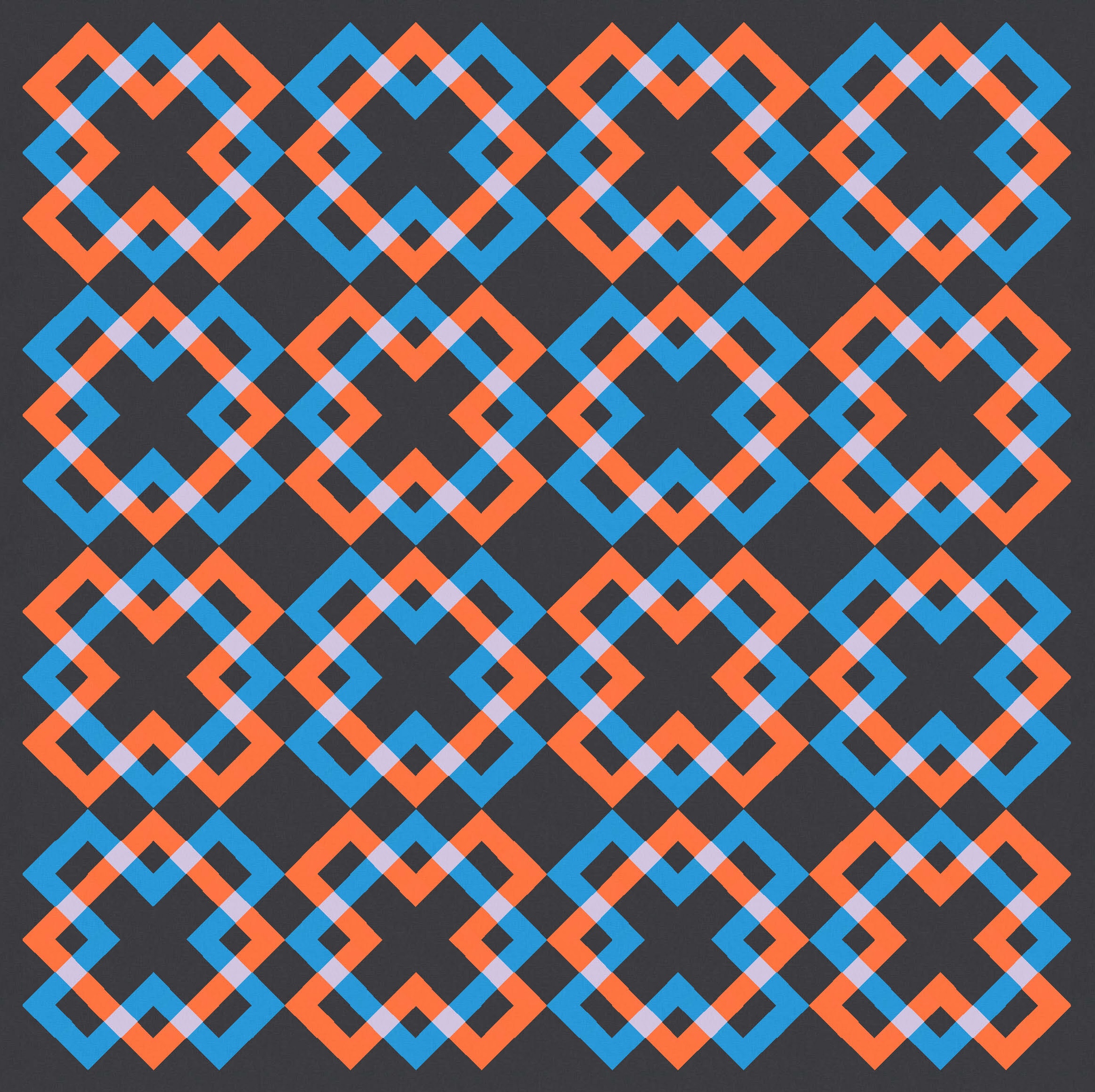
In the example above, black and pink are never going to overlap to give a bright reddish orange, but I think the transparency effect still works. Similarly, black and pale pink overlap below to produce a bright blue. I tried to create versions where the overlap produced a darker colour (bottom left) or a lighter one (bottom right).


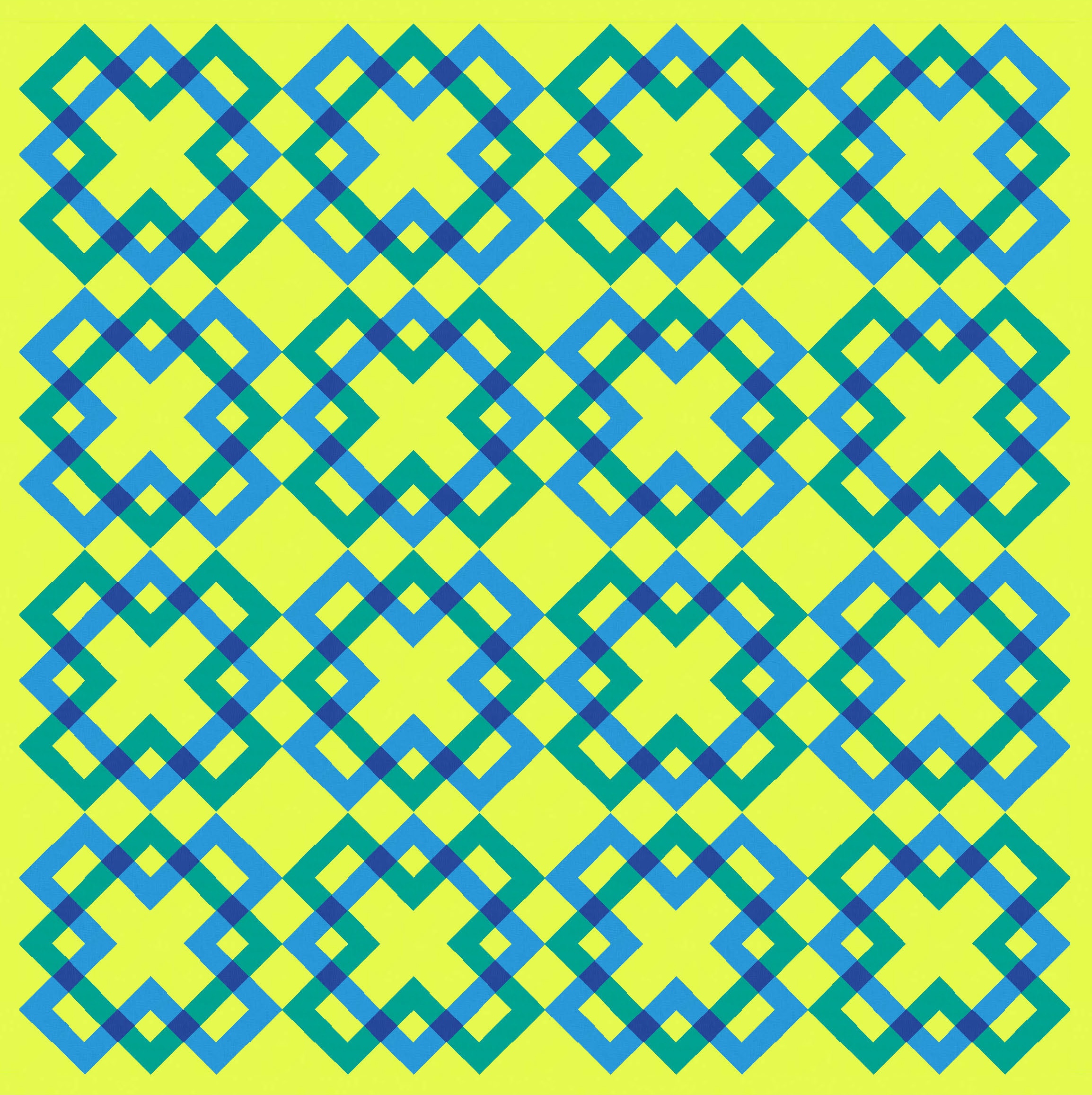
Depending on the colours I chose, the alternating Xs and Os can be more obvious or less. Sometimes I find it really easy to focus on different aspects of the design, picking out all the shapes of one colour or the other. I think the colour selection makes a big difference. The blue and green are perhaps a bit too close in this next two versions, but the combination of mid-blue and acid yellow in the bottom right version make it easier to pick out either set of shapes.


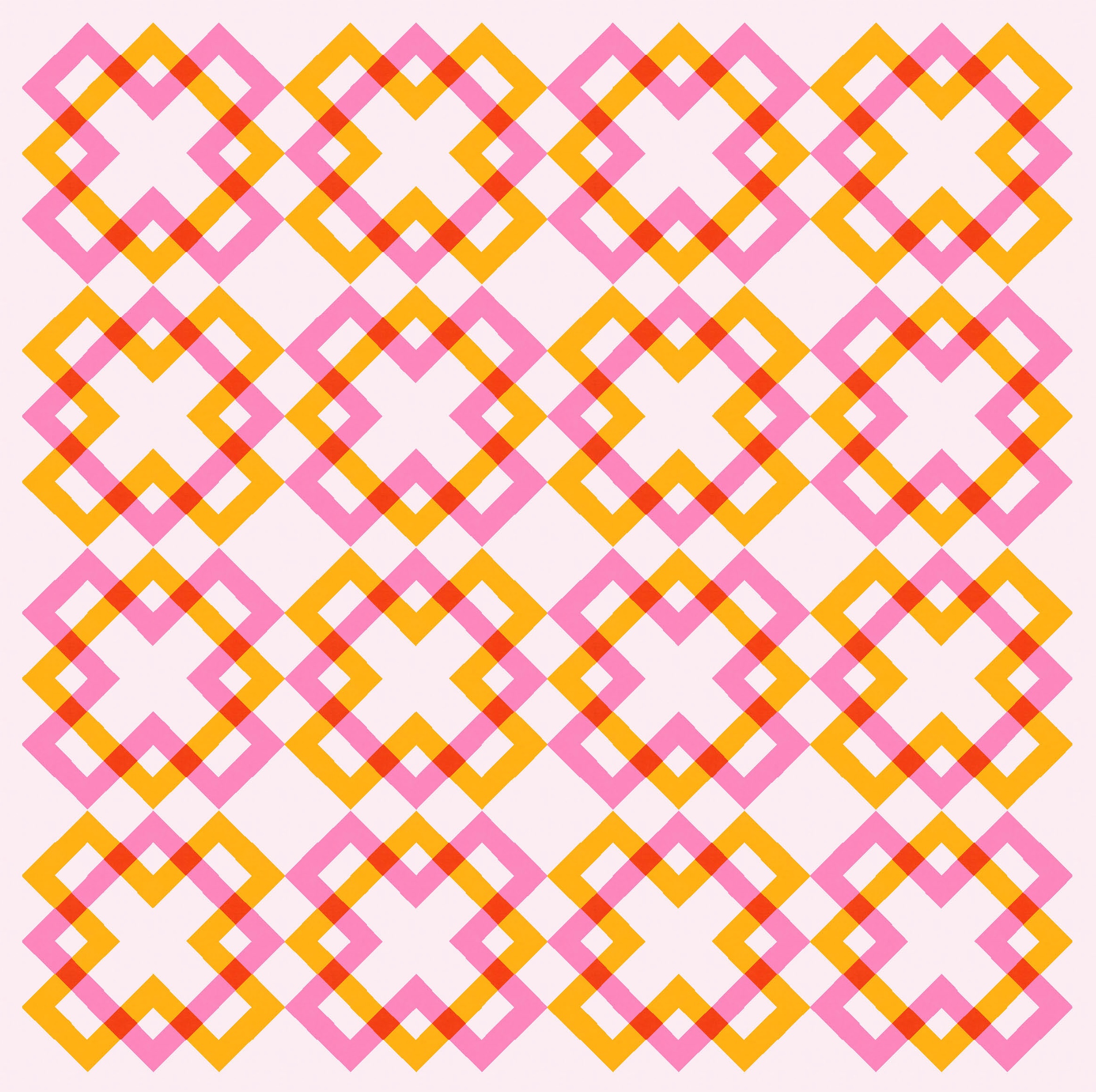
Here’s one of the palettes I used last week.
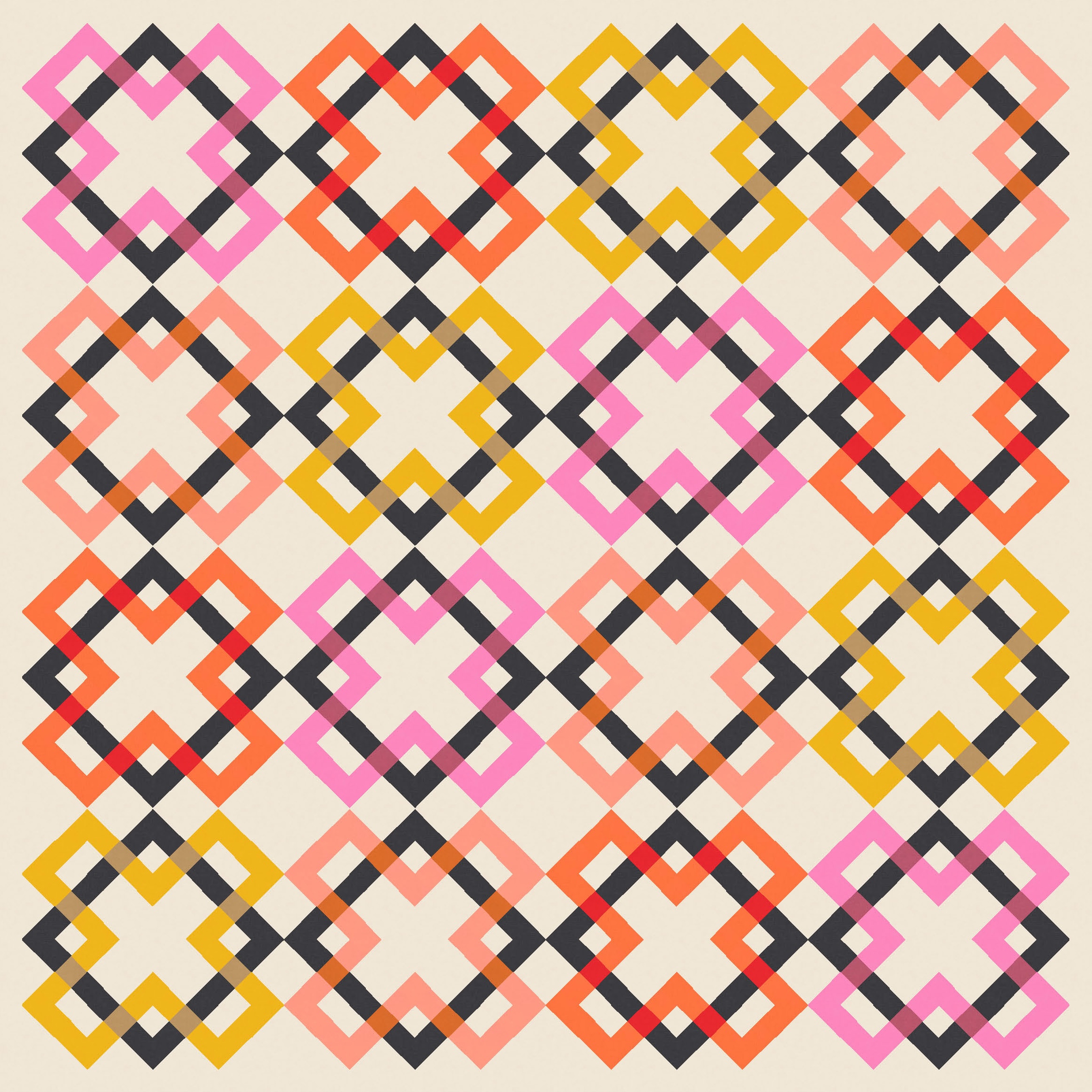
And, of course, so many shapes means so many opportunities for colour placement. In the next version, I’ve coloured all of the squares (or Os) in black, but changed up the crosses (Xs) in different colours (my usual warm palette). And I’ve still played with transparency (using a more sensible/logical colour in each case). There’s enough consistency between the blocks to not get too busy, although this is probably at my limit of busy-ness 🙂
Subtracting elements helps to show the individual shapes, too. I’d maybe play with this idea more if I were making a version of this sketch for a modern quilt show.

Like last week’s sketch, this week’s could be made into a quilt using lots of small squares (and maybe a few rectangles) set on point. There are undoubtedly ways to make the individual blocks using larger pieces. But in the time it would take me to figure all that out, I probably could’ve chain-pieced a million squares, well on my way to finishing the quilt top.
As much as I like this design, I don’t think it’s one I’d make (though never say never). I do love that X shape though, so it’ll undoubtedly feature in future sketches!
Discover more from Geometriquilt
Subscribe to get the latest posts sent to your email.

love this