Sunday sketch #423
I never stop learning new things in quilting! Earlier this year, I saw a new-to-me shape on the Instagram feed of Daisy Aschehoug (WarmFolk) – she’d been playing with it and wondered if it had a name. Other people commented that it’s called a bishop’s hat or cathedral window block (not to be confused with the cathedral window technique), or a cathedral arch or gothic arch. Or it could just be described as a double-cut drunkard’s path. Daisy’s been creating some really fun designs with it – see here and my favourite here.
A while ago, I’d designed some sketches using a block with two overlapping orange peels. They’d be a bit of a pain to make though; there’d be lots of sewing and sub-cutting (or small templates). As soon as I saw this arch shape on Daisy’s Instagram feed, I decided to redo my sketches. The end result is almost the same; with fewer real curves, there’s slightly less circular movement around the design. But I don’t mind – I feel like there’s still a lot of movement here, and I like the fact that this version would be much easier to make.
The basic block is 4 of these arches set around a square (which is on point). Each block also has setting triangles and corner triangles (you can’t see them here because I’ve coloured them all in the same background colour for each block). The blocks themselves are arranged in a standard layout.
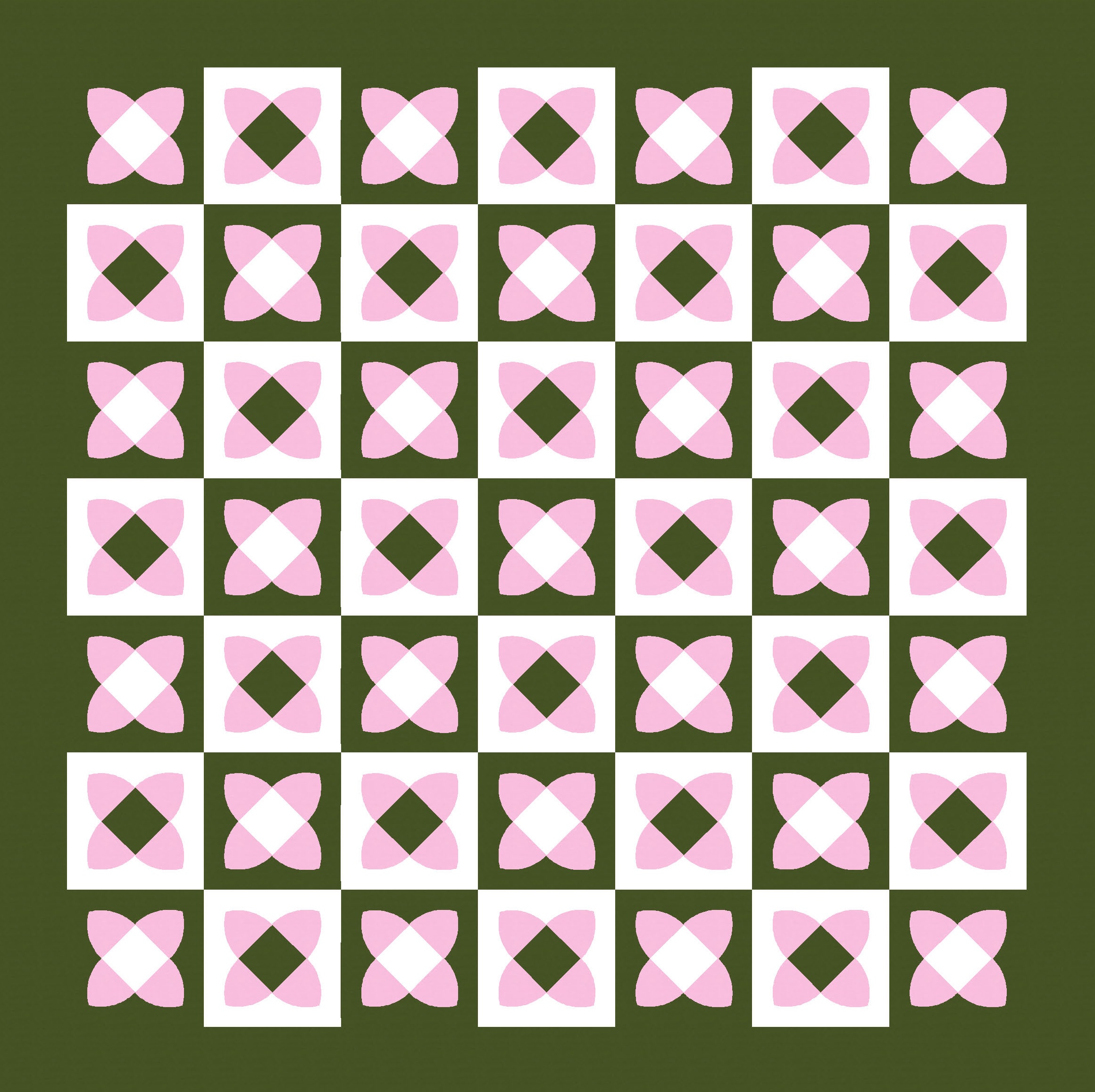
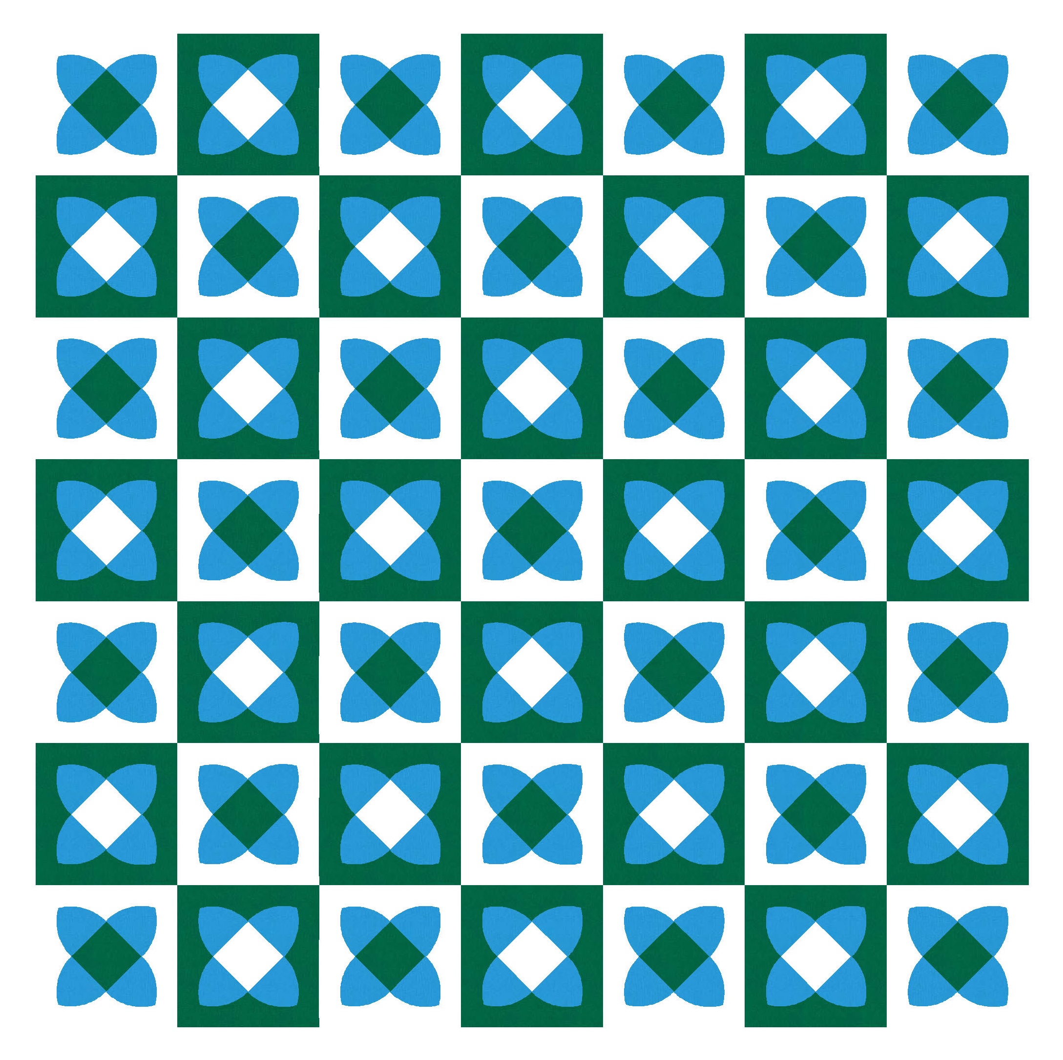
There are 3 main elements in each block: the centre square, the 4 arches, and the background. Using a different colour for each element means there are 6 permutations (3 × 2 × 1), or 6 different block colourings. I’ve used a combination of two block colourings in each design, which I’m sure increases the number of possible layouts. Here are two more, anyway.

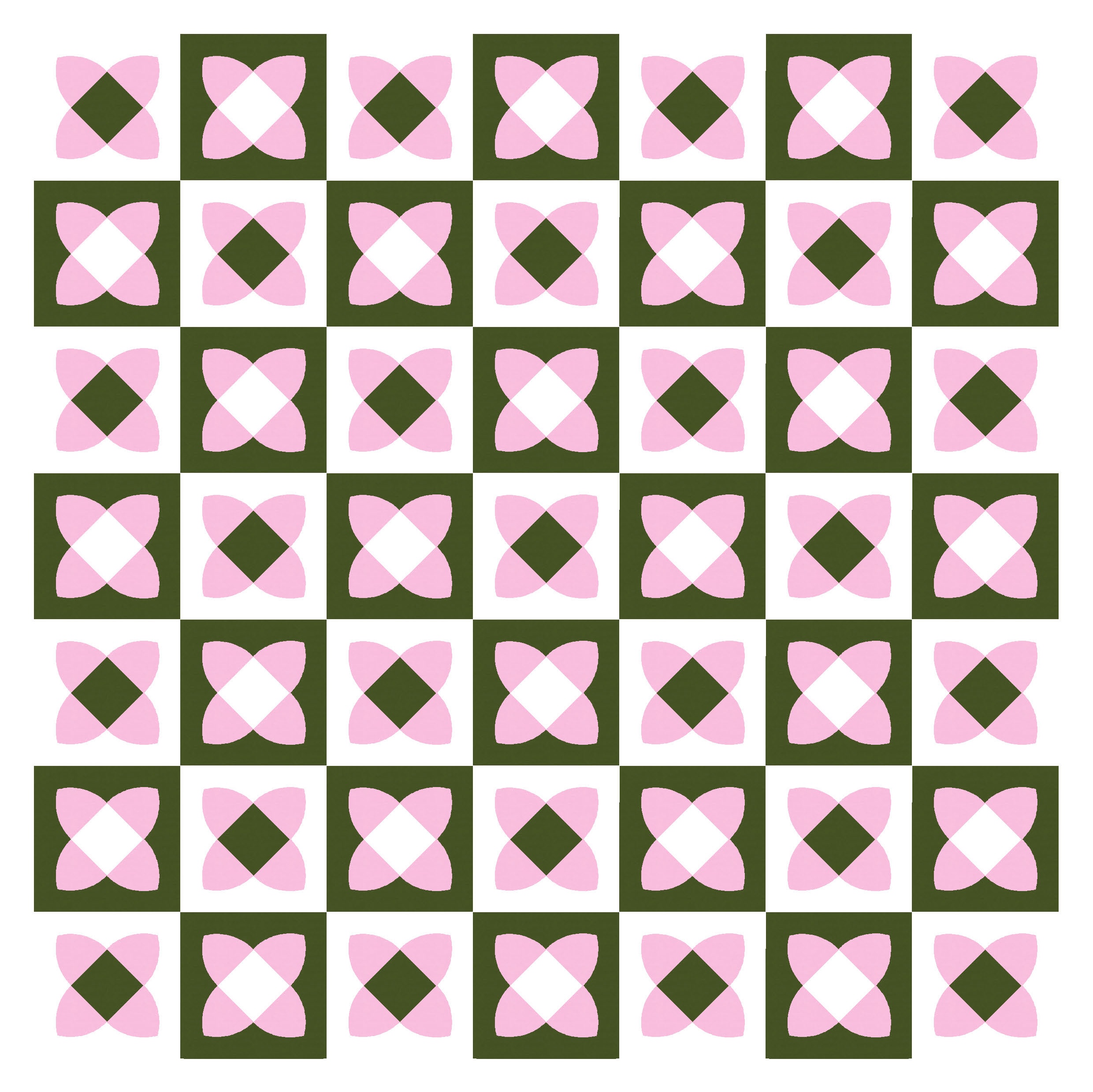
There are definitely some colour combinations and placements that work better than others. I think I prefer the lighter colours in the arches; darker colours can end up looking a bit flat, maybe?

Sometimes the lighter colours can end up creating a transparency effect, at least for the blocks with a darker centre, which helps to create some visual interest.

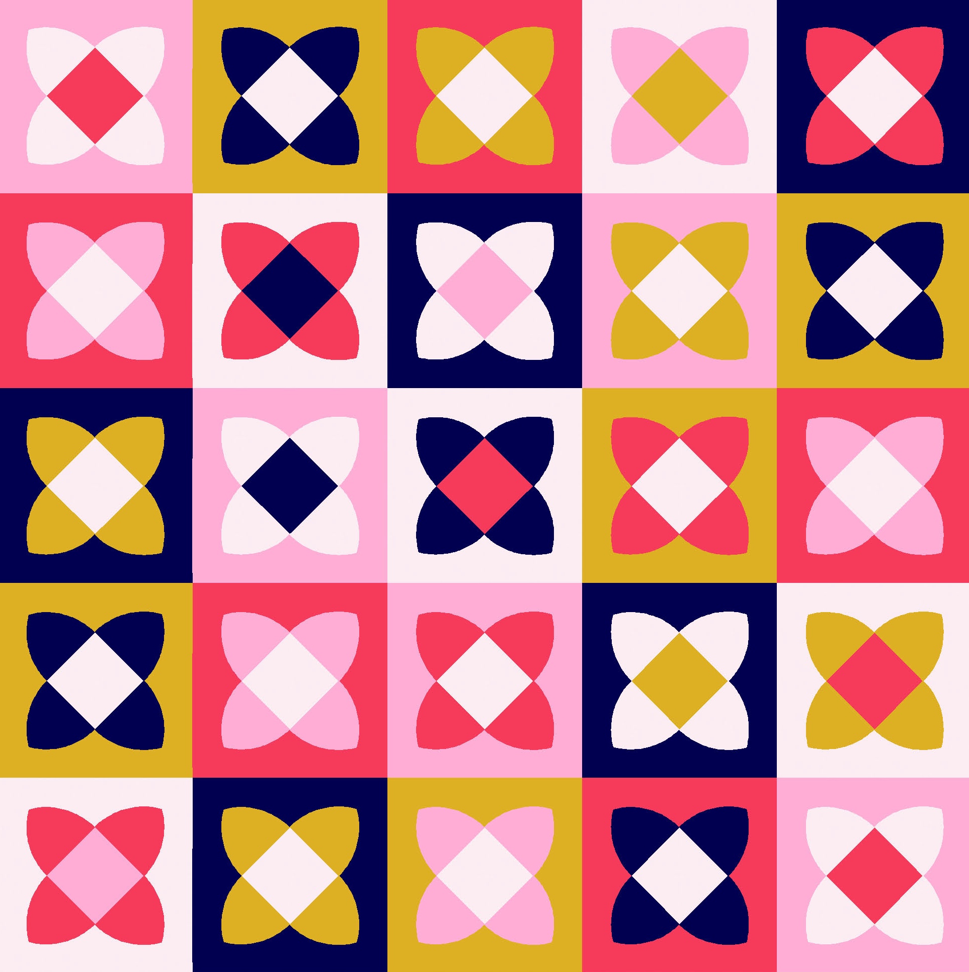
I think this design works reasonably well in a larger colour palette too. (I tried these versions very quickly; probably with a bit more care, I could find a layout that’s a bit more balanced… but you get the general idea.)

I can’t help it – I just like the 3-colour version more.

Once you got comfortable making the arch units (watch Daisy’s Instagram reel for a few construction options), you’d just need a centre square and some setting/corner triangles to create each block. Then do that over and over again until you have enough for a full quilt 🙂
Discover more from Geometriquilt
Subscribe to get the latest posts sent to your email.
