Sunday sketch #489
Would you believe that I designed this week’s sketch and drafted this blog post almost two weeks ago, and only realised last Wednesday that the basic design is the same as Sunday sketch #440 (posted last December)?! I always knew it would happen eventually… I’ve copied myself! 🙂
I thought about ditching this post, but in the end decided to keep it for a few reasons. First, it’s the lead-in to next week’s sketch, and next week’s blog post refers back to this one in a few places. And second, I’ve explored different colour placement (and palettes) here, which shows off the versatility of this design. So let’s get into it!
This sketch combines a few features I’ve used recently, like the zig-zag outer edges of Sunday sketch #475 and the grids within grids within grids of Sunday sketch #468. It’s always fun to revisit concepts to see if I can take them any further!
This week’s palette is drawn from issue 9 of Curated Colour from Tara Glastonbury (available on her website, Stitch & Yarn, and on Etsy). I haven’t used all 12 colours; there are definitely some shades that I kept coming back to. I do seem to be drawn towards warmer colours lately, so tried to balance those out with some cooler tones too. I love having this monthly colour inspiration! It’s saving me from reusing a lot of the same palettes in my sketches, as well as helping me reconsider some colours I’d previously underappreciated.
The main reason for pursuing this week’s design was that zig-zag outer edge. I love it! I used something similar in Tectonic, and knew then that it was a feature I needed to explore further. (Edited to add: I’m shaking my head as I reread this…!)
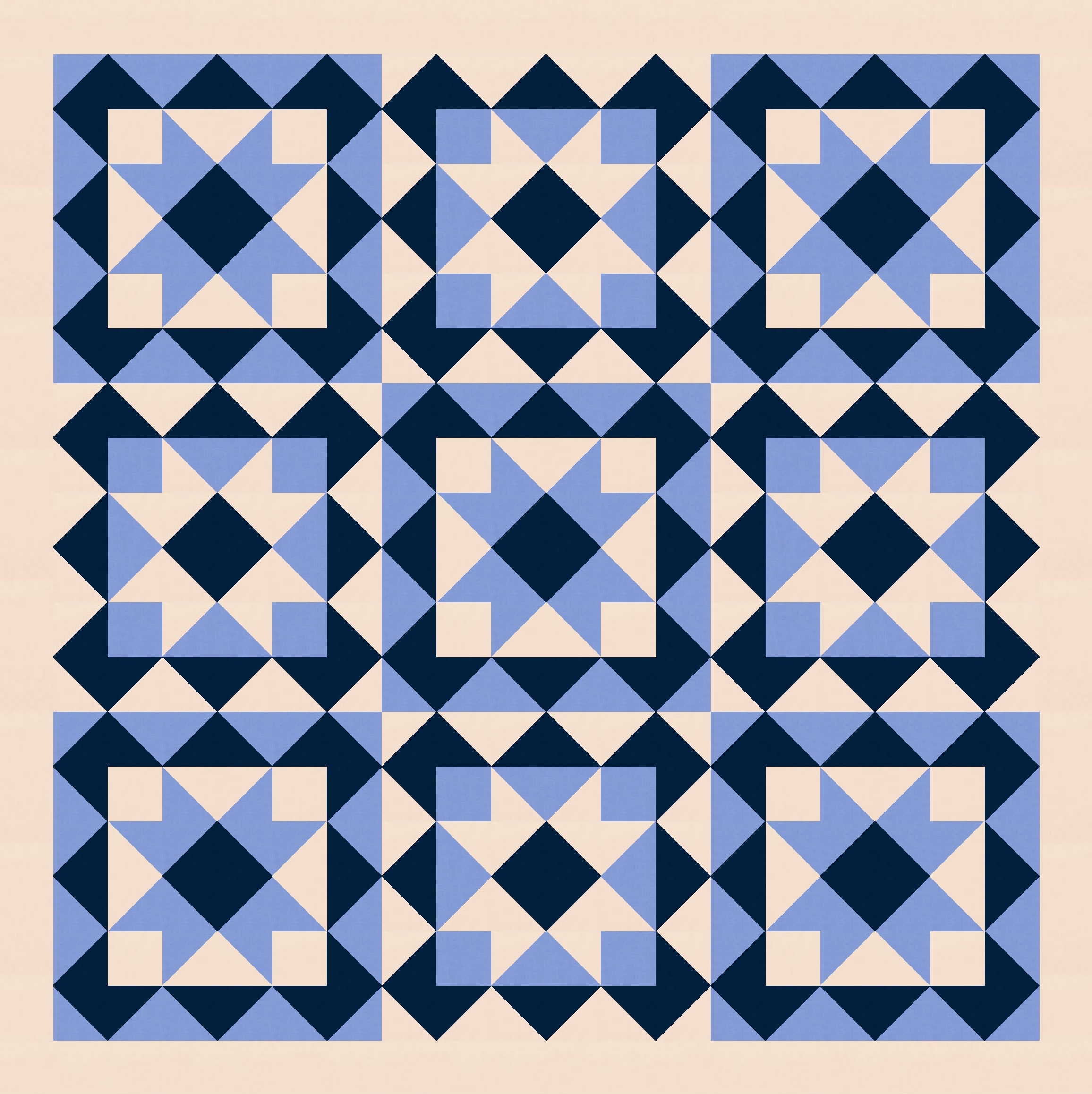
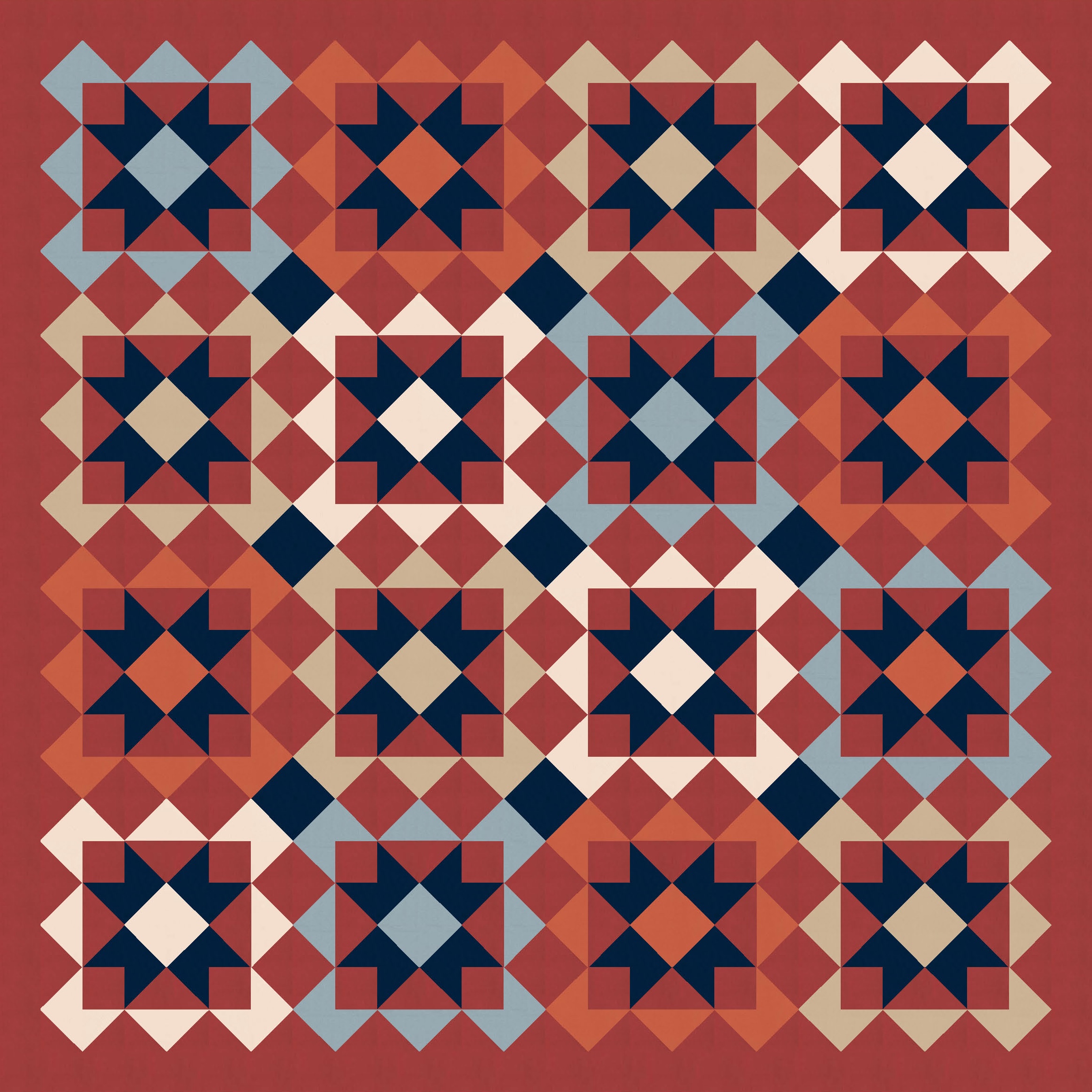
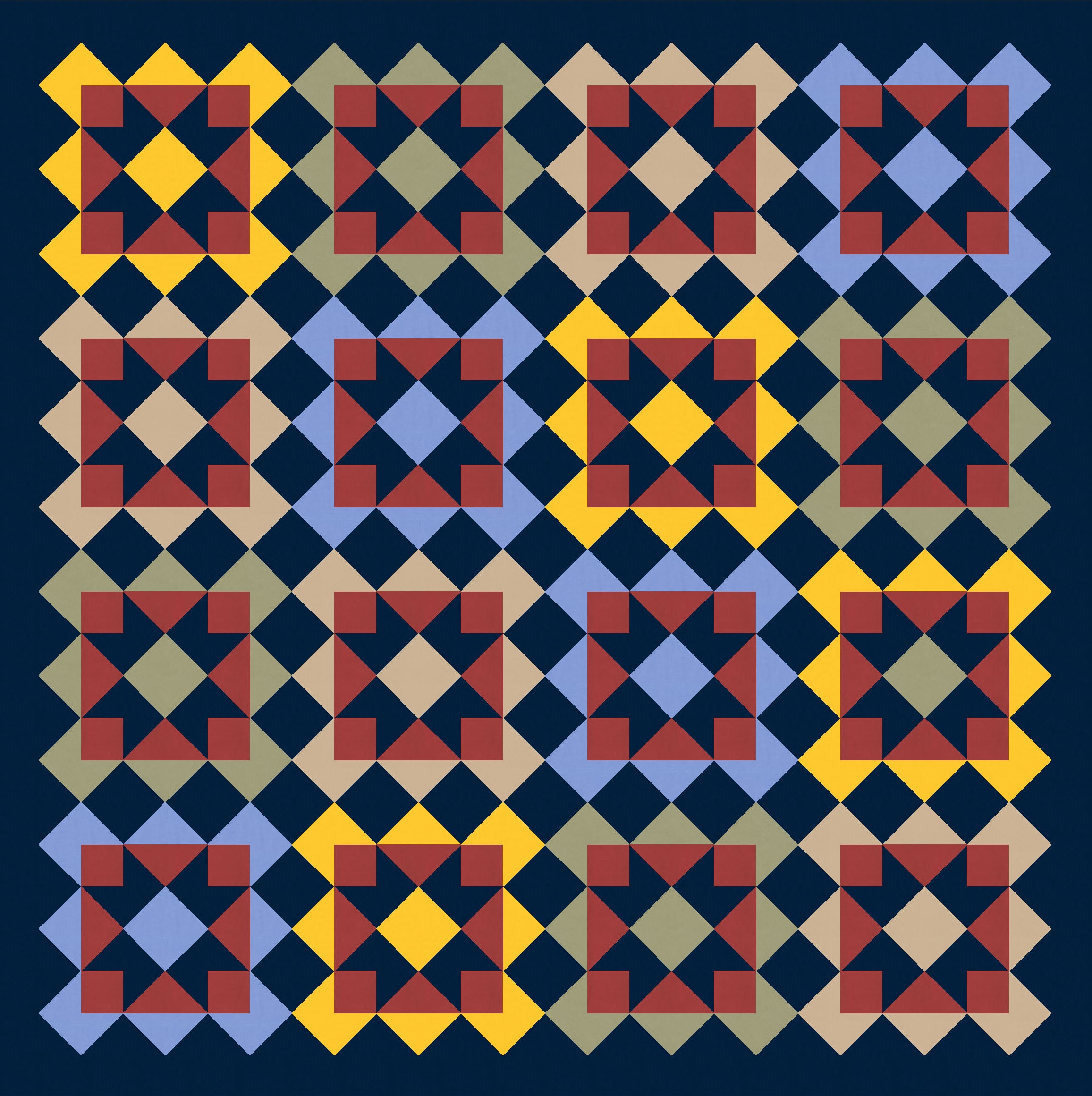
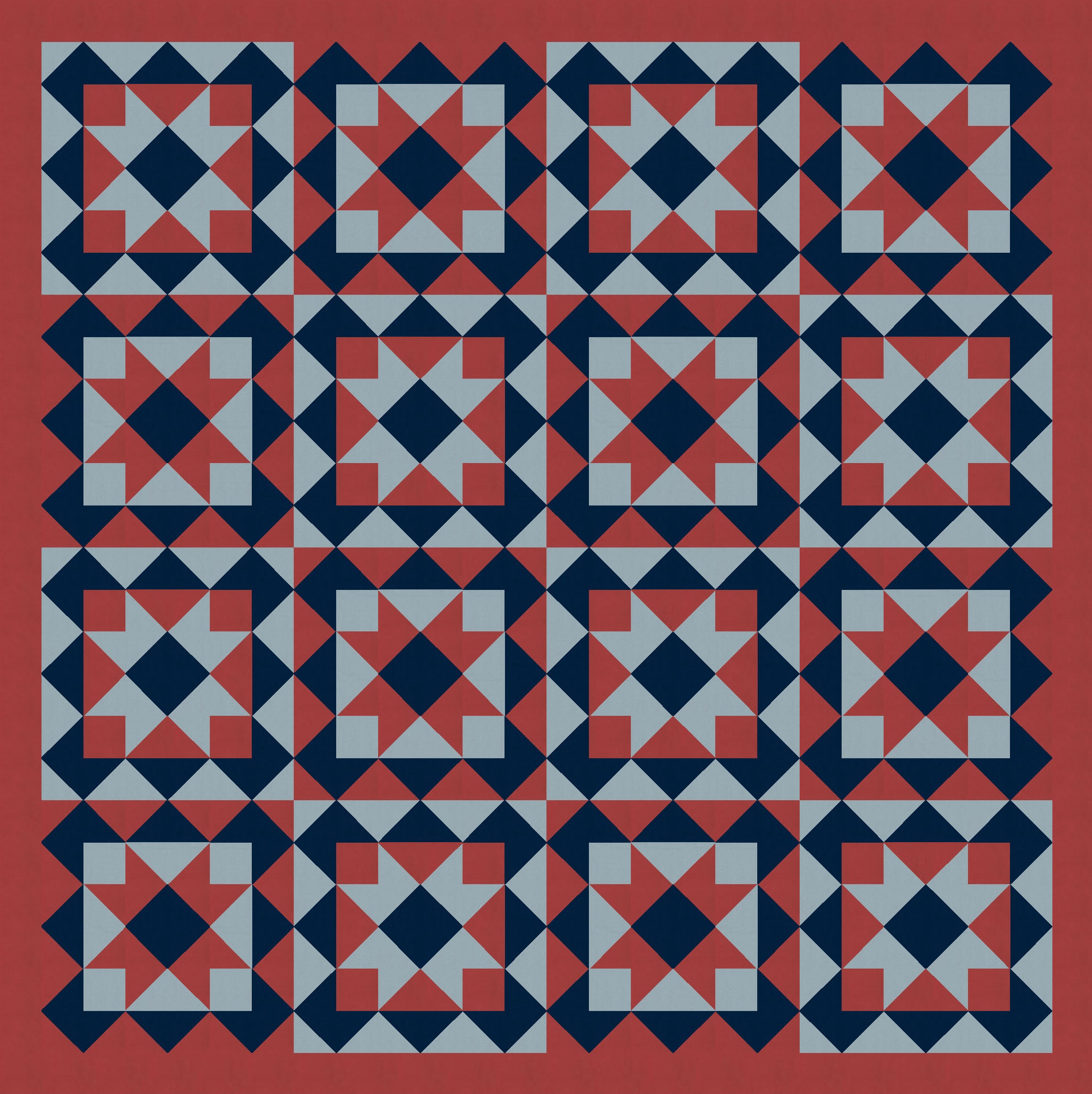
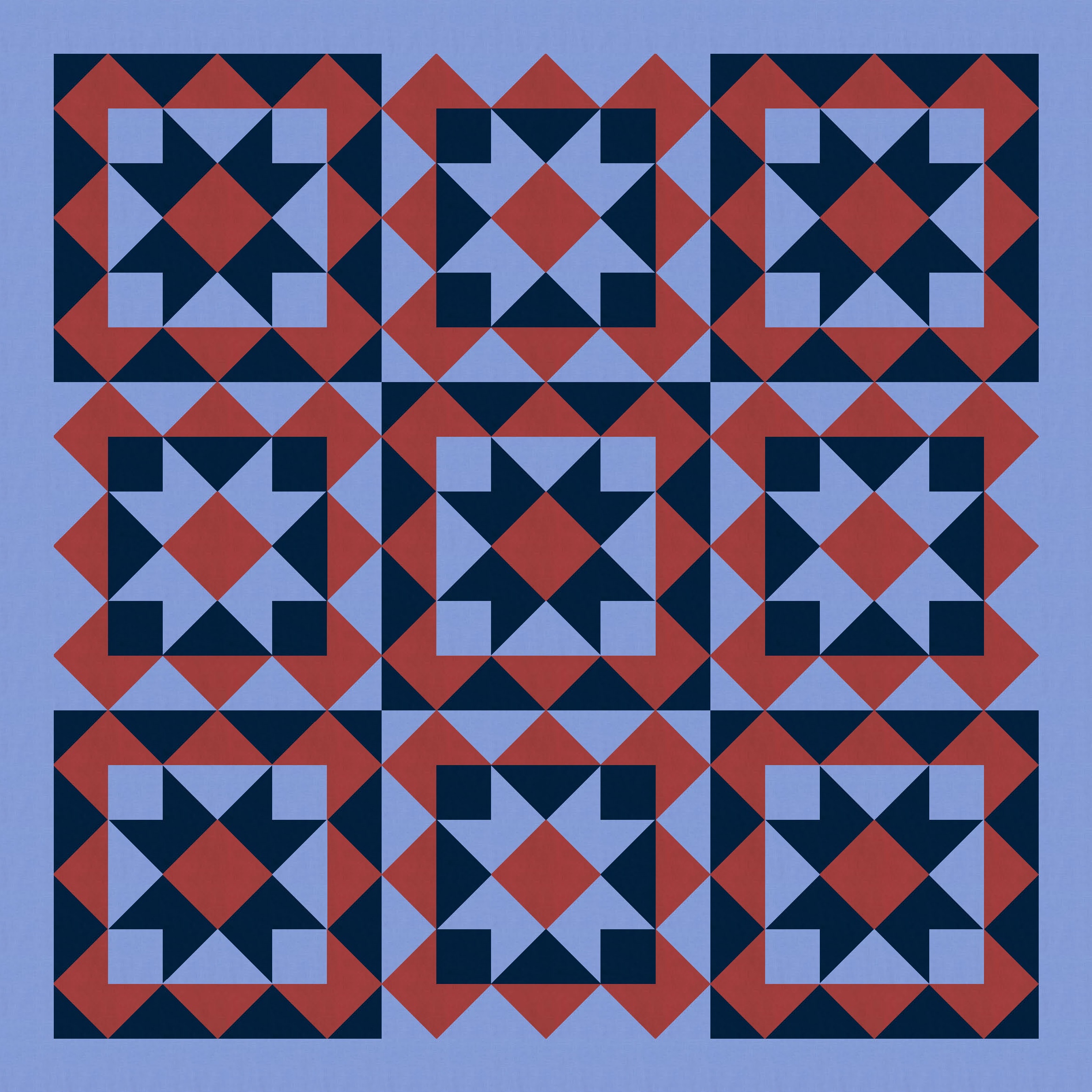
So I started with a block very similar to one in Tectonic (the outside is the same; the inside there was a cross, whereas here it’s a sawtooth star*) and just tiled it. I also coloured in some of the interstitial spaces between blocks, using the same colour as the sawtooth stars. (That ends up making more sawtooth stars in the opposite colourway.)
(*I’m calling it a sawtooth star, but it usually has a square in the middle, not a square on point. So this block may have another name, but my Encyclopedia of Pieced Quilt Patterns by Barbara Brackman is in the other room, and I’m too lazy to get up to check it.)

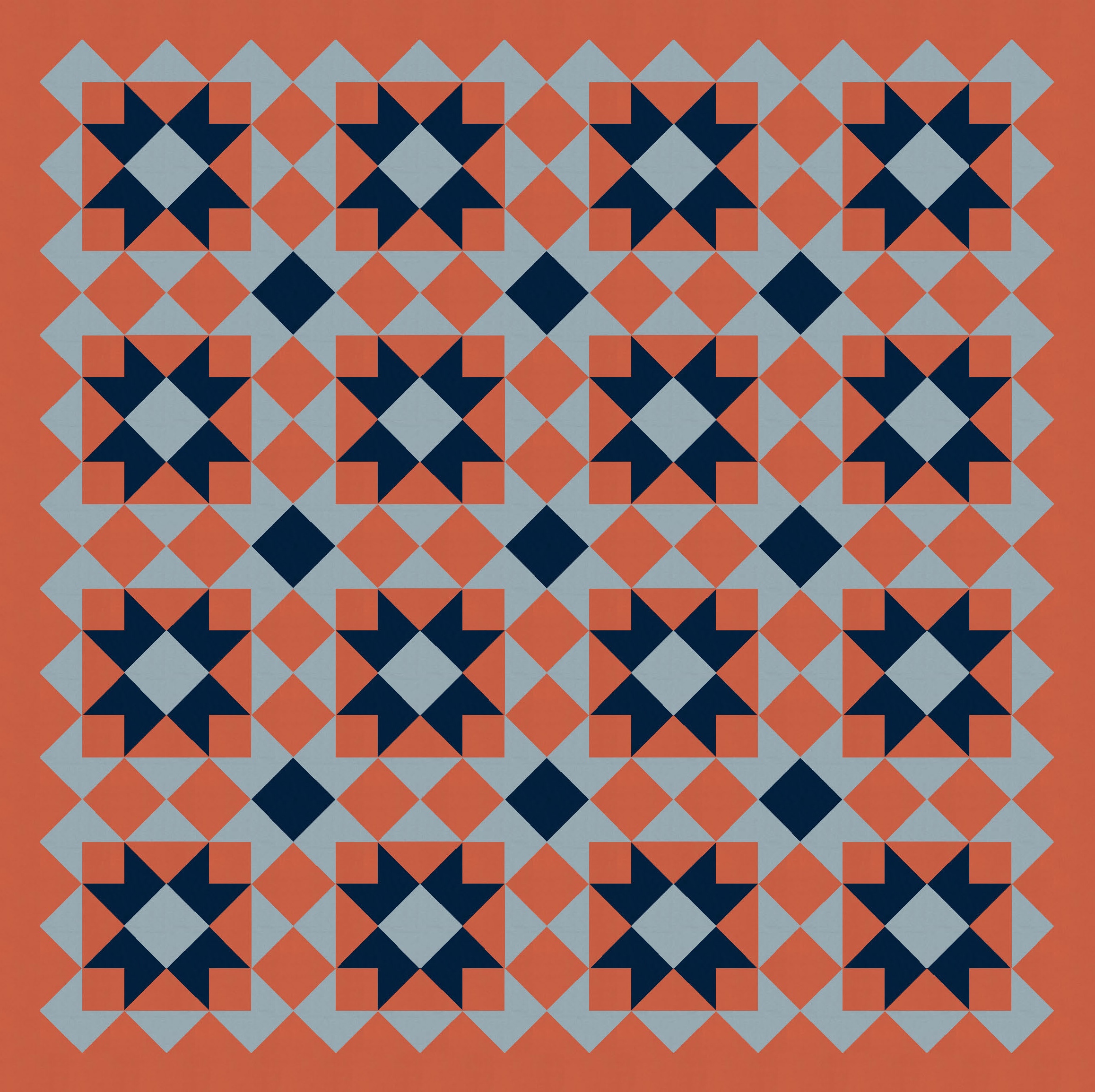

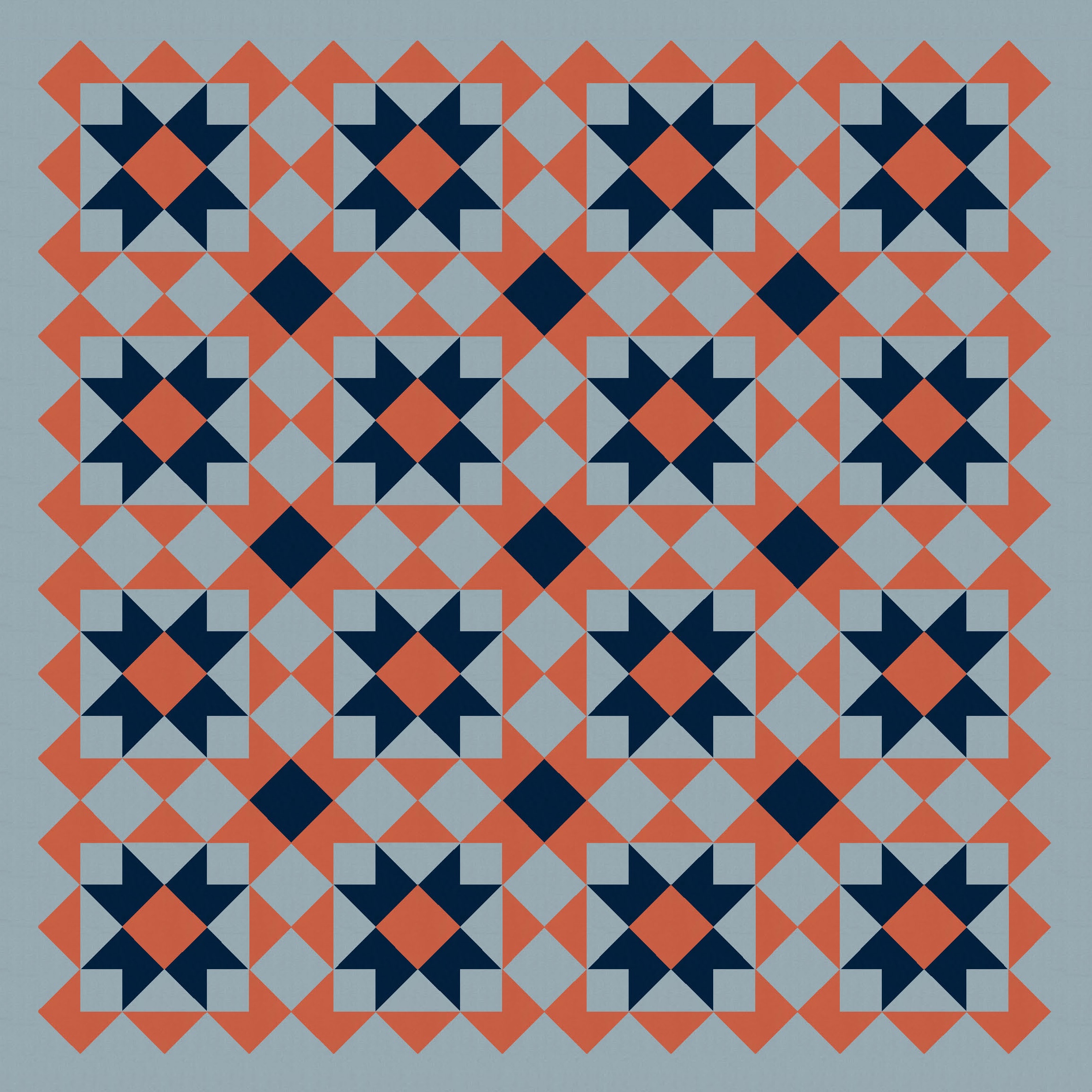
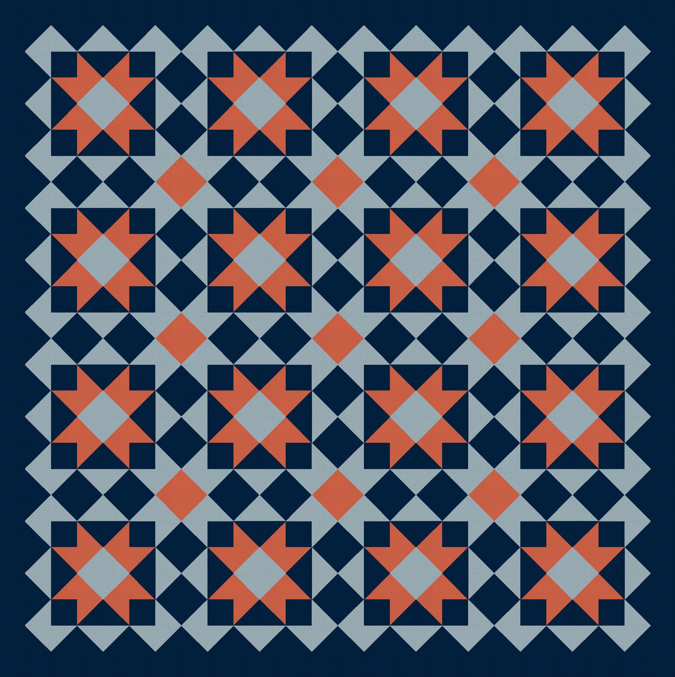
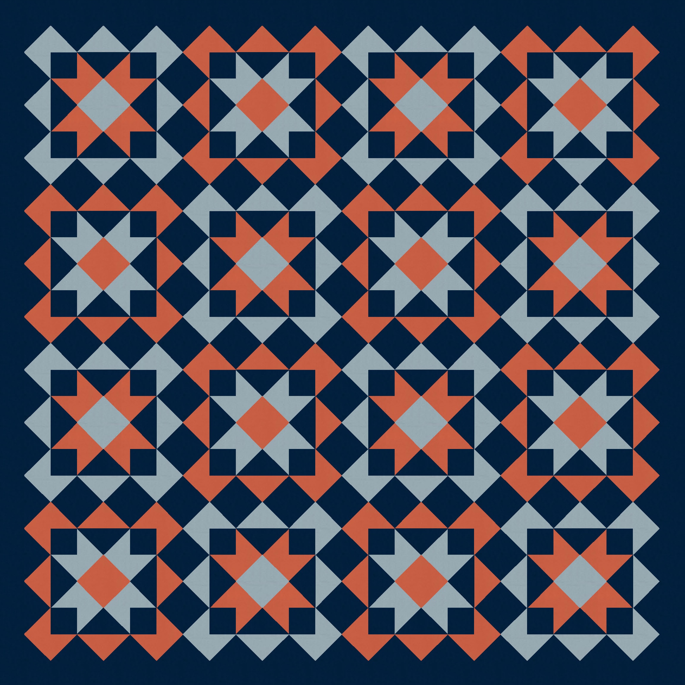
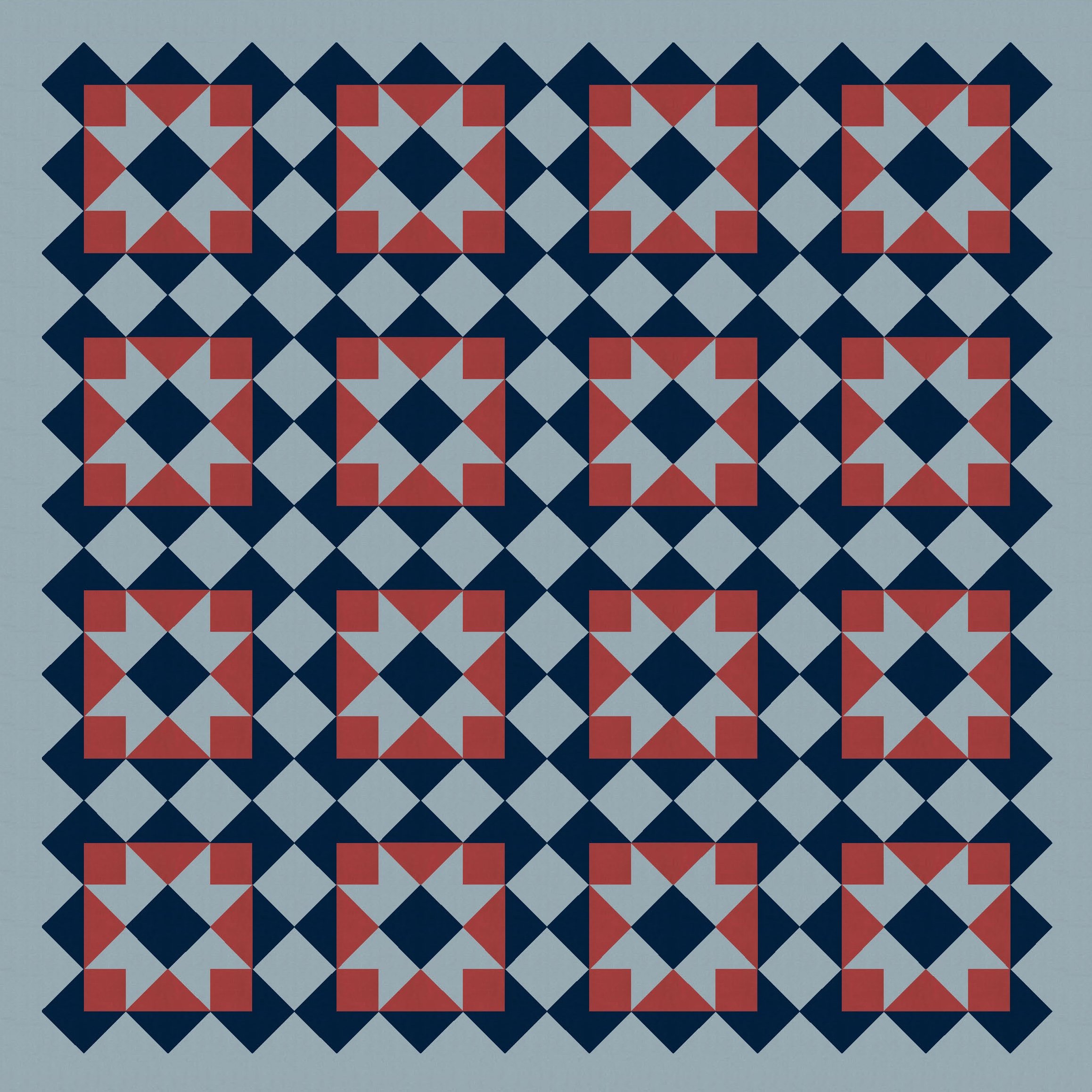
I’ve used three-colour palettes, above, which is often my favourite: I think I like the fact that it means there are only really 6 options for colour placement (3 × 2 × 1), which feels manageable! I’m always intrigued to see how the colour placement affects the overall look and feel of the design; I definitely see different shapes or movement emerging depending on which colour (the lightest, darkest, or medium shade) is the background and which are in the foreground.
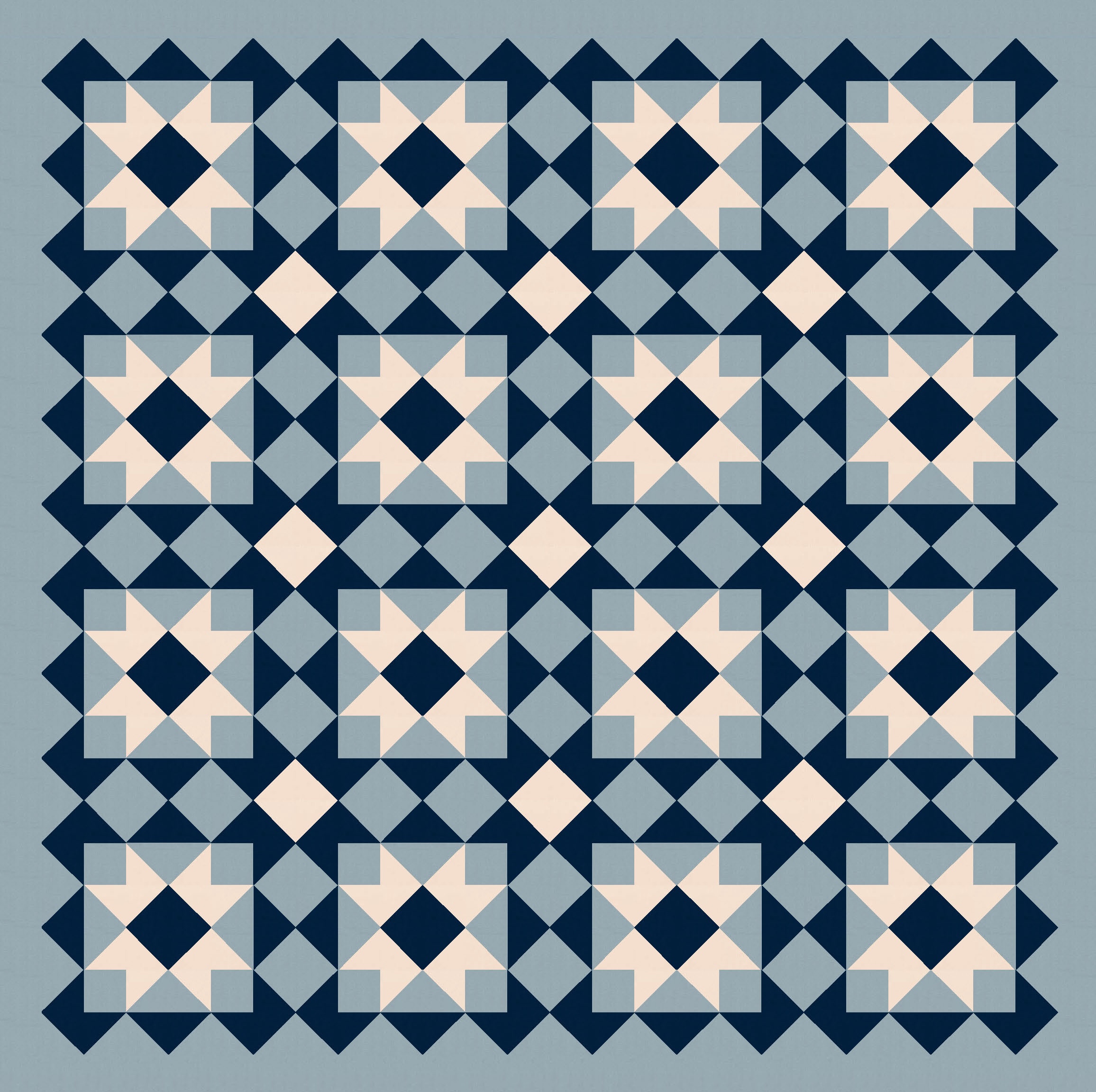
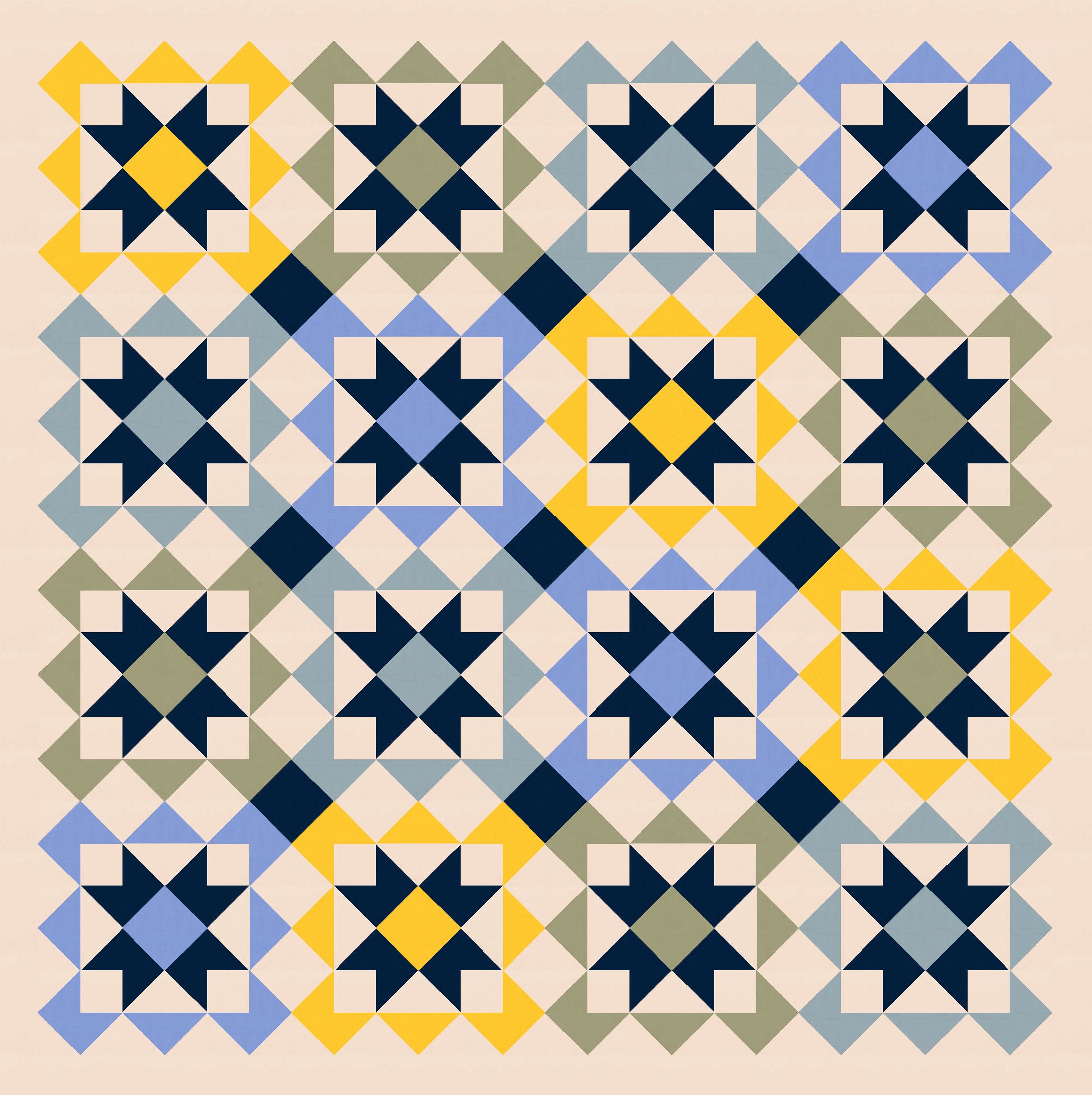
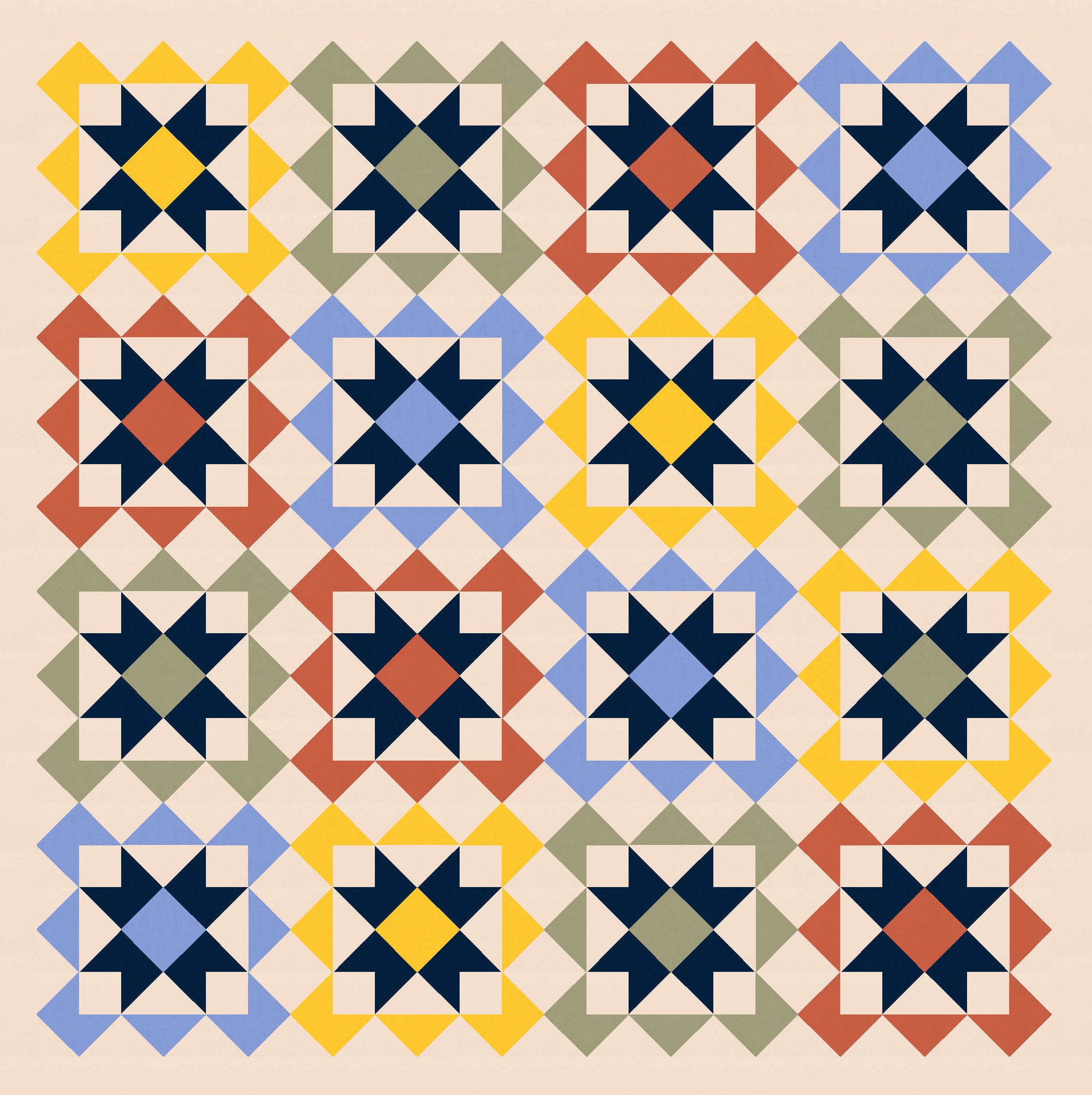
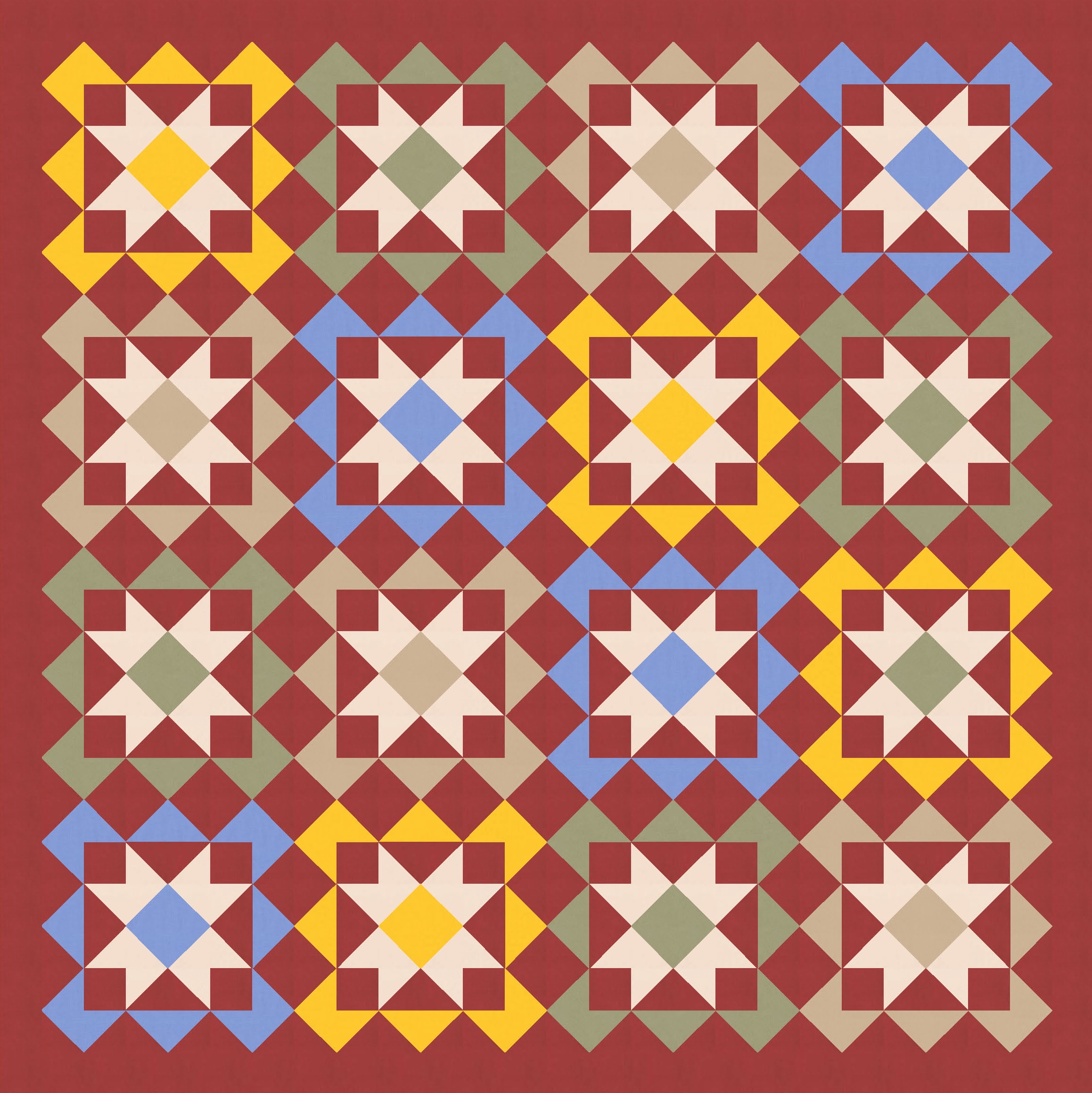
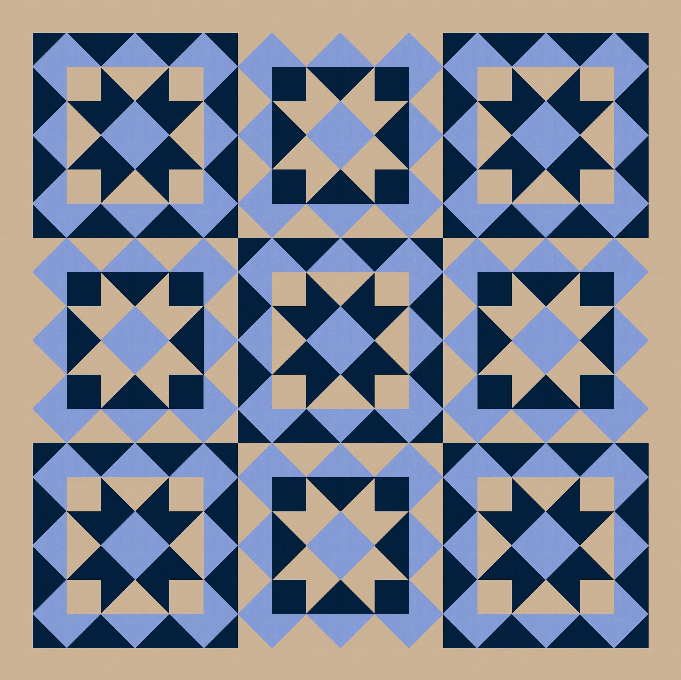
Anyway, I also tried a larger palette and colouring the blocks differently. I’ve used the background colour consistently across all blocks, as well as that darker colour to tie things together. I like how colouring those squares in the middle (the ones on point, between the blocks’ corners) connects the blocks diagonally too.
Oooh, that criss-cross action in the version below right is really pleasing to my eye!!

(I really love those two versions featuring that bright yellow – I was very tempted to post one of them as the featured image this week!)
Anyway, I played around with these blocks for awhile. I tried alternating the colours…
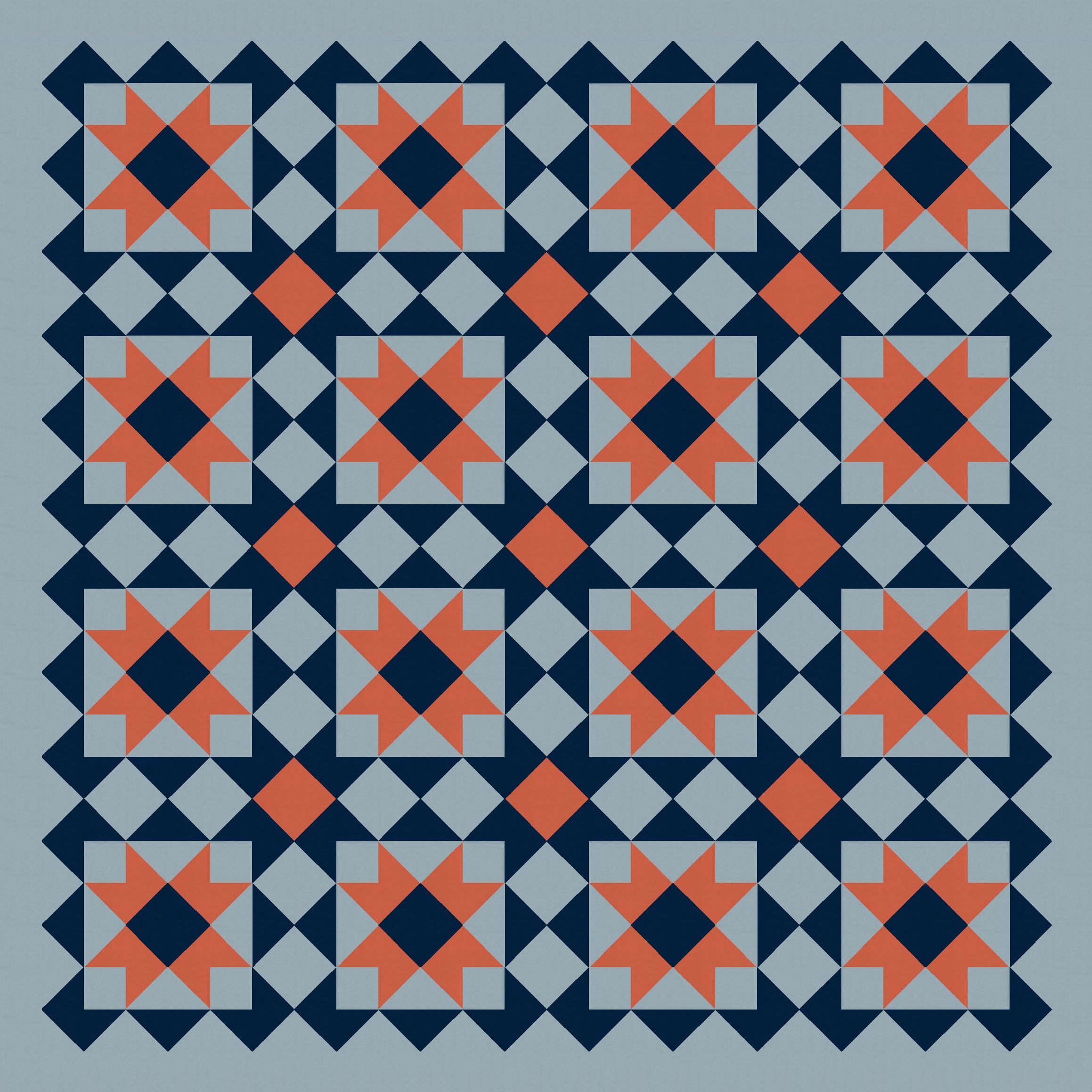
…and also changing the placement of the background colour within the blocks. Originally, the sawtooth stars (in a consistent colour) were surrounded by a square of background colour; in the next few versions, the stars themselves are in the background colour, and the surrounding squares take on the consistent colour. It just shows how easily you can tweak even simple designs.

Changing the squares brought me back to the simpler palette…
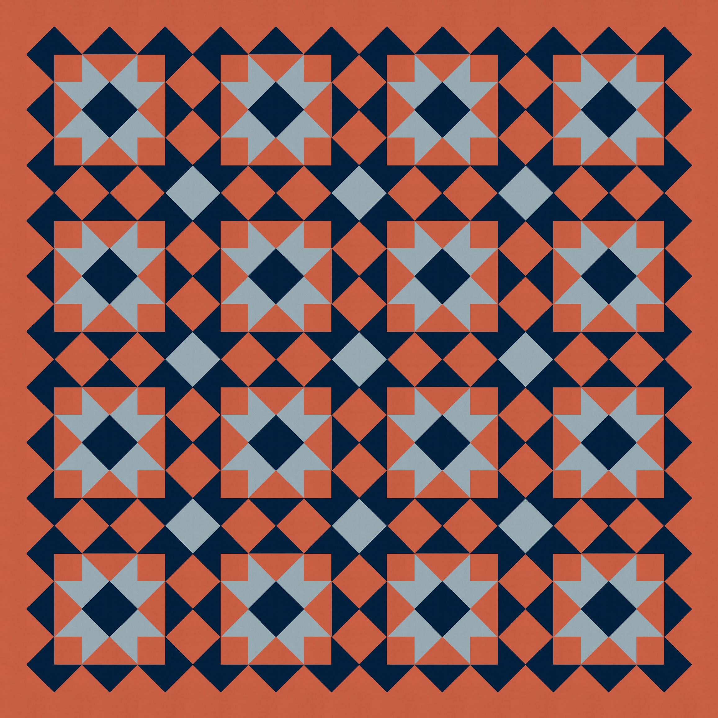
…which then prompted me to wonder how else I could differentiate alternate blocks. I echoed that internal square with an external one on half of the blocks. So now there’s another grid.
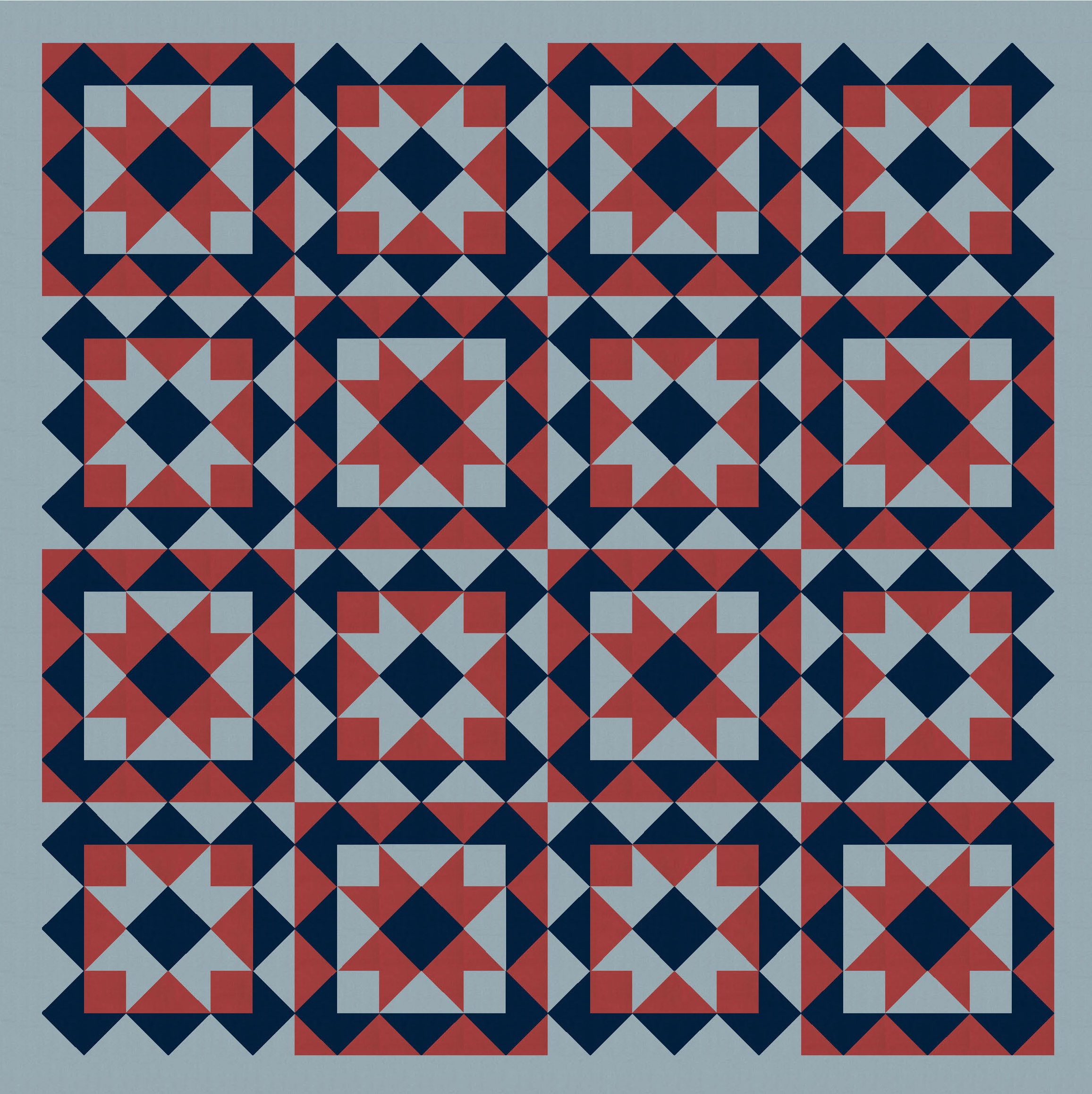
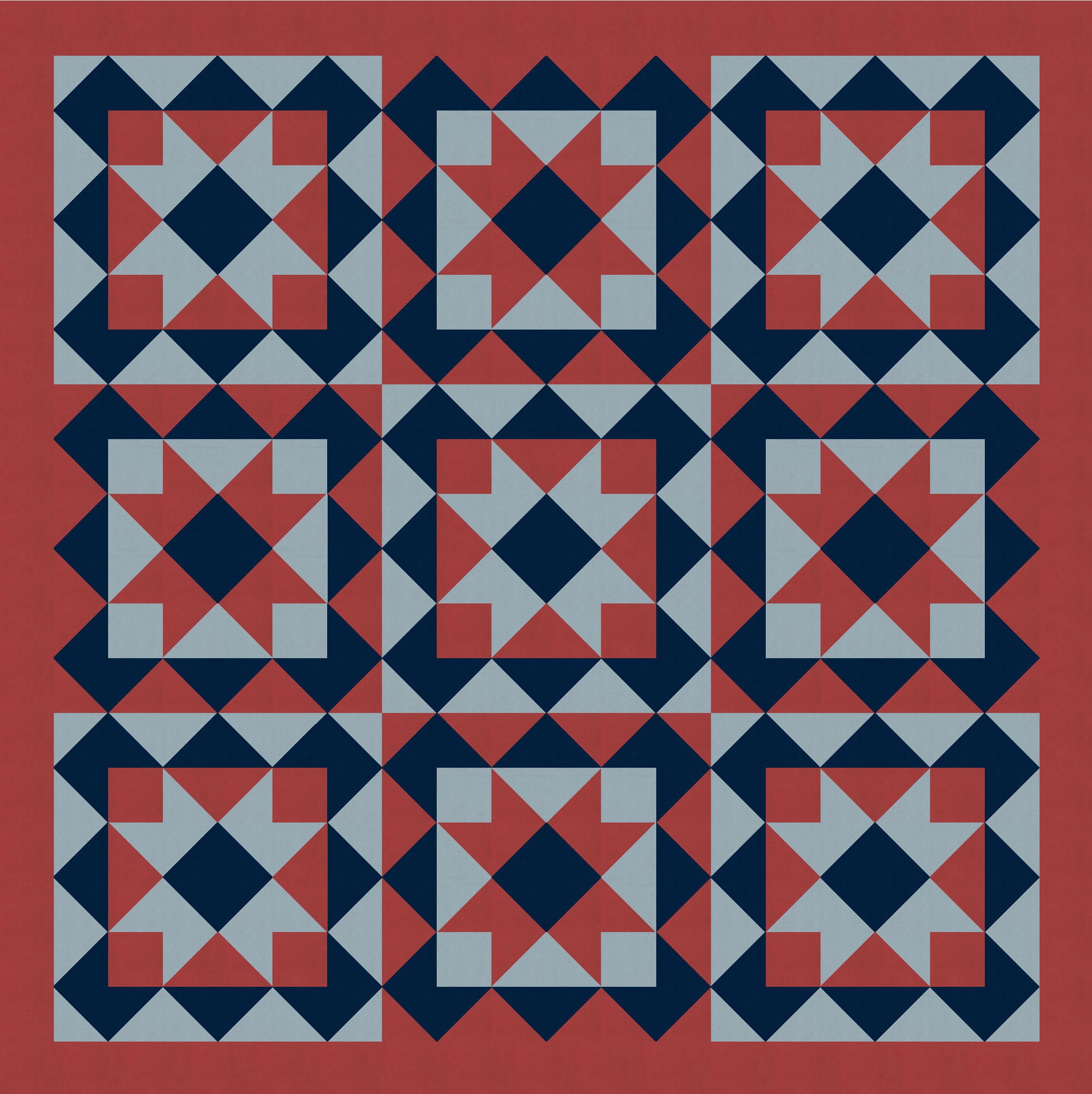
I really like these versions, but decided that a 4 × 4 layout was a lot for the eye to deal with. Paring the design back to a 3 × 3 layout has the advantages of retaining the overall feel while supersizing the blocks to give even more impact.
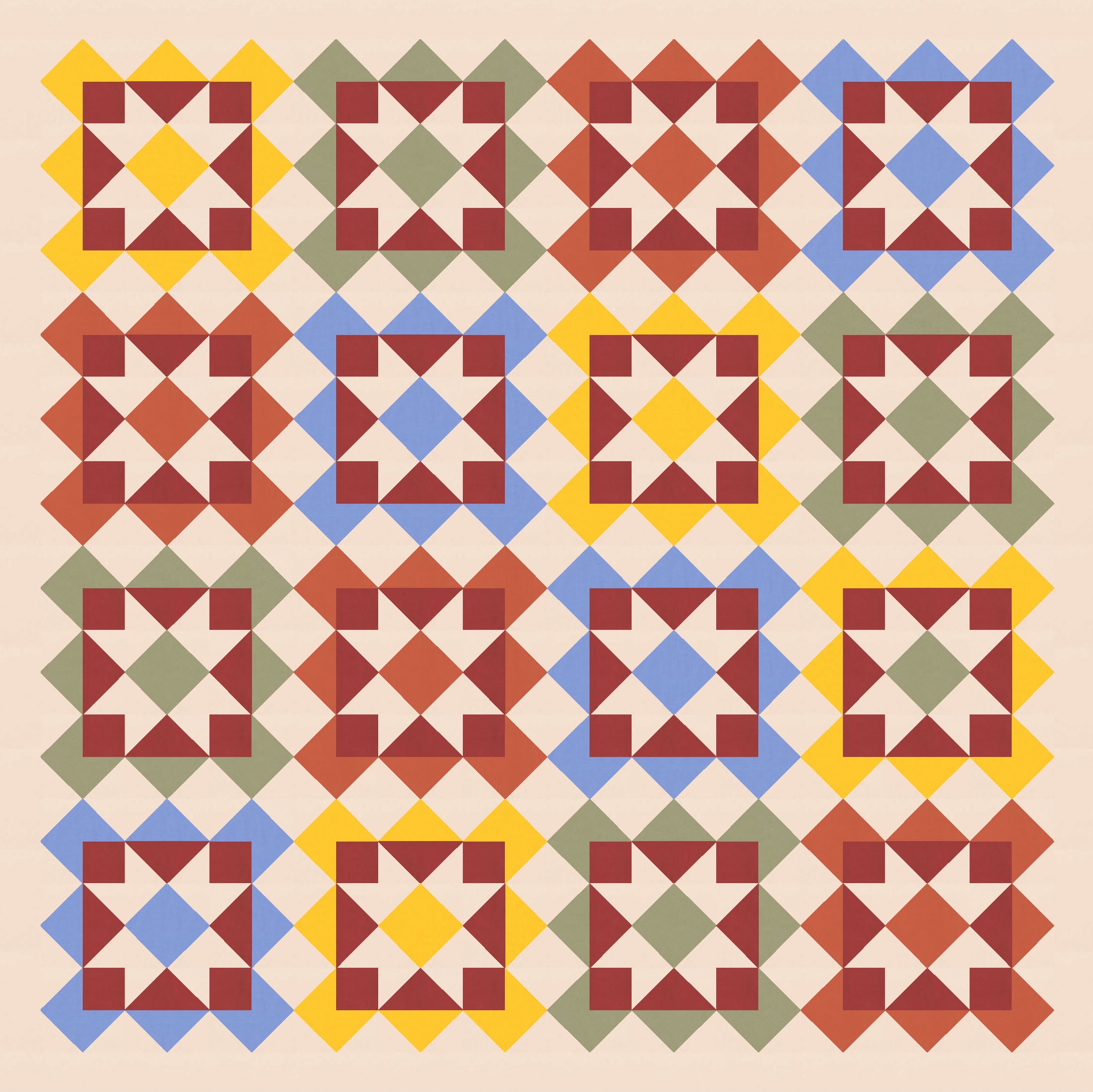
I couldn’t resist playing with more of Tara’s colours. These are all from issue 9 of Curated Colour; each issue has a full palette of 12 colours (this month in Kona only, but usually in Devonstone and Painters’ Palette solids as well), with a few ideas for two-colour and give-colour combinations. I like seeing those, but I like playing around myself with the same colours in Electric Quilt 8 – I just limit my fabric library to those 12 Kona colours and see how they work together. I’m often pleasantly surprised!

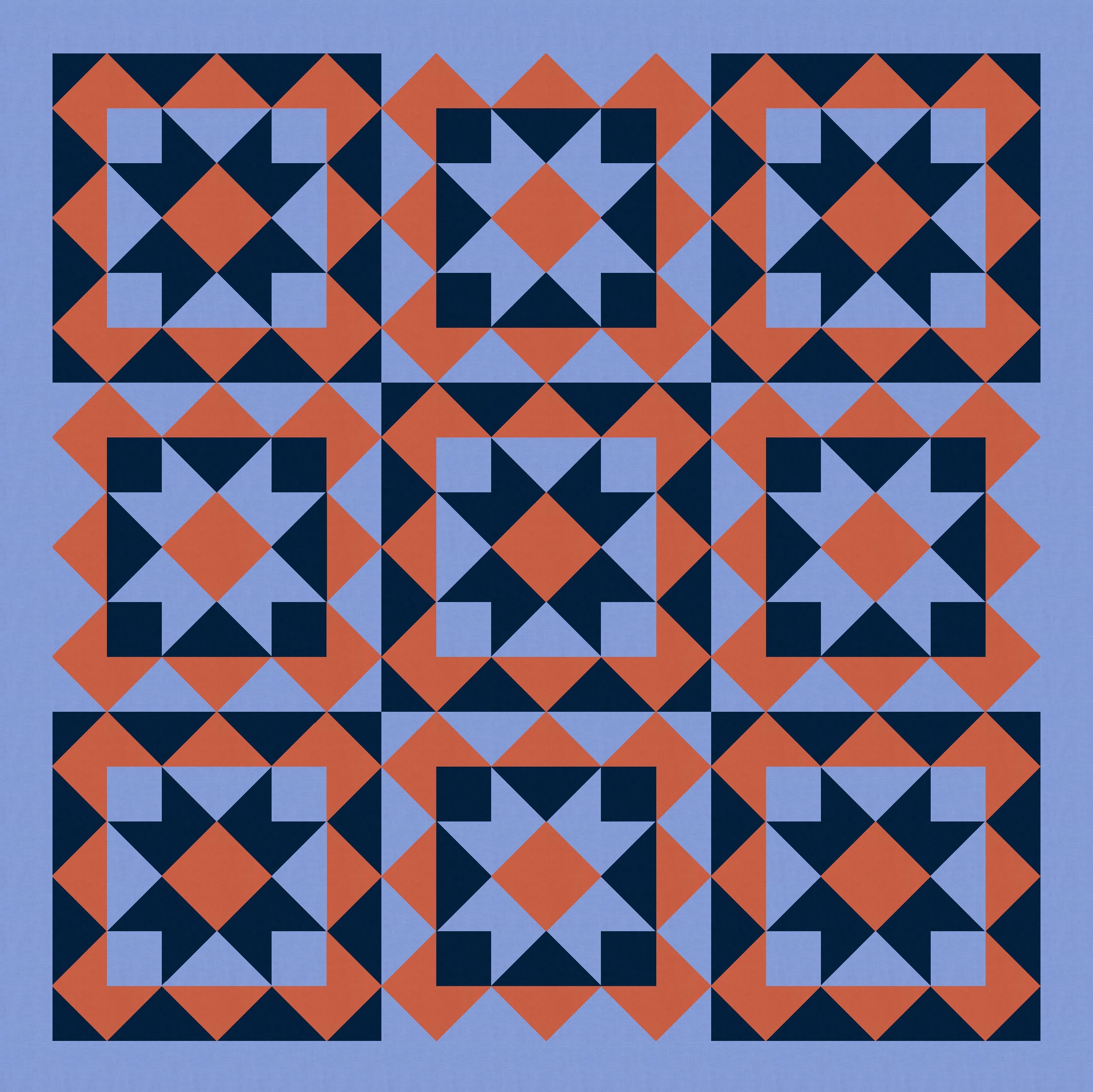

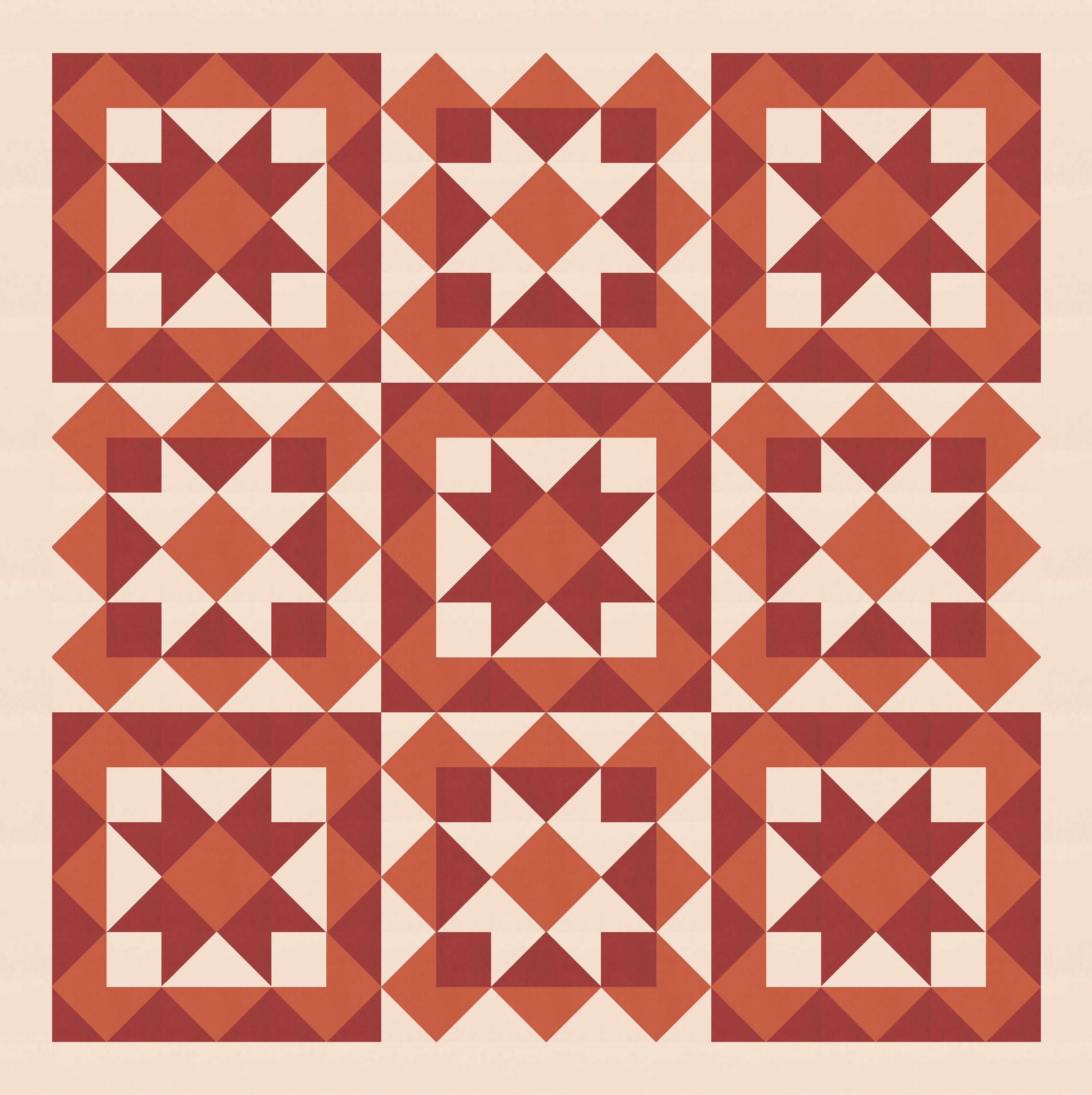
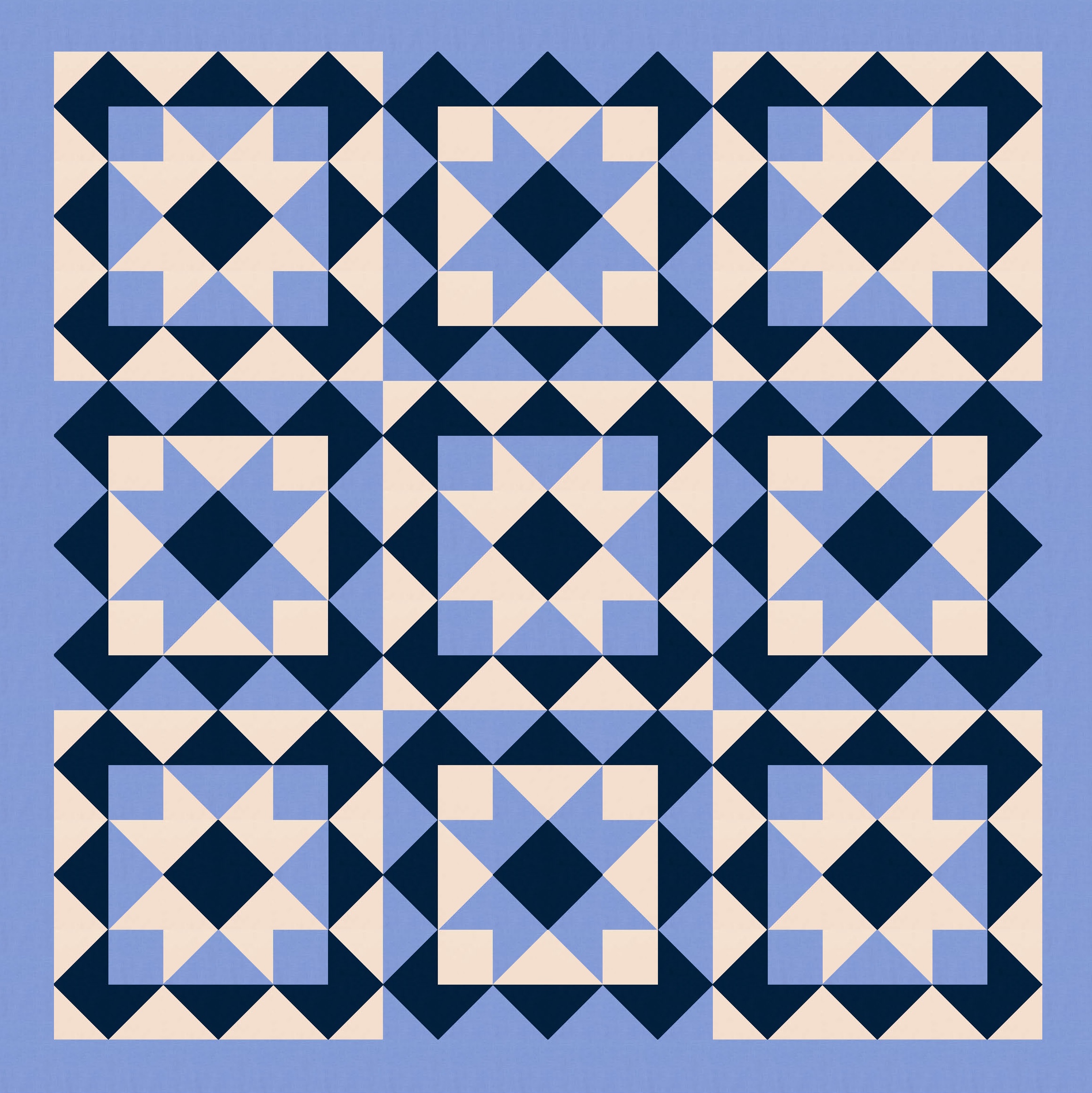
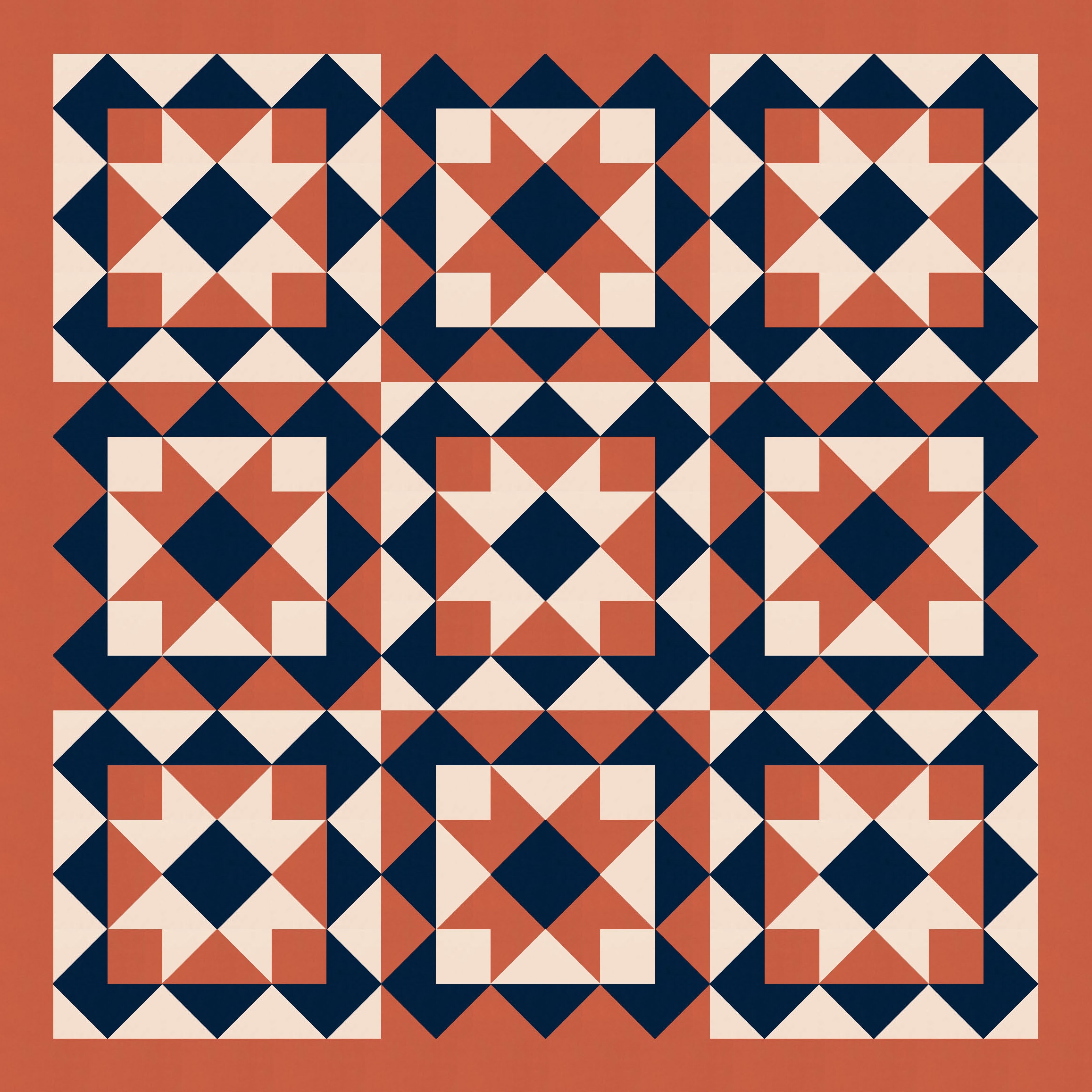
Depending on where the light, medium and dark colours are placed, you can see different shapes or movement emerge. In those last two versions, for example, I can see a big diagonal shape (more like a square on point) emerge between the sawtooth squares in the background colour (the four blue stars in the left version; the four red stars in the right version).
Anyhoo!
This is a fairly traditional design, but it’s got elements (like that zig-zag edge) that I think could work really well in a more modern design. If you wanted to make it into a quilt, you’d need squares, half-square triangles, flying geese, a square-in-a-square block… all the basics 🙂 You could possibly get away with fewer seams if you set the whole thing on point… but I don’t think I’d bother with that. It would be very straightforward to make the blocks as a standard layout, piece them together, then add a border. (I like setting blocks in a little with a border; I feel like it enhances their appearance a bit. But if you don’t like borders, you don’t have to use them!)
I kept playing with this design, so I’ll share a related sketch next week!
Discover more from Geometriquilt
Subscribe to get the latest posts sent to your email.
