Sunday sketch #466
This week’s sketch is another design that let me use lots of colours – well, up to six, which is a lot for me 🙂
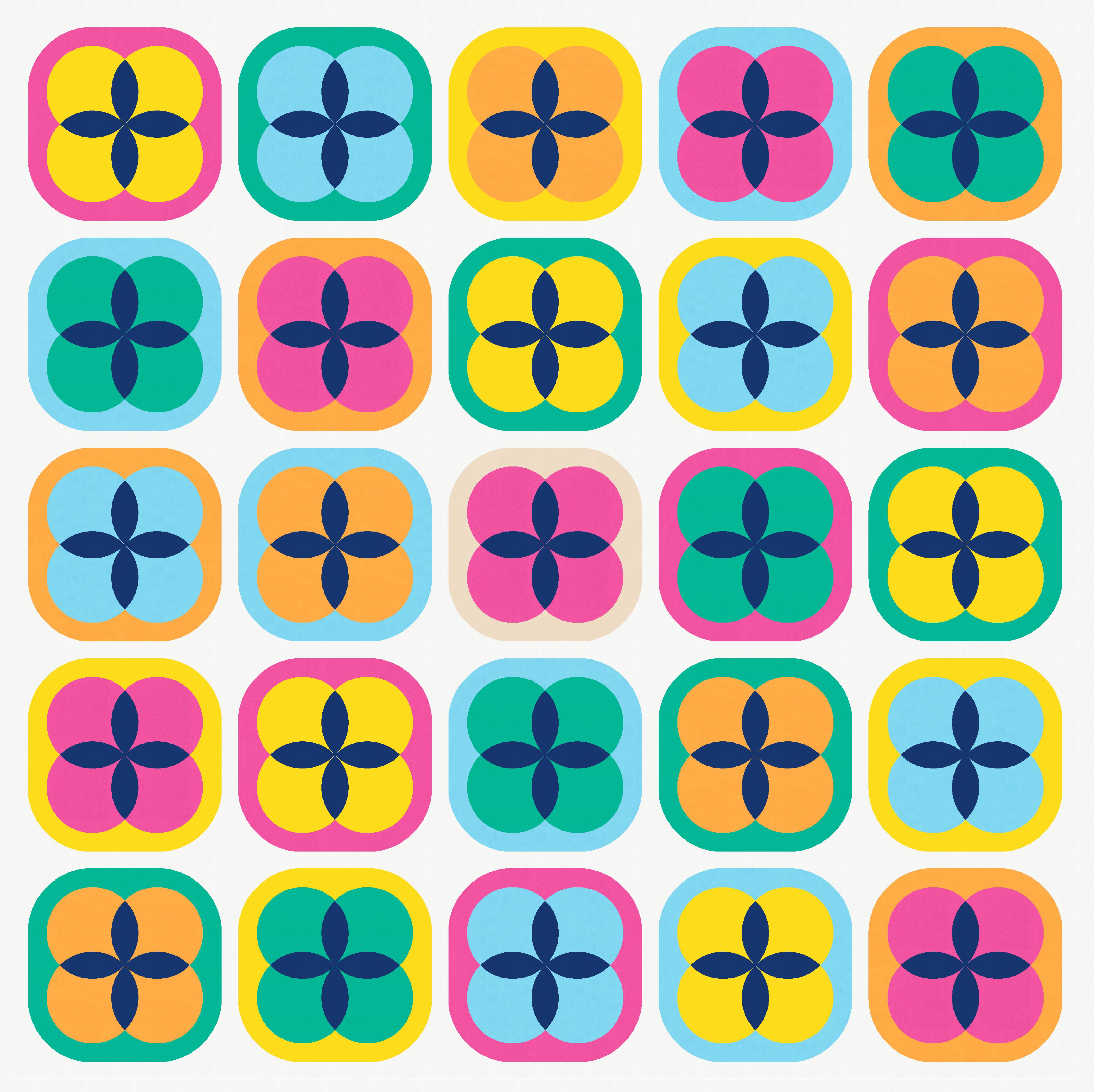
It’s a block-based design, and each block has three distinct elements: four small circles, four orange peel units, and an outer squircle encompassing everything. So a two-colour palette is possible (though not very interesting), but a palette of three or more colours is best.

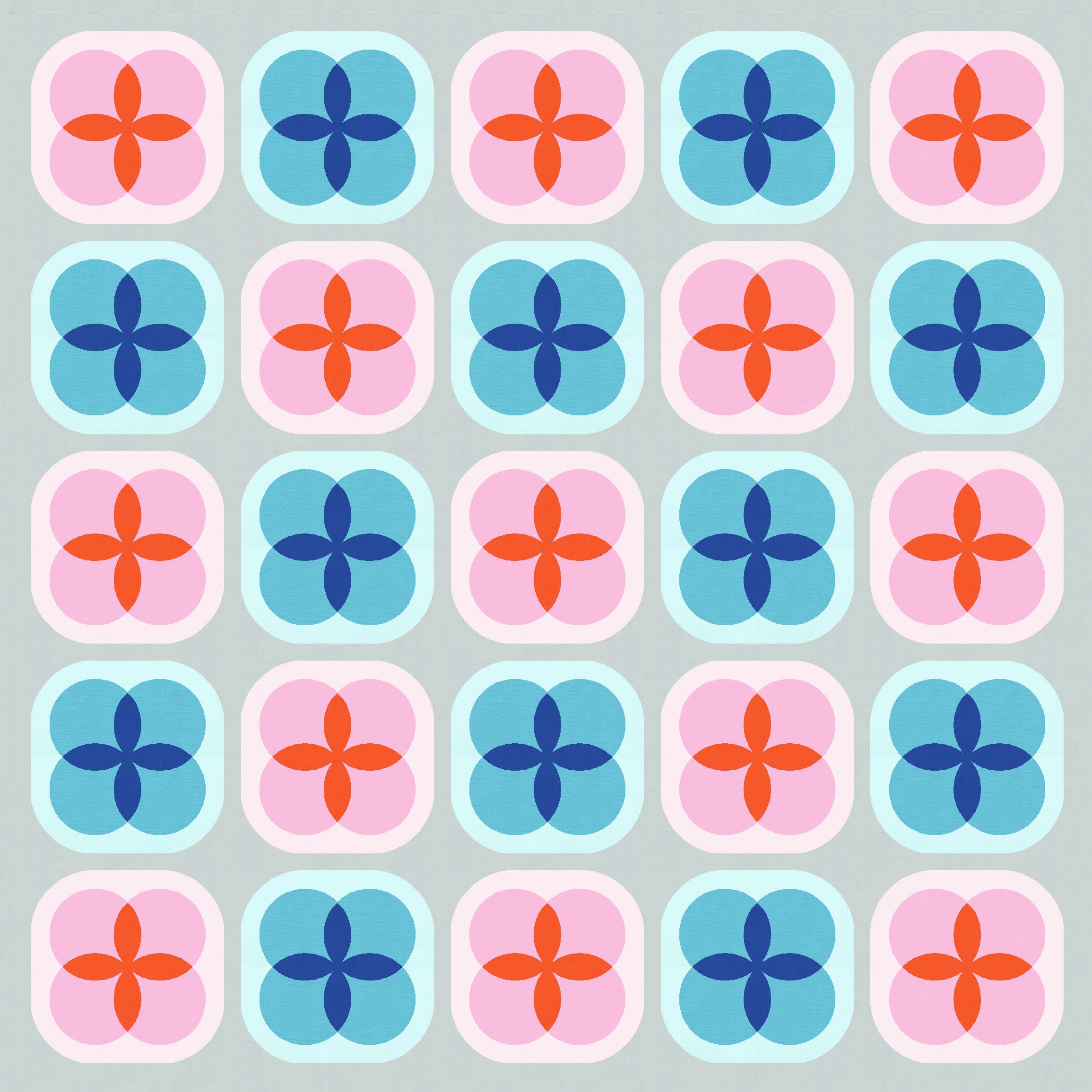
I started with a lighter background (my default), and used a different colour for the orange peels in the centre of the blocks. I often use a single colour for at least one element across all blocks for some consistency.

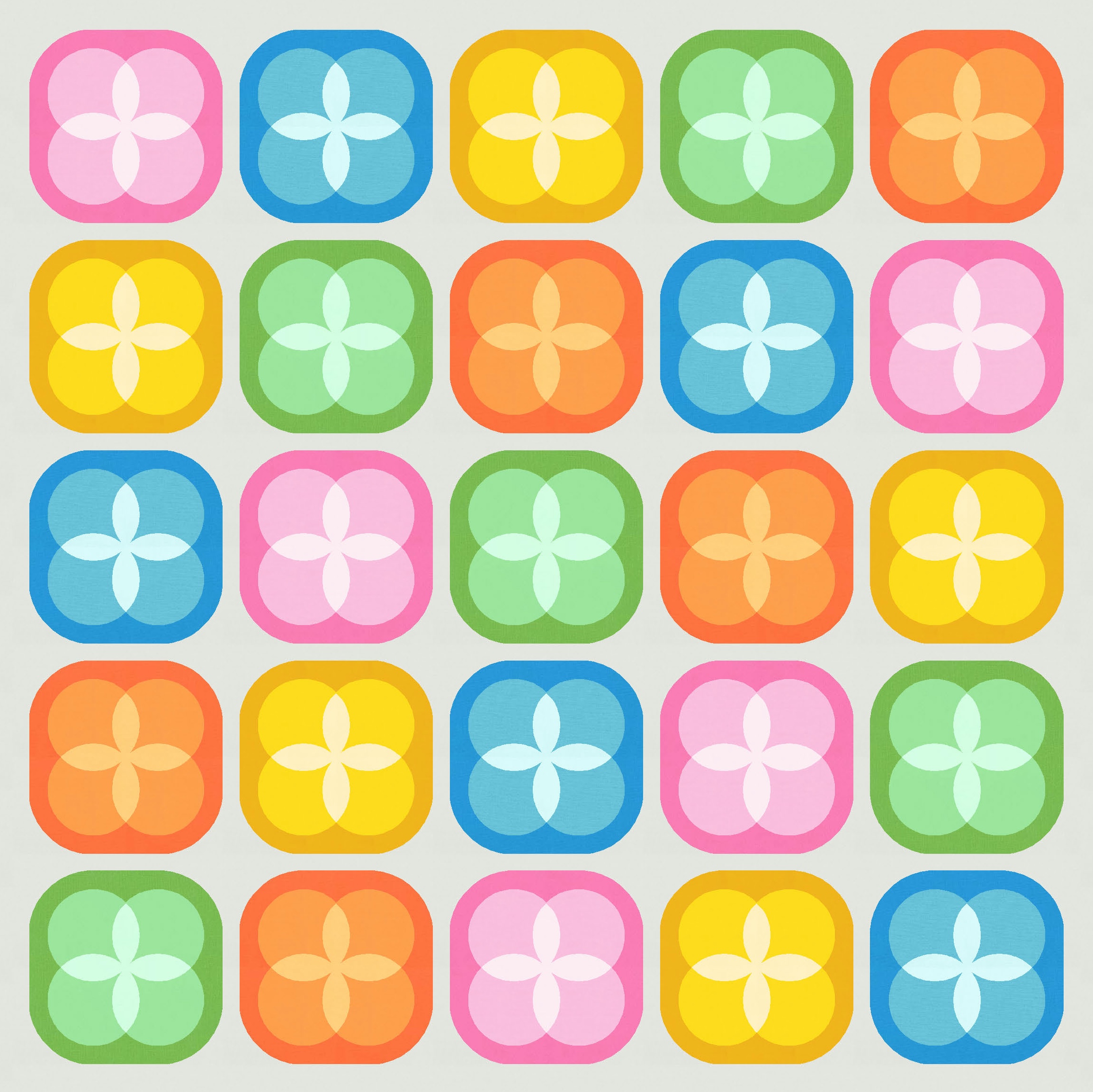
And then I went down a rabbit hole of colour selection, trying lots and lots and lots of different palettes. Here are just a few.

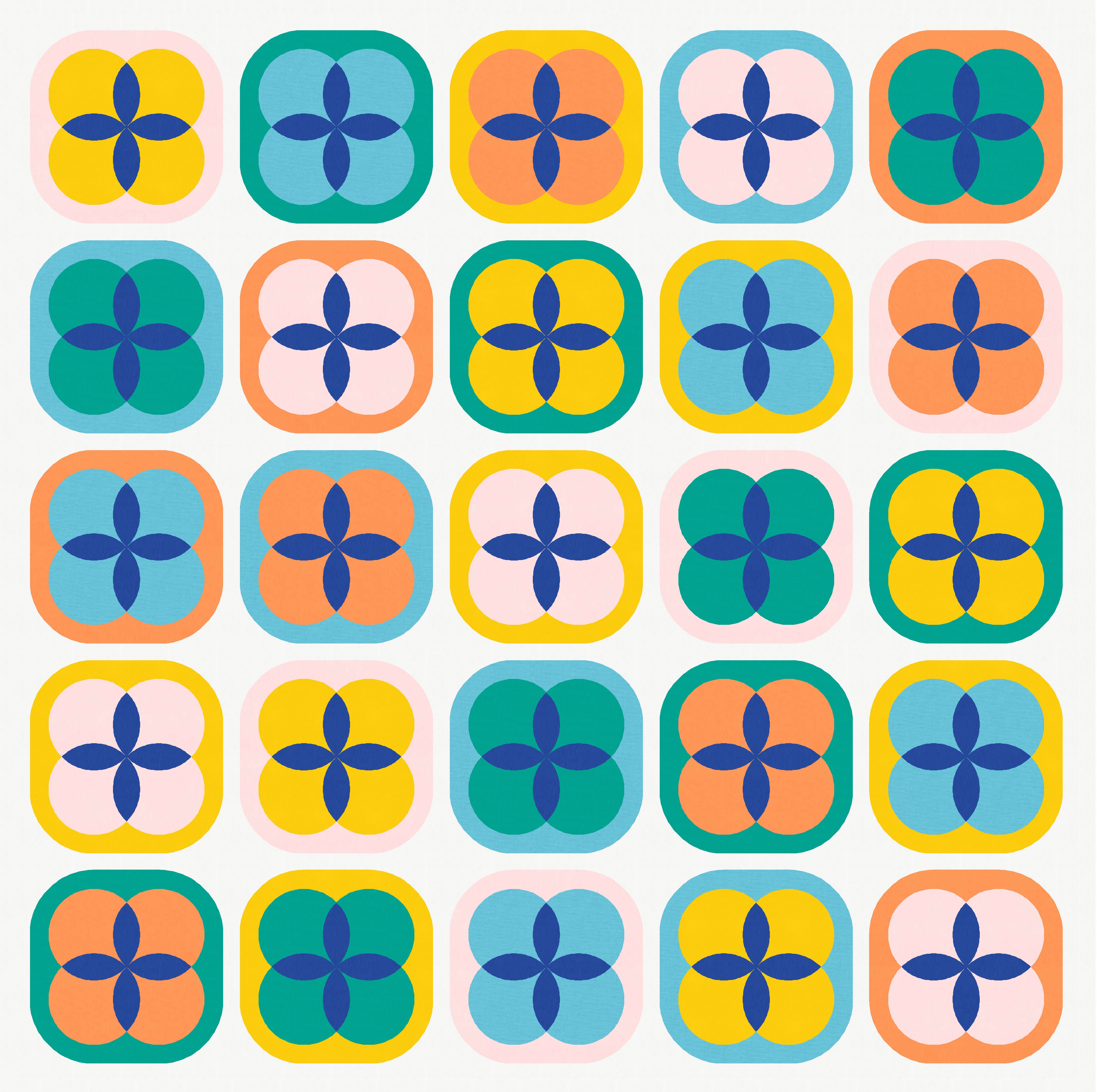

In each of those cases, the colour I chose for the orange peels was used only in the peels; it didn’t feature anywhere else in the design.
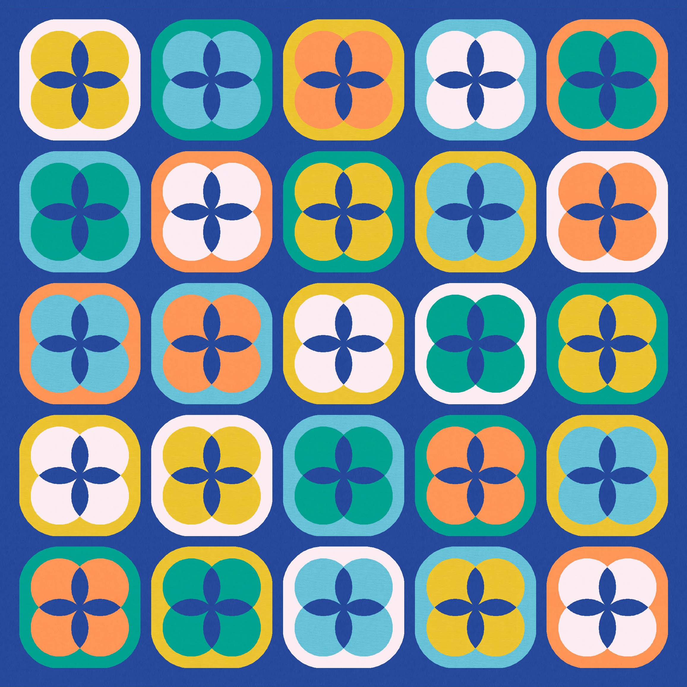
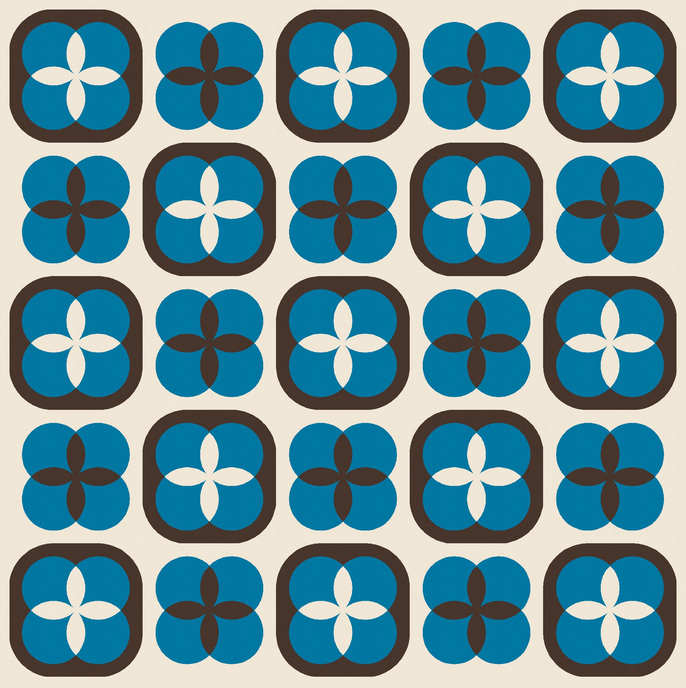
But I decided I wanted the orange peels in the same colour as the background. That seems to suit a darker background; white or light orange peels just didn’t work for me (or, at least, for the palettes I’d chosen).

Mmmm, that’s nice. And again… lots and lots of colour play.


You can see in the versions above that some blocks have a feel of transparency, while others definitely don’t. I decided to play with that effect a bit more. Below left, I’ve used the same palette for all blocks but alternated the colour placement. Below right, I’ve alternated the block palette.

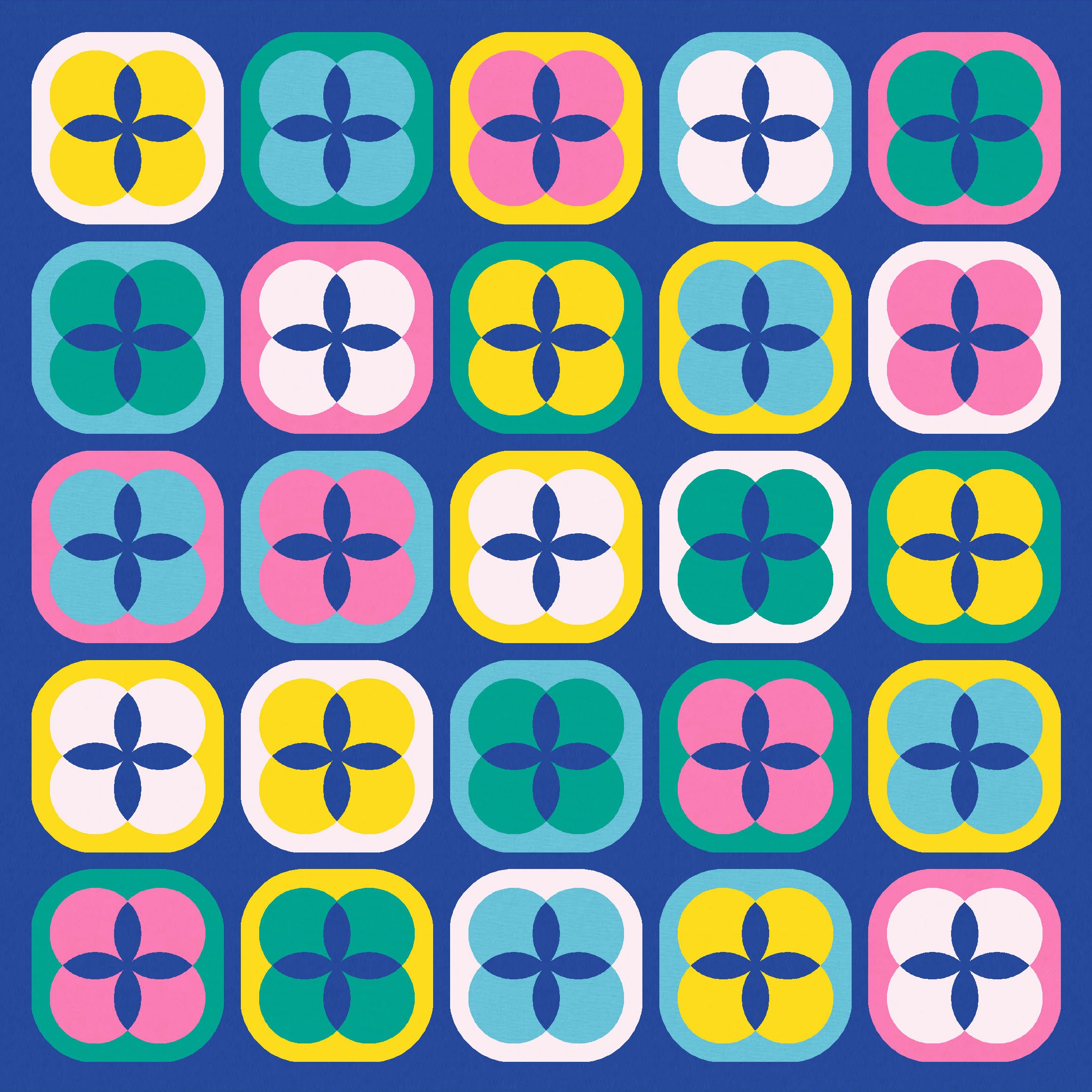
I also tried an expanded palette. Cute! This one reminds me a little of Sunday sketch #427, too.


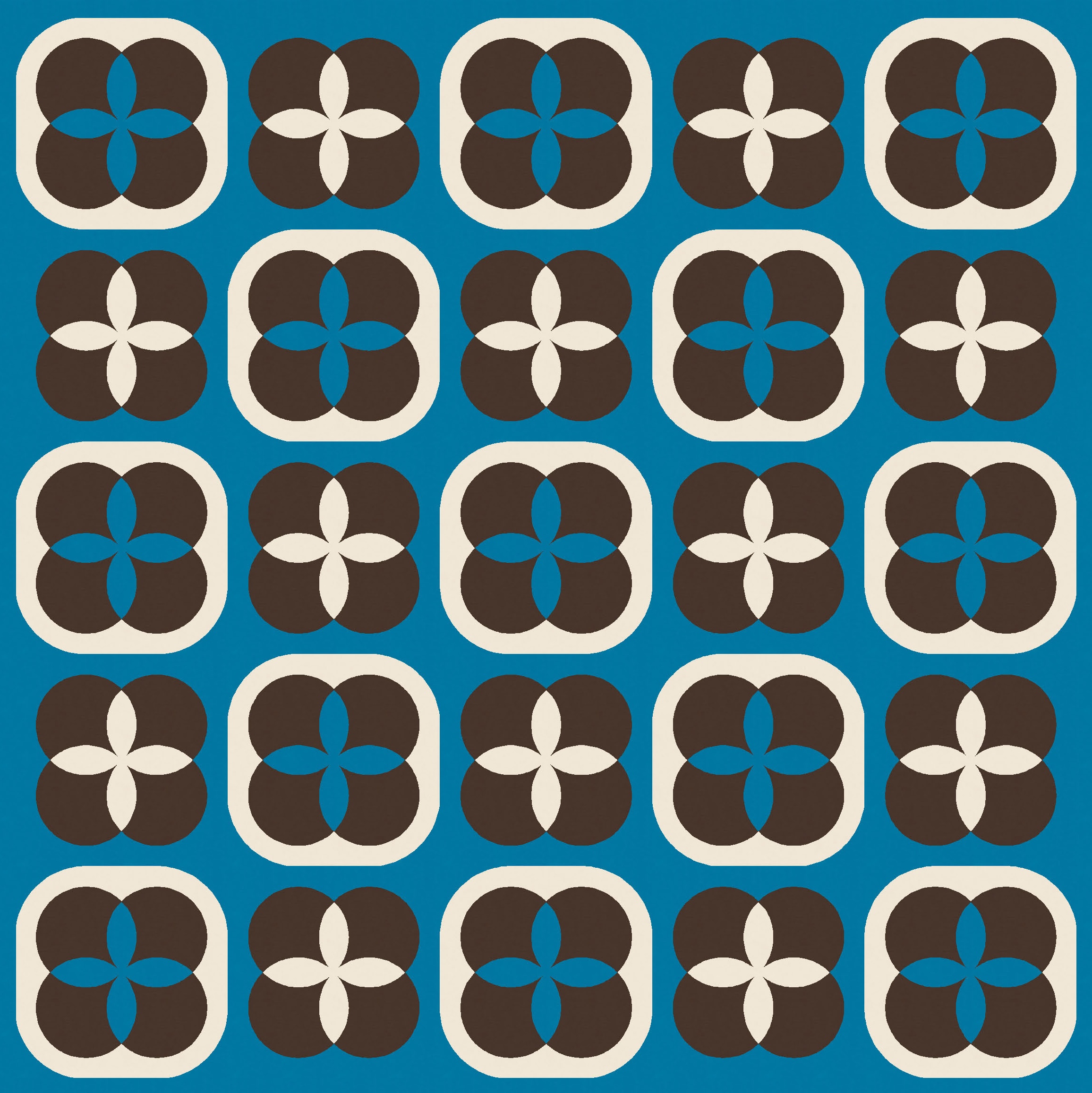
There are two ways to get the transparency effect: with a dark block border (squircle) and light orange peels, or with a light border and dark orange peels. The mid-range colour always needs to be in the middle (colouring the four overlapping circles).
In these next examples, I used one version of blocks (light border, dark peels), then the other (dark border, light peels), then mixed them.


This also got me thinking about removing the squircle in alternate blocks. In all the of versions that I’ve shown so far, there’s sashing between the blocks. I didn’t want the blocks to butt up against one another because I felt that I’d lose the squircle shapes (I mean, they’d still be there, just less obvious). I like a bit of breathing space between blocks.
Here’s two more with sashing…


…and then versions without the sashing, but with the outer squircle removed in every other block. The blocks can butt up against one another if there aren’t squircles everywhere competing for space. I kinda like these versions too.


As I mentioned earlier, the transparency effect only seems to happen in a three-colour block when the mid-range colour is placed between the dark and light colours (in this case, colouring the four small circles). Using a three-colour palette – black (dark), blue (mid-range) and cream (light) – I’ve shown below what I mean.
In this first pair of designs, which use the light colour for the background and some orange peels, only the left design (which uses the mid-range colour, the blue, for the circles) has a clear transparency effect in the blocks; the version on the right (which uses the dark colour for the circles) feels much more flat.

Neither of the two versions with the blue background has any transparency, because the small circles feature either the light or the dark colour.

In the two versions with the dark colour (black) as the background and some orange peels, only the one on the right (which features the mid-range colour, blue, in the small circles) has any transparency. The version on the left, which has the light colour in the circles, feels pretty flat.
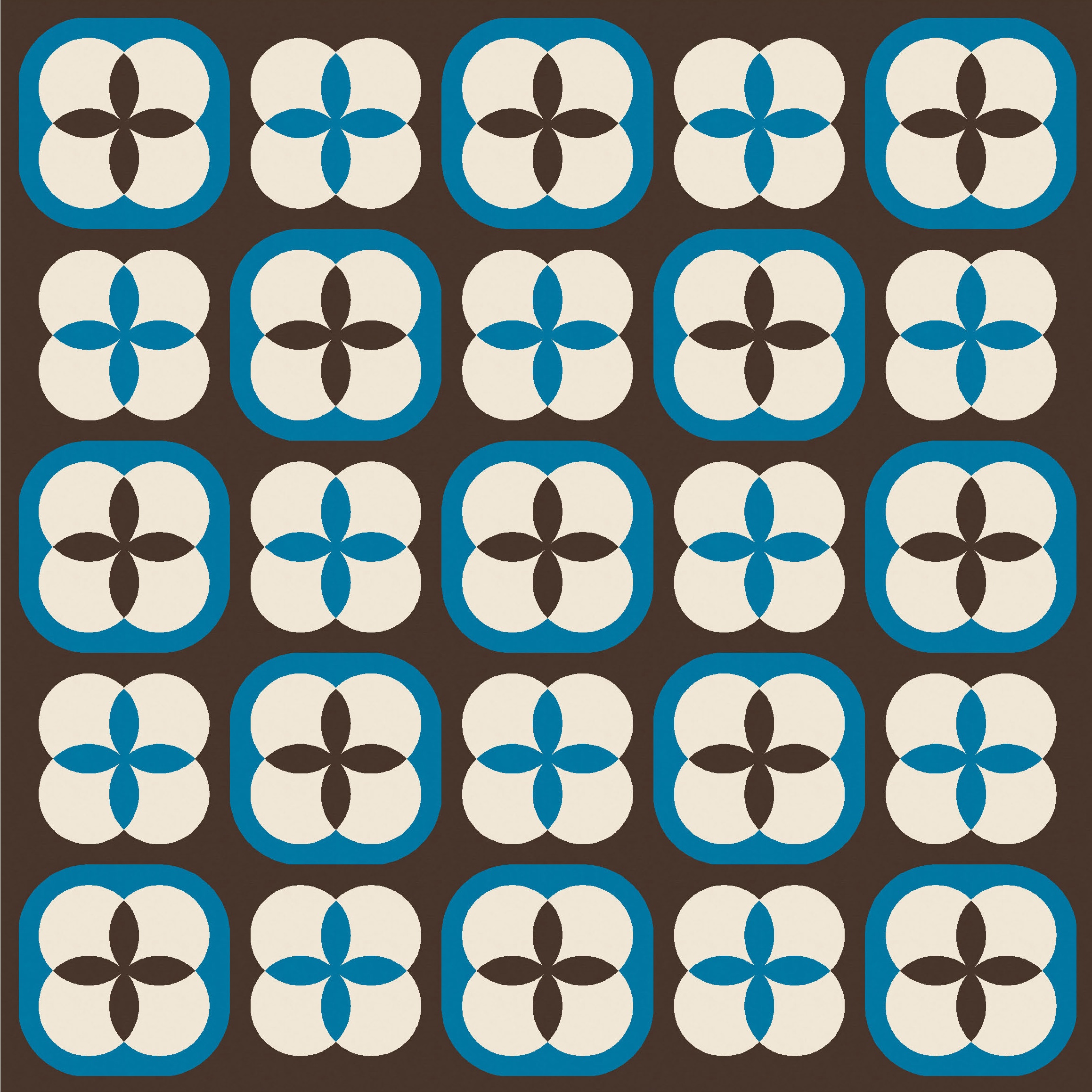

When you look at a multi-colour version of the design, that rule holds: the blocks in which the dark and light colours are separated by the middle colour look like the four circles are overlapping; in blocks where the circles are in the light or dark colour, there’s no transparency.

Even without full transparency across all the blocks though, I still think this multi-colour version is cute!
I’m not completely sure of the best way to construct an actual quilt from this week’s sketch. The way I designed it in Electric Quilt 8, the centre of the block is a square on point, made up of four orange peel units. That square’s surrounded by four half-circles. Add some setting triangles and corner triangles, and then enclose with a big squircle. So, perhaps a bit finicky?
Otherwise, the four small circle shapes are actually just four clamshells surrounding four orange peels, so you could piece those together, then surround them with a single piece (cut using a template) comprising the squircle border. Which is maybe also a bit finicky? But would have fewer seams.
I’d probably have to sit down and try both approaches to see which one’s better for me. It would also come down to how well you can sew curves. I tend to cut oversize pieces when making curved units (using Papper, Sax, Sten templates, for example), so that I can trim them down to size later; having that little bit of wiggle room at the start and end of curved seams has saved me on many occasions. With a more precise design like this one (where some of the curved piecing wouldn’t benefit from that approach), I’m not confident that my curve sewing would be up to scratch; I think there’d be a fair bit of wonkiness going on. Still, I’ve seen others do it well, so I know it’s feasible!
Discover more from Geometriquilt
Subscribe to get the latest posts sent to your email.
