Sunday sketch #436
This is the penultimate post in a series of five Sunday sketches based on a pointed arch (or a Gothic arch). I started with Sunday sketch #433, and I’ll finish next week with Sunday sketch #437.
It’s not often that I post so many related designs in a row (I’ve done quite a few series of four, but I can find only two other series of five: sketches #400–#404 in February/March this year; and #132–#136 in January/February 2019). But it’s such a fun shape to play with!
I’ve got Daisy Aschehoug to thank for this bout of inspiration: I first saw this shape on her Instagram feed, and Daisy very generously gave me some of her new arch templates to play with. I’ve been playing in EQ8 rather than in fabric!
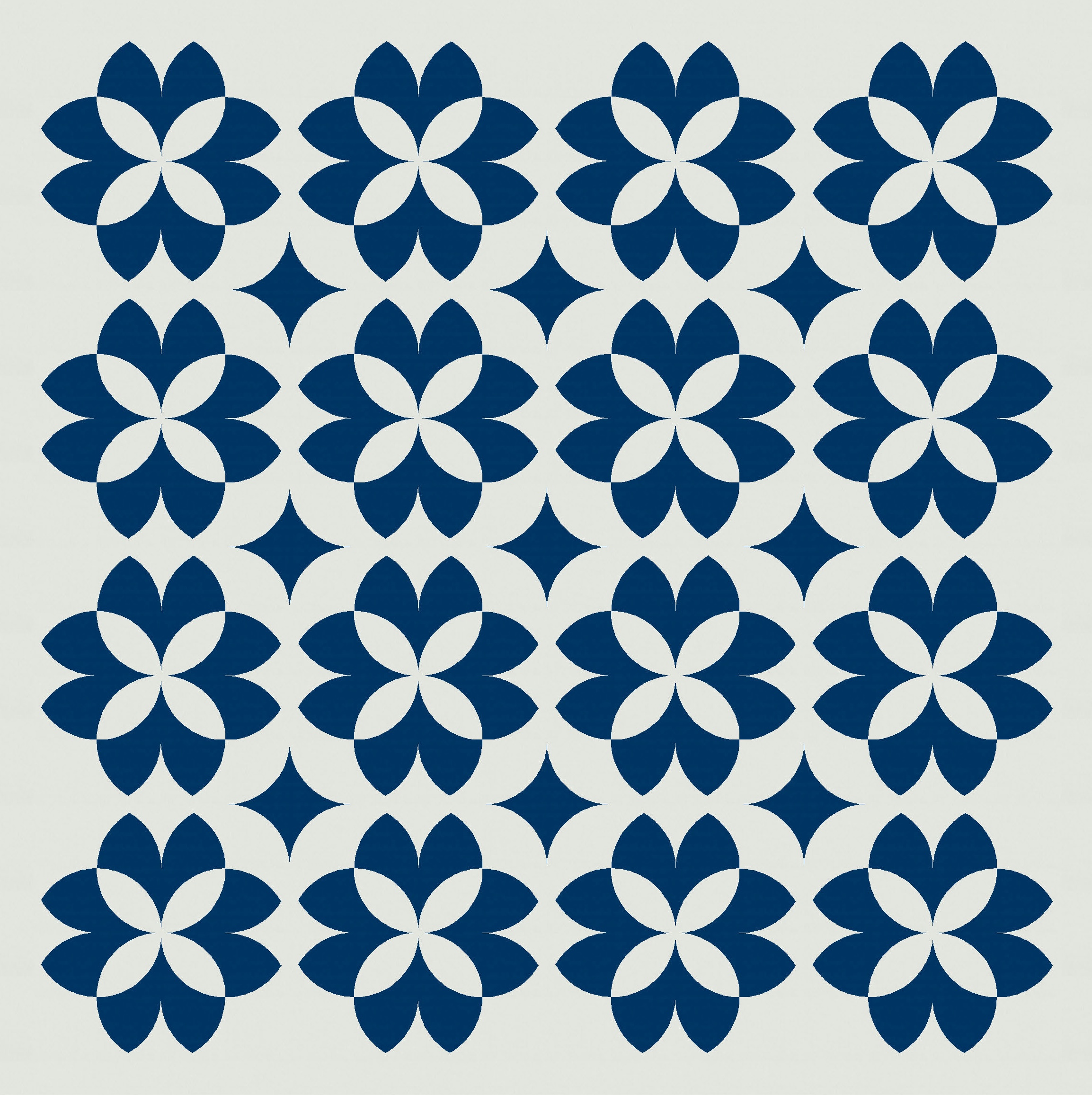
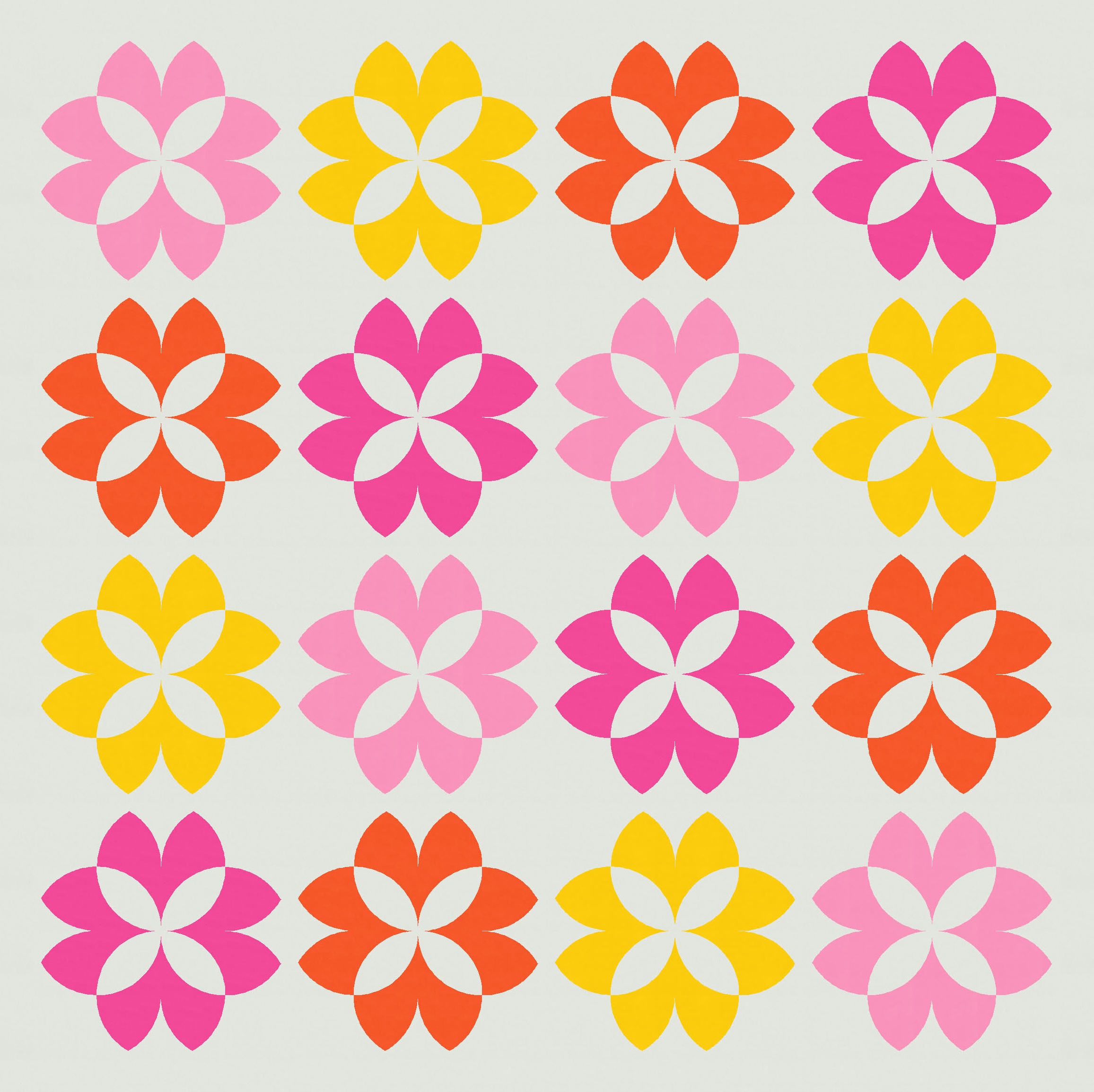
Last week, I used the pointed arch to make jelly bean shapes, which I then rotated and repeated to create a bunch of fun designs. I mentioned at the end of that blog post that there was one arrangement of beans I hadn’t shared – one where sets of 4 beans were placed with their rounded middles facing inwards, creating a flower shape.

That on its own isn’t so special, but I can see it has potential. There are a few places in the design where the addition of other blocks might make things more interesting.
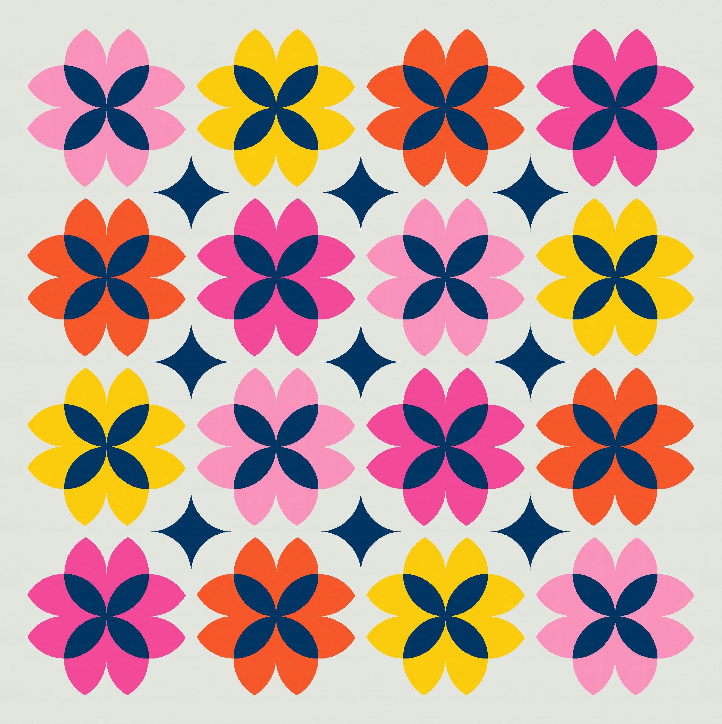
Remember last week that the rounded middles of the jelly bean shapes were made with quarter-circles or orange peels. Colouring the orange peel differently from the rest of the bean introduced new shapes, so let’s try that here.
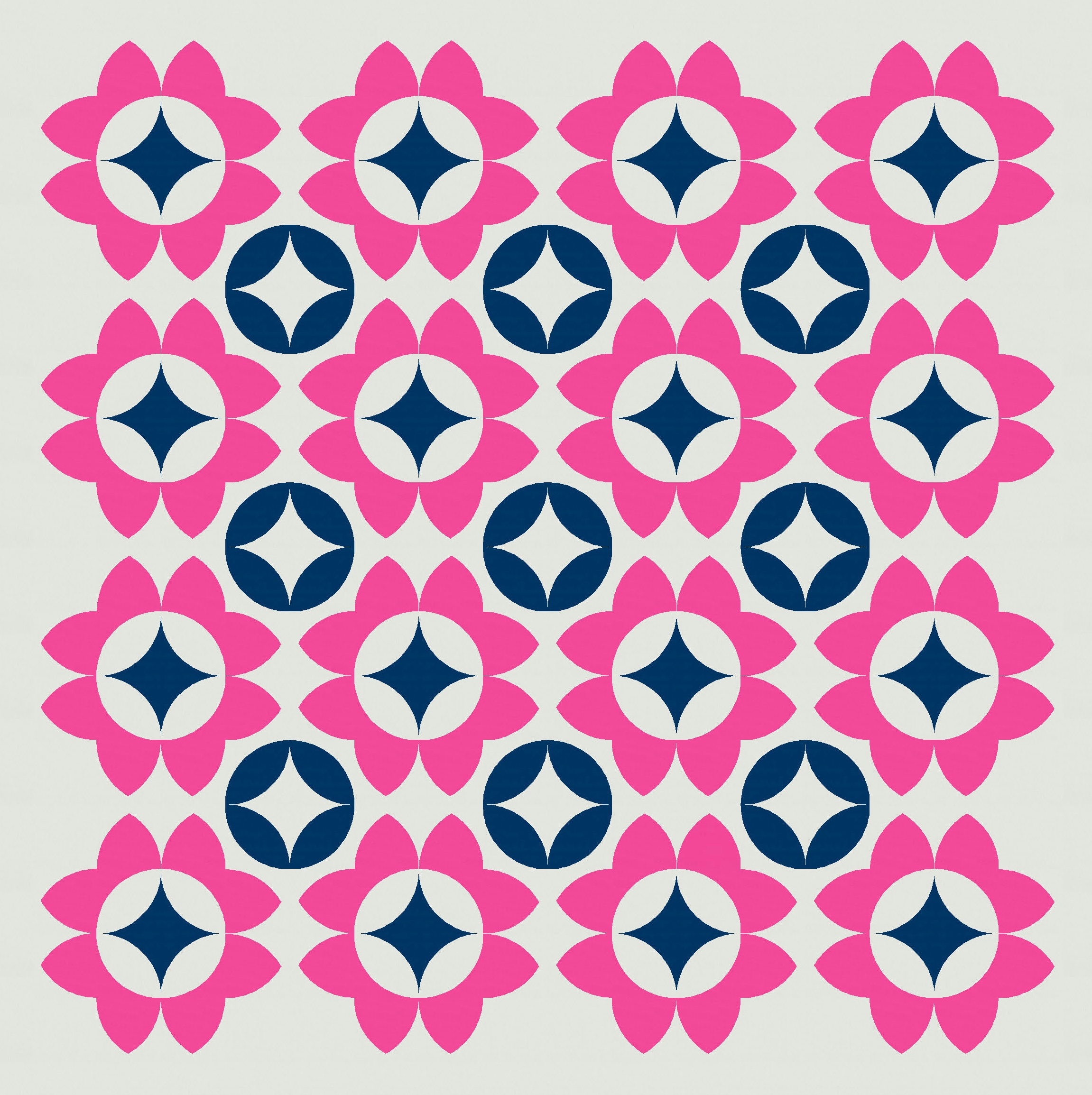
That’s better, but the spaces between the flowers feel a little empty to me. Usually my go-to approach in this situation is to introduce similar shapes – so, in this case, curves that match what’s already there, rather than straight lines or sharp angles. Since we’re already using quarter-circles and orange peels, I can try adding more.

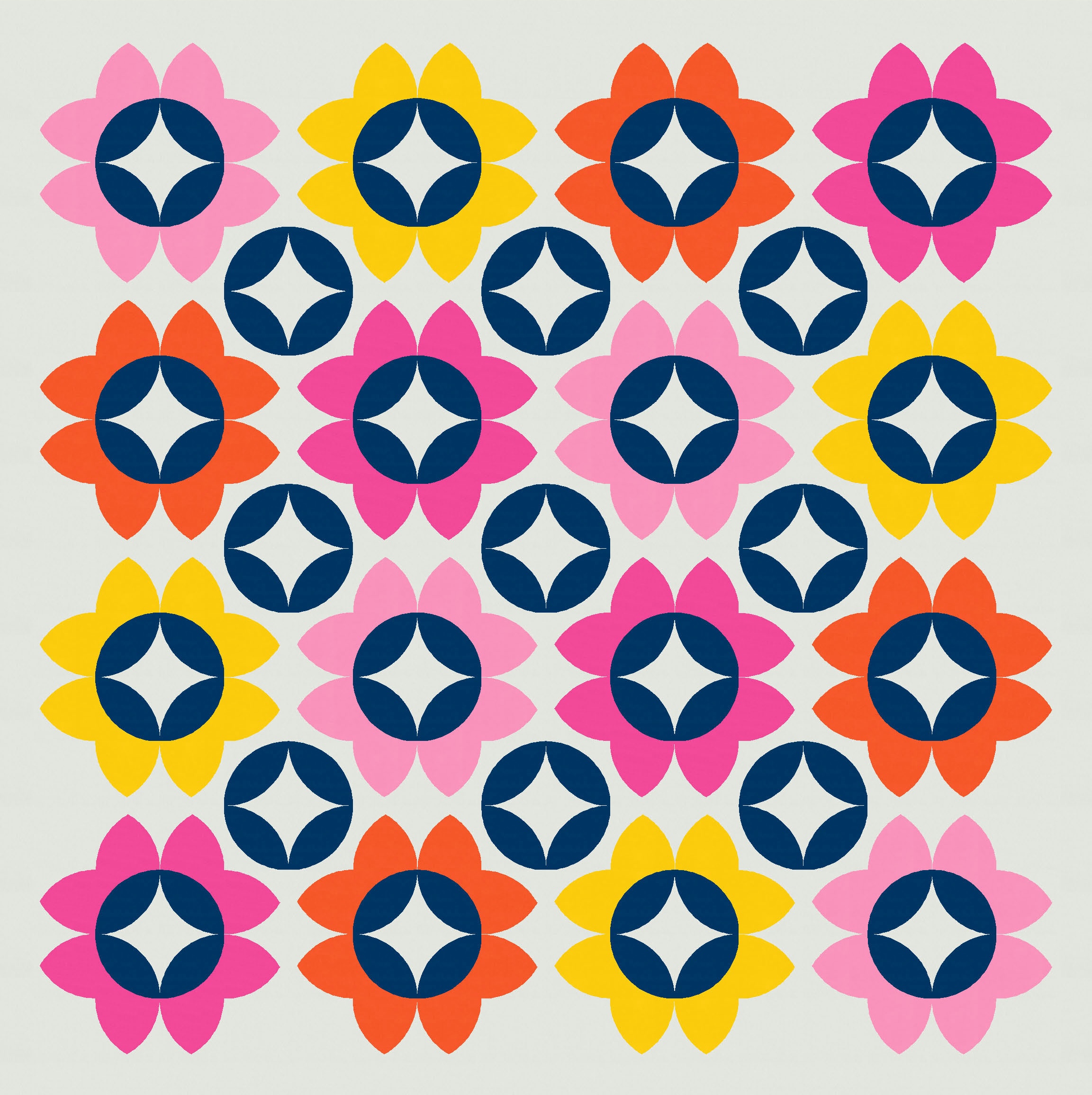


The only difference in the four versions above is how I’ve coloured the orange peel circles within and between the flowers: some highlight the outside of the circle, while others highlight the inside.
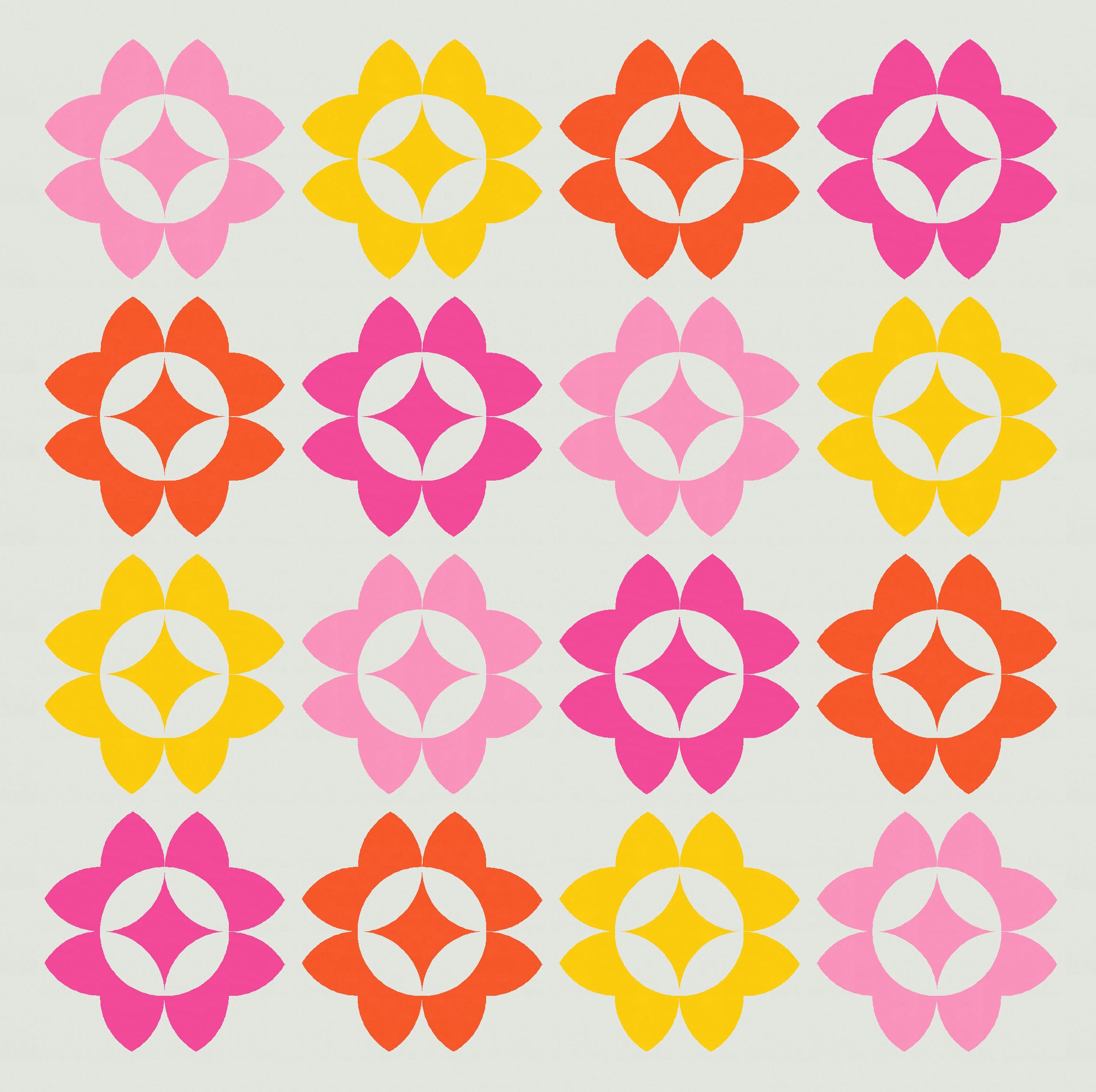
Here’s the same design in a smaller palette – with not as many variations, but you get the idea.

For simple designs like this though, sometimes a two-colour palette is the best.


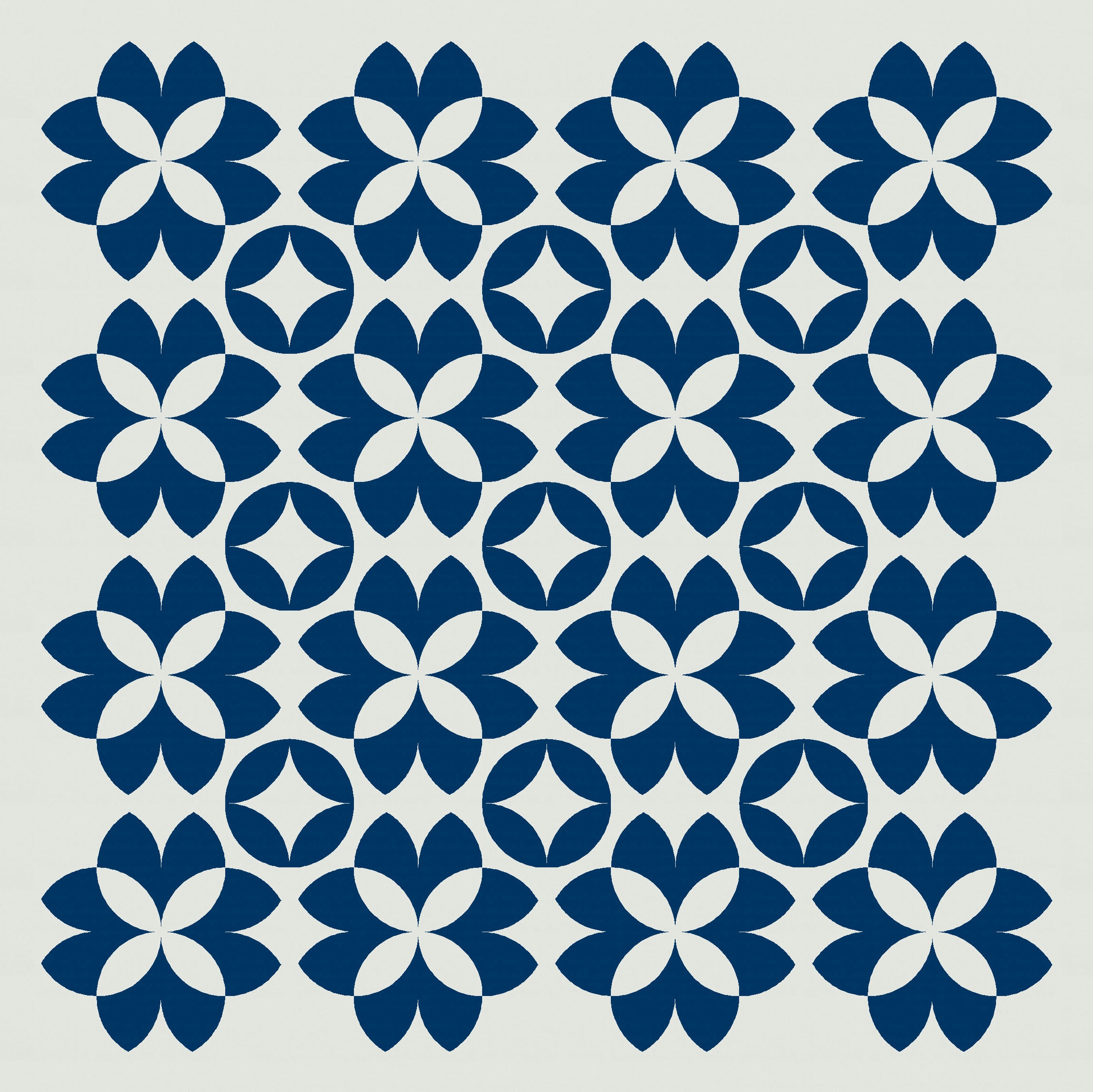
Now, I only used those orange-peel circles to fill in the gaps (within and between the flowers) because the peels were already there as part of the jelly bean shapes. I could replace those units (the middle unit of the three units that make up the bean) with something else to make a new shape. But how about we keep the peels, but just rotate them – they are 4 separate units, after all (one from each of the jelly beans that makes up a flower). If I rotate each one by 90 degrees, I get a new cross shape inside the flowers instead.
These flowers aren’t based on the jelly bean shape anymore – rotating the orange peels has disrupted that basic building block. But that’s OK. And anyway, I think I like these flowers more. Although those spaces between the flowers are still crying out for something. Sticking with the same options as before, I can fill them with orange-peel circles (and change how the crosses are coloured).


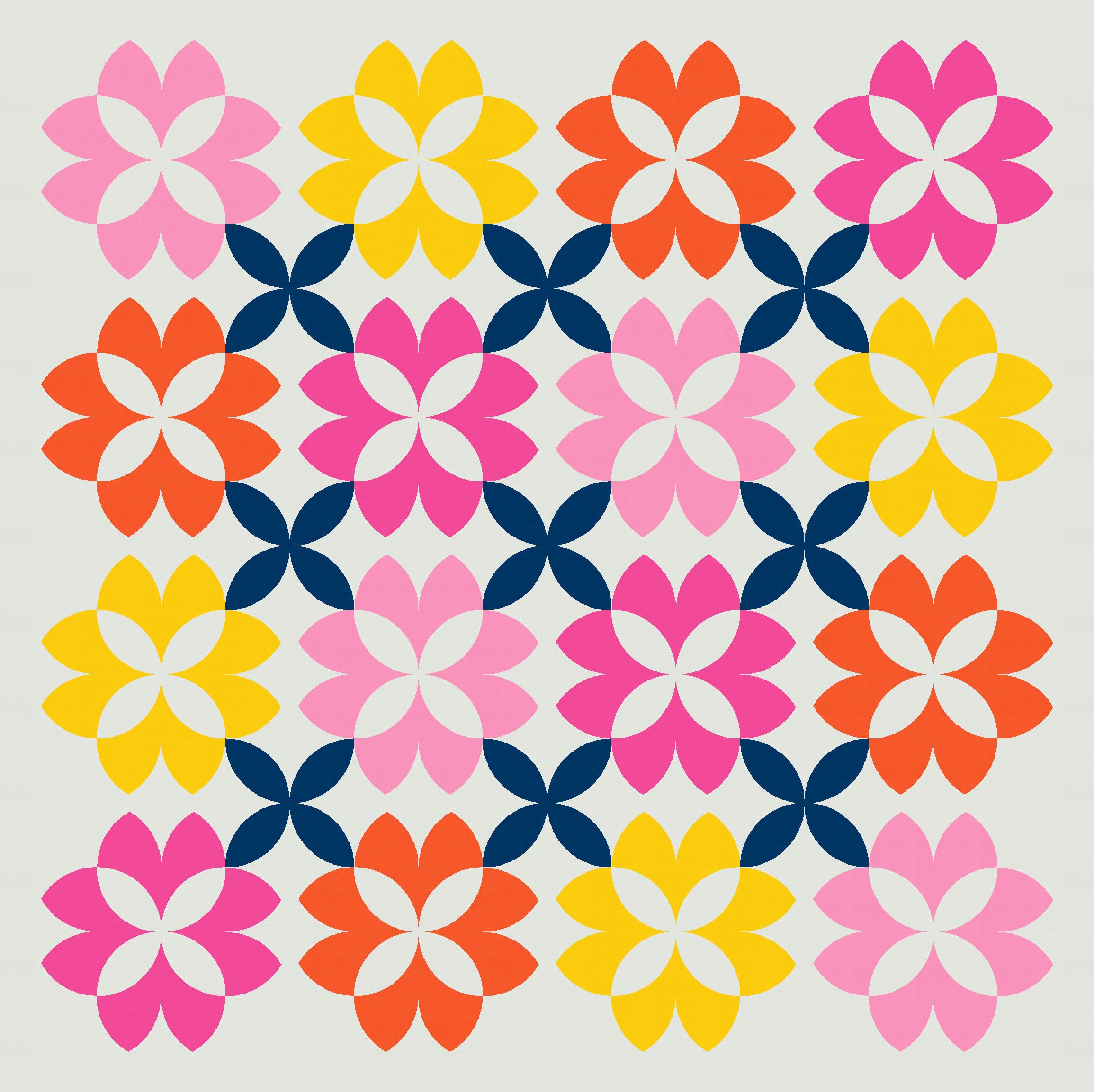
My favourite is this next version though, where I’ve used the inverse colourway for the orange-peel circles (so they end up looking like curvy stars instead). This one strikes the right balance of light and dark for me, and I like how the darker crosses draw the eye towards the flowers.
Those dark crosses also hint at the potential for transparency… sure enough, changing the colour palette can give the impression that each flower is actually 4 tulips overlapping. Can you see what I mean?
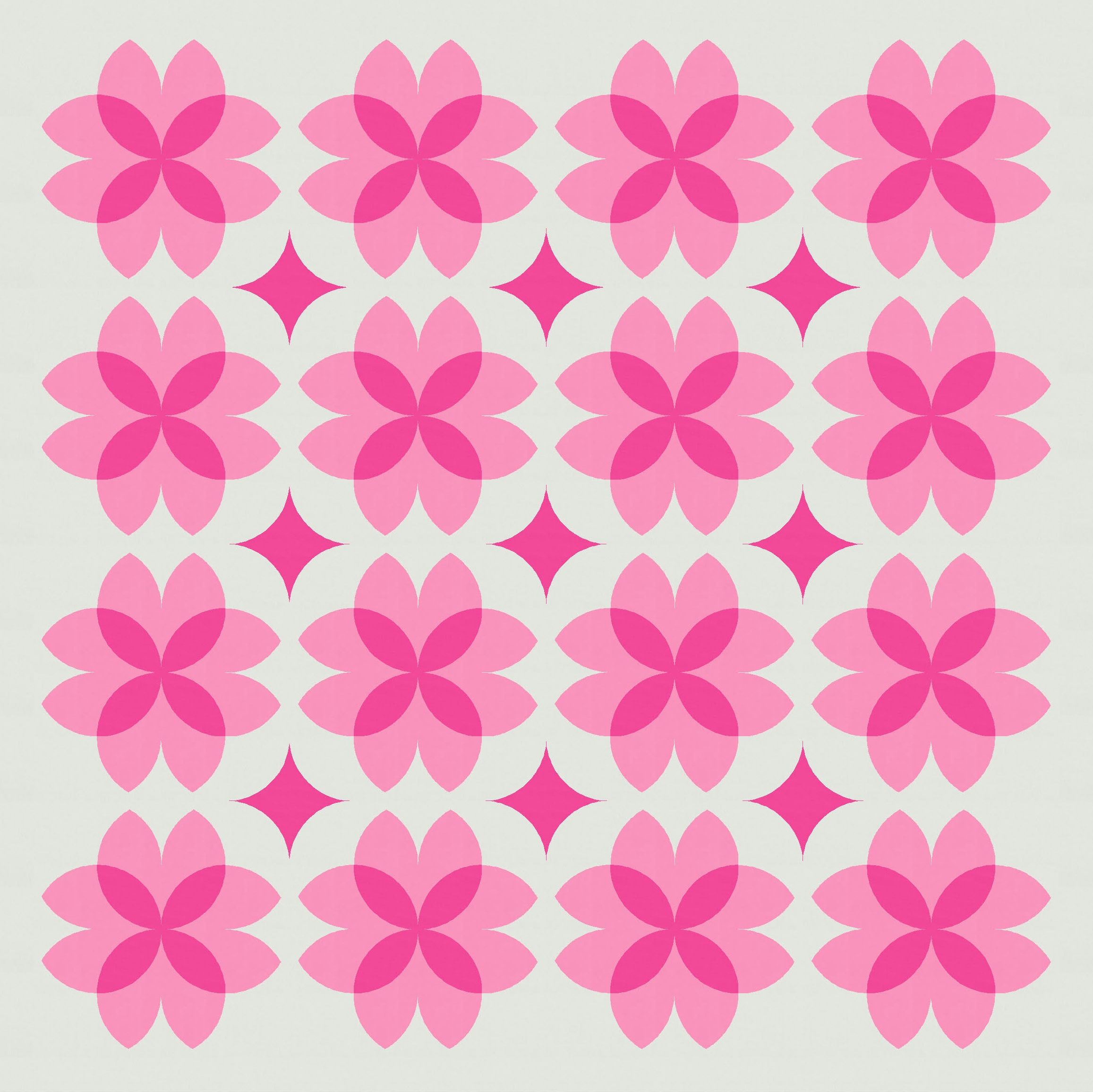
Anyway, back to a two-colour palette just so we can focus on the shapes for now.
Keeping the crosses within the flowers, I can still mix up the shapes that are placed between the flowers. I’ve stuck with the orange-peel circle for now, but alternated how I colour it (so that either the circle’s showing or the curvy star).

I like the larger version above; the bottom two are a bit busy for me.
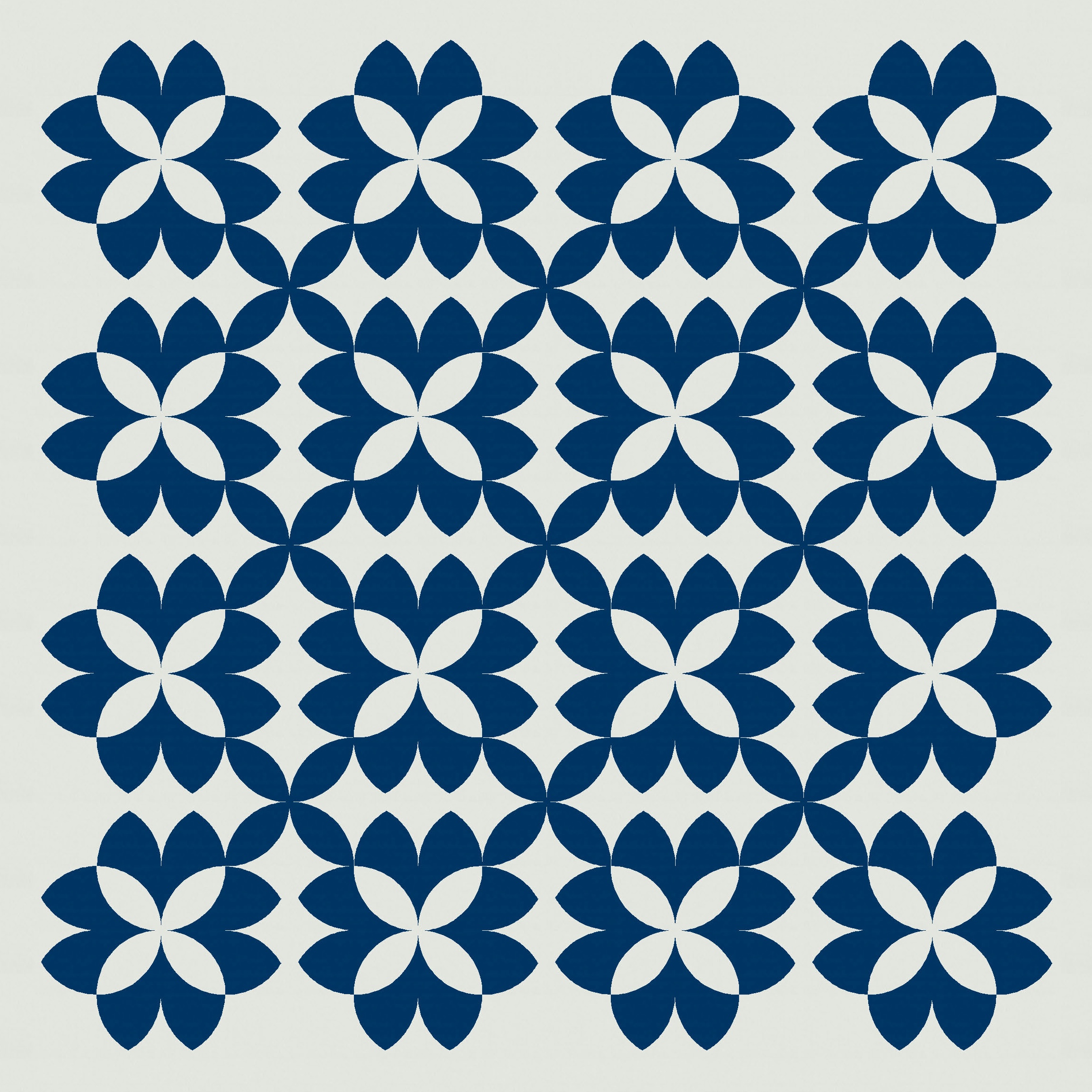
But I can open things up a bit by rotating the orange peels in the spaces between the flowers to create more crosses instead.
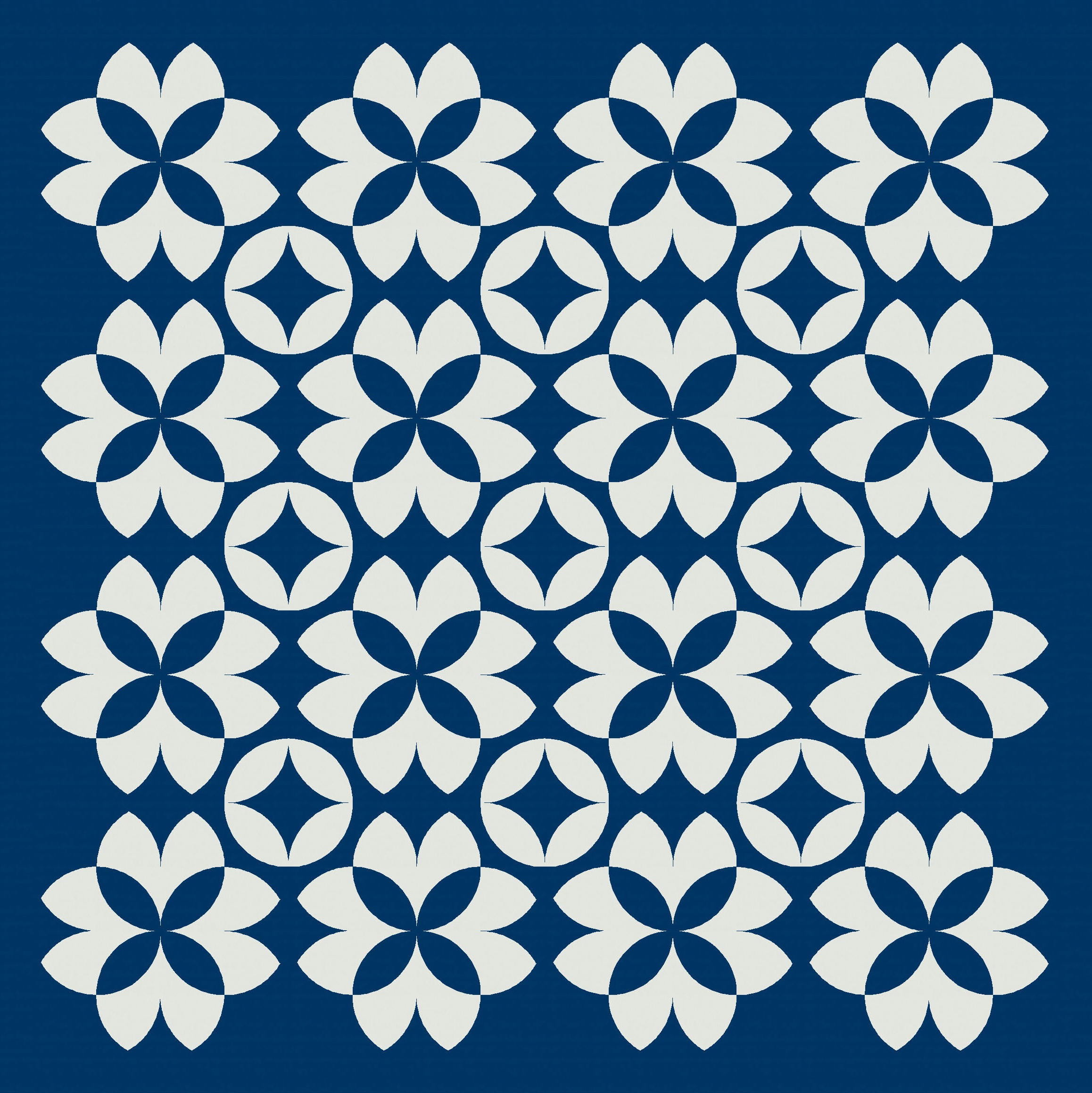
When I recoloured the same design in just a two-colour palette, another secondary shape jumped out at me. WOW. Can you see the one I mean?

Suddenly my eye is drawn to completely different shapes here – I focus less on the flowers and more on the spaces between them. Here’s the inverse colourway.
I got very excited about this one – it led to a lot more designs… some of which I’ll share next week!
Discover more from Geometriquilt
Subscribe to get the latest posts sent to your email.
