Sunday sketch #434
More pointed arches this week!
If you read last week’s post, you’ll remember that I’ve been inspired to design with this shape because of templates that Daisy Aschehoug (@warmfolk) kindly gave me. She’s been using this shape in lots of fun ways – check out her Instagram posts, like this one or this one.
Like Daisy, I’ve been combining the pointed arch with other shapes. The arch is created with the same curve as a quarter-circle or an orange peel, so these blocks are natural partners; they can extend the lines in the arch to make full circles (in your mind, if not actually in fabric).
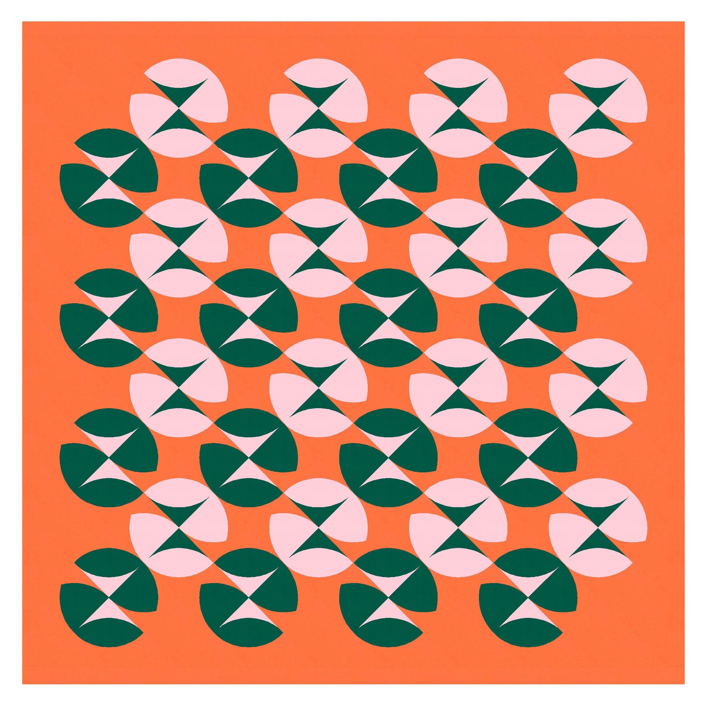
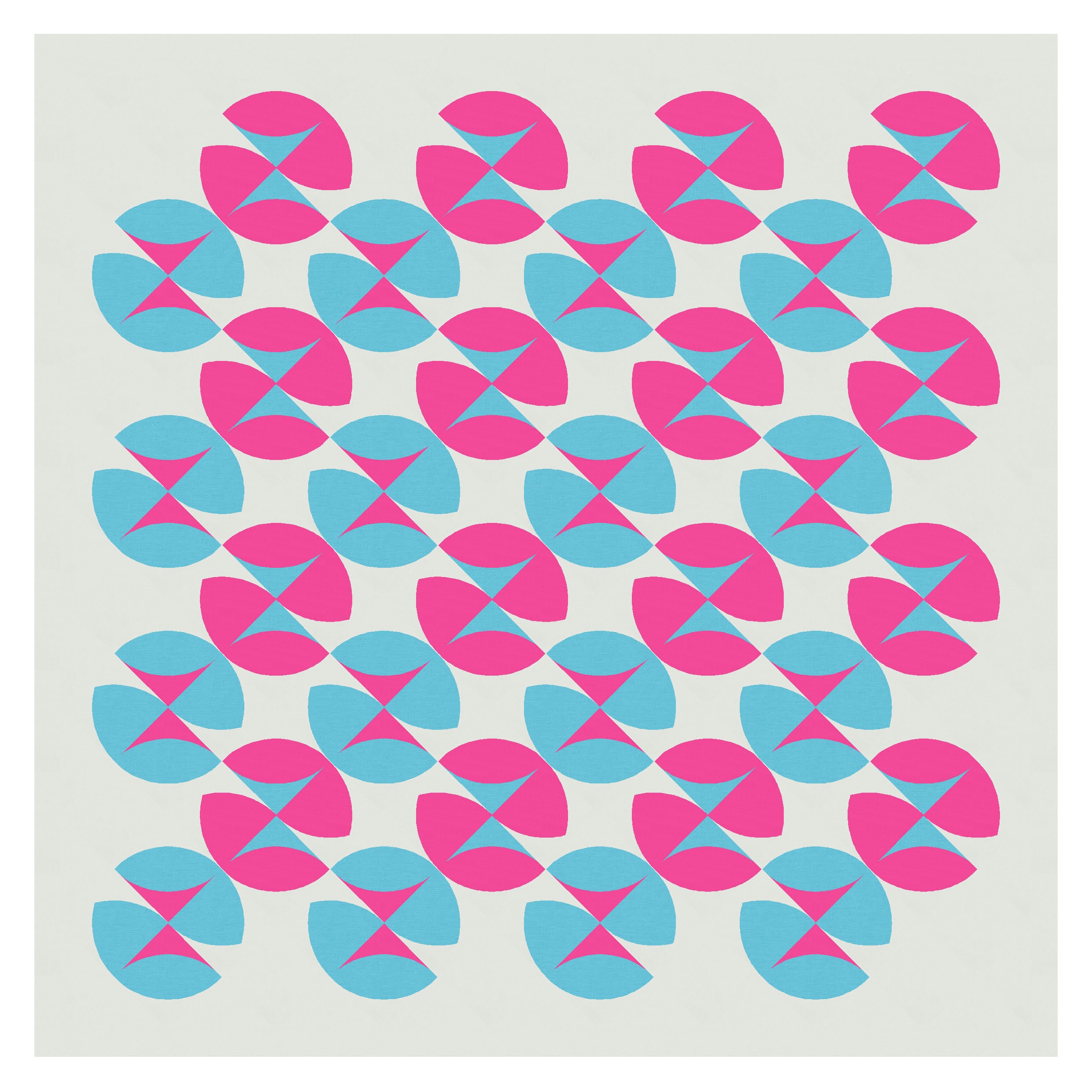
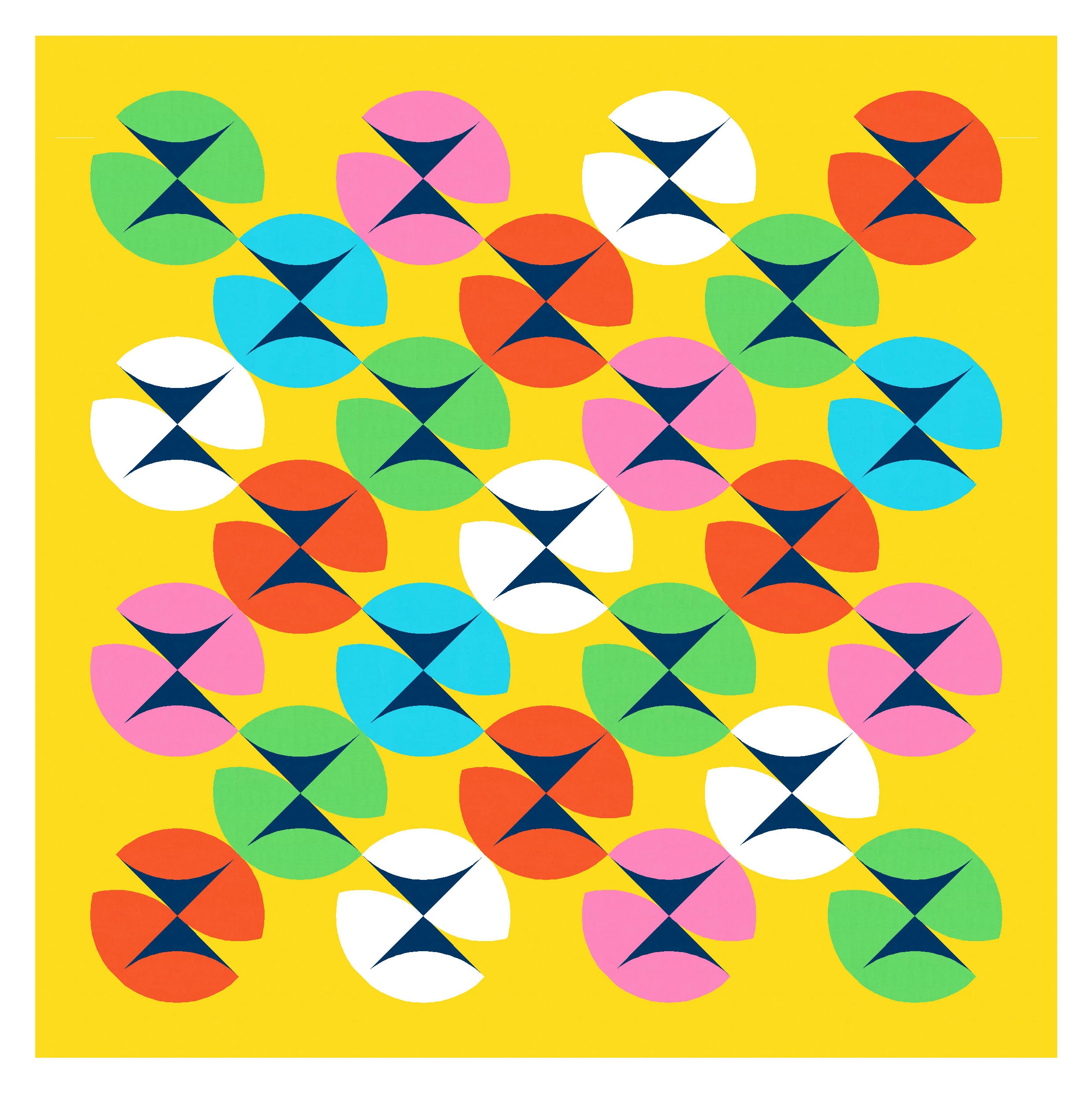
In the design above, each circle is created with 2 pointed arches and 2 orange peels. The outer corner of each orange peel is the same colour as the background; the inner corner is in a different colour to the peel itself.
But that’s not the first way I tried; I also tried colouring each side of the arches in the background/opposite colours too. It created lots of movement within and between the circles, but I think without some background colour to lighten the circles, they feel a little heavy.

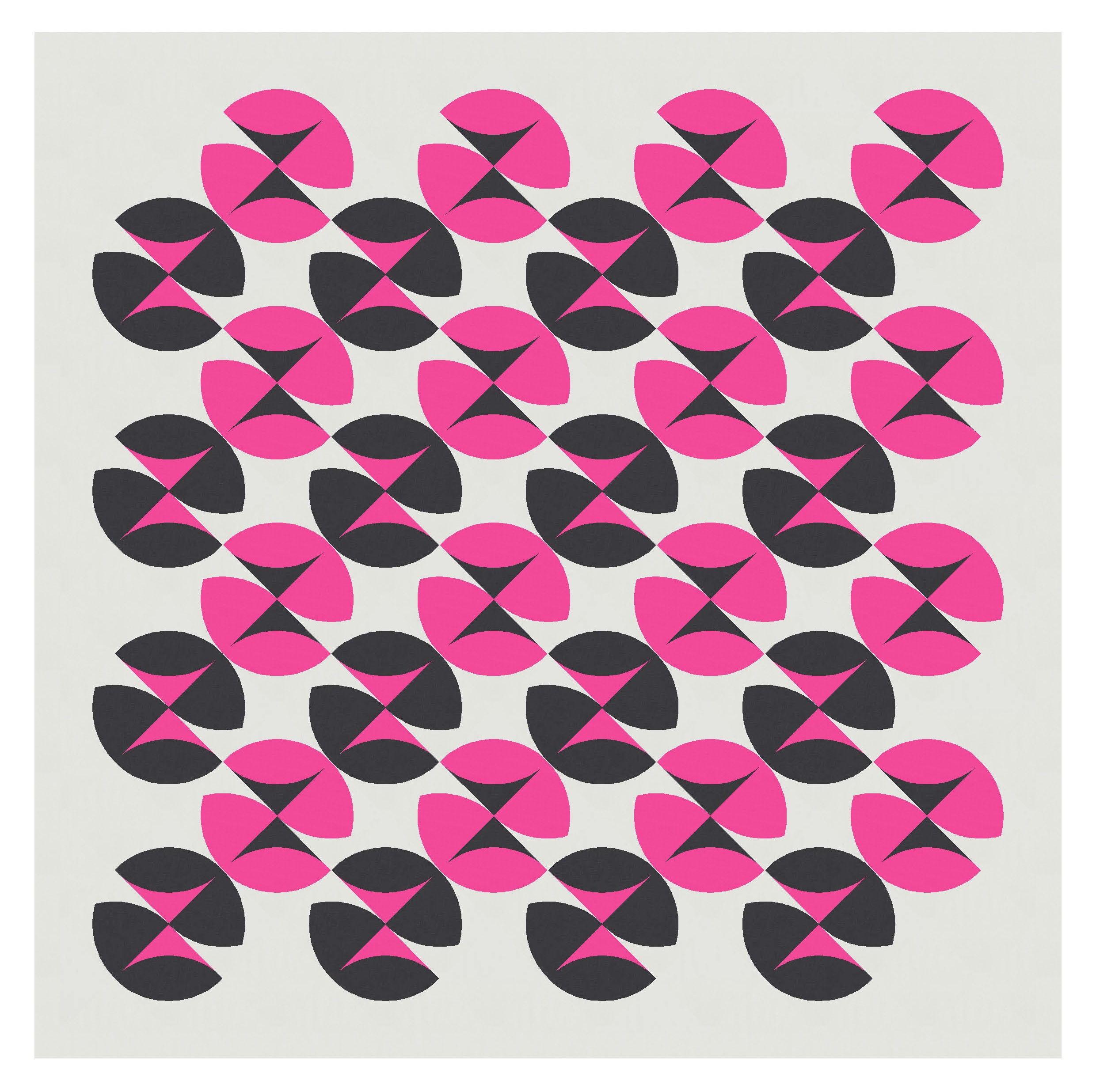
I tried a single colour for each circle, using the background colour to highlight those internal elements. This definitely lightens the load, although I don’t find it quite as interesting as where I ended up.
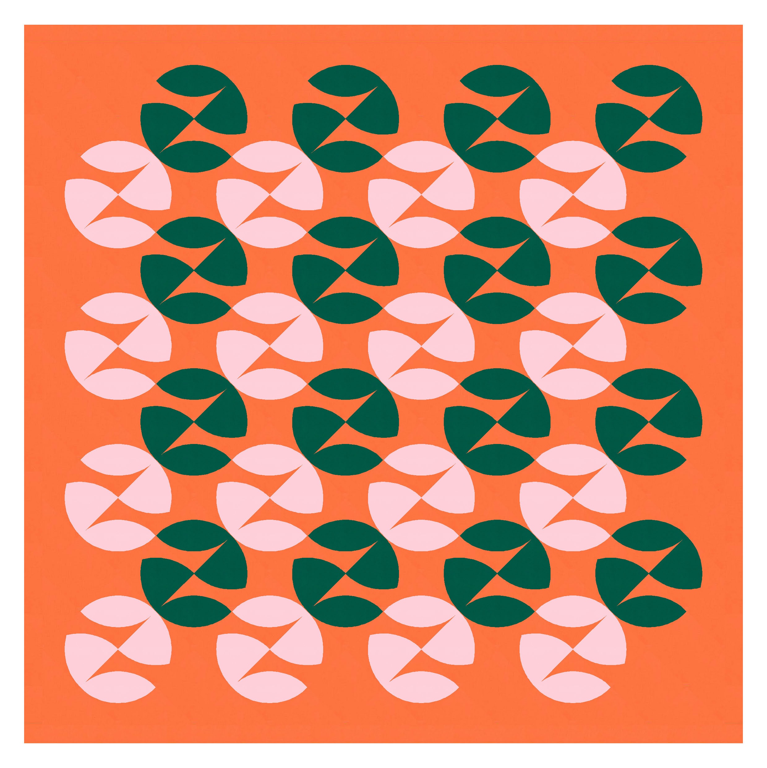
Using just one colour has the unintended effect of obscuring the circles… I find it much harder to see them now; the discrete shape that emerges for me is the kinda four-leaf clover shape (which I’ve highlighted in soft pink in the version on the right). I really struggle to find the circles once that shape pops out.

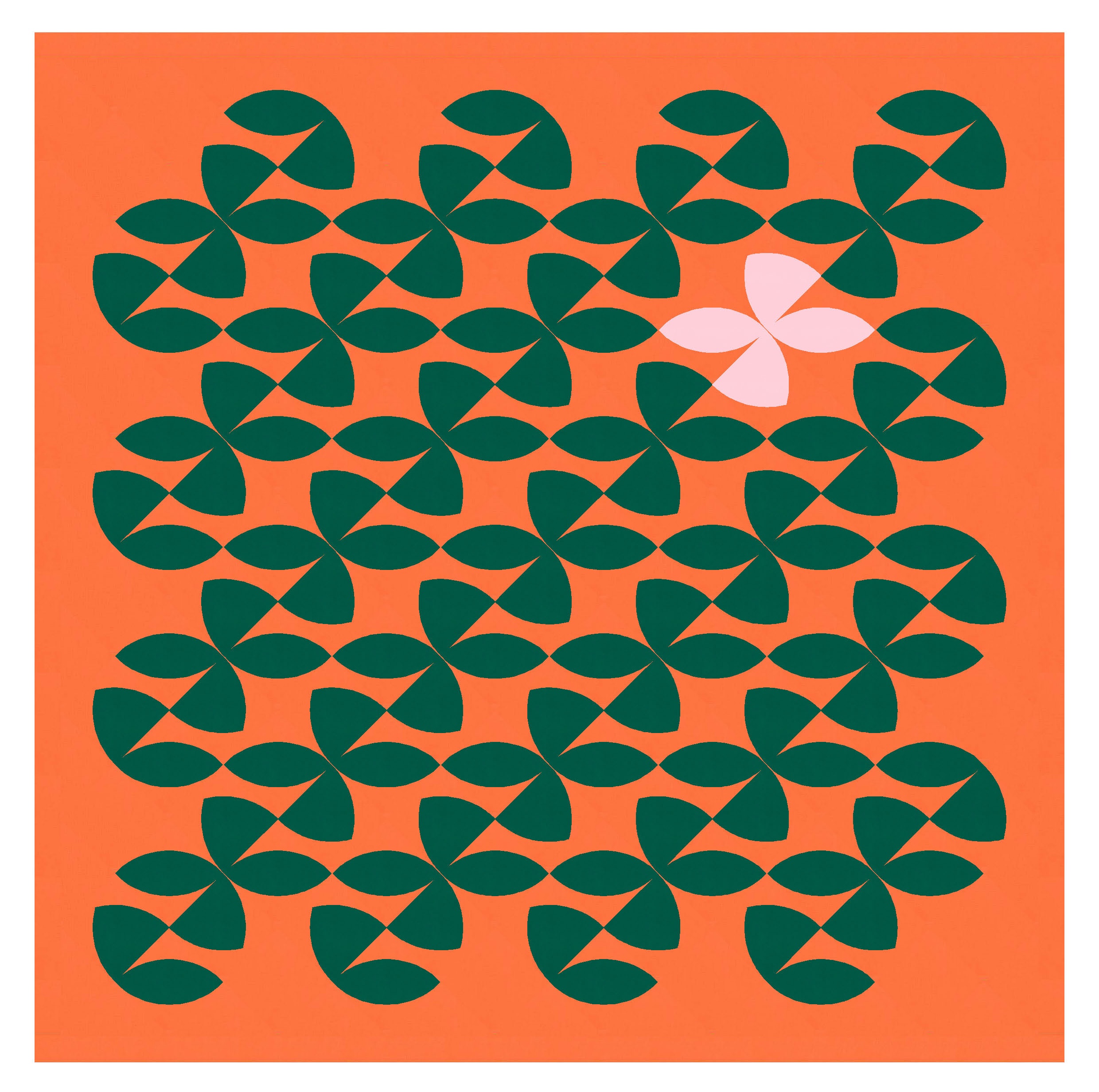
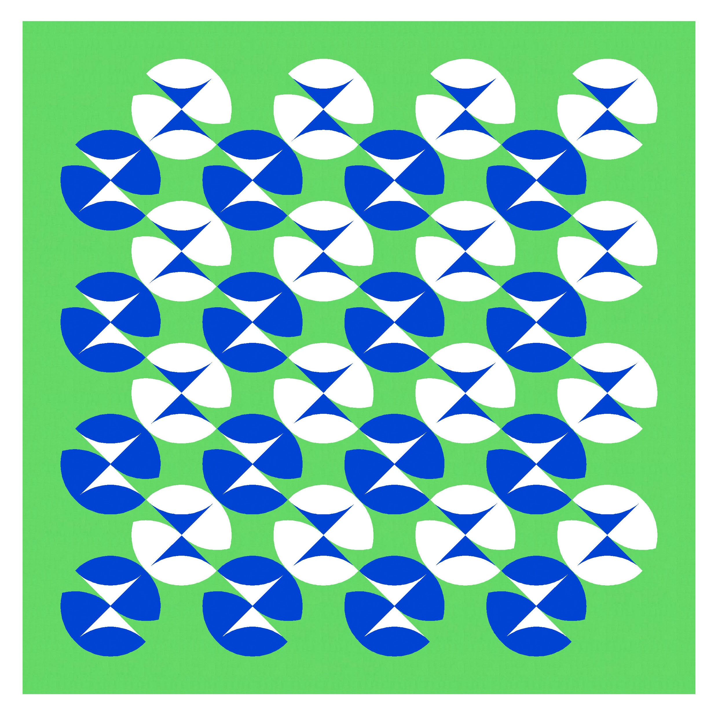
I tried another way of using two colours (plus background colour) in each circle. I like this version too. There’s still lots of movement, but now (for me, at least), the diagonal lines that criss-cross the design really jump out at me.
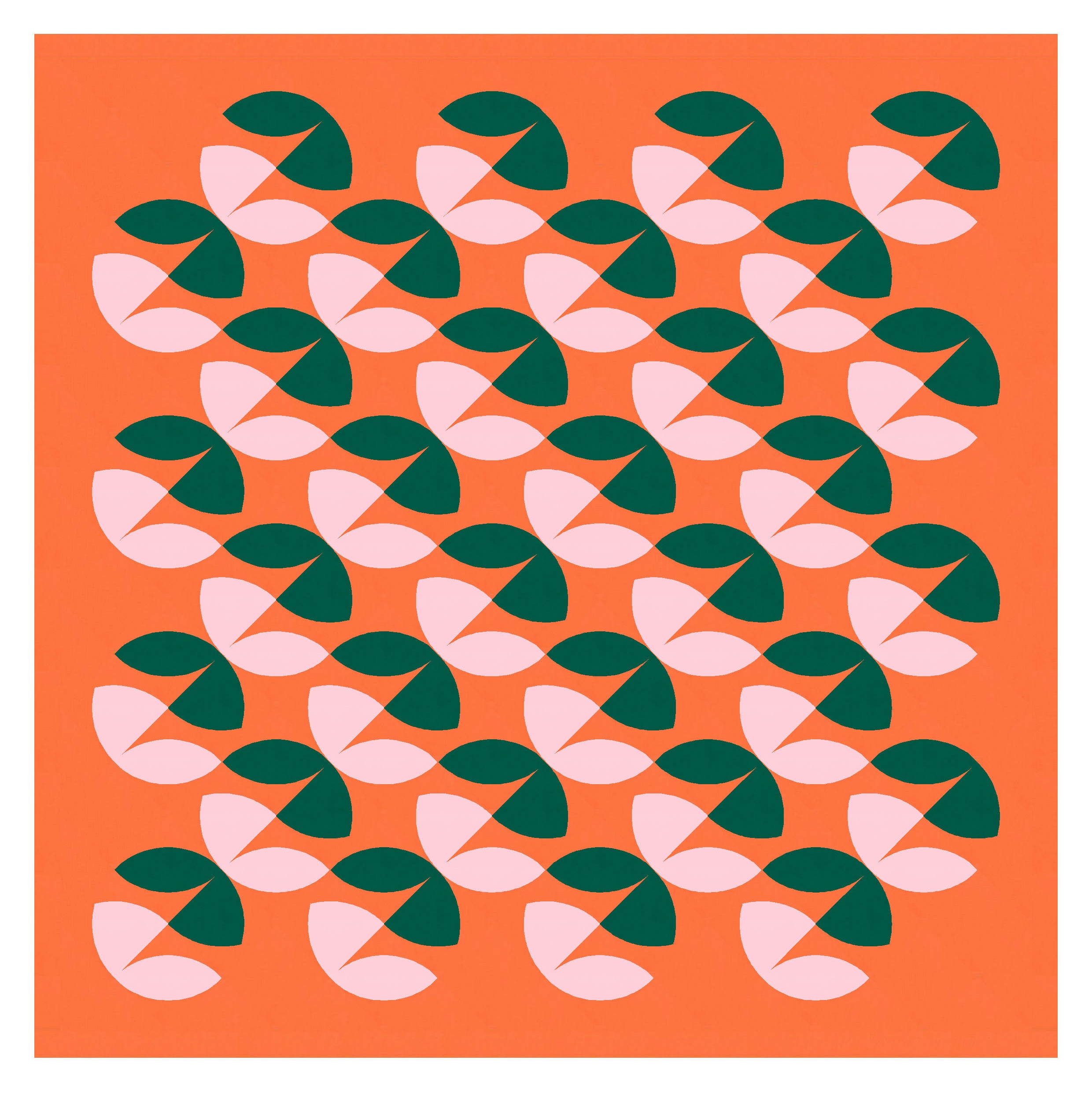
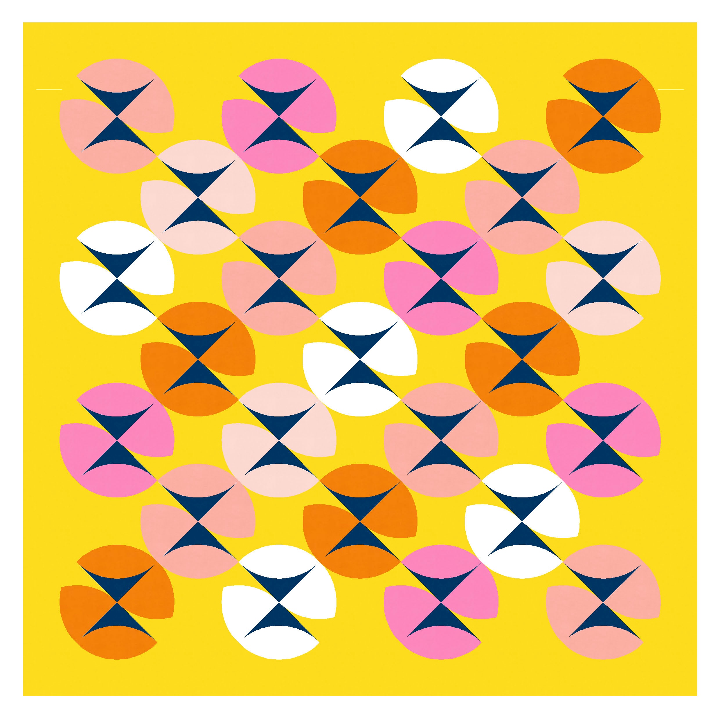
In the next version, I’ve gone back to colouring the inside corners of the orange peels, but using a different colour placement/arrangement. The circles are still there… but again, I feel like other shapes/movement come to the fore: the diagonal lines descending from left to right, and pairs of peels ‘kissing’ at their points (sandwiched between the diagonals). I really like this design too, but it feels quite different from the first version.

I really love that dark/murky green, hot orange and pale pink palette, but I think this design would work in just about any colours: it just helps to have a light, a mid-range and a dark colour. But I don’t think it matters much which colour goes where.


I also tried a multicolour palette. Suddenly these shapes kinda remind me of pansies?
These designs use square blocks (pointed arches and orange peels) on point. If you wanted to make one into a quilt, you’d benefit from using Daisy’s templates. I’m not sure if/when she will have them available on her website, but definitely contact her if you’re interested!
Discover more from Geometriquilt
Subscribe to get the latest posts sent to your email.

by the end I was paying attention