Sunday sketch #433
Last month, I attended the European Patchwork Meeting in France with Tara Glastonbury (read her blog post all about it). Tara took her ‘In Conversation’ exhibition there, and it was a great success. I got to listen to Tara’s talk about the quilts each morning, chat to attendees, promote Aussie quilting/quilters, meet people who know my Sunday sketches (so cool!), and see other quilts on show in some of the four French towns that make up this annual patchwork meeting. Not to mention practice my bad French and eat lots of cheese 🙂 Oh, and I caught up with Daisy Aschehoug and snagged some of her new Gothic arch templates, too. It was a great trip!
I designed Sunday sketch #423 using this shape, but something about holding the templates in my hands helped me to think of new ways to use it. (The shape has a bunch of names: Gothic arch, bishop’s arch, cathedral arch, pointed arch… I prefer ‘Gothic arch’ or ‘pointed arch’, so that’s what I’m using here.)
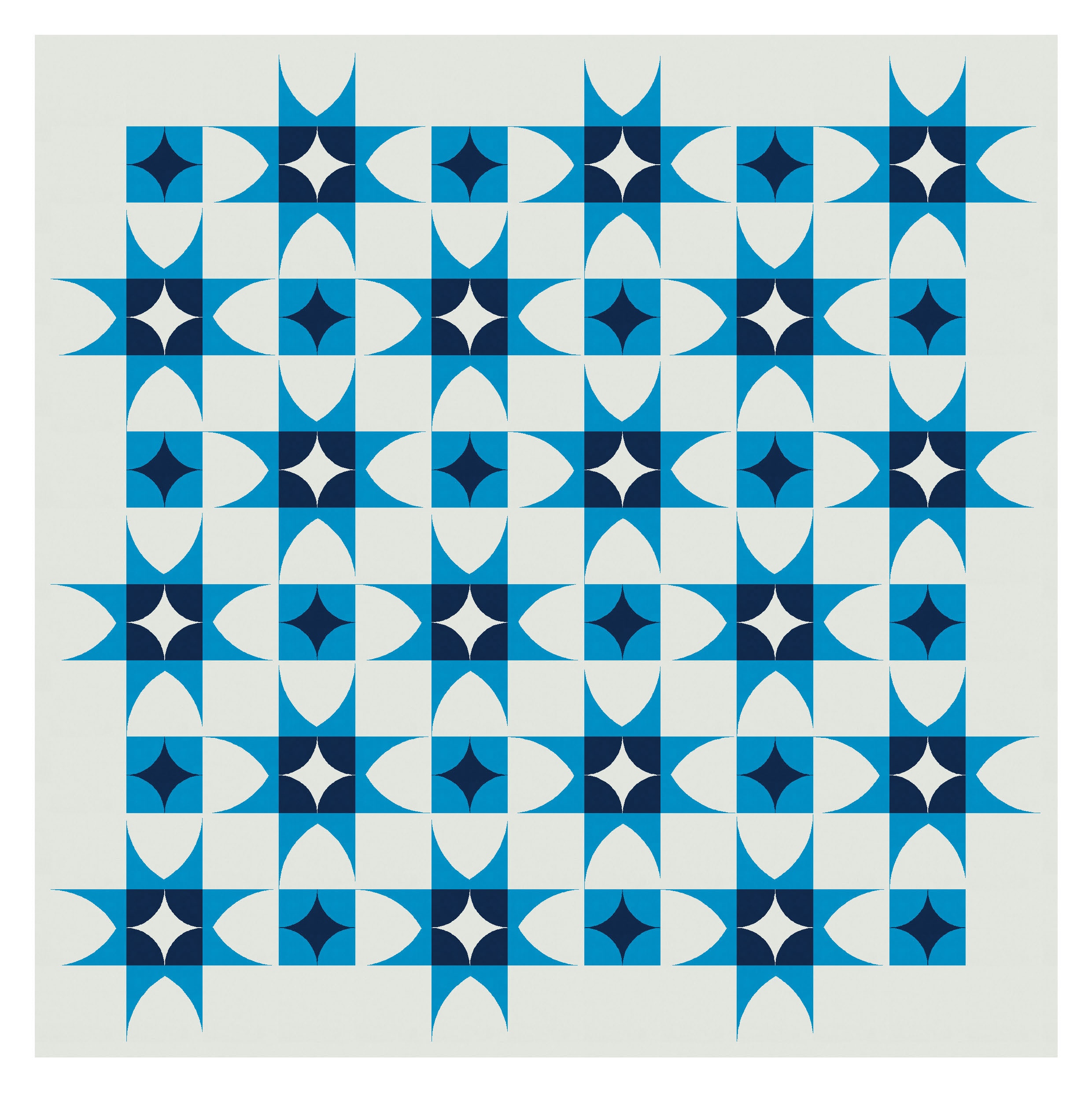
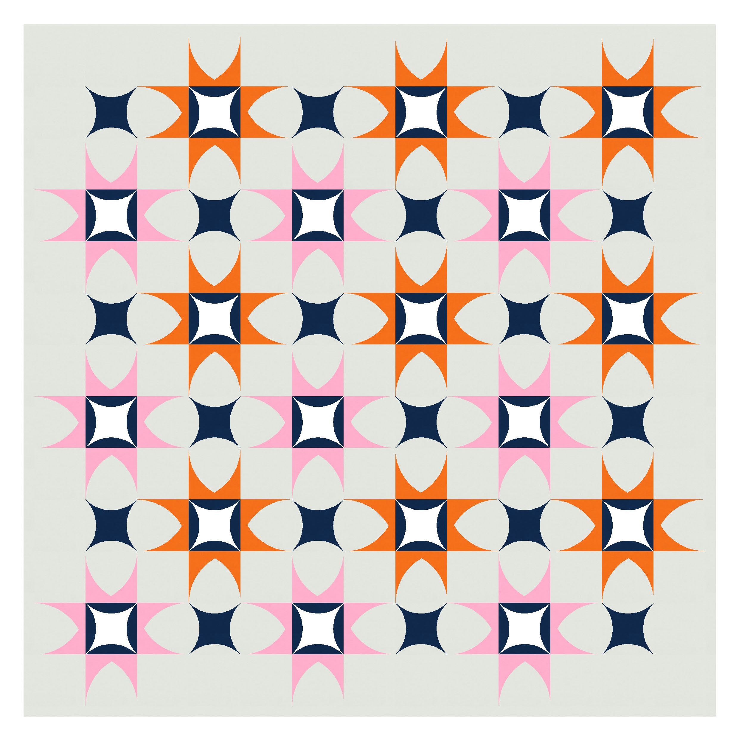
In Sunday sketch #423, I coloured in the convex parts of the arch shape (the inside bit), but this time I’m highlighting the convex parts (the outside bits). They’re basically like a curvy version of a triangle-in-a-square block, so I’ve used them to make some standard stars.

But they’re kinda boring on their own (even in my favourite palette of orange and pink!), so I introduced some new elements to the centres of the blocks and the spaces between them.

Sometimes it’s a case of trial and error when adding elements like this. I’ll try to echo features of the main blocks – such as curves or straight lines – to maintain some consistency and coherence across the design. The Gothic/pointed arch is basically two quarter circles that overlap, so I used a block featuring four smaller quarter circles.
Using the dark blue for the outsides of that block can make the whole design feel a little heavy though. One way to address this is to reverse the colours in alternate blocks – highlighting that internal curvy star in the blocks between the bigger stars. I like how this next version also lets those secondary shapes emerge from the negative space.


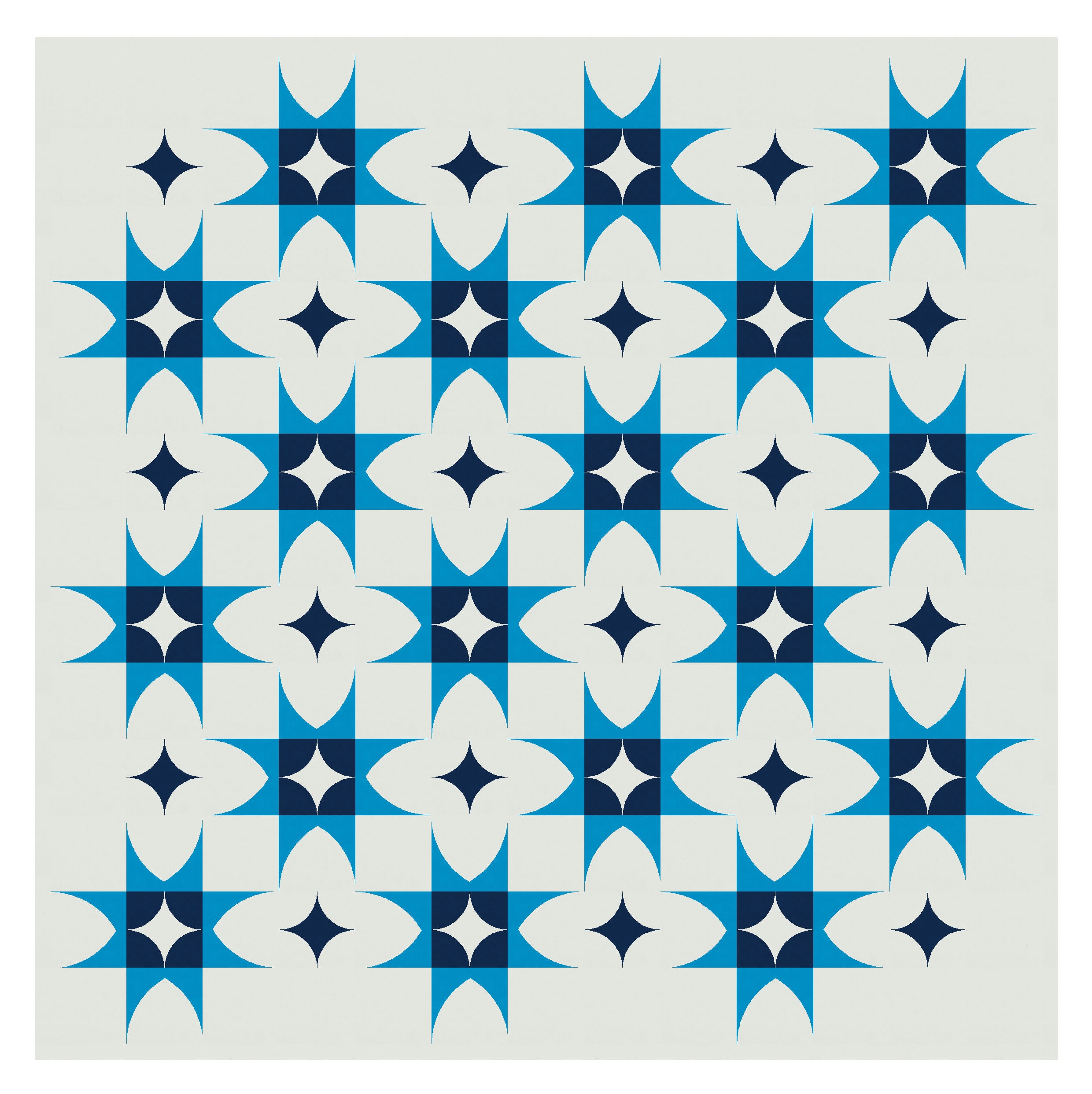
Another way to lighten the load of those added shapes is to use a lighter colour. Making the larger stars all one colour means I can use a second colour for the squares.
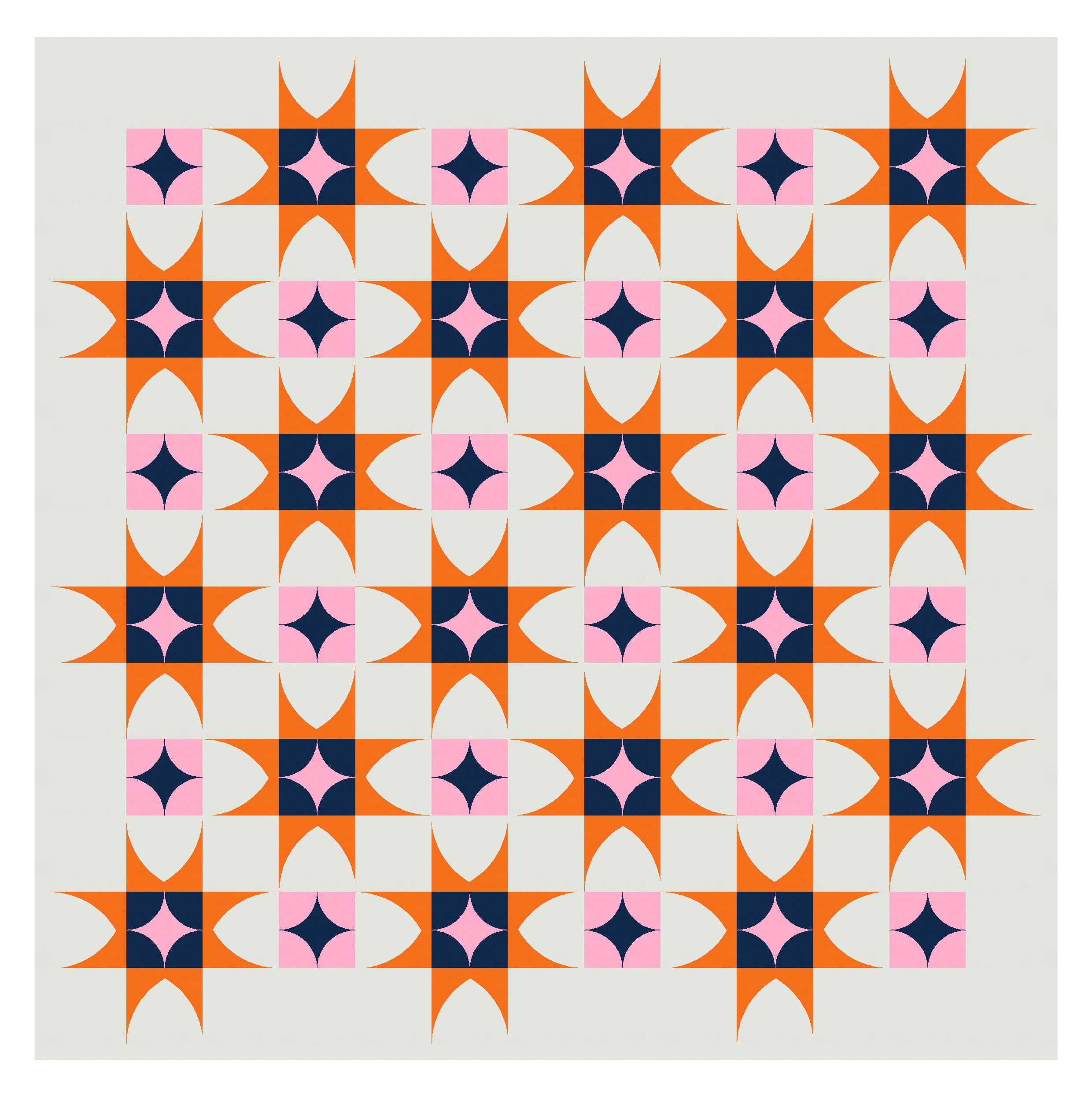

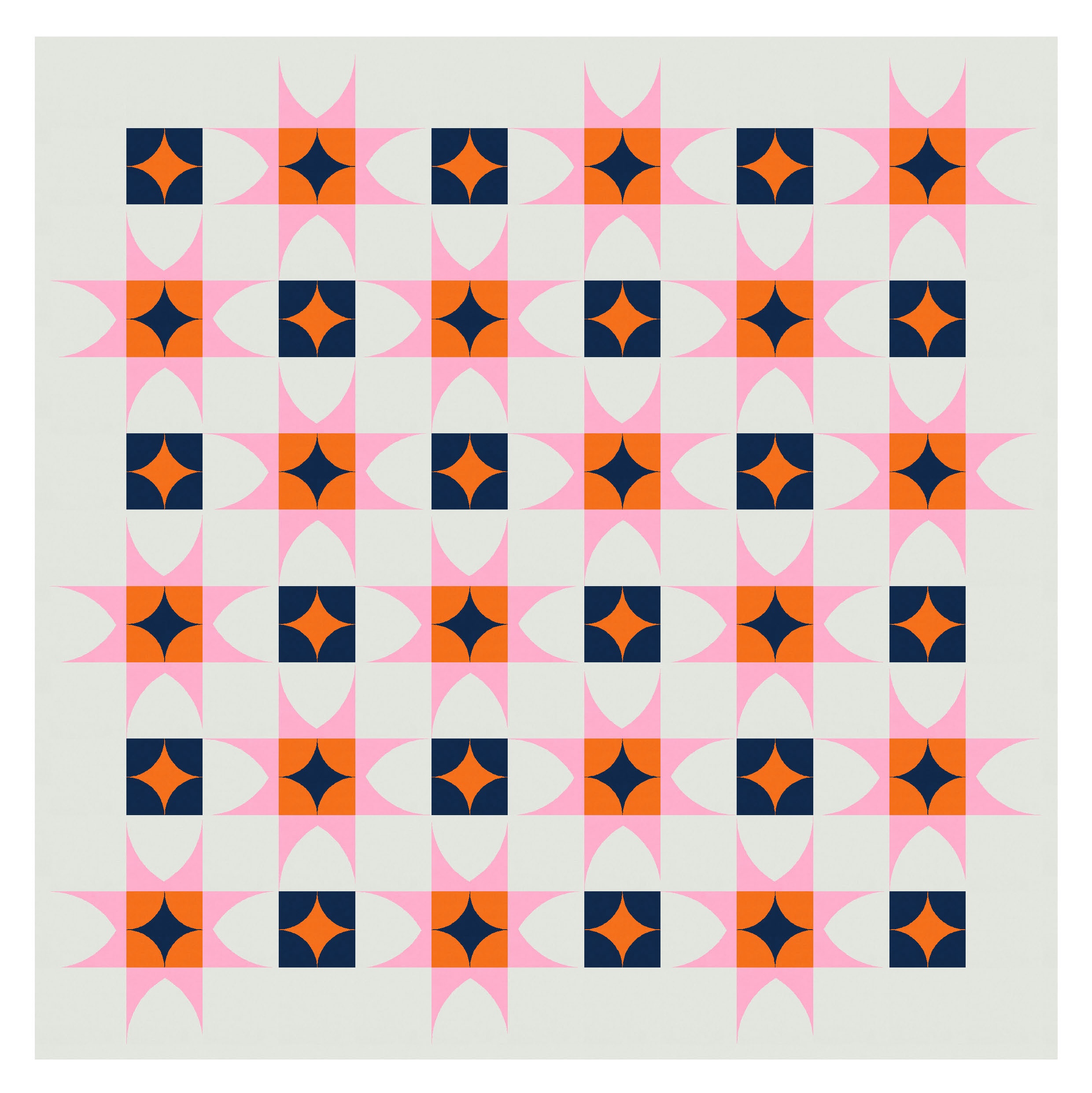
Or I can make the centres of the stars lighter, and save the darker squares for the spaces in between. I like the checkerboard effect of this one.
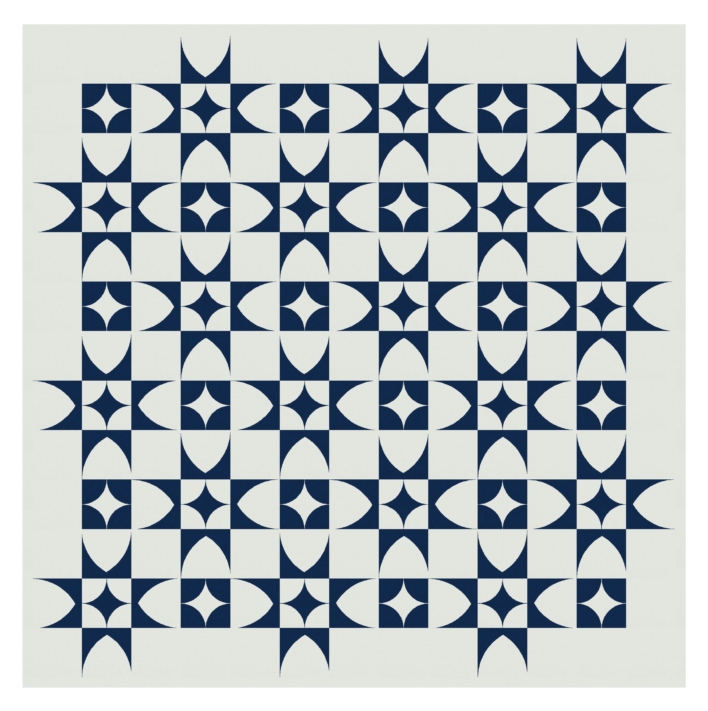
I tried different curvy shapes for those added elements, like another arrangement of curves within a square… but I don’t like these ones as much.

I also tried a more complicated (for me, at least) block that echoes the Gothic arch shapes. I love these versions – I think they’re much more visually interesting and have loads more movement – but I’d probably struggle to sew those centre units. I guess they’d need more (smaller) templates and a lot of patience. But they look good!


I’ve used a four-colour palette for most of these designs. I think they’d handle even more colours, but they also work with fewer.

There’s lots of potential with this shape, so I’ll share more iterations of these designs in the next few weeks.
If you’re interested in learning more about Daisy and her work (and her templates!), check out her website and Instagram, and listen to a recent podcast she did with Sam Hunter (of @revcraftbiz and @huntersds). I was really struck by her comments on finding your ‘why’ in quilting, as well as on the importance of persistence.
Discover more from Geometriquilt
Subscribe to get the latest posts sent to your email.

I love all of these!!