Sunday sketch #412
Like last week’s sketch, this week’s designs feature orange peels. But this time I’ve removed the thin sashing between blocks, so it’s only orange peels.
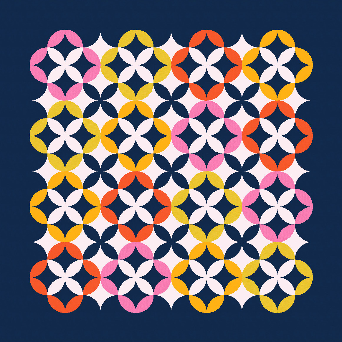
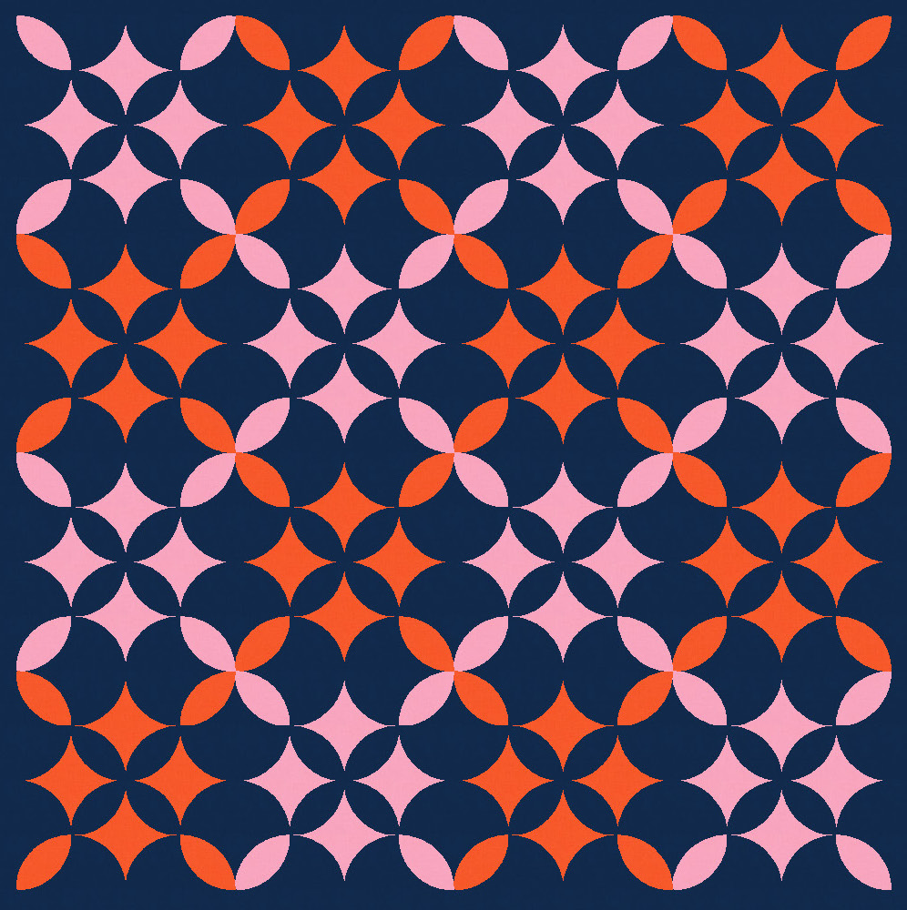
With so many shapes in close proximity, the design could become a bit overwhelming to look at. Colour placement helps to create areas for the eye to rest. For example, I’ve incorporated some of the background colour (pale pink) within the design itself, and used a single colour (dark blue) for certain elements across the whole design. That consistency helps to minimise the busy-ness.

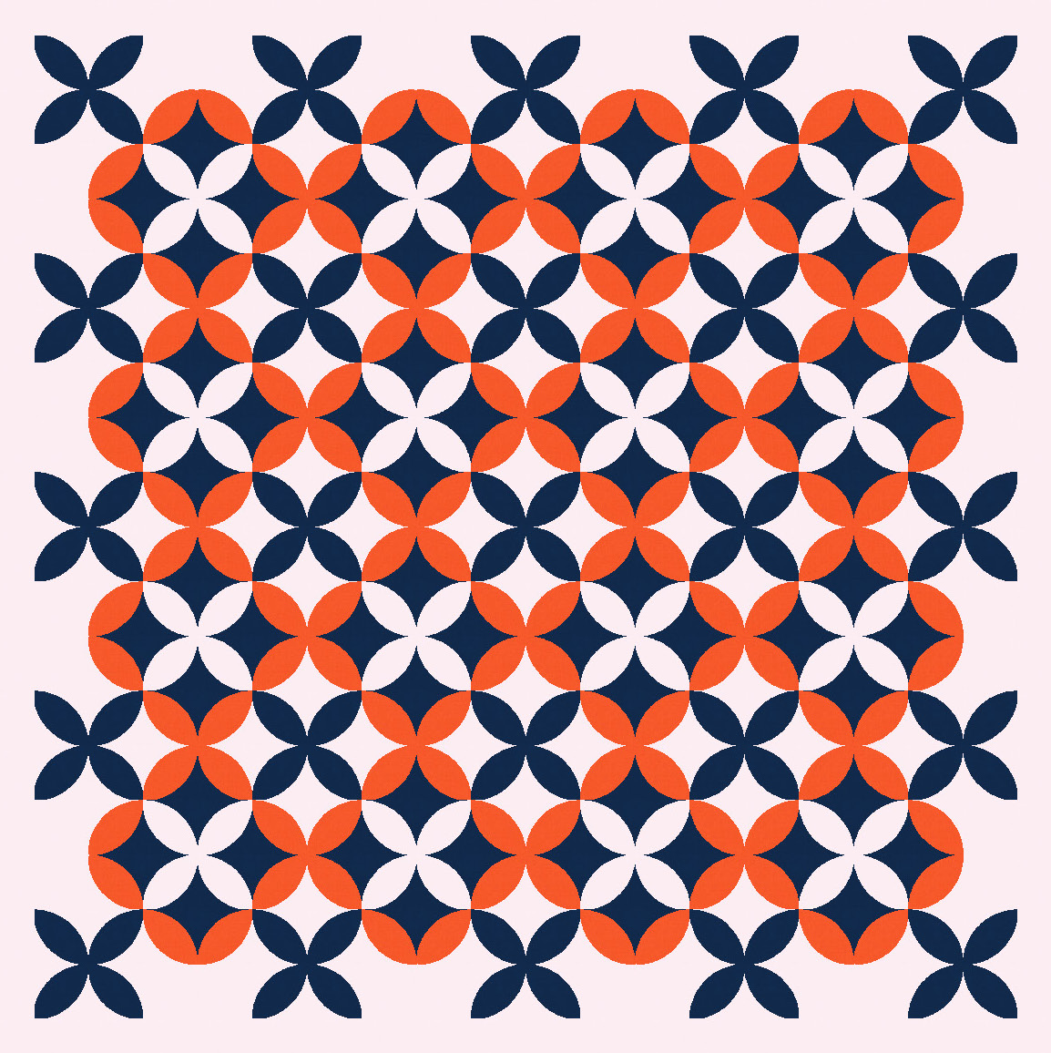
The basic block here is actually a ‘star’ of four peels placed diagonally so they meet in the middle, but you could just treat a single peel as a whole block. Either way, I’ve coloured several adjacent blocks to create larger rounded flower motifs in a palette of 4 warm colours. The big flowers each have a centre star in the same colour (dark blue above, pale pink below), and are surrounded by stars of a different colour (pale pink above, dark blue below).
In the previous designs, I think the coloured flowers are the most prominent feature, but that can be changed by adding more of those star shapes… now I feel like they draw your eye first.

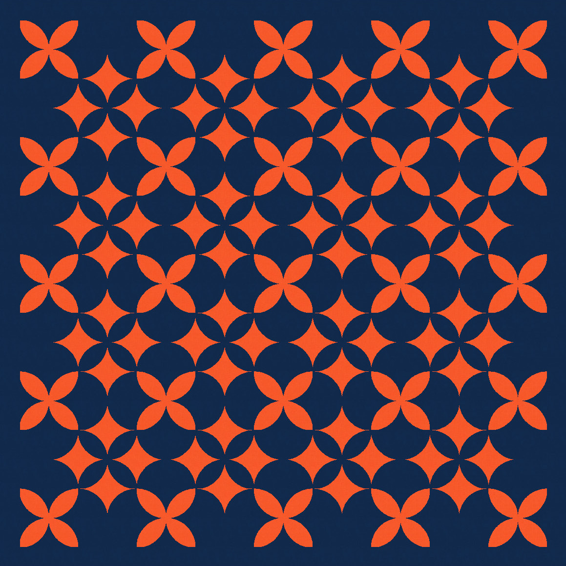
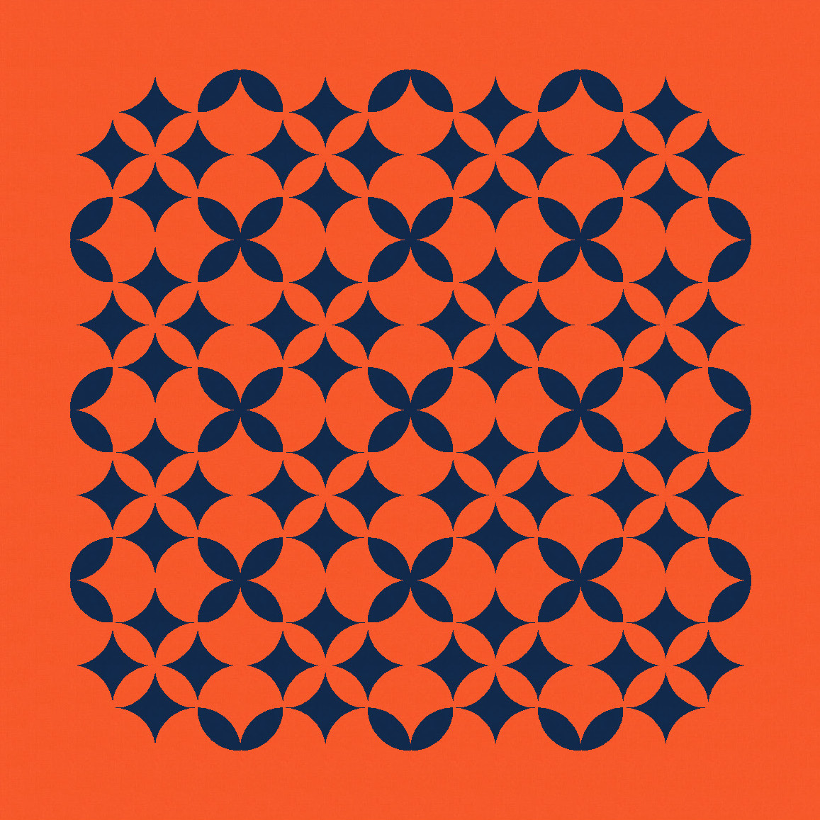
I often switch to a more limited palette when trying out different colour placement – I find it easier when there are fewer options!

Limiting the palette even more – going from 3 to 2 colours – changes the design again, because elements that were previously visible have now disappeared. Sometimes that will ruin a design (when it turns out that those elements were important), but here I feel like it’s created something quite interesting. The areas where peels were previously visible are now a collection of four adjacent curvy star shapes, whose edges still create those big flowers from before. These next versions almost feel like lace or doilies – layers of material with intricate cut-outs.
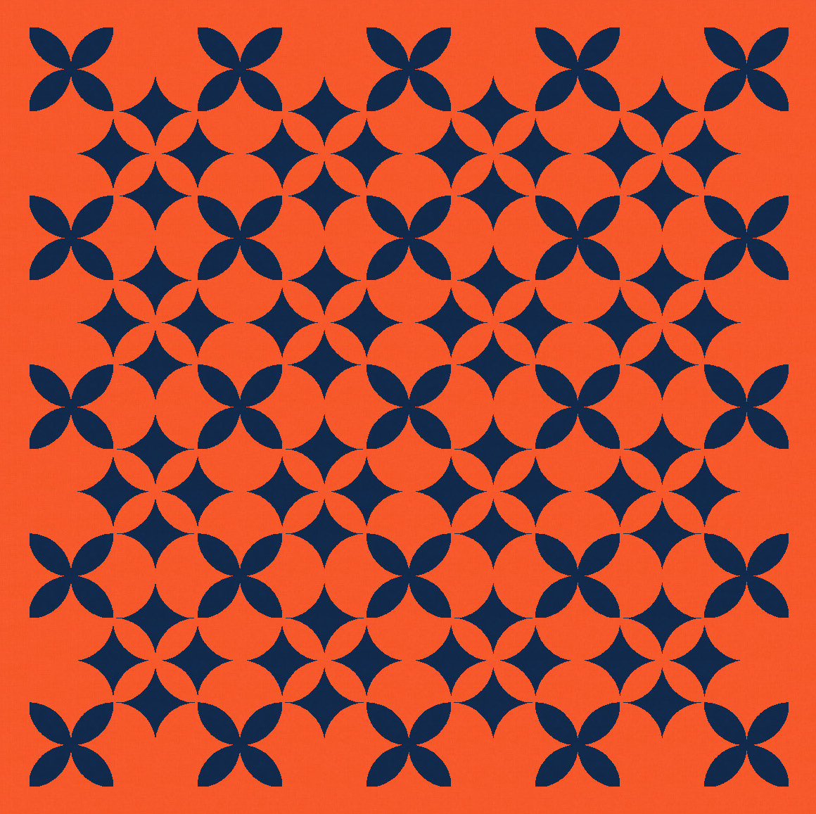
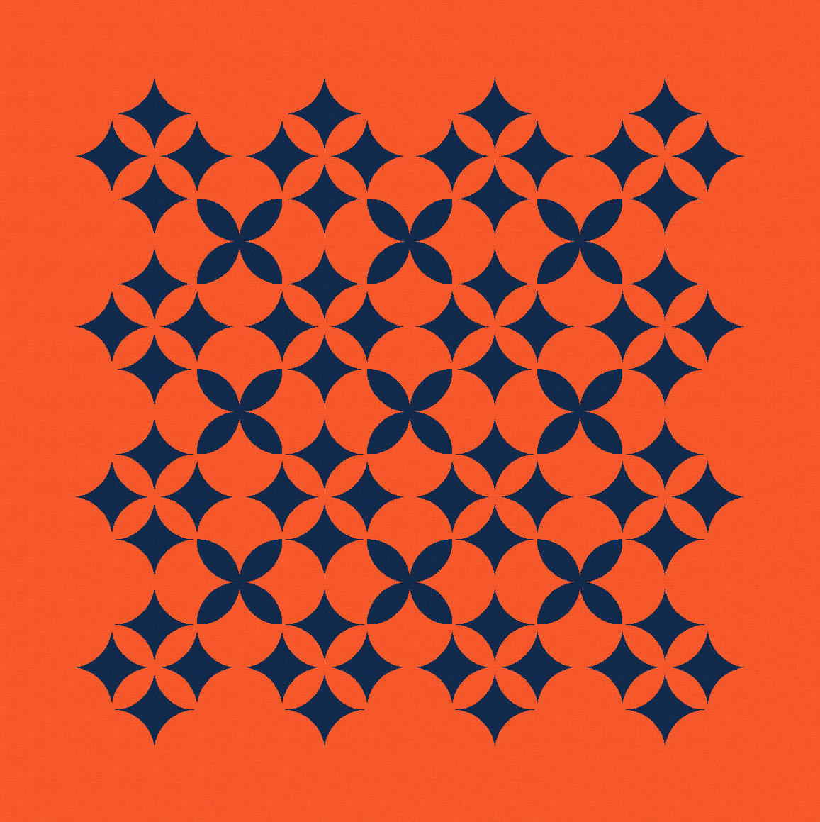
And taking away more elements simplifies the design further.


That last version intrigued me; I could see a different block-like collection of elements emerging. I’ve coloured them in differently here so you can see what I mean.
Depending on what elements are subtracted next, different shapes come to the fore. In the left version below, I still see the dark blue 4-peel stars within the larger red flower shapes first. But in the right version below, I see those groupings of 4 curvy stars first. (OK, it’s probably confusing that I’m referring to two different shapes as ‘stars’… sorry!)
Remember, all these designs are just orange peel units on repeat. The colour palette and placement are doing all the heavy lifting here.
I mentioned last week that I haven’t sewn an orange peel before. There’s no particular reason why – I just haven’t ever needed to, and I tend not to practice anything until I have to (otherwise it feels like I’m just wasting fabric, which could be a topic for another time…!). I love seeing what other people are doing with orange peels though – check out Tara Glastonbury, Yvonne Fuchs and Brigit Gail for some examples! (And scroll through their Instagram feeds for even more.)
Discover more from Geometriquilt
Subscribe to get the latest posts sent to your email.

I just love to read about your thought process & see the different options.